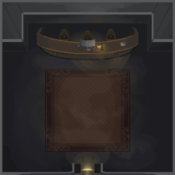
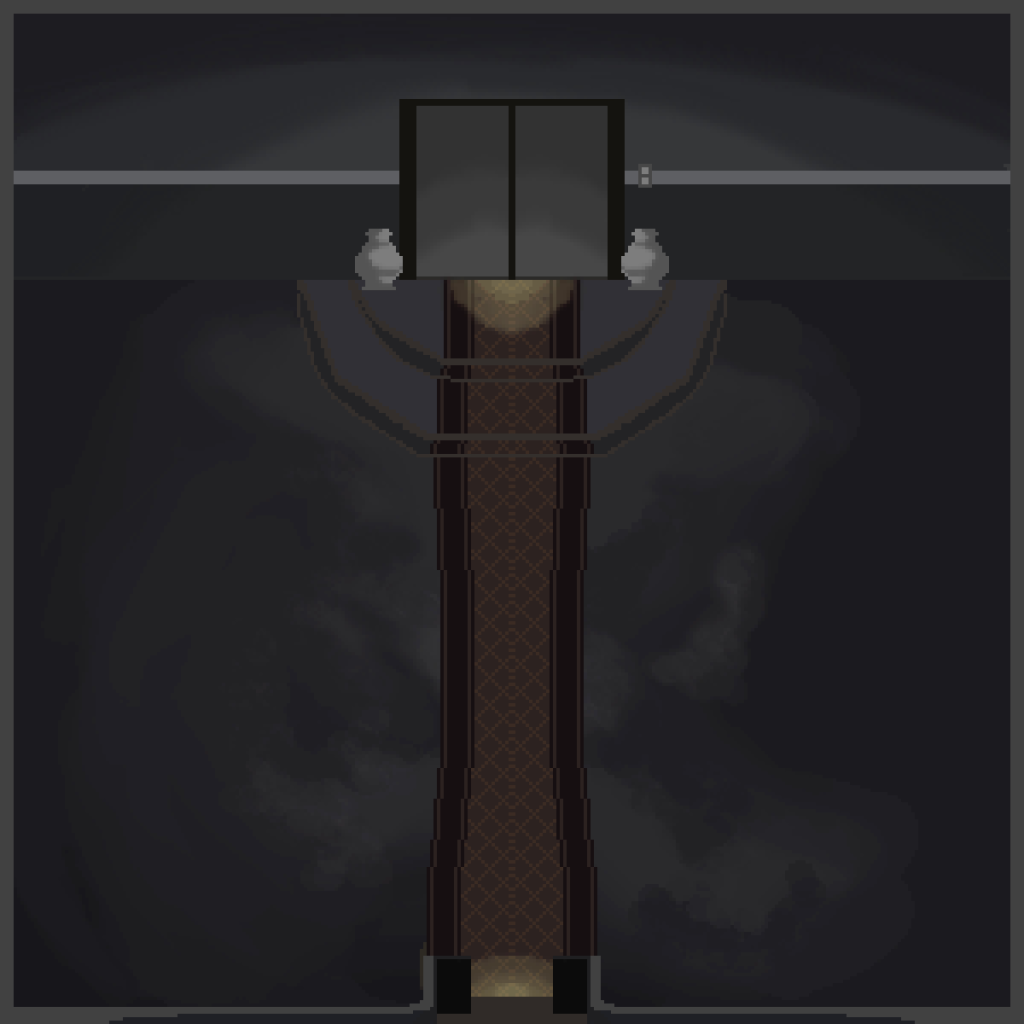
The two pictures illustrate the first floor setting of the Memory Mansion when one enters the game. The top part in the first picture shows the front desk of the mansion with a computer on the table. As the player directs the character to touch the computer, he or she is introduced to the mansion and an overview of the gameplay mechanics (which will be discussed in more detail in the Game Design Document). The bottom half is the entrance area. After the player gets into the mansion, the door closes automatically and becomes a solid wall. A tutorial level is started after interacting with the computer. At the end, the player is given a room key, which initiates a spatial distortion that changes the environment to the state displayed in the second image. Then, the player can go to the first level through the elevator.
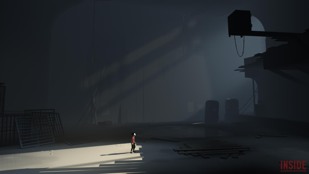
Game: Inside
The main aim of these two level illustrations is to present the general color scheme and mood of the game space. The design of the levels is mainly black, gray, brown and yellow. Black and grey are used as cool colour , which should create an impression of loneliness, detachment, and emotional coldness, visually inspired by the game “Inside” to support a cold and austere look. Conversely, the restricted application of warm colors brown and yellow plays a symbolic role in symbolizing time passage. Each floor shows memories of different time frames as players proceed through the levels, and environmental details change according to the relevant historical period. The first level currently available is placed around 2001, and the retro-style carpeting is intentionally selected to indicate this period. Brown and yellow also contribute to the visual effect of nostalgic, period-specific setting.