
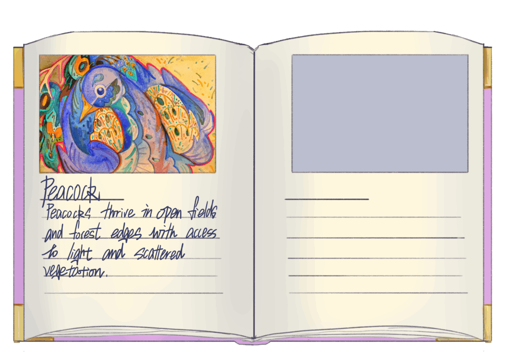
↑ I made the UI for the illustration.
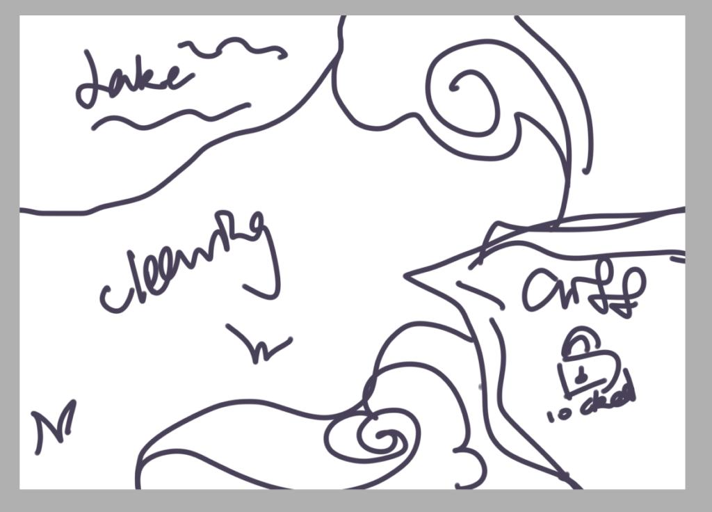
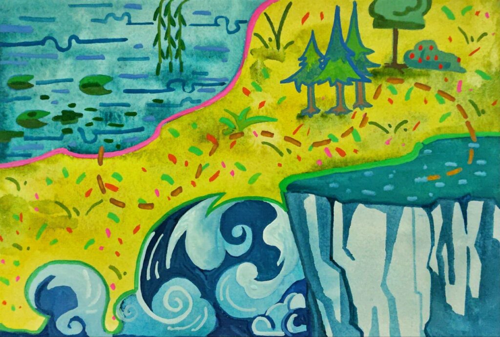
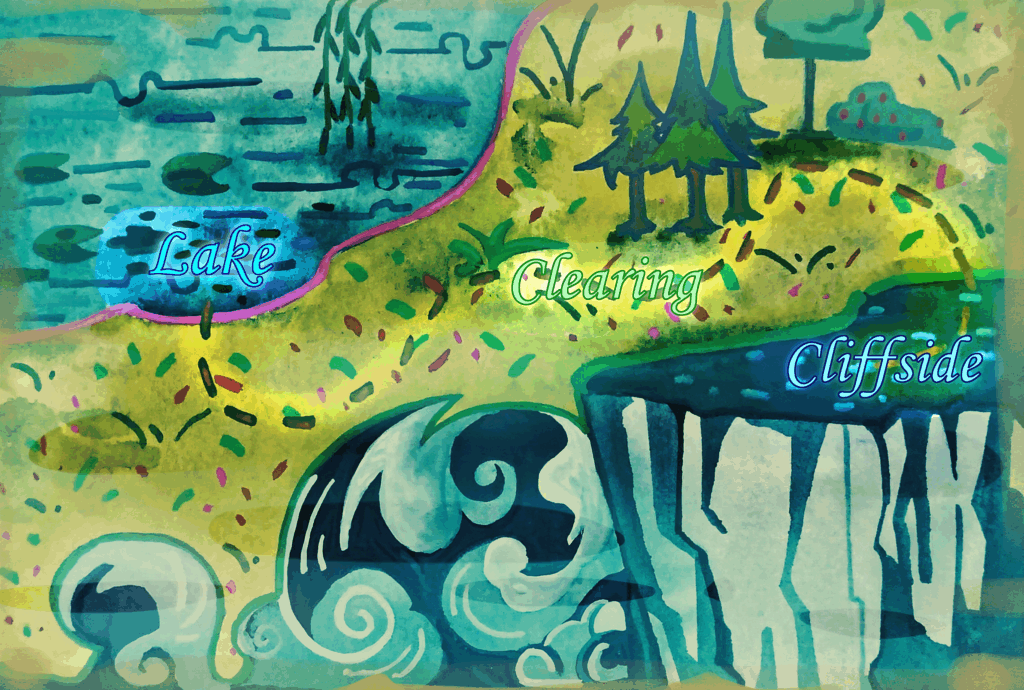
↑ The general map
Considering that pearlescent pigments do not show up after scanning, I applied secondary processing to the image using layer modes after scanning.



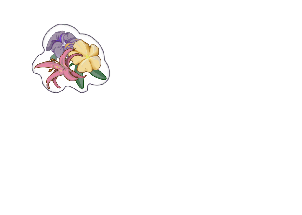
↑ I also drew the small objects for the final present
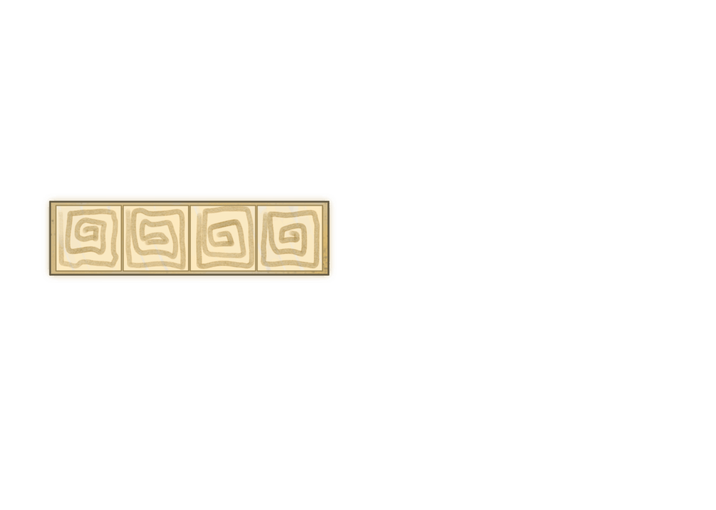
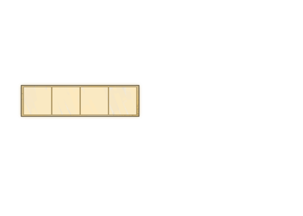
↑These are two versions of the item inventory
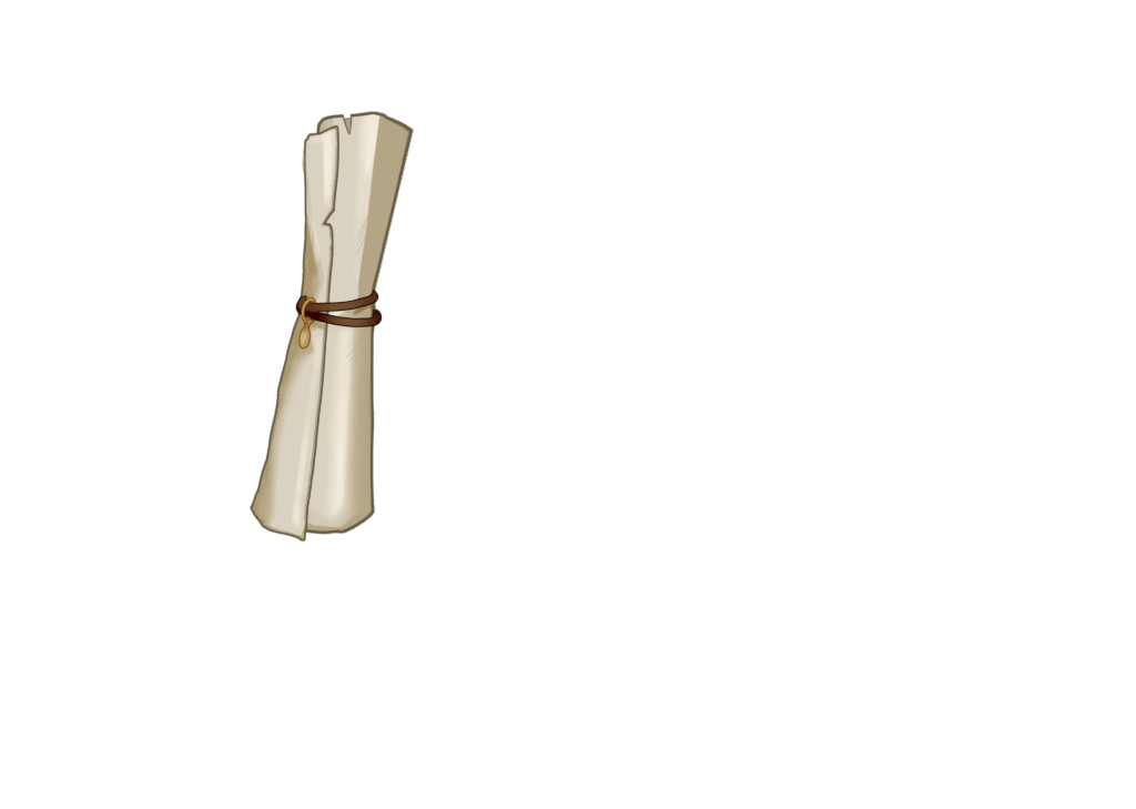

↑ Other icons
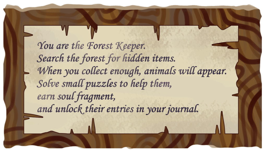
↑ Notice board
Playtest
I’ve consolidated feedback on the UI and background:
- The scroll icon and bulletin board icon don’t immediately suggest their functions.
- The content on the bulletin board doesn’t clearly correspond to the game content; adding pictorial annotations is recommended.
- The handwritten text is hard to read; switch to typed input.
- Mini-games need icons to prompt players on required actions.
- Dialogue boxes are needed to guide players through actions.
Most demo players focus their attention on the protagonist and animals. They only notice the UI when functional elements are missing—like realizing a button is missing or not understanding a button’s purpose. I was initially quite discouraged because I wanted my work to stand out. But then I remembered that in feedback, UI design directly impacts the player’s experience. Perhaps the greatest success of UI design is ensuring players can enjoy a smooth gameplay experience without getting stuck because they don’t understand what to do.
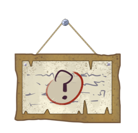
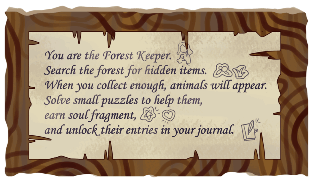
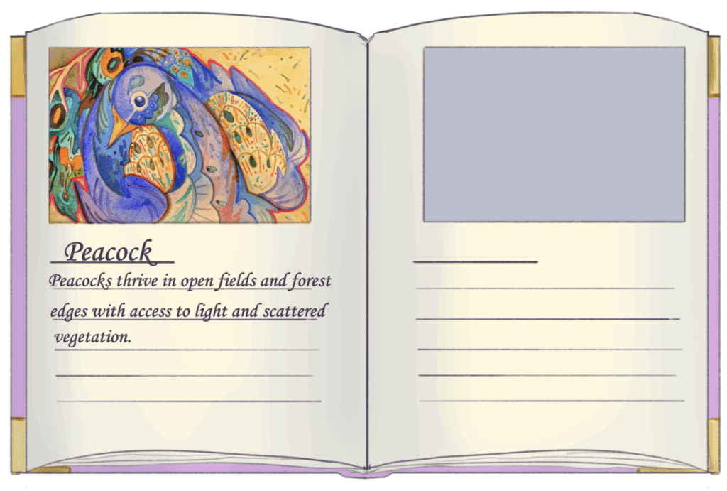
↑These are the versions revised according to the suggestions.