Final Prototype Outcome
Prototype Scope
The final outcome of our development process was a focused playable forest prototype rather than a full multi-level game. Because of the project scope and production time, our team decided to concentrate on one main playable environment that could represent the core visual direction, interaction style, UI approach, and level readability of The Verdant Trail. This allowed us to test the most important parts of the project without expanding the production scale too far.
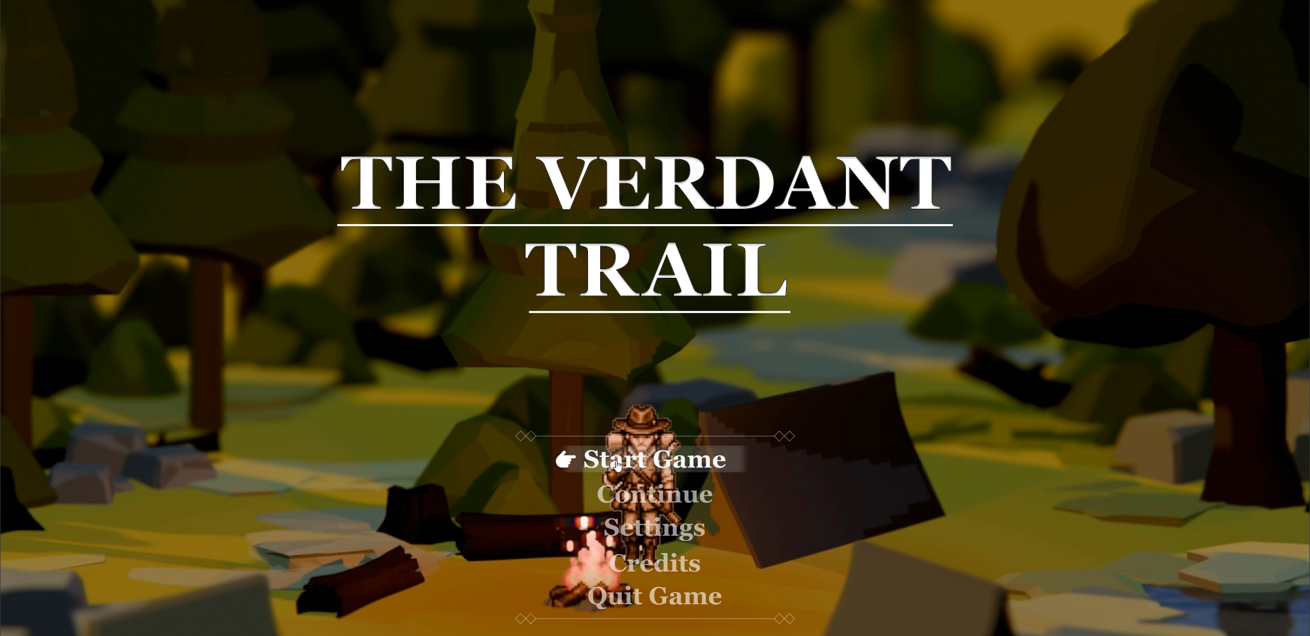
Figure 0.Main menu homepage created by Kevin; this figure shows the team’s prototype entry screen, which helped establish the first impression, title presentation, and mood before the player enters the game.
What the Prototype Validated
The prototype was used to validate several key production decisions: the Unity engine choice, the 2.5D pixel-inspired presentation, the forest level structure, character-to-environment scale, path readability, interactive object visibility, diegetic notebook / backpack UI, and pixel filter settings. Since the GDD defines the game as a top-down visual novel with survival elements, including branching dialogue, reputation, exploration, inventory, and interaction systems, the prototype helped us test how these ideas could begin to work visually and spatially inside Unity.
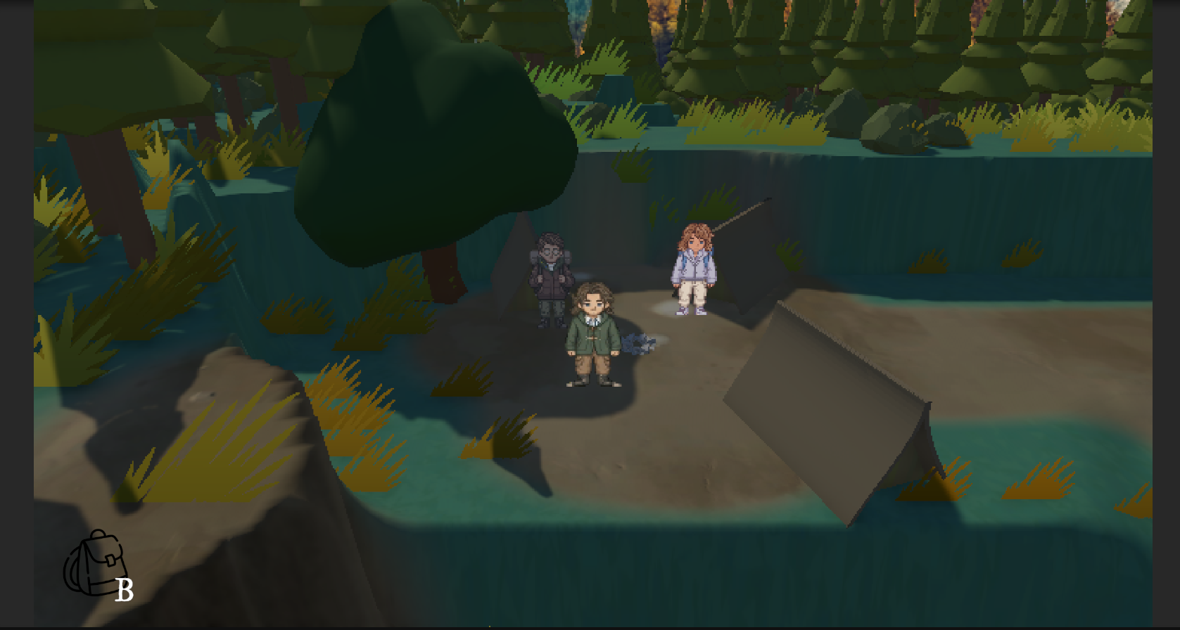
Figure 1. Engine and 2.5D Pixel Presentation Validation
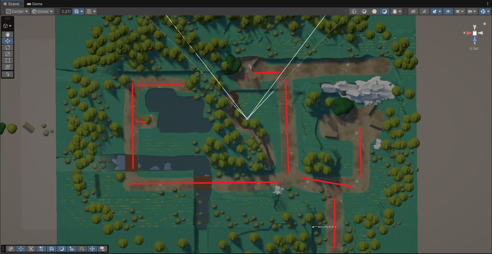
Figure 2. Level Layout and Route Readability Validation
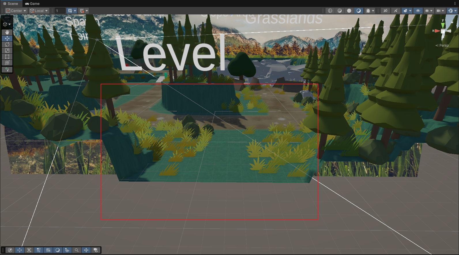
Figure 3. Foreground Occlusion and Character Readability Validation
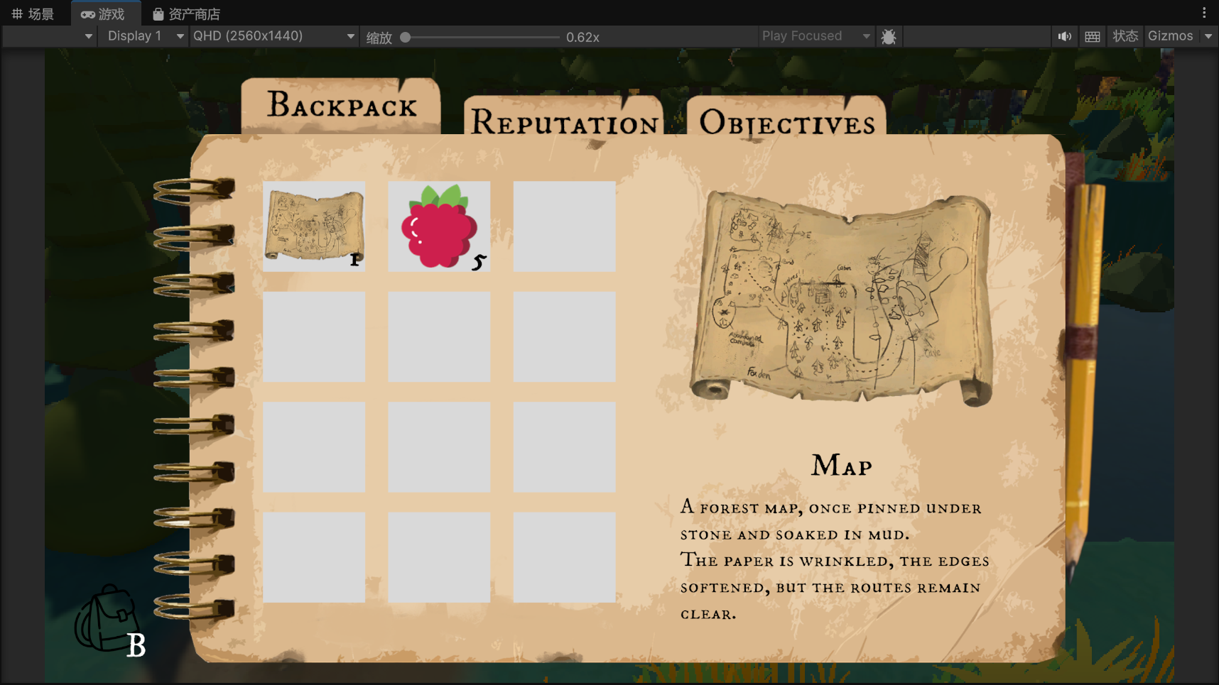
Figure 4. UI Readability and Diegetic Interface Validation
Key Development Challenges Addressed in the Final Prototype
The prototype involved many small technical and visual adjustments throughout development. Instead of listing every minor issue, this section focuses on four key challenges that had the strongest impact on the final playable experience: route clarity, pixel readability, diegetic UI, and prop interaction visibility.
Problem 1: The map route was unclear
One issue in the early engine version was that the map felt too open and lacked a clear route hierarchy. The player could easily become confused about where to go next. To solve this, we used mountain terrain, natural boundaries, and clearer landmarks to guide the player through a more controlled forest route. This supported the Forest level direction, which required a semi-enclosed space, stronger vertical forms, high occlusion, and an oppressive atmosphere.
Problem 2: The pixel filter reduced readability
Another issue was the pixel filter setting. A stronger pixel effect made the image feel more stylised, but it also made the character and environment harder to read. After comparing different values, the team selected 0.14 as the final setting because it preserved enough pixel stylisation while keeping the character, path, and environment readable. This aligned with the Art Bible’s direction of restrained pixel art, clear pixel edges, and visual consistency.
Problem 3: The backpack UI felt too disconnected
A conventional backpack UI worked for item viewing, but felt less suitable once the interface also needed to present objectives and player information. To solve this, I developed the backpack into a more diegetic notebook / journal interface. This allowed items, objectives, and player information to exist within one believable in-world object, rather than feeling like separate menu systems. This also matched the Art Bible’s diegetic UI direction, where interface elements should feel connected to physical objects such as field journals, maps, paper, and worn tools.
Problem 4: The hidden map prop was not readable enough
In the early prop interaction test, we planned to cover the map with soil. However, the soil colour was too close to the map colour, making the important prop harder to recognise. I solved this by replacing the soil cover with stones, which created stronger shape and colour contrast while still fitting naturally into the scene. The final interaction page made the map more readable without breaking the environmental style.
Final Prototype Result
The final prototype successfully brought together the main development outcomes: a more readable forest route, clearer interaction points, a balanced pixel filter setting, and a diegetic notebook / backpack UI. The forest scene no longer functioned only as a background image, but as a playable space where terrain, landmarks, props, UI, and visual style worked together. Although this prototype does not represent the complete game, it proved that the project’s visual direction and interaction logic could work as a practical Unity prototype.
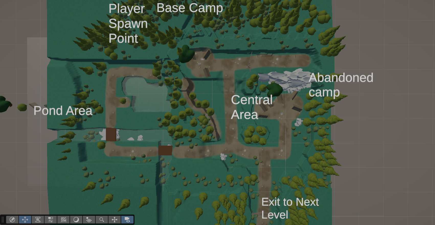
Figure 5.Own final map implementation; this figure shows the final playable map layout, presenting the forest route, key areas, environmental guidance, and interactive spaces as they appear in the prototype.
Final Reflection
Overall, the final prototype helped me understand that visual development is not only about making attractive images. In a game project, visuals must also support route guidance, interaction readability, UI clarity, and production feasibility. Through this process, I learned how to balance atmosphere with function: the forest needed to feel enclosed and oppressive, but the player still needed to understand where to go, what to interact with, and how to read the UI. For my role as a visual developer and Technical Artist, the prototype showed how art direction, level design, UI design, and technical implementation must work together.