Game Interface & HUD Design
THRESHOLD: SIGNAL AT THE EDGE
Game Interface & HUD Design Overview
In THRESHOLD: SIGNAL AT THE EDGE, the game interface is not conceived as a layer of information for the player, but rather as a system for regulating ‘presence, perception and uncertainty’
Rather than clarifying the logic of how the world works, the interface reinforces its opacity, instability, and indifference to the player; the HUD elements are kept minimal, conditionally triggered, and spatially restrained, appearing only briefly when functionally unavoidable, and receding quickly once their use is complete.
The goal of interface design is not to give the player a sense of power or control.Rather, it positions them as vulnerable observers within a larger, autonomously functioning system, making the interface itself part of the logic of the world rather than an overriding aid to it.
1.Interface Philosophy — UI as System, Not Decoration
In THRESHOLD, the interface design is seen as an extension of the world’s infrastructure rather than as a convenience overlay for the player, and the UI elements are not used to decorate the screen or appease the player, but rather to communicate the state of the system, the spatial conditions, and the intent of the operation in a highly restrained manner.
The visual language prioritises readability, hierarchy and “white space”.Any element that does not carry systemic meaning is intentionally removed.This design philosophy informs all of THRESHOLD’s interface decisions – from the launch screen, to the in-game HUD, to the quest selection and system navigation structure – ensuring that the interface always serves the logic of the world and the consistency of the experience, rather than distracting or diminishing the player’s perception.
2.Start Screen — Entry as Orientation, Not Reward
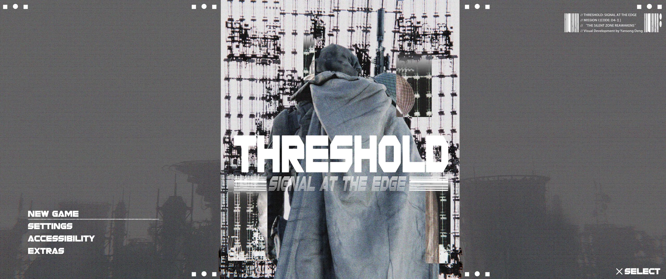
The launch interface is designed as a directional orientation layer rather than a portal for creating mood or ritual. There are no animated backgrounds, character displays, or emotional cues in the interface.Menu options are kept minimal and functionally orientated, reinforcing the overall tone of alienation and systemic indifference. The player is not portrayed as a hero, but rather is placed within an already functioning system as an operator who enters and accesses the system.
3.Mission Selection — Information Over Narrative
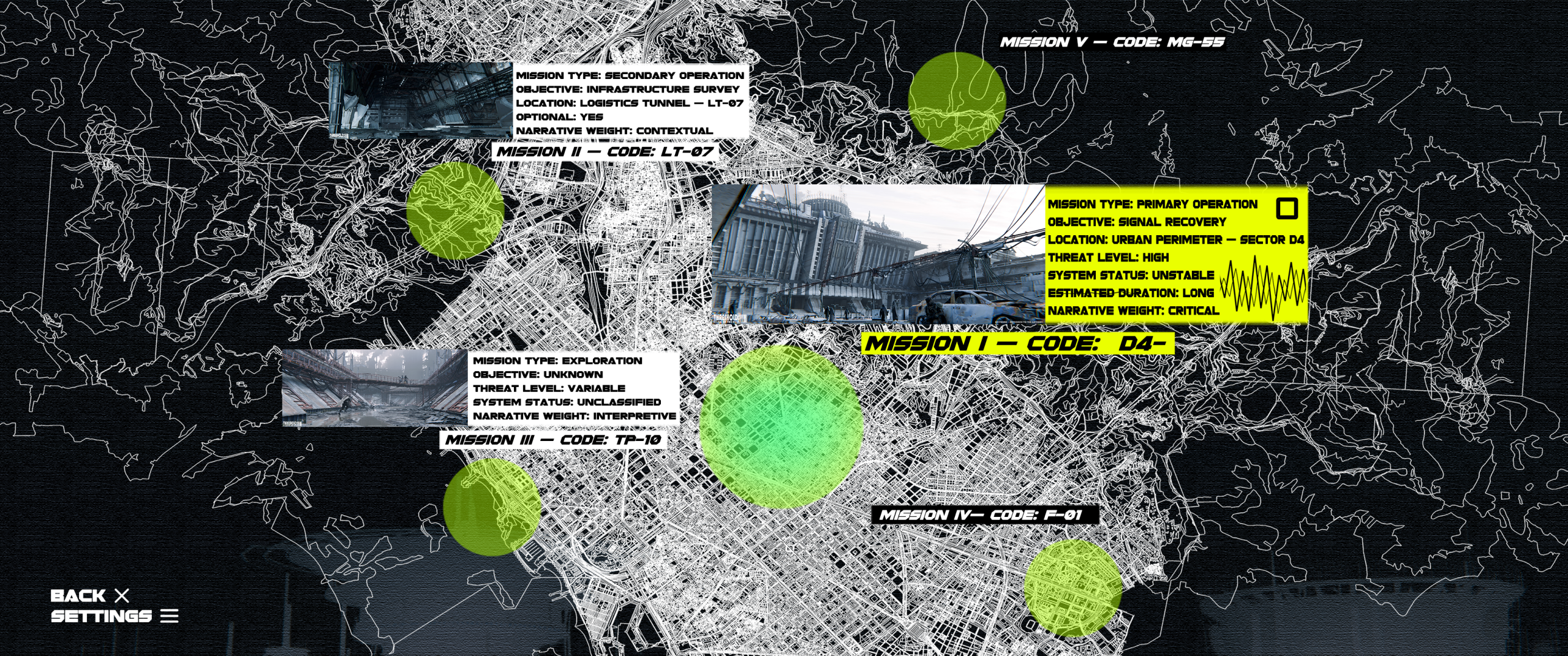
The task selection interface is constructed as a kind of data map rather than a traditional narrative hub. Tasks are identified by number, location, and system parameters rather than relying on storytelling text descriptions.Each task panel conveys clear information at the operational level: task type, target category, environmental risk, system stability, and estimated duration. Narrative components are treated as metadata rather than explicit narrative content, so that the interface always serves system understanding and decision-making judgement rather than plot guidance.
4.In-Game HUD — Contextual, Transient, Non-Intrusive
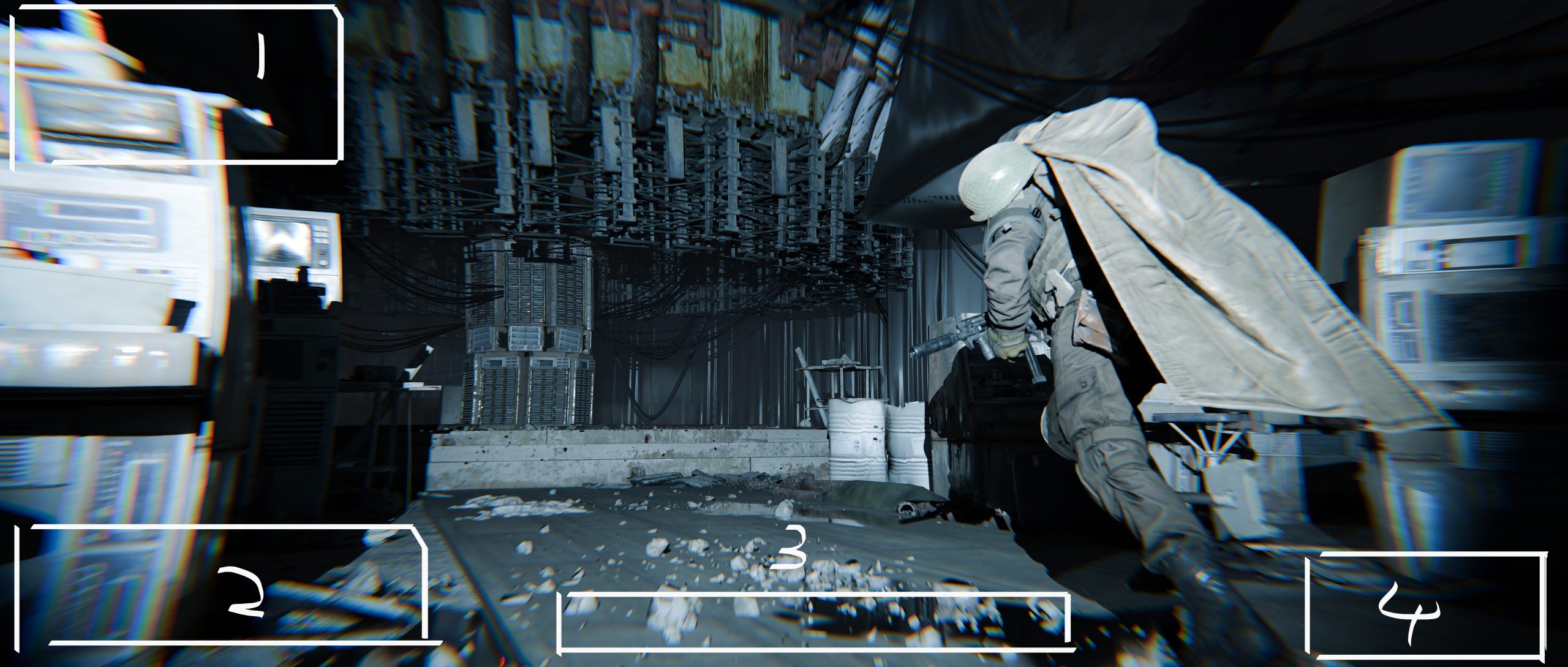
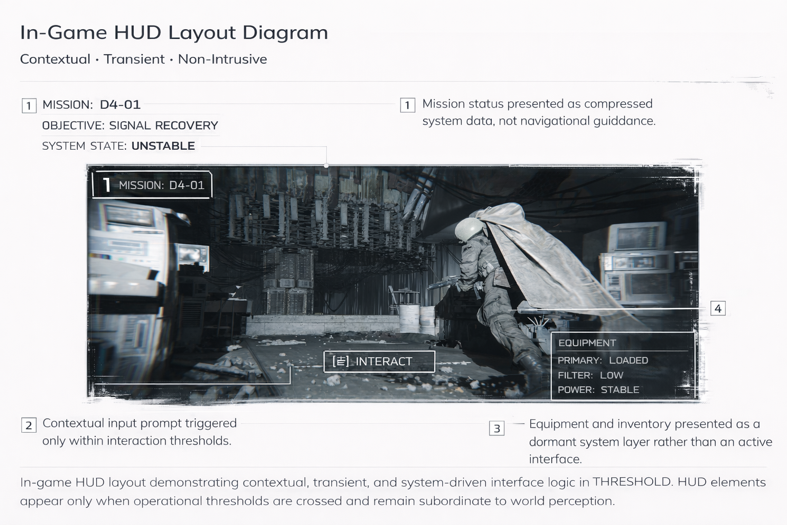
In-game HUD elements are strictly limited to contextual triggers, appearing only when crossing specific spatial or operational thresholds, with no persistent overlay display.Mission information is displayed in the form of brief action data in the top left corner. Operation prompts are placed in the bottom centre of the screen and are presented as alphabetised signals. Equipment and item bar entries are located in the bottom right corner and remain dormant at all times unless actively invoked by the player.
Top-Left — Mission Status Panel
The top-left corner displays current mission status and objective context.
Information is presented in a compressed, text-based format, prioritising clarity over guidance.No minimaps, directional arrows, or progress bars are shown, reinforcing ambiguity and player interpretation.
Bottom-Center — Input & System Prompt
The central area at the bottom of the screen is used to display contextualised system prompts, such as input letters, interaction buttons or brief system information.These cues only appear when the player is in close proximity to the interaction and disappear immediately after the action is completed to avoid creating a constant visual distraction.
Bottom-Right — Equipment & Inventory Access
The lower-right area is used to indicate access points to equipment and item bars, indicating the player’s current load configuration and survival resource status.Visual complexity has been deliberately kept low: the icons are schematic, monochromatic and unanimated.
The system prioritises functionality over comfort, reflecting the player’s vulnerability and constraints in the environment.