Team Feedback & Iteration
Map Structure and Spatial Readability
During the early visual development stage, I created concept tests to explore the possible environment direction for the playable forest level. These concept images focused on the overall mood, forest density, character scale, path feeling, and the relationship between the player and the surrounding environment. At this stage, the work was mainly used for visual exploration rather than final level validation.
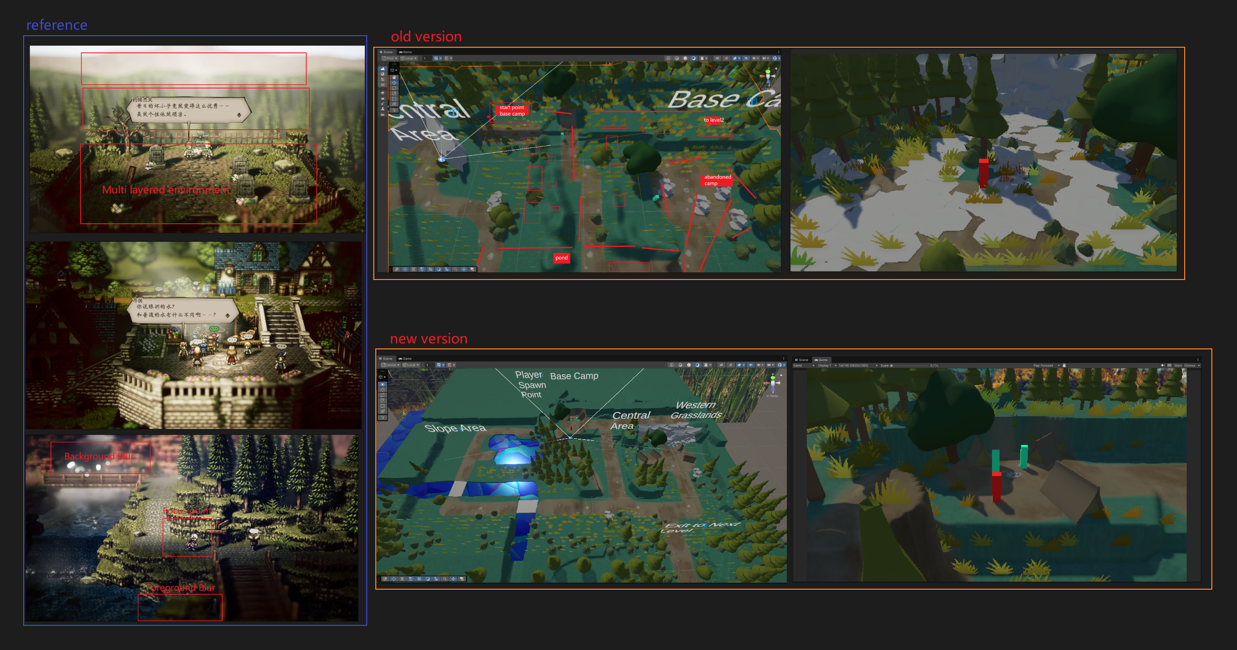
The more detailed team feedback happened later, when I started building the map inside the engine. Once the forest space became playable and the route could be tested more clearly, the team identified several problems in the first engine version. The map felt too loose and confusing, the route was not clearly guided, and there were not enough natural barriers or terrain forms to control player movement. The level also lacked clear area planning, which made it harder for the player to understand where they were and where they should go next.
the engine map production stage. It explored the possible visual direction of the forest level, including atmosphere, vegetation density, character scale, path feeling, and the relationship between the player and the surrounding environment. At this stage, the image was used for early visual exploration rather than final level validation.
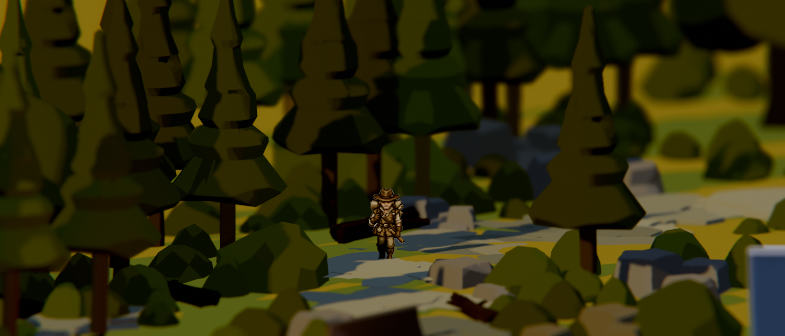
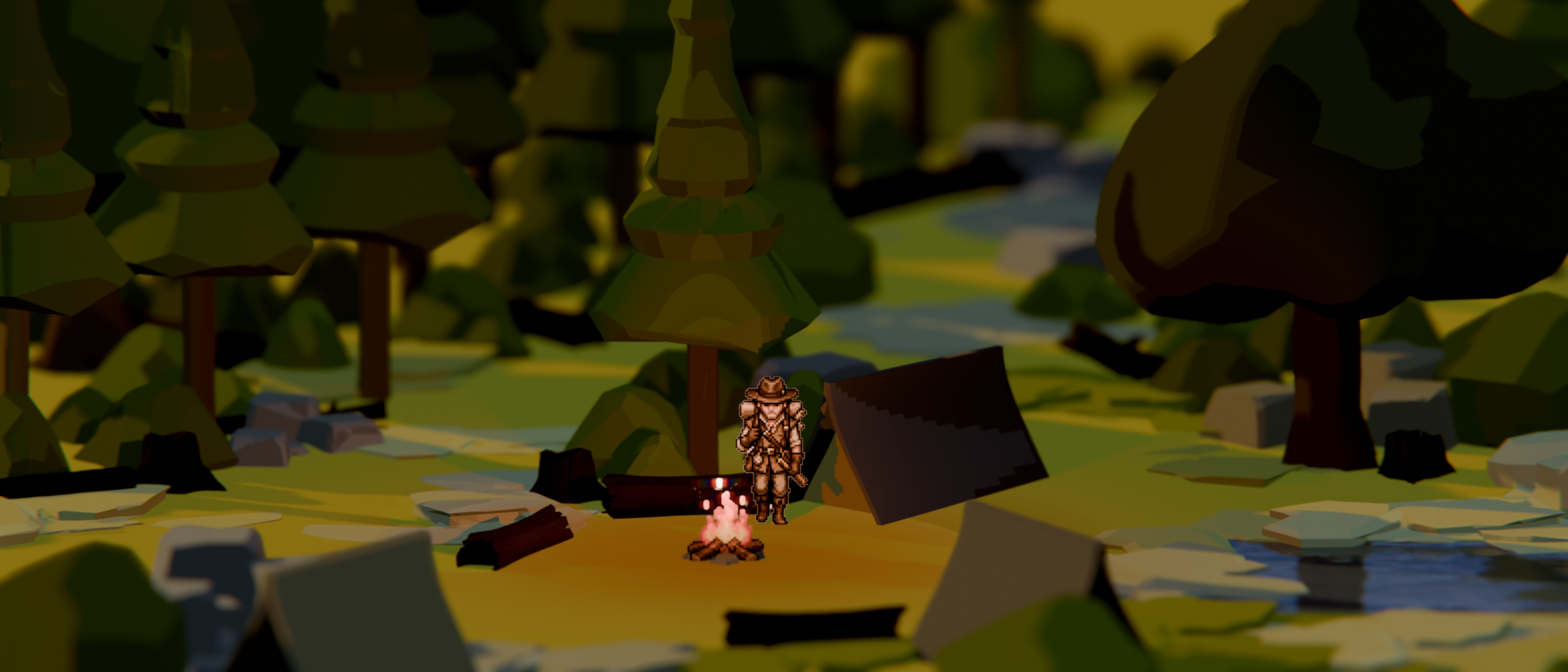
Figure 1. Early Forest Concept Test This concept test was created before
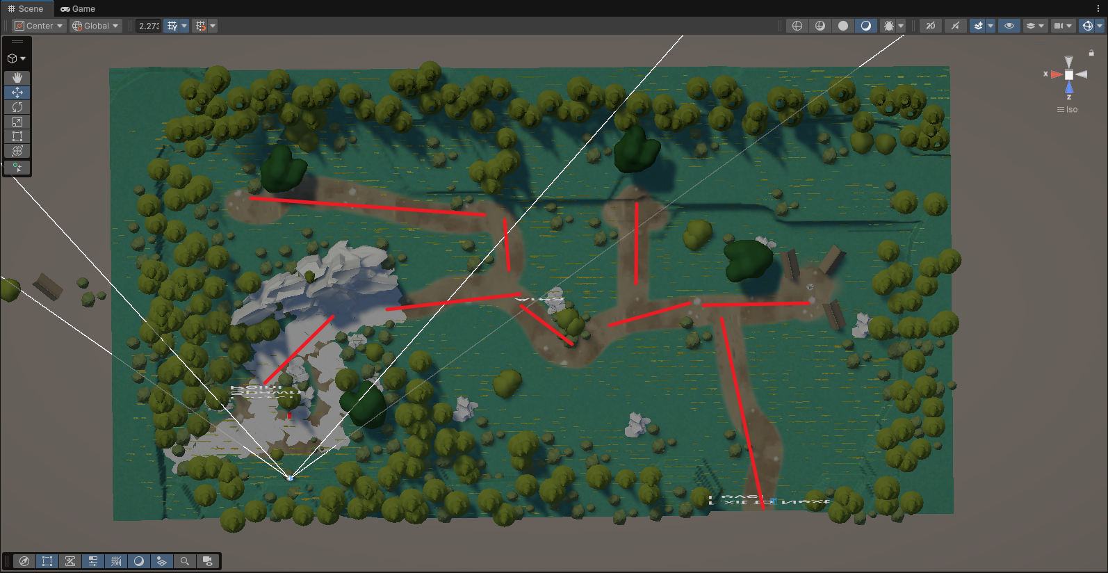
Figure 2. First Map Version This first map version shows the early forest level layout built in the engine. At this stage, the route structure was still loose and lacked a clear visual hierarchy. Because the playable space was too open and did not use enough terrain guidance, the player could easily feel confused about where to go next.
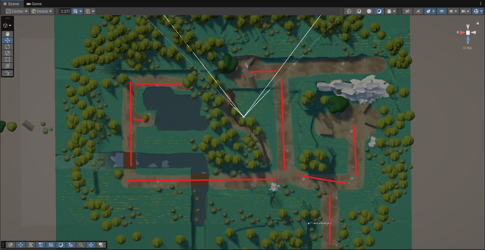
Figure 3. Iterated Map with Improved Route Guidance This iterated version shows how the map was restructured after feedback. Mountain terrain and natural boundaries were introduced to guide player movement more clearly and reduce unnecessary route confusion. Compared with the first version, this layout created a stronger main route and a clearer spatial hierarchy.
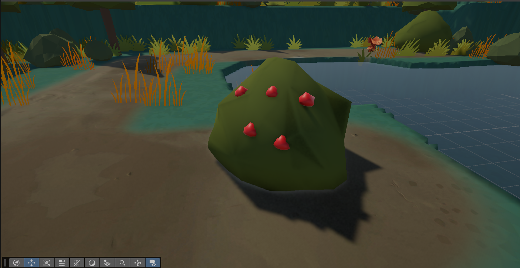
Figure 4. Red Berries as Visual Guidance for an Interactive Area This figure shows how red berries were used as a visual cue to guide the player toward an interactive area. By placing a distinct colour accent within the environment, the scene could subtly attract the player’s attention and suggest that the area contained meaningful interaction or collectible content.
Collaboration with Kevin and Map Reconstruction
After the first engine version was tested, one of the main problems we identified was that the map route felt too chaotic and lacked a clear visual hierarchy. The space was too open, and the route did not have a strong primary direction. This could easily confuse the player because they would not know where to go next or which areas were important. The difficulty was not only about making the map look better, but about making the level communicate direction, priority, and interaction clearly.
Based on this problem, I worked with Kevin to reconstruct the map structure. Instead of keeping the level as a loose open area, we used mountain terrain and natural boundaries to guide the player’s movement. These terrain forms helped block unnecessary routes and create a more controlled path without relying on artificial invisible walls. This made the forest feel more natural while also giving the player clearer movement direction.
We also used specific area landmarks to communicate narrative and interaction. For example, locations such as the camp, tent, and campfire were used to tell the player that this area had narrative or interactive importance. This approach was also applied to other interactive areas: instead of making objects feel random, we placed them within recognisable visual zones so that the player could understand, through the environment, that these spaces were meaningful and worth exploring.
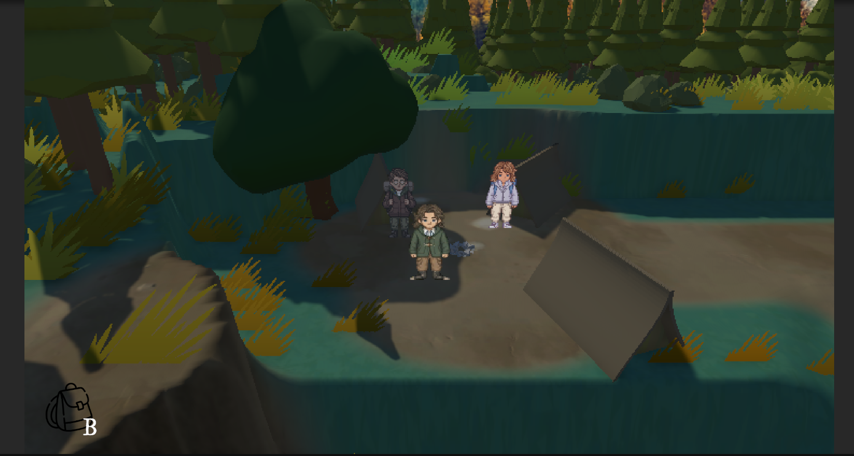
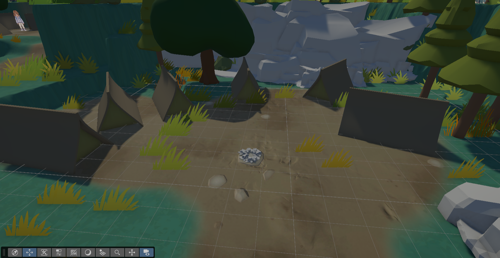
Figure 5. Narrative Scene Elements in a Key Interactive Area This figure highlights how specific environmental elements, such as the camp, tent, and campfire, were used to communicate narrative meaning and interactive importance. These scene elements helped the player recognise that the area was not just decoration, but a meaningful location connected to story and gameplay.
UI Design Development and Diegetic Presentation
During development, Kevin raised the need for a system that would allow the player to check items, similar to an inventory or backpack system. This introduced an important UI design question: how could we present gameplay information in a way that was functional, but also visually consistent with the overall narrative and art direction of The Verdant Trail?
At first, a simple backpack-style interface seemed like a practical solution for viewing collected items. However, after reviewing the project’s gameplay requirements, I felt that this approach would become visually awkward once we included not only item storage, but also other systems such as reputation and objectives. A backpack works well as a metaphor for carrying objects, but it feels less natural when used to present relationship status or narrative progression.
Because of this, I proposed a diegetic notebook / journal UI instead of a conventional backpack interface. This approach would allow the player to view items, reputation, and objectives through one unified visual object. Rather than separating gameplay systems into disconnected menus, the notebook could function as an in-world record of the journey, making the UI feel more integrated with the game’s atmosphere and narrative setting.
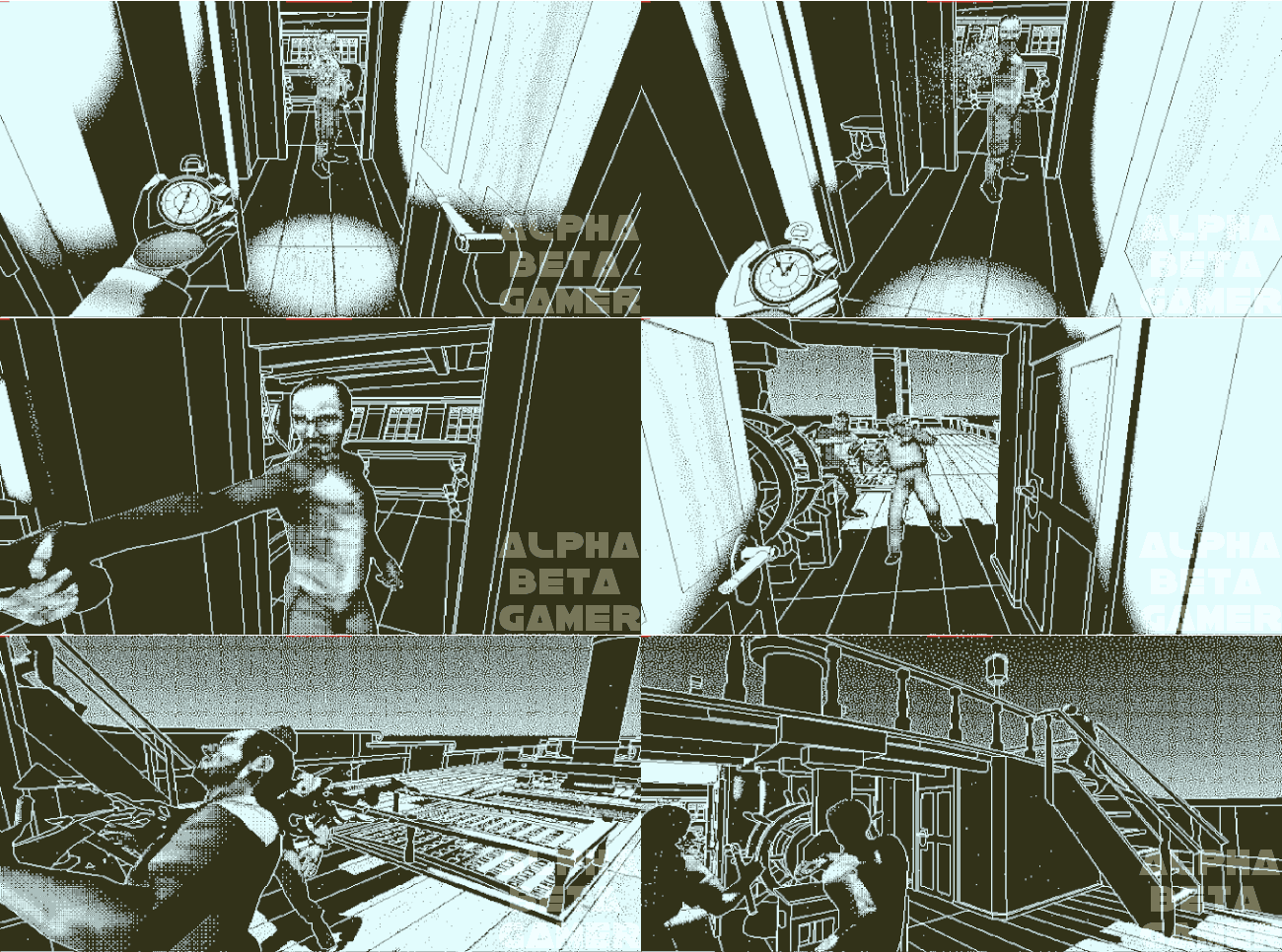
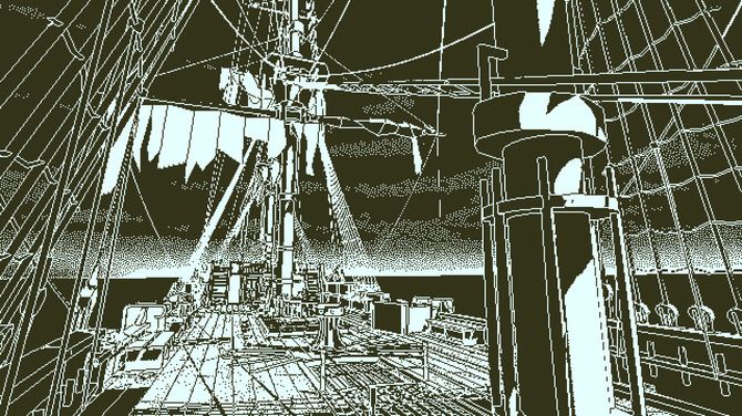
Figure 6. Return of the Obra Dinn Visual Style Reference Return of the Obra Dinn; this reference helped me study how a limited-colour visual style can create a strong investigative and historical atmosphere.
A key source of inspiration for this idea came from Return of the Obra Dinn. While its interface is not an inventory system in the traditional sense, it uses a book as the player’s main information structure. Through crew records, illustrations, and scene reconstruction, the book becomes a complete investigative archive. This was a valuable reference for me because it showed how collected information could be organised through a diegetic object rather than a generic menu.
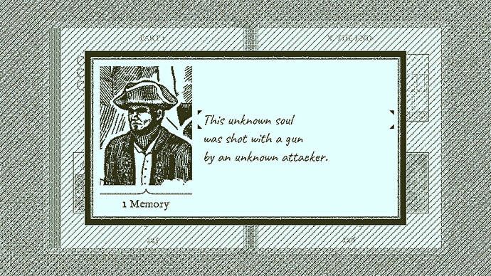
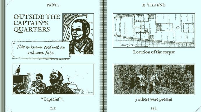
Figure 7. Return of the Obra Dinn Book-Based Information Interface Return of the Obra Dinn; this reference helped me understand how a book-like interface can organise investigation information without feeling like a conventional backpack menu.
Building on this idea, I adapted the UI design to better fit The Verdant Trail. Instead of using a clean and modern white notebook, I developed the interface with a more aged and tactile visual language, using kraft-paper tones, worn textures, and an older field-journal feeling. I felt that the original white notebook sketch provided by Kevin communicated the function clearly, but it looked too new and lacked a sense of time, history, and environmental storytelling. By contrast, the revised notebook UI felt more consistent with the game’s wilderness setting, 1980s atmosphere, and organic art direction.
This design decision helped the team move toward a UI system that was not only functional, but also narratively embedded. It allowed the interface to support gameplay systems while strengthening the project’s visual identity.
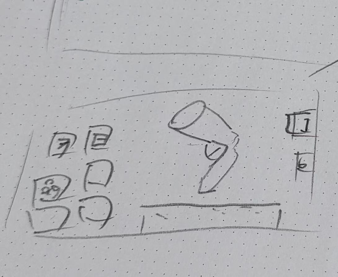
Figure 8. Kevin’s Early Notebook Draft Team draft by Kevin; this early sketch established the basic notebook idea, but it still felt too clean and modern for the game’s 1980s wilderness setting.
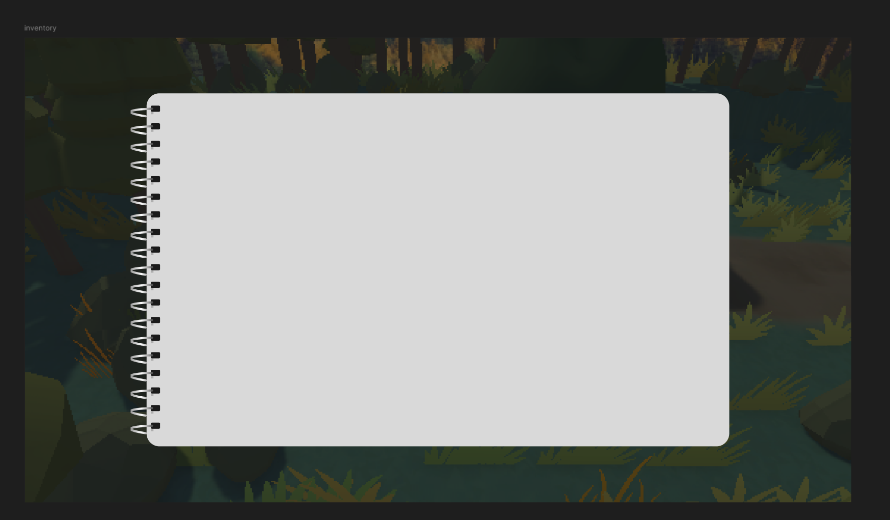
Figure 9. Early In-Engine Backpack Concept Test Own Unity prototype test; this version tested how the backpack / notebook interface could appear inside the game engine.
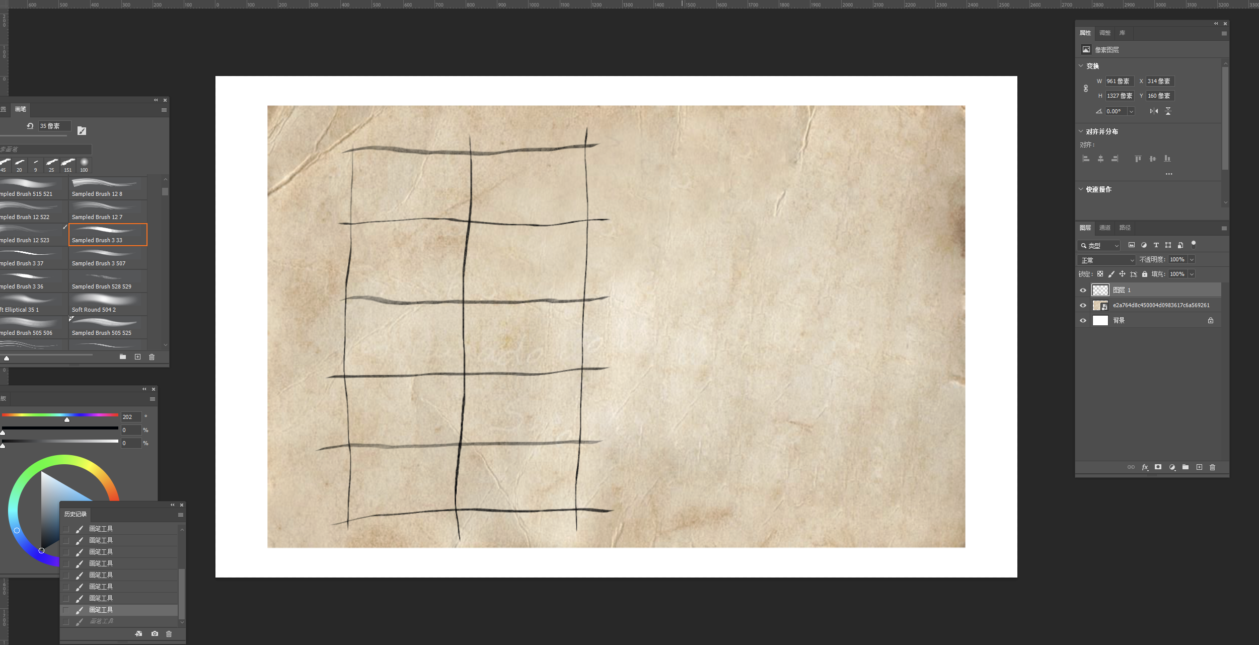
Figure 10. Photoshop Backpack Drawing Process Own Photoshop process; this image shows how I developed the backpack UI texture using aged paper tones, worn edges, and a more tactile field-journal style.
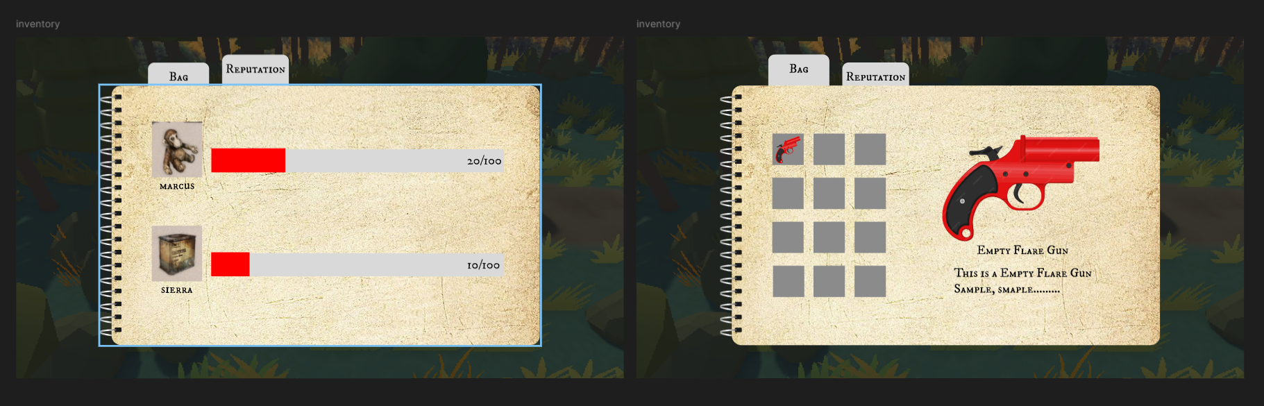
Figure 11. Kevin’s Final Backpack Style Concept this version established the final backpack / notebook style direction with a more aged, narrative-driven visual identity.
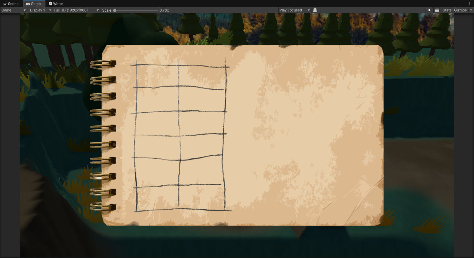
Figure 12. Backpack Readability Test in Engine Own Unity readability test; this test checked whether the backpack UI remained clear and readable when placed inside the game scene.
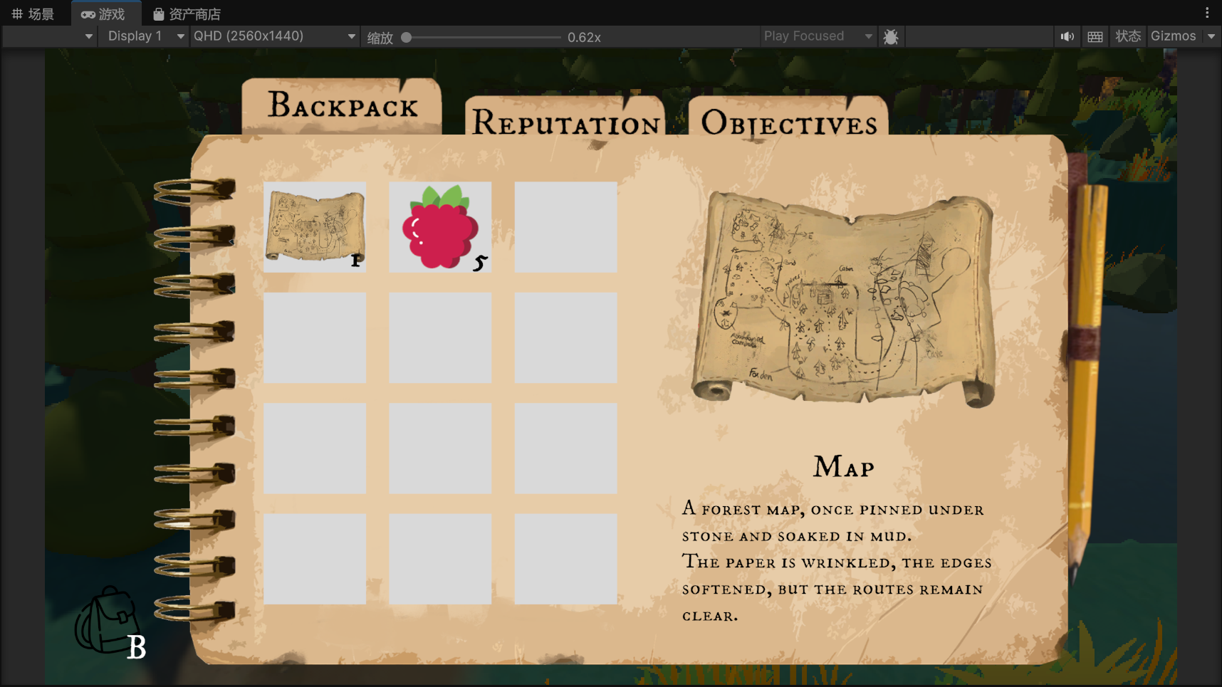
Figure 13. Final Backpack UI Presentation Own final UI implementation; this figure shows the final backpack / notebook interface used to present items, objectives, and player information in a more diegetic way.
Pixel Filter Feedback and Adjustment
At the early stage of visual testing, we adjusted the pixel filter parameters by using the pixel density of games such as Octopath Traveler as a general reference point. The goal was to find a level of stylisation that could preserve the project’s pixel-inspired identity while still remaining readable in gameplay. However, after further discussion and in-engine testing, we found that this balance was more difficult than expected because our character itself was also presented as pixel art.
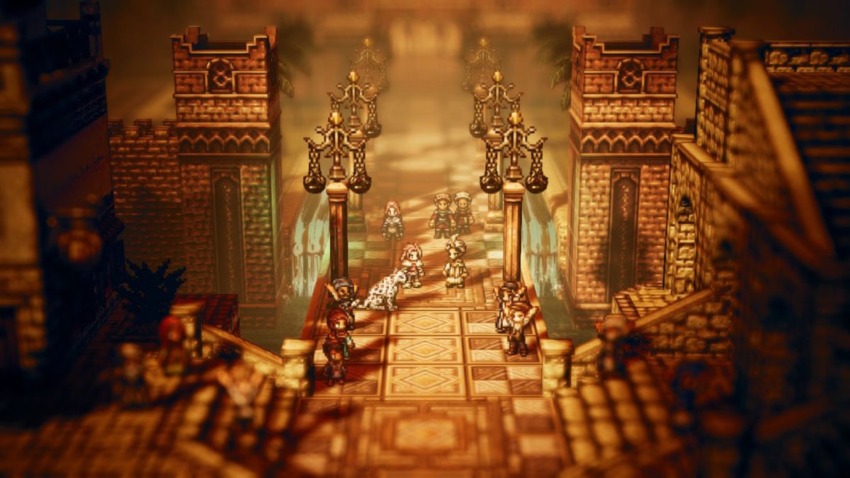
Figure 14.Source: Octopath Traveler visual reference; this image was used to study the balance between pixel stylisation, character readability, and environmental detail before testing our own pixel filter settings.
When the filter value was set around 0.05, the pixelation effect became too strong, making the character and scene feel overly fragmented and difficult to recognise. On the other hand, when the value was increased to around 0.24, the image became much clearer, but the pixel-style atmosphere was weakened too much and the visual identity no longer felt strong enough. I originally preferred a stronger pixel effect, but the team feedback showed that readability was more important for the playable prototype.
After comparing several tests, the team eventually agreed on 0.14 as the final setting. This value kept enough pixel stylisation to support the project’s art direction, while also preserving character recognisability and scene readability. The final adjustment allowed us to reach a shared visual balance between style and function.
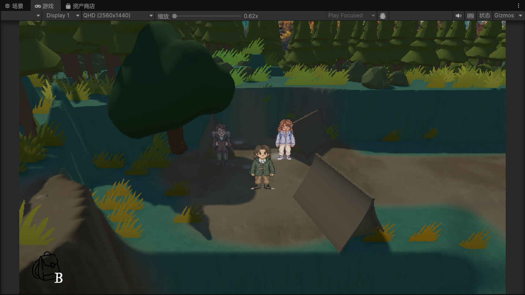
Figure 15.Source: Own Unity visual test; after comparing 0.05, 0.14, and 0.24, the team selected 0.14 as the final setting because it preserved pixel stylisation while keeping the character and environment readable.
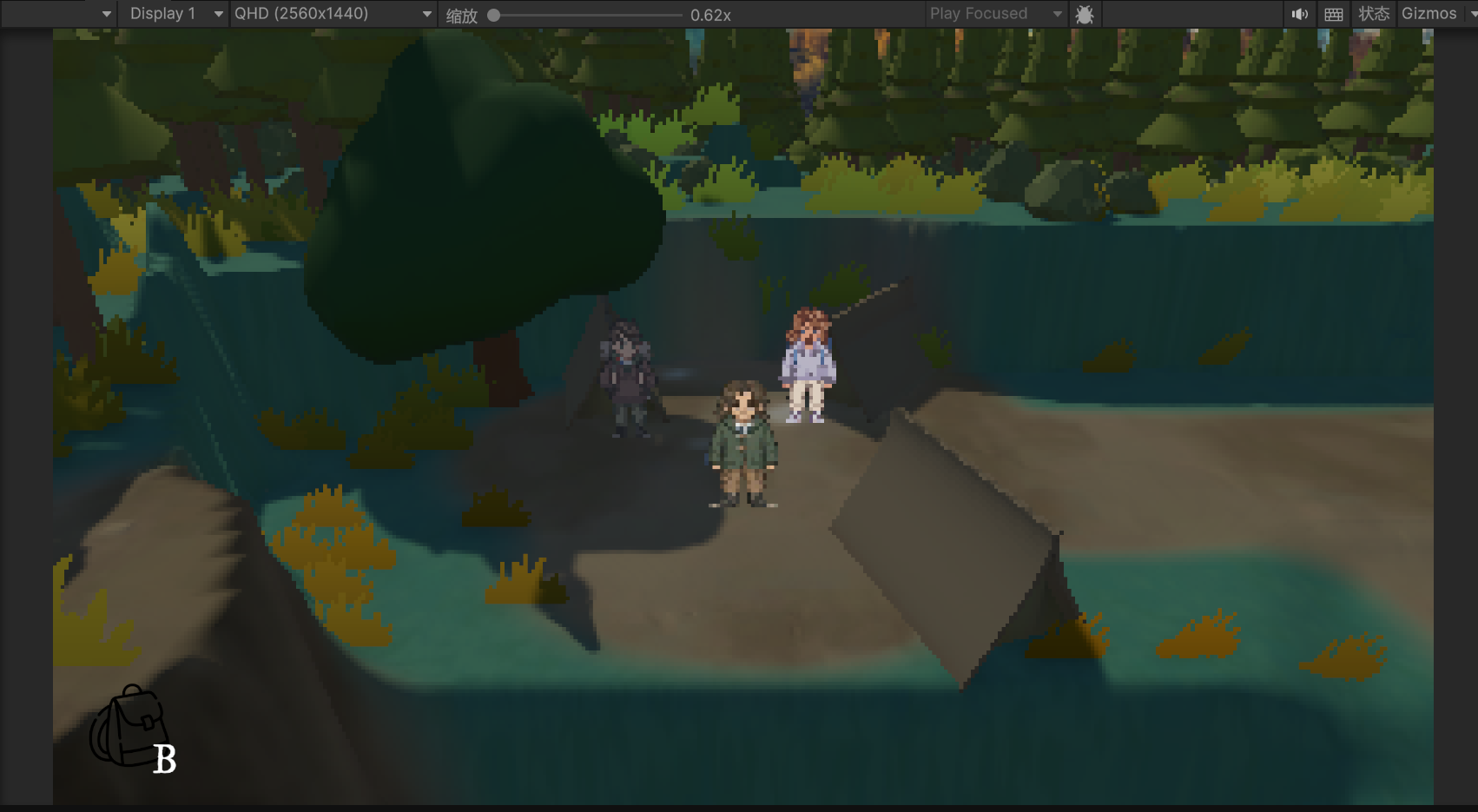
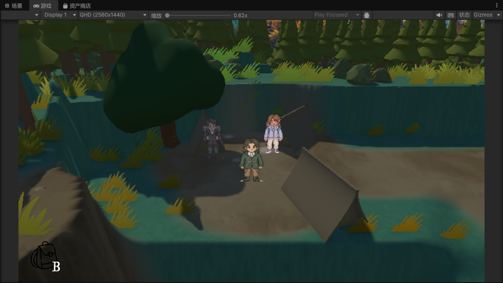
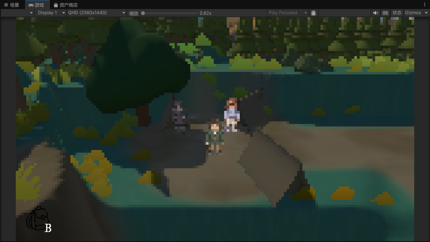
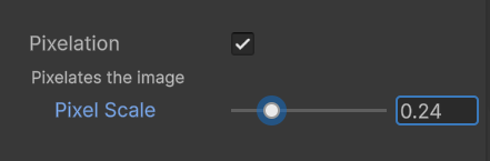
Figure 16. Low Pixelation / High Readability Style Test Own Unity visual test; this version used lower pixelation intensity, keeping the character and environment clearer but reducing the strength of the pixel-style effect.
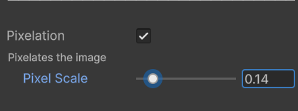
Figure 15. Medium Pixelation / Balanced Style Test Own Unity visual test; this version tested a balanced pixelation setting, keeping enough pixel texture while maintaining readable character, path, and environment details.
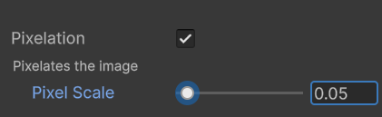
Figure 16. High Pixelation / Strong Mosaic Style Test Own Unity visual test; this version used stronger pixelation, creating a more stylised mosaic effect but reducing the readability of the character and scene details.
Prop Interaction Design
During the early development stage, Kevin suggested that the game should include interactive prop-based moments, such as a drag interaction where the player moves objects to discover hidden information. One early example was an interaction page where the player needed to drag objects away to find a map. Kevin first provided a basic interaction idea to explain the gameplay logic: the player would use a dragging action to uncover the map and progress the exploration.
In the first version, we planned to use soil to cover the map. However, after making simple colour-block tests, I found that the colour of the soil was too close to the colour of the map. This reduced the visual readability of the prop and made it harder for the player to recognise the map as an important interactive object. The problem was not the interaction itself, but the lack of visual contrast between the covering material and the key item.
To solve this, we replaced the soil cover with stones. Compared with soil, stones created a clearer contrast against the map in both shape and colour. This made the map easier to identify and helped the player understand that the object underneath was meaningful. I also designed the background with soil and scattered rocks so that the map still felt naturally placed in the environment, rather than looking like an isolated UI object.
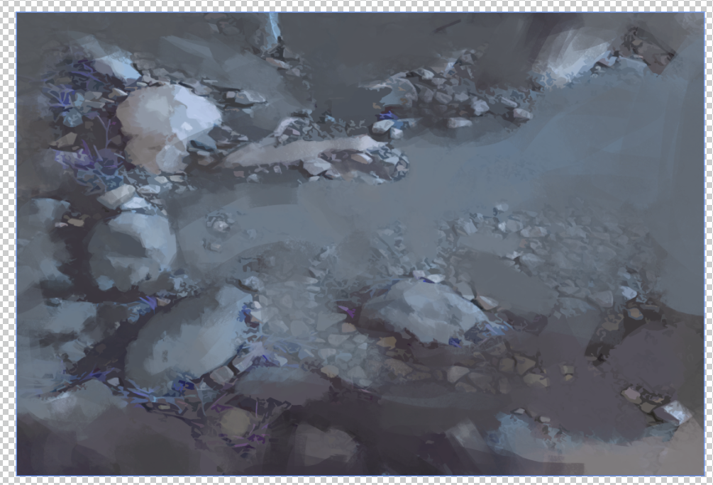
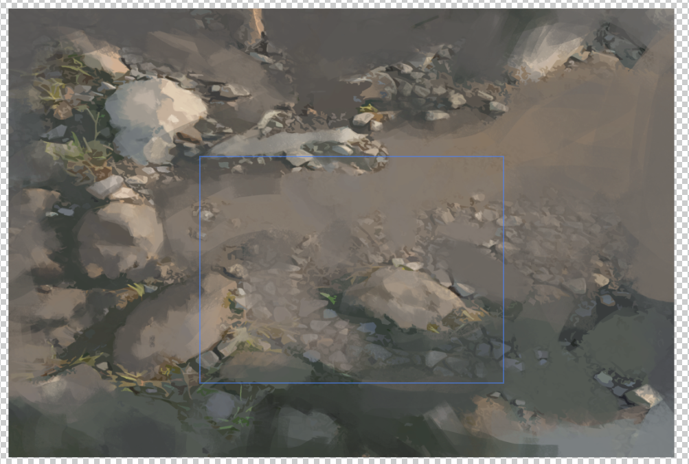
Figure 18.Own background test; this figure compares the night and daytime versions to evaluate how atmosphere affected the visual clarity of the interaction scene.
For the background design, I tested two lighting directions: a night version and a daytime version. The night version created a stronger oppressive atmosphere, but it made the prop interaction feel visually heavier and less consistent with the surrounding game scene. After comparison, I chose the daytime version because it better matched the overall level environment and kept the interactive map clearer for the player.
Reflection
This prop design process helped me understand that interactive objects need to be designed for both narrative atmosphere and gameplay readability. A prop can look visually consistent with the environment, but if its shape, colour, or contrast is too weak, the player may not understand its importance. Through this iteration, I learned to use material contrast, colour separation, and background composition to make interactive props feel both natural and readable.
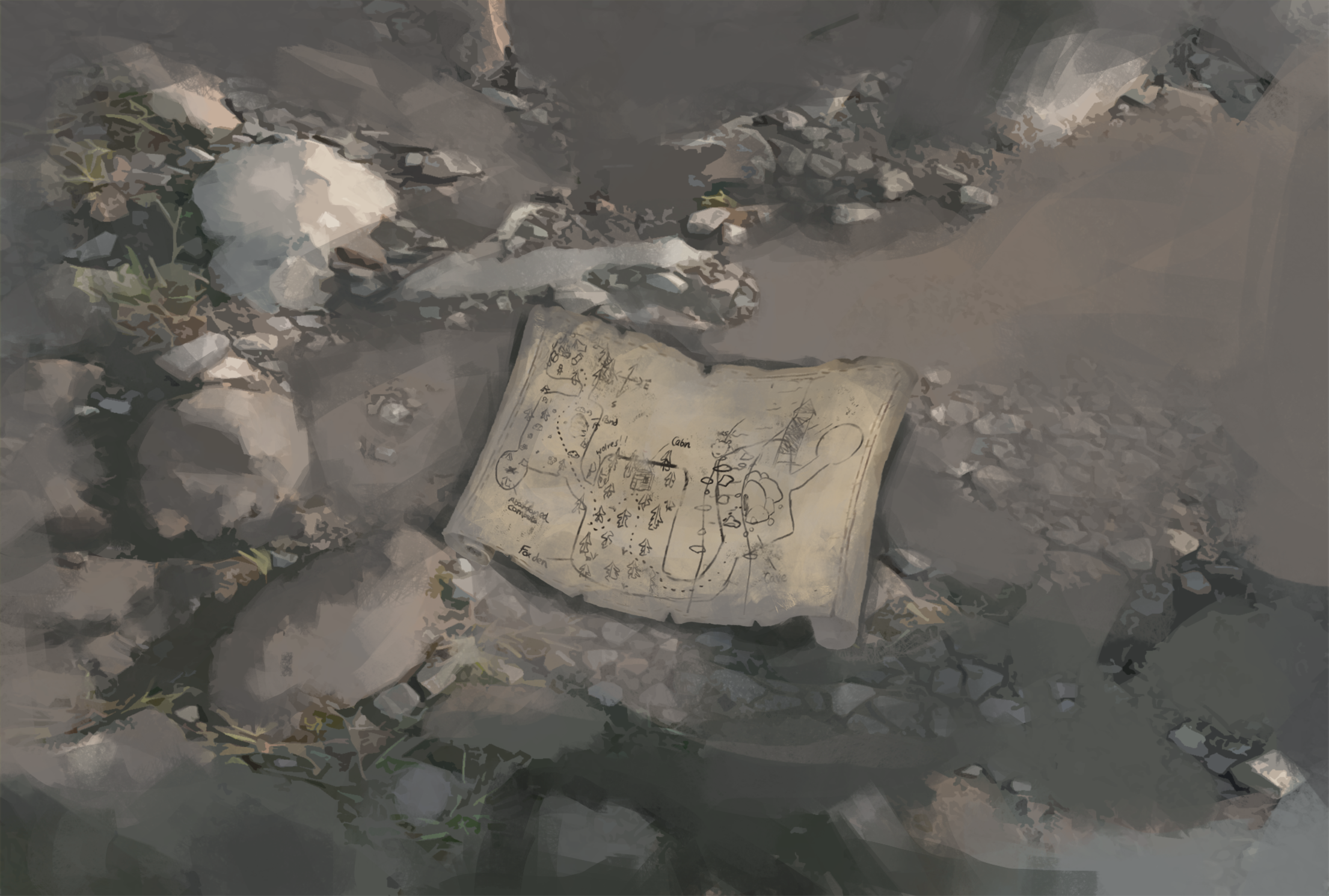
Figure 20.Own final prop interaction design; this figure shows the completed interaction page where the player uncovers the map through dragging.
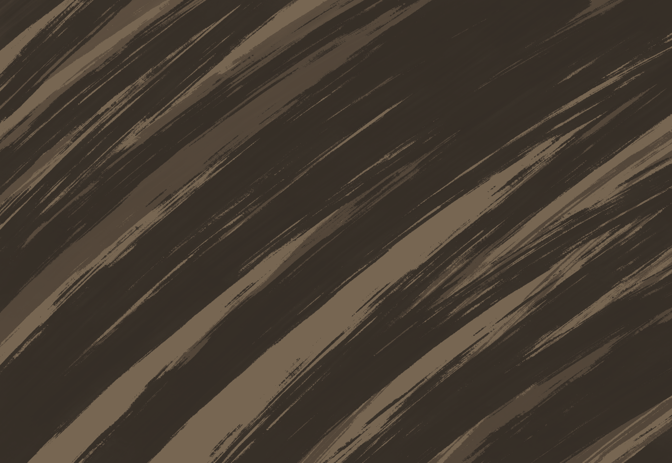
Figure 16.Team draft by Kevin; this early sketch introduced the basic drag interaction, where the player moves objects away to uncover the hidden map.
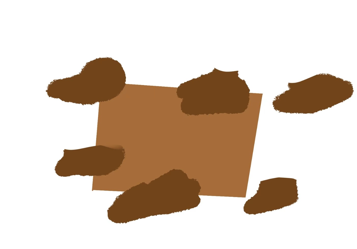
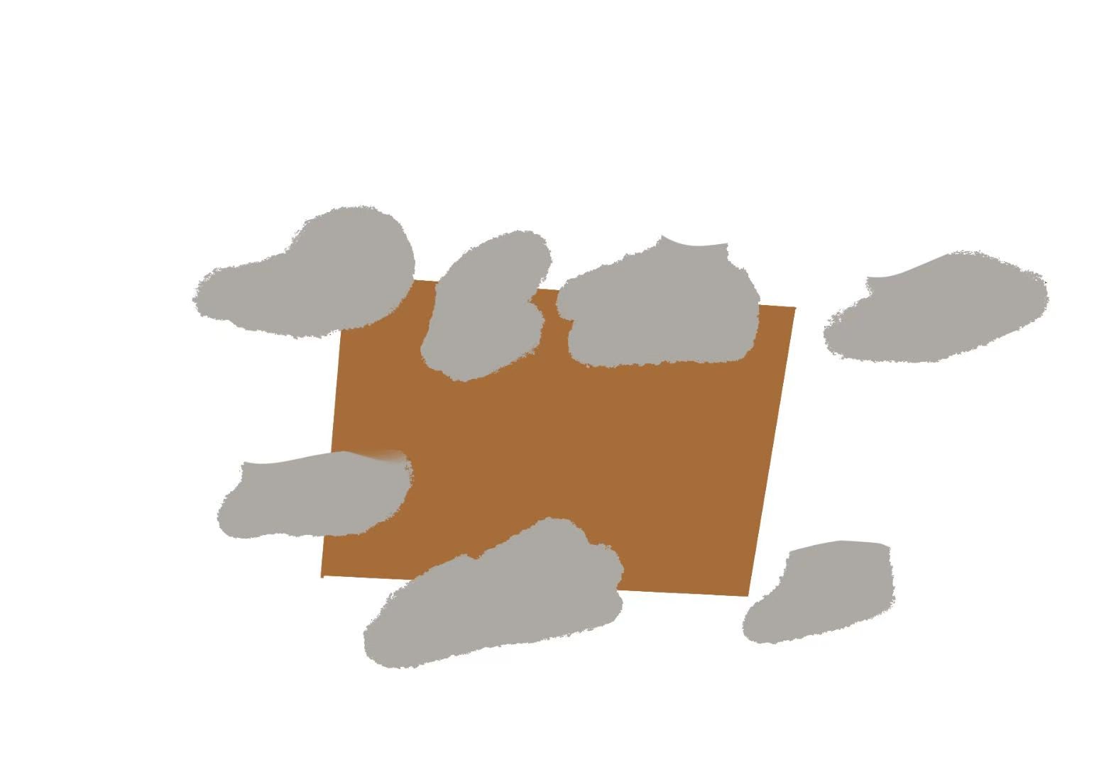
Figure 17. Own colour-block test; this comparison showed that stone created clearer contrast than soil, making the hidden map easier for the player to recognise.
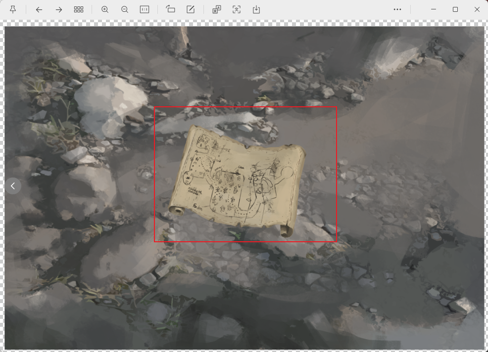
Figure 19.Own prop interaction test; this image was used to evaluate how the map, stones, soil, and surrounding background worked together as one readable scene.
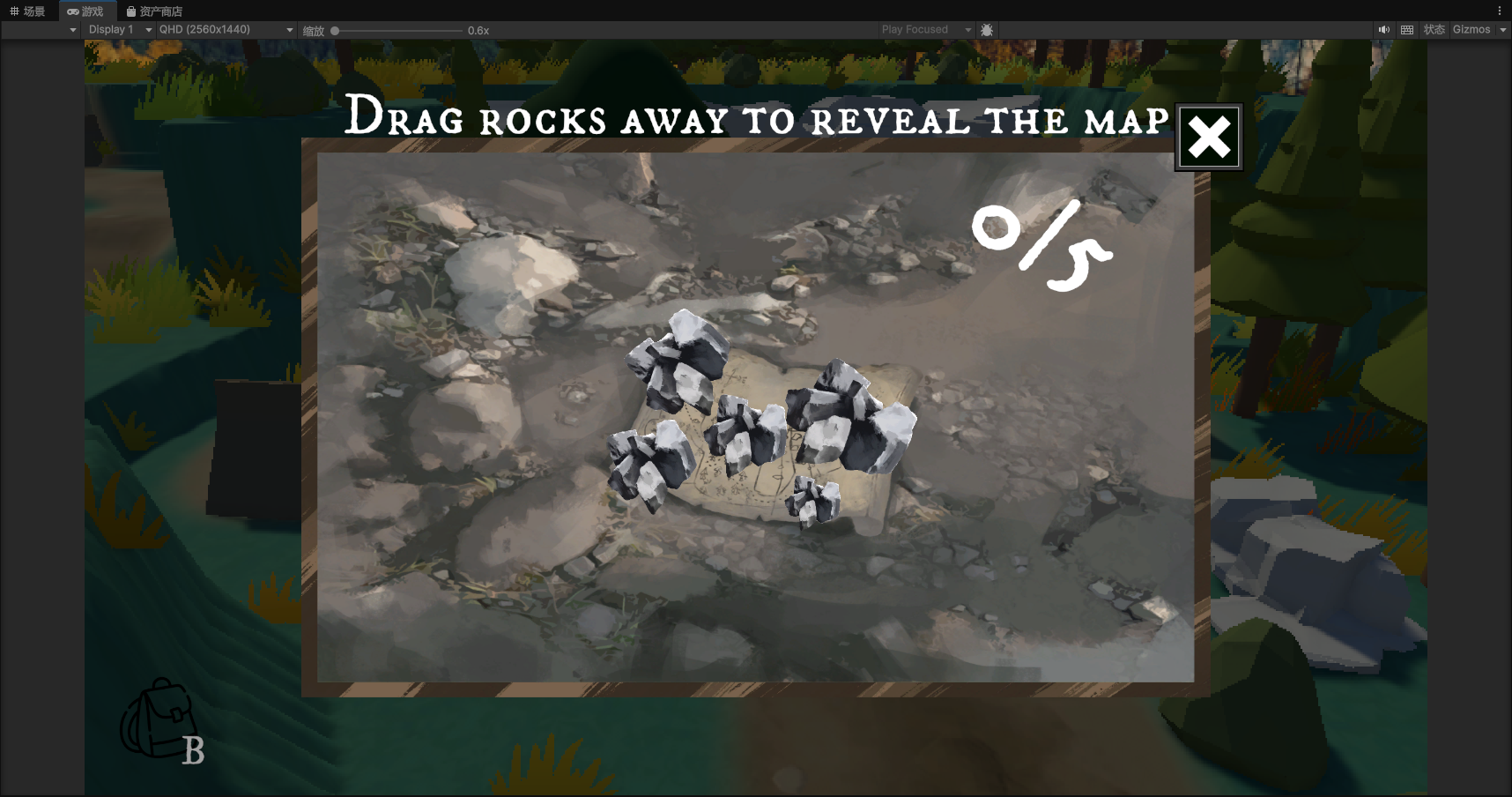
Figure 21.Own Unity implementation; this figure shows the final interaction design placed in the game engine to test visual readability and scene consistency.
Reflection on Team Iteration
This iteration process helped me understand that visual development in a team project is not only about personal style decisions. My initial preference was to push the atmosphere and pixel effect further, but team feedback helped me recognise where the design was becoming unclear for gameplay. Through discussion and adjustment, the map became more structured, the player route became clearer, and the pixel presentation became more readable. This process also showed the value of my role as a visual developer and Technical Artist: my work needed to support both the mood of the forest and the practical needs of level design.
Sources Used
3909 LLC. (2018–2026) Return of the Obra Dinn. Available at: https://obradinn.com/