After the showcase, we received some small QOF suggestions from the public. One of those was ‘it’s hard to see what is selected in the main menu’. I do agree with this and was planning to update it before submission, but as it was low on my priority list, I didn’t get a chance to now.
Redesign
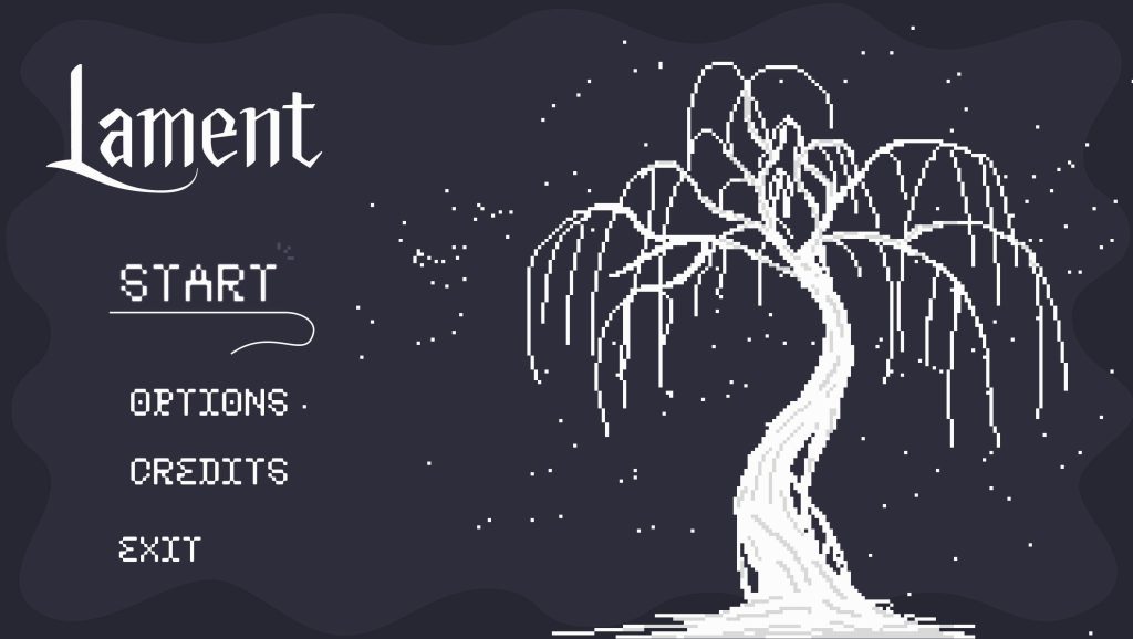
Old Design
New Design
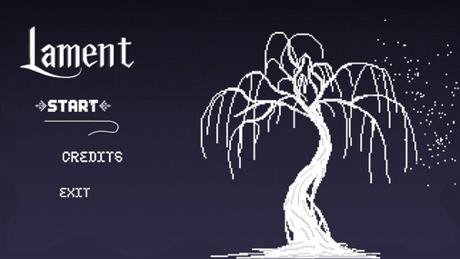
I changed the font to the final font face that is present throughout the whole game’s text. This gives consistency throughout all designs and harmony, it also makes the start button stand out from the others even more. I decided to replace the small glimmer on the buttons with a larger image, but made it one that fits in with the rest of the UI, such as the dialogue text boxes and underlinings in the skill tree.
Team Feedback + Personal Review
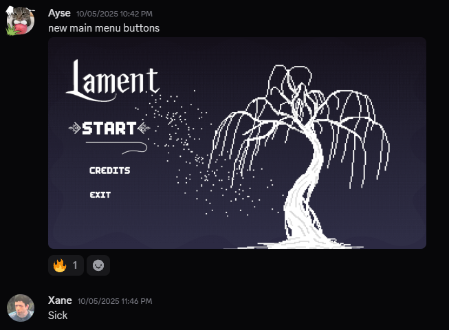
I posted in our discussion channel when I completed the final main menu and received compliments.
In all honesty, I prefer this new selection visual over the other by miles. It makes it so easy for the player to see what they are about to select. Also, after Xane made it so the cursor now shows in the main menu scene, it is almost impossible now for the player to not be able to start the game, watch the credits or finish their runs.
This was a very simple fix for me, it was just creating a new image asset and replacing the old with the new. A simple yet effective and needed one.