During our last sprint period before the showcase, I needed to plan out the skill tree for E-Jay to code and also create the design and icons for the tree.
Research + Team Discussion
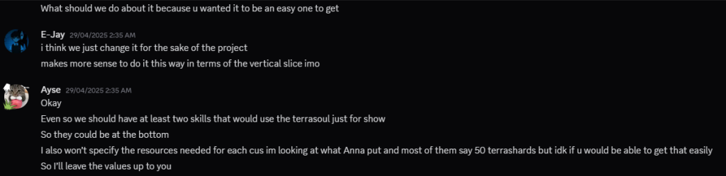
For the skill tree, we wanted to stay as true as possible to the GDD. I referred back to the condensed version I made.
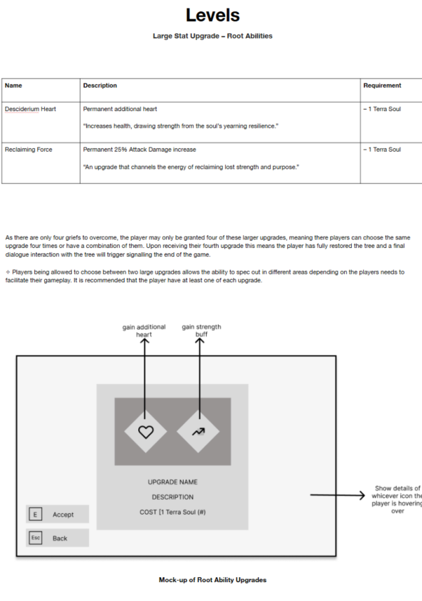
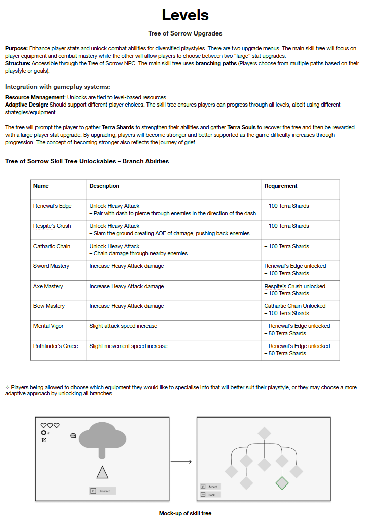
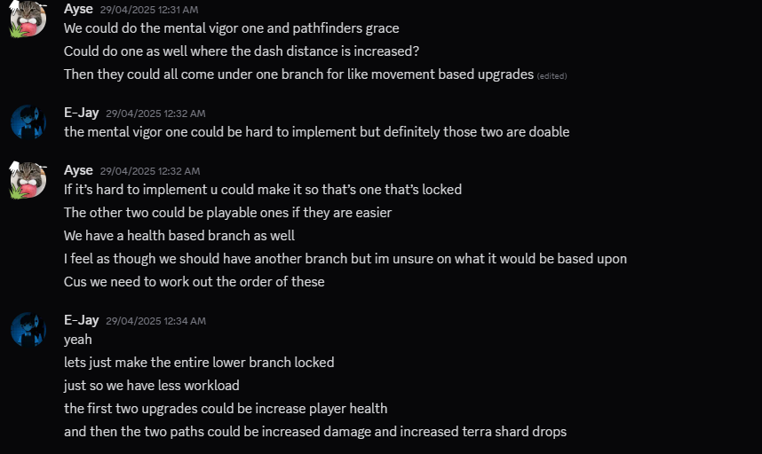
There were a few skills that we had to alter or cut completely to make the skill tree fit within our vertical slice as well.
After knowing this, I began laying out the skills matching the top to bottom layout Anna mentioned. However, after checking in with E-Jay, he wanted to do a different layout which would be easier for him to code and make work. I didn’t mind this and it gave me somewhere to re-plan from.
We had a few discussions to get to the final layout.
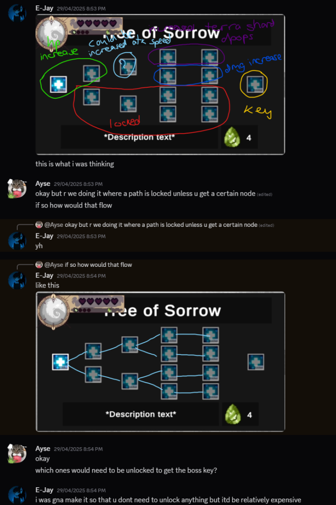
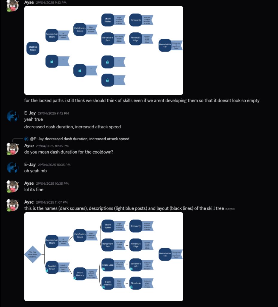
Initial Layout
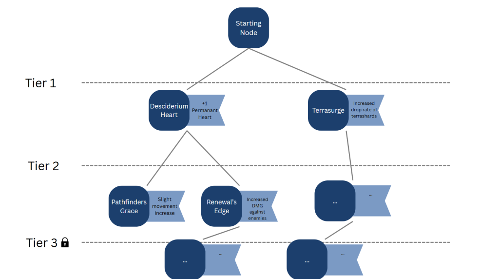
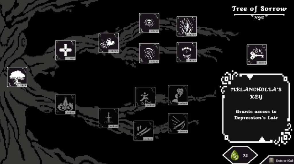
Final Layout
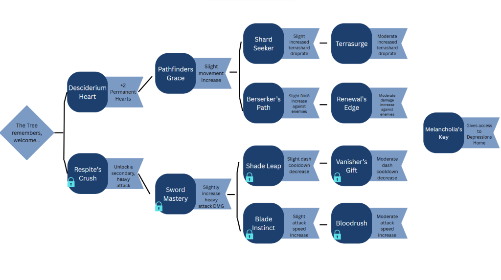
I agree with E-Jay and find that the layout on the right works so much better. Its less visually cluttered but still has the impact it needs. After getting down what I must include within the skill tree, I began on production.
Production
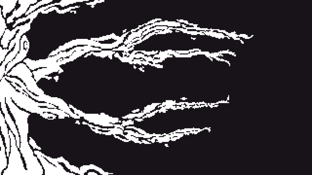
For the background of the skill tree, I knew I didn’t want to link up the skill tree nodes using a basic line, so I thought deeper. Referring back to the GDD, the skill tree would be WITHIN the tree of sorrow in the hub scene. Knowing this, I knew I wanted the background to be related to a tree somehow, but still link them together, which led me to a theme of branches and the trunk of the tree.
I used a basic monochromatic palette for the skill tree, using the same colour for the background as the pause and game over screens for design consistency.
Team Feedback
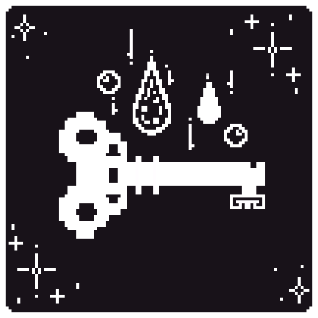
After getting the background done, I started to work on icons for the skills. They needed to represent what the node would unlock to make it unique and intrigue the player.
The skill icon on the left represents melancholia’s key, which the the node that gives the player access to the depression boss room. I added water droplets to represent the theme of the realm, a water-based environment and tears. All the skill tree icons have these kinds of considerations.
I used the same colour palette as the background, but gave the icons rounded edges to break up the visuals, utilising shape language.
Importing, Final Touches + Review
I then created some small visual flairs to help break up the whole canvas such as; a resource holder for the terrashards, an exit prompt in the bottom right, the popup box remade from the dialogue box in a previous post and a title.
After all the individual assets were completed, I replaced the placeholders in Unity with the final thematics. This also included other things from other commits as I imported the skill tree last just before our showcase as it was low priority.
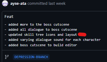
During the showcase, I received a ton of positive feedback for this design. Many loved it, and even during my personal tests in my free time, it was always something positively mentioned. This was a gruelling task just from the number of assets I had to make. However, the repetitive nature of it helped me not get overwhelmed from coding in between, which actually helped my pace in this project.