

PHOTOSHOP
For this project I want to explore Adobe Photoshop. It’s the industry standard for most forms of visual design. I have some experience of it already but I want to familiarise myself with it and learn how to make interesting and unique edits and designs. While I personally would avoid using it as my main art programme its editing suite is indispensable.
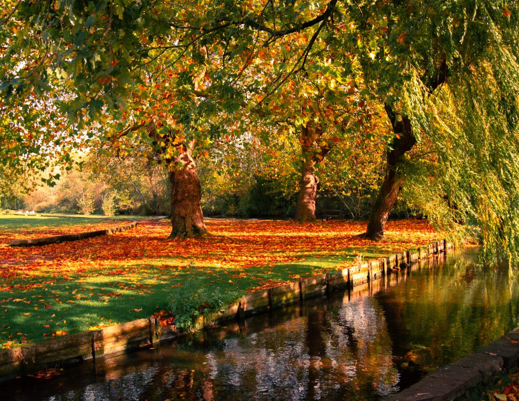
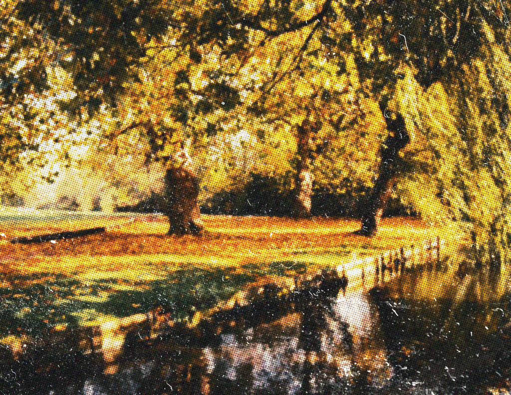
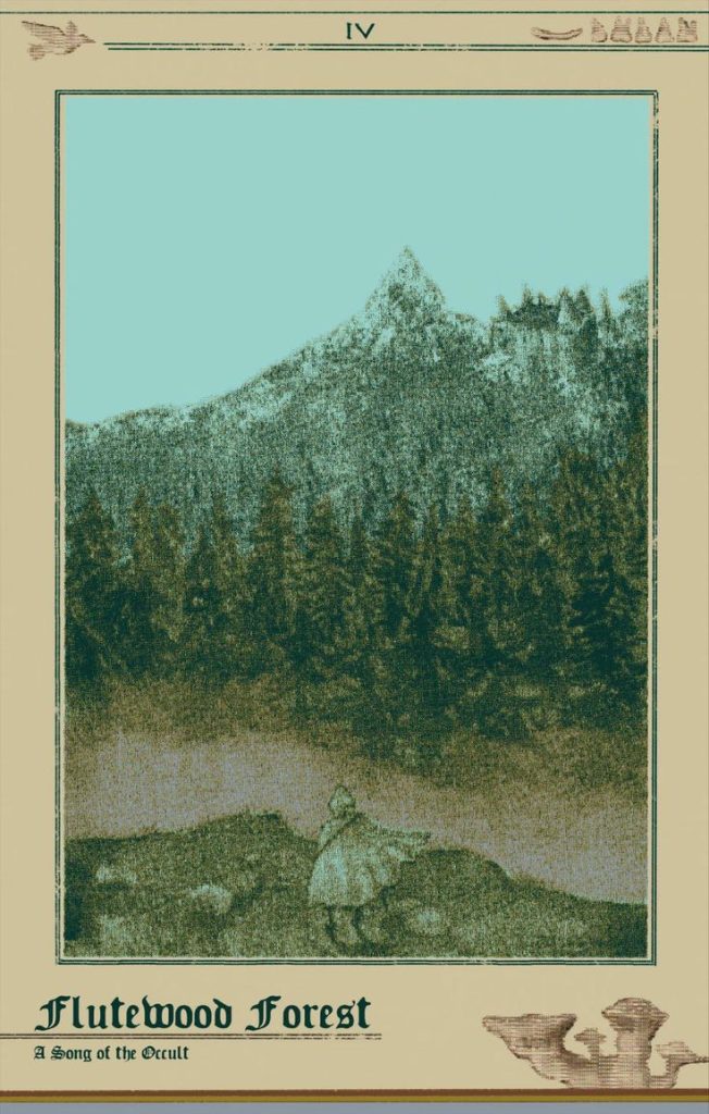
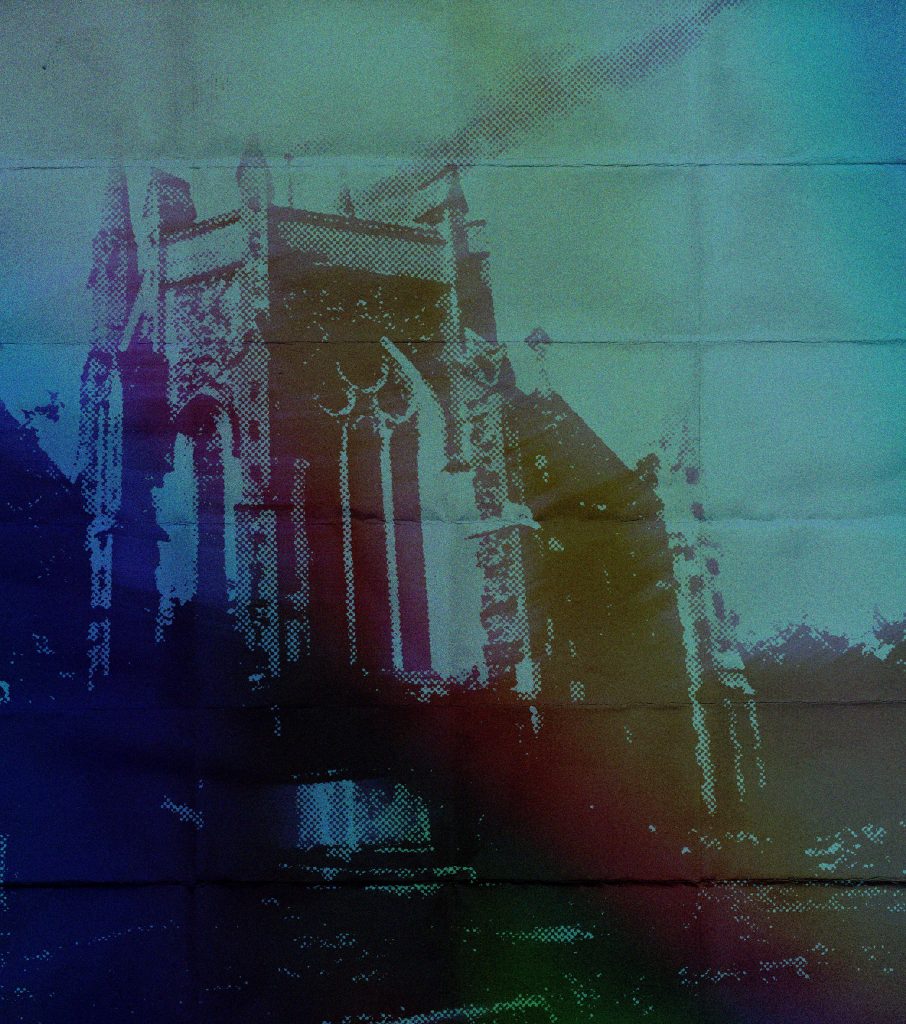
I took this photo in the park behind the Winchester campus. Old film photographs of wildlife and landscapes really inspired the initial idea for this project so I wanted to recreate that sort of effect. Overblowing the yellows, increasing the contrast and lowering the resolution really sells the idea. To really get it across, I even added a halftone pattern and texture overlay.
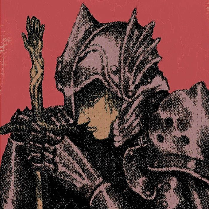
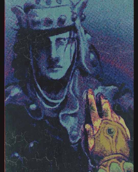
My biggest inspiration for this style is the Vermis series by Plastiboo. The fake game manual features heavily edited artwork, full of noise and grunge to suit the bleak and horrific atmosphere of the setting. In regards to tone, I want to achieve something similar while still being a completely different genre.
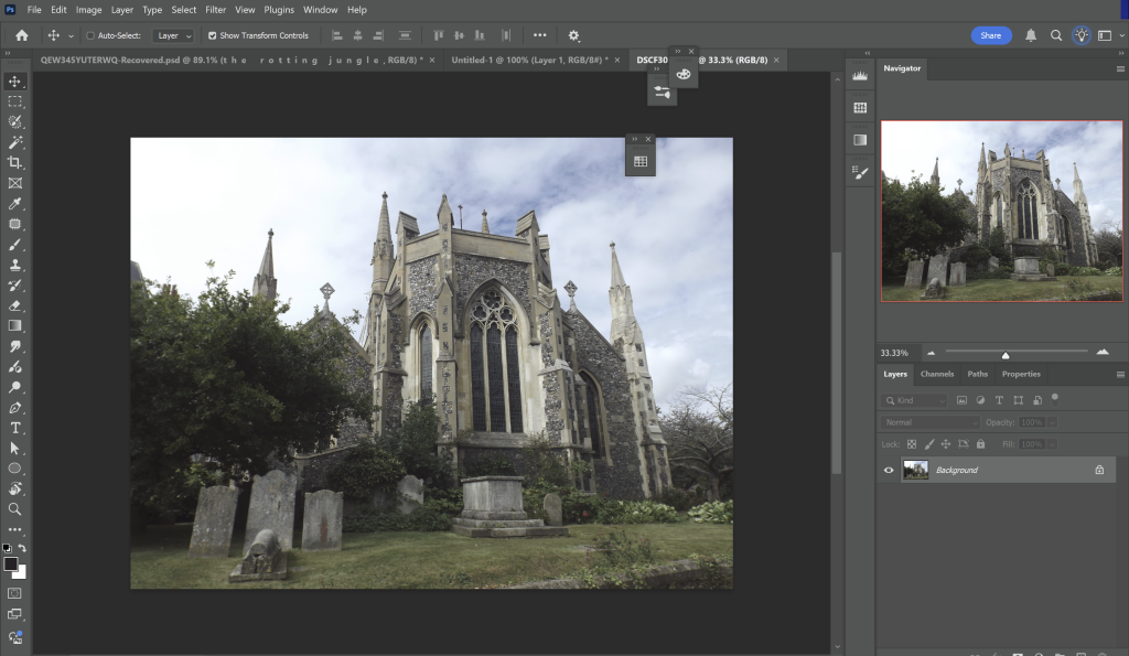
So I’m going to start off with an image of a church in Dover that I took in the summer. In the screenshot you can see the many different tools at your disposal. Most of them we don’t need to worry about right now.
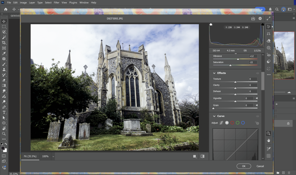
As the image is unedited, I want to first edit the colours, so hitting Ctrl + Shift +A will take me to a raw editor. It’s identical to Lightroom, just very lightweight so it can fit inside photoshop.
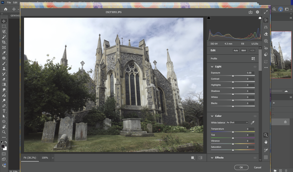
For this effect to work I want to increase the contrast between light and dark values as much as possible. This will mean that as we add more effects, the main elements composing the photograph will still look distinct as their values are different. I also increased the sharpness in the raw editor so we have a bit of more detail to work with as we take away.
A really handy thing in Photoshop is hitting Ctrl + L, you can see the levels in a chart and edit them accordingly. So once I’m done in the raw editor I’ll adjust the levels for more contrast.
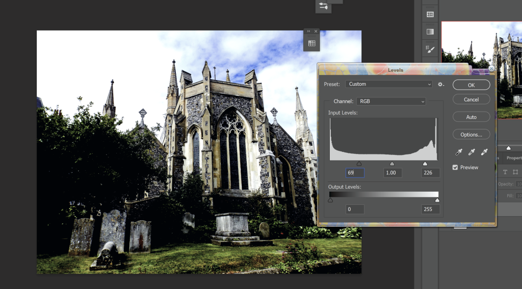
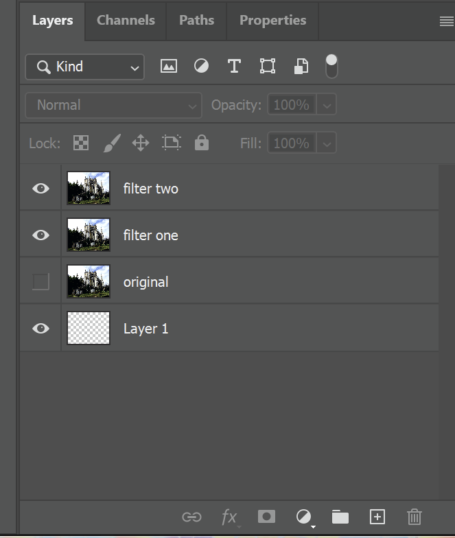
Before we continue, I’ll go to the layer panel, which should be on the right and double click it to turn the image from the background to a normal layer. Then I’ll duplicate it twice, so there’s 3 layers in total. One of them will be a backup in case I change my mind about the filters. The other two will be subject to two different effects. Layer management is very important, especially in team projects so it’s good to stay on top of it even in more minor pieces.
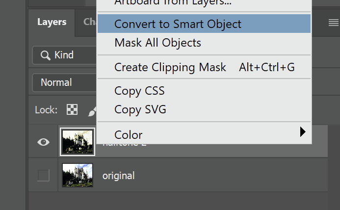
I haven’t done this in this tutorial, but if you right click the layer and select “change to smart object” the filters you apply can be toggled and tweaked afterwards.
Then go to the top left and hover over the filters panel and select the filter gallery. This is the fun part! Feel free to experiment with the different layers to your heart’s content. We’re going for something grungy and dark so just keep that in mind. The little plus sign in the bottom right adds more layers for filters.
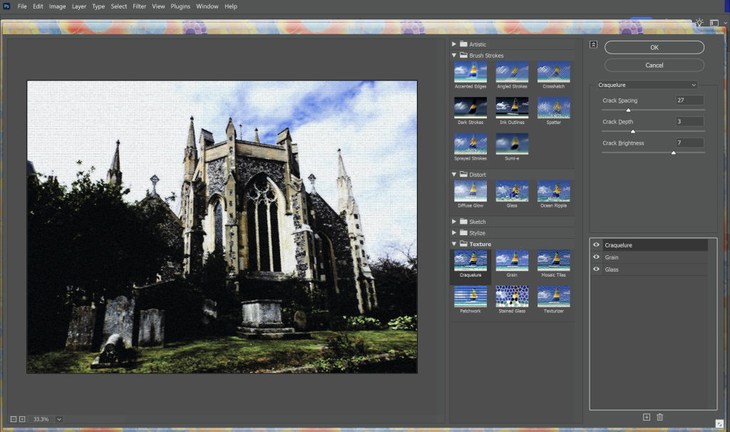
I used a grain, glass and craquelure filter. The layer order can also affect the output so that’s something to keep in mind.
Once I had done that, I went to the second layer and applied these filters. This intensifies the contrast for the final effect. Once I had applied these filters I hovered my mouse over to Image > Adjustments > Gradient map and applied a gradient map. This is also very simple as there are only two colours you need to apply.

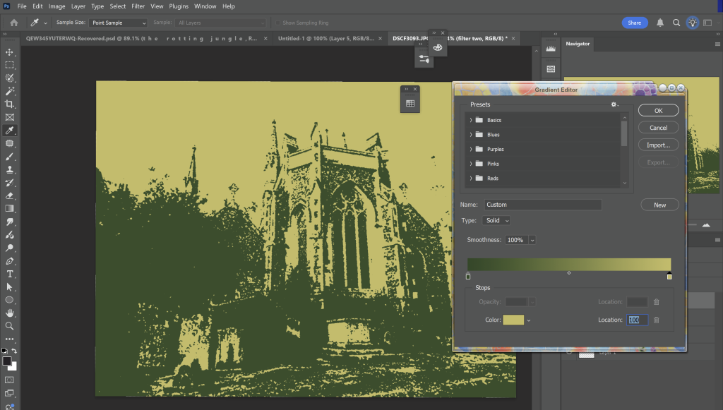
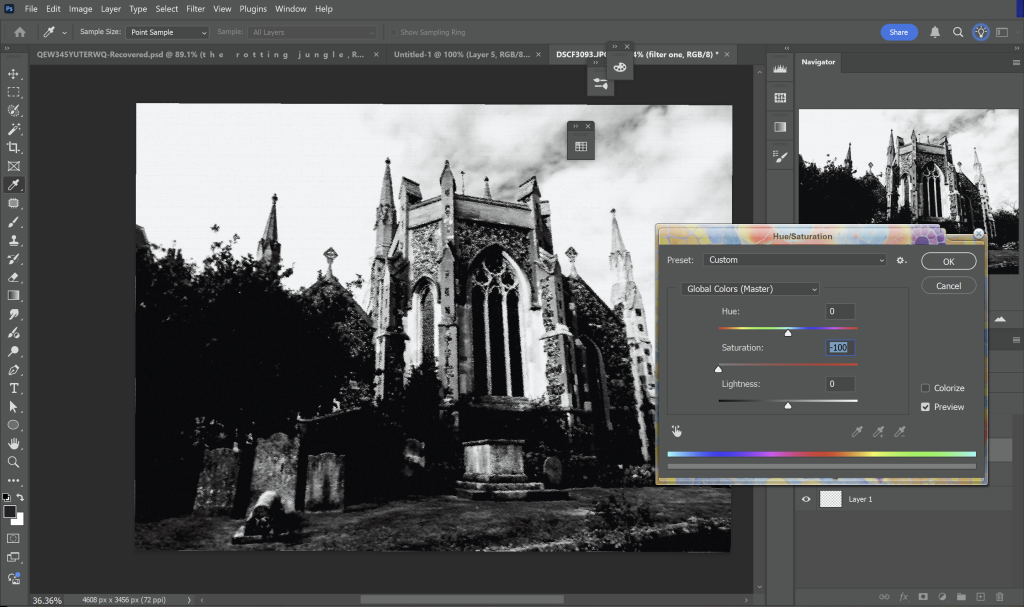
Then go back to the first layer and make it monochrome.
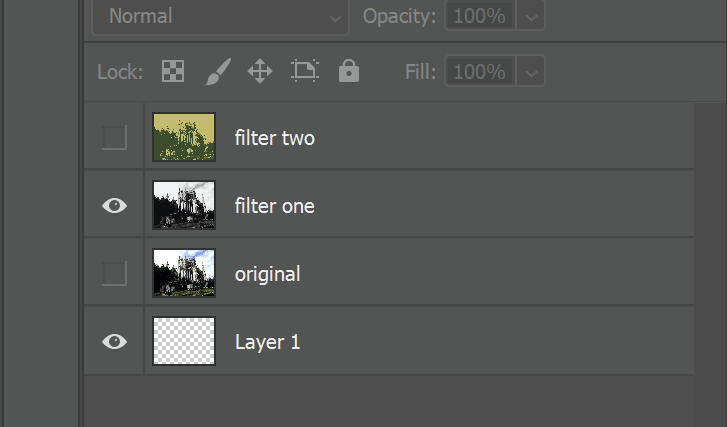
Your layers should look like this.
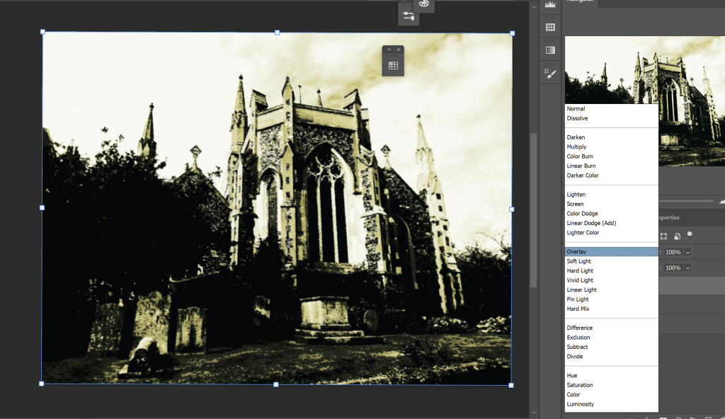
Choose a layer effect for the second filter. I went with overlay but do whatever you fancy. Then merge the layers with Ctrl + E
Go to Filter > Noise > Median and make the radius something like 3-5 pixels, depending on your image size. This is to just add some extra distortion.
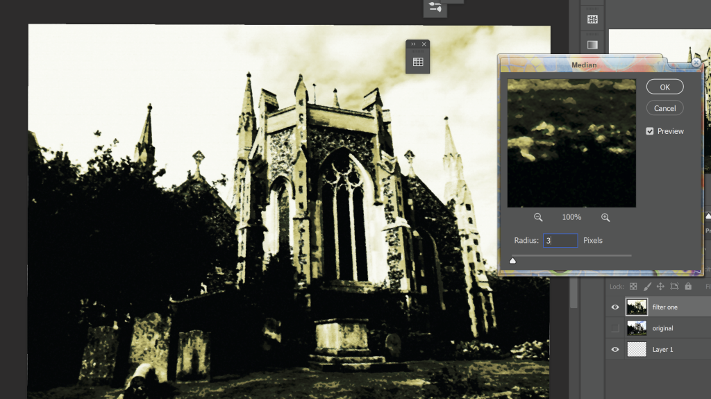
Now it’s time to add the halftone effect. We can do a complicated or simple effect.
The simple way of doing it is to click on the fx icon in the layer section and add a pattern overlay. You may have to import a pattern for this, they have to be a specific file so you’d need to convert an image file or scour for something online. And there it is if you choose to go this route, the next thing to do would be to add a texture.
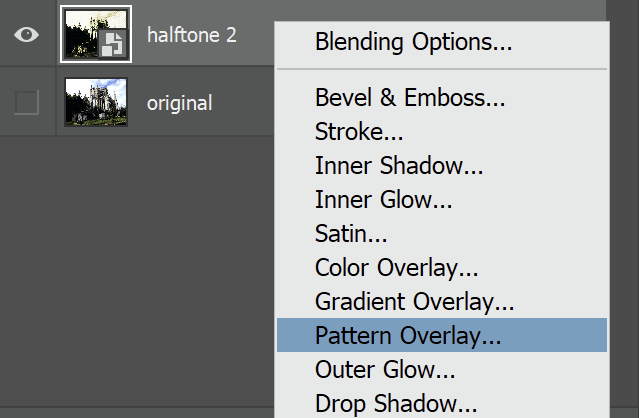
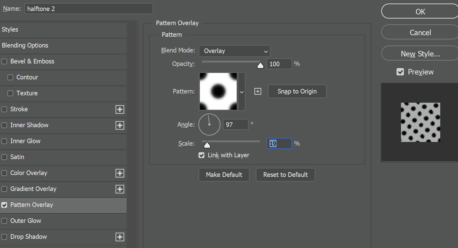
For anymore more ambitious I’ll detail a slightly more ambitious halftone effect. Unfortunately it does mean we’ll have to reapply colour (so plan accordingly!)
Create a brand new layer and press Shift + F5 to fill it to 50% grey and then duplicate those layers, which I’ll just name halftone 1 and halftone 2.
With halftone 1, hit Ctrl + Shift + A to go back into the raw editor. Increase the grain and roughness on the right hand sliders in the effects section, apply the effects and then change the blending mode to overlay.
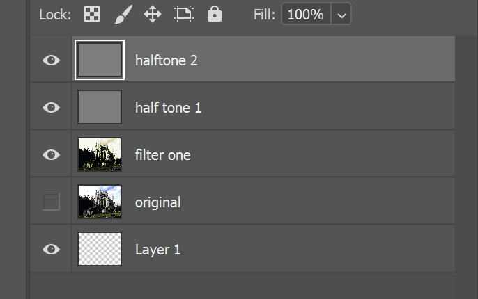
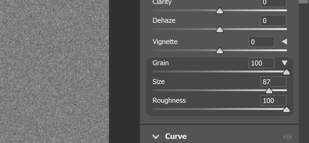
Select the duplicate layer and make sure your foreground colour is black, and the background is white. Then go into the filter gallery again. In the sketch folder, add reticulation with a density of around 40 and then add another filter layer with the halftone. Adjust the size of it to suit your canvas size. Click okay and change the blending mode to overlay as well.
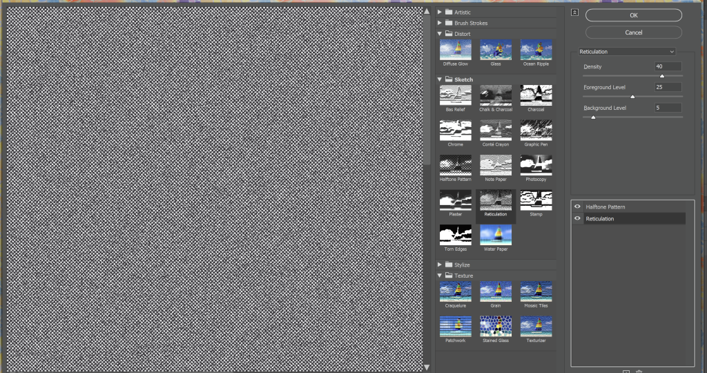
Your image should be looking a lot more run down by now. Which is great. Now merge all your visible layers into one and convert it to a smart object.
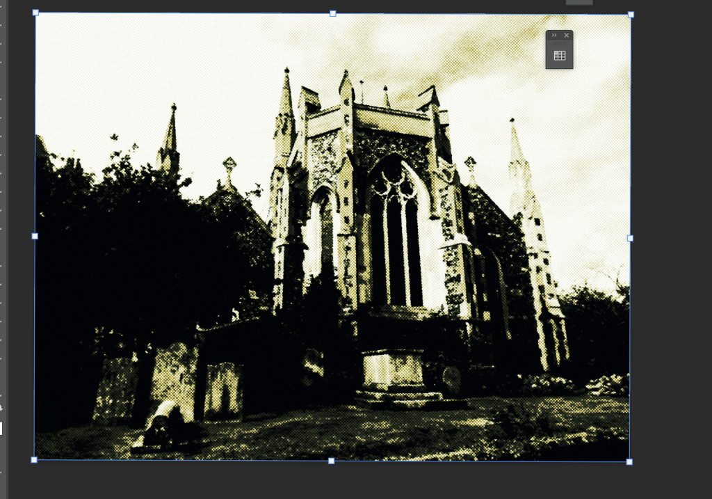
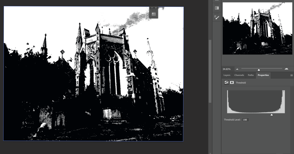
Click the little two tone circle next to the folder icon in the layer section to bring up a threshold layer. Then adjust the threshold level to however you see fit.
Uh oh. Looks like we got rid of our colours! No worries though, we can add a gradient map adjustment layer to bring it back. This does make some of our previous efforts redundant but even so it’s good to visualise the colours as you work.
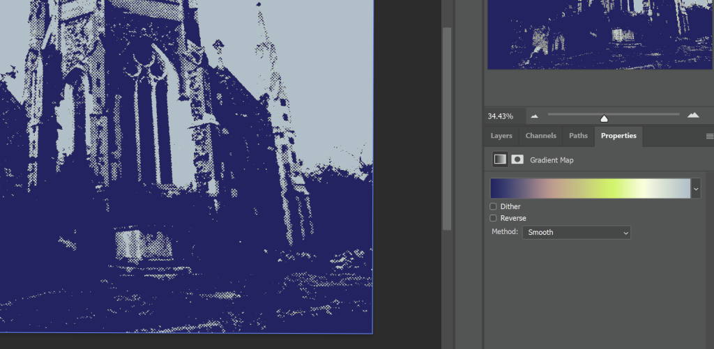
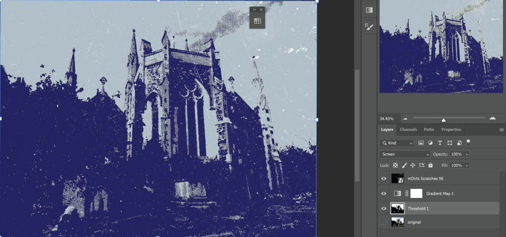
Drag and drop a texture to overlay and you’re done. Voila! I added some more touchups to the finished piece, but they’re not relevant to cover in this tutorial.
Leave a Reply