
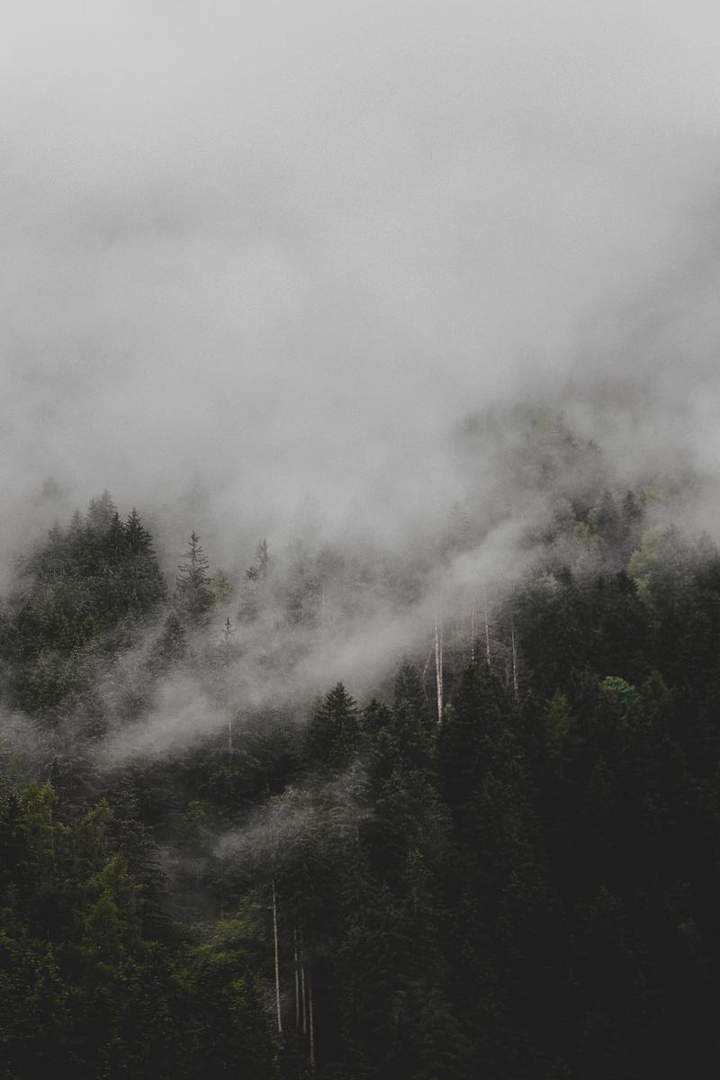

I wanted to have a clearer outline of my visuals. I had a few ideas for what I wanted the UI to resemble. My inspiration for this was the inventory in the horror-survival game The Forest. Instead of the usual grid alignment, the items are organically placed as if you were really looking on a table with all your stuff on it.
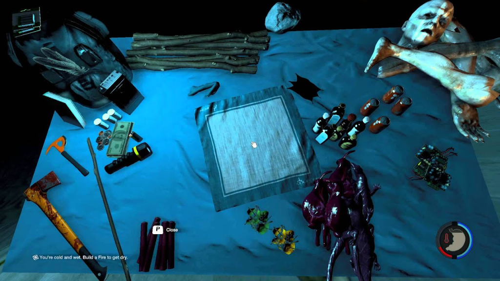
I thought this was really cool, so I took this idea and integrated it with the map as well for simplicity’s sake. Within the game, the player searches for map fragments to find out where they are for rescue. In the meantime, a hand drawn map suffices.
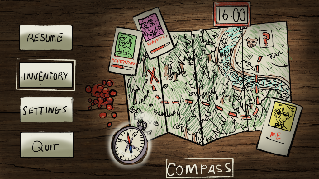
The player cards would display the reputation as well for the player to check their progress. Places that Tyler hasn’t explored show up as a red question mark. To select things for use, there would be a ghostly white outline as well as its name on thr bottom.
There’s also a clock, but on second thought I don’t think it’s a necessary addition to the game.
I also drew up references of the characters in the full body.
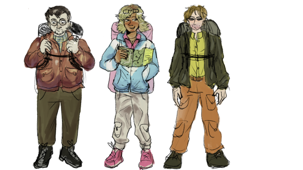
I tried to keep up the shape language and give them their own distinct colour palletes. Marcus is earthy tones, Sierra is pastel and Tyler is neon.
After this, I want to move onto completing the main GDD, to give myself as much time as possible to fill out all the necessary details as well as experimenting with certain ideas.
Leave a Reply