
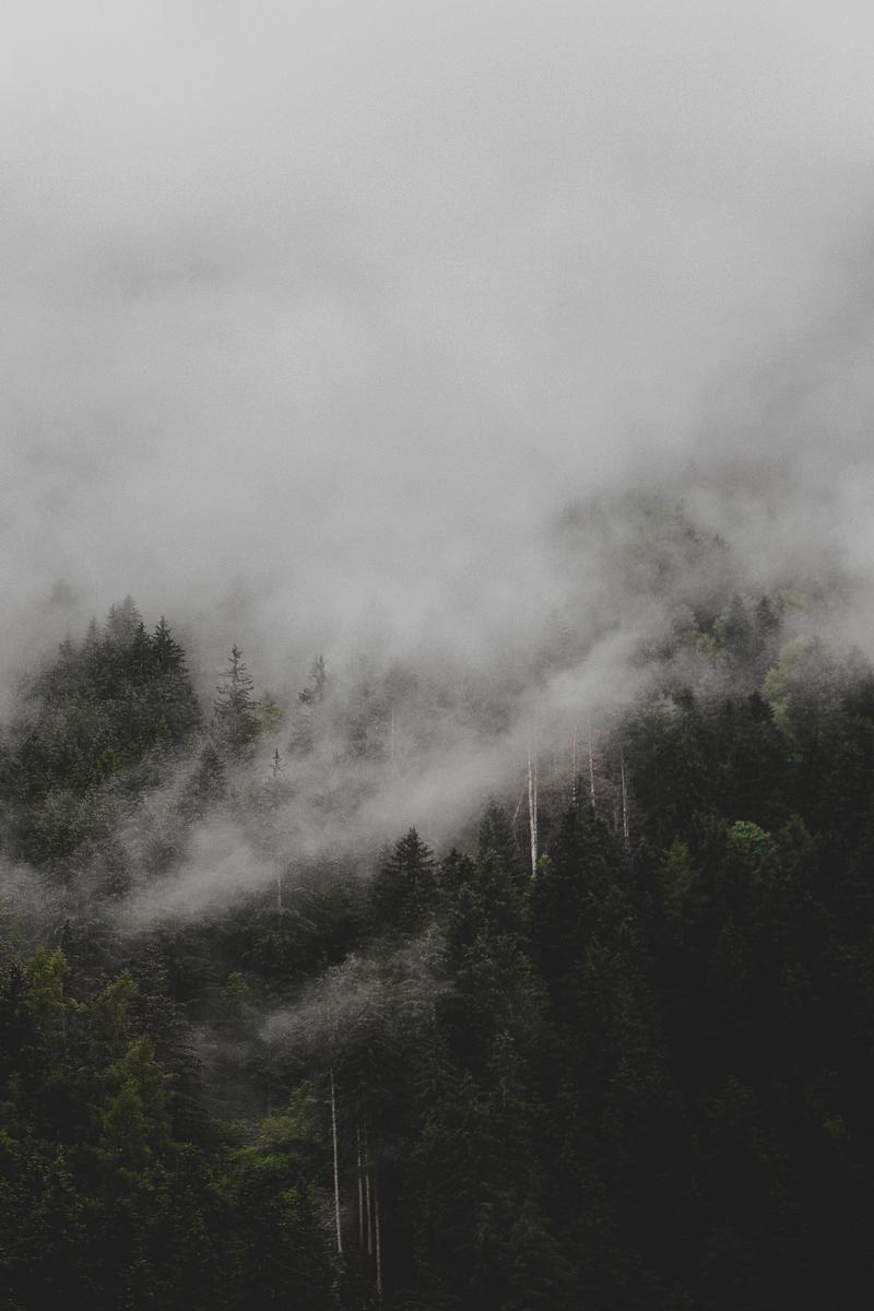

I wanted to do some first-hand studying to prepare for the artwork in the design document. As we came back in September, autumn was very quickly upon us. I commute from Southampton into Winchester and the journey over there takes me through very scenic forested areas, which is what initially inspired me to incorporate nature into this project.
The setting of my game is in Canada, deep in the wilderness, so the fauna and flora would be fairly different but nonetheless it will serve as a good reference and good experience into further understanding colour and photography. Using a camera is a lot more difficult than I anticipated, I used an auto mode for the sake of time. However I did test around with aperture and exposure to understand how to optimise the level of light in a photo.
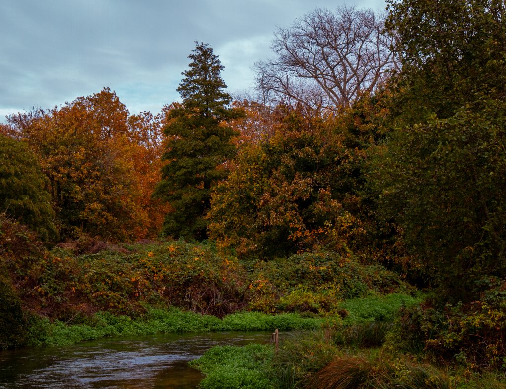
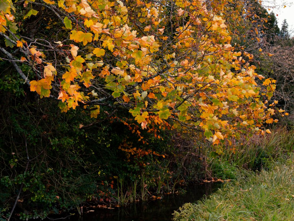
These were my first shots testing the camera, which was a Canon 7D with an 18-35 MM lens. The shorter the lens is in MM the wider it is (confusing, right?) and this made it suitable for landscape photography, as well as some closer shots. Portrait photography is usually done with cameras that have a 50+ mm lens depending on the size.
It took a few weeks for me to find a suitable day for the photoshoot, due to my availability and the weather. I walked through Winchester just south of the cathedral. While it wasn’t raining it the weather was unfortunately pretty cloudy. Nonetheless here are the shots. Photography is a surprising amount of work, each image needs to be edited in a way that suits its own strengths. The editing is another skill in of itself, that allows an otherwise bland photograph to stand out. However, if the original photo has poor composition or otherwise boring subject matter then not much can be done to save it.
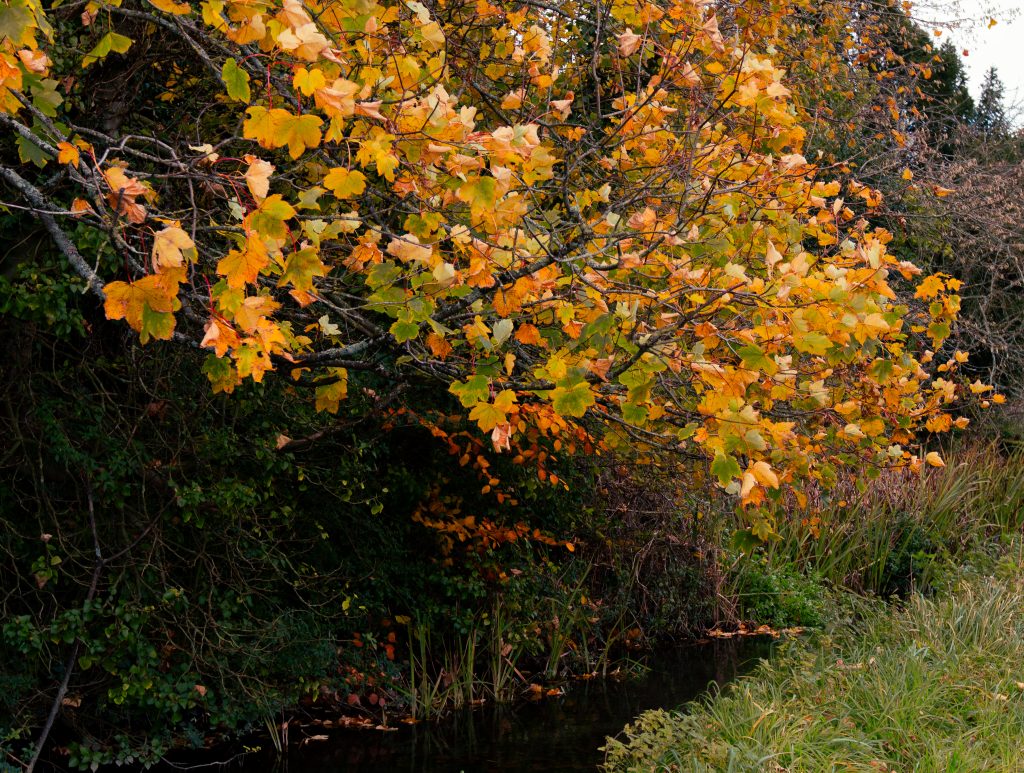
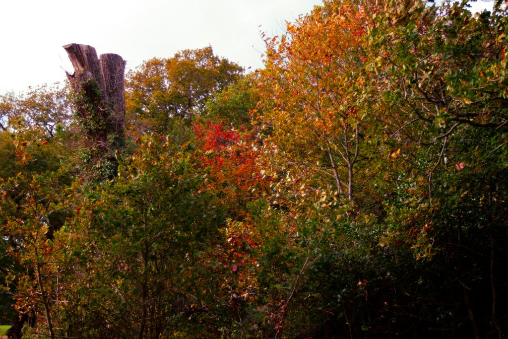
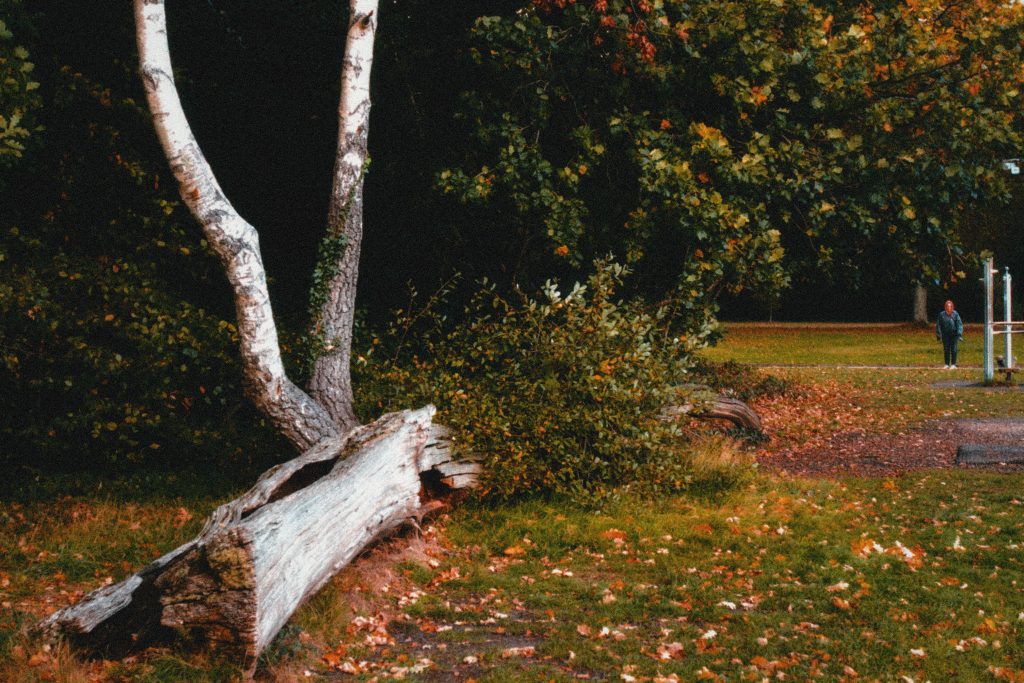
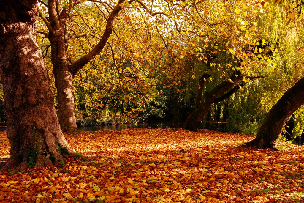
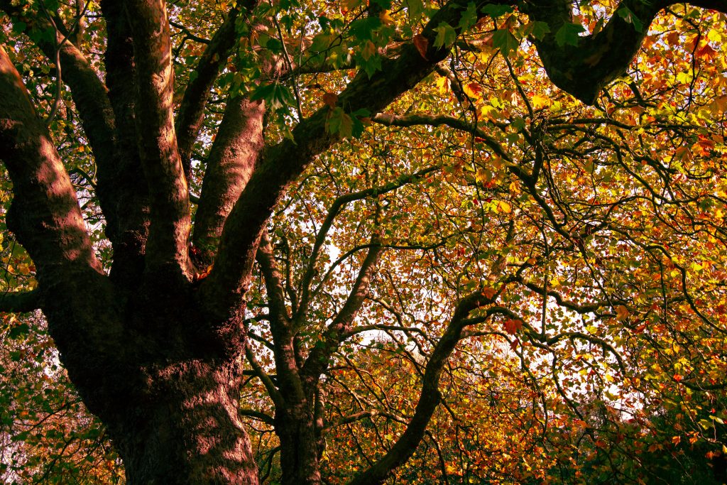
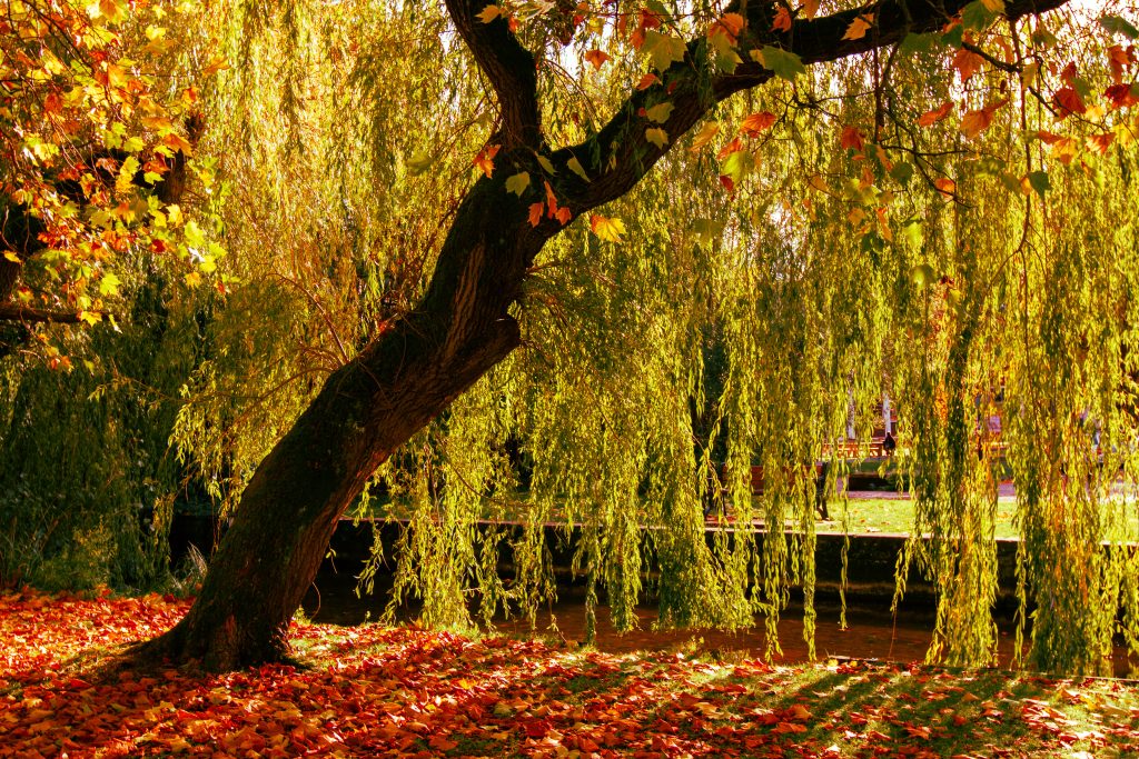
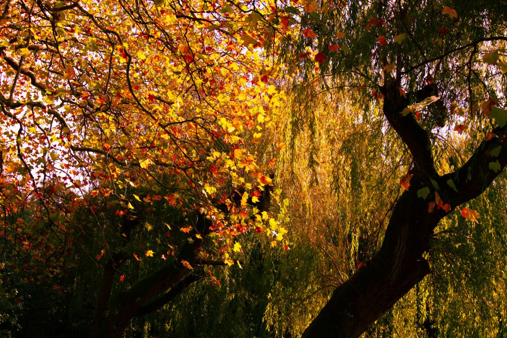
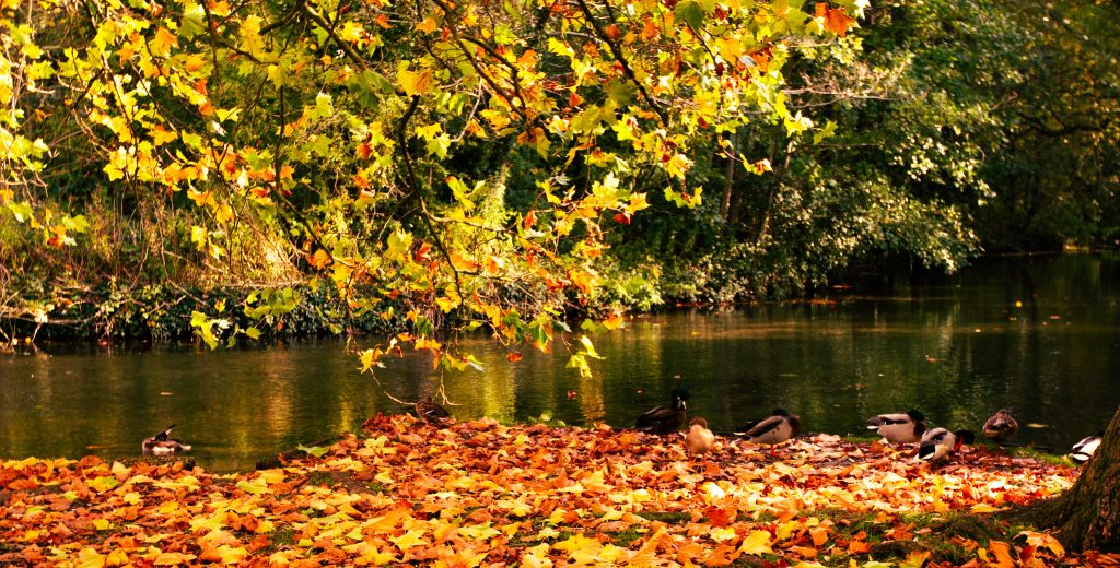

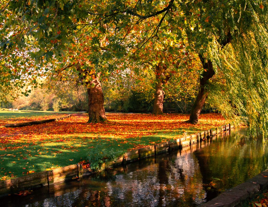
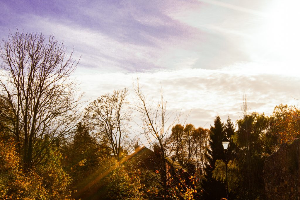
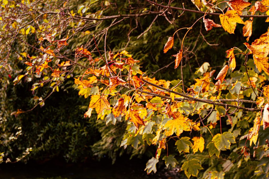
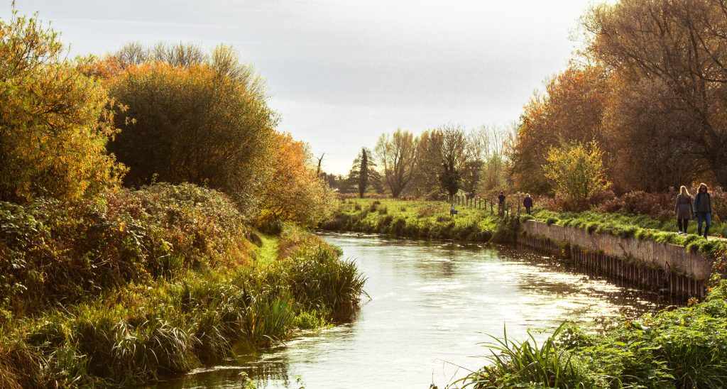
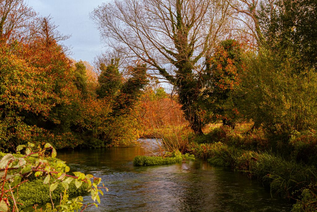
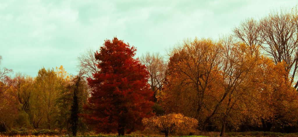
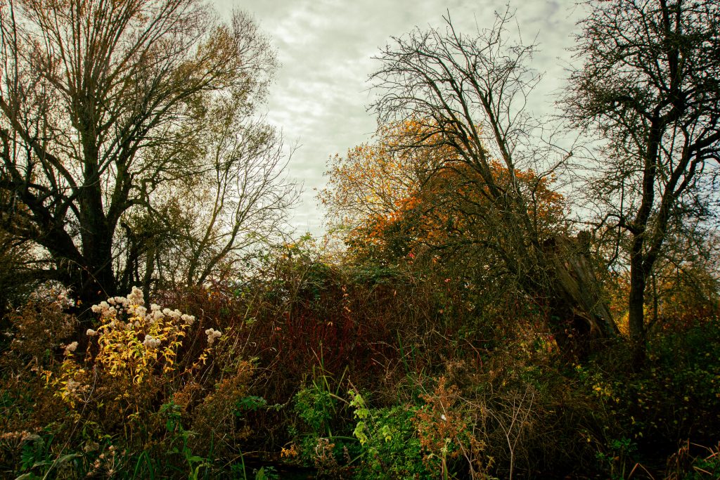
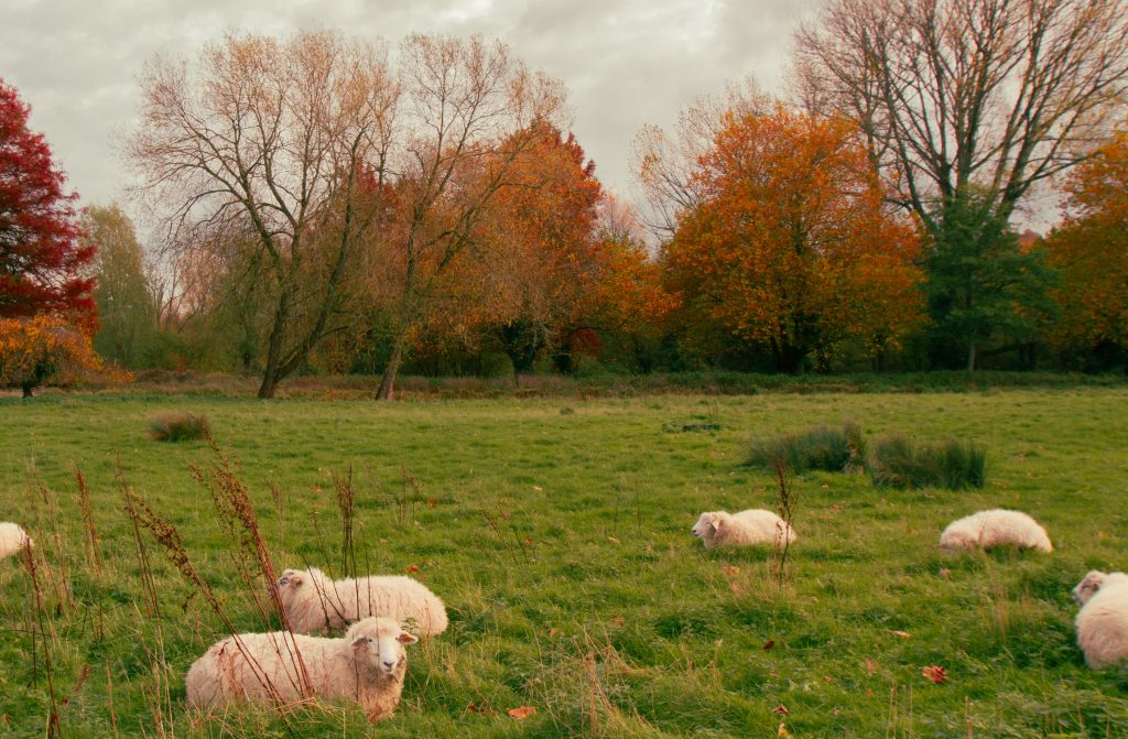
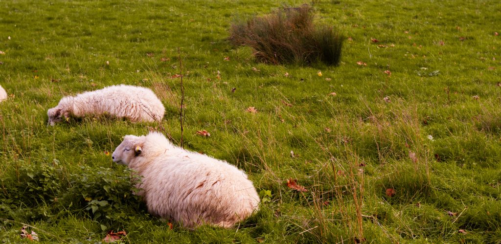
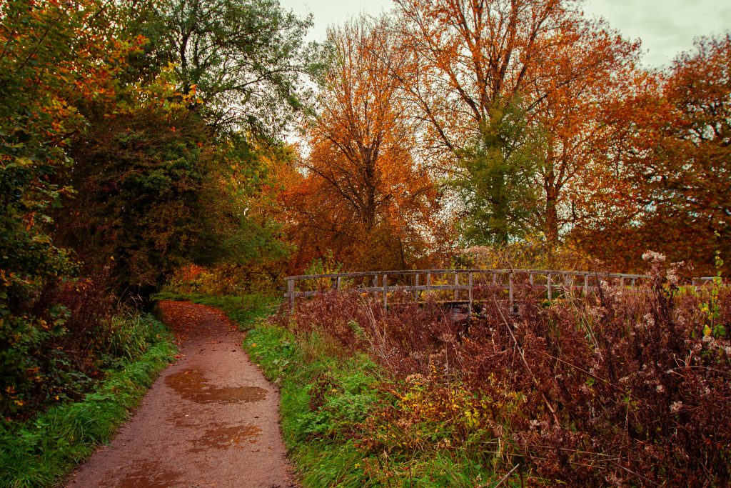
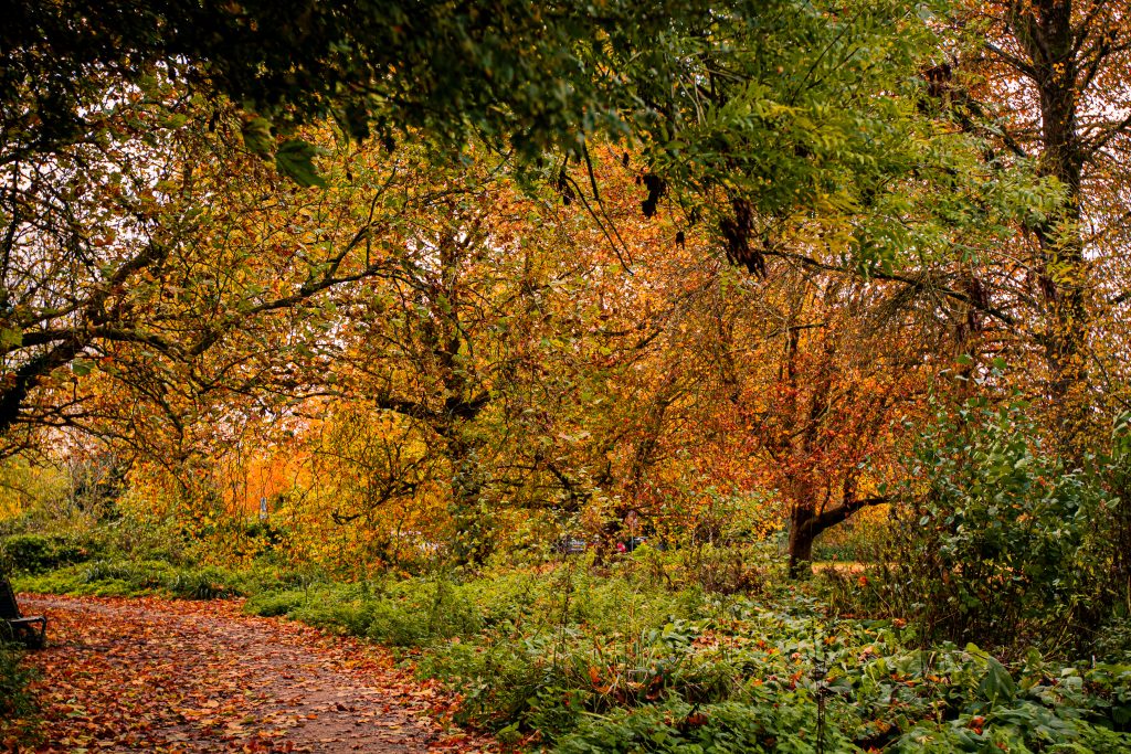
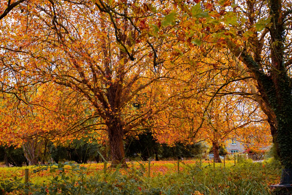
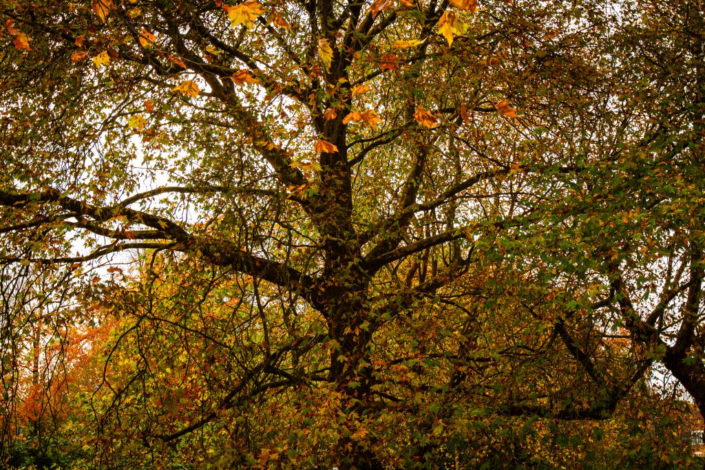
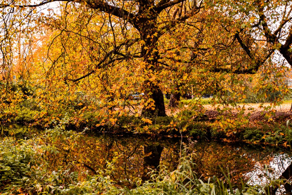
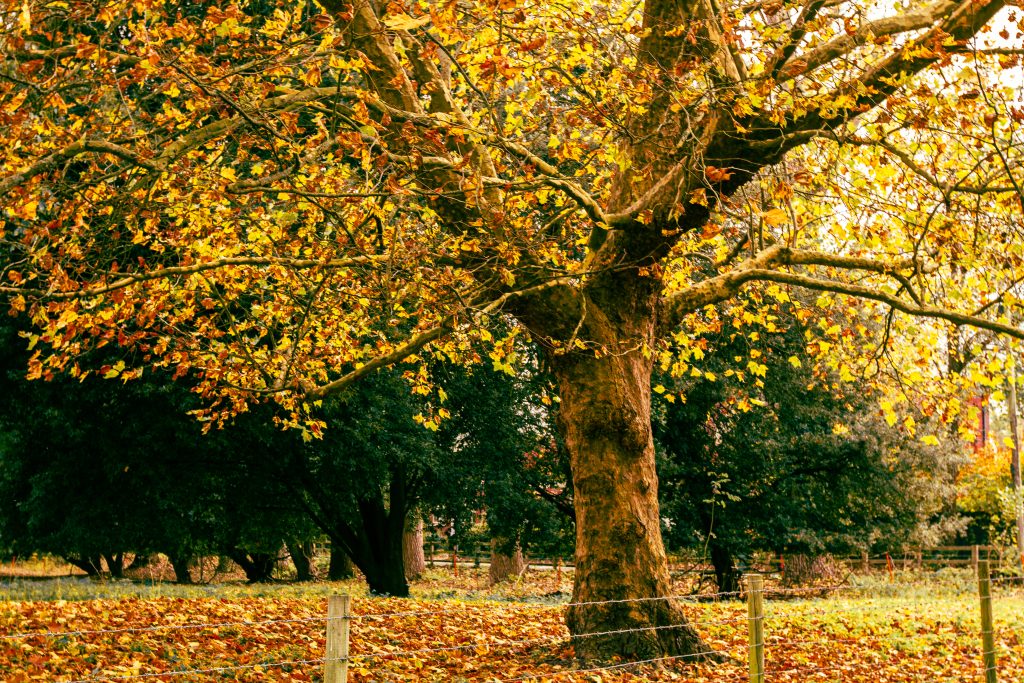
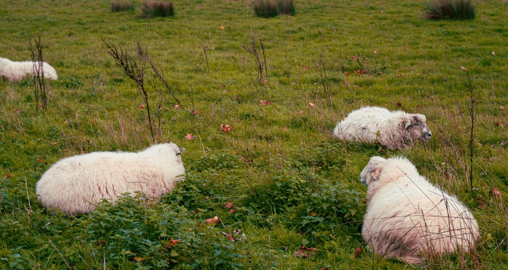
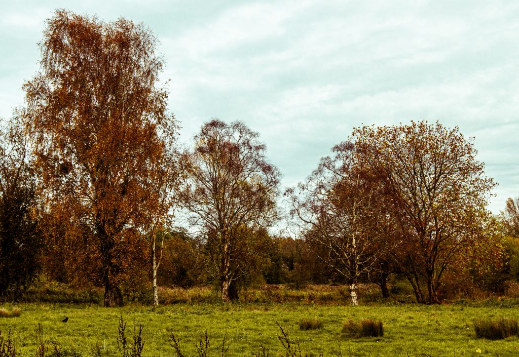
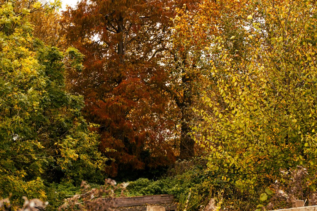
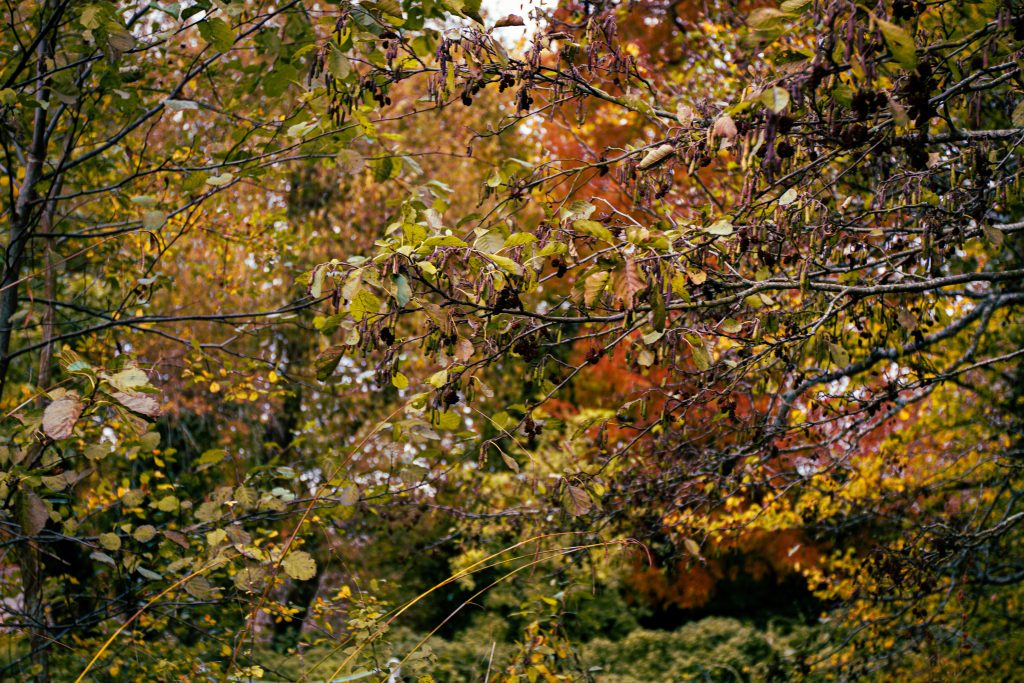
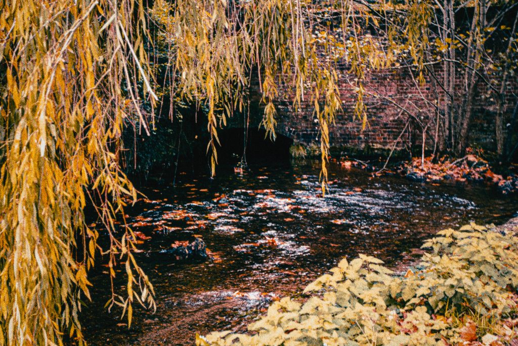
I did some further edits to some photos to add an antique flair to it. I increased the yellows and blue to add the effect that the colours had faded over time as well as some paper textures that make it look worn. A halftone pattern also recreates the low quality vintage style of printing. These could even be used as assets within the game itself. I wanted to create these edits to further hone in the aesthetic style I’m trying to recreate.
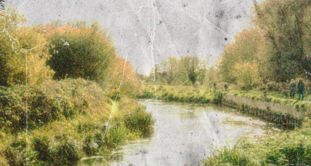
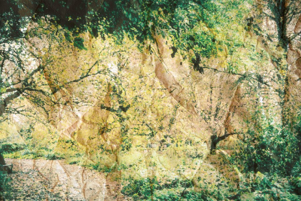
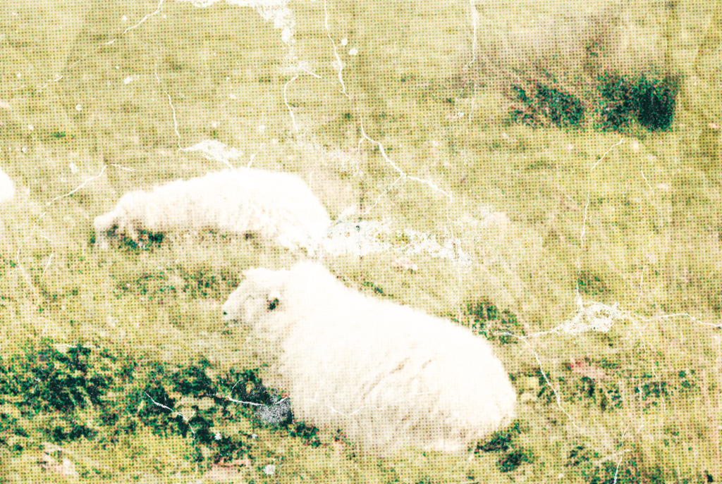
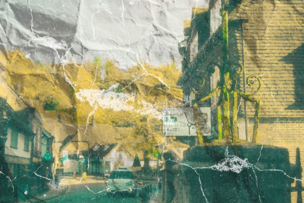
The nostalgic washed out effect is something I want to emulate within my art for the game. As the game’s themes centre isolation, guilt and madness, this visual style translates it into the design. It also creates a slightly eerie and tense atmosphere and contributes to the tension in the narrative. In regards to possible horror elements, this retro style also connotes the analogue horror genre. As the name suggests, analogue mediums such as vhs tapes are used to create a feeling of unease.
Leave a Reply