This research explores how natural environments, floral elements, and light can shape a calm, emotionally responsive game world.
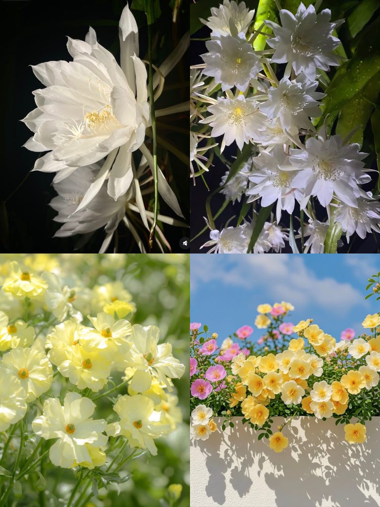
Visual studies focus on colour, organic forms, and day–night contrast to support slow exploration and reflective play.
The goal is to ensure visual design functions as part of the game’s emotional system, not just its surface style.
Lighting & Atmosphere
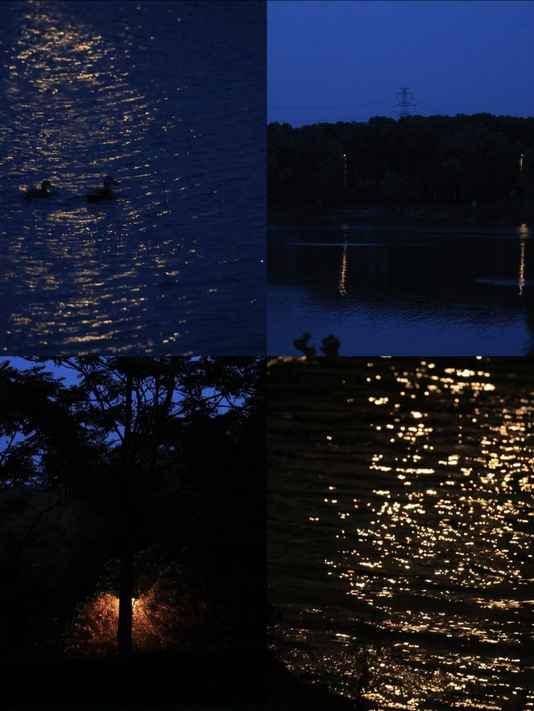
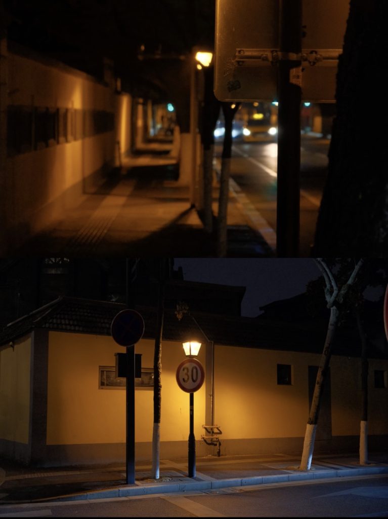
The visual direction prioritises low-intensity lighting and soft contrast.
Night scenes are designed to feel clear, intimate, and calm, while daylight appears muted and less responsive.
Light is not used for drama, but for guidance and reassurance, supporting slow exploration rather than urgency.

Colour Language
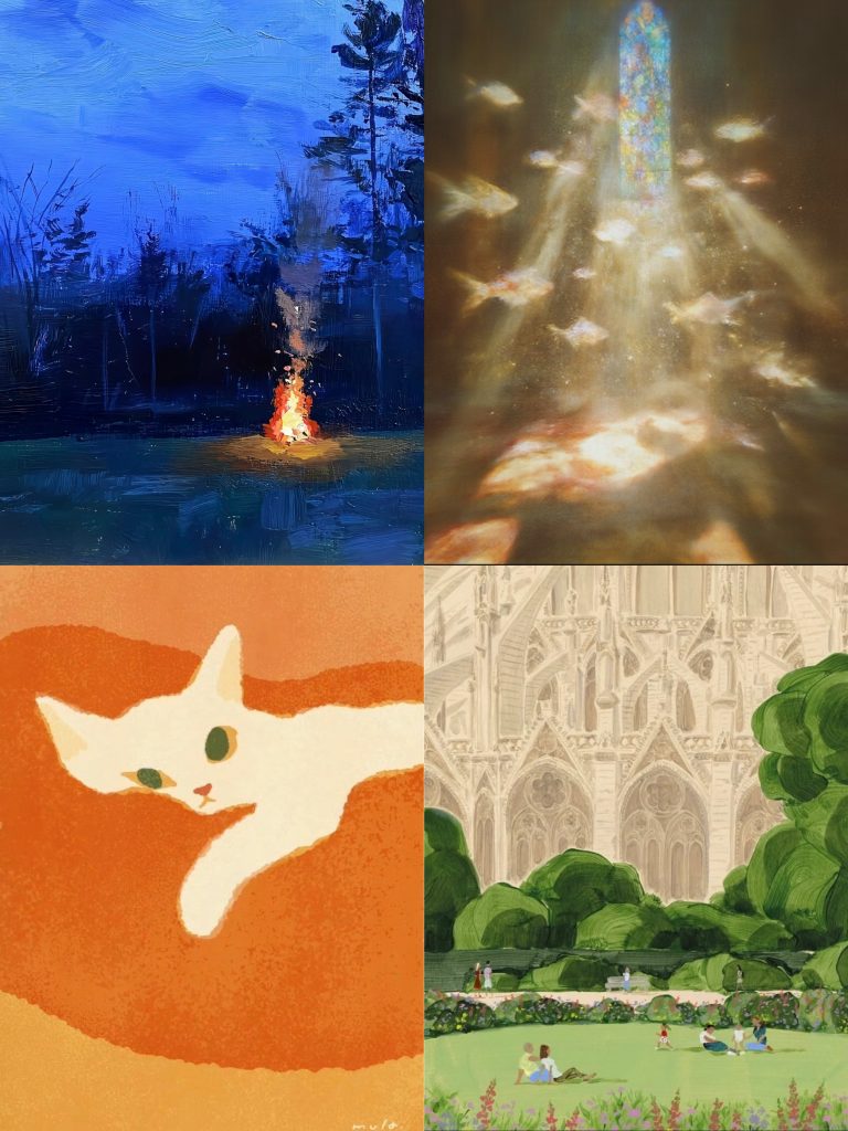
The colour palette is vivid but controlled, using higher saturation without visual noise.
Rather than realism, colours are used expressively to convey emotional clarity and presence.
Saturation helps the world feel alive even during rest, reinforcing warmth, reassurance, and quiet continuity.
Colours are not decorative accents, but emotional signals that support the player’s sense of being gently held by the environment.
Shape & Silhouette
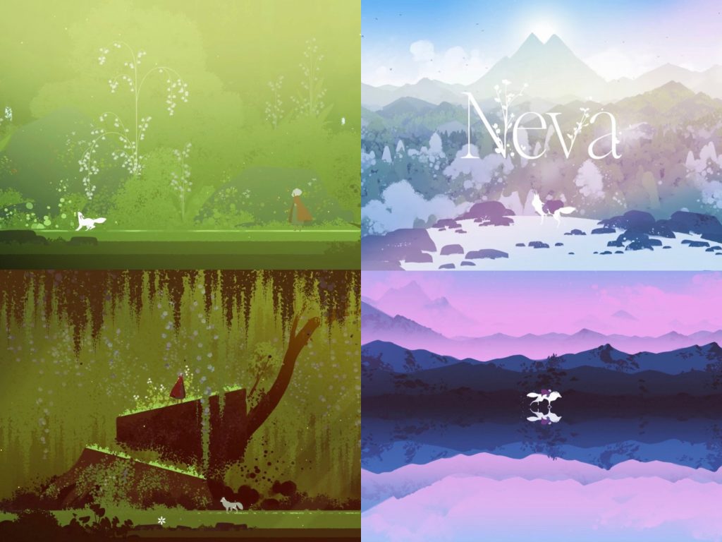
Shapes are inspired by natural growth and floral structures, rather than rigid geometry.
Silhouettes favour rounded, organic forms, echoing petals, leaves, and softly growing plants.
This approach helps the world feel alive but gentle, supporting themes of ordinariness, rest, and quiet continuity.
The design of Noctelume follows the same logic — a form that feels fleeting, yet rooted in nature.

Leave a Reply