During this sprint, admittedly, I was quite slow and unmotivated to do work for the first two weeks. However, nearing the end of this sprint, I recovered from the initial drawbacks by completing key tasks in a smaller time frame. Due to this minor lethargy from my end, it highlighted the importance of consistency and time management, as leaving important tasks to last can increase work pressure and sometimes the quality of work.
But thankfully, this sprint also runs into Easter break, this provided me extra time outside of our planned sprint to work on assets.
At the start of this sprint, we had the pleasure of being invited to UsTwo games, a studio based in London! In this visit, they gave us some insight regarding the industry and what to expect when being part of a team. Through this experience, it further strengthened my understanding of clear communication, deadlines, and team work between artists and developers, which I applied to my work straight away
This sprint’s deliverables:
- ALL decorative playable island assets
- Placeholder background
- Bounce pad
- Another tile set (player can jump upwards through it but it becomes collidable once contact is made)
Southampton fair – User testing and feedback
The following Saturday, I had the pleasure of presenting mine and EJ’s work at the Southampton Engineering and Science fair, where students would present their work. Although the audience was much younger than expected, it still provided necessary insight into accessibility and target market, which we have gotten right. The main audience ranged from 6-10 year olds, but there were some older children there. The younger audience had some difficulties maneuvering some of the platforming.
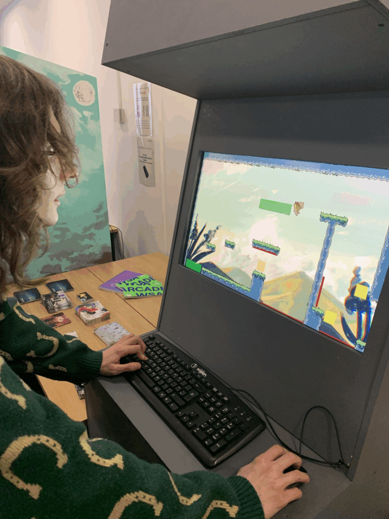
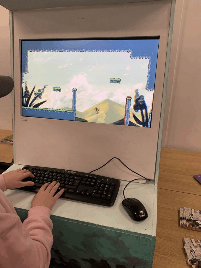
There were a couple of 12+ year olds that managed to complete the game with several deaths, but this is a good thing!
The main observations I took notice of was:
- The first level was too hard, took longer than expected for the average player to complete
- Dash button wasn’t working
But when I was thinking of our initial game pillars and audience, this is exactly what we wanted! We wanted our player base to consist of people over the ages of 12. EJ wanted to create a game where it was difficult and not easy, he wanted to create a game where trial-and-error was necessary to the game loop.
In regards to my last minute art work, it was readable and didn’t get in the way of the game play. One thing I do want to do moving forward from this is to create a background where it is slightly blurred to provide more depth, especially since there will be other assets occupying the screen to create more depth and liveliness into the scene.
Start menu update!
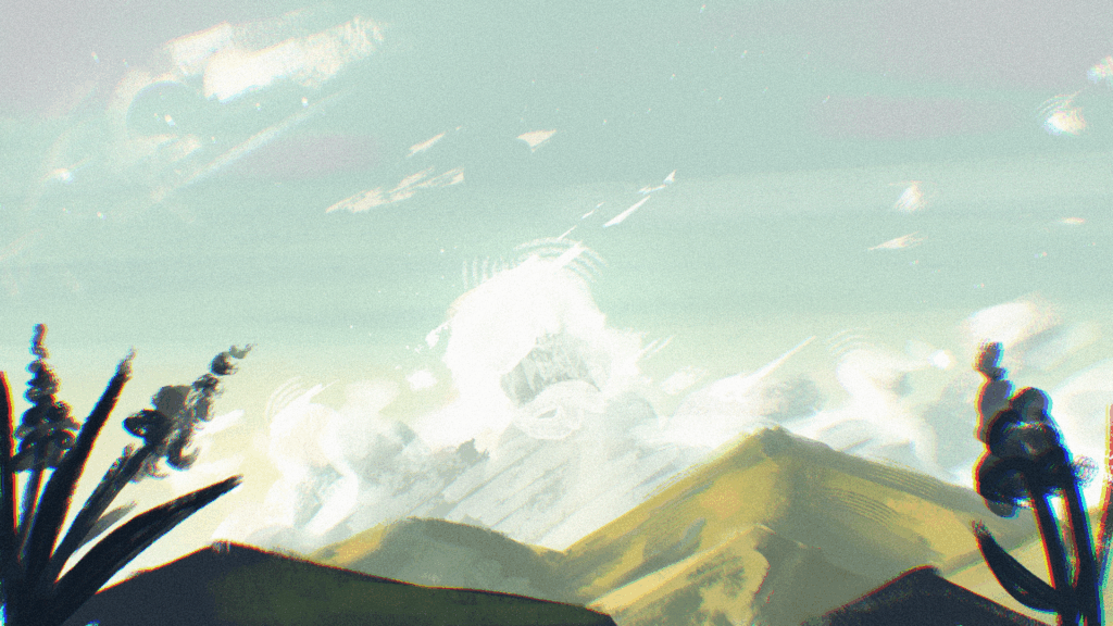
The day before I asked EJ to implement a start menu. I needed to include some art work which would also serve as the background rather than just a plain blue screen. This would also ensure visual identity as soon as the player clicked the start button.
Artwork:
Time completed: 2h > 3h
The time I completed this piece is a great development for me personally! I usually take much longer than this to complete such a simple piece, but this time I wanted to focus on ignoring imperfections and think about the piece as a whole. I started off with a simple sketch then just started to place colours on top of that, not worrying about if I was within the lines.
Communicating with my team mate:
Below, EJ wanted to make a credits and a thanks for playing screen that would show up after the player completed the levels.
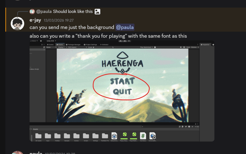
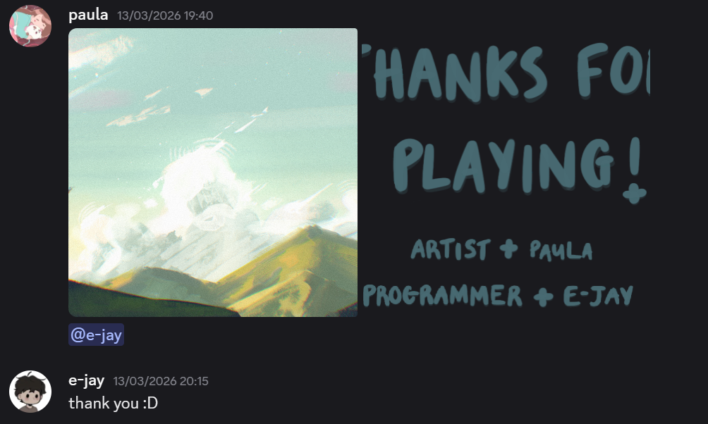
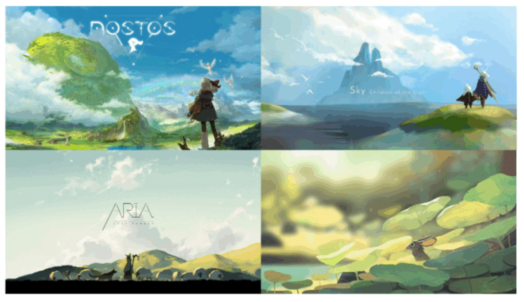
Due to the time constraints, I looked on Pinterest and ArtStation very briefly to find reference images to help with the guidance of my work. I wanted to find images with similar colour palettes to our game. In the final design, I wanted to focus on establishing the overall tone, atmosphere, and environment the player would be subjecting themselves into, which aligned with the art direction.
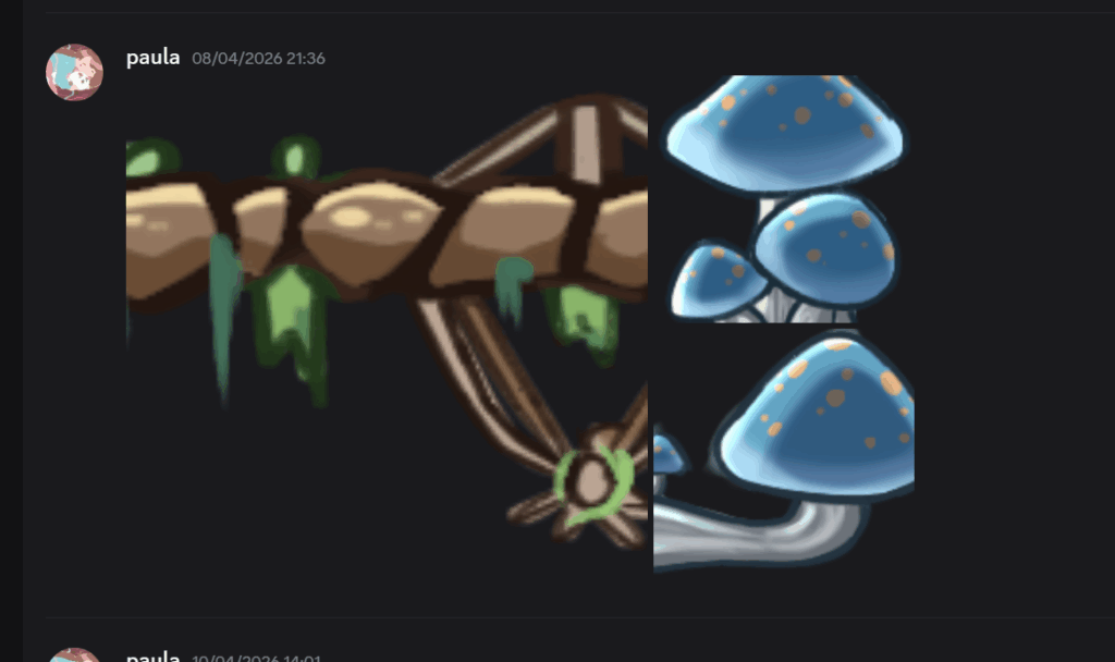
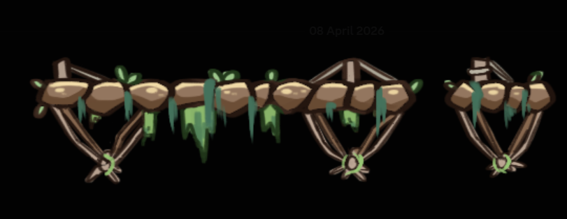
Bridge and first mushroom assets
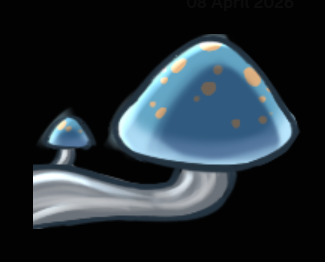
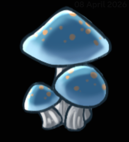
EJ asked me to create a very quick bridge tile set. This would allow the player to jump from below and land on it without colliding with it like a normal tile set. He also requested that I make a mushroom asset; one to be places horizontally and one to be placed vertically (this asset would later be scrapped anyways due to the lack of render cohesion). He also made note to make sure that it’s a little bit taller than 130px.
As a result of knowing how tile sets work, my work flow was much more efficient and faster.
Mini reflection
Reflecting back on this work, especially the bridge asset, I realised what needed to be done to make this tile set seem like you can stand on top of it after jumping. This stage of development also made me understand the technical constraints of game play functionality.
Scrapping other mechanics
EJ had communicated with me that some features will have to be removed in order to meet the deadline.
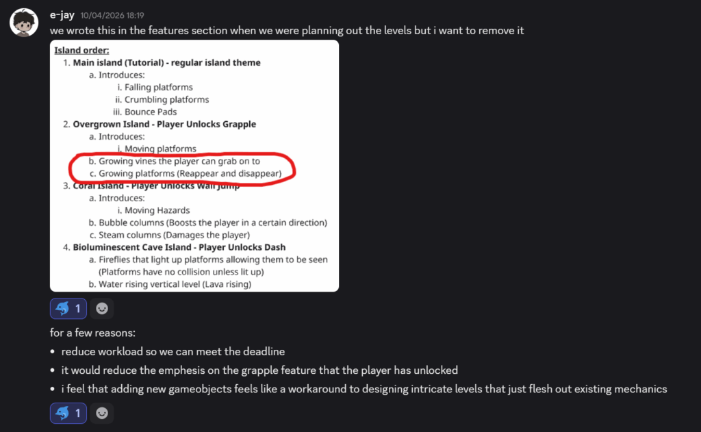
As stated in his message, he removed the mechanics “growing vines” + “growing platforms” due to:
- reducing work load
- makes the grapple hook seem less important
Although this change mainly affects his work load and level designing, it has also impacted my asset production, it has reduced the number of assets I needed to complete. This is a positive for me as I can focus on other assets and refine existing ones to make sure they align with the game’s art direction and game pillars. Through this process, it reflects our development process where mechanics or art features must be adjusted to meet the scope of the game.
Coral, cave, and restarting the overgrown island assets!
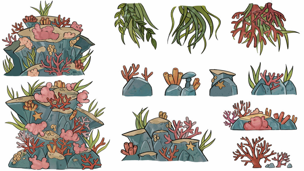
Nearing the end of our Easter break, I started making the coral island assets. The purpose of these island assets is to provide extra depth and immersion into the game play. I wanted to create 12 of these assets, although this may seem like a small number, they will be repeated across the island, so repetition is to be expected.
For each island, I wanted to create 3 big assets, 3 medium, 3 small, and 3 upside down assets which would be to cover any “unsightly” parts of the top. I focused on creating organic rock shapes and then added details such as coral and kelp, which gives the level its distinct visual identity. Maintaining visual readability isn’t as important as these assets are only present in the levels to provide decoration and atmosphere. One thing I did need to keep in mind was colours and cohesion which I managed to do.
Coral island assets
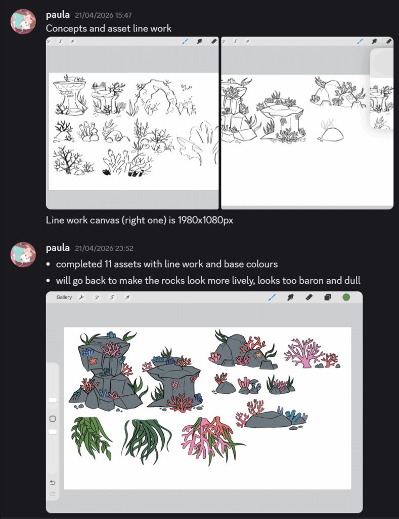
^ The screen shot above demonstrates my iterative process. I didn’t like how baron the assets looked and the shape language was far too jagged for me. I went back the following hours to correct this mistake by making the rocks appear smoother and drew on an abundance of corals and kelp to make the environment appear lush and thriving.
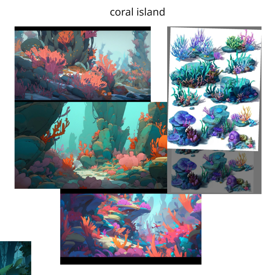
It was at this point I realised I didn’t have much reference images, which would’ve helped a lot with the colouring process. As a result, I quickly went on Pinterest and picked a few images that I thought had great colours for this environment. These images show a display of orange, red, pink, and blue which offers a bright and energetic atmosphere.
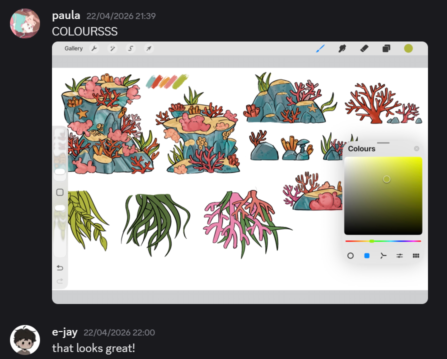
^ Above shows the changes I made to the assets. I made the colours more vibrant and adopted a warm colour palette for the coral. I went to meet up EJ in person the same week before this iteration and he commented that the bottom of the assets looked too 3D and had perspective way too much on mind. To fix that mistake, I simply just made the bottom flat, which aligns more to the side scrolling format.
Finished assets:
Mini reflection
I started this process quite strong, however, when I showed EJ my work and he gave me some pointers, I had realised that I wasn’t making art suitable for a 2D platformer. The larger assets made it abundantly clear that I needed to flatten the bottom to make it more 2 dimensional, which is suitable for our game.
Aside from the pointers, I really liked how this colour scheme came out, I believe this island will sell as a very distinct island with it’s own visual identity. The warm colour palette is very symbolic of coral reefs and their geographical locations— that being the prettiest reefs are found in hot, humid climates. I believe this colour palette is very representative of that fact. Another design choice I liked for these assets is how irregular the silhouettes are, for the big ones at least. Nature isn’t supposed to be perfect or symmetrical and I believe I have done a good job at showing that.
However, this island has also made me realise that I didn’t really make a distinctive identity for the first island (overgrown). Later down this sprint, I want to work to make assets for that island.
(quick background discussion)
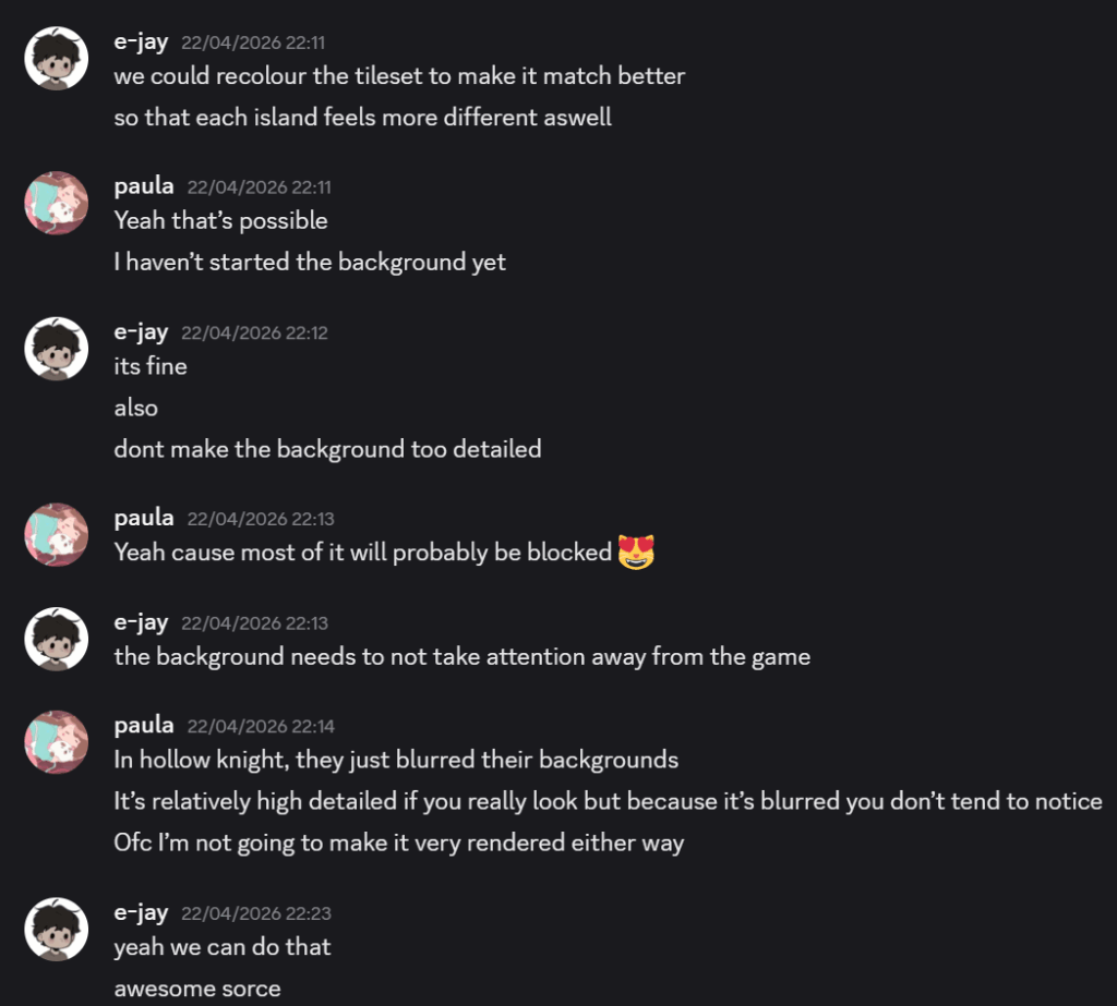
We then started talking more about what the background should look like. EJ states that I need to make it simple or make a background where it doesn’t take too much attention away from the game.
I then suggest that I create a background but then blur it like in the game Hollow Knight, although the background isn’t something the player tends to notice, it still adds so much atmosphere to the game play.
Back to assets!
Bioluminescent mushroom assets
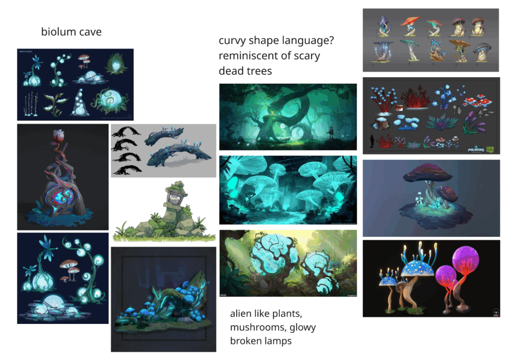
The following day, I didn’t waste much time. I wanted to look at possible reference images first since I wanted to make this environment look quite glowy and cold. Below shows the images I used as reference and inspiration. It was at this point I realised that I didn’t have the luxury of exploring iterative ideas as much due to the deadline approaching. However, this allowed me to engage in a much more focused and efficient approach, leading me to prioritise a strong visual approach quite early on.
The mood board I quickly put together shows mainly fungi with alien structures and this glowing sphere in a trunk with branches winding over it. This specific concept really stuck with me and as a result, was influential to the large assets for this island which contribute to the distinct visual identity.
I was especially drawn to the use of bright blues as it reminds me of the AVATAR franchise- known for its beautiful alien worlds and environment. By using the colour blue, I want to achieve an other worldly, yet familiar atmosphere.
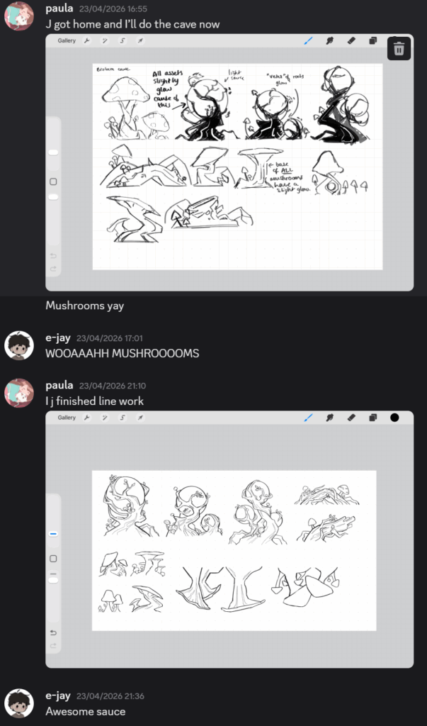
The screenshot below shows the very quick concepts I made, I tried to keep it quick and focused on shapes once again. I then started to make the line work for these assets and added small details to the line work, such as the veins/roots of trees and the stem of the fungi.
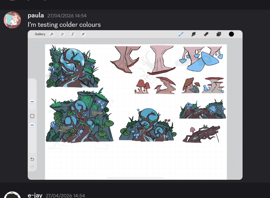
The screen shot below shows me playing with colour choices, but I stuck with the same one anyways due to the cohesion and delicate time constraints.
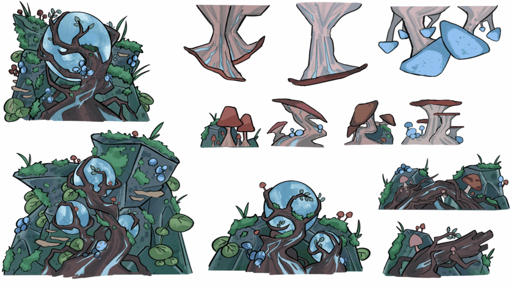
Finished assets:
Mini reflection
Reflecting back on these islands assets, I believe that this environment has the most distinct style and colour palette out of the three islands. Details such as the small mushrooms, moss, and spherical orb encased in the branches helped to create an atmospheric environment that felt visually distinct from the rest.
Looking back, it would’ve helped to make more iterative designs and have either my classmates or EJ review them before finalisation. But due to the time constraints, this option wasn’t viable. However, through this process, I developed a much more focused and quicker workflow that allowed me to get these assets done in such a short time frame which aligns with industry practices where studios cut back on certain tasks to make sure they reach their deadlines.
Overgrown Island assets #2
Then I began to restart the overgrown island assets. I did this because I felt like the old ones didn’t add enough atmosphere to the game because they were too small, and didn’t have enough visual identity. At the beginning of sprint 1, I wanted to make an overgrown island, however, the first asset sheet didn’t really encapsulate that. I was just drawing flowers and rocks, which could be found on ANY island.
So I spent a few seconds thinking about what “overgrown” means to me, so I made a very quick brainstorm exploring the adjective:
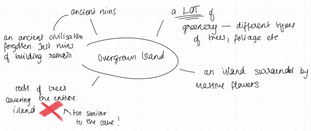
- My first idea was an island surrounded by a lot of flora, which wasn’t much change from my original assets.
- I then thought about an island surrounded by a lot of flowers, mainly big ones, to make the player feel small and insignificant. It would also be a great starter island for the player to platform on as it feels welcoming.
- I also thought about just tree roots sprawling across the island floor, but after thinking about it, it wouldn’t have been as aesthetically pleasing, at it would’ve shared some environmental similarities to the mushroom cave
- Finally, I thought about the ruins of an ancient civilisation. This idea really stuck with me, I also thought it would’ve been incredibly distinct visually in comparison to just drawing vines and trees.
Mood board
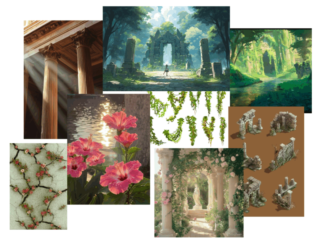
I started to create a mood board for this island as I wanted to nail the visual identity down. In this mood board, I put together what I wanted to create for this “lost civilisation” island. I wanted to show that the debris was ancient. I could do this by adding extra flowers or vines to sell this fact. I also came across images of flowers and hibiscus, which I think adds accent colour to the scene, seeming as I will most likely be using greens and a creamy yellow colour. Pink (essentially light red) adds variation and is technically greens complimentary colour.
Design Process
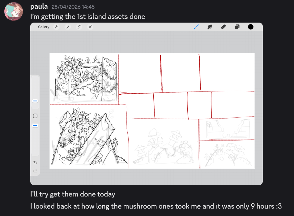
^ It was also at this point I realised how efficient I have been with my asset designs.
Eventually, I developed a concept where nature was taking over this lost civilisation. To add onto the atmosphere, I added hibiscus flowers which are universally recognised as the flower a person typically thinks of when the word “island” comes to mind. With the addition of overgrown flowers and vegetation growing from the rock formations, it creates a more unique environment that connects to the island’s theme.
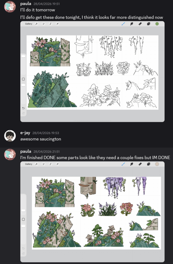
^ Screenshot of progress in asset creation
Finished assets:
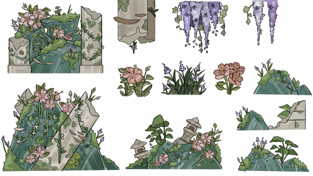
(Old assets)
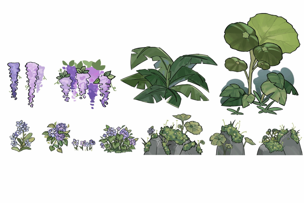
Mini reflection
Reflecting on this design made me realise that the visual cohesion of the assets and the uniqueness of environmental identity impacts the overall atmosphere of the game. Restarting these assets allowed me to think more about the atmosphere, shape, language and how small details impact the player’s game play experience.
Comparing both new and old assets made it quite apparent that I did not do enough research in my old version. Although I made more concepts and sketches, I didn’t really do the research before hand or collect enough inspiration. But most of all, I didn’t think to put myself in the shoes of a game artist. However, redoing these assets allowed me to properly think about what I was designing and how I could clearly differentiate each island.
I have also learned the importance of sketches without research or knowing the aesthetic of what I was going to create, only hinders the design process.
Sprint reflection
Reflection on this sprint, I believe I made a lot of progress in the development of environmental asset creation and improving visual identity across islands. Throughout this sprint, I learnt the importance of time management and the consequences of not prioritising larger tasks. However, because of this mishap, I have become more critical of my work and had to change my workflow to adapt to the time constraints.
Restarting and redesigning the overgrown island assets made me develop a clearer understanding of shape language and how visual design is imperative to environmental story telling.
I also believe that this entire sprint is reflective of our core pillars, distinctive visual identities:
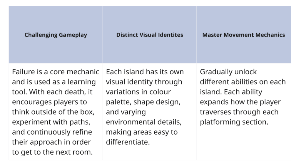
I believe I greatly devoted this sprint into researching and creating distinctive identities for each island. Each mood board and brain storm was dedicated to making our game stand out and to make the player immerse themselves into the world.
For me, the assets were the tasks I was worried to do as I thought they would take a considerable amount of time. Although this fact is somewhat true, I managed to get the majority of these asset sheets done in less than 12 hours from sketch to colour. What helped to speed up the process was consistent work schedules and workflow that enabled me to concentrate and keep working. Now that one of the tasks I was dreading to do is out of the way, next and final sprint, I will be focusing on backgrounds, village assets, and other smaller tasks that can be done within a few minutes.
Leave a Reply