Tag: Game Design

  • Week 6: Pitch evaluation and developing Rift Runner

    This week

    • I brought the pitch up to date with Rift Runner v0.21 and reviewed the nine pitch evaluations. The main question for me was whether the presentation explained what the rhythm system adds to an FPS.
    • I also followed up the Week 5 playtest: the opening needed teaching, the rewards needed to be easier to read, and the route after a fight needed more direction.
    • The latest deck has 12 slides. It covers the player experience, three design pillars, the loop, references and prototype development.

    The pitch and gameplay

    A 60-second gameplay demonstration from v0.21, recorded and edited on 26 October. The footage uses arranged gameplay inputs and keeps the game HUD and sound.

    What I am trying to make

    • Rift Runner is a single-player PC FPS about crossing a machine world towards its core. The current route has seven connected regions, twelve regular arenas and a final boss.
    • I want players to start by coping with the fight, then learn how a weapon and their movement fit the music. The audience I have in mind is FPS players who are curious about rhythm mechanics.
    • The main loop is to fight through an arena, recover in a supply bay, choose an upgrade when a chip is available, and carry that build into the next encounter. A run has six upgrade choices from a pool of 26.

    The pillars in the game

    • Fluid movement: jumping, sliding and dashing let the player change position. Dashes use a short cooldown, so movement no longer depends on a three-charge allowance.
    • Readable combat: enemy silhouettes and red weakpoints help the player choose a target. Health, ammunition and beat information have their own areas on the HUD. The opening now teaches these systems before the campaign starts.
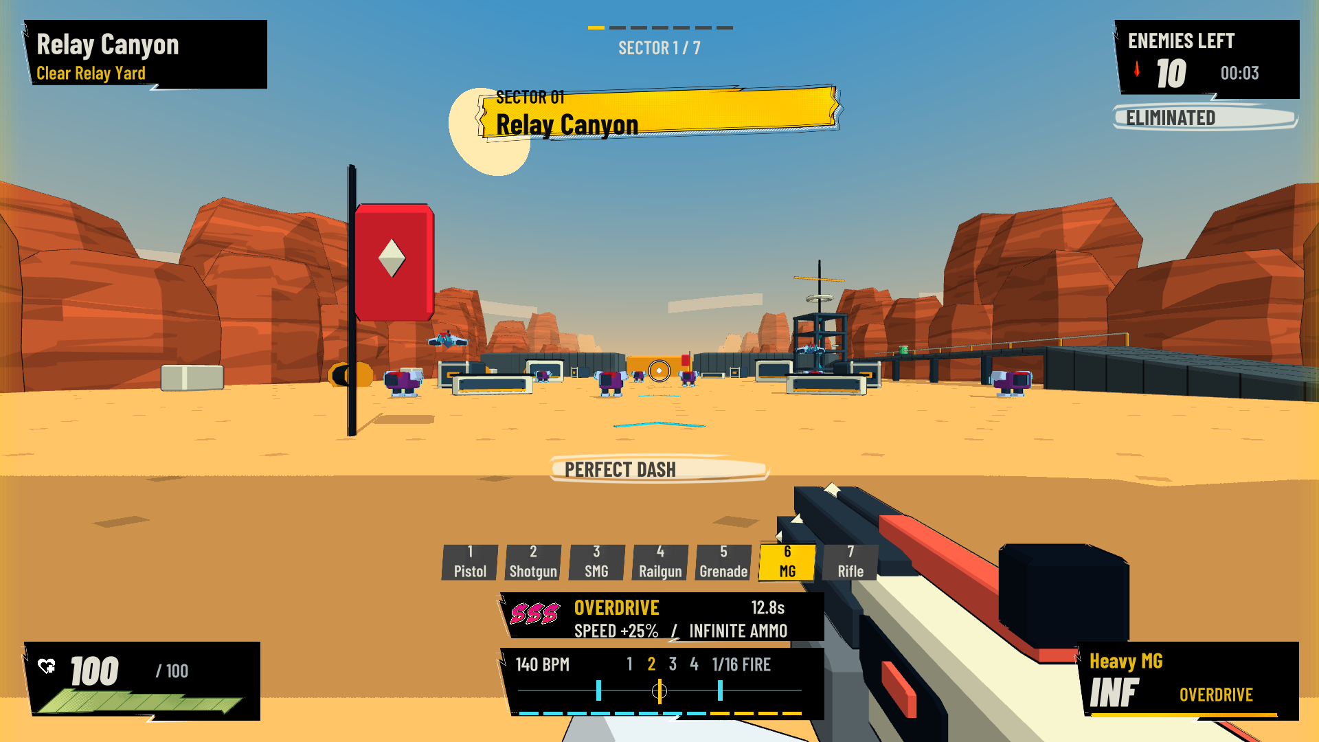
    • Rhythm rewards: the main game runs at 140 BPM. Accurate dashes build S, SS and SSS ranks. SSS gives a short period of faster movement and unlimited ammunition.
    • Weapon timing gives the rhythm rule a practical use. The heavy machine gun fires sixteen shots across four beats, while the railgun charges across three beats. Those patterns ask the player to learn different firing habits.

    Pitch evaluation: nine responses

    CriterionAverage / 5
    Design intention is clear4.11
    Core loop is clear4.11
    Loop seems engaging and supports the intention4.11
    Design pillars are distinct and clear4.22
    Gameplay supports the pillars4.00
    Prototype and concept materials help explain the pitch4.44
    Unique positioning is clear4.22
    Overall average4.17
    Nine responses to each question.

    What I took from the scores

    • All nine evaluators agreed or strongly agreed that the supporting materials helped explain the pitch. That was the strongest result, at 4.44/5. I will keep using screenshots and short sequences that show a whole action and its result.
    • Gameplay supporting the pillars scored lowest, at 4.00/5. Two responses were neutral. I need to show each pillar through an example: a dash used to avoid an attack, a readable weakpoint, and an on-beat action leading to a visible reward.
    • The two loop questions averaged 4.11/5. Two people were neutral about how engaging the loop seemed. A list of actions cannot explain the change of pace on its own, so the video includes fighting, entering a supply bay and choosing an upgrade.
    • Unique positioning averaged 4.22/5, but one person disagreed. I should not lose that response inside the average. The pitch needs to explain the timing rules and player freedom clearly enough that someone can describe the difference without my help.

    How I responded to the earlier playtests

    Teaching the opening

    • Mason asked for tutorials and instructions. I added a training area for movement, weapons, reloading, aiming, weakpoints and rhythm actions.
    • In v0.21, each objective must be completed and then confirmed. Holding a button from an earlier stage cannot skip the next task. The elimination exercise now uses a robot that can actually be defeated.
    • After the objectives, the player walks through the open portal into the first campaign region. The player can move straight from training into the campaign.
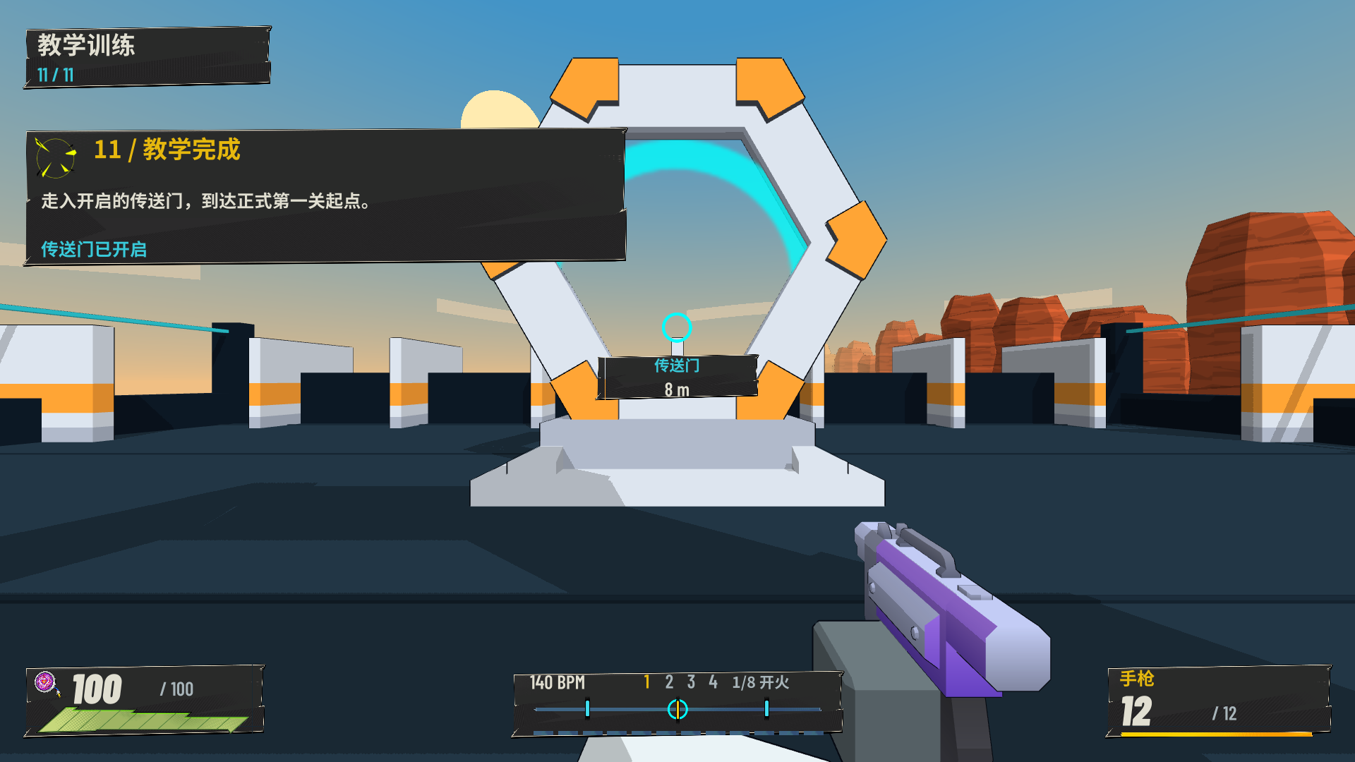
    Rift Runner v0.21 tutorial completion in Simplified Chinese, showing an open portal and a distance marker.
    v0.21 developer capture: completed training, an open portal and the Chinese language option.

    Difficulty, rewards and the route forward

    • Alice and Shirley found the first level too difficult. Opening-region enemies now have 70% of the previous health and ranged damage, with longer intervals between shots. This gives the player more time to learn while moving.
    • Shirley could not tell where to go after clearing an area. Route markers now name the next destination, show its distance and tell the player when it is behind them. The objective switches to collecting supplies when a reward is waiting.
    • Maggie found the clear screen too abrupt. Clearing an arena now leaves the player in control and opens the exit with a clear banner. Supply rooms provide repair pickups and upgrade chips between fights.
    • The final victory view keeps the scene visible behind a gold completion heading. I also reduced an oversized clear effect after it obscured the supply area.
    • The bridge floor bug Maggie reported came from overlapping visible surfaces. I shortened the visible bridge pieces to fill the gaps while keeping the collision surface continuous.
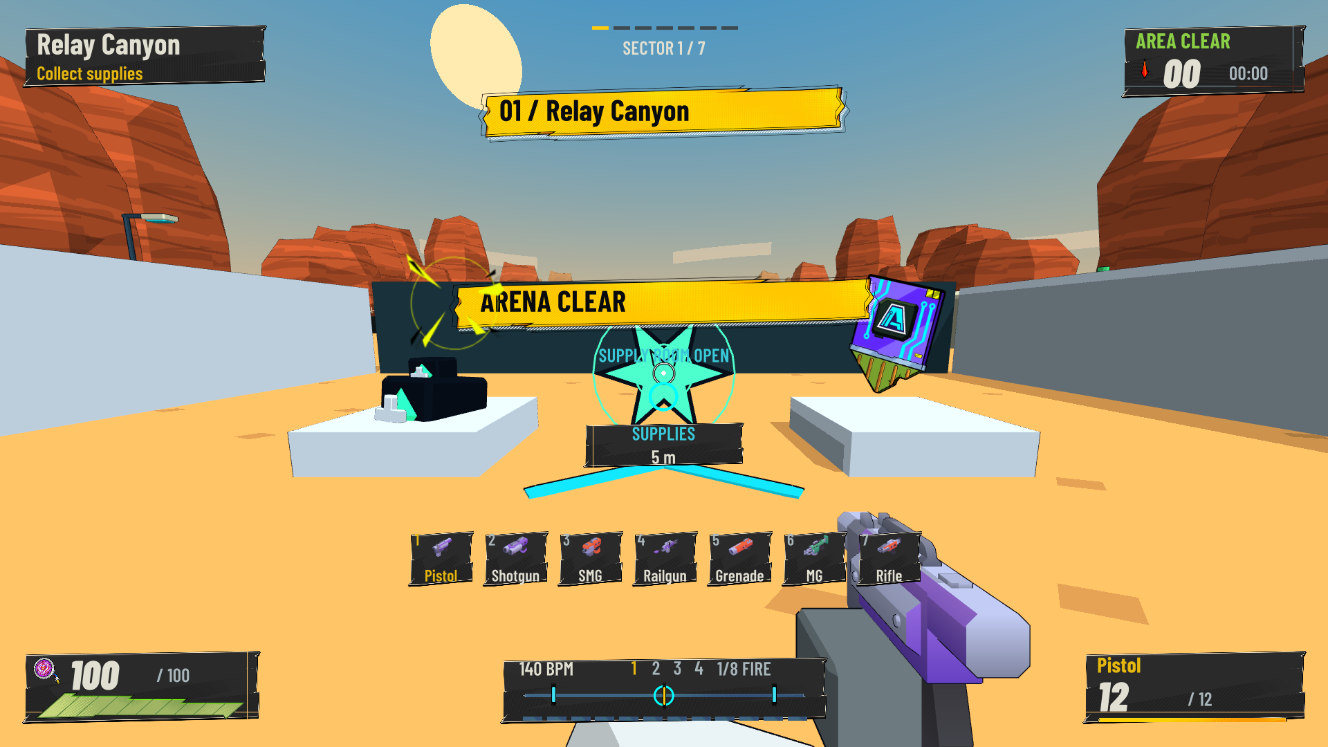
    Developer capture of a supply-room entrance with an Arena Clear banner, upgrade chip and a Supplies distance marker.
    The supply and route changes introduced in v0.18: an open exit, a repair pickup, an upgrade chip and a visible destination.

    Beat feedback and language

    • The Week 5 comments showed that rewards could exist without being noticed. The S ranks and timed bonus sit beside the beat guide, while Perfect and kill messages sit away from the crosshair. The build sheet pauses combat so upgrades can be read safely.
    • Maggie also asked about Chinese. v0.21 includes English and Simplified Chinese settings for the menus, tutorial, combat HUD, results and all 26 upgrade descriptions.
    • I kept aiming assistance optional. The latest sniper change removes its camera pull in both scoped and unscoped use, while the other weapons keep their existing assistance.
    • A larger basic ammunition capacity, closer enemy placement and a short story introduction remain design questions. The SSS ammunition reward answers a different problem, so I have not counted it as the requested magazine increase.
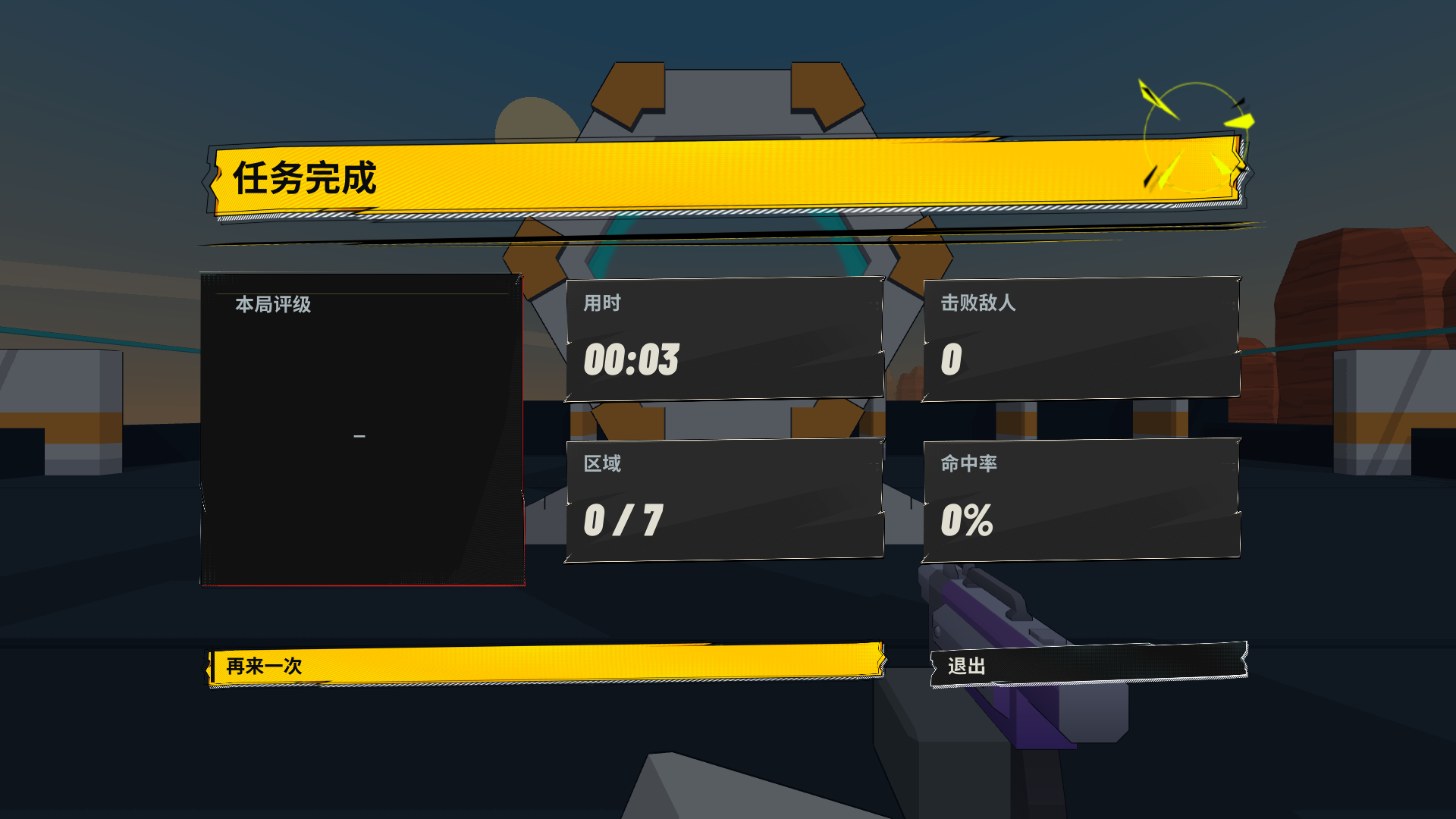
    Simplified Chinese completion-screen layout with a gold success banner and the game scene visible behind the statistics.
    v0.21 interface capture showing the Chinese completion-screen layout. The displayed statistics are a layout example.

    Research and the choices I made

    • Roboquest: I studied its fast movement, arena combat and quick rewards. In my game, raised routes and cover give the dash a purpose, and supply bays separate fights. The comparison also reminded me that speed alone is a familiar selling point.
    • Hi-Fi RUSH: its timing rewards and music-linked action informed the beat guide and feedback. My adaptation uses first-person aiming and weapon-specific timing. Keeping normal actions responsive matters because the player is also tracking enemies.
    • BPM: Bullets Per Minute: this is the closest genre comparison in the pitch. I explain Rift Runner through free aiming, optional timing assistance and actions that still work off the beat. I need those rules to be clear in the footage, rather than relying on a claim of uniqueness.
    • In the game video, I drew inspiration from the concept of weapon and location changes in the Roboquest trailer, as well as the clearer action-to-reward sequence in Hi-Fi RUSH. I kept the HUD visible and left time to show the railgun charging and the upgrade choices.

    Reviewing the three prototypes

    • The pitch also compares two earlier experiments from 7 October with Rift Runner. They helped me consider different uses of shooting, rather than only changing the appearance of the same arena.

    Prism Relay

    • The player paints a connected power route to restore three relays, then returns home. Paint also affects movement and refilling. Drones can repaint parts of the route.
    • The Splatoon research led me to make colour change how the ground works. The repair objective asks the player to maintain a connection, rather than simply cover the largest area.
    • This gives the world a reason for the paint: it acts as a temporary power network. I would like to find out how players choose a route and respond when a drone breaks the connection.
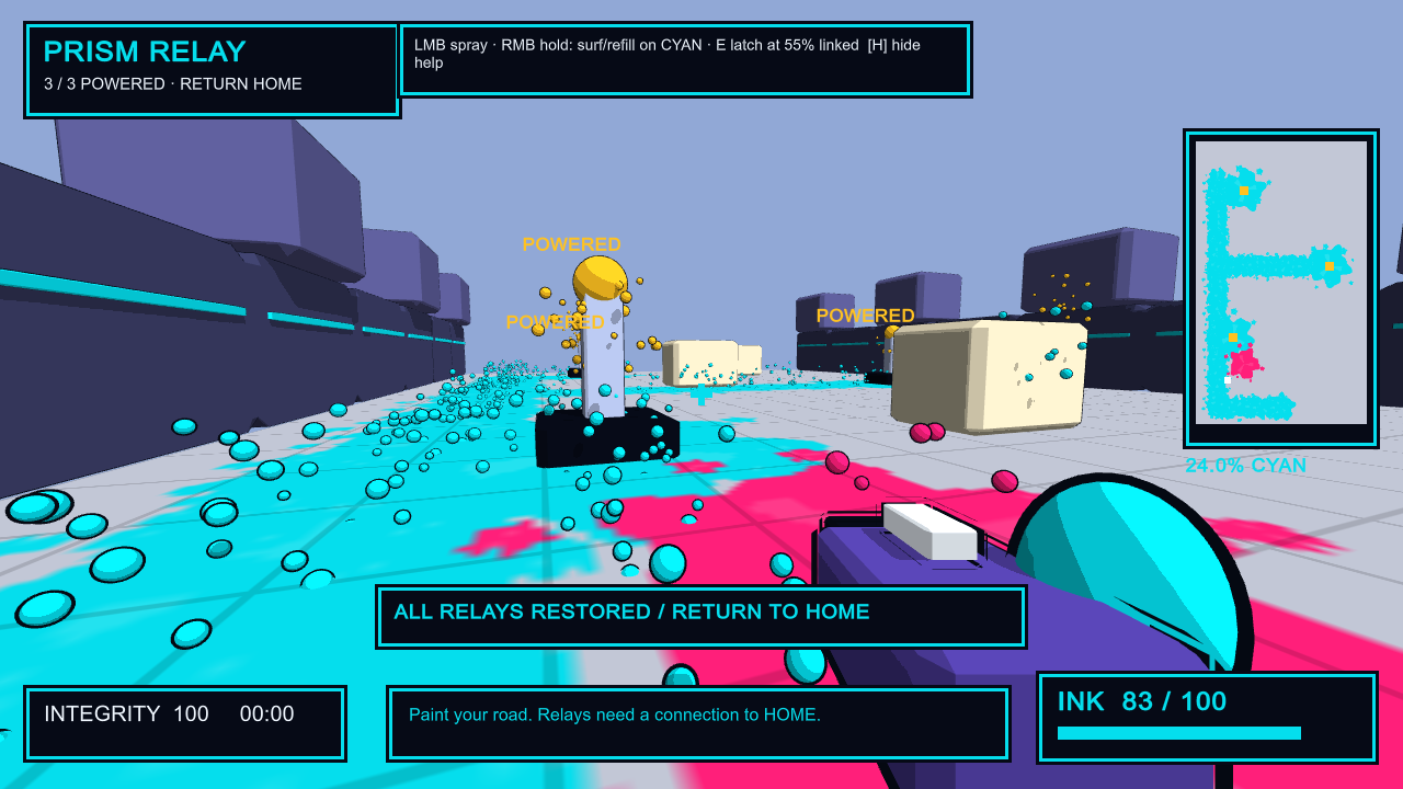
    Prism Relay developer capture with a cyan painted route, three powered relays and a return-home objective.
    Prism Relay, 7 October: a developer capture showing the connected paint network and powered relays.

    Beat Foundry

    • This separate prototype uses an original 120 BPM loop, immediate shooting and dodging, timing bonuses and a four-beat finisher. It isolates the timing idea in a smaller combat space.
    • I chose to take rhythm further in Rift Runner because it can affect both movement and weapon use across a run. Prism Relay remains a separate direction; its paint network has not been added to the main game.
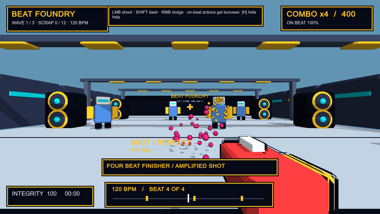
    Beat Foundry developer capture showing the beat guide, timing feedback and a four-beat finisher.
    Beat Foundry, 7 October: a developer capture of the separate 120 BPM rhythm experiment.

    What I would test next

    • Give a new player the tutorial, then ask them to explain what an on-beat shot and dash do. Record their explanation before offering help.
    • Watch the first arena and the route to the supply bay. Note where the player hesitates, runs out of ammunition or misses the next destination.
    • Ask the player why they chose an upgrade, then watch whether it changes how they approach the next fight. This would help me judge the weaker link between the pillars and the actual play.
    • Use the same short questions for Prism Relay and Beat Foundry: what was the goal, what choice mattered, and what would make them want another attempt? Keep those responses with the individual prototype records.

    Looking back across the six weeks

    • The early ideas explained the game through its influences. The Week 3 feedback pushed me to define a hook, an audience and design pillars. The Week 5 playtest then showed where those intentions were difficult to read in action.
    • The playtests showed me that players could miss a reward I thought was obvious. The current pitch gives the rhythm rule more space, and the nine evaluations help me see where the explanation still needs a better example.
    Related records

  • Week 5: Testing Rift Runner’s Rhythm and HUD

    • I showed Rift Runner at this week’s class test and collected comments on Nodenoggin. People liked the movement and the look of the game, but a few could not tell what the rhythm system was doing while they played.
    • That was useful to hear, because rhythm is now the main thing I use to explain the game.
    Week 5 Nodenoggin peer comments on Rift Runner rhythm, HUD readability, visuals and sound.
    Peer feedback from the Week 5 playtest on Nodenoggin.

    Guest lecture notes: 19 October 2026

    • Ricky’s talk discussed how his teams make games through collaboration and experiments. Blackboard places Ricky Winchester Talk.pptx in Week 5, Making Unique Games. The recording includes examples from Hohokum and Wilmot’s Warehouse.
    • Design ideas can come from different people on the team. Art and technical experiments can develop together, with each changing the direction of the other. Someone still needs to make decisions and keep the project manageable.
    • The advice on scope was to choose limits that help shape the game. A small team can build around one useful tool or interaction. Leaving some things unexplained can also give the player room to imagine them.
    • Ricky encouraged showing unfinished work early. Feedback needs to be read in context: some comments describe unfinished parts, while others reveal a problem with the idea itself. Playing classmates’ games can also help develop critical judgement.
    • For a pitch, he suggested describing a particular moment that makes the game interesting. A long introduction to the setting can delay the part that makes someone want to play.
    • The talk also covered calm communication, giving people time to think and keeping documentation useful for the team. Near-term work can be specific while later plans stay more flexible.
    • Ricky explained why his team avoids generative AI, including concerns about losing practical skills, control over small design decisions and its environmental and ethical effects. This was his account of the team’s approach.

    My response to the 19 October talk

    • The advice about testing unfinished work fits the comments on my HUD. Alice and Maggie could see that rhythm was part of the game, but the reward was still difficult to read. That is a problem I need to address through the game’s feedback.
    • For the pitch, I can show one timed dash building a reward and what the player can do with it. That gives the viewer a specific example before I explain the rest of the run.
    • I also need to keep the scope manageable. Clear instructions and readable rewards are more useful at this point than adding another system. The playtest comments give me a reason to prioritise those changes.
    • The discussion about practical skills is something I need to consider in my own process. I should be able to explain the timing and HUD decisions, and keep records of the changes I make.

    At the Week 5 test: changes since Week 3

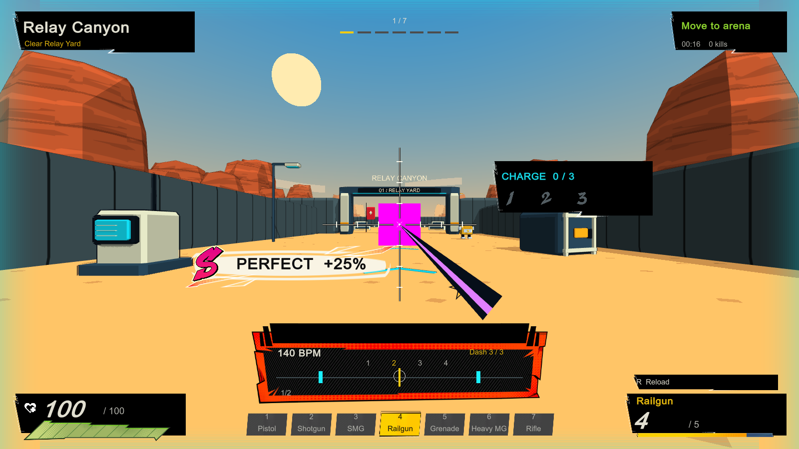
    • In Week 3, several classmates asked what made this more than another fast FPS. At that point the rhythm idea was still mostly a plan. The v0.11 build shown here has a 140 BPM beat that affects shooting and dashing.
    • A well-timed manual shot earns extra damage, and an accurate dash travels further. Missing the beat does not stop either action. Beat assist is optional. My pitch uses BPM: Bullets Per Minute as a comparison and explains the difference I am aiming for.
    • The Week 3 comments also asked for a clearer goal and a world worth moving through. The prototype now has seven connected regions on one map, starting in Relay Canyon and leading through more industrial spaces towards the core.
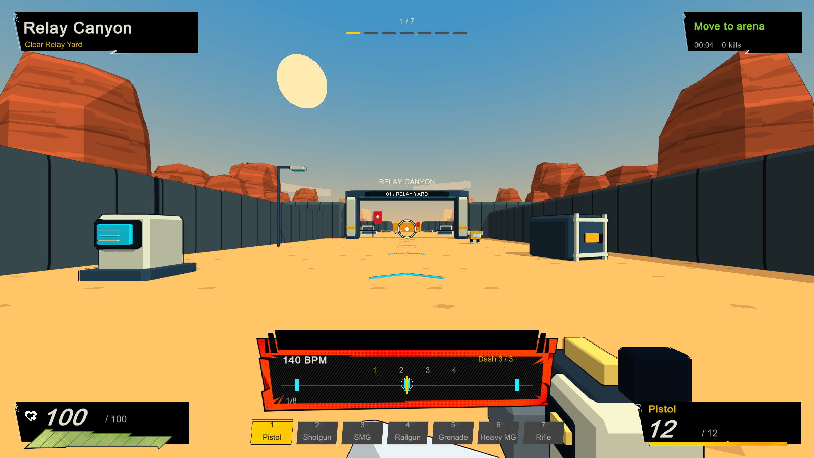
    • The HUD shows the current area and objective. In the pitch I describe the intended audience as players who like quick FPS movement and are curious about rhythm, without wanting every missed beat to halt the fight. I still need to develop the story.
    • At this stage, the upgrades mostly improved stats.
    Rift Runner v0.11 screenshot in Relay Canyon showing the area objective, health, ammunition, metronome and Dash 3/3 counter.
    A developer capture of the HUD at this stage in Relay Canyon.

    What classmates noticed this week

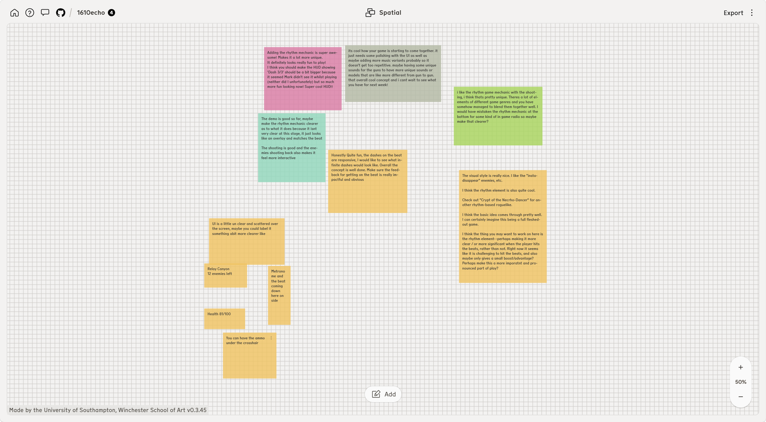
    • Several people liked shooting and dashing with the beat, and one said the dashes felt responsive. Another liked that enemies fire back, which made combat feel more interactive. The art and sound also made a good impression.
    • In Week 3 people had liked the movement but struggled to see a clear hook; this time some noticed the rhythm idea straight away.
    • The difficult part is making the rhythm reward obvious during a fight. One classmate thought the indicator near the bottom was a radio. Another said it looked like an overlay that matched the music without showing what it changed.
    • There is a Perfect shot bonus and feedback banner in the build, but these comments suggest that the connection between timing and damage still gets lost in play. Someone also asked for a stronger reward when hitting the beat.
    • I want to test that before increasing the bonus, since a larger number alone might not make the rule easier to understand.
    Rift Runner v0.11 developer capture showing a Perfect shot and its 25 percent damage feedback banner.
    The v0.11 build shows a Perfect shot reward, although classmates still struggled to read its effect during play.
    • The HUD needs another pass. A player missed the Dash 3/3 counter because it was small. Others found information scattered around the screen and suggested clearer labels, a better placed metronome and ammunition nearer the crosshair.
    • There were requests for more variety in music, gun sounds and weapon models as well. One person suggested unlimited dashes.

    What I planned after the first test

    • I want the next test to show whether players understand what an accurate shot or dash gives them without my explanation. I will make the beat indicator and reward feedback easier to notice, then see if players can read them while moving and aiming.
    • I also need to revisit the dash limit and the spread of HUD information. The suggestion about more varied sound and weapon shapes is worth keeping, but I would rather check readability and the core rhythm rule first.
    • The build at this stage had a working loop of fighting, choosing an upgrade and moving on. The harder question from Week 3 remains: can an upgrade change a player’s next decision instead of only raising a stat. This is the next part I need to prototype and put in front of players.
    • View my 14 October Rift Runner pitch (PDF).

    19 October update: changes after the playtest

    • The Week 5 comments gave me a clearer idea of what was getting lost during combat. Dashing no longer has a three-charge limit. Accurate dashes now build S, SS and SSS ratings at four, eight and twelve successful beats.
    • Reaching SSS gives a short speed boost and unlimited ammunition. I have made the beat guide smaller and put the reward next to it, while moving the Perfect and kill messages away from the crosshair.
    • An optional aim magnet helps when the reticle is close to a visible enemy. The enemies also have red weakpoints that pulse with the music, giving me another way to make timing and targets easier to read.
    Rift Runner v0.15 developer capture showing Perfect Dash feedback, SSS Overdrive and the compact beat guide.
    The v0.15 build places the SSS reward above a smaller beat guide and moves feedback away from the crosshair.
    • The HUD was another repeated point in the feedback. The v0.15 update uses larger type, keeps health and ammunition in the lower corners, and puts the enemy count at the top right. The weapon list now appears briefly after switching instead of staying on screen.
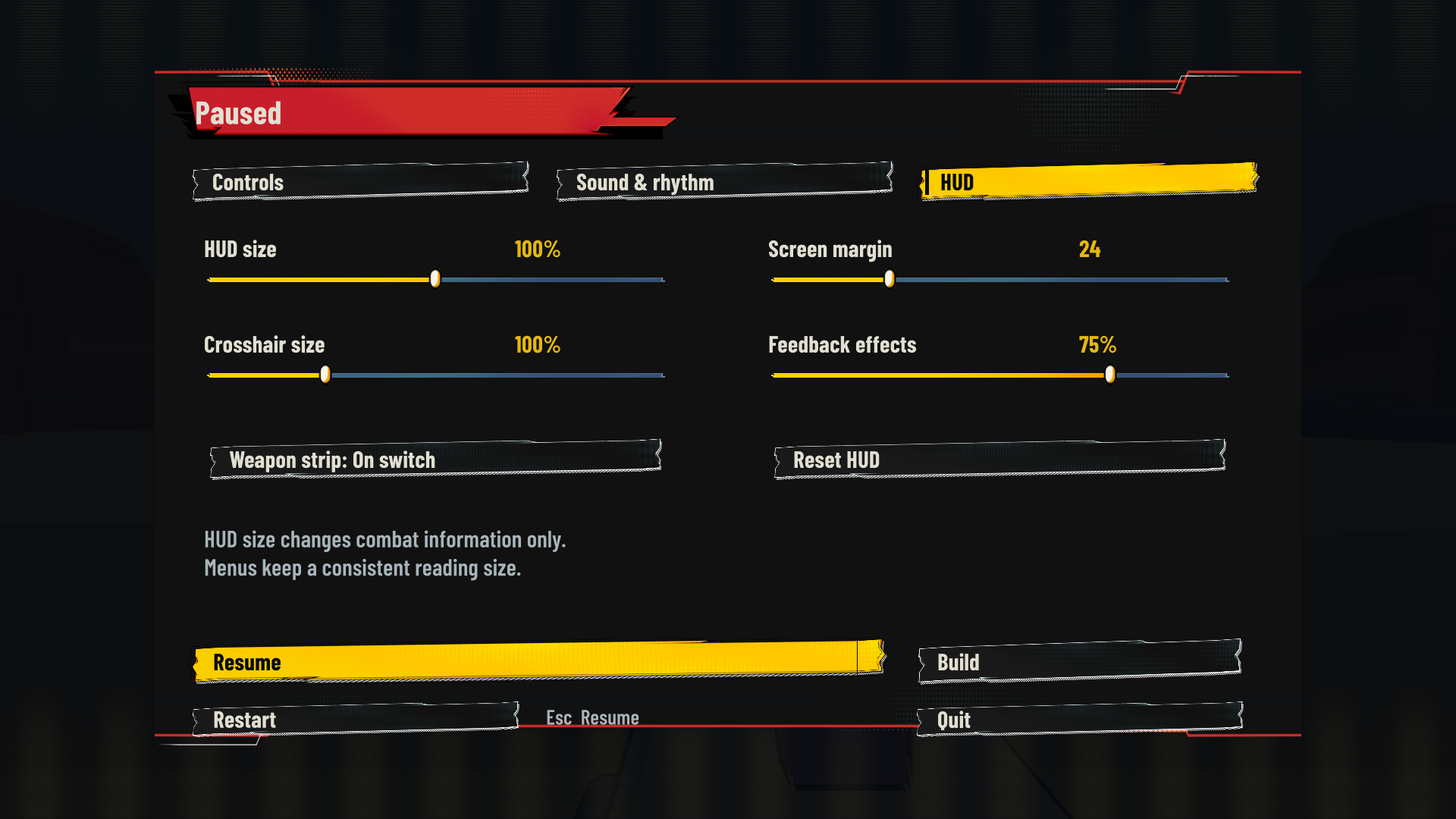
    • I can change the HUD size, screen margin and crosshair size in the settings. Tab opens the current build sheet and pauses the fight, so I can read my choices without getting shot.
    Rift Runner v0.15 HUD settings showing controls for HUD size, screen margin, crosshair size and feedback effects.
    The new HUD settings let me change the size and spacing of combat information.
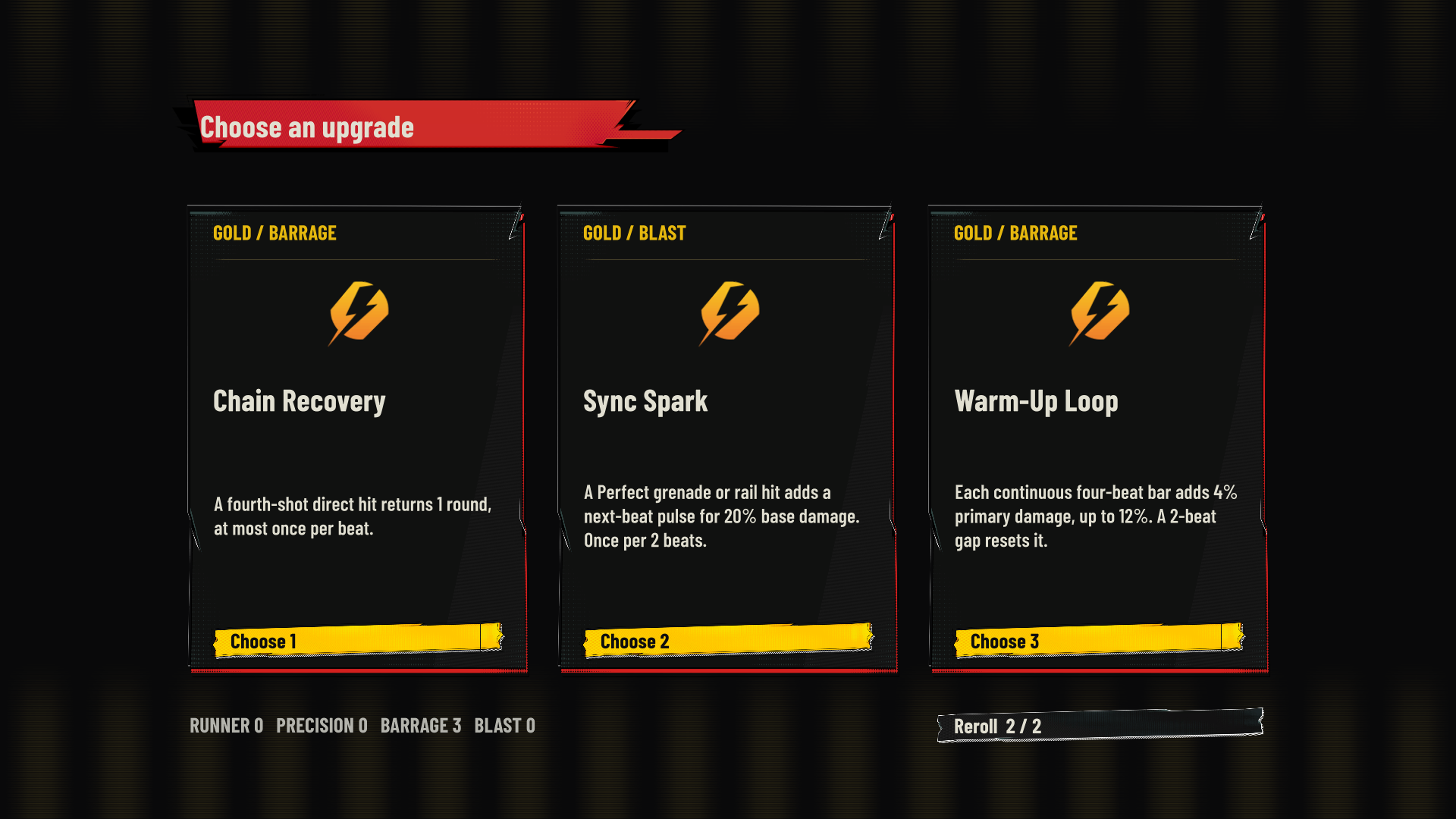
    • The older question about upgrades has moved on as well. The build now offers six choices from a pool of 26 upgrades, grouped into Runner, Precision, Barrage and Blast. There are two rerolls.
    • Some cards alter what I do in combat: Dash Capacitor charges the next attack after a Perfect dash, while Marked Target rewards repeated weakpoint hits. The image below shows an actual gold-tier choice screen.
    • I also corrected enemy spawn overlaps and the entrance triggers that could interrupt progress through the second area.
    Rift Runner v0.14 gold-tier upgrade screen showing three combat-changing choices and two available rerolls.
    An in-game gold-tier choice between Chain Recovery, Sync Spark and Warm-Up Loop.
    • I have updated the pitch to match v0.15. It now shows the current rhythm system, upgrades and HUD, along with the Week 5 comments that prompted these changes. The 14 October PDF above remains as a record of the earlier version.
    • View my updated Rift Runner pitch (v0.15, PDF).

    Further playtest with four classmates

    • I wanted to see whether players could follow the rhythm rewards, manage the first encounter and find the way to the next level.

    Mason

    • Suggested trying closer enemy placement, or reducing how many things the player has to focus on at once.
    • Asked for a short tutorial and clearer instructions.
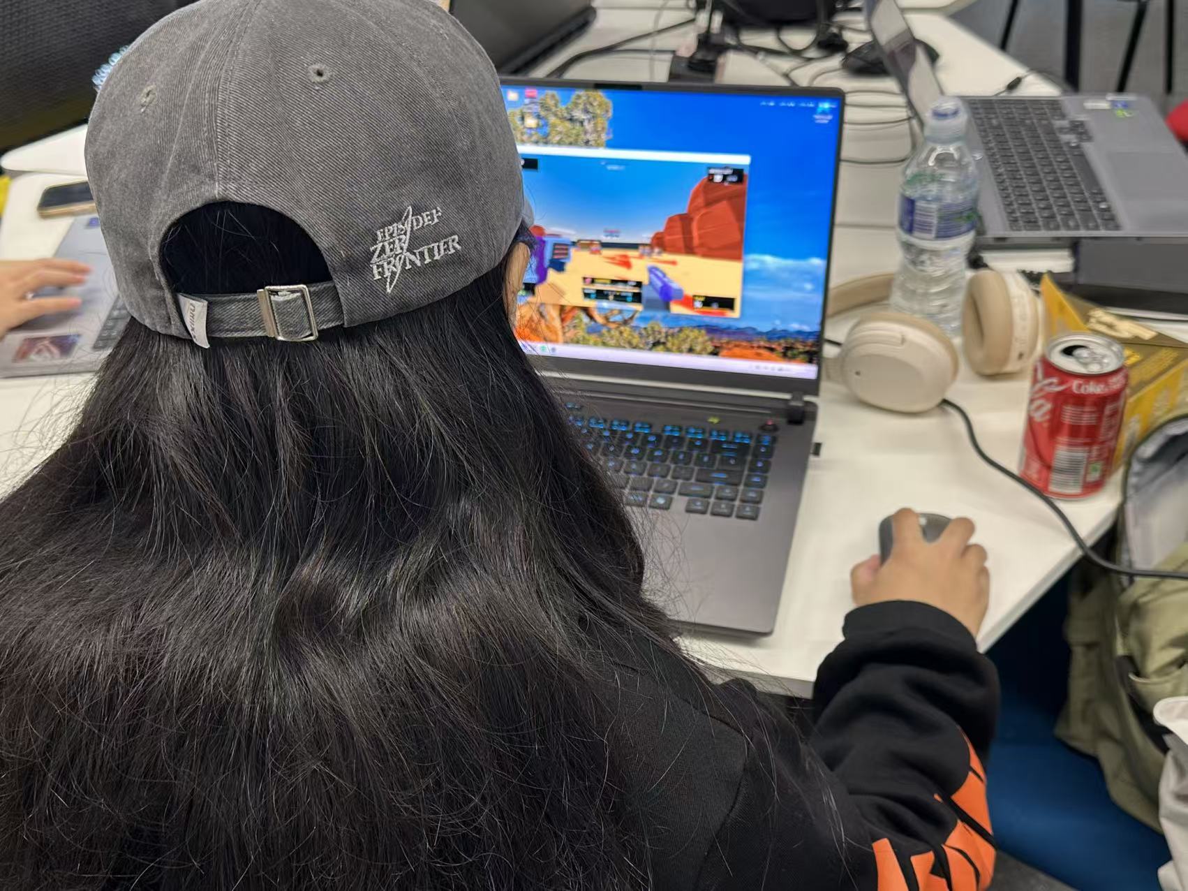
    Mason playing Rift Runner on a laptop during the class playtest, viewed from behind.
    Mason playing the first level of Rift Runner.

    Alice

    • The bonus effects were hard to understand, with too many things competing for attention on screen.
    • Hit effects need clearer feedback.
    • Enemies in the first level attack too often; she suggested lowering their attack frequency.
    • A short story or introduction would help establish the setting.
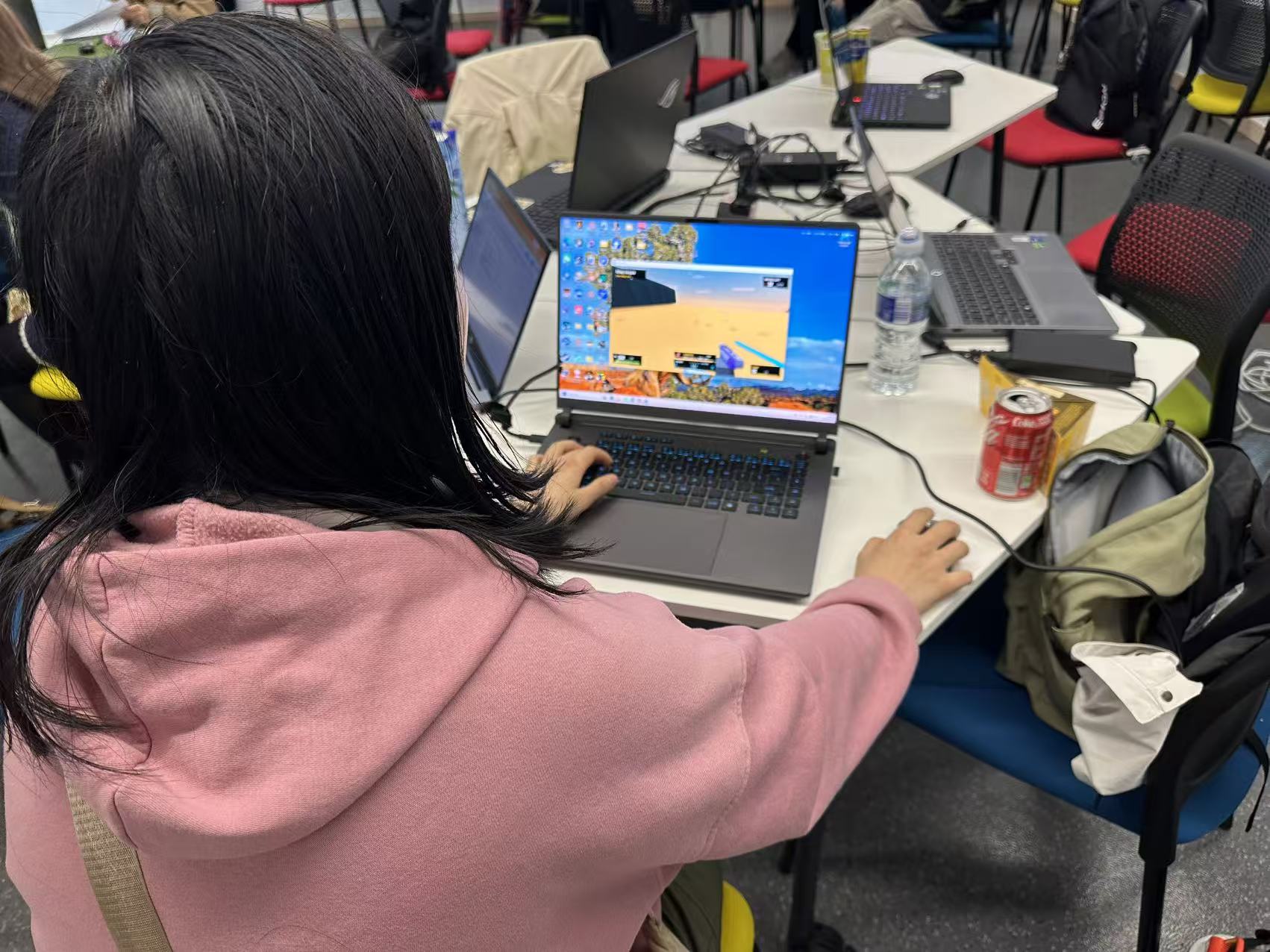
    Alice playing the first level of Rift Runner on a laptop during the class playtest.
    Alice trying the first level of Rift Runner.

    Shirley

    • She enjoyed the game, but found the first level too difficult.
    • Suggested giving the player more ammunition.
    • After clearing the area, she could not tell which way to go next.
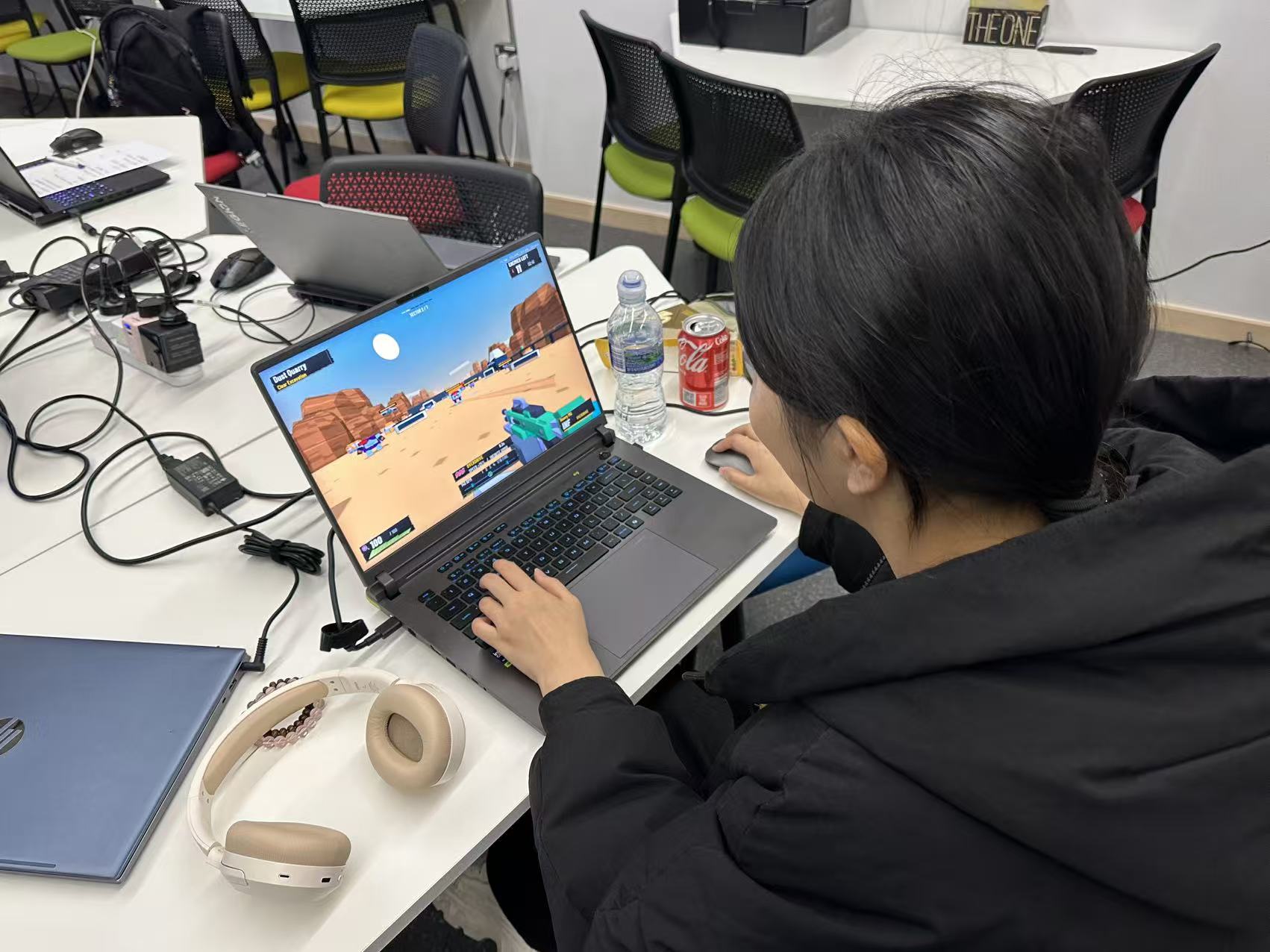
    Shirley playing Rift Runner during the class playtest, with the first level visible on the laptop.
    Shirley testing the first level of Rift Runner.

    Maggie

    • The screen that appears after clearing a level is abrupt and looks like a death screen. She suggested a distinct completion and reward screen.
    • Well-timed shots and dashes need more positive feedback, such as a brief screen-edge effect or an encouraging prompt above the action.
    • She noticed a floor bug on the way to level two.
    • She suggested more aim assistance in Focus mode and asked about a Chinese language option.
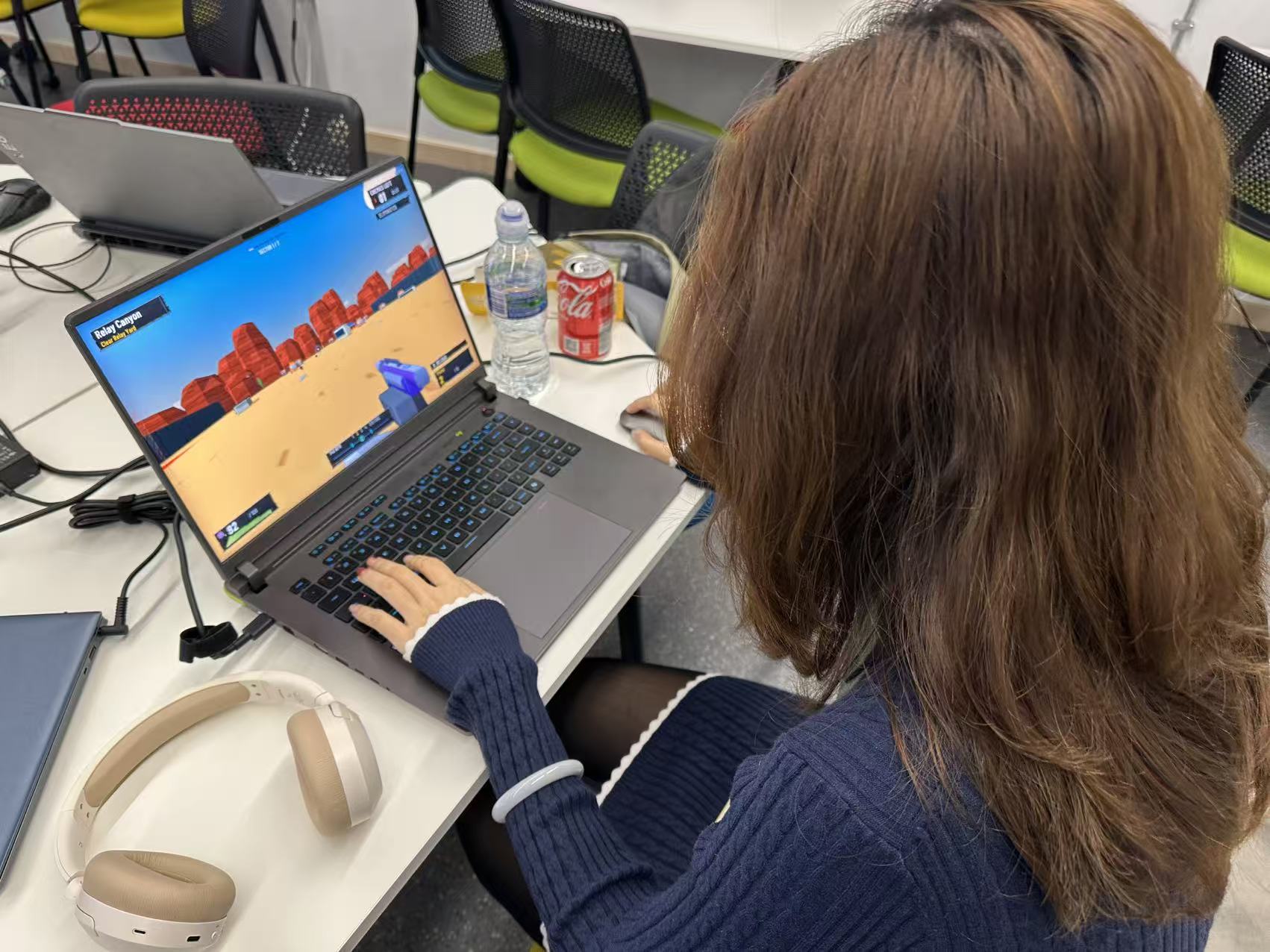
    Maggie playing the first level of Rift Runner on a laptop during the class playtest.
    Maggie testing Rift Runner and the route towards the second level.

    What I took from the test

    • The beat system has rewards, but Alice and Maggie still found those rewards difficult to read during combat.
    • Shirley and Alice both found the opening difficult. Ammunition, enemy pressure and the timing of instructions all need another look.
    • I did not expect the level-clear screen to look like failure. Success and the route forward need to be much clearer.

    Changes proposed after this test

    • Review first-level enemy attacks and ammunition capacity. Try Mason’s enemy-placement idea without making the scene busier.
    • Add a short control tutorial and a brief introduction before the first fight.
    • Improve beat and hit feedback, then give the level-clear moment its own reward screen and clearer direction to level two.
    • Fix the floor on the way to level two. Explore optional Focus-mode aim assistance and a Chinese language option.

    Later development

    • The tutorial, opening-difficulty adjustment, supply rooms, clearer routes, bridge-floor repair and Chinese interface developed after these comments are recorded in Week 6.
    • The Pitch page holds the latest full deck and gameplay video. The v0.11 and v0.15 material above remains part of the development history.
  • Week 4: FPS Design Direction

    • This week I put together a direction board for my FPS idea and a hand-drawn hide-and-seek loop for the classroom exercise. The board develops the FPS concept after the Week 3 feedback.

    Lecture notes: 12 October 2026

    • The session covered pitching, game design documents and gameplay loops. This matches the core-loop and player-experience topic listed for Week 4 in Blackboard.
    • A pitch and a GDD use some of the same information, but have different readers. The pitch explains the idea and why someone would want to play or support it. The GDD gives a team enough detail to build it.
    • He distinguished an early prototype from a vertical slice. A prototype explores whether an idea works. A vertical slice is a short section intended to show the experience and finish of the proposed game.
    • The Tetris example showed how a simple loop contains many smaller decisions. Block shapes, movement speed, collisions and failure rules all need answers, even if the pitch only shows the broad steps.
    • We were asked to consider different timescales: what the player does moment to moment, what those actions achieve over a level, and why they come back later. A diagram also needs to make the win and failure states clear.
    • The discussion connected level layout and tutorials to the loop. A tutorial can introduce the actions one at a time. Maps and blockouts help explain how the player moves between those actions.
    • The planning advice was to break broad features into smaller tasks and leave room to reduce scope. The pitch should explain what can be cut while keeping the main experience. The session also raised accessible presentation, including avoiding colour as the only way to communicate information.

    What this means for my prototype

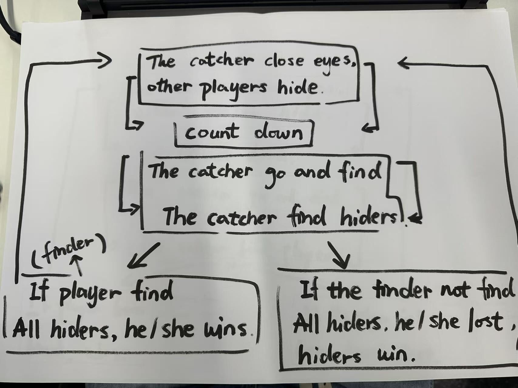
    • My hide-and-seek sketch shows a countdown, searching and two possible outcomes. It still needs rules for the time limit and how a player is found. Those details would matter if someone else tried to make or play it.
    • For Rift Runner, I can separate the immediate movement and shooting from the longer loop of clearing a room, collecting supplies and choosing an upgrade. That should make both the diagram and pitch easier to follow.
    • I would keep the first explanation focused on the player’s goal. The detailed input and timing rules belong in the supporting design notes. A short playable section is also a better way to explain the movement than a long list of features.
    • Class record: my 12 October recording notes, checked against the Week 4 module topic in Blackboard.

    A clearer direction for the FPS

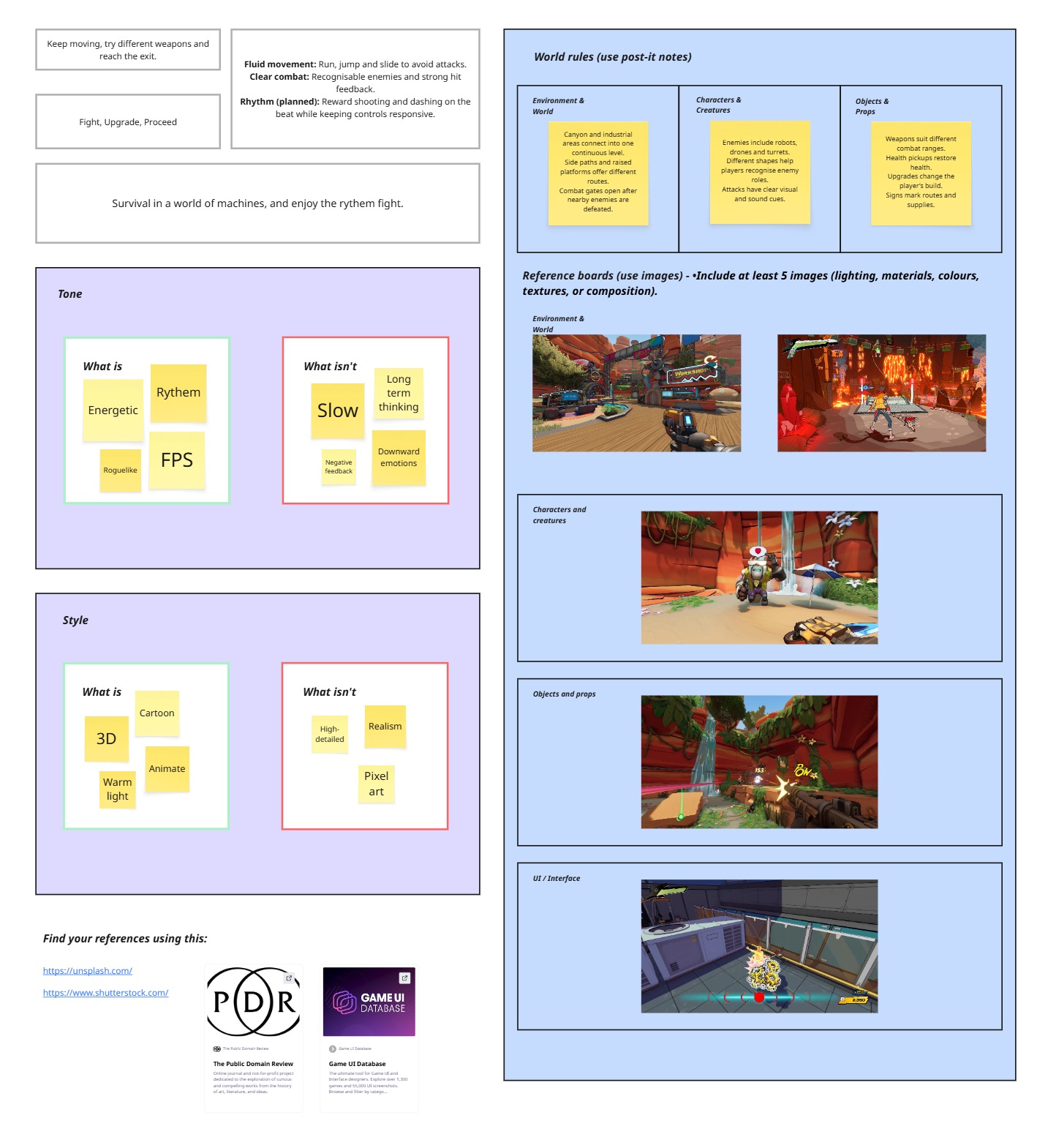
    • I wrote the player’s immediate goal as: keep moving, try different weapons and reach the exit. The short loop is fight, upgrade, proceed.
    • This gave me a clearer way to explain what happens between encounters.
    • “Survive in a world of machines, and enjoy the rhythm fight” is my pitch slogan.
    • The board sets out three design aims. Movement should feel fluid, with running, jumping and sliding helping the player avoid attacks. Combat should be clear, with recognisable enemies and strong hit feedback.
    • For Rift Runner, rhythm was still planned at this stage. I wanted to reward shots and dashes on the beat while keeping the controls responsive.
    • I also sketched rules for the world. Canyon and industrial areas could form one continuous level, with side paths and raised platforms offering different routes. Combat gates would open when nearby enemies have been defeated.
    • Robots, drones and turrets would need different shapes and clear visual or audio cues so players can understand their roles. Weapons would suit different ranges; health pickups, upgrades and signs would support the player’s route through the level.
    • For tone I chose energetic and rhythmic over slow or gloomy. The style board points towards a 3D cartoon look, animation and warm lighting rather than realism or pixel art. The images on the board are visual references for colour, lighting, characters and interface.
    Week 4 FPS direction board showing design aims, tone, style, proposed world rules and visual references.
    My Week 4 FPS direction board.

    Core game loop exercise: hide and seek

    • The class exercise was to draw a gameplay loop in a small group, then let the other groups guess the game from the diagram. The image below lays out a simple game loop. The catcher closes their eyes while the other players hide. After a countdown, the catcher searches for them. If the catcher finds everyone, they win; if they do not find every hider, the hiders win.
    Hand-drawn Week 4 hide-and-seek rules loop: players hide, the catcher counts and searches, and either the catcher or hiders win.
    The hand-drawn hide-and-seek rules sketch.

    What I need to test next

    • The Week 3 feedback asked what makes the FPS distinct. The direction board makes my intended experience clearer, but it does not answer that question on its own.
    • I want to test whether rhythm changes the way a player moves and shoots, and whether an upgrade changes their next decision rather than only raising a number.
    • For the hide-and-seek idea, a short paper rules test with other players would show where the loop is unclear. These are next steps, not tests I have already carried out.

    Later development

    • The reference board draws on Roboquest for the cartoon FPS environments and Hi-Fi RUSH for music-linked action and interface feedback. Roboquest and Hi-Fi RUSH are credited as references; the board images belong to those games.
    • The useful design question was how the references could support the rules. Raised paths should offer different movement choices, while a rhythm cue should show the timing of a useful action. The later build and pitch show how I developed those intentions.
  • Week 3: FPS Prototype and Peer Feedback

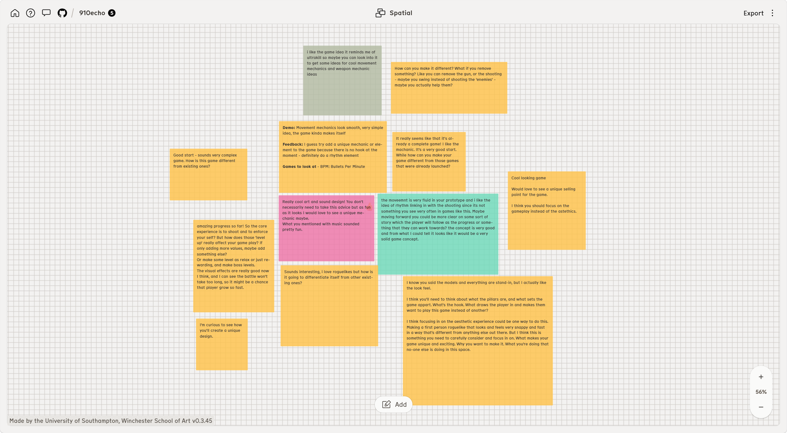
    • In Week 3 I showed the current version of my FPS prototype and collected comments on Nodenoggin. Their comments helped me see what was clear in the demo and what still needed work.
    Nodenoggin board with classmates’ feedback on the Week 3 FPS prototype.
    Classmates’ comments on the Week 3 prototype.

    Guest lecture notes: 5 October 2026

    • Venezia G.’s Game Loops and Pillars presentation covered the game overview, design pillars and repeatable actions. I checked these notes against the PDF in Blackboard’s Week 3 folder.
    • An overview should explain what the player does in a few sentences. The suggested structure was a hook, the actions and player fantasy, then the experience being promised. It should be possible to explain the main idea in about 30 seconds.
    • Pillars should help decide which features belong in the game. Each needs a short explanation, because a title alone can mean different things to different people. A feature should support a pillar without working against another one.
    • One useful check was to reverse a pillar. If the opposite could also describe a sensible game, the original is probably a real design choice. A claim such as “best in class” does not help me choose between features.
    • The session separated the core loop from the metagame. Hades II was used to explain how arena fights and rewards connect to longer-term upgrades. Astro Bot showed how actions can be mapped from seconds to longer periods of play.
    • A loop diagram should show the actions in order and what the player gains or spends. Resources can include health, equipment or story progress. The notes also stressed revisiting the overview and pillars after prototyping.

    What I took from the 5 October lecture

    • For my FPS, “fight, upgrade, proceed” needs more detail. I need to show what the player gains from a fight and how an upgrade affects the next encounter.
    • This gives me a way to review the movement, readable combat and rhythm aims. For rhythm, I need to explain the reward for timing an action, then show it in the prototype. Calling the game an FPS roguelite does not explain that choice.
    • The same questions apply to the two smaller experiments: paint and connection progress in Prism Relay, and timing bonuses in Beat Foundry. I can use their rules to compare what the player is actually deciding.

    What classmates said

    • Several classmates liked the movement. They described it as smooth or fluid, and some also liked the visual effects, sound and general look of the prototype. One person thought the idea of linking rhythm to shooting was interesting.
    • The movement and sound were the parts people noticed first.
    • The question that came up most often was what makes it different from other fast FPS roguelites. One classmate compared it with Ultrakill; another suggested looking at BPM: Bullets Per Minute. A few felt there was no clear hook yet, despite liking the demo.
    • The suggestions include changing the players’ expectations regarding FPS, such as the handling of firearms, shooting, or the portrayal of enemies.
    • Players also asked what effects the upgrades and levels would have. If the upgrades merely increase a single number, it might not change the way players play.
    • One comment suggested changing the pace between fights with a quieter or reward-focused level, rather than making every area another battle. Another asked for a clearer reason to keep moving through the world.
    • Although some liked the art and sound, others wanted me to spend more time defining the gameplay, the design pillars and the kind of player this game is for.

    How I will use the feedback

    • First, I need a short explanation of what the player does repeatedly and why this particular game is worth playing.
    • I will compare my idea with the games named by classmates and write down where my own rules or player experience differ.
    • I need rhythm to affect the player’s choices. The beat should give them a reason to time a shot or dash.
    • For a small next test, I want to try an upgrade that changes a decision in combat rather than only raising a stat.
    • I can observe whether players use the movement option, whether upgrading affects the next battle, and where the actions start to repeat. Short breaks between encounters might help test the rhythm.

    Points from my one-to-one feedback

    • In the one-to-one discussion I was also asked to think more about worldbuilding and to make two more prototypes. For each idea, I need to ask what is unique or interesting about it, who would play it and why they would choose it.
    • Someone recommended that I refer to “Splatoon” and “Slime Rancher”.

    Later development

  • Week 2: FPS Concept and Peer Feedback

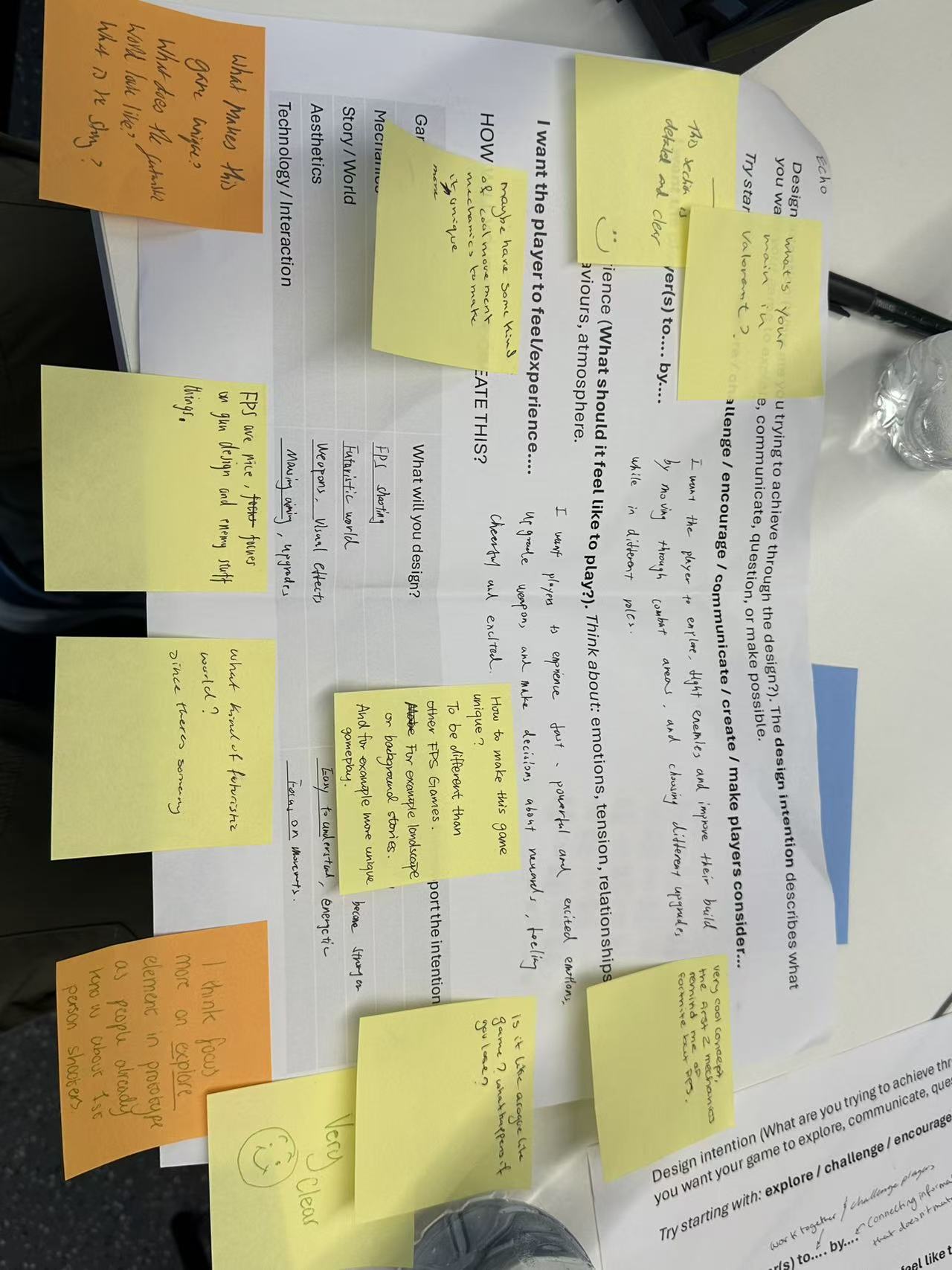
    • In Week 2 I developed my first-person shooter idea from Week 1 into a clearer design intention. The photograph below is the main record of this work. My writing is on the printed worksheet; the sticky notes are comments written by other people.
    • They are feedback on the idea, not features I have already built.
    Week 2 FPS design intention worksheet. Writing on the printed page is mine; the sticky notes are peer feedback.
    Week 2 worksheet and peer review. The handwriting on the printed page is my original concept; the sticky notes are other people’s comments. Select the image to view the full-size original.

    My original design intention

    • I want players to explore, fight enemies and improve their build as they move through combat areas and choose upgrades. I want the experience to feel fast, powerful and exciting. Weapon upgrades and decisions about rewards are part of that experience.
    • On the worksheet, I listed an FPS shooting game in a futuristic world. The elements I want to design include weapons, visual effects, movement, aiming and upgrades. I also wrote that the game should be easy to understand, energetic and focused on movement.
    • These notes describe the intended experience and possible mechanics; they are not a finished prototype.

    Feedback from other people

    • The sticky notes include positive comments that the idea is clear, as well as questions about what makes it different from other FPS games. Several people ask what the futuristic world looks like and what its story is.
    • One comment suggests making exploration more prominent in a prototype because players already know the basic conventions of first-person shooters.
    • Other notes ask whether the game is a roguelite and what happens when the player loses. Suggestions include giving the game a more distinctive setting or background story, experimenting with unique gameplay, and considering limits or cooldowns for abilities.
    • I am treating these as questions and suggestions from peers, not as decisions already made.

    What I will develop next

    • The most useful question from this review is how to make the concept recognisably my own. I need to define the world more clearly and decide which action, beyond familiar shooting, creates the main experience.
    • I also need to explain the loop after failure if I keep the roguelite structure.
    • For the next small test, I plan to outline one area that rewards exploration, one combat encounter and one upgrade choice. I will use feedback from that test to decide whether exploration, movement and upgrades work together as intended.
    • I have not yet recorded a playable test of this Week 2 concept.

    Later development

    • The later FPS gives the player a route through a machine world towards its core. The remaining story work and the changes to teaching, movement and rewards are recorded in Week 6.
  • Week 1

    Week 1

    • For the first week, we looked at how an emotion might become something a player can do. My group made an association map around fear. I then used the worksheet to sketch a chase and presented three possible game ideas.
    • These were early proposals and drawings.

    1. Starting with fear

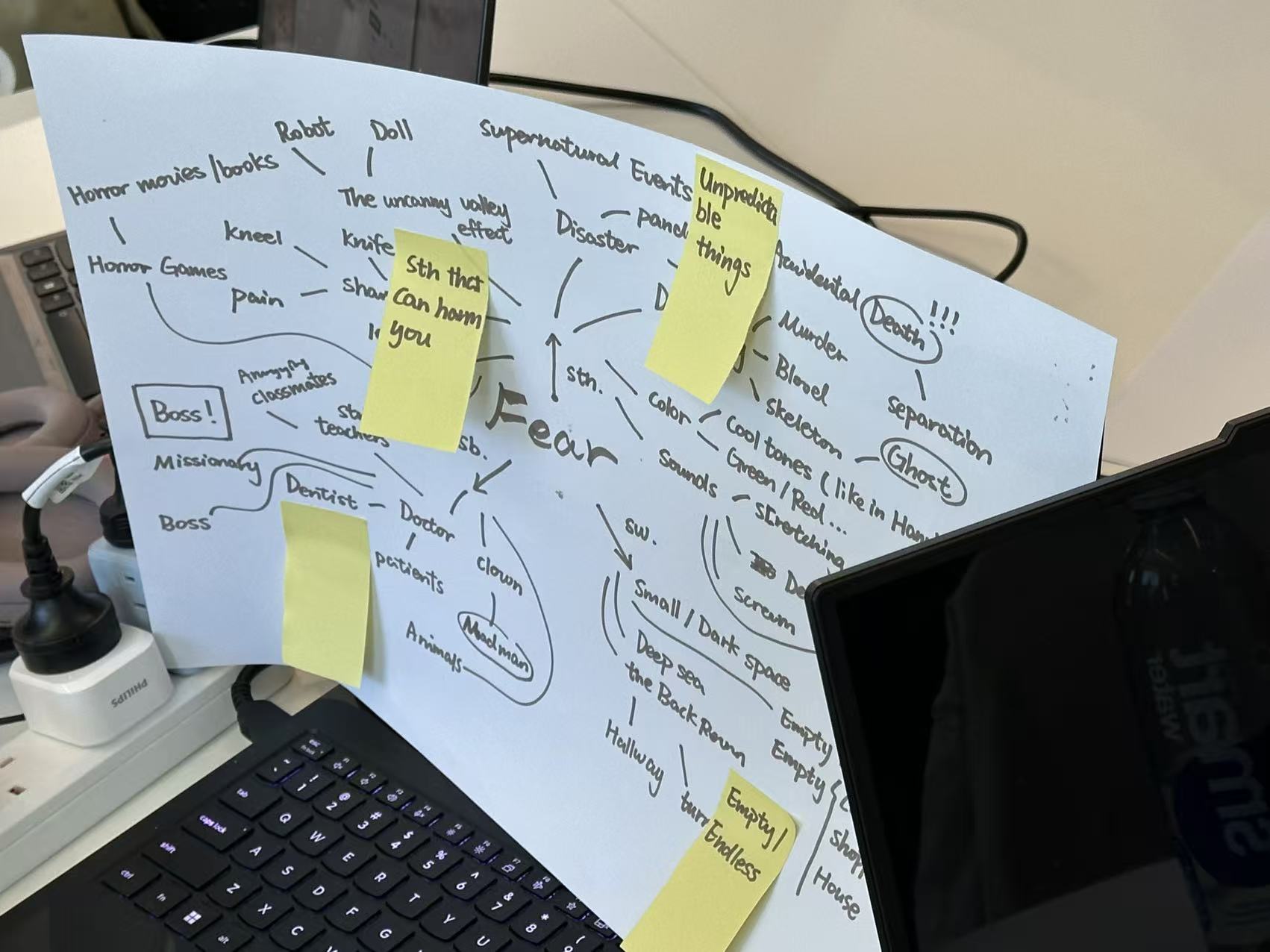
    • We put “fear” in the middle of a large sheet and followed whatever came to mind. The map moved from things that could hurt someone to horror games, dolls, robots, ghosts, disaster and spaces such as deep water or an empty room.
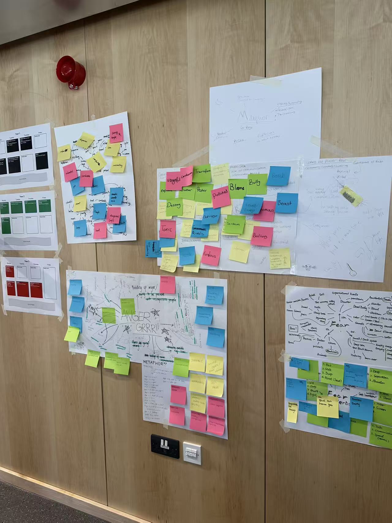
    • We pinned it up with the other groups’ maps.
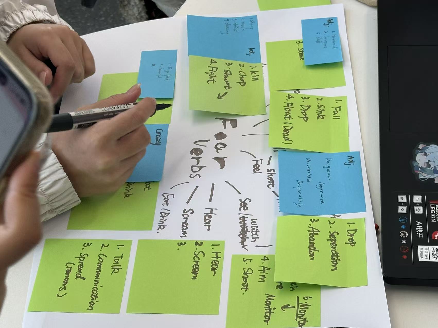
    • We also wrote down actions that might give a player that feeling: falling, dropping something, fighting, hearing a sound, hiding, watching and talking to someone else. This was more useful to me than a list of scary images.
    • Choosing actions helped me start drawing the chase.
    Group association map exploring fear, harmful things, uncanny imagery and unsettling spaces.
    Group association map exploring fear, harmful things, uncanny imagery and unsettling spaces.
    Turning fear associations into verbs, nouns and adjectives during the group exercise.
    Turning fear associations into verbs, nouns and adjectives during the group exercise.
    Completed group association maps displayed on the classroom wall.
    Completed group association maps displayed on the classroom wall.

    2. A playable situation from three words

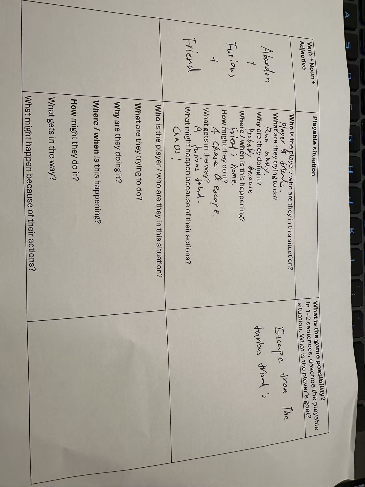
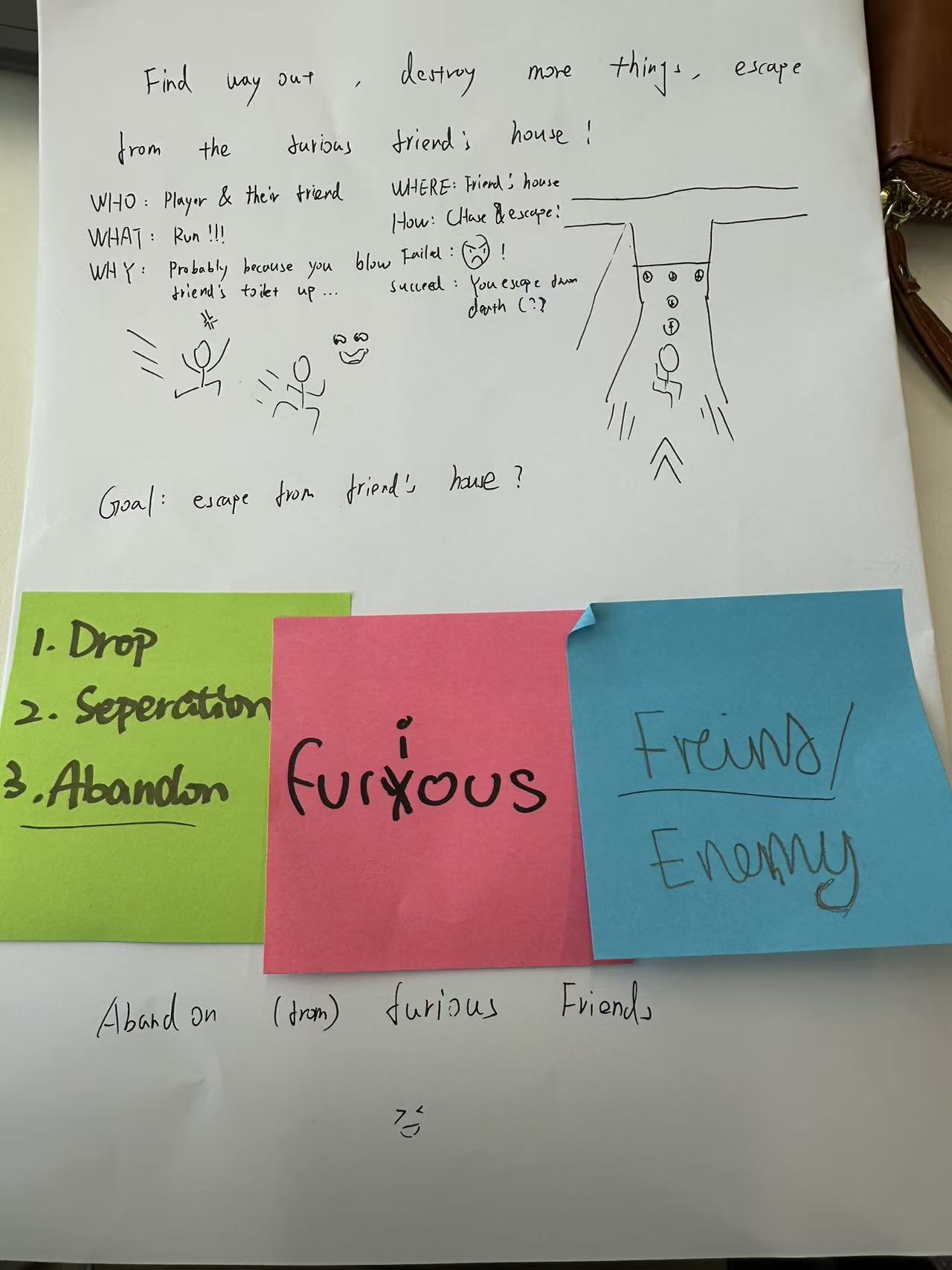
    • For the worksheet I used Abandon + Friend + Furious. My first thought was a player trying to escape from an angry friend’s house after breaking their toilet. I thought that would give the chase a funny starting point.
    • I drew a passage with obstacles and a route out of the house.
    • The drawing gave me a starting point. I still needed to work out how players would find the exit and what would slow them down. I also had to decide how threatening or funny the friend should be.
    Completed worksheet: Abandon + Friend + Furious, with chasing and escaping as the playable situation.
    Completed worksheet: Abandon + Friend + Furious, with chasing and escaping as the playable situation.
    Early paper sketch showing the goal of escaping a furious friend’s house and a possible chase route.
    Early paper sketch showing the goal of escaping a furious friend’s house and a possible chase route.

    3. Three ideas from my presentation

    Idea 1: Escape from the Furious Friend

    • I took the chase into a co-op setting. The players would be small magical creatures inside a human wizard’s house, trying to finish a list of jobs before they escape. They might steal objects, break magical devices or collect ingredients.
    • At their size, a table, cupboard or staircase could become part of the level.
    • I used Burglin’ Gnomes as a reference for exploring an ordinary house at a tiny scale, and YAPYAP for voice-controlled magic and messy co-op interactions.
    • What I wanted to test was the interaction between players, including mistakes and moments where they have to help each other. My proposed first version was one room with four movable objects, one enemy and two simple spells.

    Idea 2: FPS roguelite

    • Here the player would be a lone runner entering ruined machine zones to collect energy cores. Each short arena would lead to a fight, an upgrade choice and a route onwards, ending at a boss or extraction point.
    • Sprinting, dashing and jumping were meant to keep the player moving rather than standing still and shooting. Weapons and upgrades could vary between runs.
    • Roboquest was my reference for pace and quick rewards. I proposed starting with one combat room, one loot choice and a simple boss encounter. That would let me find out whether the movement and upgrade choice are interesting before trying to build a whole run.

    Idea 3: an FPS with route and module choices

    • The third idea kept the shooting but added planning between fights. The player would climb a tower or move through a facility, choosing between combat rooms, shops, elite fights and events.
    • Instead of collecting cards, they would build a set of modules that alter their weapons or skills.
    • I referred to Slay the Spire because its route choices make risk and reward easy to understand. My first test would be a small node map linked to short FPS encounters.
    • The part I am unsure about is whether that extra decision changes how someone plays the next fight, or simply interrupts the action.

    4. Feedback from Nodenoggin

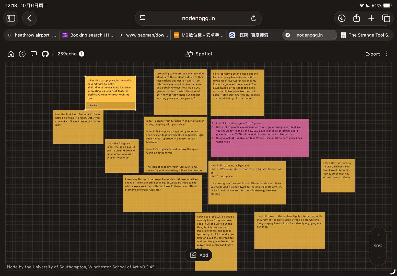
    • After the presentation, classmates left feedback on Nodenoggin.
    Nodenoggin board with classmates’ comments on three early game ideas.
    Classmates’ comments on the three ideas.

    The co-op house

    • Several classmates liked the idea of escaping together and thought it could be funny. They also worried about how much work the house and its interactions would take.
    • One person wanted distinctive rooms or architecture, while another asked what would make it different from games such as Untitled Goose Game.
    • I would keep the first prototype to the one-room version in my slides. With only four objects, an enemy and two spells, I could see whether being tiny actually changes how two players work together.
    • I would ask players to try the room together and note when they communicate, get stuck or find an unexpected solution. I can think about a larger house once that small space works.

    The FPS roguelite

    • The FPS idea had some of the strongest positive reactions. Classmates understood the fight, upgrade and route structure, and one said it was their favourite. A useful criticism was that this kind of FPS could become repetitive.
    • Another comment pointed towards better movement skills and more attention to the environment.
    • That gives me a clearer test for the first arena. I would watch whether players actually use the dash and jump to move around enemies, and whether one upgrade makes the next fight feel different.
    • If everyone stays in one place or ignores the upgrade, I need to change the room or the choice before adding more content.

    The module and route idea

    • People who liked card games were interested in this one, but they asked what separated it from Slay the Spire. One classmate suggested trying the choices as a physical card or board game first.
    • Others mentioned a different rule or story, multiplayer strategy, and games such as Balatro and Blue Prince as references.
    • A paper test seems sensible here. I would lay out a short route and a few modules, then ask whether the choice before a fight changes the player’s approach to it.
    • I would leave multiplayer aside for now; I have not shown that the basic solo loop works yet.
    • The broadest comment was that the three ideas still sounded too close to the games I used as references. That is fair criticism of the presentation: naming familiar games explained the genre quickly, but did not explain enough about my own designs.
    • Another classmate liked the interaction but wanted stronger storytelling. When I present these ideas again, I need to say what the player wants, what they do repeatedly and what is specific to this game before naming its influences.

    Game elements brain storm

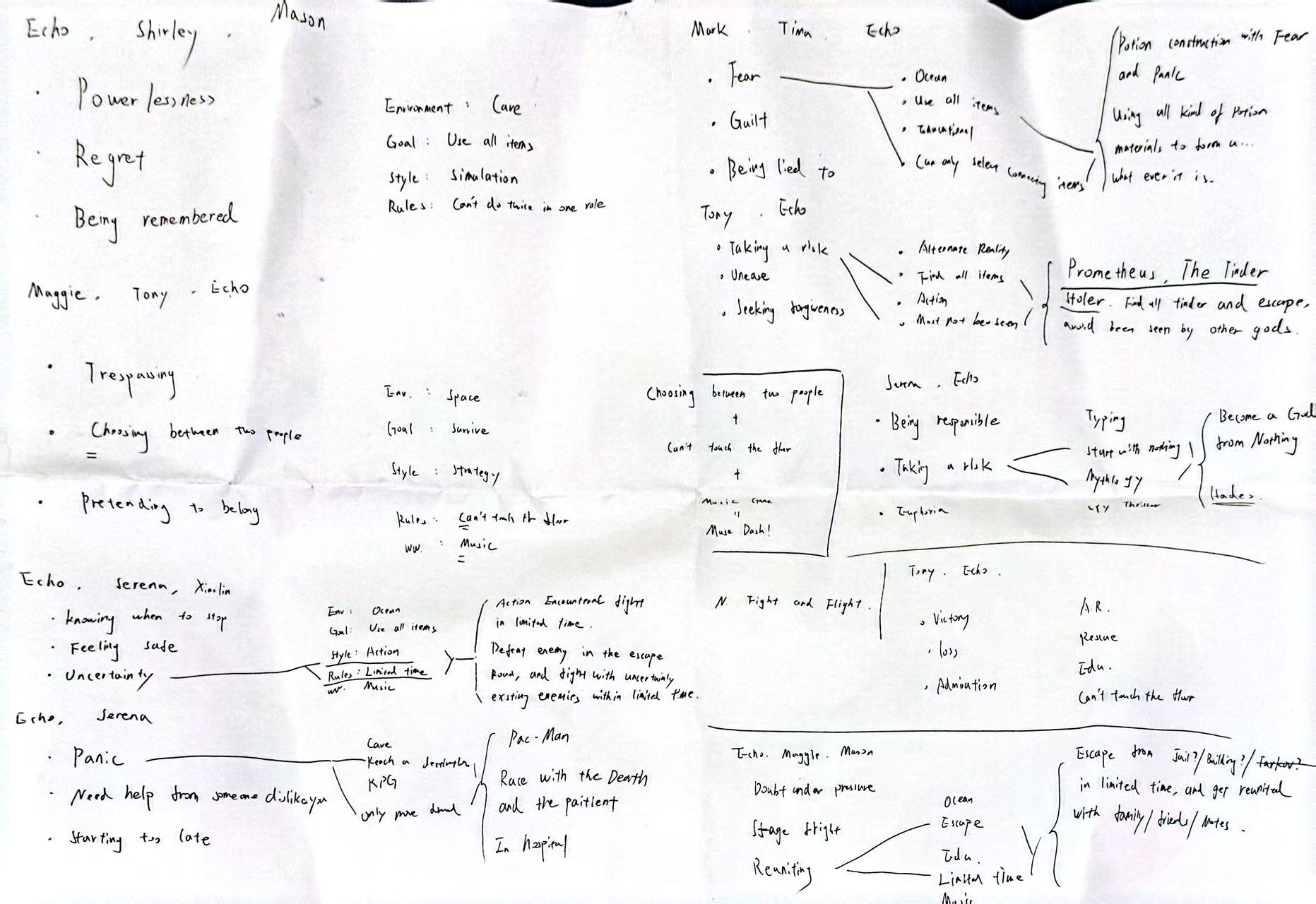
    • The picture records exercices for game elements brain storm. We started with feelings or situations, then added an environment, a goal and a rule.
    • One set of notes combines uncertainty with an ocean setting and a time limit. The idea was to defeat enemies during an escape while the player was under pressure. Another connects risk and unease with a Prometheus-inspired idea: collect the fire and escape without being seen by the other gods.The hospital idea starts with panic, needing help from someone disliked and starting too late. Other notes explore escaping under pressure and being reunited with family or friends.
    Classroom notes connecting emotions and situations to settings, goals and rules for possible games.
    Group workshop notes with classmates.

    5. What I took from the week

    • The worksheet helped me see the gap between a theme and a playable situation. “Fear” gave us a direction, but the chase only started to make sense when it had a player, a goal, a place and something in the way.
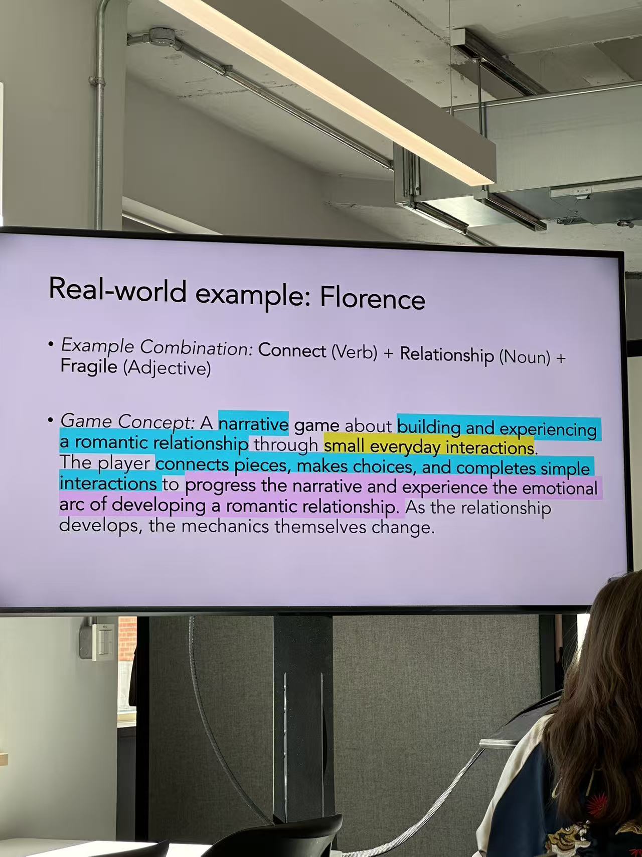
    • The classroom example of Florence, using “Connect + Relationship + Fragile”, made a similar point: small actions can carry the feeling of a game.
    • I still do not know which of my three ideas will work best. The house chase has a clear situation but could be difficult to build. The FPS has a straightforward action loop, although it needs more than fast movement to stay interesting.
    • The module version might add useful decisions, but it could also slow the shooting down. I wanted to try the ideas in small prototypes before choosing one.
    Class reference: Connect + Relationship + Fragile, using Florence to discuss emotion through interaction.
    Class reference: Connect + Relationship + Fragile, using Florence to discuss emotion through interaction.

    6. What I planned to test next

    • For the co-op idea, I wanted to try a single room and see whether handling objects and using two spells produced funny moments between players. For the FPS, the question was whether one arena and one upgrade choice made movement matter.
    • For the hybrid, I wanted to check whether choosing a route or module changed the next encounter.
    • I planned to watch what players actually did in each test, especially where they hesitated or misunderstood the goal, then use their comments to decide what to change. At the end of this week these were still proposed tests, not completed playtests.

    Week 1 presentation

    Later development

    • The questions about repetition and originality carried into the FPS work. My Week 6 reflection follows the decision to develop rhythm rewards and compares the three implemented prototypes.