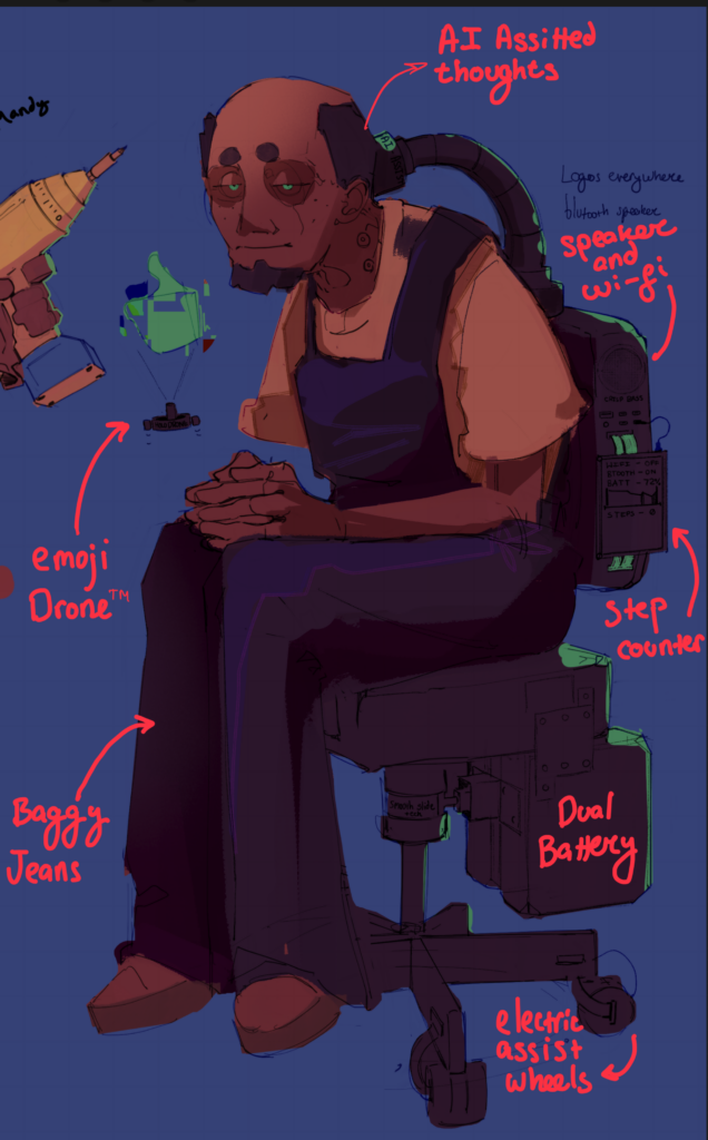
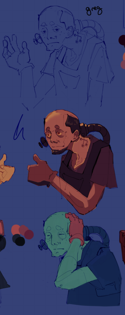
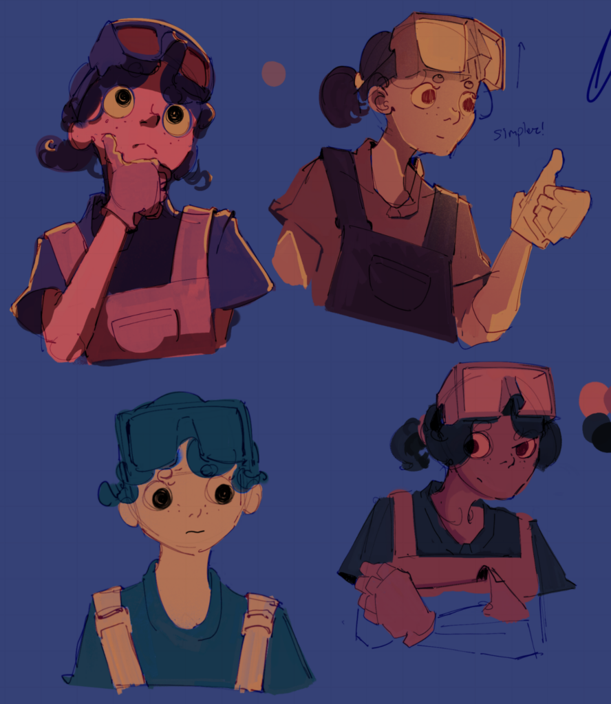
When designing the characters I had to make it seem like Greg and Sammie were two opposites, but I still wanted there to be similarities to make the player believe Sammie can still influence Greg’s thinking, which helps the narrative. Therefore, I kept the colours similar, but their personalities at opposite ends.
Although I think it’ll be obvious by the narrative that Sammie is Greg’s niece, I’ve still added similarities like circular eyebrows and freckled cheeks.
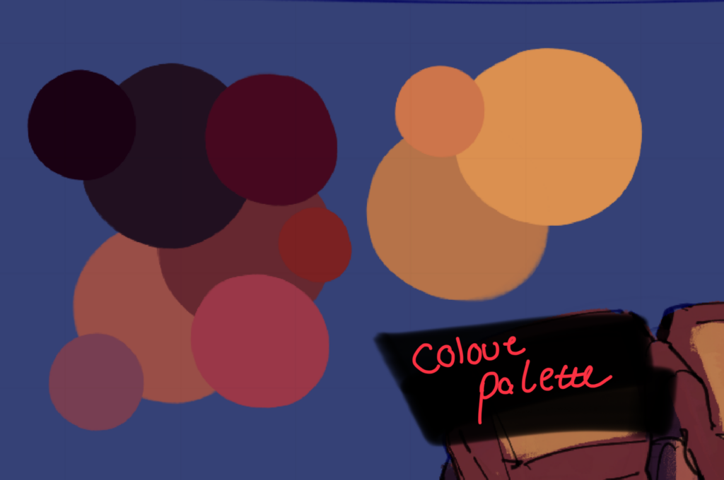
For both characters, I have tried different colours throughout all the sketches to see what fits best. I set out for a red, yellow and purple pallette, because it had the potential to both come off as warm and cool. I like how they both share the same palette, because Sammie and Greg are family. I have emphasised more darkness and coldness within grandpa’s colours, as well as used more of the sharp green accent. I think it makes him look more like a cyborg.
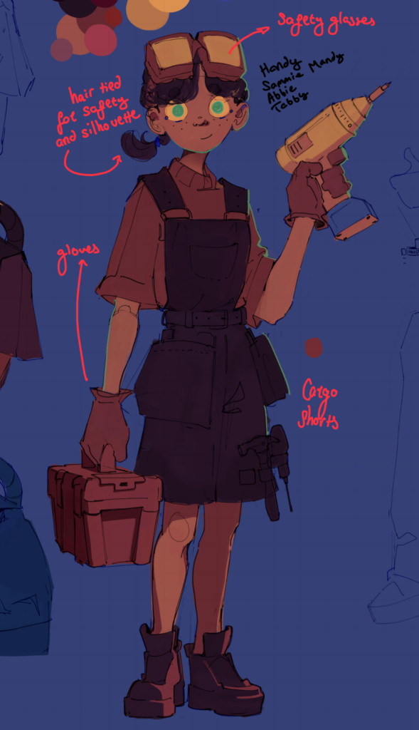
Sammie
Similar to the environment design, the characters represent the antonym of one another. They are full of tools of their own speciality: digital and artisan-ish tools. Sammie carries a toolbox around her and has professional cargo shorts for more storage. I chose this clothing because it naturally makes her tools visible so it’s easier to symbolise that she works with her hands.
Sammie has protective gear like gloves and eyewear.
Sammie is 13 as to me it represents an age of curiosity. At the very least my sister is the same age and is picking up many interests. It’s important to have the character curious because Sammie takes the role of questioning Greg about his lifestyle – something I think adults do less of for some reason.
What I’d change is to try and make her design more simple. She already is quite simple, yet drawing her hundreds of times doesn’t sound fun. There should be a version of her in dialogue form and then in a very simple game form. I’m thinking like the Coffin of Andy and Leilei. For Sammie specifically, I wish it was obvious that she carries with her pens and paper too and generally had more indication that she is for traditional media, not just in construction.
Greg
Greg has more unique attributes to represent a digital recluse. He’s got little drones automatically assisting with his emotions by showing emojis on occasion. He’s got a power smart chair which has screens, a battery and wifi.
He’s also got a tube connected to him whenever he is in his room. This is a device that allows him to connect his thoughts to the computer to interact with the computer as fast as you think.
This tube is important for Season 4 of the narrative because Sammie needs to learn to dismantle him from the machine to progress the story Storyline-Dialogue-Persona
He’s got logos everywhere to represent how everything needs to have a logo from teaspoons to sinks, which I find odd. On the tip of the logos, he’s got little writing like “AI assisted” and “XBASS” to make the product feel special.
Lastly, his posture accurately represents his digital lifestyle.
Greg is a cool character but is also highly complex. Therefore I would improve the design by having a version of him in the workshop that is simpler. I think Gregs tube is a cool choice and could’ve been doubled down on with many other things plugged into his brain. Apart from the tech, Greg himself seems fairly average, which could be seen as “Greg is nothing without his tech”, but that was unintentional. I wish I made gregs colours emphasise something more than just his shirt, which may be the most boring part of his design.