There are two rooms that were distinctively designed. The Workshop and Greg’s room. They are designed to represent the two sides of the story – A warm cosy place for an artisan and digital nomad dungeon.
The Workshop
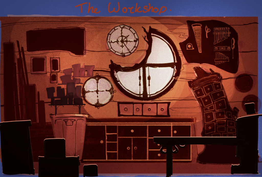
The workshop was designed to be warm and very wooden, the centerpiece being a charming round window cut out to fit a custom clock. It is all fairly cluttered but all in use too and in its own way is organised. There is a large workbench in the middle which will be the place Sammie does most of her things. Sammie will also have the ability to climb the workbench to access all tools on display.
Overall, the Workshop is designed to look horizontal. Lots of lines span that way to create a sense of calmness.
Grandpa Greg’s Grungeon
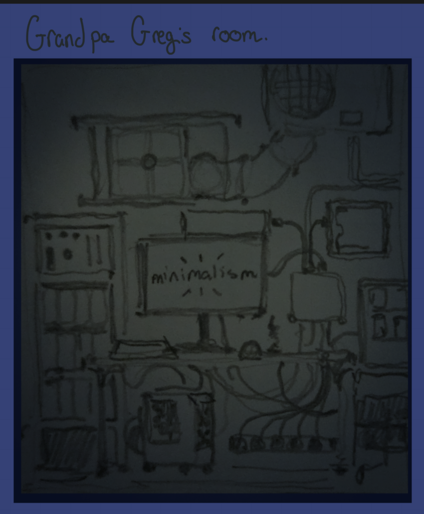
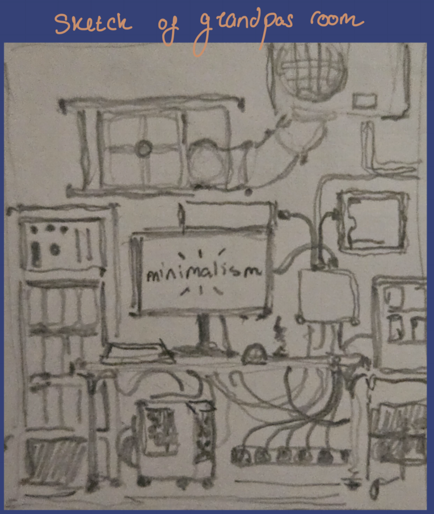
Next door is Grandpa Greg’s room, which represents more of a closet and has a much colder atmosphere. Everything is happening in this room, all sorts of wires and monitors, statistics and sounds buzz everywhere. This room is designed at the back of the bungalow to make him feel more resided. The centerpiece of his room is also a window to his world, also known as a 4K monitor. Ironically, he has a wallpaper that preaches minimalism contrary to how he lives. It”s a nudge to how generally people want to be minimal but don’t commit. Overall the room is designed with more vertical lines to represent a sense of things happening and movement everywhere.
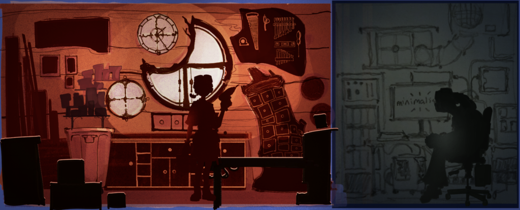
I would improve the functionality of the rooms, because I’m not entirely sure how the player is going to interact with the pots on the left. I would’ve also changed the size of the space to be bigger horizontally. I would’ve liked to include Sammies little trinkets that she has made for herself and generally have the design more related to the narrative.
Older Ideas
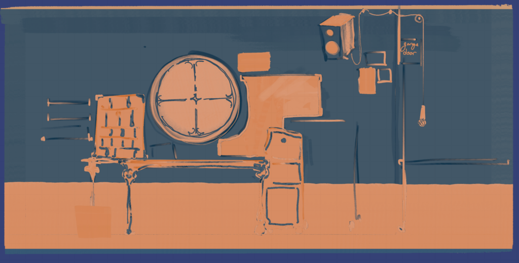
I was getting really uninspired by so many of my ideas and rendering because of how awful they were turning out as a final result. I didn’t understand that I was missing depth. I probably had enough stuff and detail, but only in one area of the z axis, everything else was empty. This is why Hollowknight’s execution of backgrounds worked really well for my rough render of the workshop at the top of the page. I also found it really frustrating to draw digitally instead of traditionally. I figured it’s because my digital workflow requires me to add more details, whilst sketching in A7 means I can fill out my thumbnails much quicker and there is life in them within 10 mins not one hour.
One remedy is to zoom out of your canvas and don’t zoom in again, like how you can’t zoom in traditional art. Another is to limit the space you’re allowed to draw in in a small box. And a third is to lower the canvas resolution or increase your brush size and keep it that way.
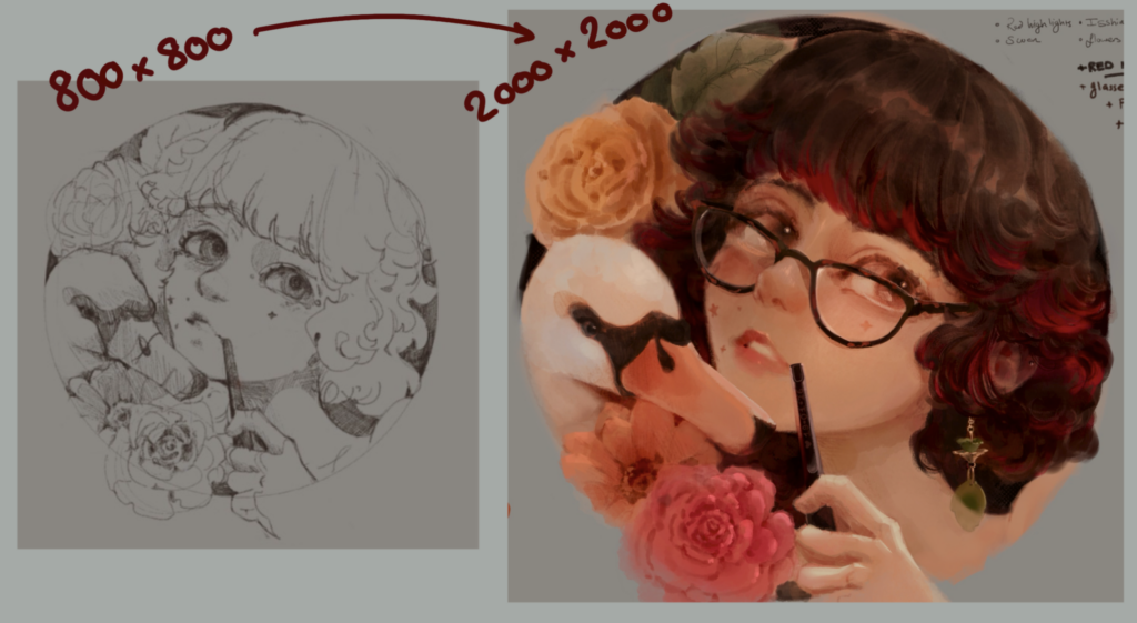
Sketching in a lower resolution is so so much better, You’re basically sketching in A7 which is the ideal sketchbook, which is the ideal, idea generating resolution / size. It’s not like I didn’t know this, because with the image below I applied this theory to create one of my favourite digital paintings. However, I do still have to keep practicing it, I keep forgetting and make crappy results like what’s above!
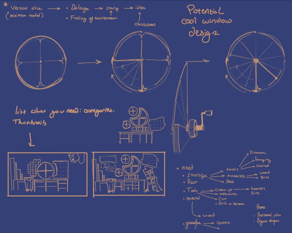
I like having functional ideas. I thought it would’ve been really cool to have window blinds that spin outwards like a hand-held fan, but fully 360 degrees. This design stemmed from the question of how circular windows would block light from the sun in a low profile way.
I ended up choosing the crescent shaped window because the design is even more intriguing – I thought circular windows in a fantasy-like workshop are a bit cliche.
Design of the UI
The idea behind the UI is to feel interactivity whenever you change anything. I wanted that feeling because it’ll mimic the sense of physical touch that lots miss out on when everything starts getting replaced with screens. A good example are car companies reverting back to physical switches after too many controls were moved onto a touchscreen.
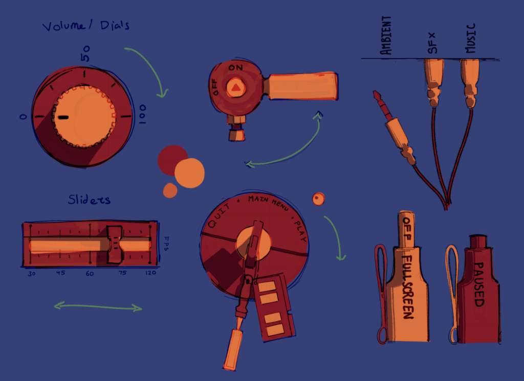
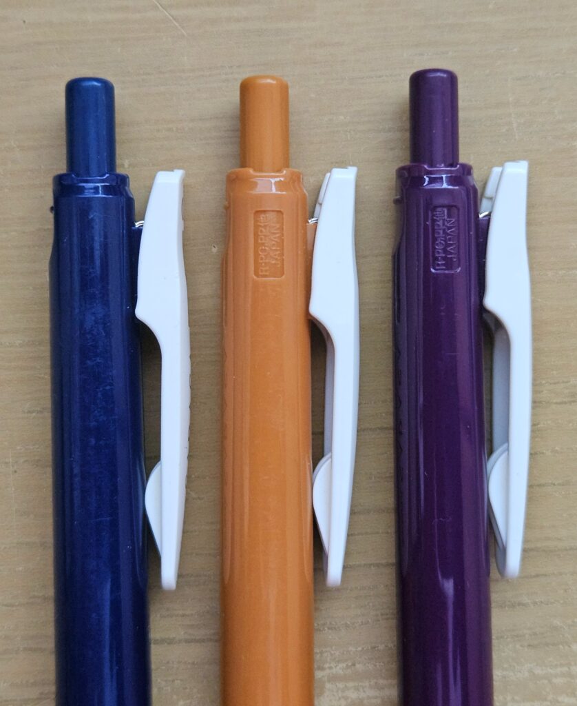
There are designs with varying adjustability and ones that only switch on / off. When designing the dials, I tried relating them to either the narrative or what they adjust. For example, Sammie carries pens with her always and the AUX wires represent Greg.
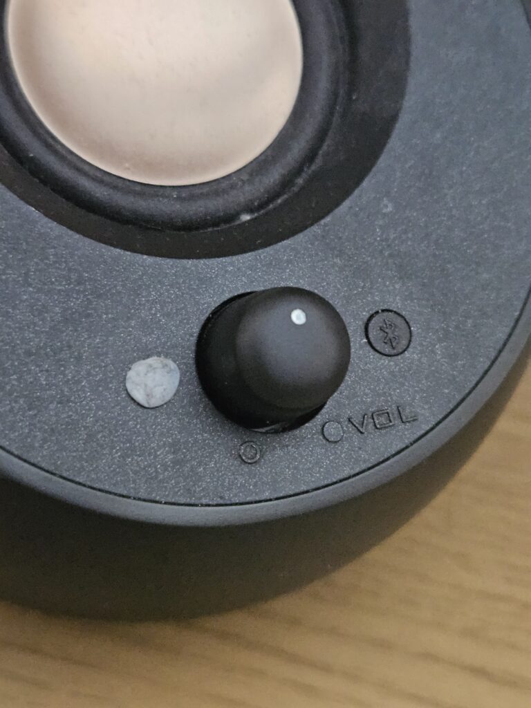
My sliders and dials are for adjustable controls. They were inspired by synthesizer dials and they’ll be used for the sound settings.
They would be for volume, frame limits, resolution or anything that has several options of adjustment. They have a simple design, therefore it’ll be used for multiple settings.
The AUX cables will have options for ambient sounds, where you can choose from an array of noises like rain, seashores or brown noise. I find this to be nice sounds to concentrate too and it could be interesting to have that either over your music or by itself.
The pens will switch a setting on or off and make a clicking sound every time they’re pressed.
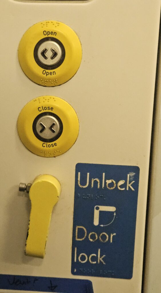
The handle was inspired by the rugged door handle used to open and close a train toilet door, because it seemed very rugged and primitively designed.
More complex designs are only to be used for one setting and for more critical controls. For example the key unlock is for switching on and off the game / quitting it. Because the keys are designed more intricately than anything else, they’ll be more distinguishable, therefore there will be less chance to accidentally press it.
As a side note, the keys also have a RAM stick and a chisel to represent Greg and Sammie. I didn’t find that any colours in particular were more or less suitable, so I went with a red and orange in theme with the character colour palettes, a multiply layer for the shadows.
To improve my designs, I should’ve made them look more intuitive to use. Although these designs are from 3 dimensional objects, they are represented in a 2 Dimensional way and only from the front view. Therefore, people may not understand how to adjust something like the pen, because they’ve probably not seen UI like this, it would likely confuse them.
Another thing is the colour choice is still up for debate. I don’t know what is suitable and just think that the best colours are the ones that the characters would be.