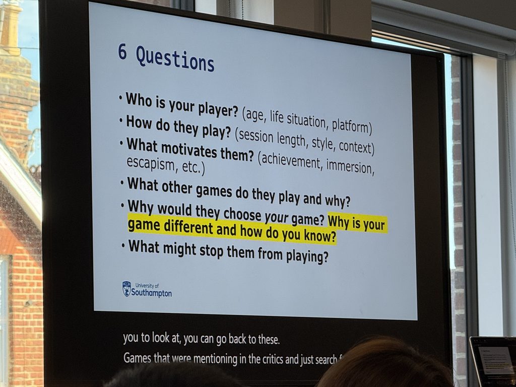
This photo was taken during class this past Monday. To be honest, I only really considered this question as I was developing the game—or perhaps it’s more accurate to say I had the answer in mind from the very beginning. I envision this game for players who aren’t particularly interested in combat or killing, and who might find typical horror games distressing—people looking for a sense of comfort within a horror-themed setting. Naturally, the primary audience would likely be fans of farming simulators and management or raising-simulation games.
On Monday afternoon, we conducted a fairly professional playtest. An expert instructor evaluated the game and provided a great deal of feedback. To be honest, the optimizations I made over the weekend didn’t turn out well; the playtest revealed many shortcomings—to the point where, in my view, the game is currently barely playable. There are still significant issues with the core game loop, map exploration, and the utilization of map space.
Next, I will demonstrate the specific improvements I made to my project this week, along with the problems these changes addressed. I have used red and black text to present these points in a side-by-side comparison.
Feedback
“Sound of money” effect ⭕️
Incorporate audio cues when collecting money to enhance the player’s sense of financial gain ⭕️
These two changes are primarily intended to enhance the feedback players receive when collecting money. In the initial version, there was no feedback whatsoever when a player picked up money from the ground—no sound effects and no “vacuum” or “suction” visual effect. During testing, my instructor suggested adding these elements to encourage players to collect money.
Add visual or sound feedback when items are ready to be combined ⭕️
In the initial version, when a player picked up a chick by pressing ‘E’, a green border would appear around it; however, this border remained unchanged during the crafting process. Through testing, I discovered that the presence of this static green border didn’t necessarily help players understand how the game’s crafting system actually works. Players need the border to change during the crafting process to determine whether a specific crafting action can be performed—which is why I implemented this change.
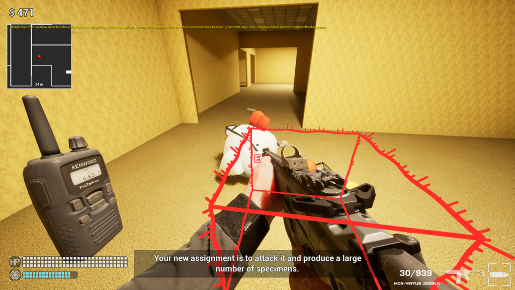
Enable a gameplay loop where players can scavenge for items in open areas ⭕️
Introduce blueprints for creating new types of chickens to prevent players from getting stuck or aimlessly running back and forth ⭕️
In the original version, the map was extremely sparse, offering little incentive for exploration. By introducing “ground data” required to unlock higher tiers of chicken synthesis, players are now compelled to venture out, explore more of the map, and then return to their original location. This is a pivotal change—one that fundamentally shapes the game’s core loop and determines its overall viability.
Implement a radiation mechanic and a weapon upgrade system 🚫
This change was ultimately not implemented. The primary objective was to ensure that as players ventured further from safe zones, they would face increasingly greater threats. In the current version of the game, I’ve adapted this by having monsters possess higher health the further they are located from safe areas; I will consider incorporating this mechanic more fully in future game development.
Core gameplay loop: players earn money, explore the map for resources, combine chickens to generate more wealth, and upgrade equipment (e.g., radiation resistance, increased damage, and unlocking new ammo types) ⭕️
This content serves as an annotation for the overall revisions, outlining the player loop experience that we aim to achieve within the game.
Guide players through a few essential introductory points before letting them loose in the larger open world, rather than dropping them into an empty space with no direction ⭕️
During playtesting, it was observed that players would initially wander the map somewhat randomly, failing to engage with the game’s core objectives and often becoming disoriented. This suggested a need to teach players the basics before letting them loose in the game world—a crucial insight. However, my actual implementation takes a slightly different approach: I keep the “chick” unit hidden at the start, allowing players to explore freely. If they haven’t found the chick after a certain amount of time, the game automatically teleports them to its location. In practice, this method has proven to be just as effective—if not better.
Monster spawning and character models ⭕️
In the test build that launched at the beginning of this week, there are no monster spawns, which means the game completely lacks a terrifying, exploratory atmosphere—not what I’m aiming for. Furthermore, the placeholder monster model is currently just a zombie; I need to create custom “Backrooms” monster models and implement a spawning mechanic to flesh out the experience.
“Angry Birds”-style mechanic 🚫
This system was originally designed to encourage players to return to their original location after exploring the map. I haven’t implemented it yet, but I plan to in the future. The system is quite complex to implement, requiring consideration of both ensuring the chickens can kill each other to reduce their numbers and the speed at which this cannibalization occurs.
Alerts for declining SAN (sanity) levels ⭕️
In the game, players will die if their Sanity (San value) drops too low; however, since the game content doesn’t explicitly highlight this, I need to add appropriate prompts or indicators.
Structures that restore SAN, repel enemies, and provide bonus armor ⭕️
The purpose of this content is to enhance the role of furniture in the game. In the original game, furniture items are merely decorative models that can be placed around; they do not contribute to a player’s sense of security. I feel this falls short of my intended vision for this system, so I need to add features that allow players to perceive their collection of furniture as a true sanctuary.
A special “Vergil” chair ⭕️
This content enhances the playability of the furniture system.
On-screen prompt for switching ammo types (using the ‘Q’ key) ⭕️
The initial version lacked a prompt indicating that players could press ‘Q’ to switch ammunition—a feature that had essentially been overlooked—so we have added this functionality during this week’s development.
Encourage players to shoot chickens to create multiple copies before combining them (currently, some players pick up the chickens immediately upon seeing a prompt, bypassing the intended combination mechanic) ⭕️
In the early stages of the game, the prompt instructing players to press ‘E’ to study a chick—which appears before the chick has a chance to replicate—ends up being more misleading than helpful. This needs to be adjusted to better guide players in learning the chick-crafting/synthesis system.
A quest system that directs players toward combining chickens (highlighting this as a core gameplay loop) ⭕️
Initially, the game lacks any defined tasks or objectives; players might simply leave after testing the chicks a bit. I would like to see players engage in a gameplay loop that centers more around the chicks.
Subtitles and a dedicated button to review past radio transmissions (allowing players to focus on gameplay without needing to constantly listen, and providing a way to catch up on missed dialogue) ⭕️
This content serves to improve the instructional system.
Monster health increases as they get closer to the edge of the map, scaling up to a maximum of 300% ⭕️
This addition enhances the sense of depth in the map; players face a greater threat from monsters the further they venture toward the outer areas. In practice, however, I’ve found that the level of threat posed by these monsters remains somewhat insufficient—it will need to be increased further down the line.
A progress bar for “paper” (resources) to show how much is needed for the next level 🚫
After careful consideration, I have decided not to change this aspect. I want players to remain uncertain about exactly how much content they have collected; this adds a layer of ambiguity to the collection process, encouraging players to spend more time exploring and to undertake more exploration runs.
Introduce more distinct variations for chickens at different levels to make leveling up feel more rewarding and surprising (crucial—simple changes in size alone aren’t enough to make a level-up feel significant) up)⭕️
This comparison touches upon the game’s core loop. From the very beginning of the design process, the upgrade system for the chick was intended to be the primary gameplay loop and the main source of surprise for the player. Initially, these upgrades simply increased the chick’s size—an approach that was undeniably dull and made it difficult to gauge the chick’s actual level. Consequently, this change represents a crucial adjustment.
Eating food no longer requires pressing ‘E’ or ‘F’; it now depends on where your crosshair is aimed. 🚫
This is essentially a bug; I discovered during testing that pressing ‘E’ in certain locations could trigger things you didn’t intend to activate. I felt that distinguishing between ‘E’ and ‘F’ was a good idea, so I decided to keep it.
Added a crosshair. ⭕️
little change.
Included a settings menu (sensitivity, music volume, and toggle for ‘E’ key interaction—tap vs. hold). ⭕️
Enhance the completeness of the game
Upgrading a chick causes it to “spit out” money. ⭕️
This addition primarily enhances the positive feedback players receive when merging chicks, encouraging them to engage in the merging process more willingly.
Added prompts to inform the player about the two designated weapon-upgrade zones. ⭕️
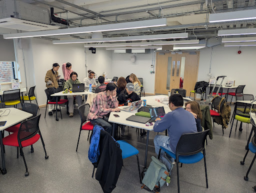
The feedback regarding the game’s content emerged following a playtest this past Friday; no changes have been implemented yet. Overall, the playtest went quite smoothly. Players with prior gaming experience will likely find the game accessible and easy to pick up. For those with less gaming experience, the experience might be a bit more challenging, though still within an acceptable range. Moving forward, my optimization efforts will focus on refining details and lowering the entry barrier—specifically by improving the tutorial system—to ensure that even less experienced players can quickly grasp how to play the game.
Refined the map.
Added cues indicating that players can fight enemies.
Prevented switching to locked ammo types via the ‘Q’ key.
Added on-screen prompts for all basic controls.
Changed chair interaction to “tap to grab.”
Implemented a tutorial-based progression to unlock features gradually.
Reduced player mobility while on the phone.
Added a “Recall” (log) UI accessible via the ‘Tab’ key.
(Ensuring consistent game pacing is crucial.)
Added a prompt regarding the “10 o’clock” position.
Added a UI for the ammo vending machine.
Calls are answered automatically after three seconds.
Added the option to decline calls; call content is logged directly to the ‘Tab’ menu.
Added a UI prompt (for the first five instances) explaining that aiming at another chick of the same level allows for merging.
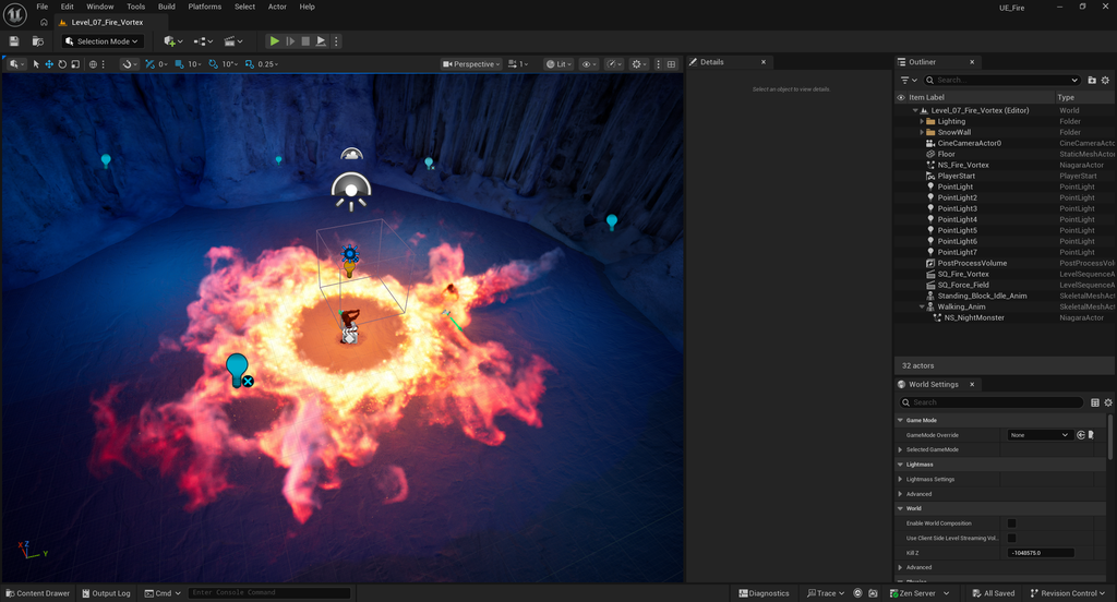
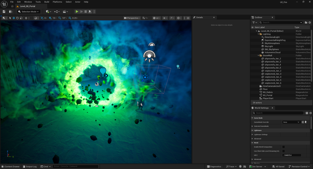
This week, I continued working on the Niagara tutorials and completed the entire set of instructional content.
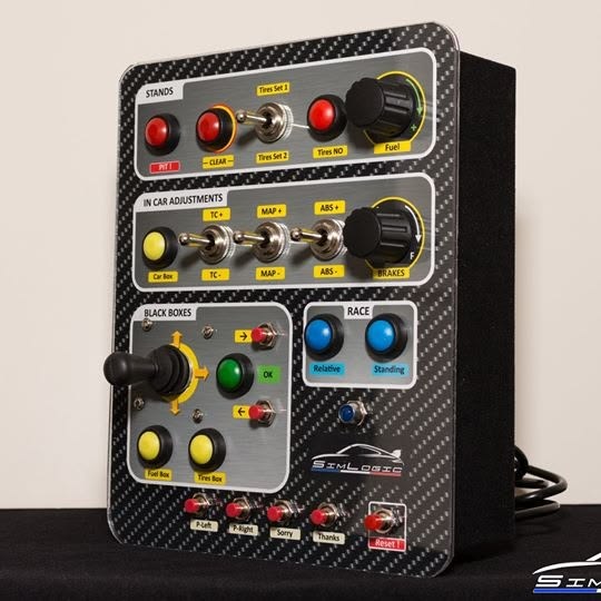
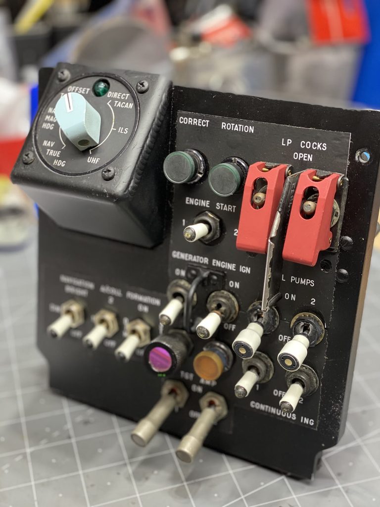
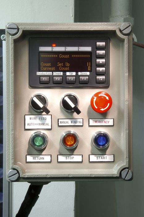
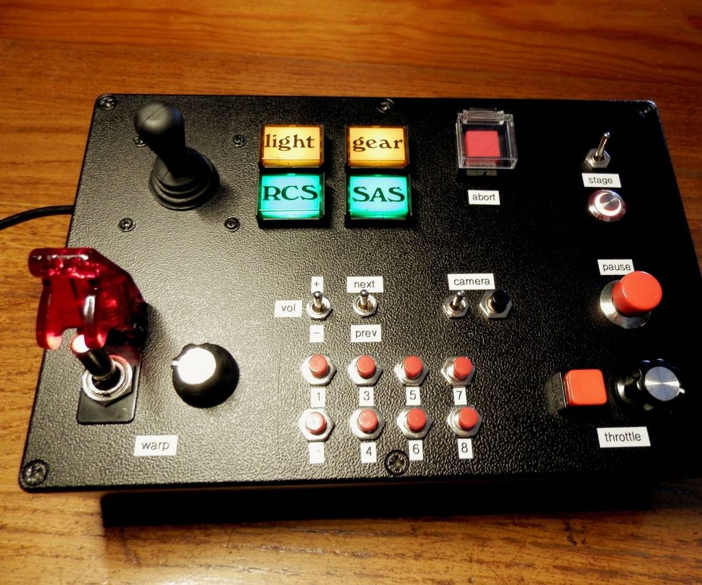
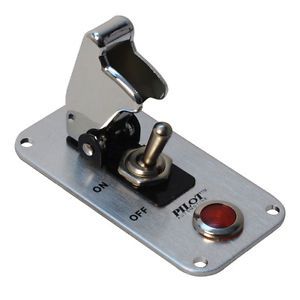
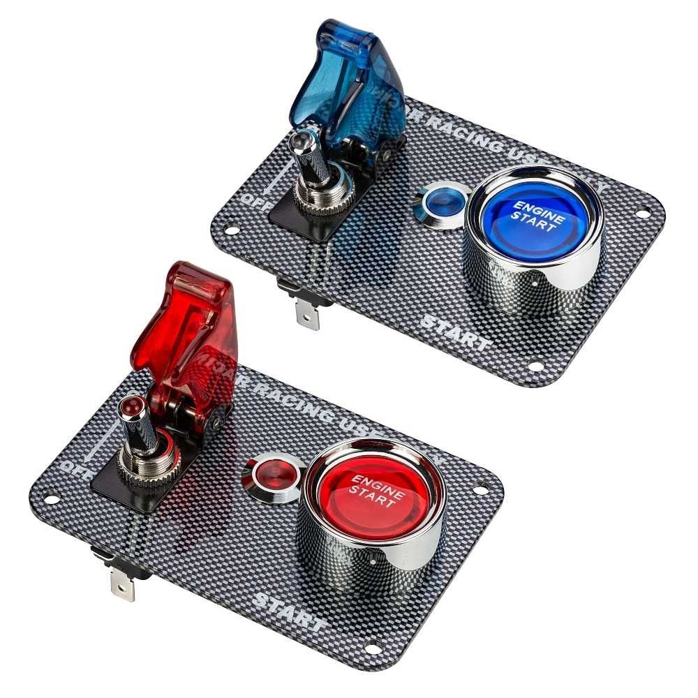
This week, I began a personal study plan focused on high-precision modeling and the production pipeline for AAA-quality game assets. I anticipate needing to create various in-game interactive props—such as ID card slots, control panels, and buttons—during the mid-to-late stages of this project. Consequently, I’ve decided to start by modeling a control panel, dedicating some time to it each day.
The content above is primarily sourced from the internet and served as a reference for me while creating the control panel. Additionally, I reached out to my family, who took some photos of actual control panels in a factory for me.
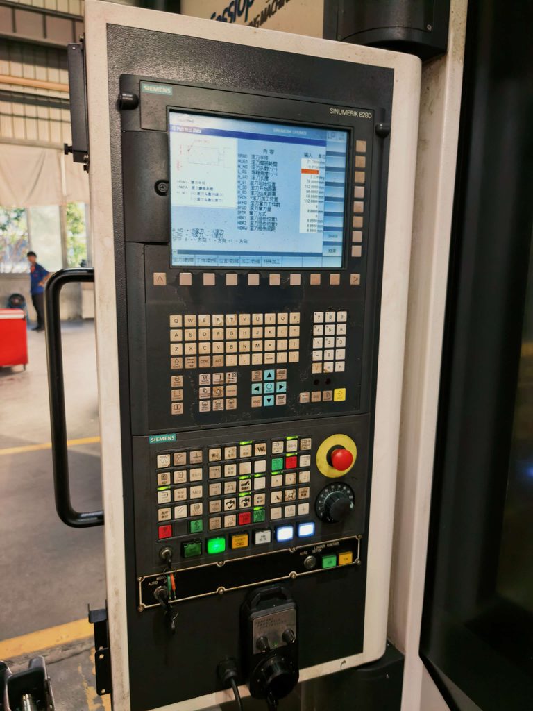

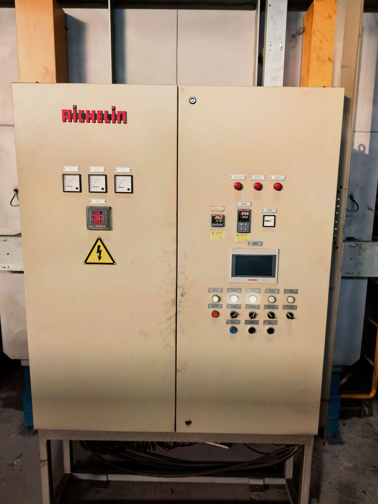
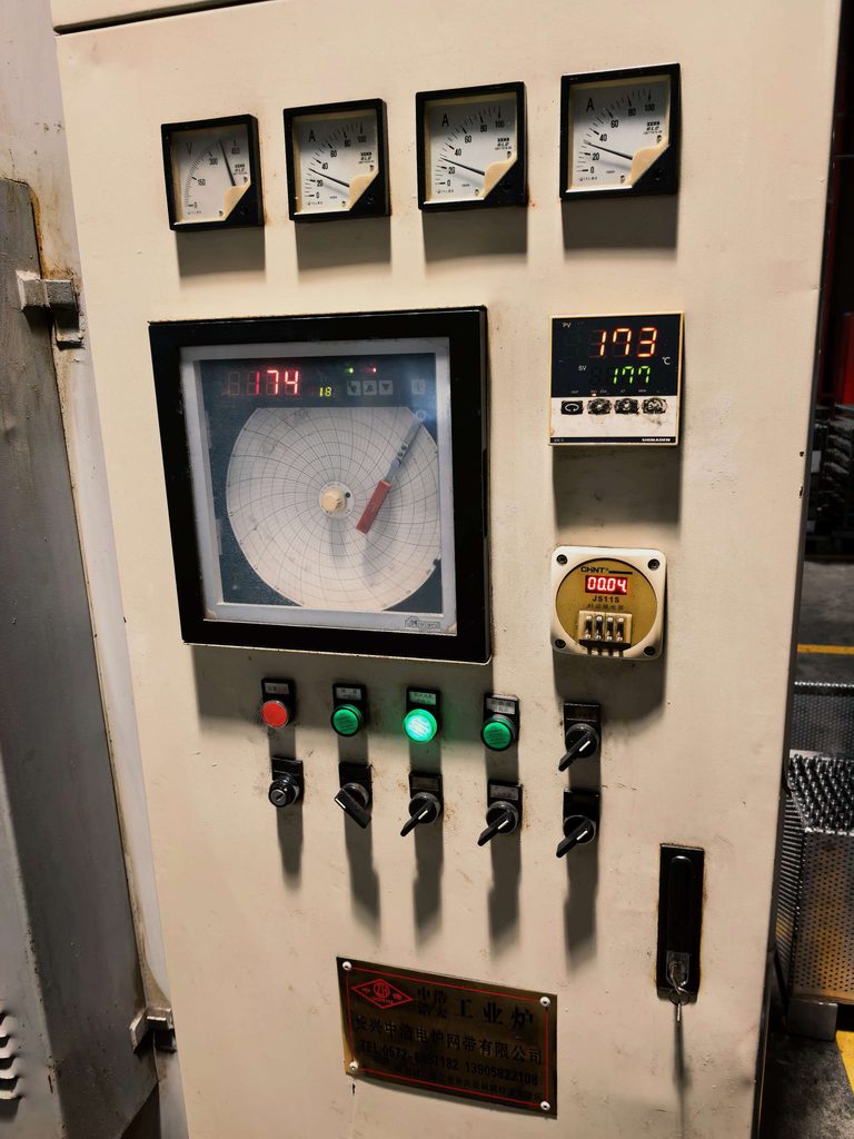
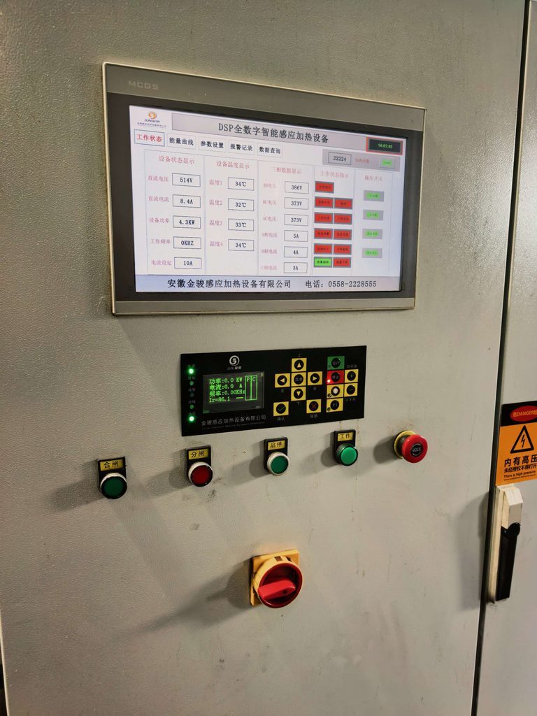
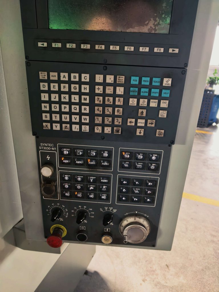
I think the research behind this content is excellent; it’s very helpful for my workflow.
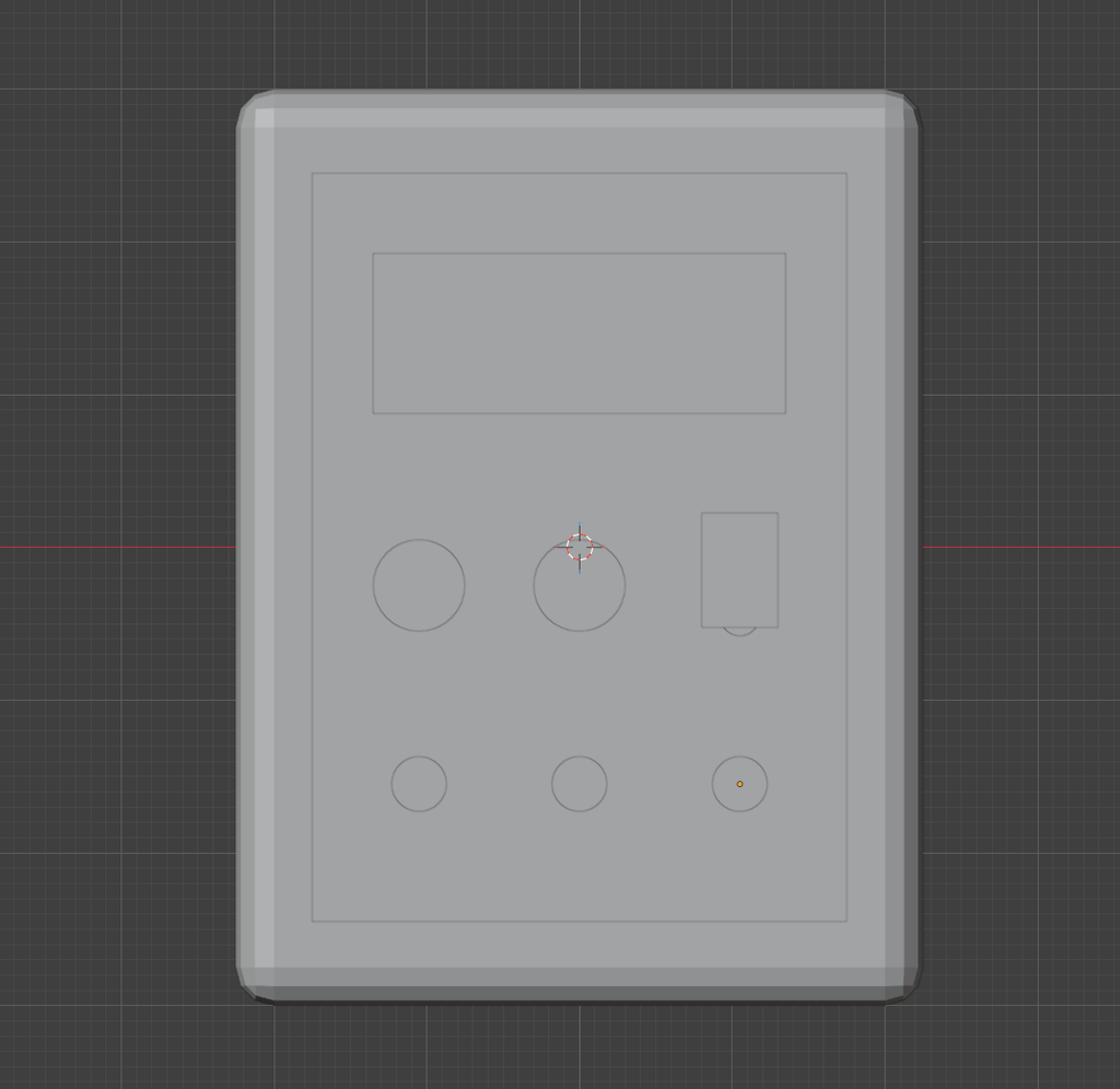
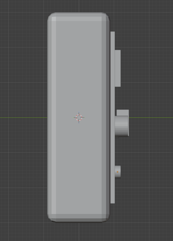
To begin, I drafted an initial concept for a control panel. While I incorporated some assets found online, I customized and redesigned the buttons themselves. My goal was to treat this project as an exercise—specifically to practice creating a wide variety of buttons—in order to sharpen my proficiency in hard-surface modeling, rather than simply repeating the same two or three button designs across the panel.
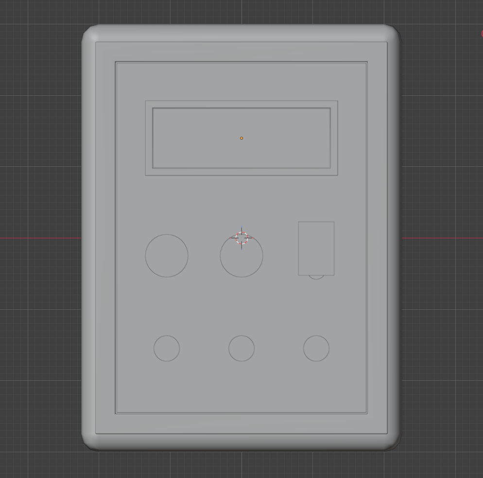
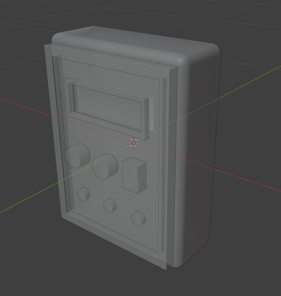
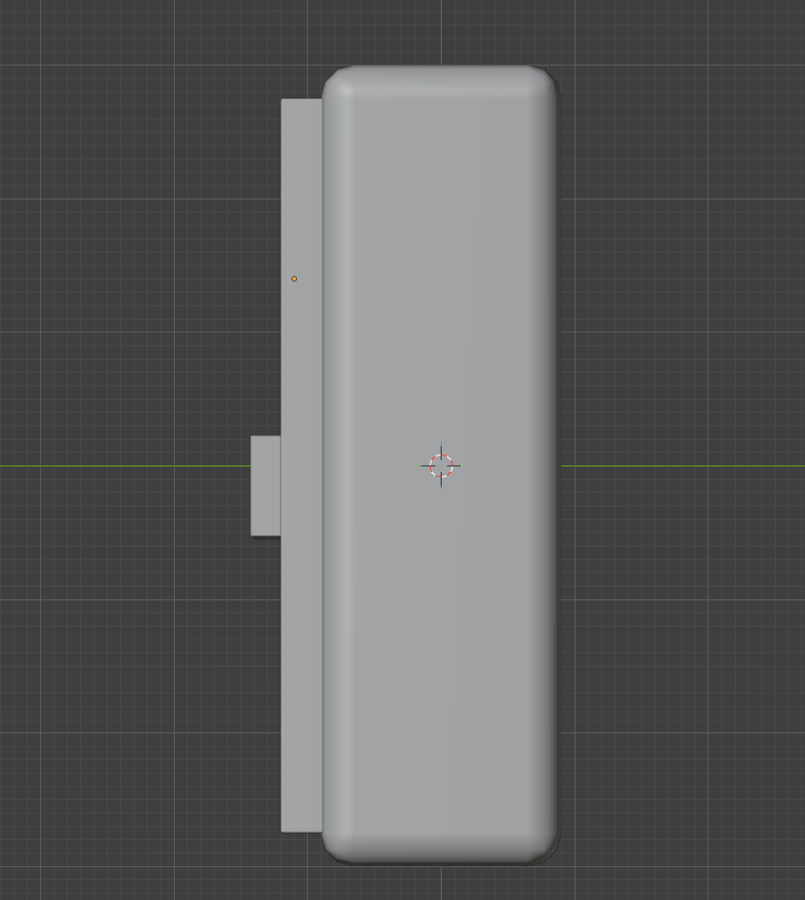
The second step involves further refining the content based on the first step, but at this stage, the focus is mainly on the proportions of the model, without much attention to detail.
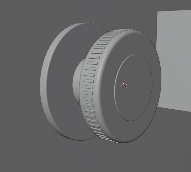
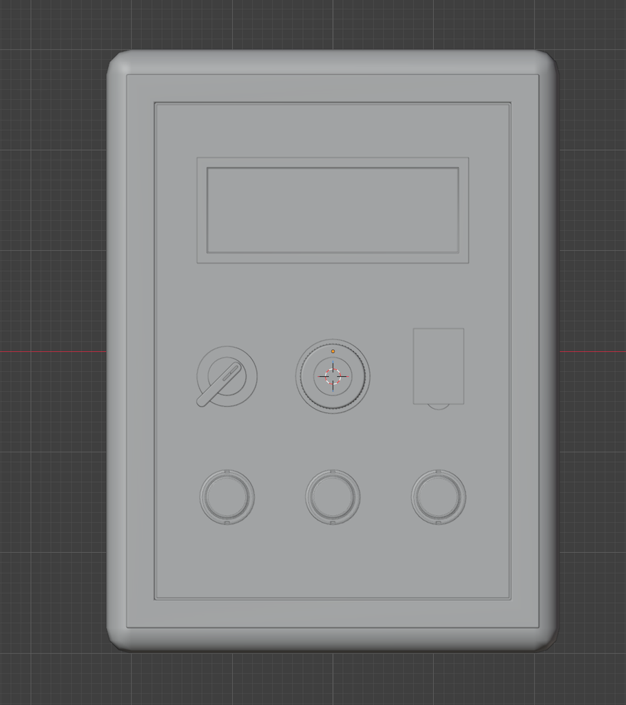
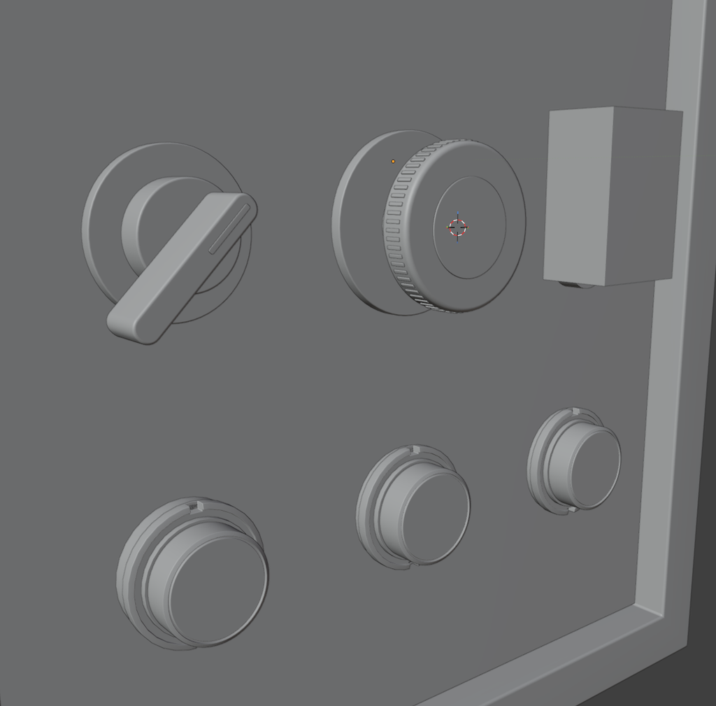

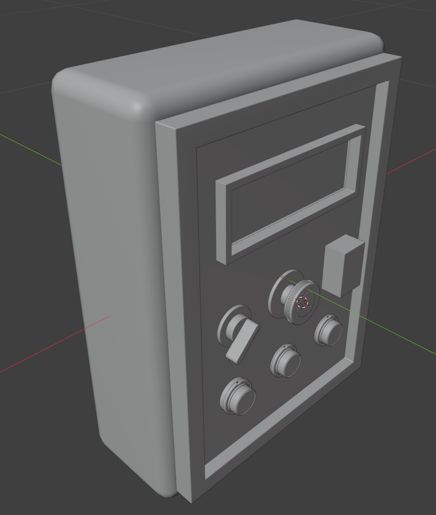
In the third step, I added details to most of the buttons. This served as a great refresher for various Blender features and components—such as the Array modifier, as well as face extrusion and complex modeling operations. The process didn’t take too much time—perhaps around 5 hours—largely because I made a conscious effort to ensure that the dimensions of each model were logical and that the fine details held up well when viewed up close.
However, the next step took up a significant amount of my time, as it involved a relatively complex topology—specifically, this button with a cover.
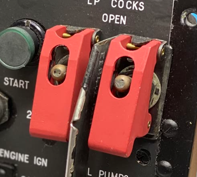
This covered button consists of two parts: a lower rocker arm button and an upper cover.
I think the toggle switch at the bottom is relatively straightforward to create; essentially, it involves the back-and-forth topological transformation and stretching of several circular rings, followed by adjusting the angle of the control lever.
However, creating the top cover is a bit too challenging for me at this stage. To begin with, the cover starts as a rectangular shape. Furthermore, I need to incorporate cutouts—specifically, the opening for the joystick and the cutout on the upper section—both of which can be achieved by using cylinders for Boolean operations.
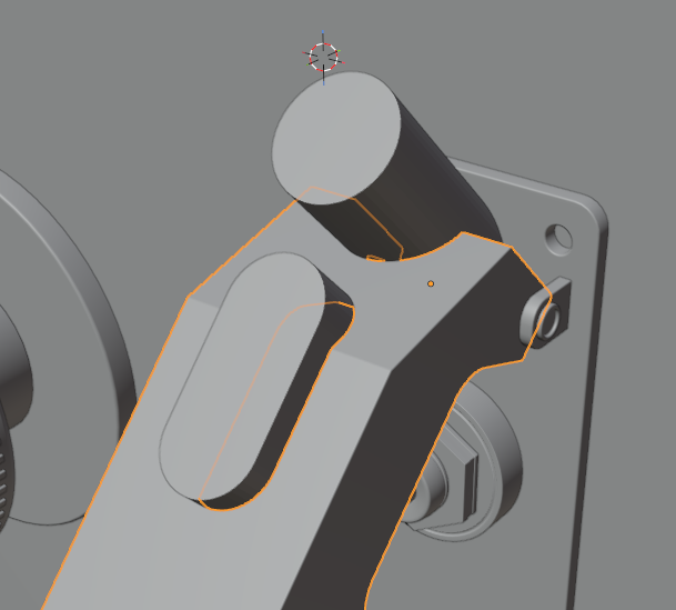
However, the openwork design on the sides of the cap is quite challenging to execute. Based on my reference images, this structure is divided into three or four distinct sections. It includes a toggle-like cover—shaped to fit a human finger—as well as a load-bearing component that supports the entire assembly. Since both of these parts are circular in form, they cannot be created using simple chamfering techniques.
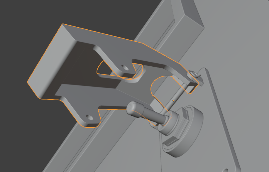
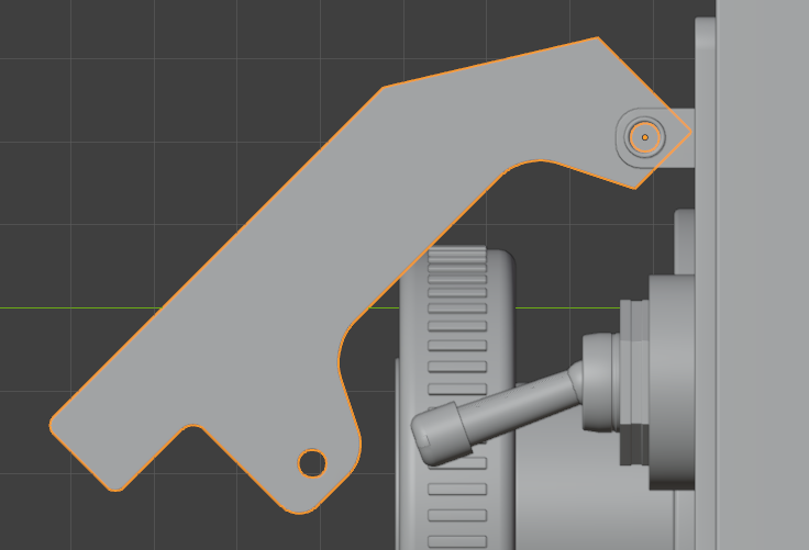
I ended up dividing this block into two trapezoidal sections and then applying chamfers to achieve the desired curvature. Throughout this process, I also had to ensure that the thickness of the lid remained perfectly uniform—it turned out to be significantly more difficult than I had initially imagined.
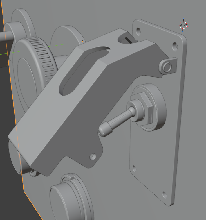
However, after a long period of effort, I feel I’ve gained a lot. I’m particularly pleased with the final version of the joystick button with its cover—it turned out very well and was well worth the time I invested. At the same time, this project has clearly exposed the shortcomings in my hard-surface modeling skills. I need to take some professional-level courses to address these gaps, especially since my career goals and future plans are focused specifically on this field.
Leave a Reply