Hi! This is the first sprint of mine and EJ’s game. We discussed before this semester started, I should start making some character concepts of our player character. This sprint was quite a busy start for me, as it involved a lot of feedback from my team mate and other people in my class.
This sprint’s deliverables:
- Finalised character
- Turnaround
- Animation
Character finalisation & Turnaround
Before the end of January, and week 1, I discussed with my teammate that I would get a turnaround done. However, before completing a turnaround, it was vital that I establish a character design for the player that both me and EJ both agree on. Above all, it needed to fir the game’s atmosphere and aesthetic to ensure that it belongs into the game world.
I began with sketching several designs that varied in silhouette, proportion, and defining accessories. Although each of these designs vary in aesthetic, they call look fairly similar in one aspect— they’re all fairly nature themed, embellished with leaves of some sort. This was to make sure that they aligned with the nature elements and Polynesian ties with nature and the Earth.
In this process, I wanted to focus on silhouette design, as creating visually distinct shapes would improve character recognition and readability during gameplay. If the character had too many lines or messy shapes, it becomes harder for the player to play. At this stage I played a lot with the accessories, giving each concept a sense of individuality.

I then asked my teammate for his opinion and this is what he had to say about my concepts:
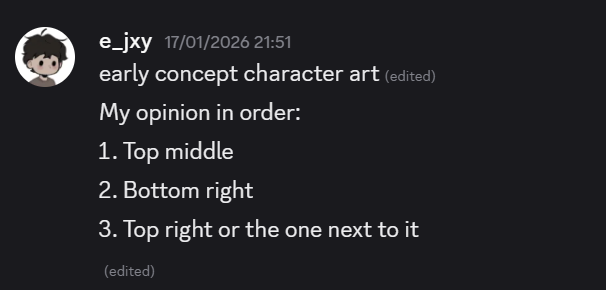
With these recommendations in mind, I created more concepts. I then started to closely look at my designs and started to realise how similar the designs looked to an already existing franchise, Hollow Knight. One of the trade marks that this franchise capitalises on are the recognisable “hollow eyes”. From this point on, I wanted to try steer away from creating designs with empty looking eyes as I want to create art for a game with its own artistic individualism.
It was at this time (although late), I watched a video on making good character designs FOR animation. I came across these videos to help me with my designs to prioritise efficiency when animating.
Notes from this video:
- Silhouettes are VERY important for creating recognisable characters
- Avoid simplistic looking bodies
- Keep in mind of shape language and what they convey e.g circles convey softness and approachability
- Limit the colour palette
- Colours support the role of the character
- Simpler designs are easier to animate
- Symmetrical designs are EVEN MORE easier to animate (you don’t need to animate both sides of the same character)
From this video, the tip that I will most likely be carrying with me is the fact that creating a symmetrical character would help significantly. With a project so early in development, work load can always change. Additionally, I’m quite new to the realm of animation. Beginning with simpler and manageable animations for the game while also maintaining the quality, is incredibly important.
Then, I began my final sheet of concept work. I felt like I already wasted too much time and I wanted to narrow my work down within the next couple of hours.
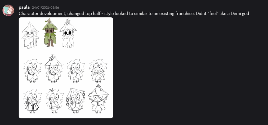
^ Here, I started to abandon the entire ‘hollow eyes’ aesthetic and tried something more distinguishable from an already established franchise.
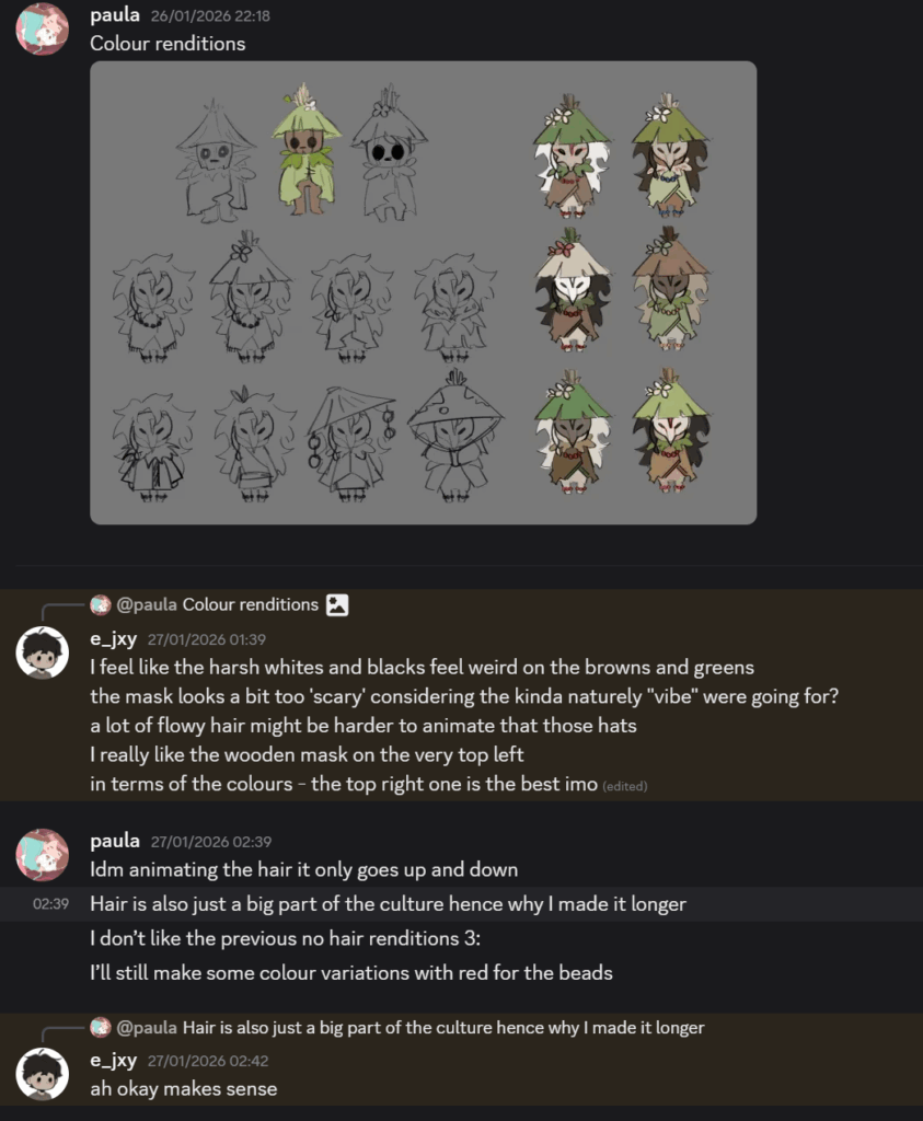
^ Screenshot above shows my colour iterations and communication between me and my team mate. EJ brought to my attention that the mask can come off quite scary because of the angled eyes and sharp like “beak”, which is something I want to avoid.
Important things to note from feedback:
- Player character may come off as unapproachable due to the angular mask
- Harsh whites doesn’t look the best against certain colours
- Settle for a more earthy palette.

Above shows the final player character design. I had some difficluty figuring out why the line up on the bottom didn’t look aesthetically pleasing. I took a break from concepting and figured out the reason why was because the shapes were clashing too much:
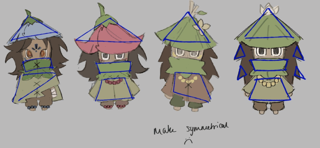
As we can see, there is a combination of squares and triangles, although this combination can be pulled off, I made it look too chaotic. The shapes seen clash too much and doesn’t look visually appealing. This is mainly because of the triangular hat and the square clothing.
To combat this problem, I settled on one shape to take up the majority of the design: triangles.

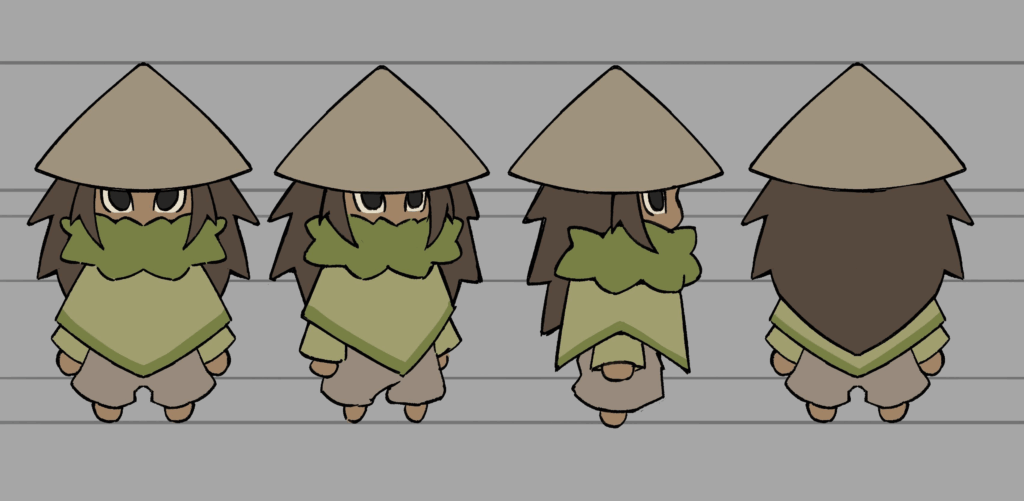
As seen above, the shapes work much more harmoniously and do not clash with each other. The main features the player will see are: the hat, hair, and poncho. Making the poncho a more angular shape was a good call, as now the shape language is clearer and it makes the character design more cohesive and harmonious.
Final turnaround
Practicing animation
This week felt slower due to my inexperience with animation; due to this I frequently became frustrated and took several breaks. However, with many references and studying other people’s run animations, I made a run cycle in no time.
I saw a YouTube video about making a stick man walk, and I thought it would be the perfect opportunity to teach myself the basics of a walk cycle.
From watching this video, I made this animation in 5 minutes. From the video above, I notices that as soon as the foot makes contact with the ground, the head bobs down as well. Although my attempt below lacks fluidity, I feel like I gained a better understanding of how frame by frame animation works.
Attempt #1
(Screen shot below) Then, I made other cycles. But after the 1st attempt, my team mate requested that I only make a run cycle, since the player character running will be the default movement:
Attempt #2
(Screen shot below) Here, I used a guide (in orange) to help me with the timing of the hand movements. The movement slightly slows down when the arm swings outward and the movement is faster in the middle of the swing— when the movement is faster, there are less frames to signify that the movement is faster than perceived.
Attempt #3
In this attempt, I focused more on leg movement and the player character’s body is now a side profile to show more intent in the movement.
Finalisation:
My team mate and I were happy with this, with a few more frames and line tidying, we would use this for the final run animation. However, with our time constraints and the sprint almost being over, I decided to just colour this and use this for the playtest on week 3, but during the next sprint, I will clean up the line work and fix the frames to perfection.
Finalisation + colour
Playtest + Idle animation
When making the idle animation, I realised that because the player character is standing still, the movement will be more smooth rather than choppy like the run cycle. I was able to get this one done fairly quick.
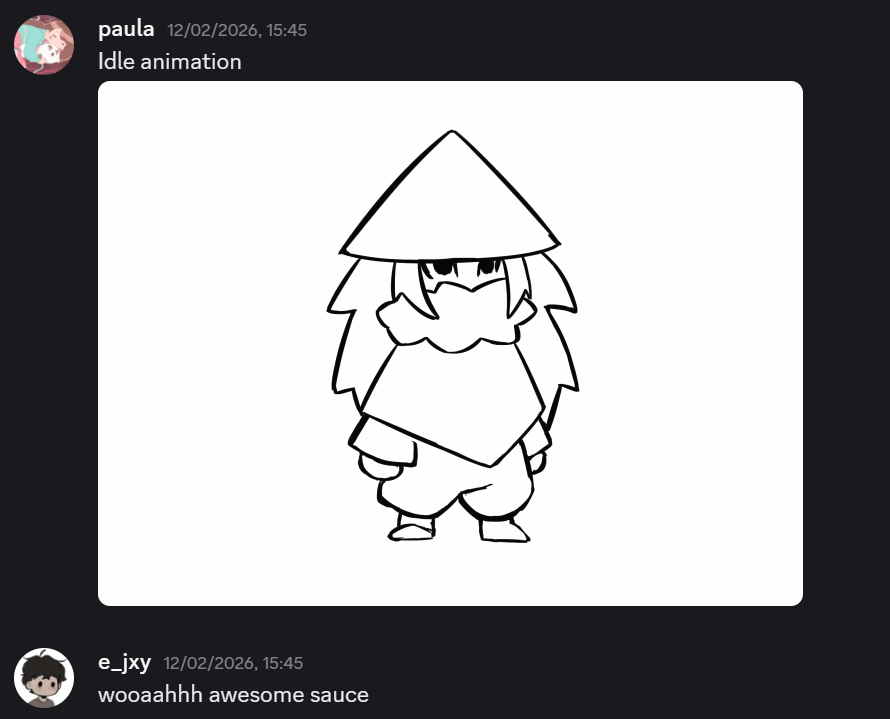
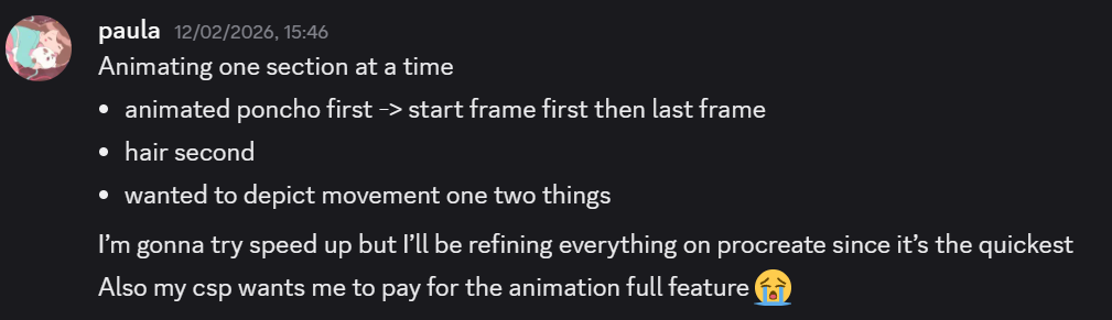
^ I took some notes about what I should be animating. I wanted to show movement in the hair and the poncho so it doesn’t look too messy.
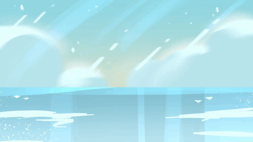
Placeholder Background
For the playtest, I asked E-Jay if it was doable to implement a background for the upcoming playtest. I also thought it would be an appropriate time to practice the art style that I want to go for in this project. I looked at Steven Universe’s background work and found out that it was made by Rebecca Sugar’s husband, Kevin Dart.
I really wanted to make this placeholder background glossy looking and have a “glazed donut” effect.
Playtest Day
For our playtest, me and E-Jay showed up relatively early and had a few people to play our games and had the chance to play some of our peers’ games. I took some notes down to remember what needs to be done.
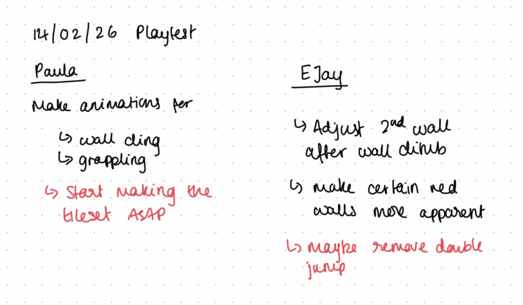
The main thing that was noted from this playtest was that players felt a bit frustrated that the hitbox was unforgiving. But this is an issue that EJ addresses. Here is a post leading to how he tackles the game play elements:
On my side, there wasn’t much advice given to me yet since this was the first build of our game and it wouldn’t have been possible to make enough polished art. However, EJ managed to put in the rough animations ready for this playtest. From watching people play our game, I realised that the character animations needed to be done soon and fast. Another thing I want to do is making the tile set and EJ agreed that I should get this done above anything else.
This is because the tile set will serve as the fundamental building blocks for each level. It can also be used as a taster to experiment with colours and line art.
Reflection
For the first sprint, I feel like I nailed some of the fundamental art down ready for future sprints. I especially enjoyed creating the concepts for our player character and hearing what my team mate had to say about my work and what I could do to improve and adapt to the game’s visual direction.
I also think it was a good idea to start off with one of the hardest hurdles for me to overcome, that being animation. Although the animation isn’t quite finished, attempting it quite early on gave me the opportunity to learn about timing, movement, and readability, especially in the character’s limbs.
Leave a Reply