This week, my team mate asked me if I could prioritise the tile set as this was the most necessary asset I could contribute as this time of production. This is because the tile set would form as the foundation of the environment and game play spaces. The completion of this task was imperative at an early stage as it was important for level construction.
While trying to develop a tile set, I encountered some technical difficulties with my graphics tablet. since I work more efficiently from my home space, the Wacom screen tablets the Uni provide (although a lot more high tech than my device), would not be a viable option for me. To adapt to this issue, and maintain production progress, I switched to Procreate. Although the app has some major limitations, it also provides me that extra accessibility; I’ll be able to draw wherever and whenever.
This sprint’s deliverables:
- Tile set
- Both animations and static character images
Tile sets
Attempt #1
Before the production of these tile sets, EJ requested a 7×7 layout. 1 tile would be 128px x 128px. These specifications would ensure that the tiles would integrate with the engine seamlessly.
I discussed with EJ in person that it would be best for me to make the rough outlines for the tile set. This would ensure that I did not waste any unnecessary time on work that would not entirely work in game. This decision served beneficial as when put in the game for testing, the tile set immediately showed issues with misalignment.

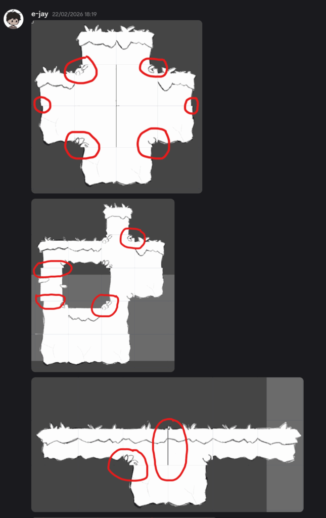
^ Above, we can clearly see that some of the tiles don’t even align properly and there is negative/invisible pixels in some of these tiles. Additionally, some of the tiles don’t even make sense. For example, the first image shows the corners not matching the line work of the tiles next to it.
This is something that I should be more careful in the future moving on. However, I am pleased that I didn’t jump straight on to finalising this tile set as that would’ve been even more wasted time.
For the next tile set I need to keep in mind of:
- guidelines to help line tiles up
- checking that tiles can match up next to each other
Attempt #2
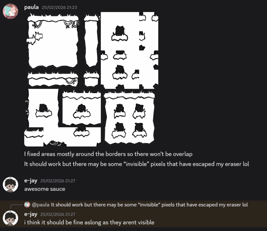
Within this attempt, I made the line work more thick and used a solid pen brush rather than one with texture. This allows the player to see what is interactable and will be able to easily distinguish between background and foreground.
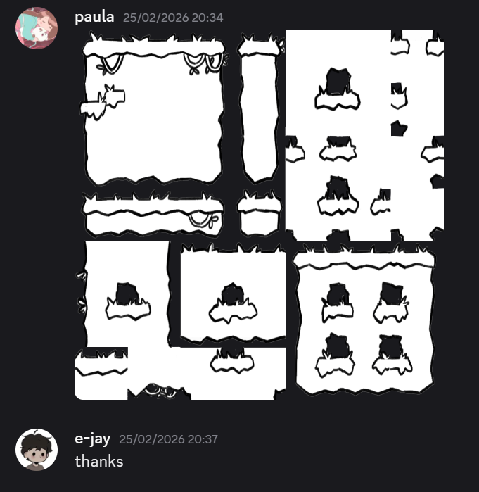
(The screen shots below show EJ testing this tile sets and informing me what needed to be corrected.)
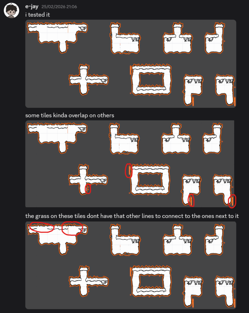
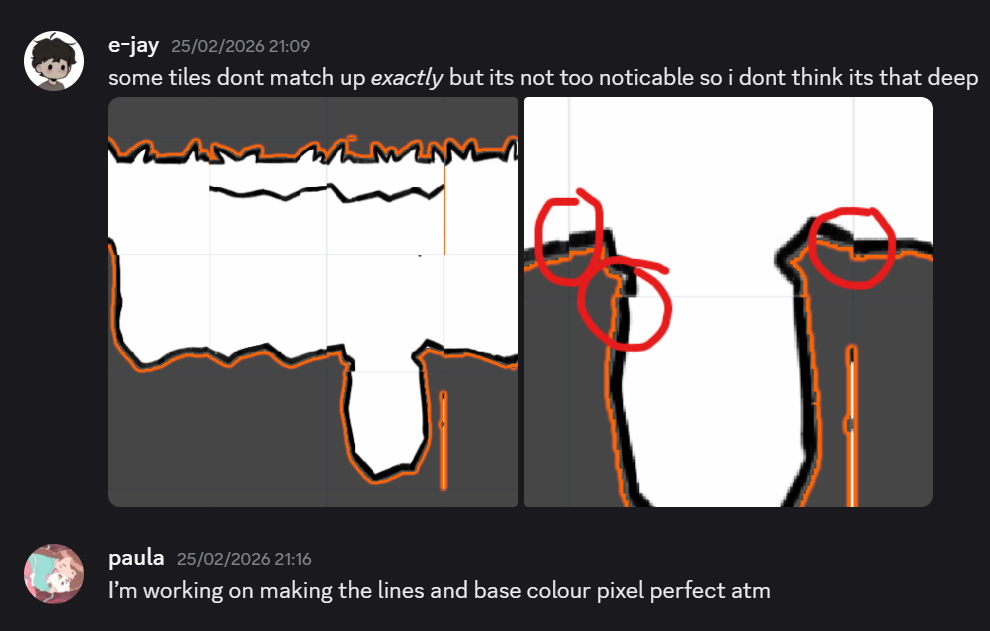
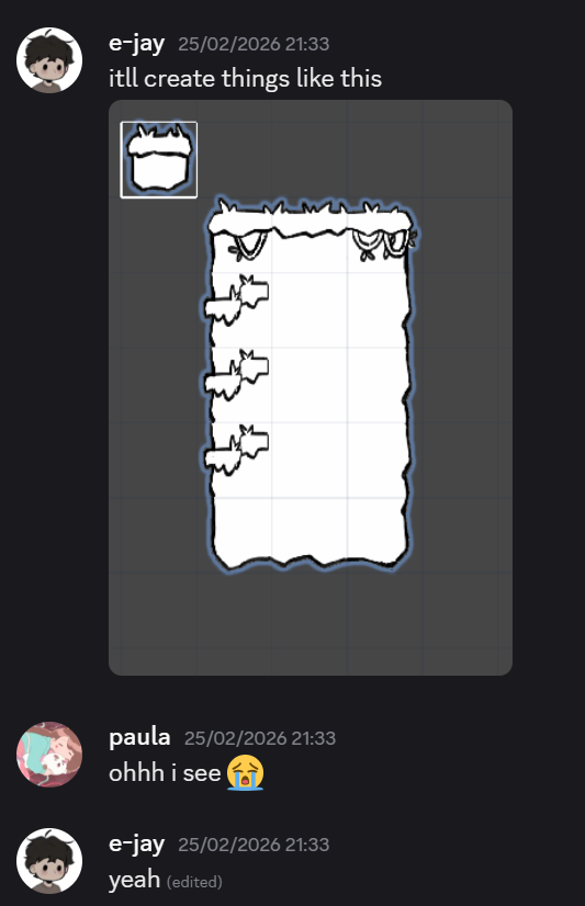
^ This time, tiles matched up better. However, some of the tiles did not align correctly. There would be visible gaps in between certain tiles and inconsistent pixel placement in between tiles. Additionally, there would be corner tiles that didn’t match with its surrounding neighbouring tiles. This meant that pixels can be seen when they aren’t supposed to (as seen in the circled).
Fortunately, my team mate reassured me that this wouldn’t be a massive problem that would destroy the immersion of the player. He advised me that I should try to keep the line work in each tile the same with little pressure sensitivity, so the strokes don’t vary too much.
With this attempt, I learned that I should use Procreate’s guidelines more to help me make the tiles match up. Additionally, I should also be more wary of trying to make the tiles “pixel perfect” as they don’t bleed into other tiles.
(Screen shot below) EJ had also advised me not to make tiles too individualised or else it becomes too obvious that the tiles are repeated. Moving forward, I needed to make tiles very simple with little detail:
Attempt #3
In this attempt, I changed the tile size for a single tile 130px. This would make my life easier on Procreate as the tools aren’t as advanced and developed as Adobe.
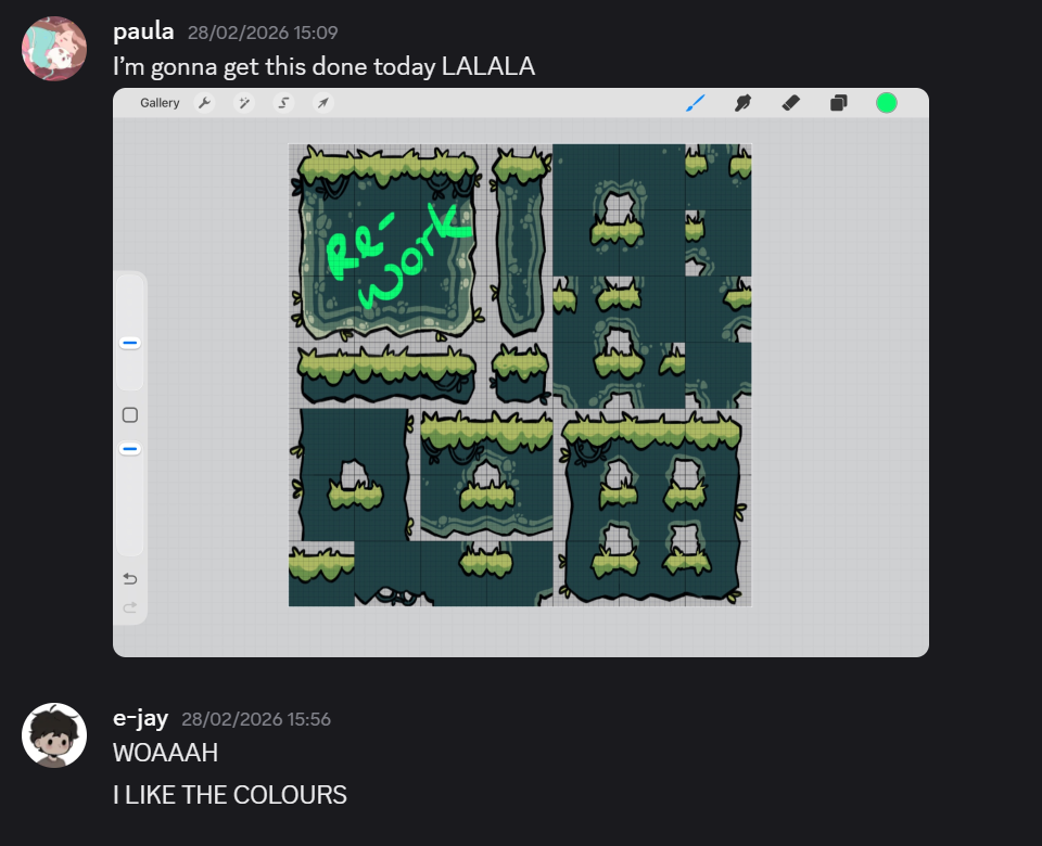
^ With this attempt, I was hoping to make it my last. This time, I changed the line work of the grass tiles to make them look more soft. I also found it too challenging to make seamless rock tiles for the rocks especially but I found other tiles on Pinterest that just textured rock tiles by giving them a light source and some randomly placed rocks for texture.
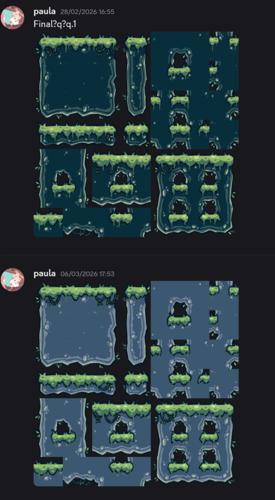
^ Here I sent two variations of rock colour. By the end of the week, E-Jay and I discussed that it would be best to use the blue one as the green tile set appeared to look like slime.
Animations
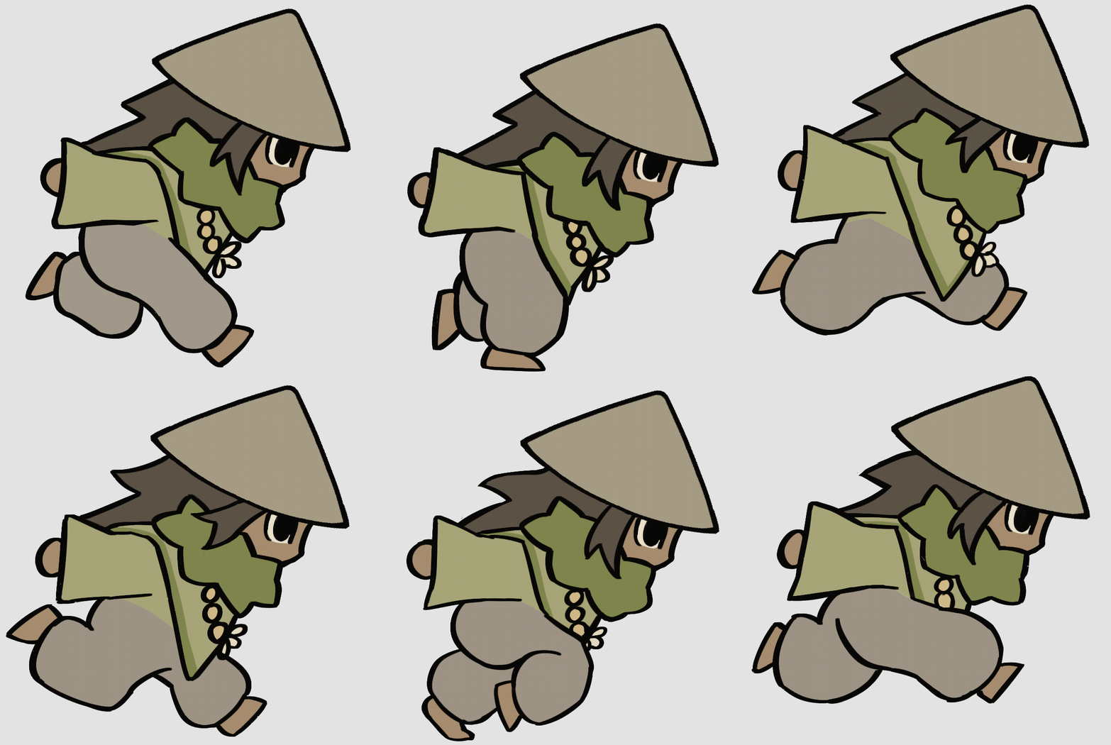
For the character animations, I used the previous place holder animations and just cleaned them up a tiny bit.
At first, I didn’t like how choppy the animation looked at first. Now looking at it, I’m glad that I made the decision to not make it look smoother. This decision supports the art direction of a hand drawn feel.
Run
Idle
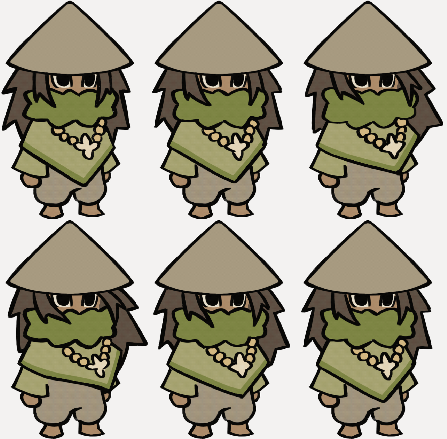
For the jump, fall, and wall cling I was requested to keep them as static images before compiling them into a sprite sheet for implementation. This method ensured that the animations could be integrated into the game without much hassle.
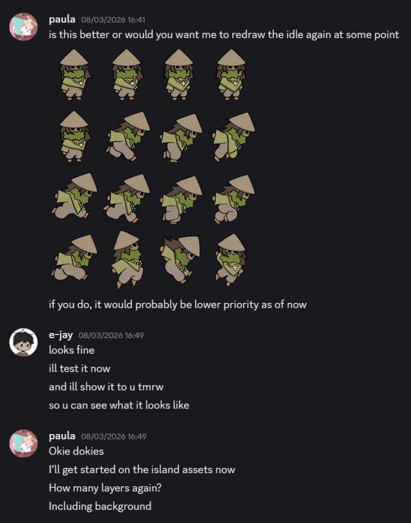
To continue this process I used an online sprite sheet generation tool sent to me by EJ. This allowed me to organise each frame and static pose in a more structured layout ready for implementation.
Throughout this stage, I focused on maintaining a clear and readable silhouette, especially with the line work, especially with the legs as they were the feature that stayed in motion. I copy and pasted the head line work as I didn’t want the animation to come across too hand drawn to the point where it felt like scribbles.
Sprite Sheet Maker | Final Parsec
Next week discussions
By the end of this week, I discussed starting on making concepts for the island assets and EJ helped me narrow down how many layers there would be in the game. This allowed me to think about what I needed to produce and how I would allocate time for each feature.
Defining these layers helped me identify what assets needed the most attention. This improved my ability to prioritise each task and maintain a more structured workflow.
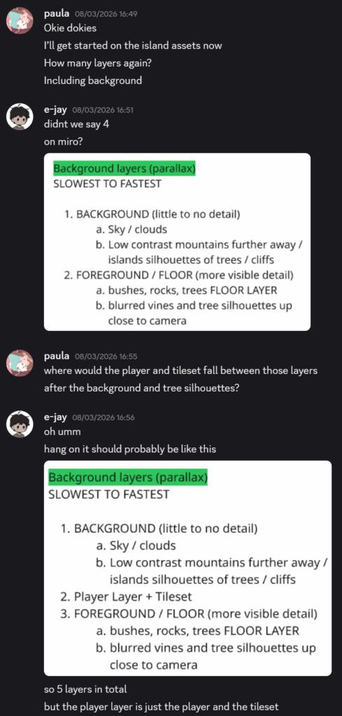
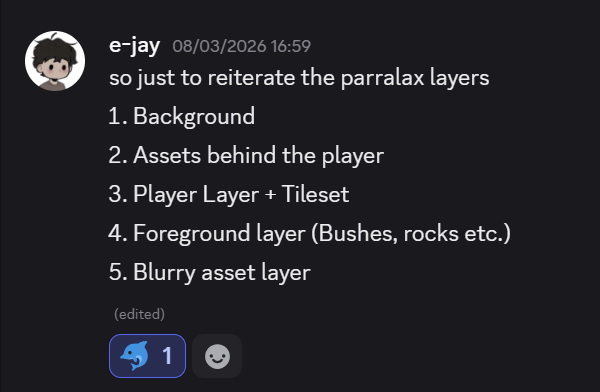
The screenshots above show me and EJ communicating, mostly him clarifying how the parallax background will work. How this affects me is that I will need to prepare what art assets will be required and how to allocate time to each of those assets.
Starting assets – overgrown island
Nearing the end of this sprint, I began to conceptualise the first playable island’s aesthetics. For this island, I wanted to give it a generic island feel with flourishing flora everywhere.
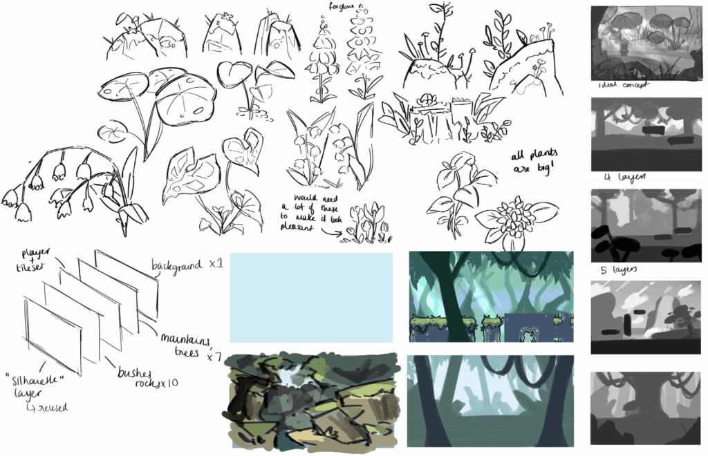
In the image above, I covered different styles of concept techniques. I started off by drawing generic plants and rock, seeing what works best in this environment. Then it dawned on me, I wanted to make this island sprawl with flowers and wisteria. These flowers would be purple and blue, the extra nature would be green. This would make this island’s distinctive colours green, purple, and blue making them all analogous.
At the bottom left, I mapped out the layers that would be required which was discussed with EJ. On the right side of the page, I started to sketch out in greyscale what the island could look like and how the layers would look like on the levels. I also used the tile set and experimented with colours for the background. Very soon, I started to make the assets:
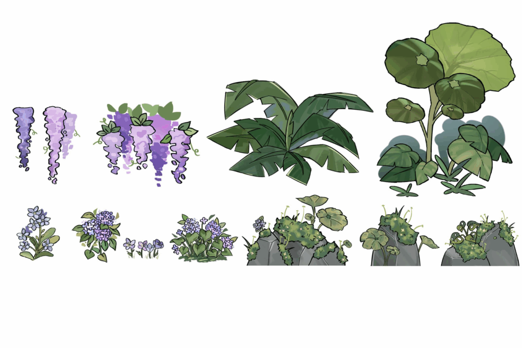
Above I limited the colour palette for consistency.
Mini reflection
I decided to make an early start with the assets and came up with several ideas as to what I could produce. By the end I came up with 12 different assets that would be used to decorate one island. I wanted to make the theme obvious for this island (overgrown and flowery), so to really make it obvious that the island hasn’t been occupied by other people, I added some moss onto the stones and other leaves.
By aligning myself with industry workflows, I was able to make this quite fast and ready for implementation.
Playtest – Playing our own game!
For this playtest, EJ asked me if I would be able to complete the island level! As someone who considers herself not an avid platform gamer, I felt like this was the perfect opportunity to play our own game. If I wasn’t going to defeat the game, I’m sure the majority of people would not be able to, this is why it was essential that I playtest.
In this test, we wanted to see if the average person could complete the game. If not, then we will have a major problem.
However, I found some of the platforming WAY too difficult. Another issue I was facing was that it was taking me too long to figure out how to get to the other side of the room. There was one room in particular that was quite unforgiving in terms of reaching the other side:
(Screenshot taken from EJ’s website)
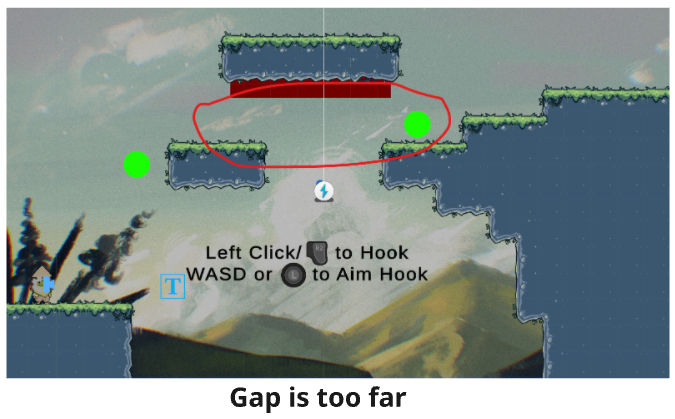
When I tried to grapple from one side to the other, it was almost impossible, the player had to almost fall off the platform in order to reach the next section. EJ admitted this wasn’t the intended way to reach the other way. One of the later rooms also proved too difficult for me:
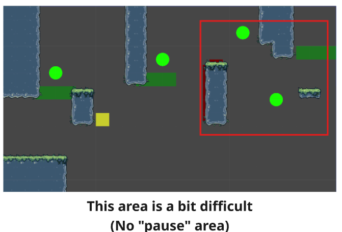
This room didn’t provide the player a break, this can cause frustration and make them stop playing the game all together.
Mini Reflection
What me and EJ have both learnt from this playtest is that, although the difficulty can be rewarding, there needs to be a balance between difficulty and accessibility. Playing the game myself and struggling to understand where to move next or dying repeatedly made me realise that extremely difficult games does not create engaging game play if the player becomes repetitively frustrated.
This is the post that leads to how EJ addresses these problems:
After playing the game, I realised that I should make the decorative assets for next sprint so we can populate the scene and make it look more immersive.
Sprint reflection
Reflecting on this sprint, I believe I have developed a deeper understanding of how technical aspects and visual design go hand in hand together some times and that they are essential for early development. Producing assets such as tile sets and sprite sheets demonstrates the importance of testing and adapting my work to fit within the game engine.
This sprint allowed me to step further out of my comfort zone and explore other regions of game art other than concepts. Through tile sets, I have learnt on implementation focused workflows which helped me develop a further range of practical skills. I also overcame a large anxiety obstacle— animation. 2D animation is one of the aspects of game art I actively avoid as I find giving images the illusion of movement to be quite tedious. However, this sprint allowed me to dip my toes into something more foreign. Although the animations I have produced are far from smooth transitions, I feel like the choppy frames offer a charming, hand drawn , and indie aesthetic which is what I was aiming for.
One of the biggest lessons I have learnt from this sprint is the importance of planning, which has been shown effectively in my tile set testing. Although the alignment in tile sets was frustrating at times, it was a necessary part of development and it ultimately saved time and improved work flow efficiency. As a result of this, it reinforced the importance that prototyping and testing assets before implementing into our game, improves workflow and quality of the final product.
Leave a Reply