After reflecting on the feedback from previous phases, I decided to revise the overall visual art direction of the game by introducing a felt fabric aesthetic that was originally conceived for the board game version into the current digital design.
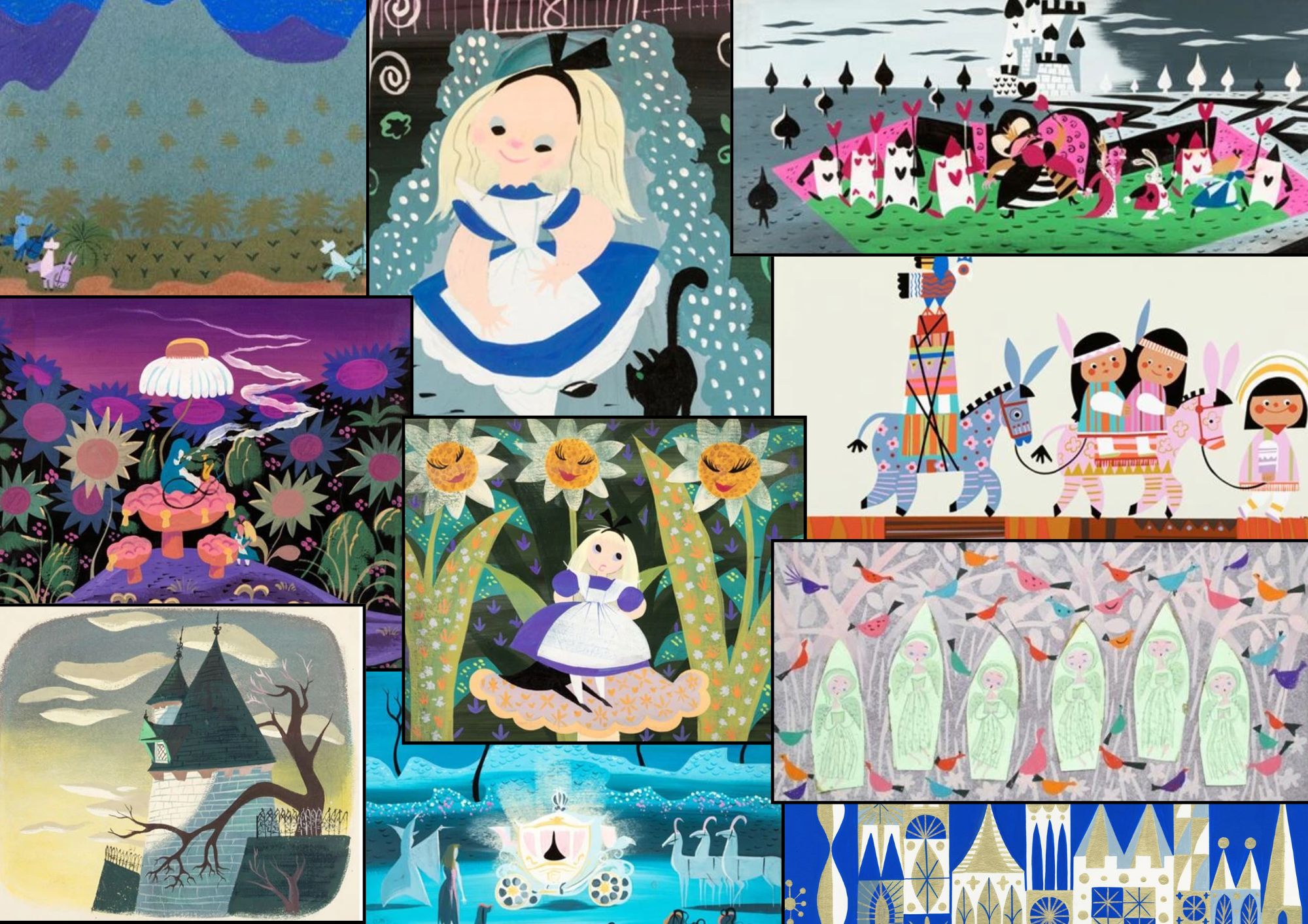
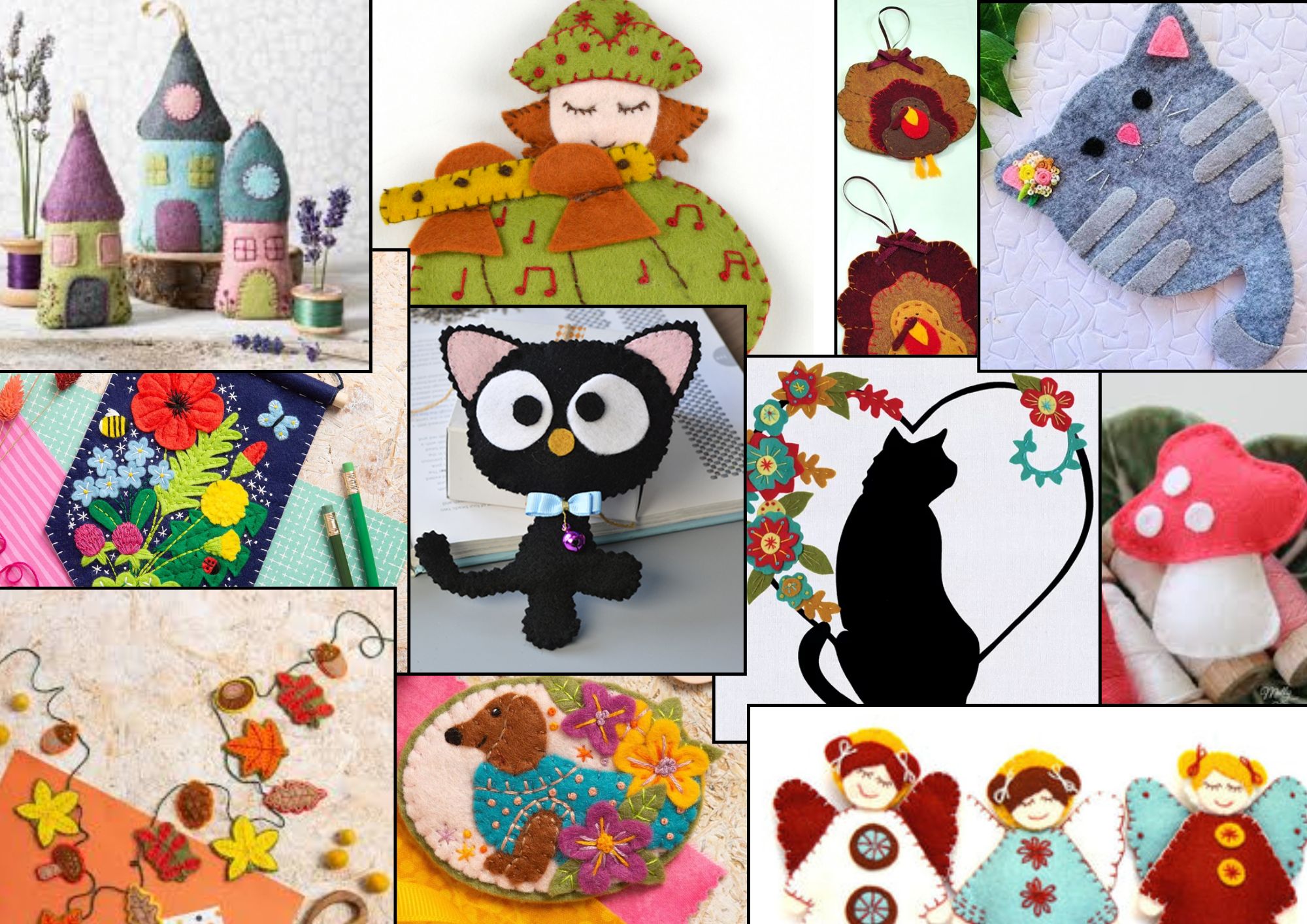
During my research, I studied the works of Mary Blair, one of Walt Disney’s favorite artists, and examined a wide range of felt craft references. Through this process, I identified several key elements necessary to achieve a felt-like visual style:
- Using large, flat color blocks
- Minimizing or completely removing visible outlines around individual components (face, hair, clothes)
- Representing structural or connective details through stitched lines, typically shown as dashed lines.
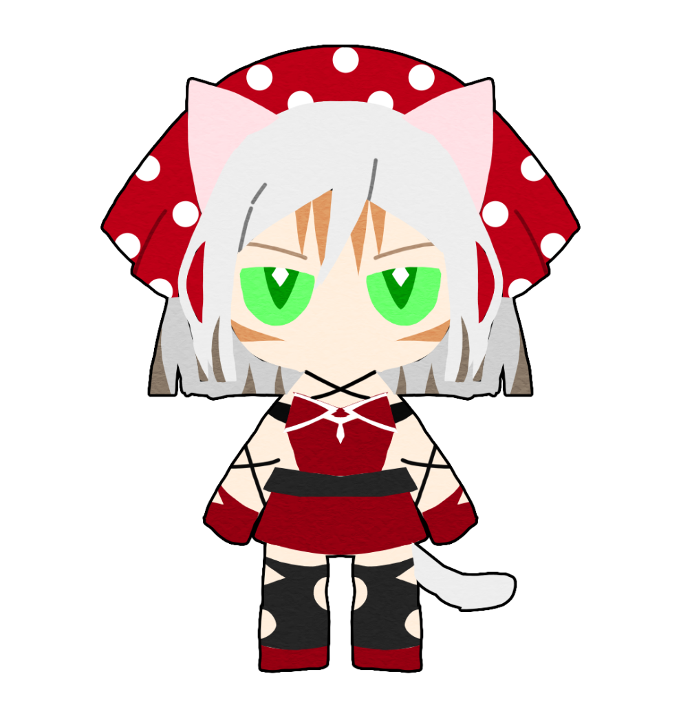
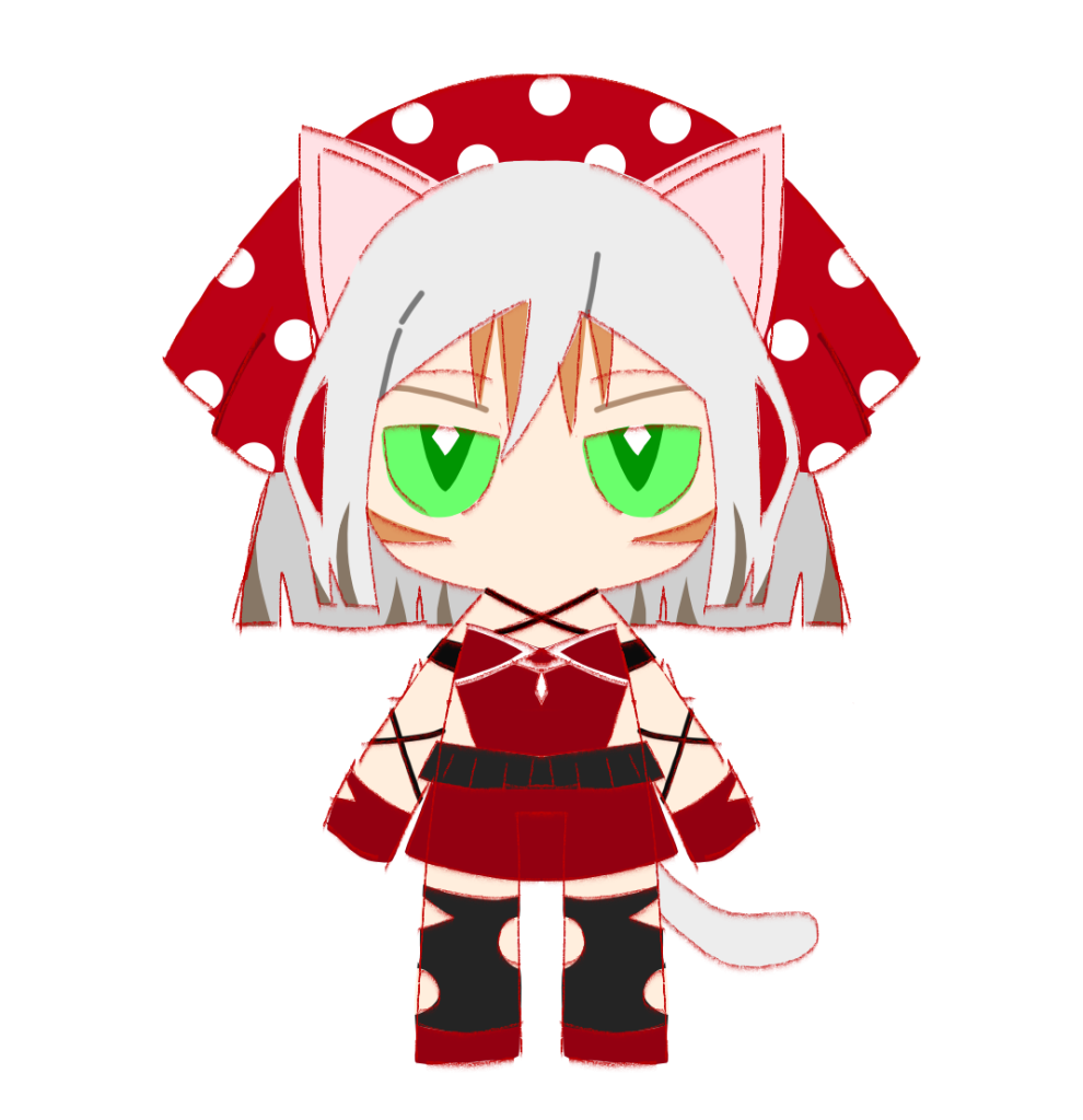
At this stage, I have experimented with applying texture maps to the draft visuals. However, the texture appears relatively subtle in lighter-colored areas. In future iterations, I plan to directly use scanned or photographed felt materials for digital cut-out compositions, or explore alternative texture maps with stronger visual contrast to better convey the tactile quality of felt fabric.
Leave a Reply