
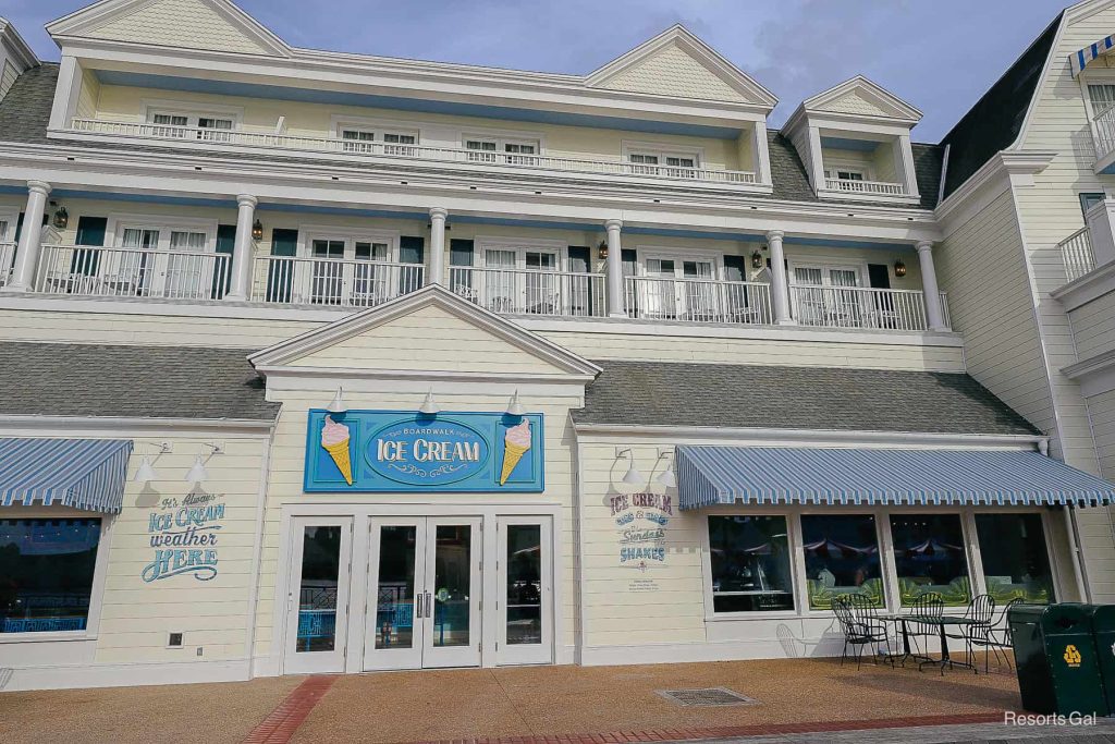
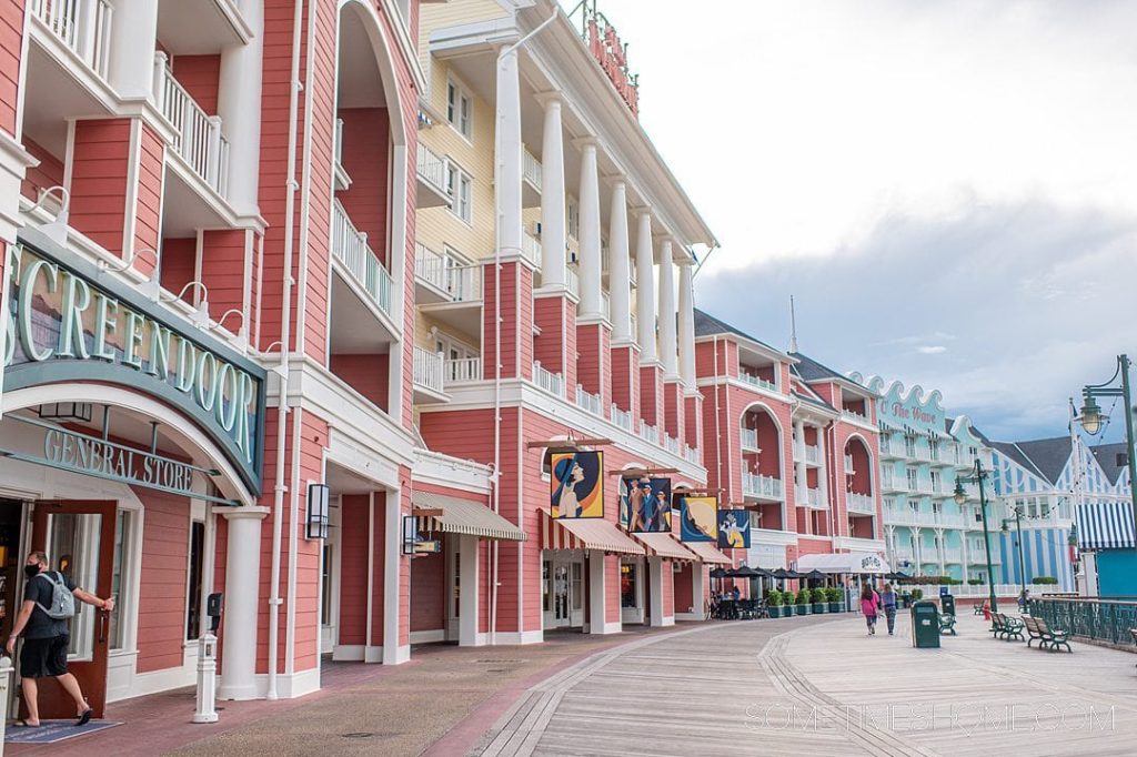
As my game is based around a childhood memory of Disney World Florida’s boardwalk, the location where my game takes place is also a boardwalk.
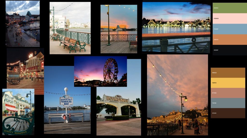
I have made a mood board using photos from the actual location, I also used the coolors software and created some colour palettes directly from the photographs. I want the world to feel exciting and nostalgic so soft but light colours are going to be important.
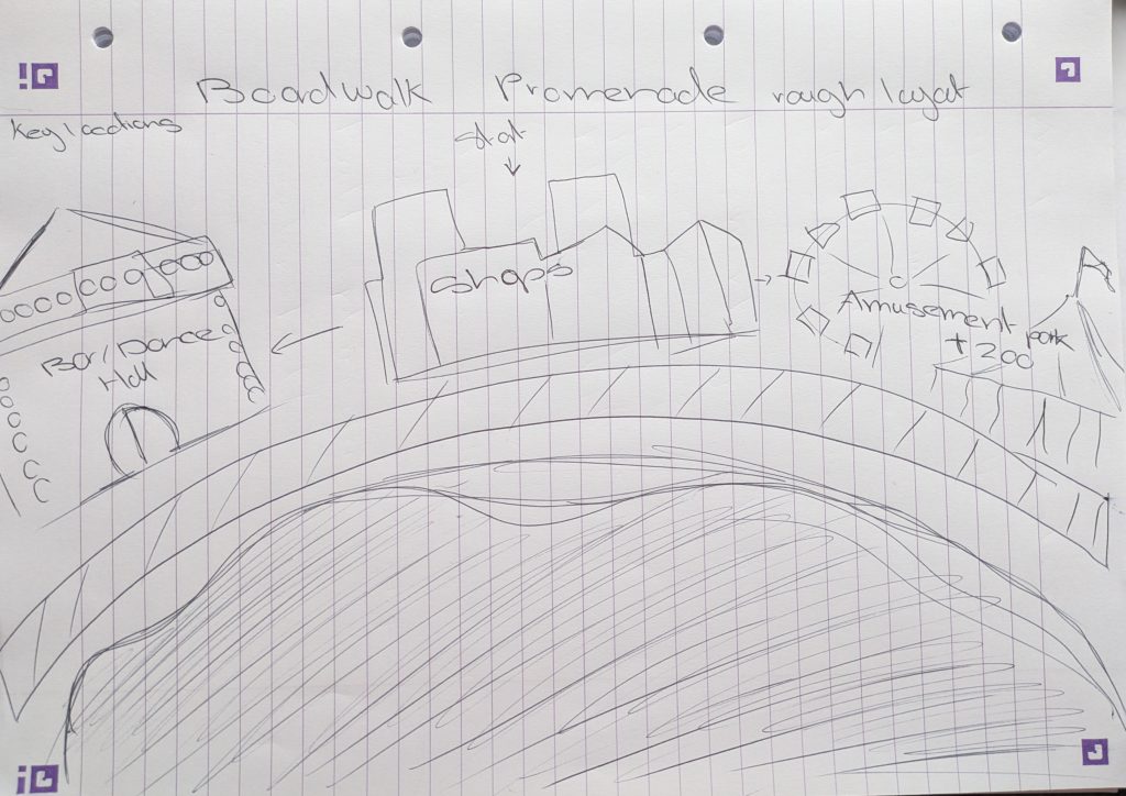
This is a rough sketch of the layout of the world. There is a bar/dance hall, this is based off Disney’s boardwalk as they had a famous piano bar JellyRolls when I was there. Then there is the shops and restaurant area fianlly culminating in a amusent park area and zoo. I chose these locations as amusement parks are commonly found on boardwalks and zoos are very popular amongst children.
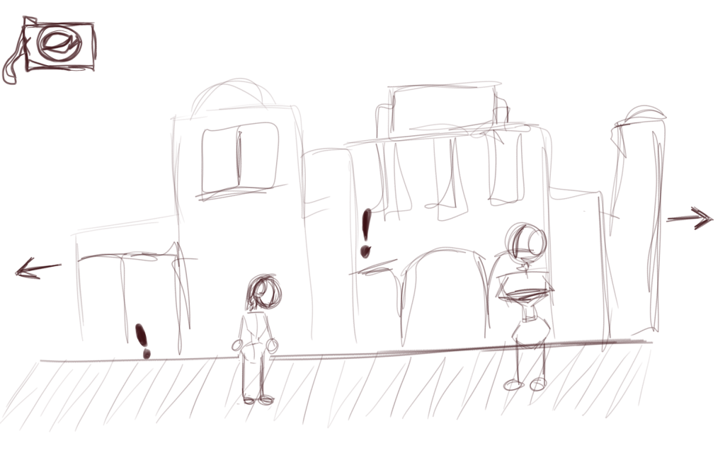
This is a simple mock up of what the screen could look like. The camera would link to an inventory. the exclamation marks are interactable hotspots and there is a NPC waiting to be talked too.
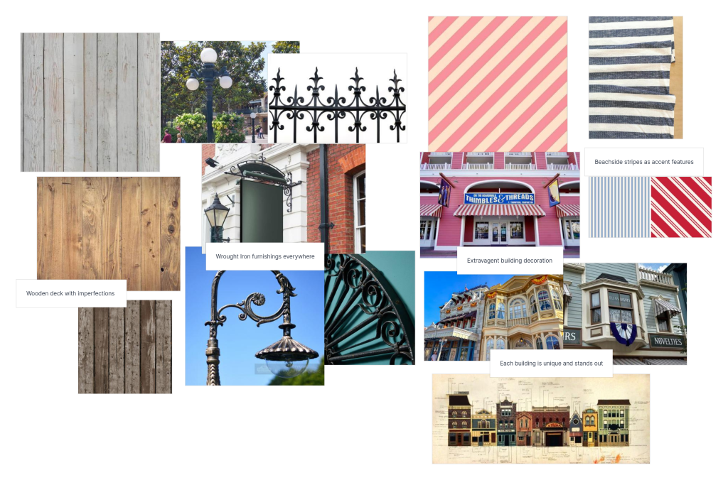
Making Concept Art –
I used Photoshop to create these images, working in grayscale to figure out values and textured brushes to try and create the blurry look I want.
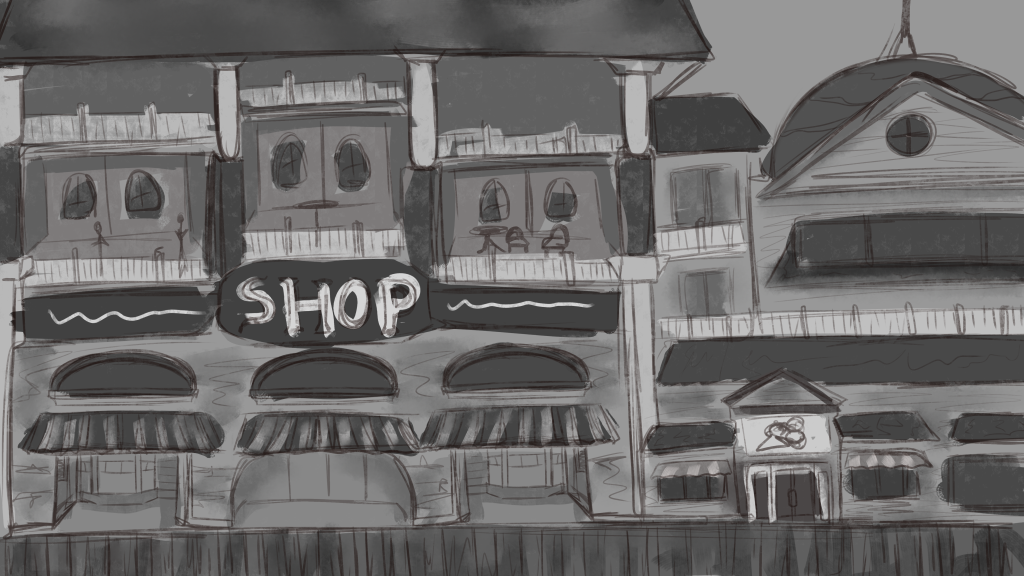
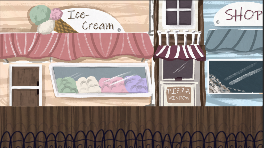
The first area of the game will be the shopping area. I have drawn a zoomed out version of the environment, I gathered lots of images of the actual boardwalk shopping area so that my design choices were informed correctly.
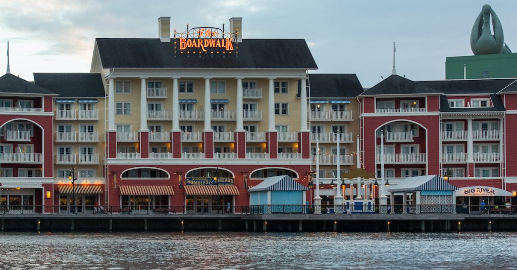
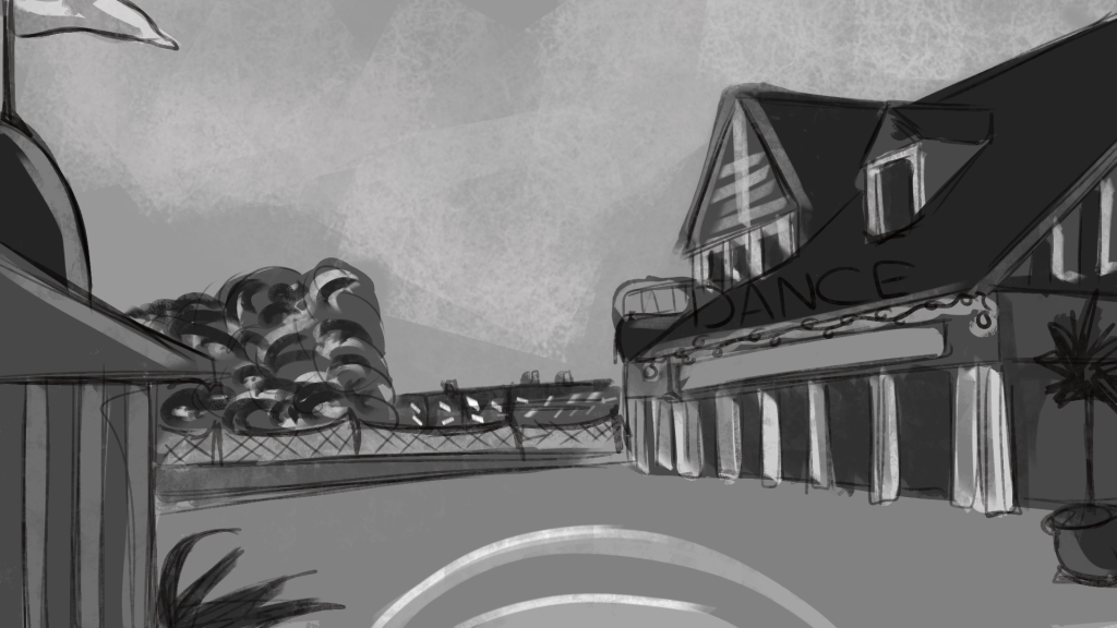
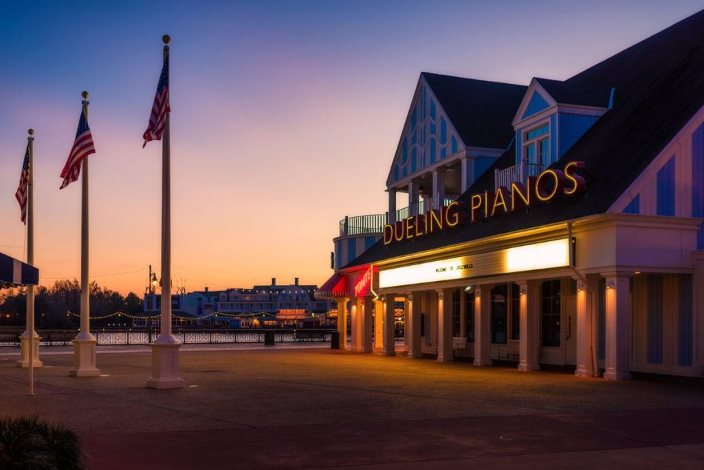
The second area is based off of Jelly Rolls. For this one I used a direct reference from a photograph, this helped me get the angle correct.
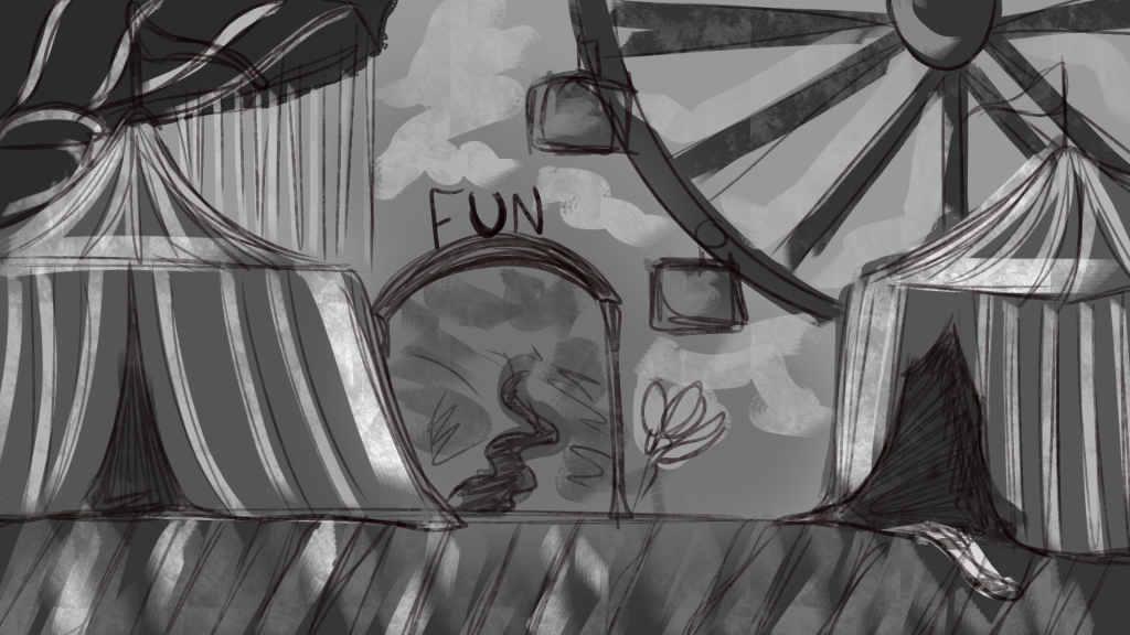
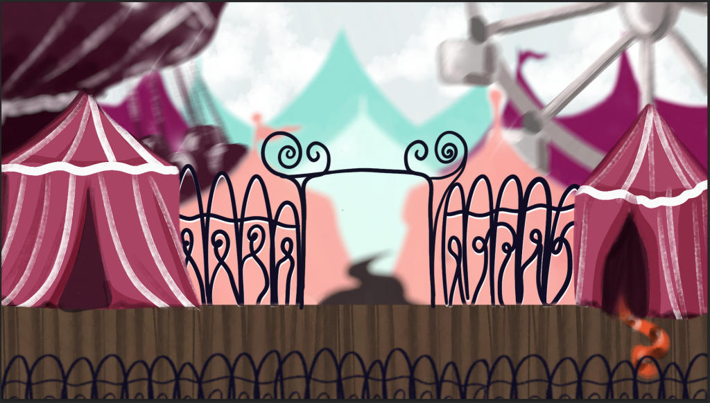
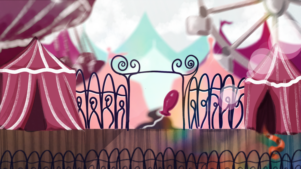
The final area is a fun fair, the player will see and hear the rides in the background, though the main focus will be on the circus tents at the entrance and the tiger which is part of a puzzle. Whilst the Disney Boardwalk does not have any rides there are performers and a funfair feel in the air, which has inspired this area.
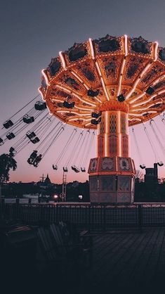
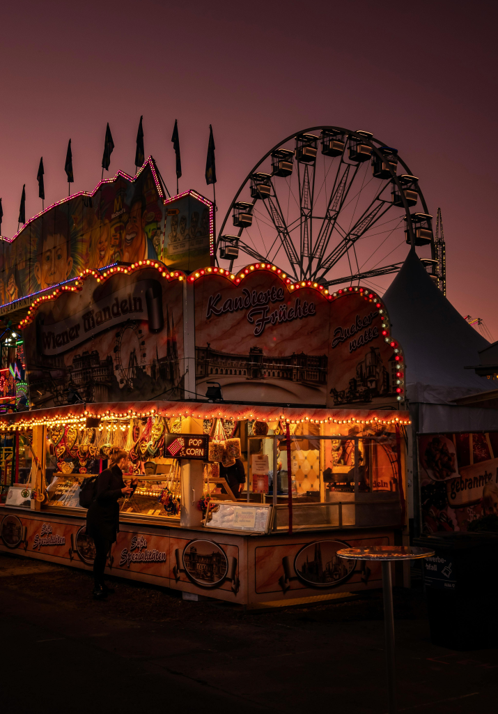
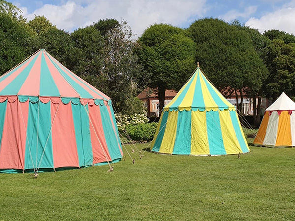
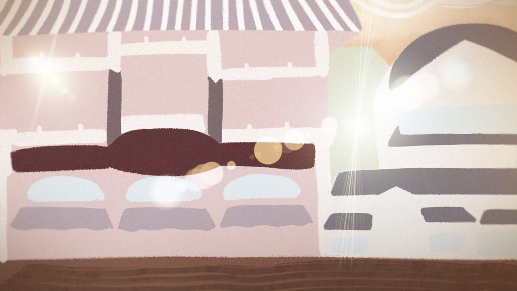
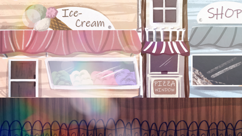
This is a test of screen effects in Photoshop. I used a large chalk like brush to block in importnat shapes of the shop environment, then I downloaded a pack of lens flare brushes and played around with different layer settings like overlay and glow to build the shine and glow effects. As my goal is to make it look nostalgic I tried to give the image a warm overlay as well plus a noise effect too. This was a helpful exercise as it let me get comfortable with the use of light and lens flares. I will have to be careful when creating concept art so that the effects do not take away from the scene by being distracting.
Location Concept Art
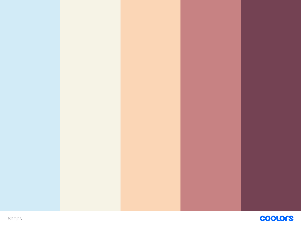
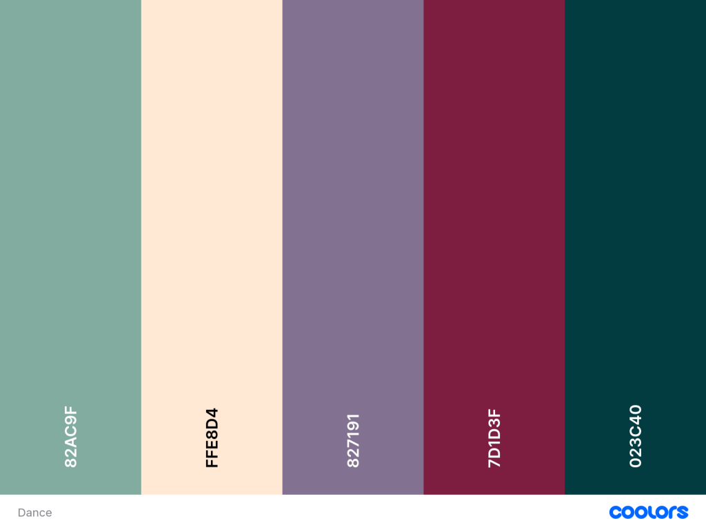
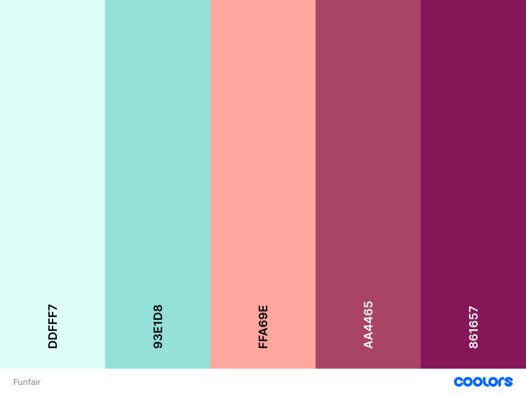
Before I started drawing the environments I went onto the website coolors and created three colour palettes, one for each location. For the shops I kept the colours light and pastel, then for the dancehall – a more mature night based location a darker palette and finally for the funfair I chose almost neon colours that are very bright and fun. These palettes need to reflect the locations atmosphere and vibe, I believe I have done this.
Shops

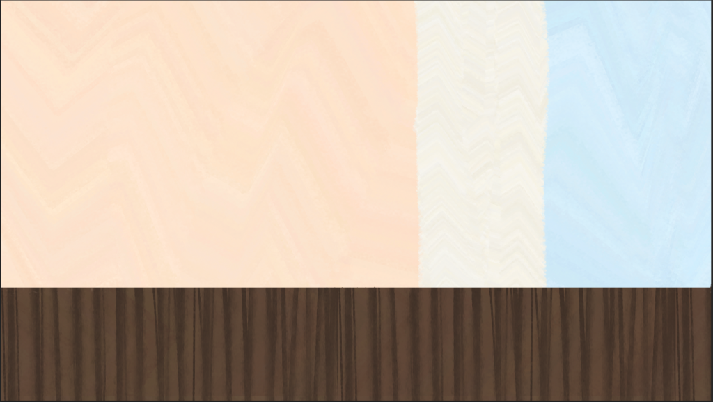
I began by using all of my references to sketch a simple line drawing, outlining all of the important buildings and parts. I then took the first three colours from the palette and blocked in the big shapes. I tried to give the piece lots of texture by using different brushes in Photoshop and playing around. To finish I added rainbow effects and lens flare to give it a glossy nostalgic feel, like my moodboards.
Dancehall
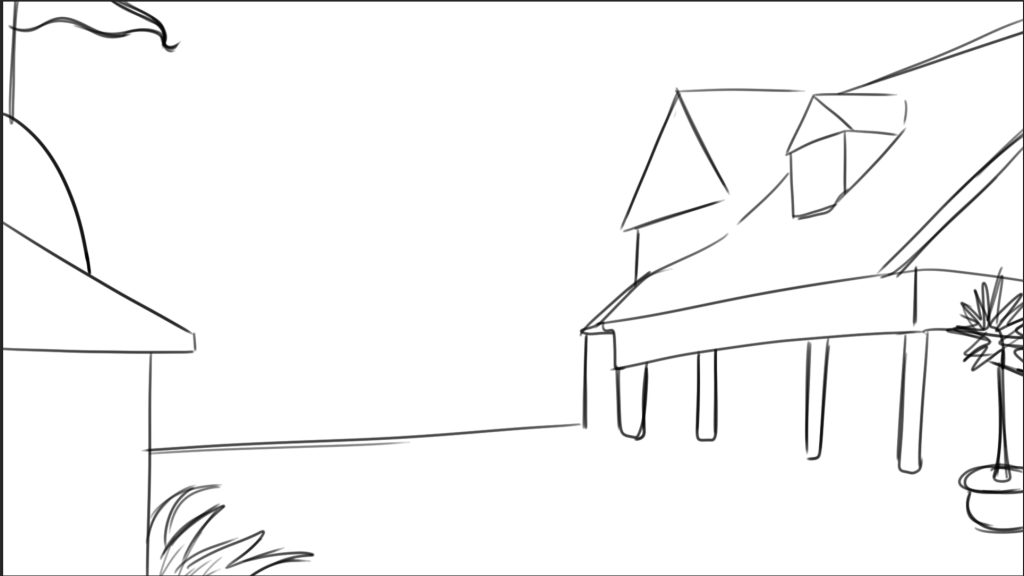
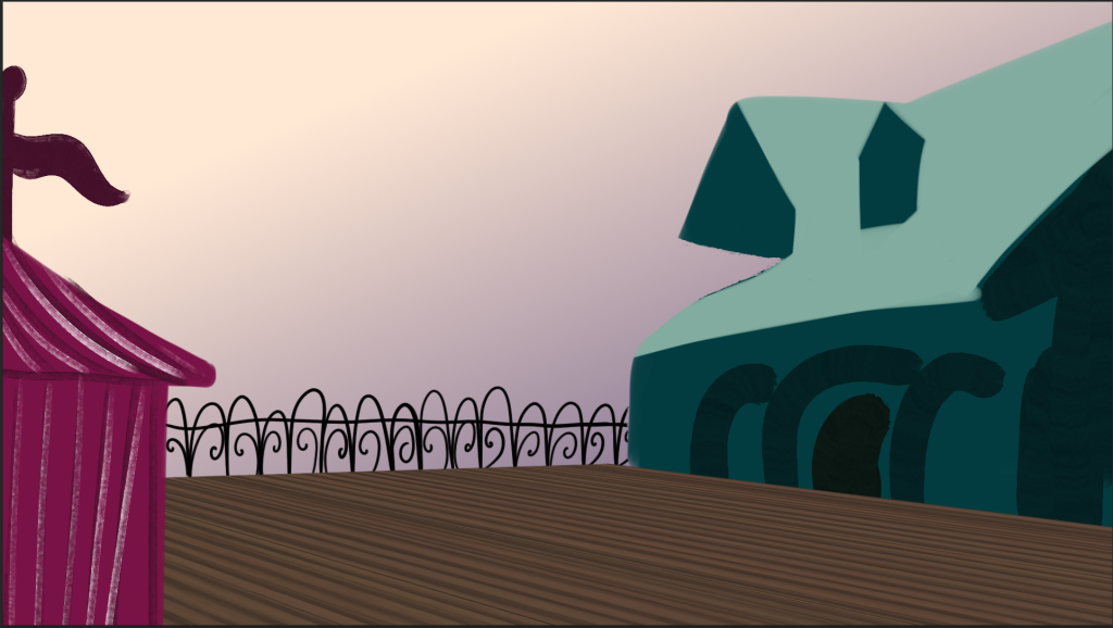
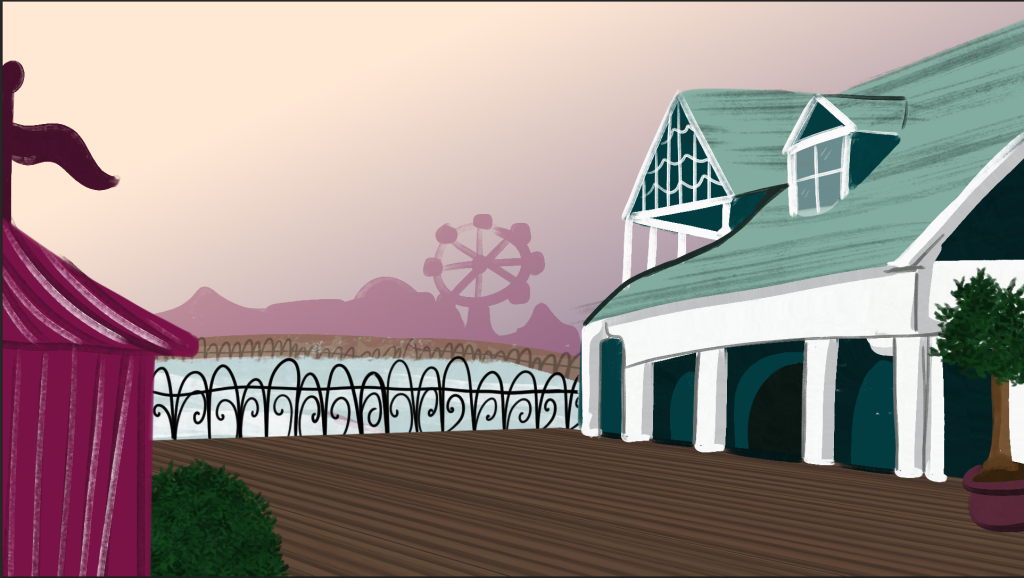
This location did not change much from the inital concept art so I only quickly sketched the buildings. I want this location to feel like dusk when the player is there so I used a warm yellow to purple gradient for the sky. I then blocked in the big shapes and slowly refined them adding the details. As the boardwalk is a semi-circle I icluded the location at the other end of the boardwalk the funfair. I also included effects and clouds to make it seem wistful and nostalgic.
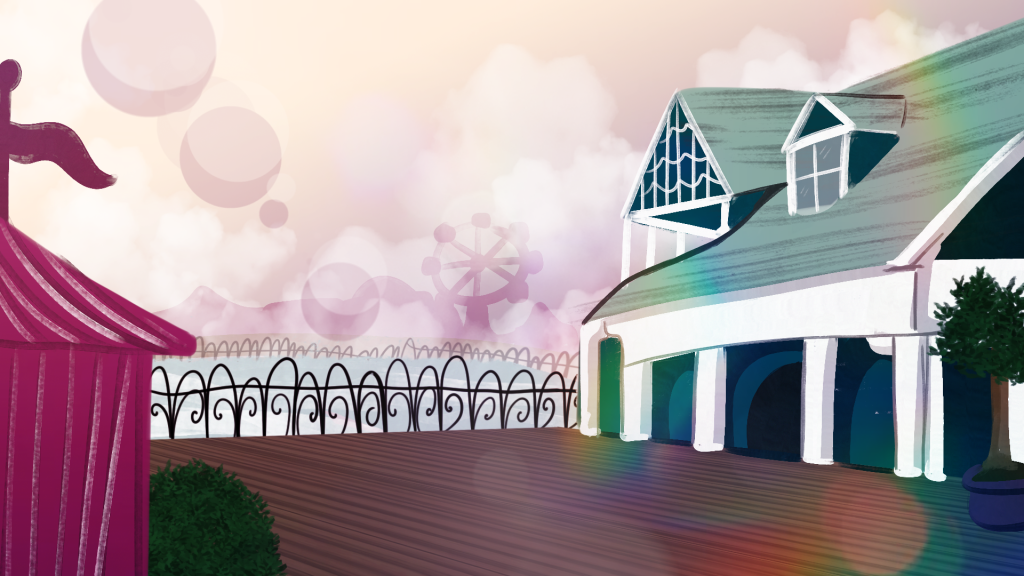
Funfair
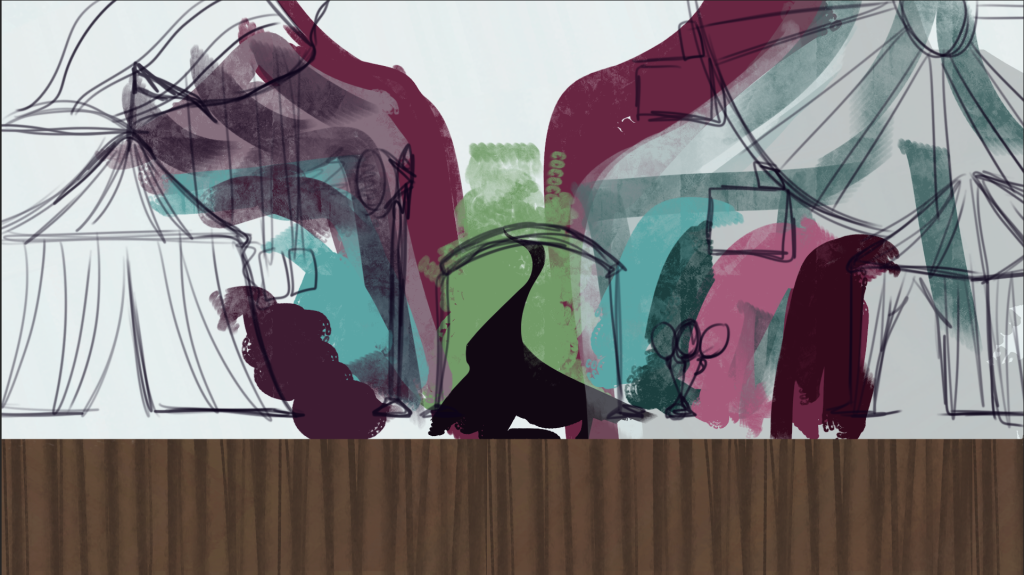
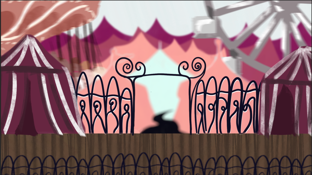
This was the hardest location to create, I had a clear idea of what I wanted it to look like – with the gates leading into the tents and attractions, but I was not entirely sure how best to represent it. In the sketch I played around with the different perspectives. After some iteration I was going to keep with the second image but ultimately I felt it looked to busy and the colours were still off. I removed lots of the tents to unclutter it and moved the two big attractions to the middle layer. I finished it by adding small details and the nostalgia effects,
Thoughts –
I am really pleased with how this development has come along, the final concept pieces accurately embody the atmospheres I want for the environments and I think I have created a way to imitate the images of nostalgia I collected at the beginning. As this project is to make a GDD not a finished game I am stopping with the concept art here as for presentations these capture what I want to convey and present.
Leave a Reply