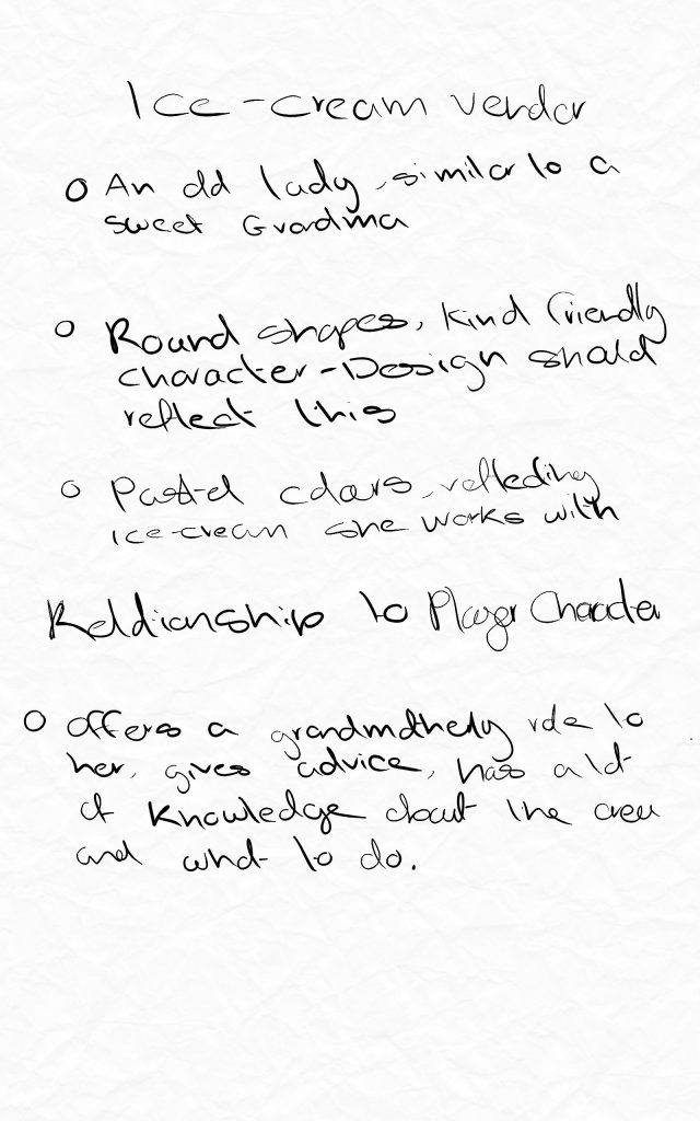
For the shops section of the boardwalk the NPC will be an ice-cream shop owner.
The vision for this character is a helpful guiding figure.
As the games story takes place in a childs imagination it would make snse for the character to resemble a grandmother.
Reference Board
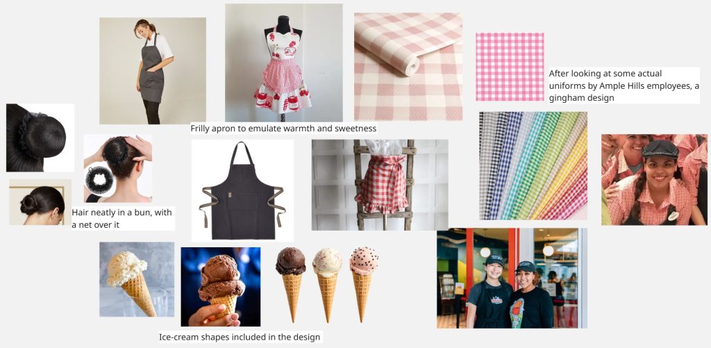
For the reference board I rsearched actual Ample Hill bakeries to see what kind of uniforms and colours they use. The common denominator in these were neatly tied away hair and gingham like designs on the uniforms. I also researched soft scoop ice-creams and want to incorporate the shapes into the design.
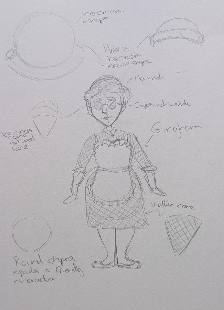
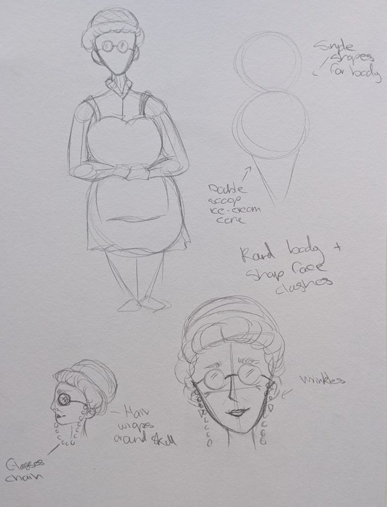
These are my pencil sketches. I began with the generic shape of an ice-cream, two circles on top of an inverted triangle. These lined up nicely with a round body shape. I also gave her hair that looks like a scoop of ice-cream. There was one problem that I ran into where I tried to make the face pointy as well unfort7unntaely this looked weird when put on top of the round body. So I will have to lessen the more obvious ice-cream shapes.
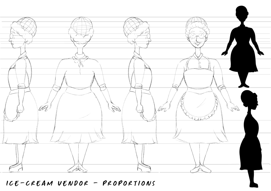
These are the Ibis Paint X turnarounds, I used the same method to draw them as when I drew Jace, using lines to keep thinmgs proportional and lined up. Although I had to lessen the more dramatic shapes I am still very satisfied with the shape language I used. She looks friendly and welcoming exactly how I wanted. For her silhoutte her hair is interesting to look at and the welcoming impression is still there.
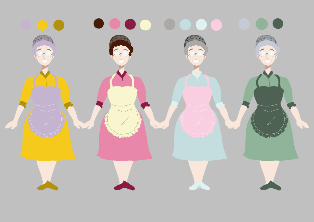
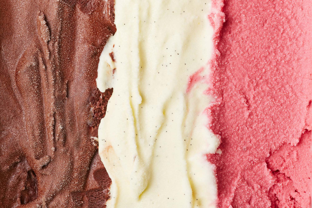
These are the colour thumbnails for her. I focused on bright colours, as the environemnt she is in uses pastels I wanted her to stand out. I chose the second colour combination because the colours complement each nicely making her pleasing to look at and the colours are based off of neopolitan ice-cream. I did not choose option one as though they are complementary colours the yellow does not suggest ice-cream to me. Option three was liked by my peers but it did not stand out enough in the environemnt as the colours where too similar it was also very alike the player characters design. Option 4 felt too flat and the green did not suggest welcoming.
Final Character Design
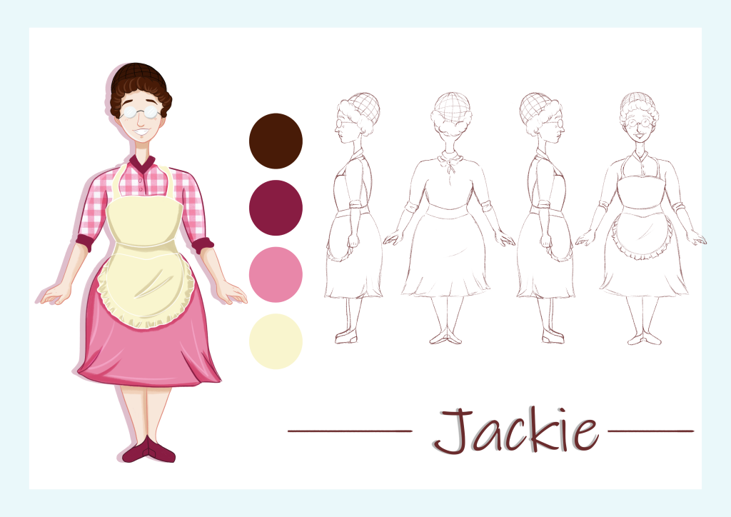
I am satisfied with all of the elements brought together. She looks how I imagined and wanted. The name came from the co owner of the real Ample Hill ice-cream parlours as her name is Jackie too.
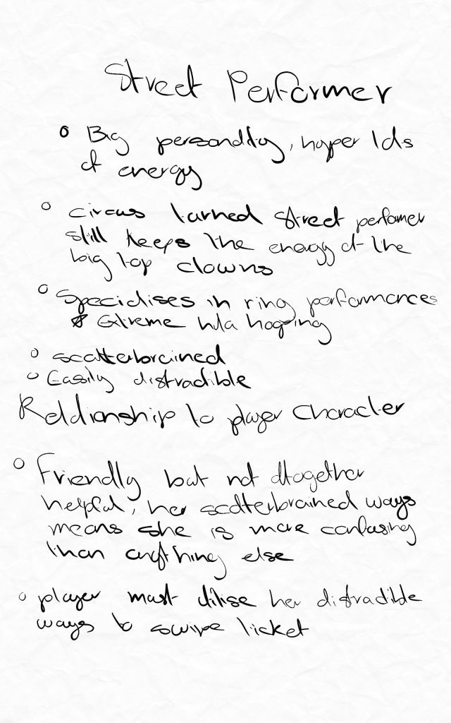
Earlier in this project I knew thgat I wanted a street performer as on the real boardwalk there are often many little shows happening. I did not know what kind of performer it was going to be until I saw a video online of a ring performer this sparked some inspirastion and I began making notes of the character.
She is a hyper energetic character, she both helps the player and serves to confuse them.
Reference Board
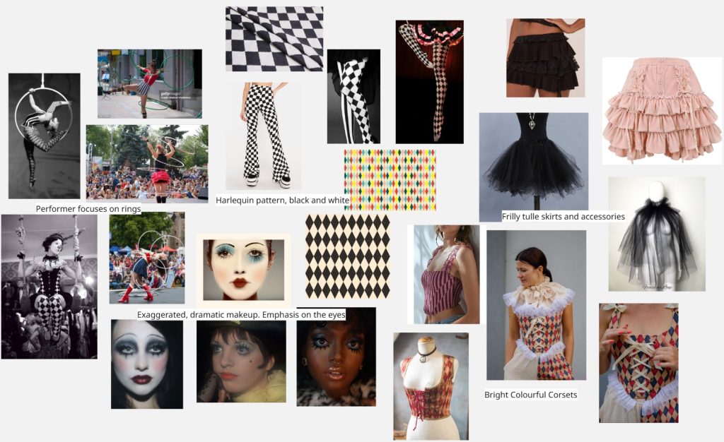
This is the reference board. My inspirations are mostly from a circus aesthetic, harlequinn patterns, lots of tulle and exaggerated face make-up. The characters personality is loud and bright I want her appearence to scream this as well.
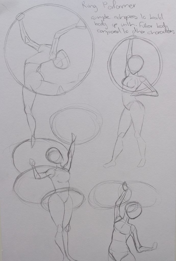
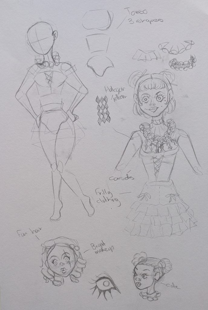
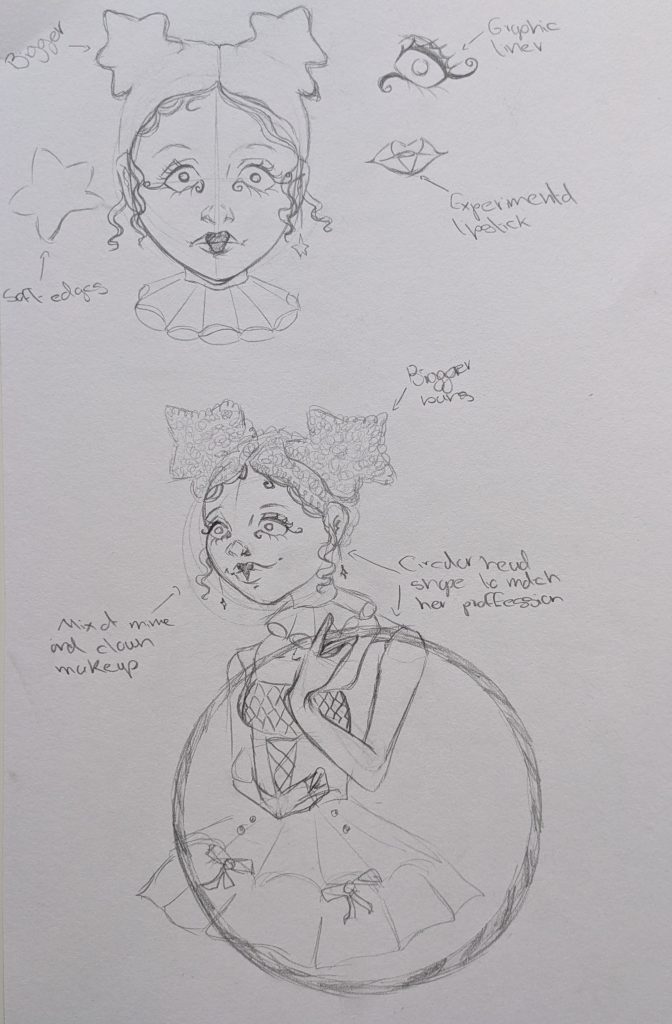
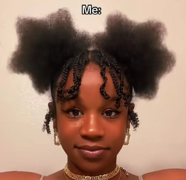
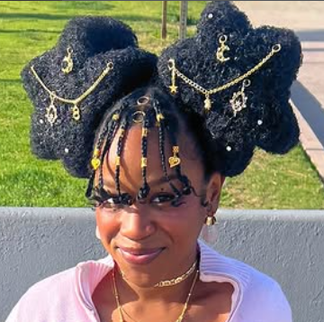
Once I started sketching her I did some observational drawings of actual hoop performers to see how they do it and what muscles they use, this helped me see that her body would need to be more complicated than the previous simple NPC’s shapes, such as splitting the torso into three shapes. For her costume I had a lot of fun with it, testing different materials and shapes plus corset make ups. For her hair I took inspiration from an influencer from instagram I follow who specialises in hair shaping, most known for her star looks. It was difficult to draw these at a 3/4 angle but they add to the look and communciate her fun personality.
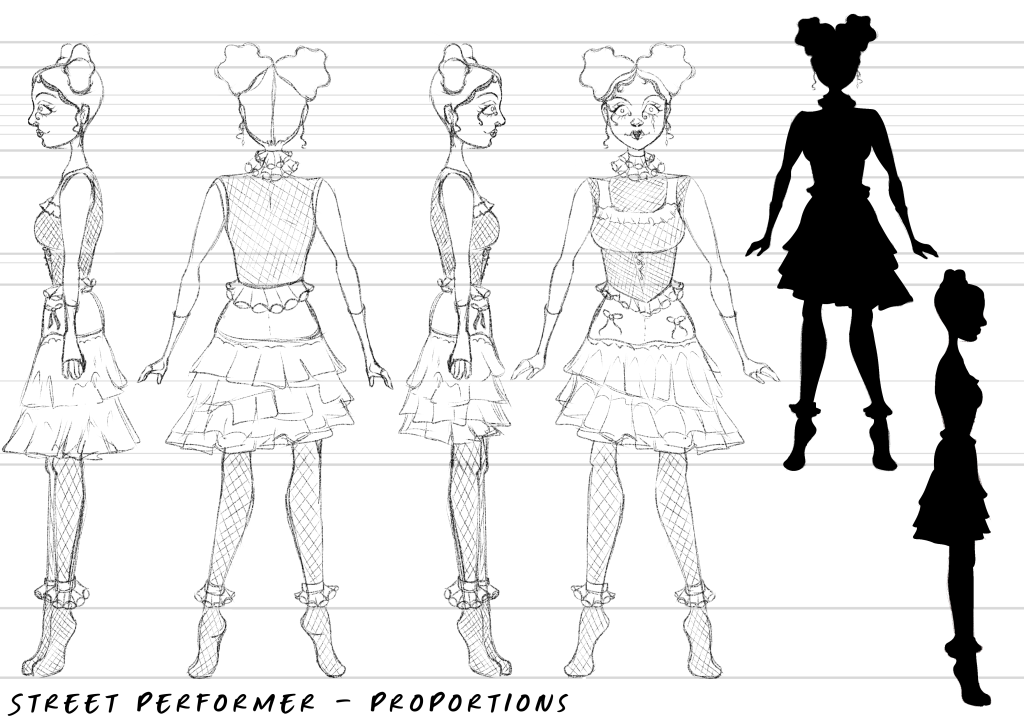
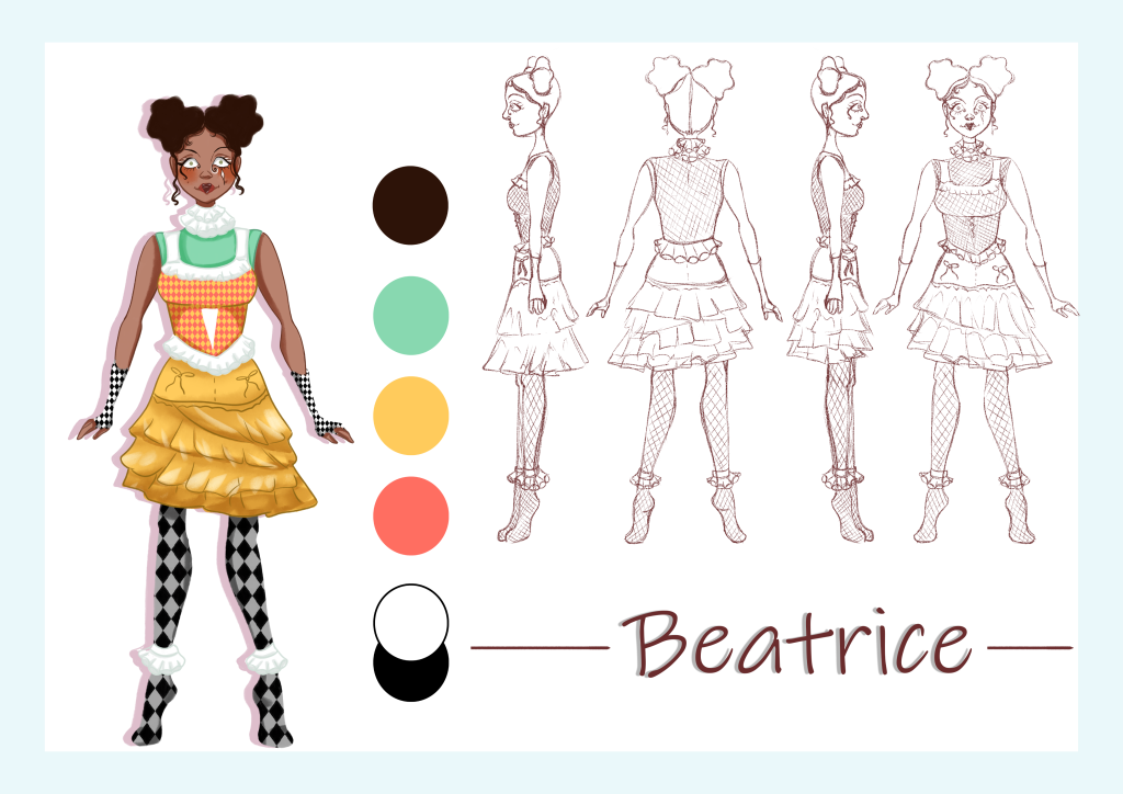
For the character turnarounds in Ibis Paint X I settled on the full design for her costume, adding frills and playful elememts to it such as the skirt being asymetrical. This created a very striking silhouette. The most difficult part was rotating her hair around and keeping the recognisability of the star shape.
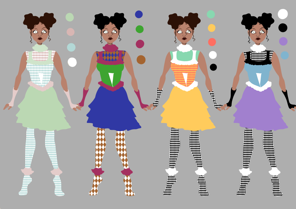
These are colour cominations in Photoshop, for the harlequinn patterns I just imported turxtures and used clipping masks to change the colours, this was easy and efficient so I could do these quickly. The first options colours are too pastel allowing her to be washed out. The second option feels to dark and though I want her to stand out in the environemnts this would look too out of place. I chose option three as my peers liked it and it was more fun, staying in line with her personality more than option four.
Final Character Design
I really like how this design came out, she looks fun and quirky exactly how I wanted her to look.
One of the NPC’s in my game is loosely based off of the real life piano players at the actual Jelly Rolls location.
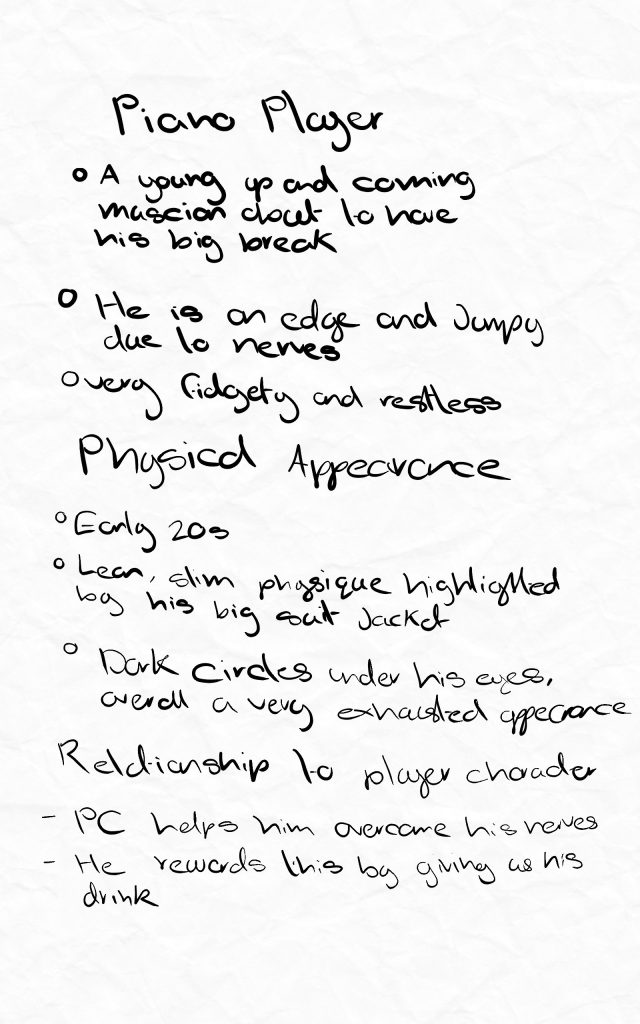
These are notes I made about him, focusing on his physical appearance and his relationship to the player.
He is very young, only just getting his first professional gig so when I design him I want his appearance to reflect all of these aspects.
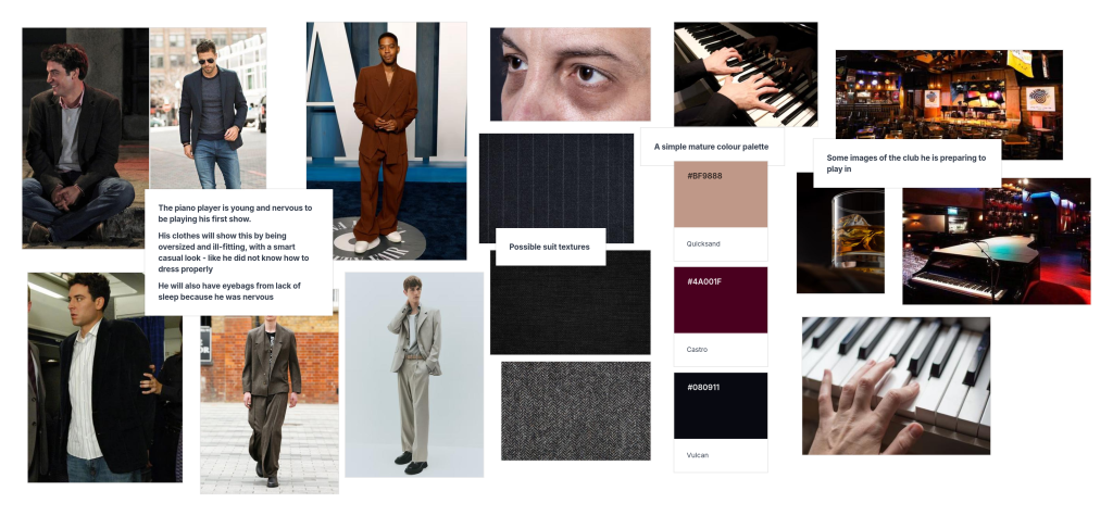
Reference Board
This is the reference board I created for the character. He is new to the professional music world so I gathered images of baggy clothes to suggest that he is scared by the big responsibility the job brings, he still feels like a kid playing dress up in grown up clothes. I also looked at actual piano players and saw that many have developed long skinny fingers to easier reach the keys.
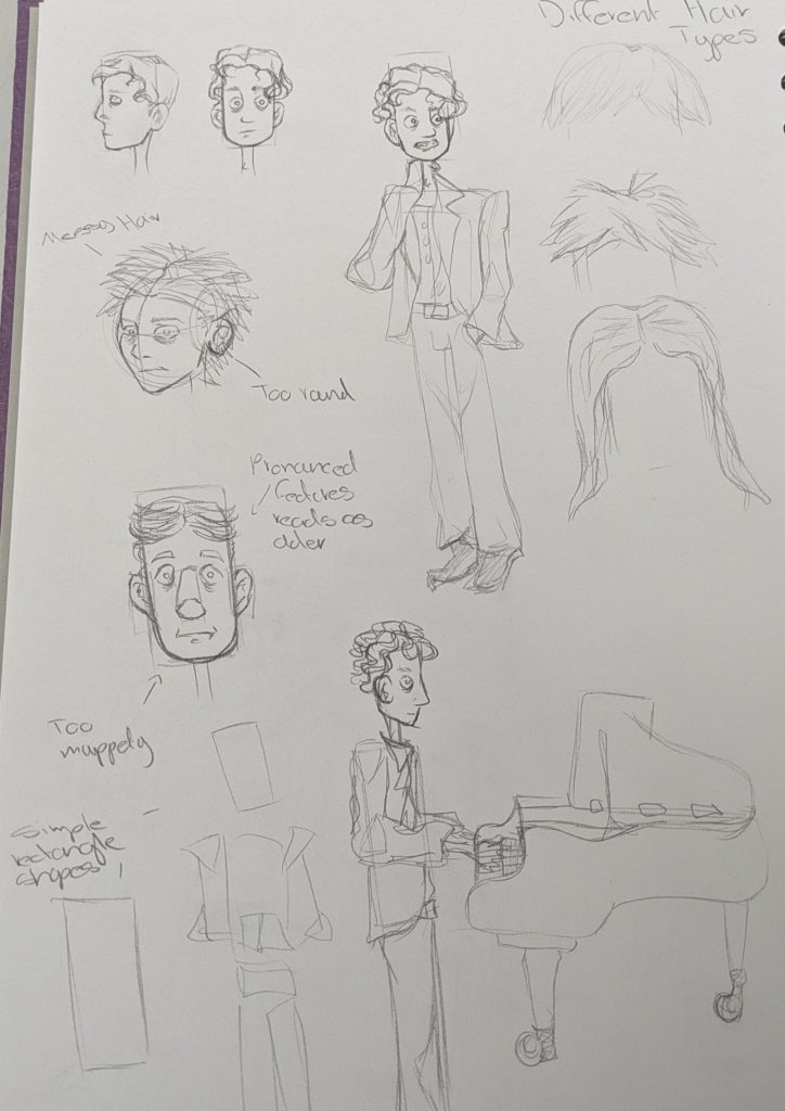
After my reference board I began sketching him. Starting with basic block shapes to figure out his proportions and physicality. I liked the ones that emphasised his height and legs making him feel and look awkward. For his actual face I played around with different shapes but found myself drawn back to the long rectangular face, I felt it also resembled a piano key. I initally liked a messy haired lookkeeping with the theme of him feeling out of place but I thought it looked too careless and that is not one of his traits. Eventually I found a curled style that can still look slightly unkempt but ultimately suggests that he cares about his appearence, he just lacks experience.
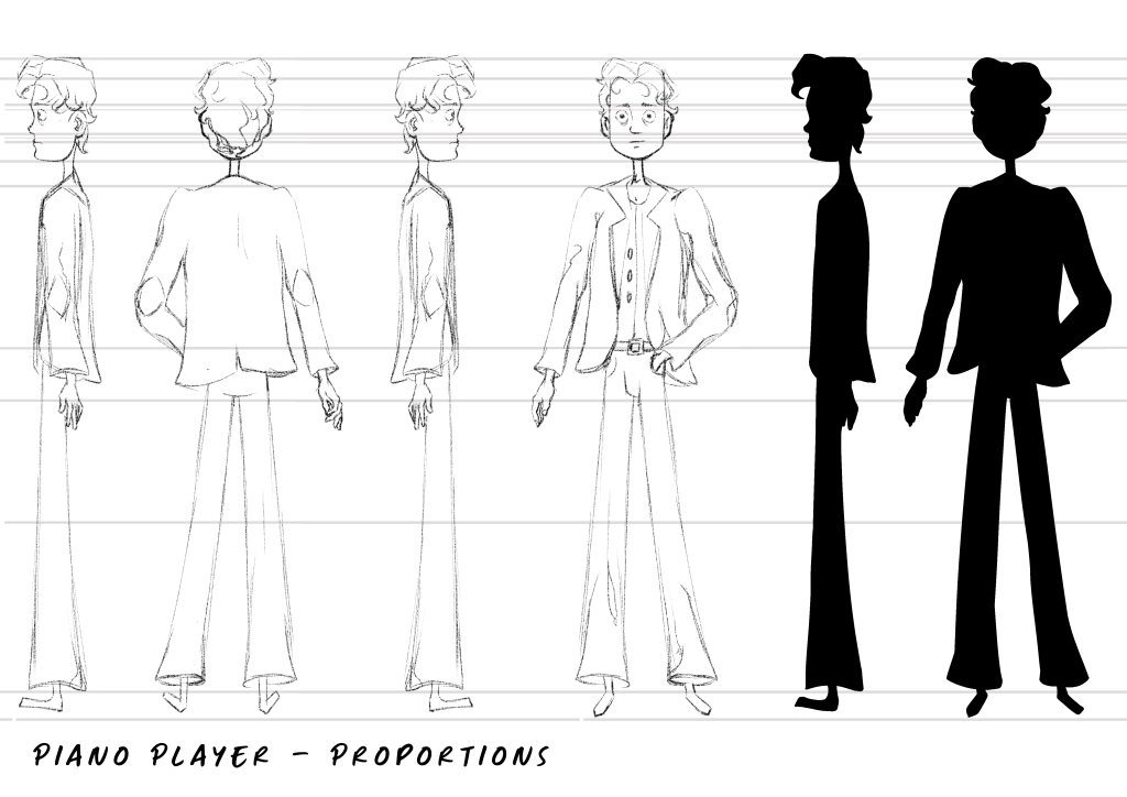
After my pencil sketches I used Ibis Paint X to finalise his design more and make a turnaround poroportion sheet. I started with the forward facing one incorporating the elements I previousely looked at. Then I drew lines from each important part such as hip placement, size of head etc. and began drawing the side profile. I am really pleased with how this came out as I am not very experienced drawing turnarounds. I also tested the silhouette of his design seeing if it is recognisable and if any parts are unclear. I think it is a successful silhouette as the contrast between his skinny neck and larger torso communicates the baggy clothes and his hair nicely breaks up the uniformity.
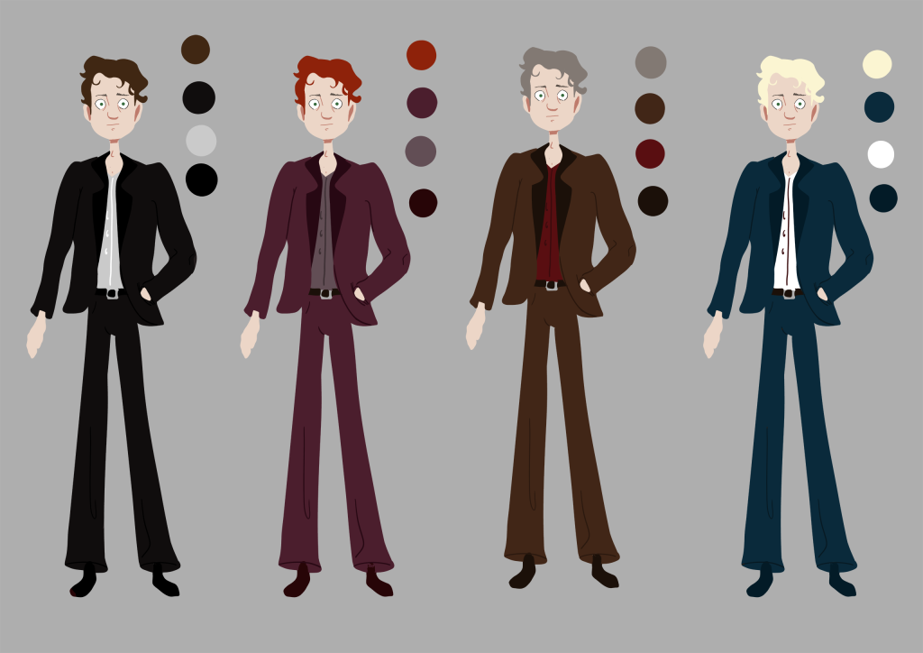
Once I had a good base sketch, I went into Photoshop and used a large blocky brush to create some colour thumbnails. So that I could see the colours for what they are I used a neutral grey background. After making the reference board I knew that I wanted subtle deep tones for the colours to reflect the establishment he works in. Once these were done I showed them to my peers for feedback and most of them liked the red one. I went with the decision as I also belive this one suits him the most and the ginger hair looks more youthful.
Final Character Design
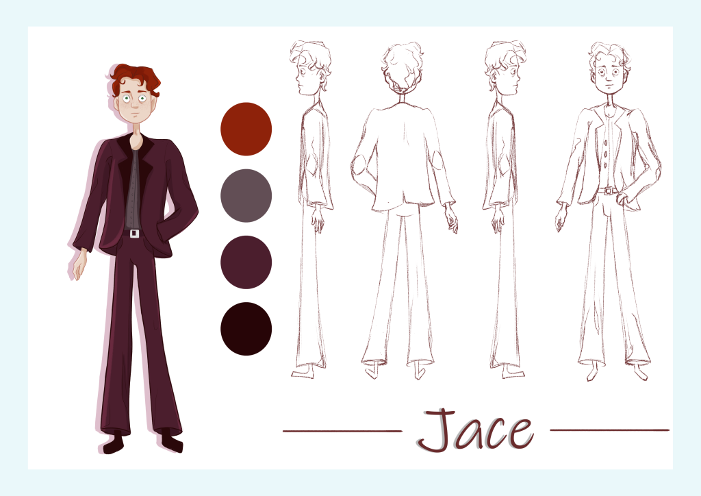
I am happy with the harmonius colours and his appearance I think I have accomplished what I wanted to communicate with the character design.
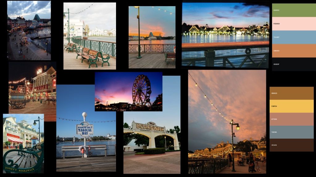
As my game is based around a childhood memory of Disney World Florida’s boardwalk, the location where my game takes place is also a boardwalk.
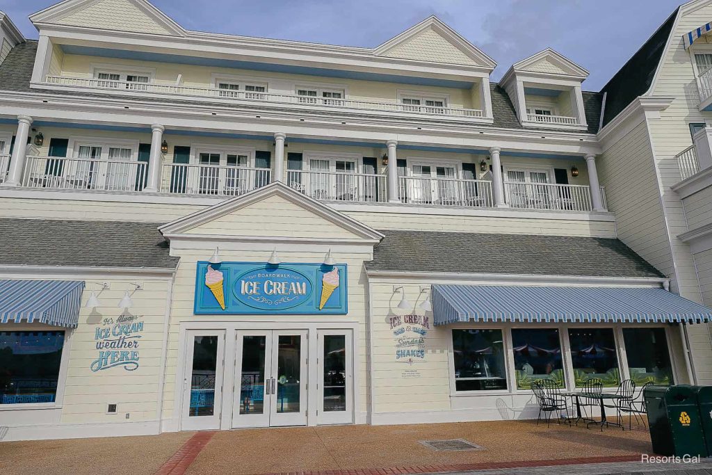
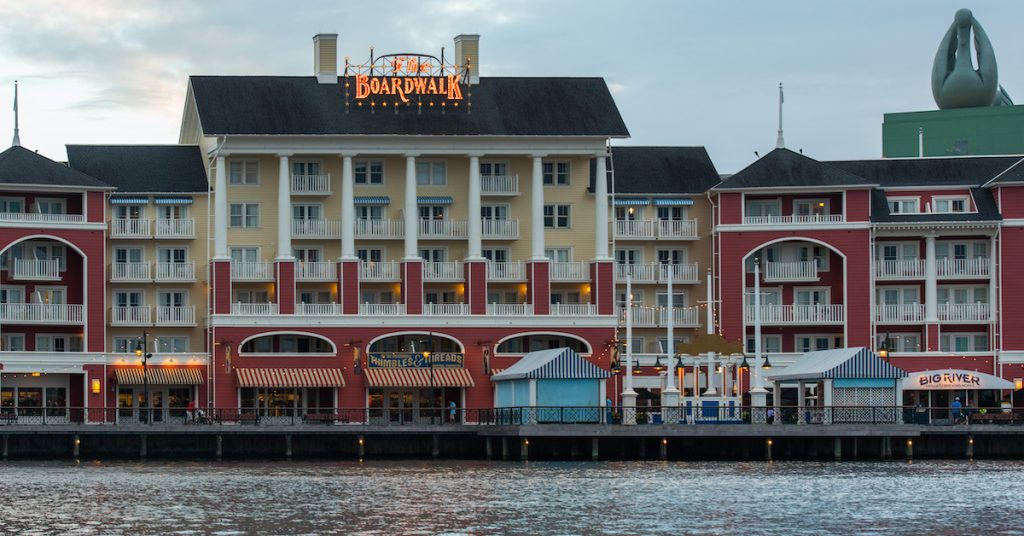
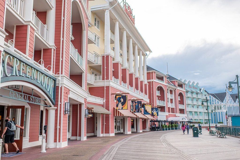
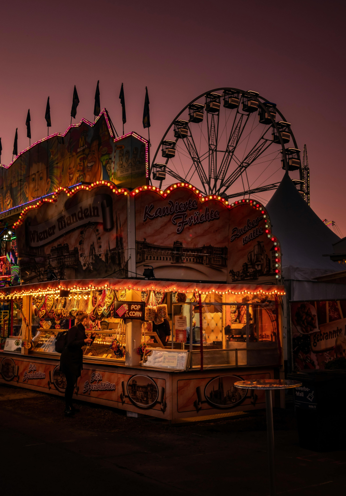
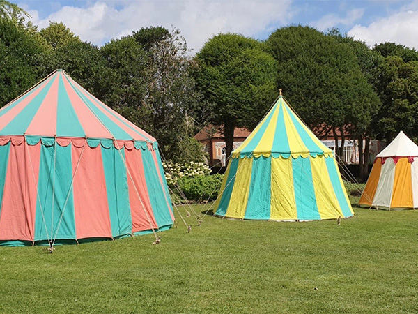
I have made a mood board using photos from the actual location, I also used the coolors software and created some colour palettes directly from the photographs. I want the world to feel exciting and nostalgic so soft but light colours are going to be important.
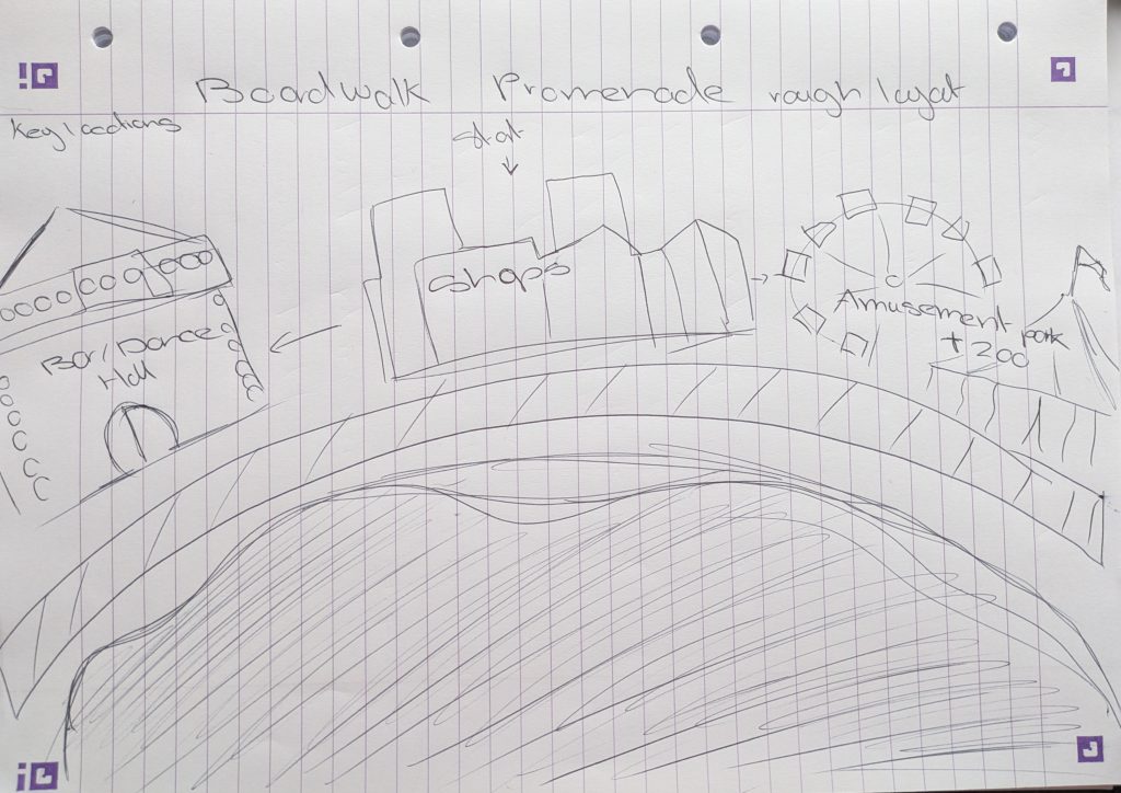
This is a rough sketch of the layout of the world. There is a bar/dance hall, this is based off Disney’s boardwalk as they had a famous piano bar JellyRolls when I was there. Then there is the shops and restaurant area fianlly culminating in a amusent park area and zoo. I chose these locations as amusement parks are commonly found on boardwalks and zoos are very popular amongst children.
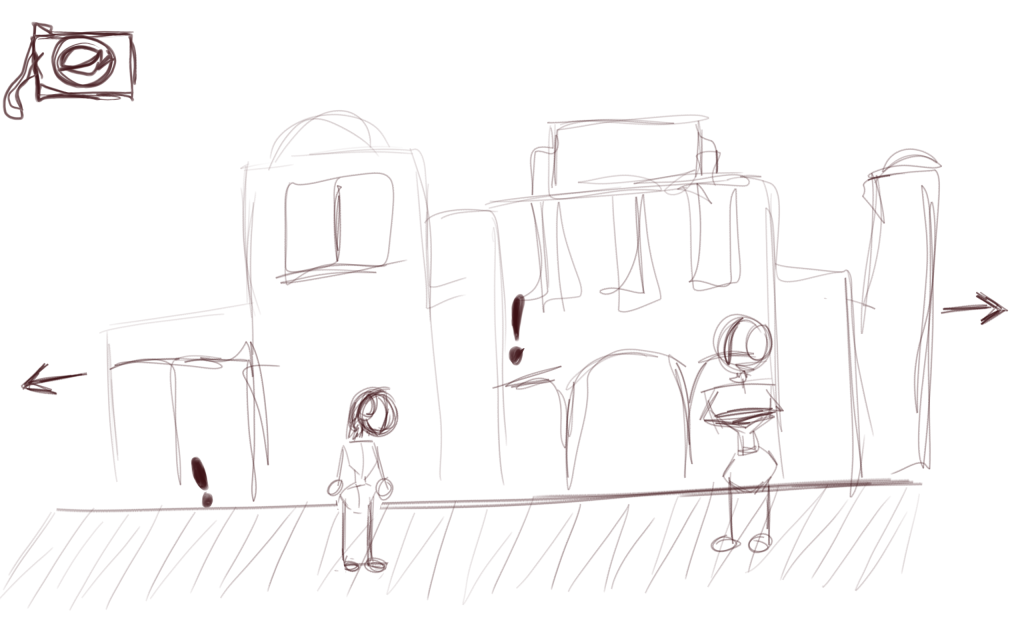
This is a simple mock up of what the screen could look like. The camera would link to an inventory. the exclamation marks are interactable hotspots and there is a NPC waiting to be talked too.
Making Concept Art –
I used Photoshop to create these images, working in grayscale to figure out values and textured brushes to try and create the blurry look I want.
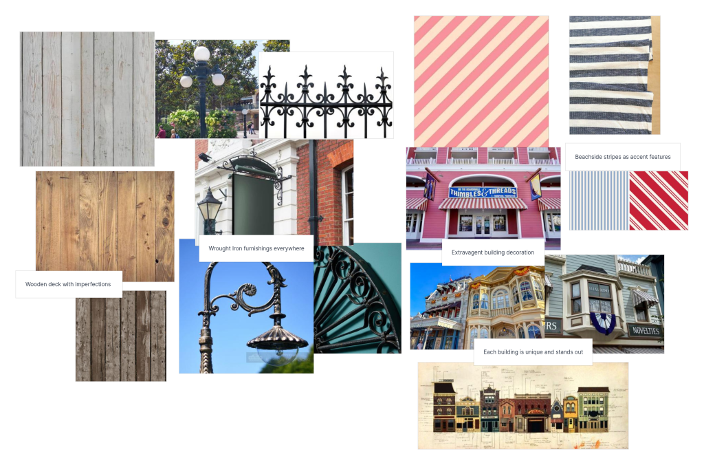
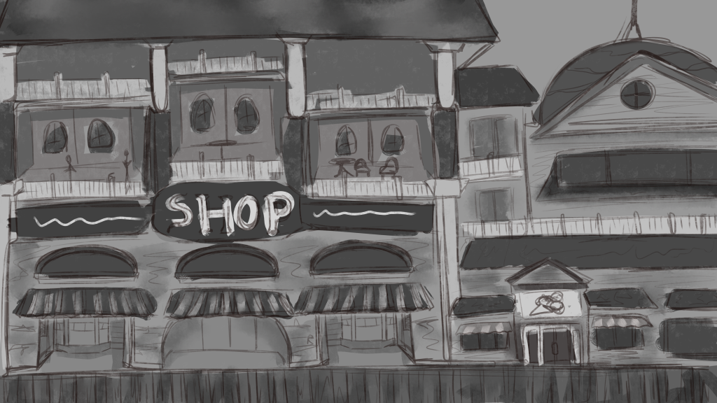
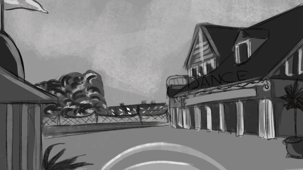
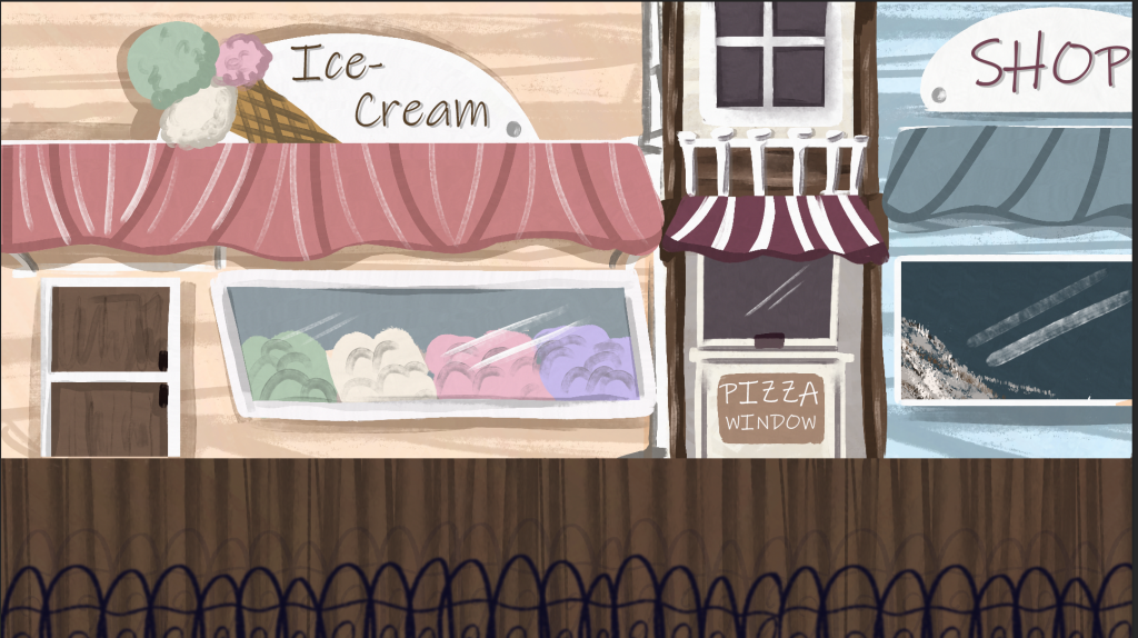
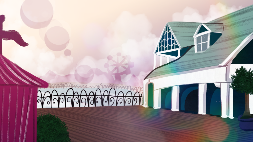
The first area of the game will be the shopping area. I have drawn a zoomed out version of the environment, I gathered lots of images of the actual boardwalk shopping area so that my design choices were informed correctly.
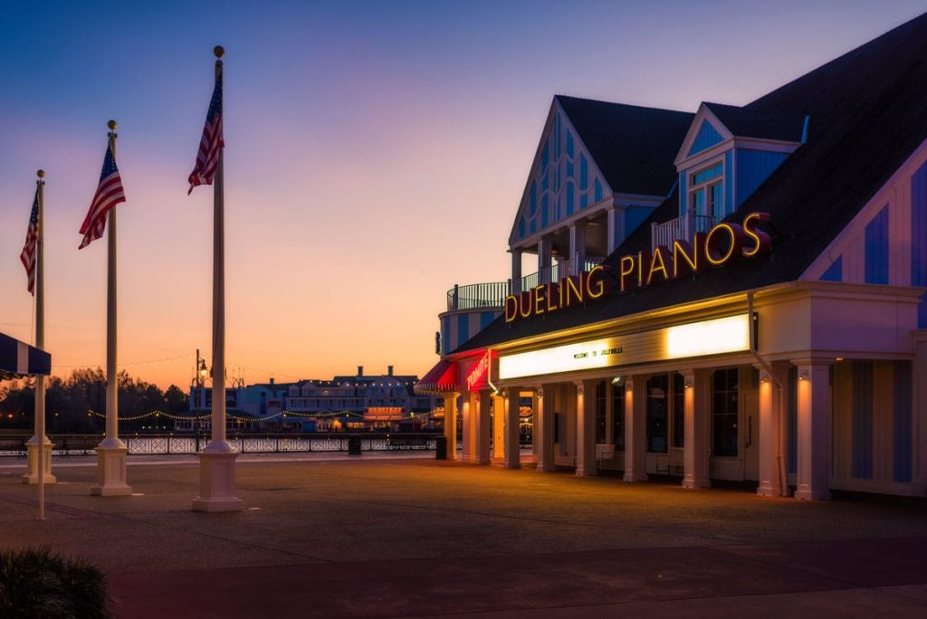
The second area is based off of Jelly Rolls. For this one I used a direct reference from a photograph, this helped me get the angle correct.
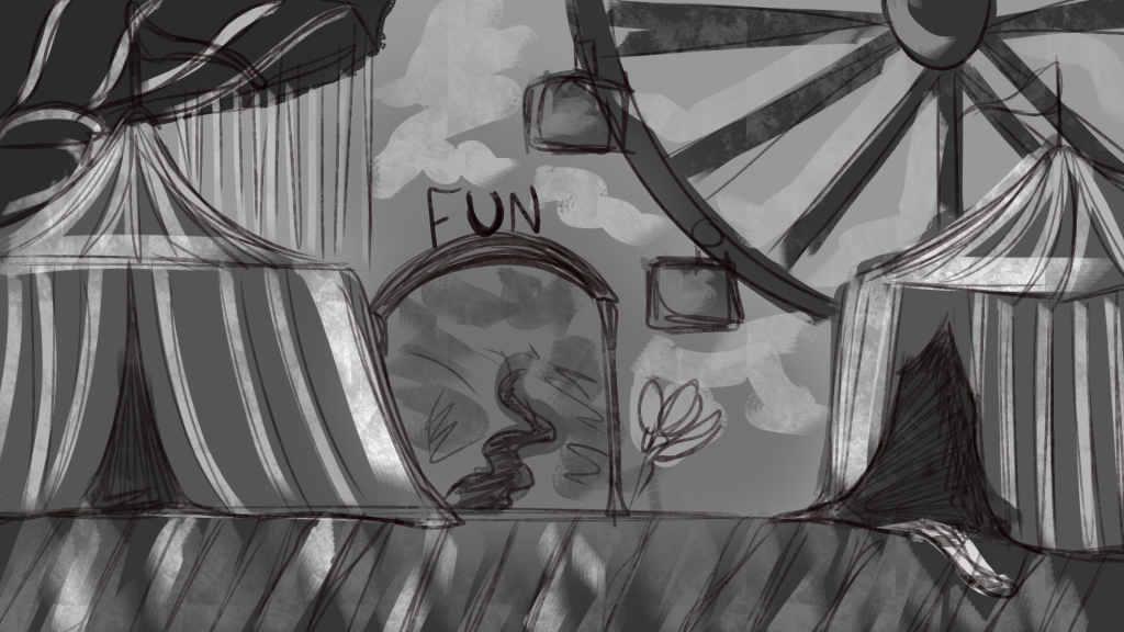
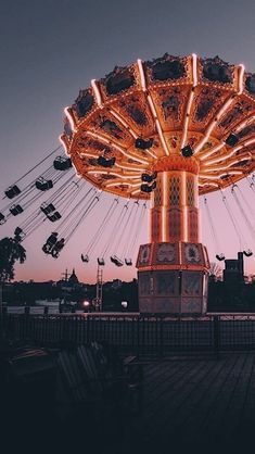
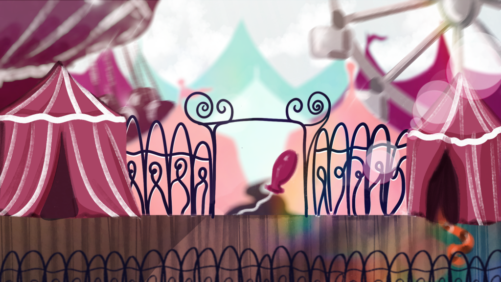
The final area is a fun fair, the player will see and hear the rides in the background, though the main focus will be on the circus tents at the entrance and the tiger which is part of a puzzle. Whilst the Disney Boardwalk does not have any rides there are performers and a funfair feel in the air, which has inspired this area.
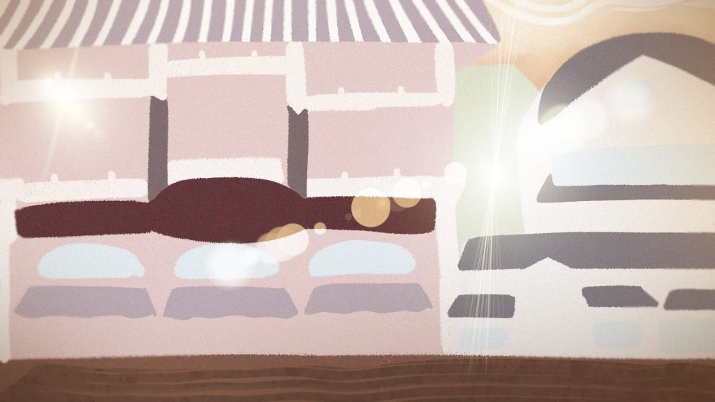
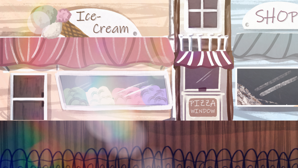
This is a test of screen effects in Photoshop. I used a large chalk like brush to block in importnat shapes of the shop environment, then I downloaded a pack of lens flare brushes and played around with different layer settings like overlay and glow to build the shine and glow effects. As my goal is to make it look nostalgic I tried to give the image a warm overlay as well plus a noise effect too. This was a helpful exercise as it let me get comfortable with the use of light and lens flares. I will have to be careful when creating concept art so that the effects do not take away from the scene by being distracting.
Location Concept Art
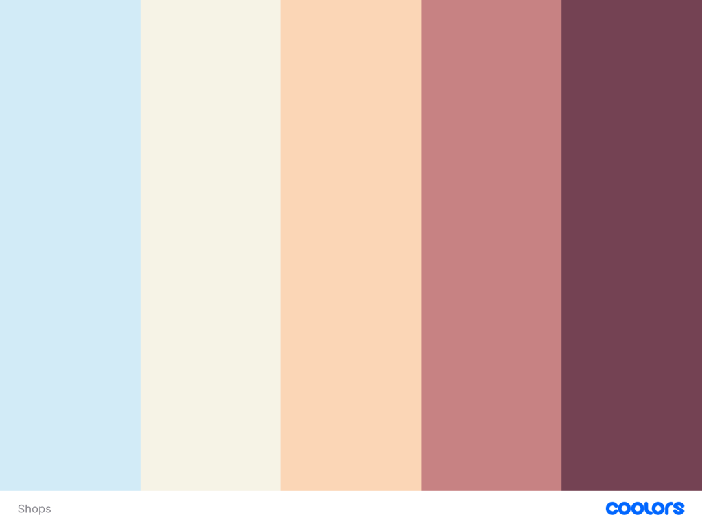
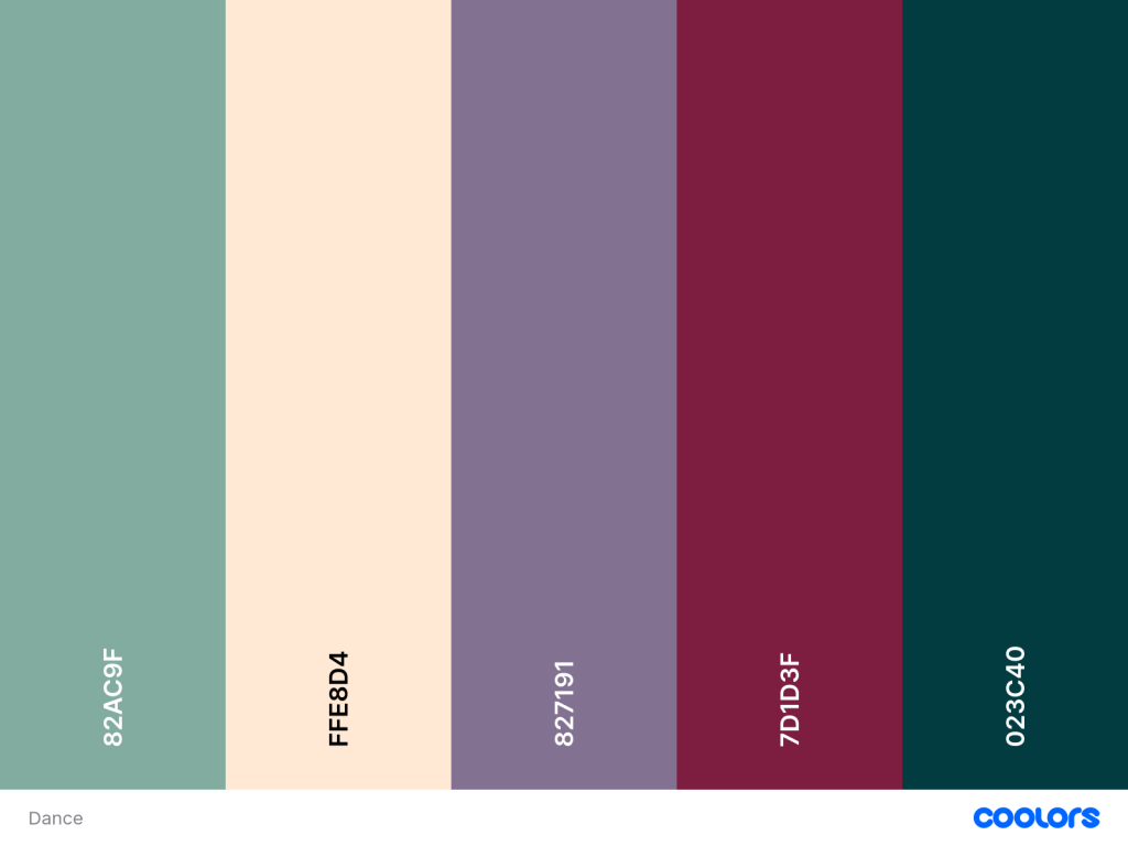
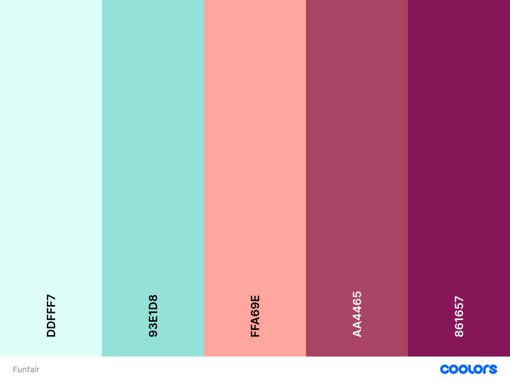
Before I started drawing the environments I went onto the website coolors and created three colour palettes, one for each location. For the shops I kept the colours light and pastel, then for the dancehall – a more mature night based location a darker palette and finally for the funfair I chose almost neon colours that are very bright and fun. These palettes need to reflect the locations atmosphere and vibe, I believe I have done this.
Shops
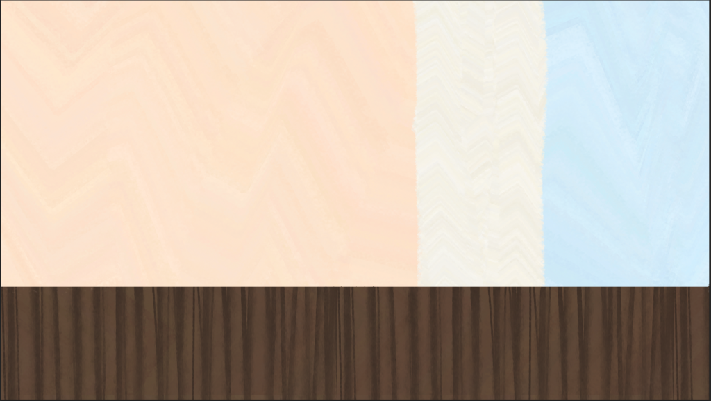
I began by using all of my references to sketch a simple line drawing, outlining all of the important buildings and parts. I then took the first three colours from the palette and blocked in the big shapes. I tried to give the piece lots of texture by using different brushes in Photoshop and playing around. To finish I added rainbow effects and lens flare to give it a glossy nostalgic feel, like my moodboards.
Dancehall
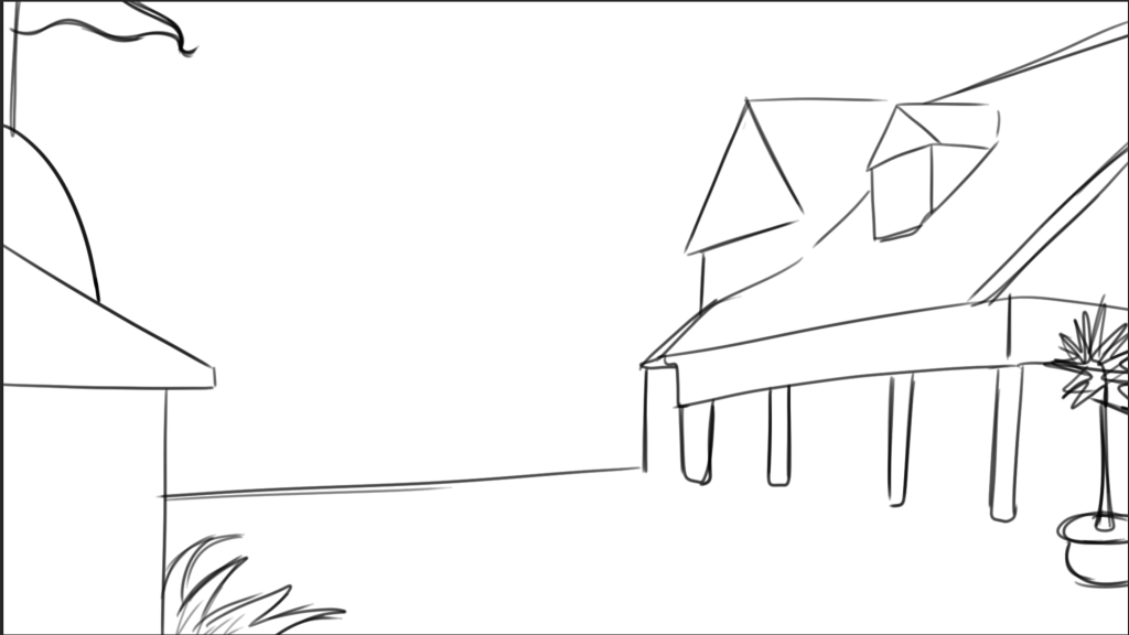
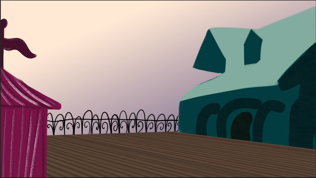
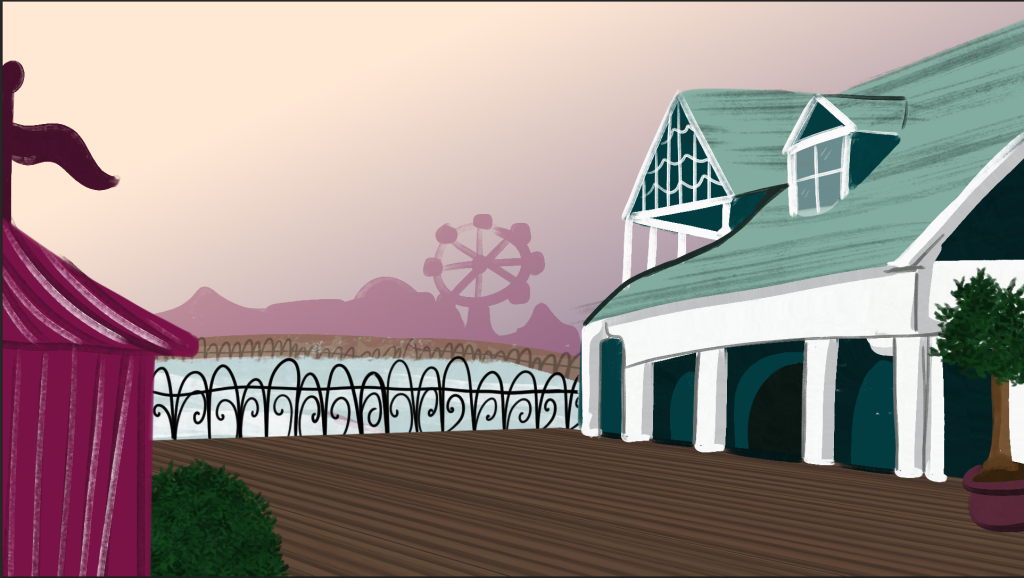
This location did not change much from the inital concept art so I only quickly sketched the buildings. I want this location to feel like dusk when the player is there so I used a warm yellow to purple gradient for the sky. I then blocked in the big shapes and slowly refined them adding the details. As the boardwalk is a semi-circle I icluded the location at the other end of the boardwalk the funfair. I also included effects and clouds to make it seem wistful and nostalgic.
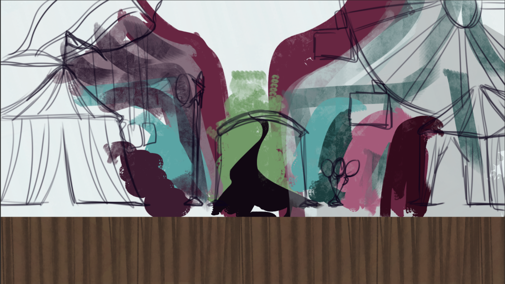
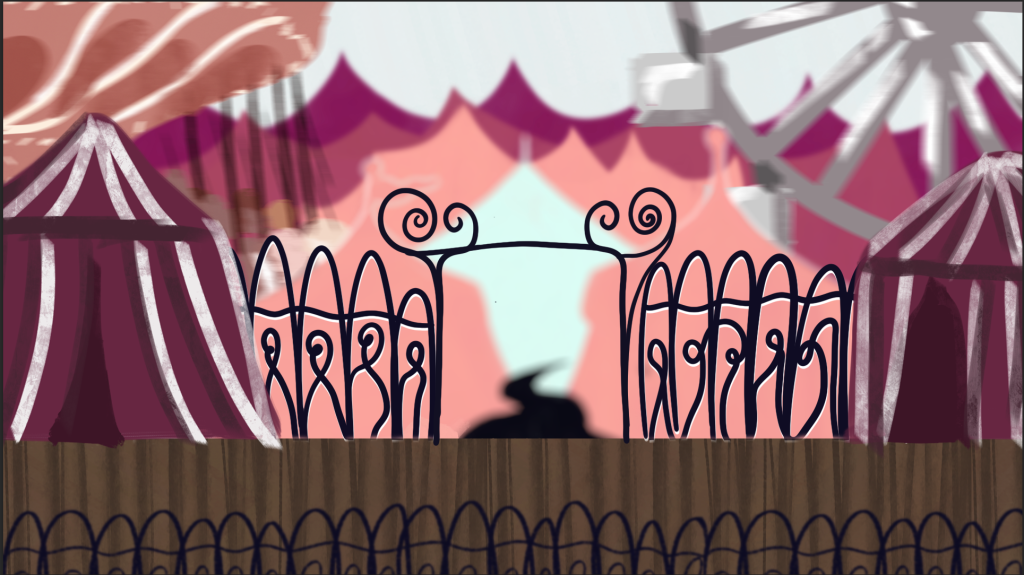
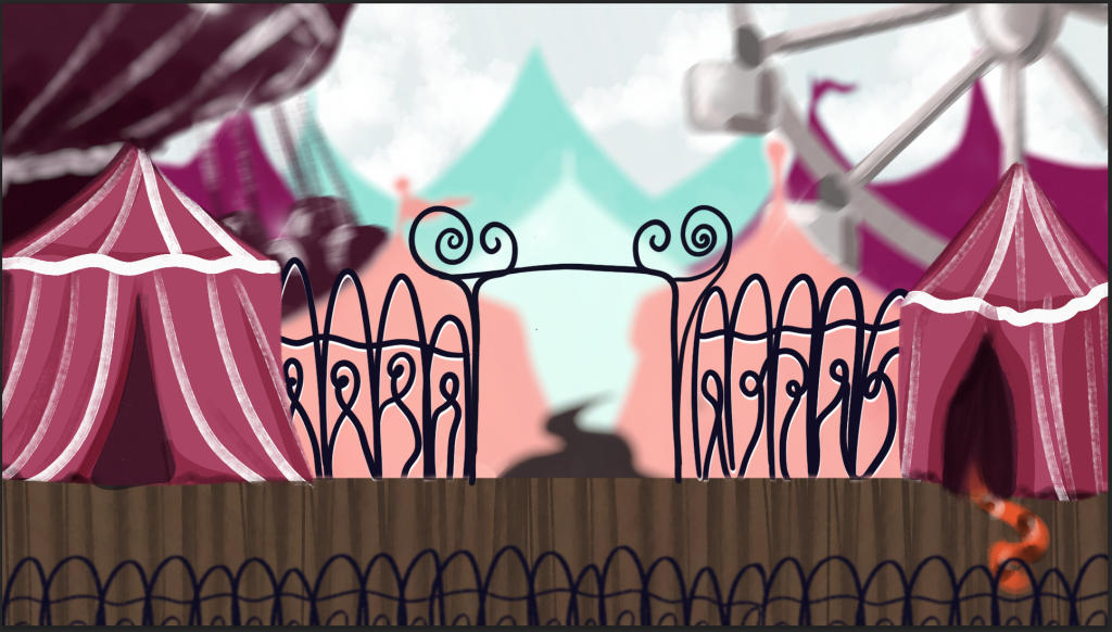
Funfair
This was the hardest location to create, I had a clear idea of what I wanted it to look like – with the gates leading into the tents and attractions, but I was not entirely sure how best to represent it. In the sketch I played around with the different perspectives. After some iteration I was going to keep with the second image but ultimately I felt it looked to busy and the colours were still off. I removed lots of the tents to unclutter it and moved the two big attractions to the middle layer. I finished it by adding small details and the nostalgia effects,
Thoughts –
I am really pleased with how this development has come along, the final concept pieces accurately embody the atmospheres I want for the environments and I think I have created a way to imitate the images of nostalgia I collected at the beginning. As this project is to make a GDD not a finished game I am stopping with the concept art here as for presentations these capture what I want to convey and present.
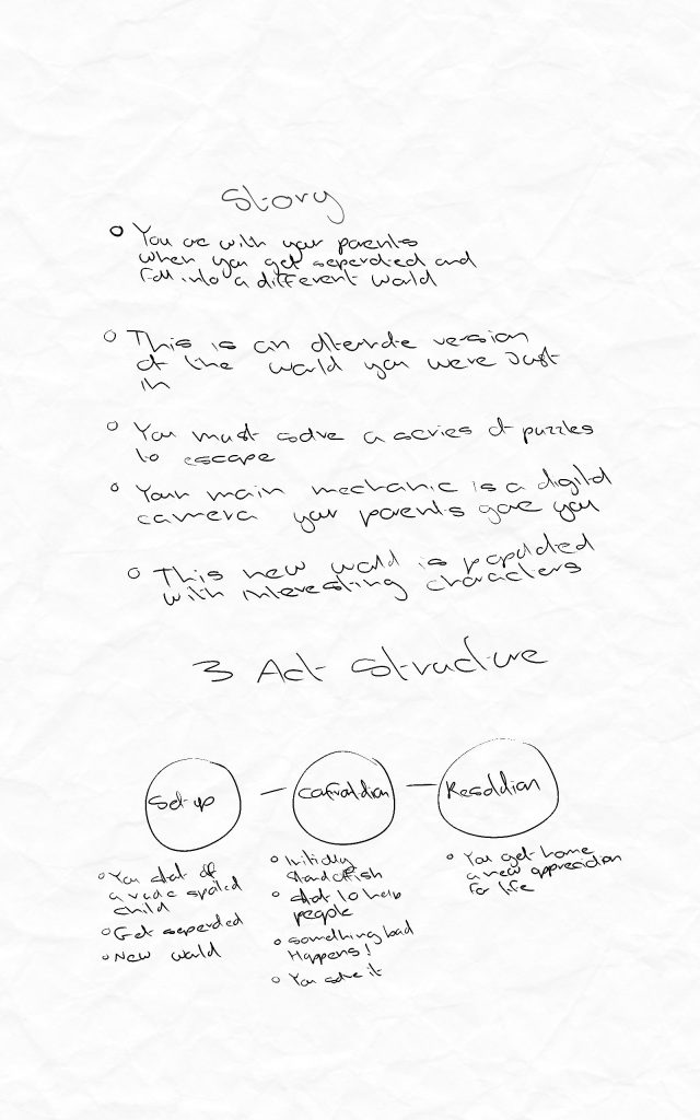
This is an early draft of the story that very simply uses the three act structure, laying out the main beats of the story.
I know where the story is set and what kind of items and elements can be used in the puzzles.
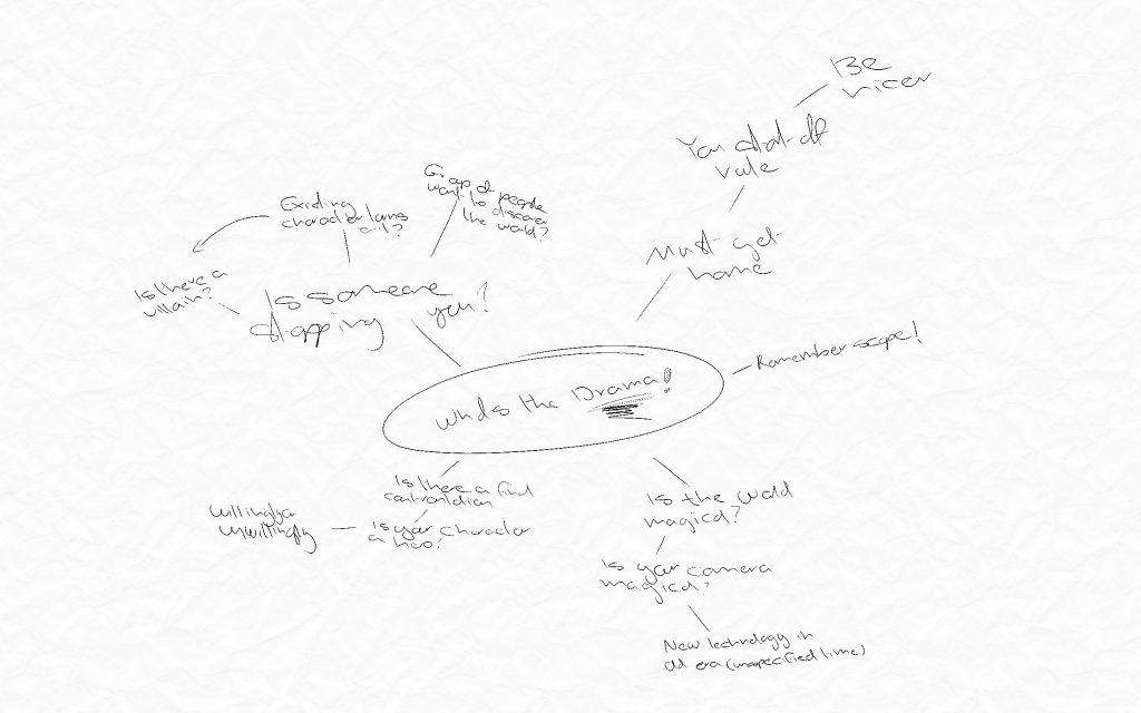
A moodboard where I was trying to figure out what the conflict or drama of the story could be.
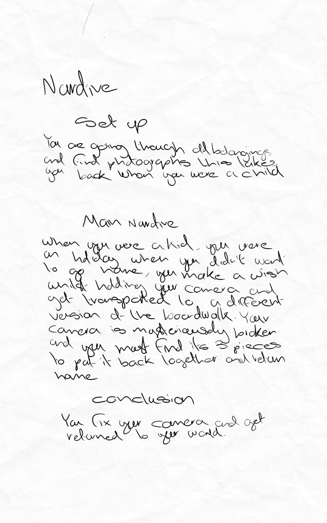
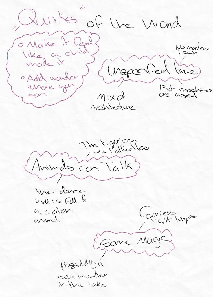
These are possible narratives and quirks of the world for if it was a magical alternate world that the character gets transported too. I liked this narrative but felt it was missing something.
Week 10 Overhaul
The narrative for the game has been a struggle I went back and forth over it a lot and could not refine the small details. So, in week 10 I went to my lecturer and sought help, she agreed that something was missing, some kind of edge and gave me some guidance. During our conversation she mentioned the story being different each time and a theme of passing stuff down between generations. I then went to my family and peers to see what they think. After these conversations I felt a lot more confident and excited as some concurrent themes had emerged. The conversation with my family helped me expand on the generation theme by making the photographs belong to a parent or grandparent. I also had the idea of bringing in a photo development aspect this helps reinforce the generational angle as at the end the two generations come together to pass a technique down. I also think this ties nicely into the nostalgia angle as well, as I have fond memories of creatiung and being taught by my grandmother.
My next steps after these conversations were to take all of my thoughts and storyboard them.
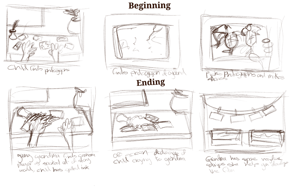
This is a storyboard for what happens at the beginning of the game and the end. I decided to change it from it being an alternate world to taking place in the unnamed childs imagination, coming up with a story based on photographs she finds of her grandmother as a kid.
Story
Act 1
You play as a young child going through her grandmothers’ belongings, you find old photographs of her on holiday. You start creating a story with the photographs.
Act 2
The player takes on the role of the grandmother as a child in the made-up story. Here they must solve puzzles to collect there camera pieces.
Act 3
The player is abruptly ripped out of the story’s world; the child has spilled ink over the photos ruining them. She goes and gets her grandmother who comforts her and reveals that there is an undeveloped roll of film. The player helps to develop these new photographs.
After workshopping the narrative I am now pleased with it. The current iteration has room for imporvement but is a solid base for the story it also opens up the door to a different narrative experience, giving the player the hcoice to use certain photographs in the story in the order they would like gives room for a much bigger complicated narrative and is overall a really cool concept.