
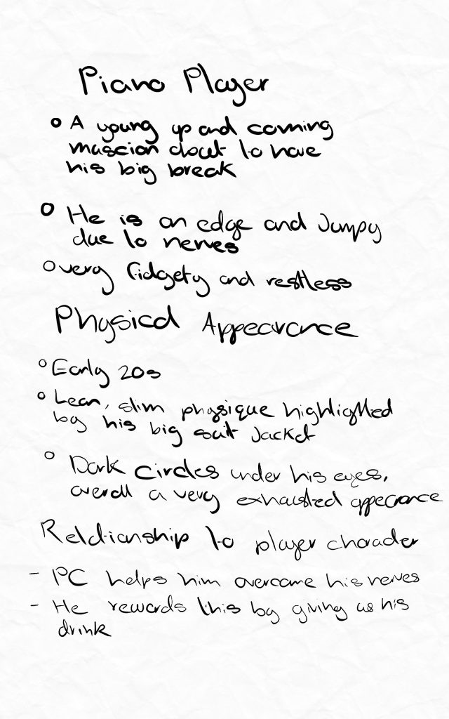
One of the NPC’s in my game is loosely based off of the real life piano players at the actual Jelly Rolls location.
These are notes I made about him, focusing on his physical appearance and his relationship to the player.
He is very young, only just getting his first professional gig so when I design him I want his appearance to reflect all of these aspects.
Reference Board
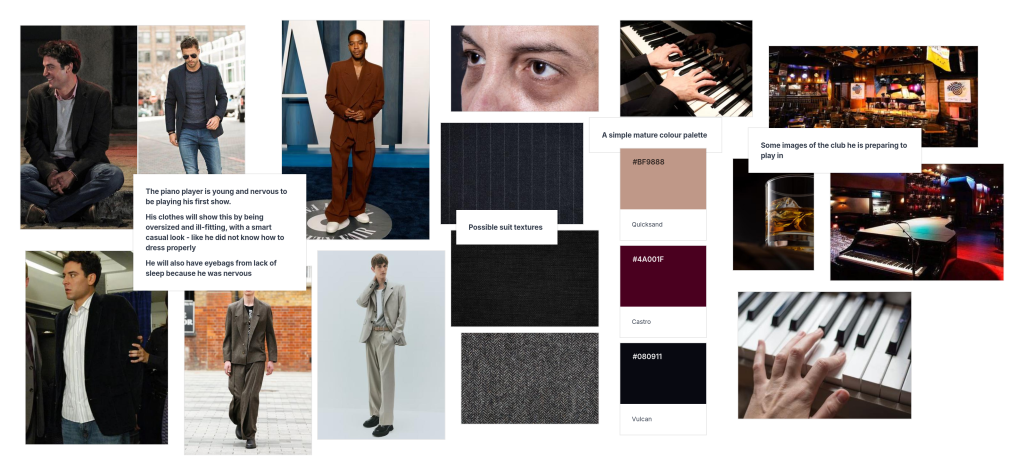
This is the reference board I created for the character. He is new to the professional music world so I gathered images of baggy clothes to suggest that he is scared by the big responsibility the job brings, he still feels like a kid playing dress up in grown up clothes. I also looked at actual piano players and saw that many have developed long skinny fingers to easier reach the keys.

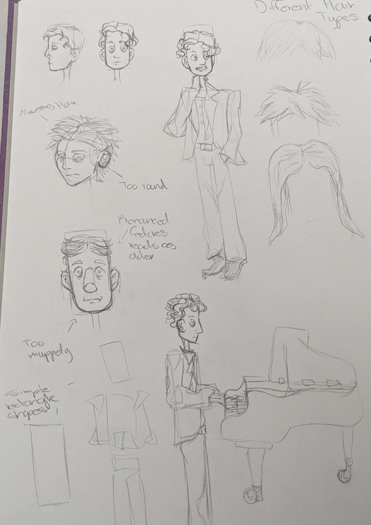
After my reference board I began sketching him. Starting with basic block shapes to figure out his proportions and physicality. I liked the ones that emphasised his height and legs making him feel and look awkward. For his actual face I played around with different shapes but found myself drawn back to the long rectangular face, I felt it also resembled a piano key. I initally liked a messy haired lookkeeping with the theme of him feeling out of place but I thought it looked too careless and that is not one of his traits. Eventually I found a curled style that can still look slightly unkempt but ultimately suggests that he cares about his appearence, he just lacks experience.
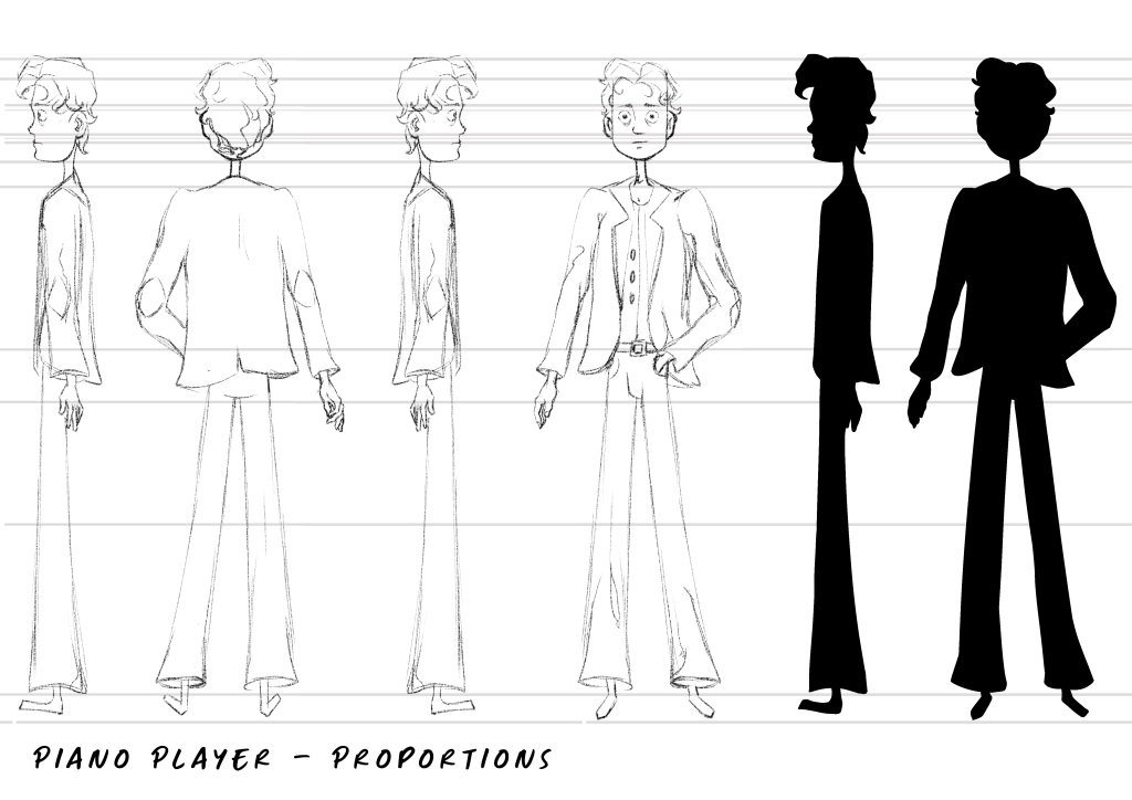
After my pencil sketches I used Ibis Paint X to finalise his design more and make a turnaround poroportion sheet. I started with the forward facing one incorporating the elements I previousely looked at. Then I drew lines from each important part such as hip placement, size of head etc. and began drawing the side profile. I am really pleased with how this came out as I am not very experienced drawing turnarounds. I also tested the silhouette of his design seeing if it is recognisable and if any parts are unclear. I think it is a successful silhouette as the contrast between his skinny neck and larger torso communicates the baggy clothes and his hair nicely breaks up the uniformity.
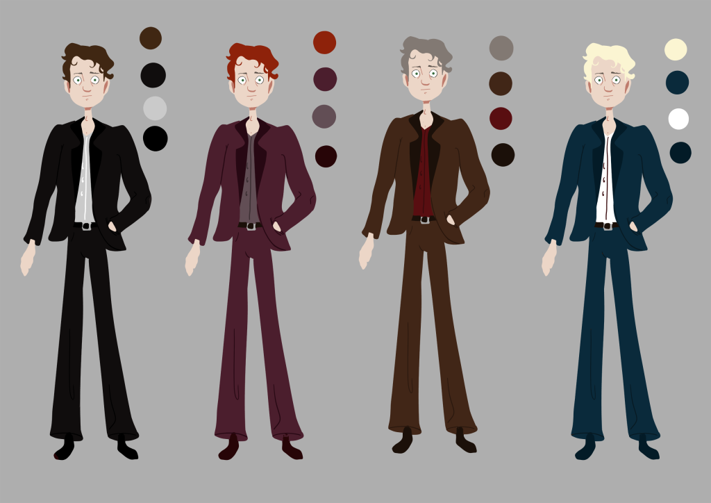
Once I had a good base sketch, I went into Photoshop and used a large blocky brush to create some colour thumbnails. So that I could see the colours for what they are I used a neutral grey background. After making the reference board I knew that I wanted subtle deep tones for the colours to reflect the establishment he works in. Once these were done I showed them to my peers for feedback and most of them liked the red one. I went with the decision as I also belive this one suits him the most and the ginger hair looks more youthful.
Final Character Design
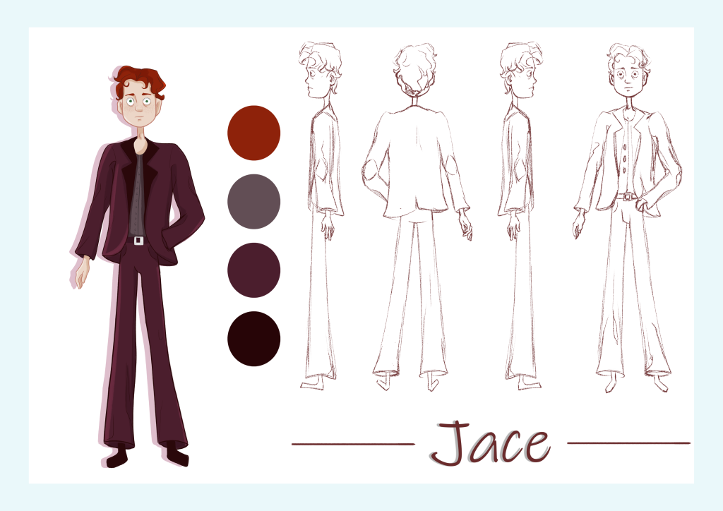
I am happy with the harmonius colours and his appearance I think I have accomplished what I wanted to communicate with the character design.
Leave a Reply