
Poster
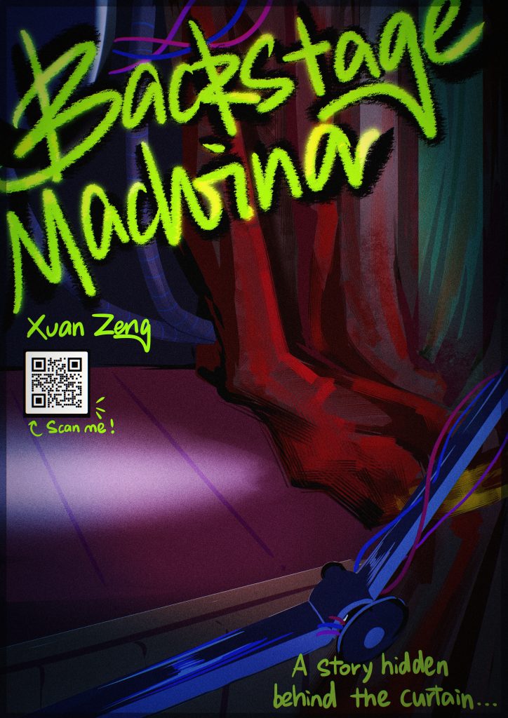
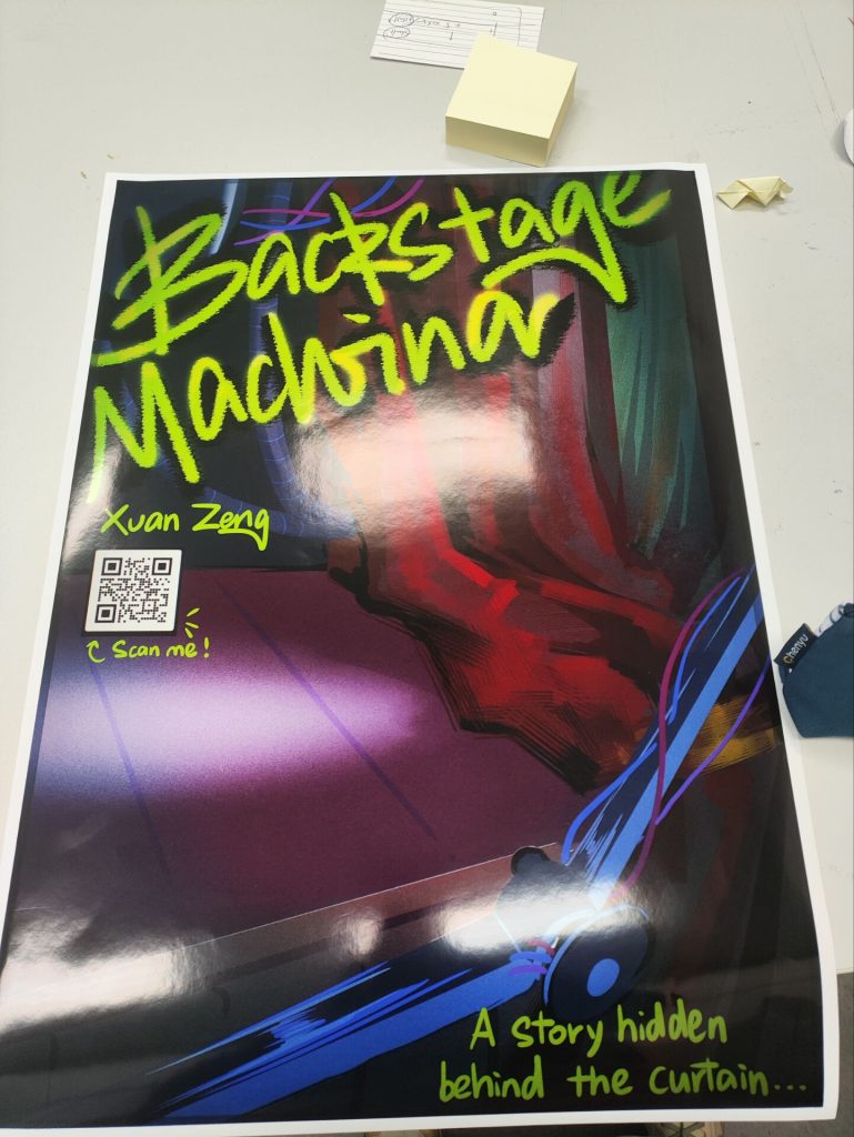
Due to time constraints, my poster isn’t very refined visually. The lack of time also meant I couldn’t include characters in the composition, as I believe any missteps with human elements would ruin the entire poster. If people were present, the viewer’s focus would be drawn to them—and humans are the most familiar elements to audiences, making mistakes there the easiest to spot. Therefore, I chose the elements that best represent my game: the curtain, the robotic arm, and the stage.
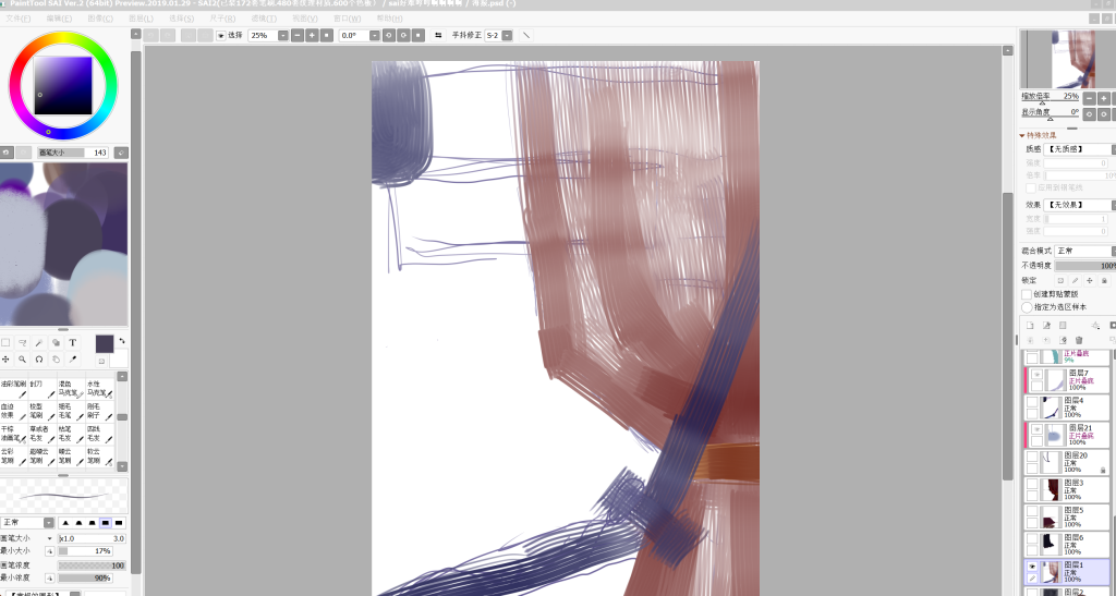
Visual Guidance
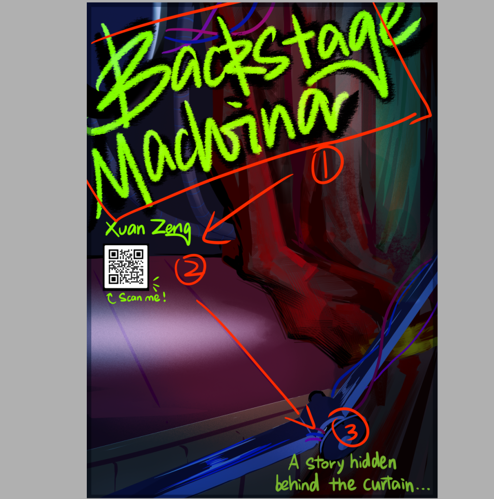
↑ This is the reading order I recommend for the audience, so I’ve differentiated the text using font size, font color, and position.
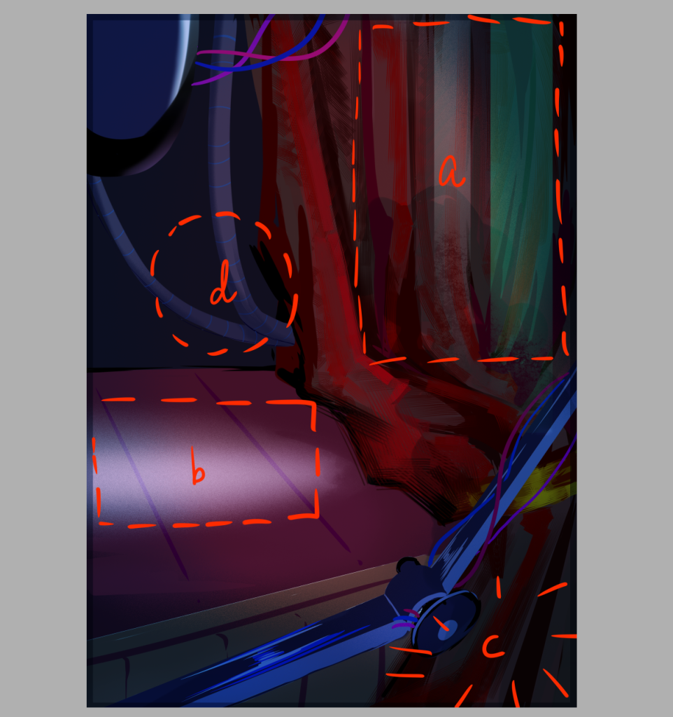
Design Details:
a. Since both the title and text colors are bright yellow-green, they clash significantly with the red backdrop and the overall dark tone of the background. Therefore, I added two low-transparency green and white color blocks to brighten the composition. As most of this layer will be obscured by the title, it helps balance the image without disrupting it.
b. The white spotlight positioned below the QR code prevents it from appearing jarring within the composition. It serves to guide the viewer’s gaze and establishes a visual focal point. The placement of the main title toward the upper portion of the frame ensures the viewer’s attention doesn’t linger after reading it. To create a cohesive visual center rather than a scattered composition, the spotlight effectively enhances detail and directs the viewer’s focus.
c. The foreground, being the most forward and easily overlooked area, is where I placed the introduction. The robotic arm in the background foreground serves to visually separate the text.
d. Positioning is awkward: situated centrally yet flanked by the spotlight on left and a complexly rendered backdrop on right, it struggles for initial attention. Yet leaving it empty would feel hollow. Thus, I placed two simply modeled pipes here—adding information density and depth of field while hinting that the game’s main arena lies beyond this scene.
Unfortunately, I didn’t participate in the pitch deck, so I didn’t receive any feedback.
After seeing my poster printed, I reflected on it based on the physical object.
First, the poster appears brighter under natural light than on screen, and the paper’s reflective surface makes it less atmospheric than the digital version.
Second, I had no concept of the canvas’s actual size, so the visual guidance wasn’t as effective as I’d hoped. The text in the bottom-right corner is too far from the rest, breaking the visual flow and making it easy to overlook.
Furthermore, since the canvas is significantly larger than the screen display, sculptural flaws become highly noticeable. This does validate my earlier decision not to include characters—had I drawn people, the lack of sculptural detail would have made the composition appear even flatter. Some hatching strokes intended to add information density became very prominent on the printed poster, creating visual clutter and making the material rendering look coarse. For similar designs in the future, I need to refine the material sculpting with greater precision.
Leave a Reply