
1.Understanding the GDD
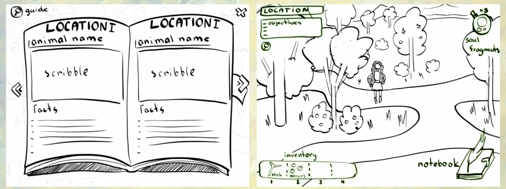
This is the UI icon style and usage demonstrated in the GDD. It’s presented very clearly, so I just need to polish it up.
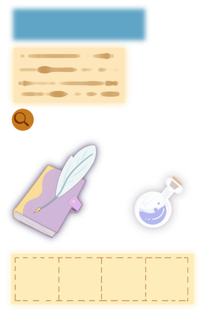
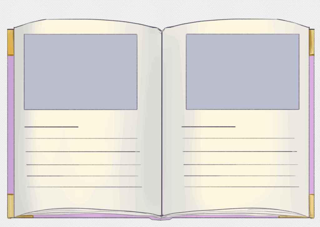
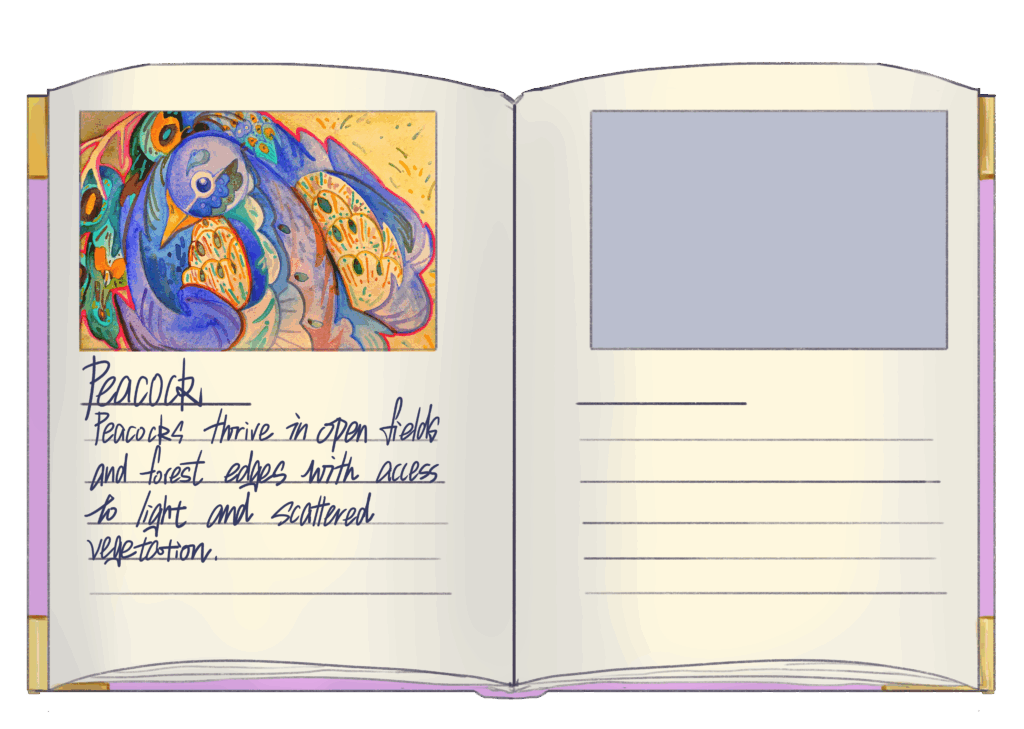
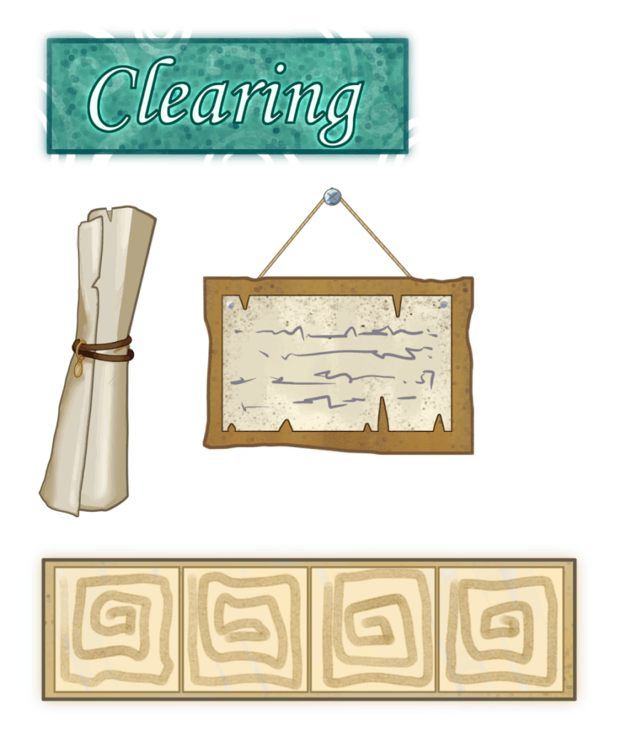
These are the first icons I drew. They were used for testing by the programming team and to experiment with different styles for the first version in conjunction with the map.
These icons were drawn exactly as shown in the sketches, and because we initially experimented with a digital style without outline strokes, they have a bright, vibrant look.
During internal testing, due to changes in the map style and mechanics, I modified and removed some buttons to better align with the project’s style.
2.First Playtest
After the first playtest, I made some improvements to certain icons based on the feedback.
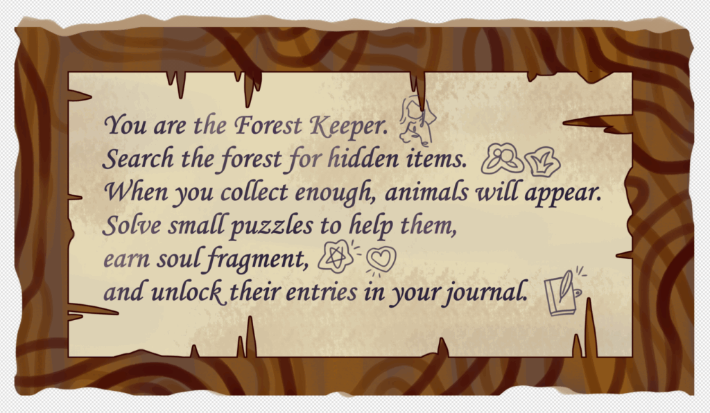
To make it easier to understand, I’ve drawn some simple sketches in the prompt bar to help illustrate the text.
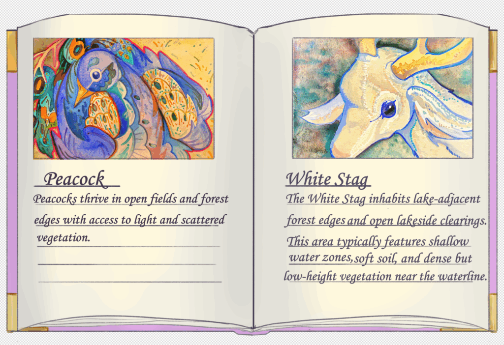
Players reported that they couldn’t read the handwritten text, so I replaced it with a typed font.
We received feedback that the item bar’s functions were unclear, so we removed the growth rings to make it easier to understand.
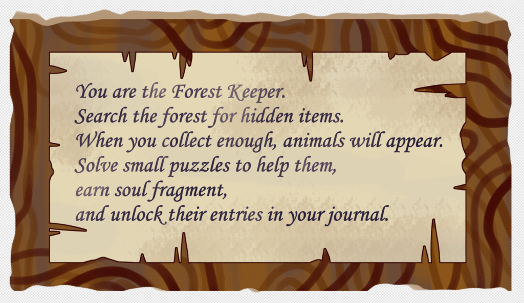
Some players have mentioned that they don’t know what to do when they first enter the game, so after discussing it with my team, we decided to add text prompts to guide players through the gameplay.
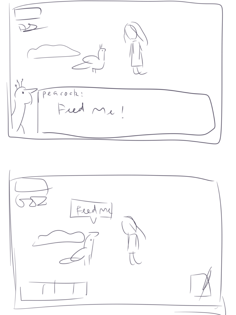
I proposed two options, and ultimately chose the one below.

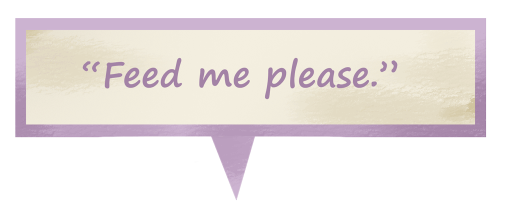
This was my first attempt, and it was rejected because it was a bit rough. In the second version, I added hand-drawn textures and adjusted the font and border colors to make it blend in better with the composition.
Since the game has two scenes, we added a button for the soul fragment to switch between them. This button appears after the player completes a mini-game in one scene and views the notebook.
I added a small animation to the soul fragment to make it stand out more on the screen and encourage players to click on it.
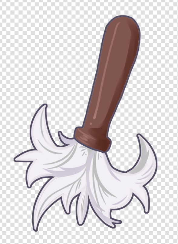
Since players reported that the first mini-game had no instructions on how to play, I created a brush icon to indicate that dust needs to be wiped away.
3.Second Playtest
There are no obvious UI issues, and we’ve received virtually no feedback regarding the UI.
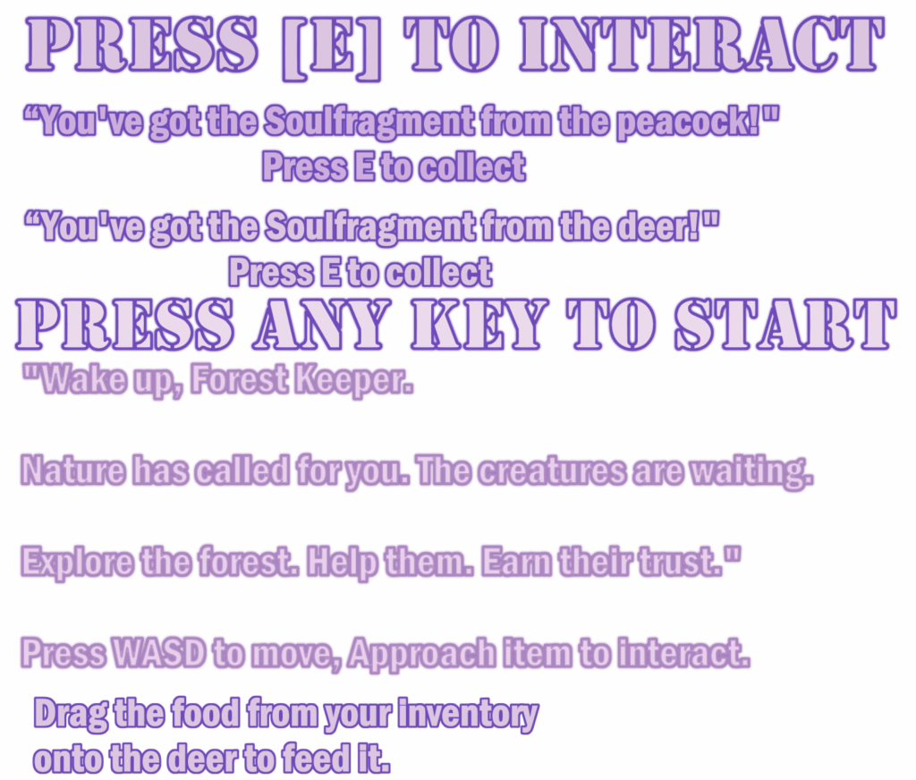
My team and I discussed and standardized the fonts used in some game instructions to make them look more polished.
4.Public Playtest
The improvements proposed in this section will be considered as areas for enhancement in future projects, no changes will be made to this game.
- The fonts across all sections need to be standardized.
- The notebook logo looks too modern and doesn’t fit the overall atmosphere of the game.
- The icons are too large and detract from the game’s atmosphere.
Leave a Reply