
1.Understanding the GDD
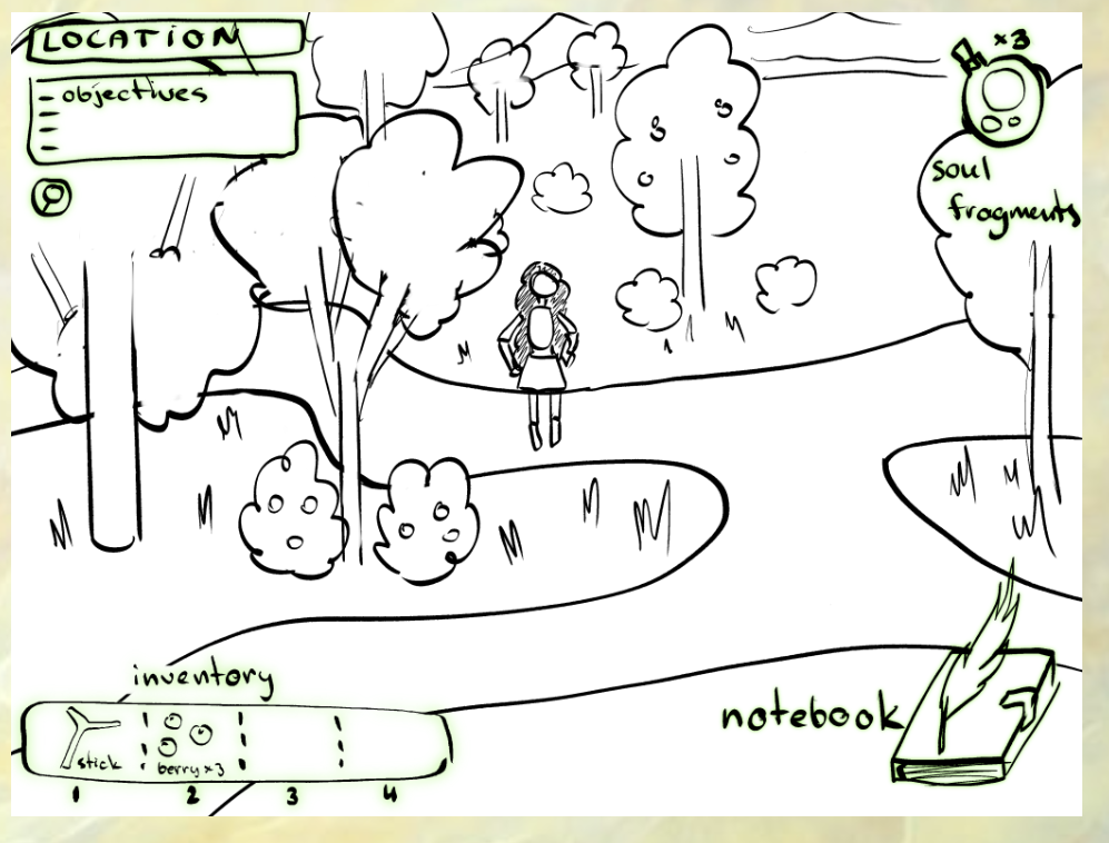
Based on the draft, my team and I agreed that this was a 2.5D game and quickly decided to use Don’t Starve as a reference for creating the maps and backgrounds.
Since I hadn’t yet settled on a style with the other artist on the team and I wasn’t familiar with map creation, I opted for digital painting, which I felt most confident with.
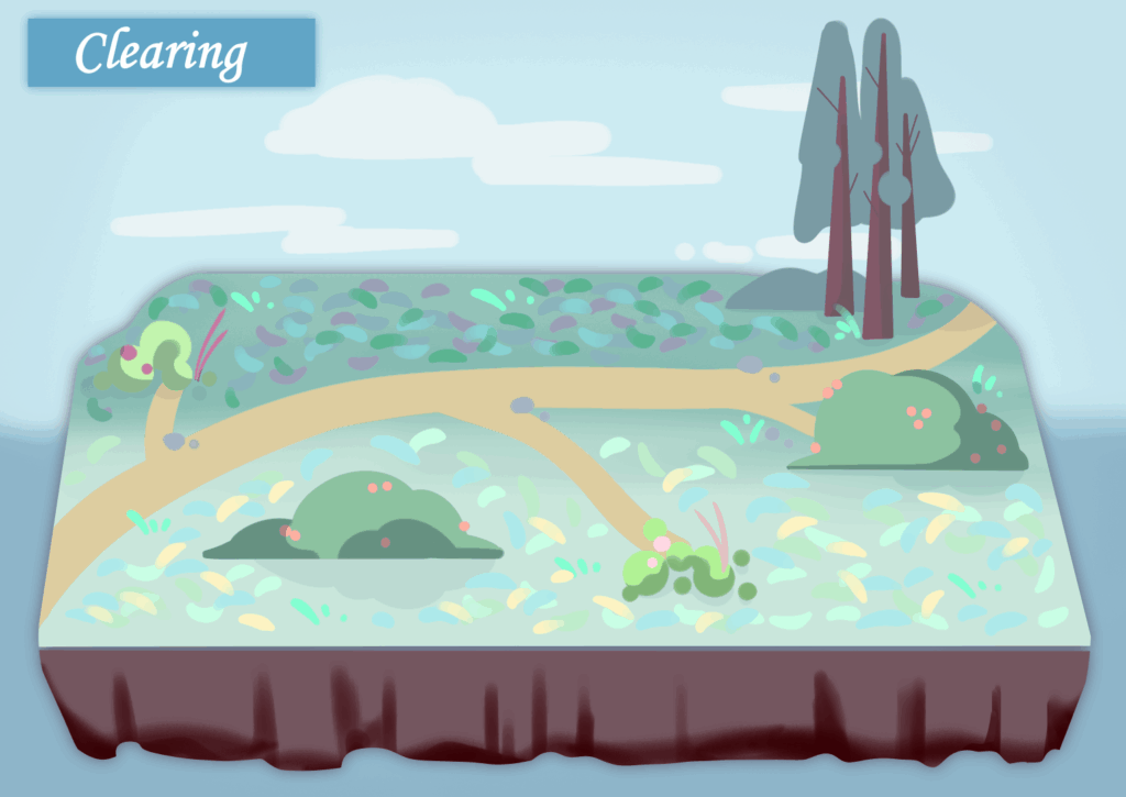
This was the first map I ever created. Since I wasn’t sure how the programmers would handle the assets, I placed everything on a single layer. It wasn’t until later, after they explained it to me, that I realized I needed to separate the ground, the map’s edges, and the vegetation, because the programmers would have to “reassemble” the assets in the game engine.
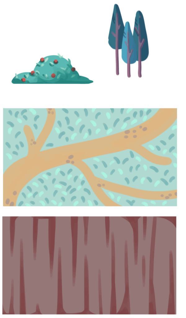
These are the “parts” I’m providing for the second time. I’ve also learned that, due to the screen size, the ground section requires a canvas of a specific size.
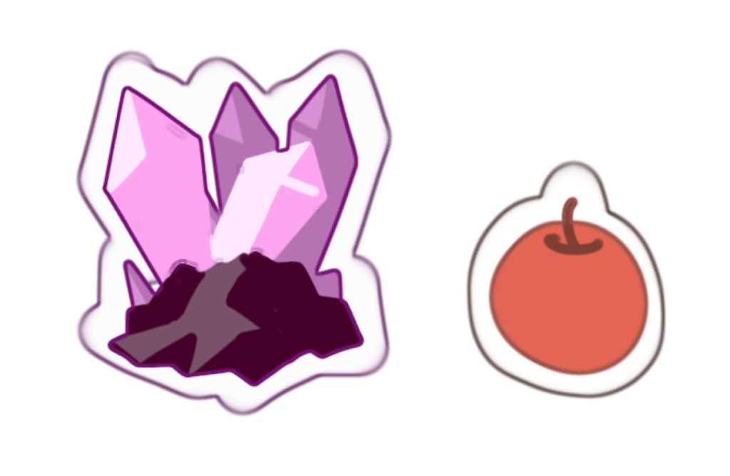
Due to the game mechanics, I also drew some collectibles scattered across the map. Since the art style wasn’t finalized at the time, I just sketched two simple ones for testing purposes.
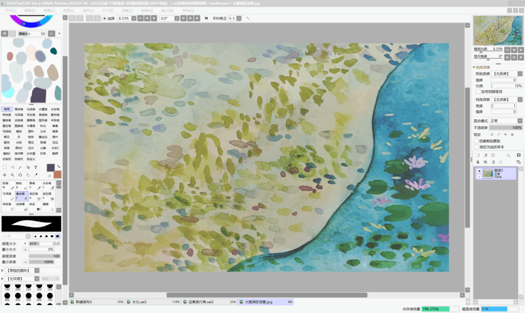
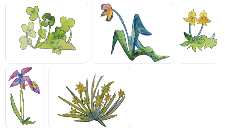
Once I had decided on the style, I started by sketching with watercolors on paper, then scanning the drawings into my computer. After making minor adjustments in the drawing software, I sent them to the programmer.
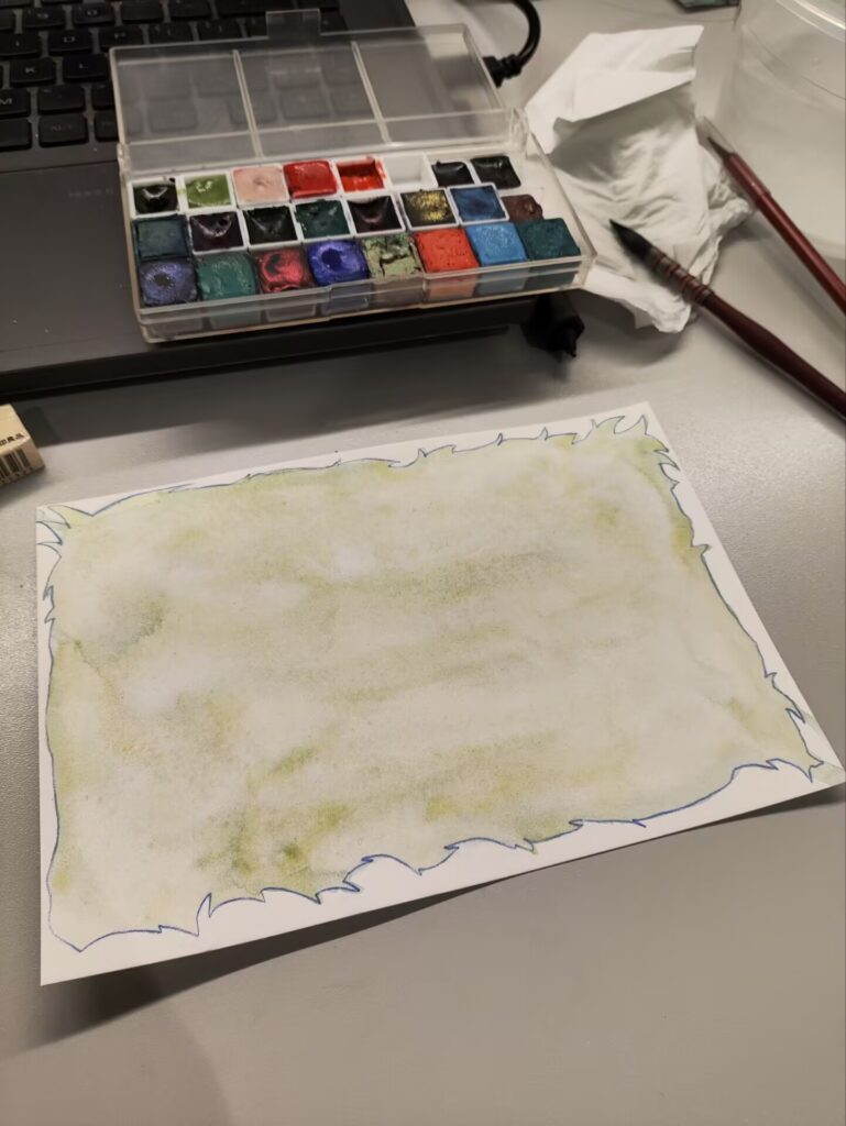
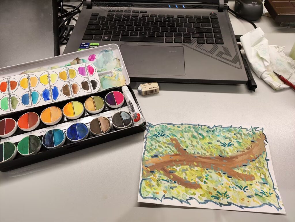
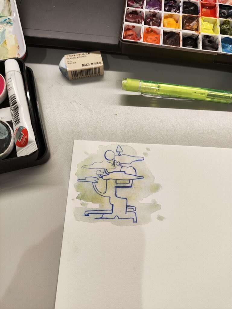
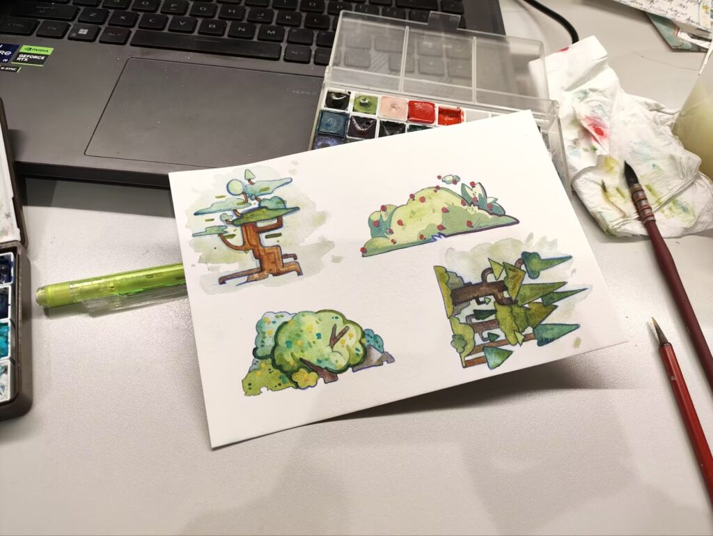
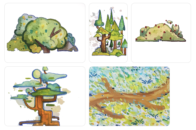
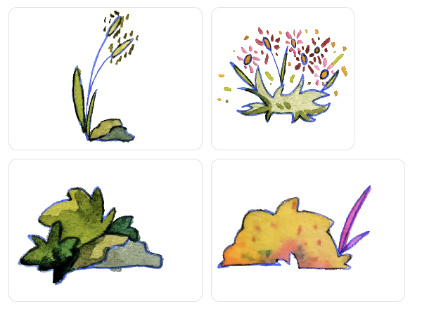
When Misty placed the character in the scene, we noticed a problem: the background was too saturated, making it stand out more than the character, and the scan was blurry. So I lowered the saturation and increased the brightness to keep the colors from looking muddy, and I also improved the image quality.
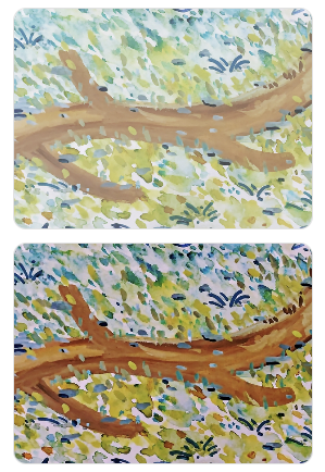
Here are the two revised versions. Ultimately, we felt that the image above looked better.
2.After The First Playtest
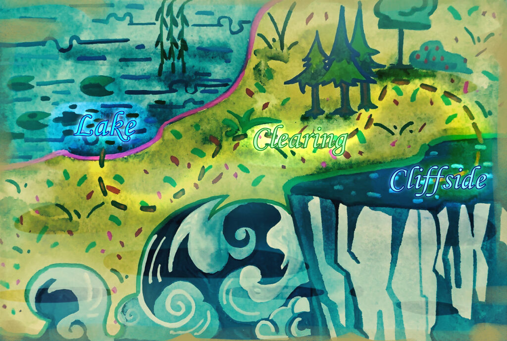
To make the game feel more complete, I created a mini-map that shows players their location.
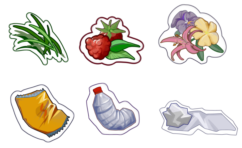
At the same time, I redrew the food items to increase their variety while aligning them with the animal behaviors described in the copy. I also created some trash that would appear in the scene due to a change in the game mechanics (this mechanic was later removed because it didn’t fit the GDD theme).
As the project progressed, I began working on the second map—the lake area.
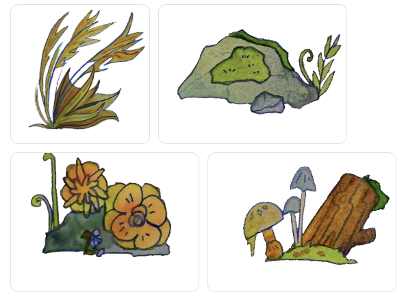
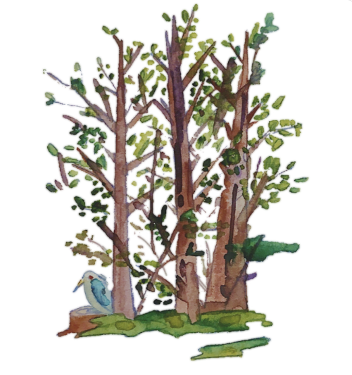
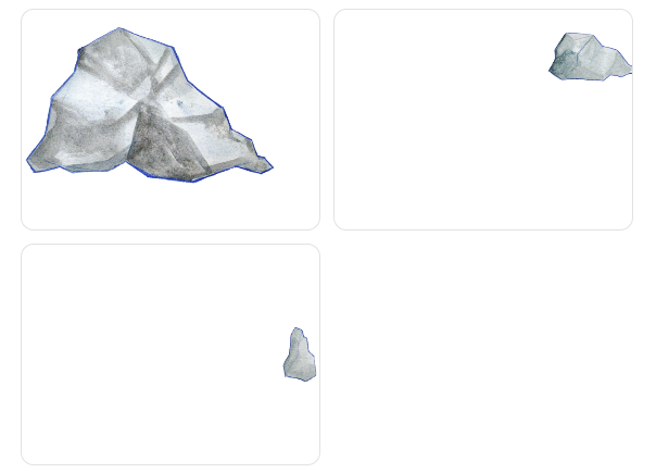
Following Misty’s suggestion, I drew some rocks along the edges of the Lake District map as decoration, so that readers would be enclosed by the rocks and wouldn’t see the unmodeled void beyond the map.
3.After The Second Playtest
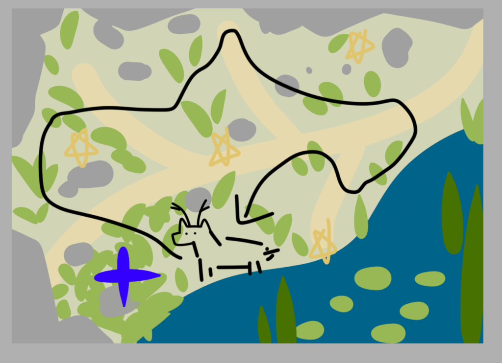
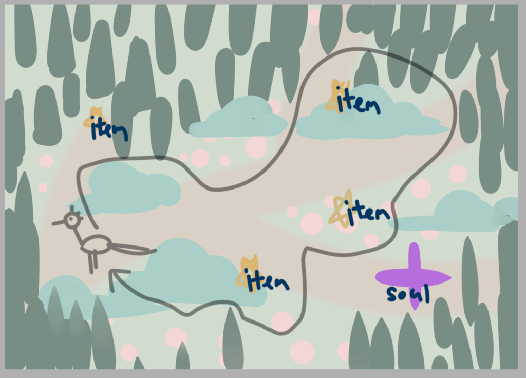
Since some players found the collectibles hard to spot and the layout and scenery confusing, I created two rough sketches of how the map assets should be placed, but ultimately didn’t get around to implementing them due to time constraints.
4.Final Playtest
The last playtest didn’t yield much feedback on the background or items, but due to a programming issue, only two types of collectibles were implemented, even though players needed to collect four. Since three of them looked identical, the last one didn’t appear to be an interactive item.
Another issue that hasn’t been addressed yet is that I’m in the habit of using colored pencils for outlines. After scanning, the blue of the colored pencils stands out so much that some players mistakenly believe the background walls with blue borders are interactive. I’ll pay closer attention to details like this in the future.
Leave a Reply