User Experience
While my Graphic Novel Adventure does not have UX in the typical way that a Video Game will, UX is still important in the way that players will interact with the mechanics of the graphic novel.
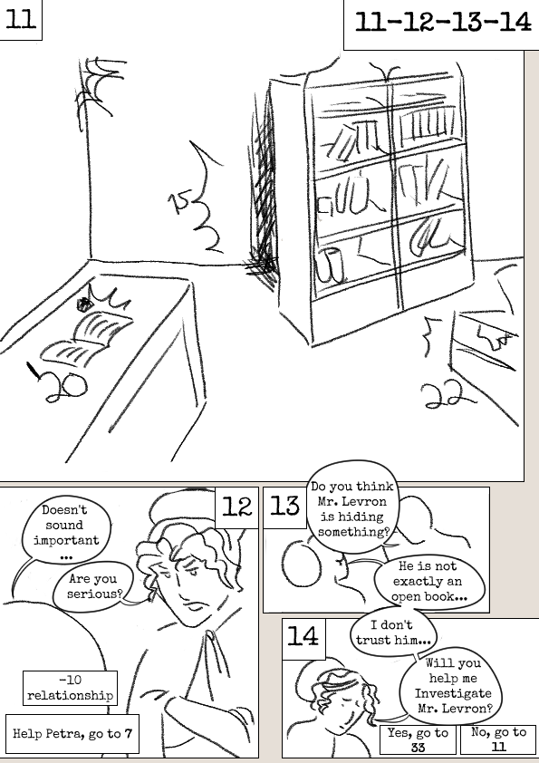
How will players make know to make a choice, what will this look like?
It should blend well into the overall look of the comic, not sticking out in a way that can break immersion. It needs to be:
- consistent (the same mechanics looks the same throughout the graphic novel)
- clear and intuitive (not overwhelming, simple memorable rules that make sense)
- accessible (contrast, size)
An appealing aspect to graphic novel adventures is the ease in picking it up and reading, which is quicker and easier than the barrier to entry for many tabletop games, namely reading through the rulebook and remembering the rules yourself as you act as the ‘computer’ for the game. With this in mind, the audience for this will be expecting simple and easy to understand mechanics with an engaging branching storyline.