This sprint focuses on finalising bigger assets, refining existing assets, and making the game feel more lively. This is the last sprint on my end that involves rigorous amounts of work, the next sprint leading to the week before the deadline, will be small things I can add to the game to make it feel more polished. That being said, I maintained a consistent workflow and ethic as to not slow down the work. This approach led me to tackle larger tasks at hand while continuing to refine other assets.
This sprint also started off with clarifying that I needed to make assets for the village island, some decorative, some would need collisions.
MUST GET DONE:
- Village houses (collidable)
- Village decorative assets
- 3 NPCS + the good Samaritan NPC
- 4 Backgrounds
Village assets
Starting the week strong, I began to develop and conceptualise what the village assets would look like. My team mate discussed that we would need houses for the player to platform on. These houses would act as the fundamental building blocks as to how the game functions. Before I get stuck to a final idea, my team mate gave me some guidelines on Miro to showcase the certain specifications as to what would work in the game.
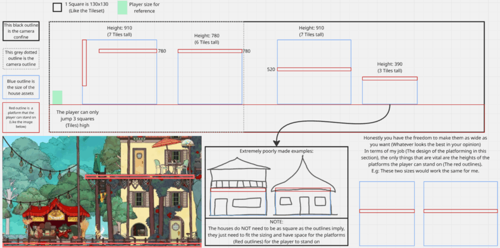
In the screen shot above, he provides some context as to how big the houses should be and where the collisions would occur. For reference, 1 tile equates to 130x130px, the player character is 1 1/2 tiles, and the player can only jump up to 3 tiles maximum.
With all this information in mind, I began to come up with designs for the housing. Once again, due to sensitive time limits, I wanted to come up with great, fitting concepts from the get-go that would require little iteration when doing the line work.
Housing
Mood board
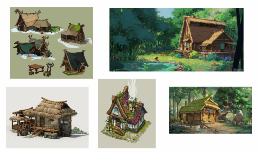
In the mood board below, I compiled some images I would use as inspiration for the housing platforms. I wanted to combine traditional Polynesian hale— which I have done research on, it can be found here in the architecture section— and English medieval country side houses. I wanted some houses to have straw roofing, while others would have tiles. All the houses would have some forms of nature embellishing the exterior to maintain the nature island themes. Additionally, I wanted the houses to not have doors and exclusively have curtains or rags covering the doors.
When colouring these houses, I want to remain in the primary colour palette if possible, accompanied by green hues for the nature aspects of the village.
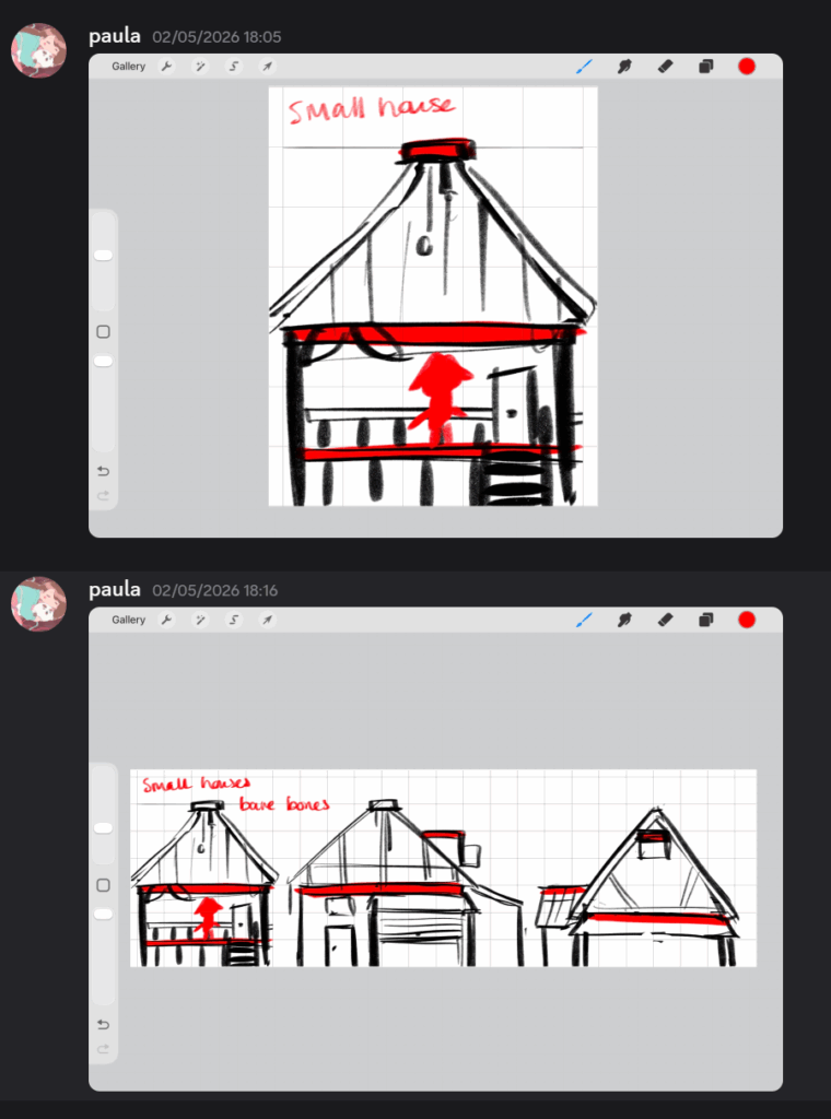
In the screen shot above, I did the first round of housing designs. I really liked the asymmetrical designs of these houses. However, when I brought these concepts to EJ, he requested that I stick closely to the guidelines as it would make his job easier when implementing these assets.
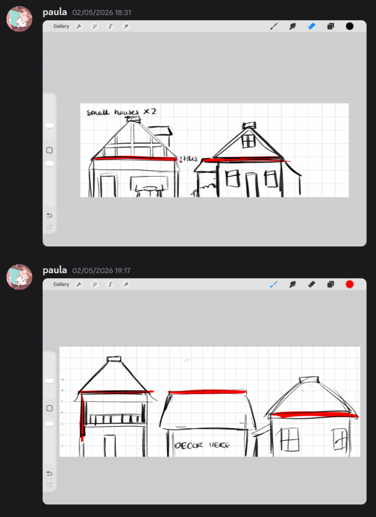
In the screen shots above, I did not deviate away from the original guidelines as to not waste time. I still kept the asymmetrical aspects of the previous design for variation in the village scene.
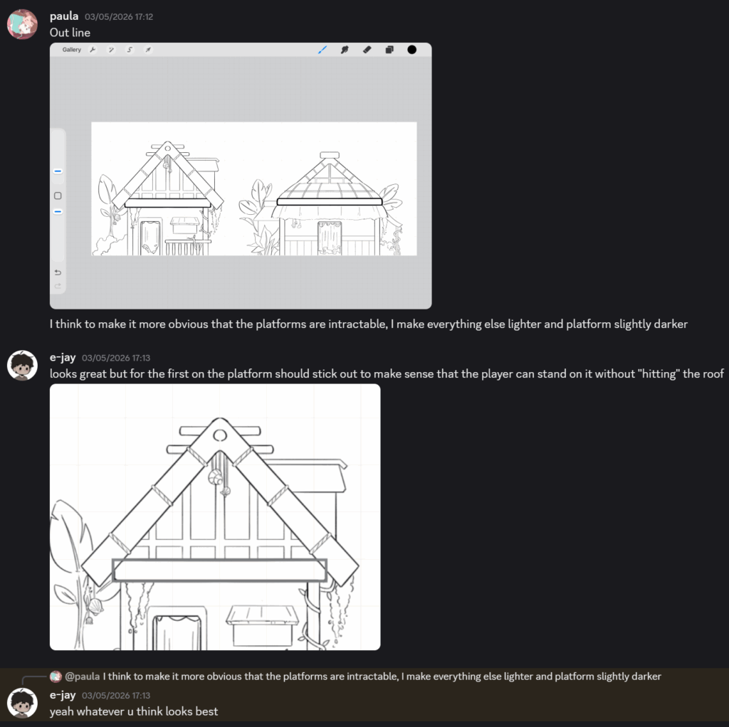
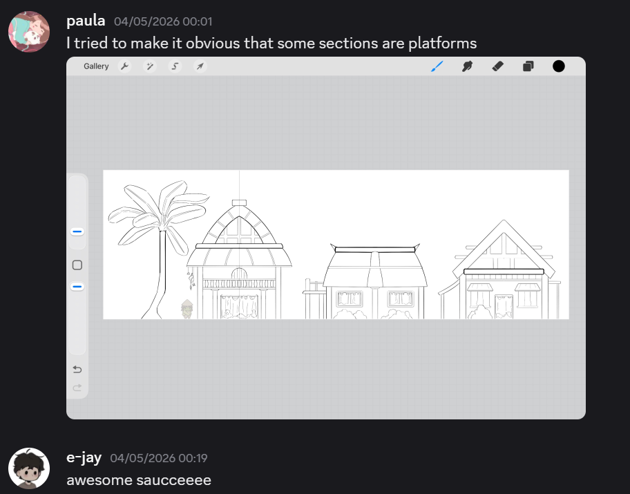
In the screen shots above, I had shown EJ what I was working on. For the platforming sections on the house, I made certain lines thicker so it becomes evident for the player that they can interact with it.
Once I was done with the line work, I started to render out the housing:
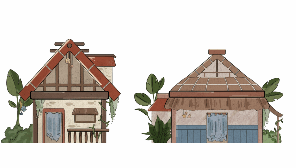
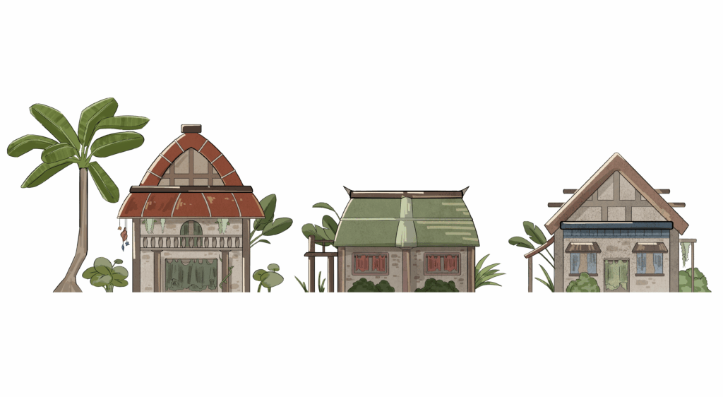
Decorative assets
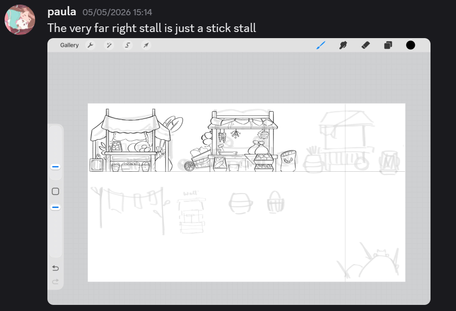
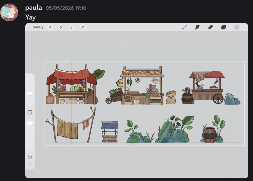
However, I’m still not done with the village assets, one of my goals for the village is to make it feel more lively. To do this, I wanted to make some stalls and trees to populate the scene. As I had done the housing fairly quick and nailed down the rendering style for it, the decorative assets didn’t take me long to complete.
Assets in game
Mini reflection
Looking and reflecting on these assets, I believe I have captured the island feel through the use of colour palette, silhouette of the houses, and nature embellishments such as foliage or overgrowth.
Combining two opposing architectural inspirations from traditional Polynesian hale and medieval countryside housing helped me to create a distinctive housing style while also maintaining cohesion within the game’s overall visual direction.
As a result of this process, it reinforced the importance of balancing illustrative creativity with game art functionality. Receiving constant feedback from my team mate constantly made me adapt my designs to fit within the functionality of the game, especially with platform readability and collisions. I have developed a stronger understanding of how environmental assets must work with game play interactions with the player.
NPCs
Now that the village assets are done, the next thing to do is populate the village with some NPCs!
In the world we have built, Kauri gets washed up ashore after a storm but someone saves him and drags him to their house. This is the NPC I wanted to design first. I was heavily inspired by the existing character Zote in the Hollow Knight franchise. He’s an elderly bug that seems quite delusional in his “overpowering” strength. For this NPC, I wanted to create an elderly sprout creature.
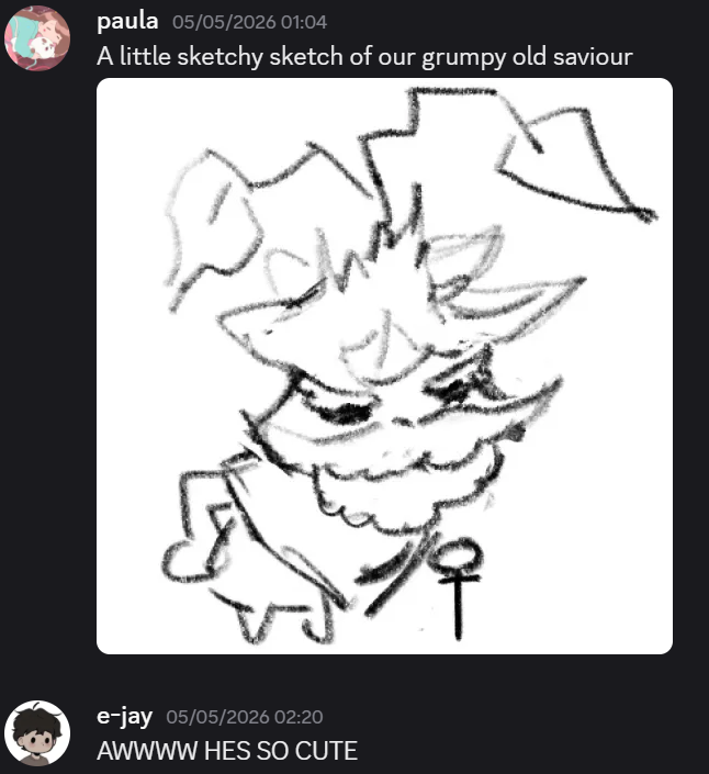
Through this sketch, I wanted to showcase his long lived life through his beard, posture, and the wilting leaves on his head. Below, I made some other sketches alongside the good Samaritan. I wanted these NPCs to vary in height, shape, and facial expressions.
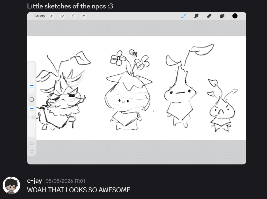
Since I had established what characters in game would look like through Kauri, picking colours and doing the line work for the good Samaritan character wouldn’t serve as a difficult obstacle to overcome. In game, he would be slightly shorter than Kauri.
Screen shots below show me showing EJ the NPCs.
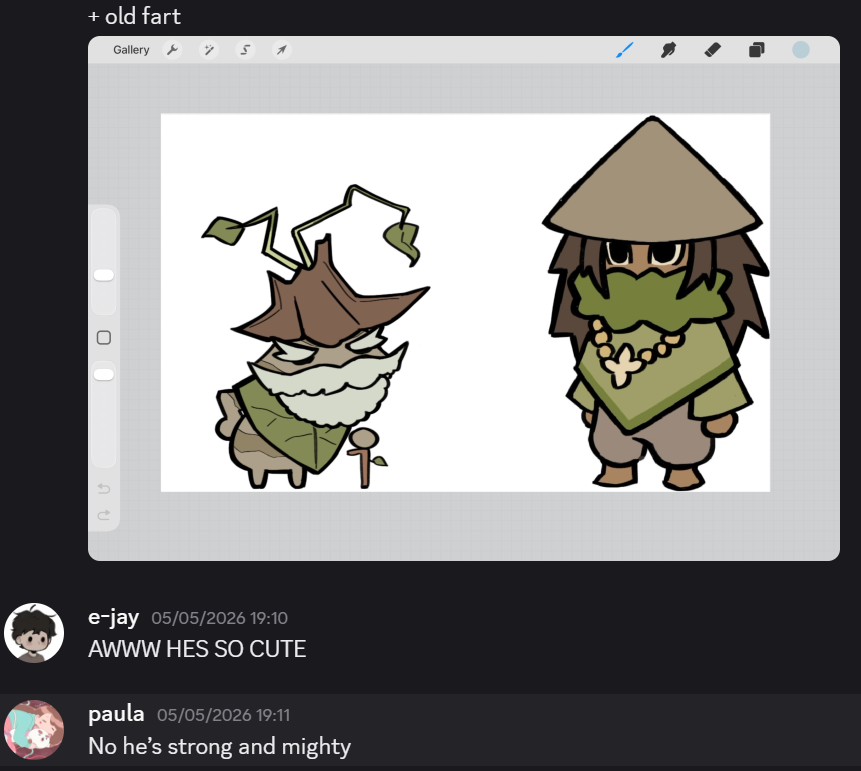
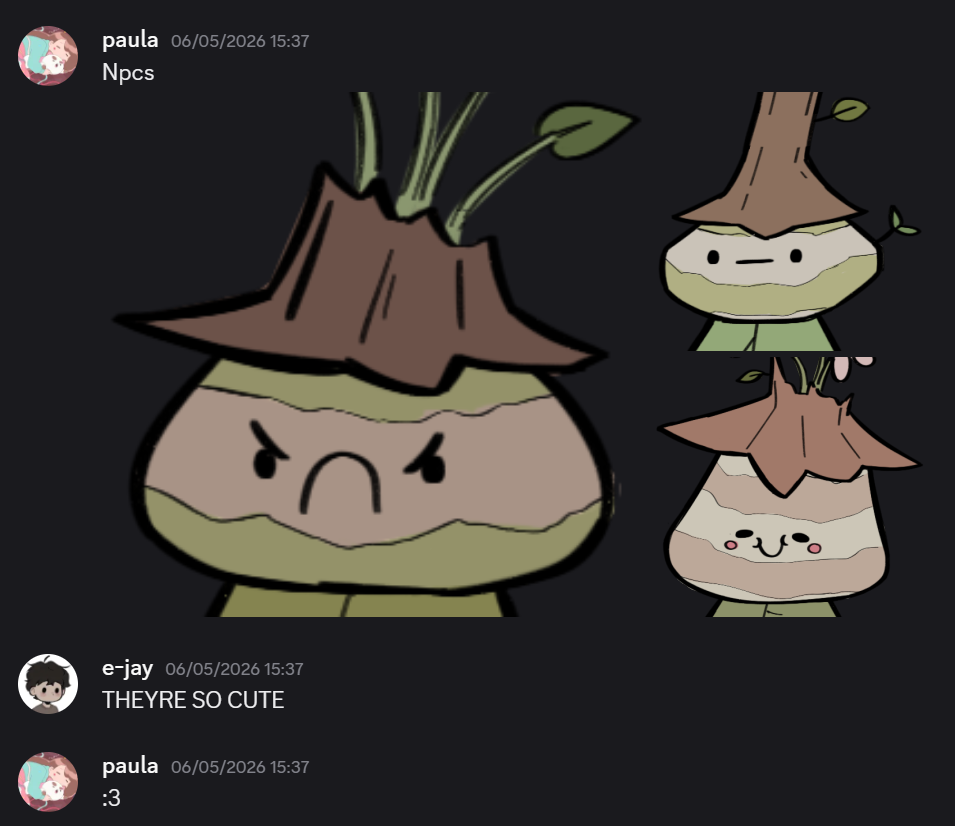
Mini reflection
I really like how these designs came out, although they are very similar in design, I feel like I made them diverse enough through stature and facial expressions to give off the impression that they’re different enough.
Backgrounds
Doing the background work was something I was pushing back as much as possible, but as soon as I started making them, I managed to get them done in just over an hour. As a reminder, EJ wanted me to make a background and then blur it, with this information in mind, the most important factor I try get as close to perfection as possible was the colour and structure of the background illustration.
As per usual, I usually start off any illustrative processes with coming up with a new thumbnail sketches to show EJ before moving forward with any finalised decisions.
Village Island (main hub)
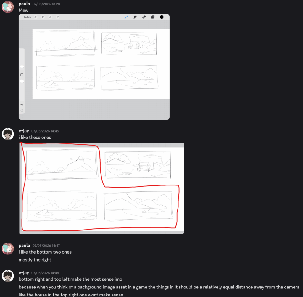
In the screenshot above, I came up with 4 quick thumbnails, the aim of this process was to capture the angle, structure, and shape of the shot. In person, my team mate requested that I try to not make it very zoomed in as the camera would be parallaxed, meaning it would be zoomed in and would move when the player moves as well.
He points out that he likes the backgrounds without housing, and especially liked the top left image. With his opinion, I began to create the background work; but I still needed some extra guidance as to what colour palette and composition I should follow.
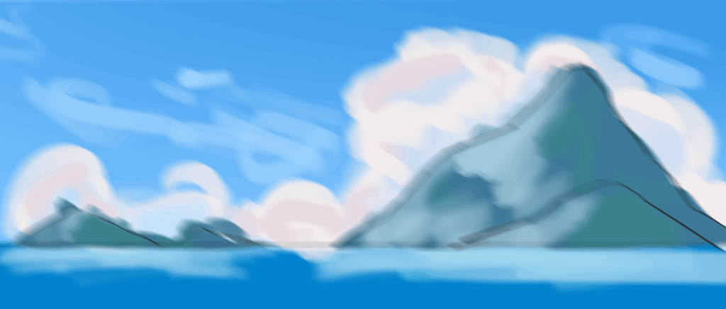
In the images below, I use the top left and bottom right thumbnails to experiment colour with. For the first image, I wanted to use a very blue colour palette to reflect the ocean and picturesque island life. The image at the bottom uses primarily green, flaunting the flourishing fauna the island possesses. When I was done with placing the colours, I blurred both images and asked EJ to put them in game so I could see what they would look like.
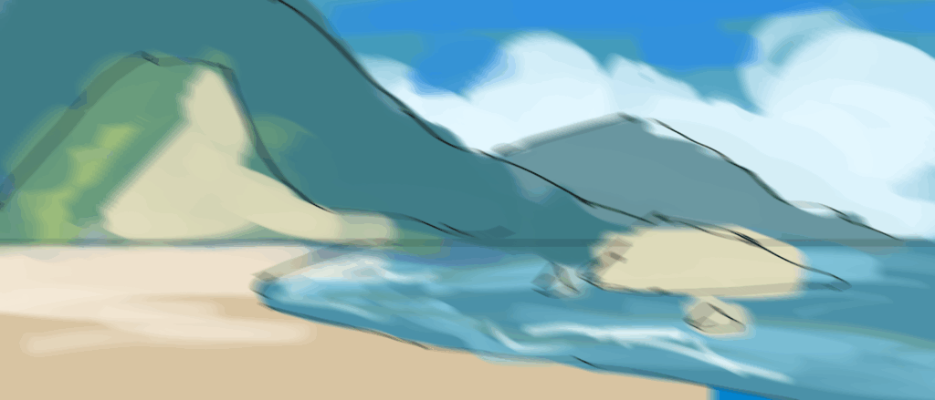
Testing in game
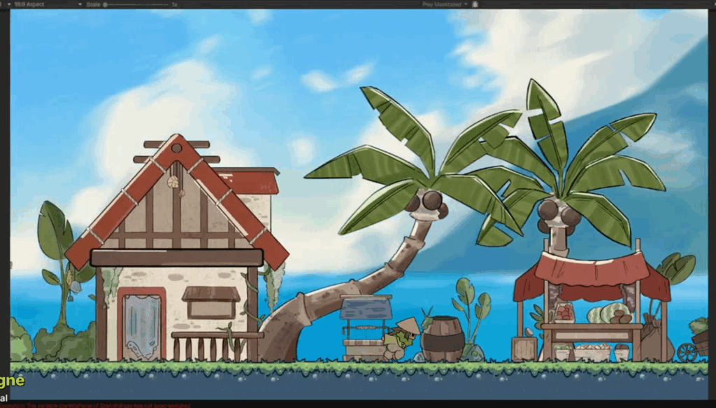
Motion blur
Gaussian blur
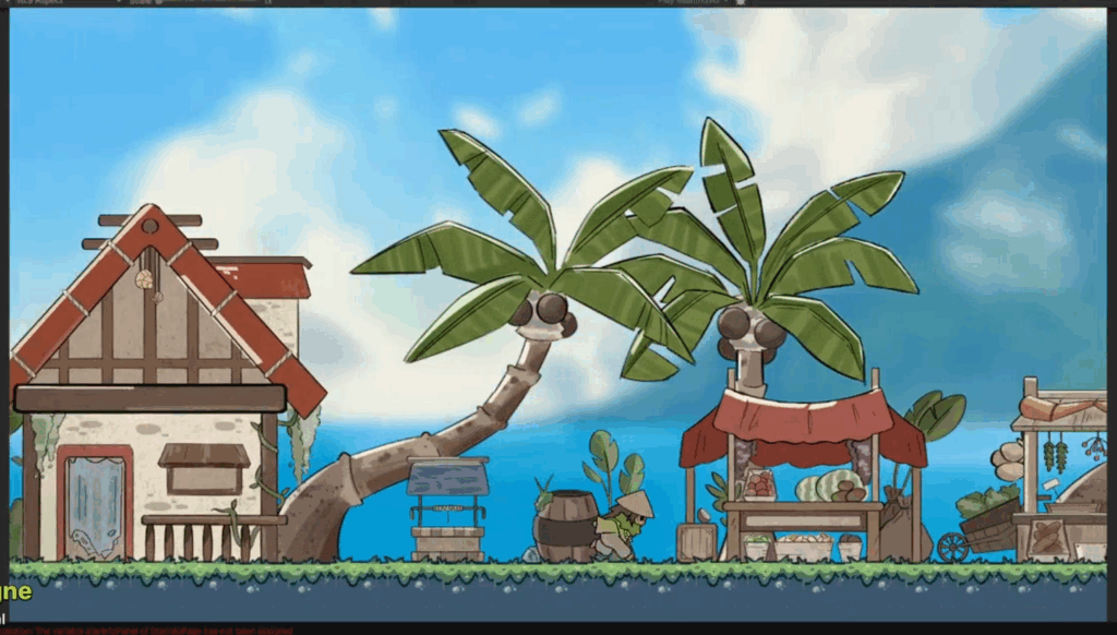
Although me and EJ had both agreed that a blurred background would look best, I tested with motion and normal gaussian blur to see what each filter offers. Gaussian blur makes the background appear further away, however motion blur does that as well and it provides some energy in the scene; considering that our game is a platformer where the player doesn’t sit still for a moment, I felt like the motion blur filter was the best option out of the two. From this moment moving forward, I will be using motion blur for the backgrounds.
Overgrown island
Following the same process as the previous island, I began with a few thumbnails then coloured them in to test the colour.
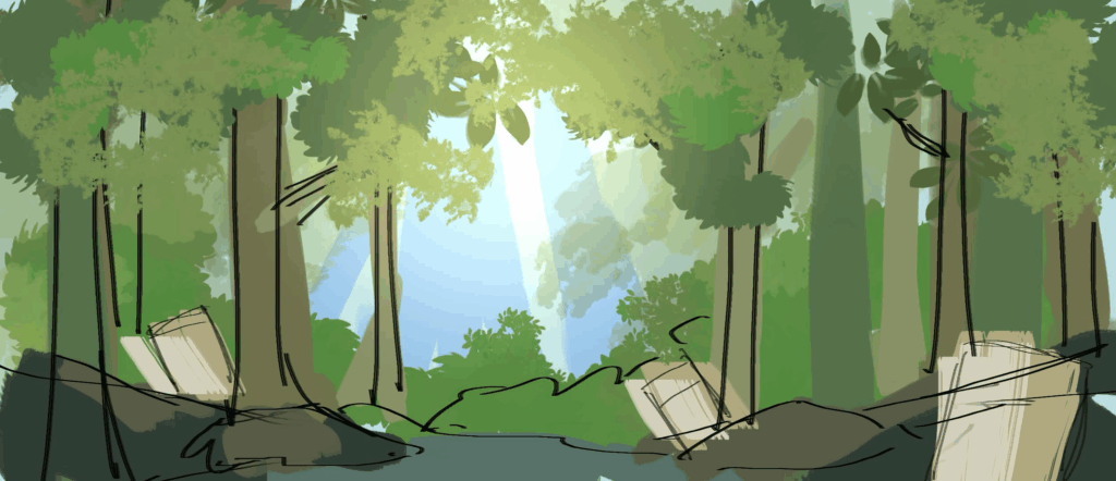
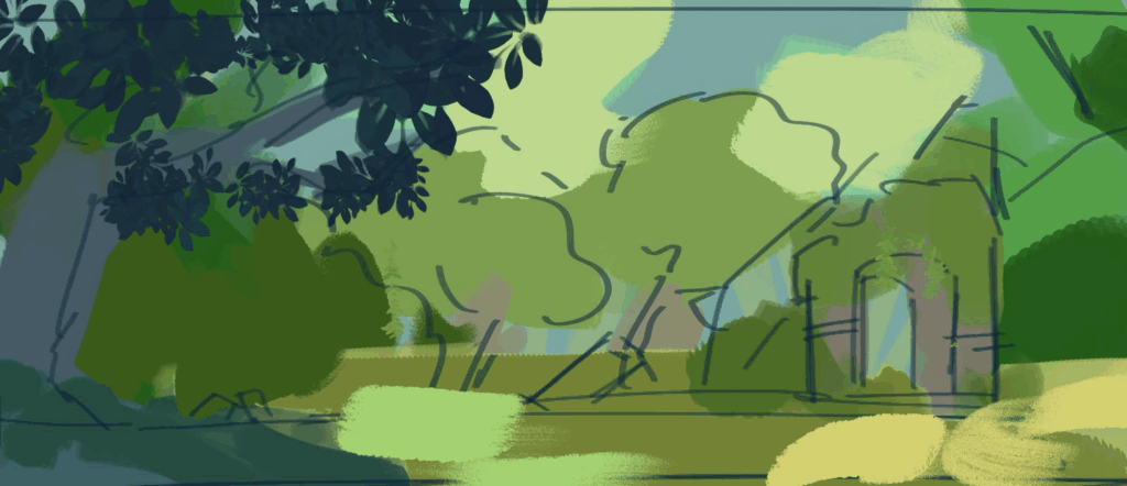
I chose to move forward with the first image as I liked the symmetry of the background.
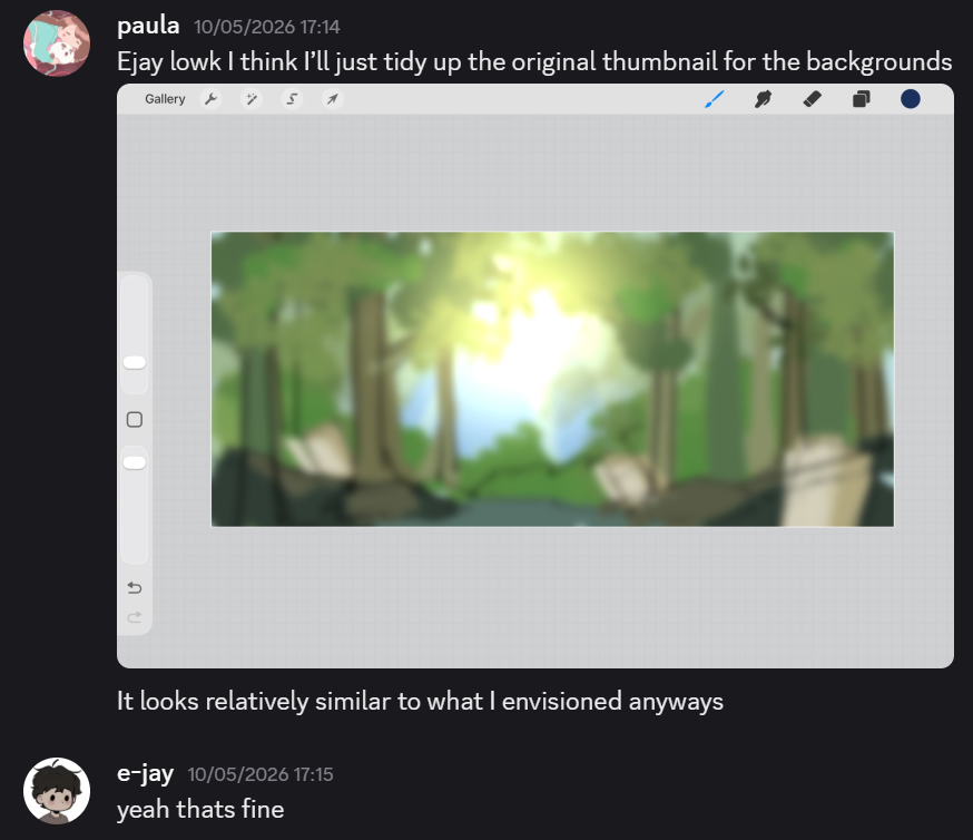
It was at this point I realised I was confident enough to not constantly ask for my team mate for feedback and trust my creative instincts; however, this doesn’t mean I won’t ask for his opinions every now and then (for the background work).
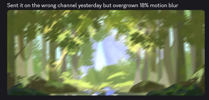
Once I was done, I sent it to EJ on our art asset channel. This background took me a short amount of time as well, roughly 50 minutes. As this project progresses in time, I have developed so much speed and efficiency in my work flow. In previous works, I believe something like this would’ve taken me 2 hours due to my indecisiveness and uncertainty in my creative input. Another factor that contributed to my speed are using the correct brushes and textures. I have learnt that using something as simple as a pastel brush can make something look like tree bark or moss.
To make this background feel more immersive and lively, I used a glow layer to resemble sun rays peering through the leaves on the tree and a slight vignette to make it appear more cinematic.
(The same process above happens for the next 2 islands)
Bioluminescent mushroom island
I started off going straight into sketching this background without much thought as I wanted to get this done quickly. However, I still used a reference picture to help me with the shape and structure of the foundations of this environment. As this is technically supposed to be underground, I wanted to give it the illusion that some of the formations feel bigger in comparison to the player.
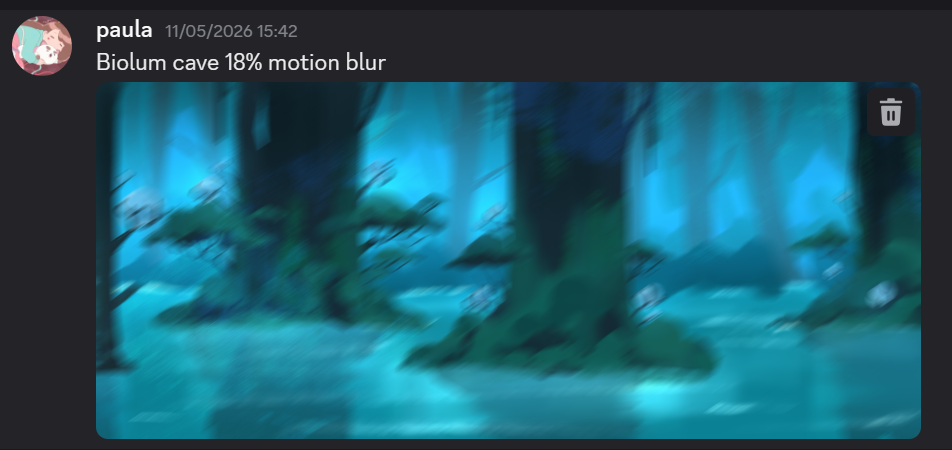
Here, I combined both surface and underground aspects. The formations are supposed to be ambiguous as to whether it’s either trees or underground rock formations.
Coral island
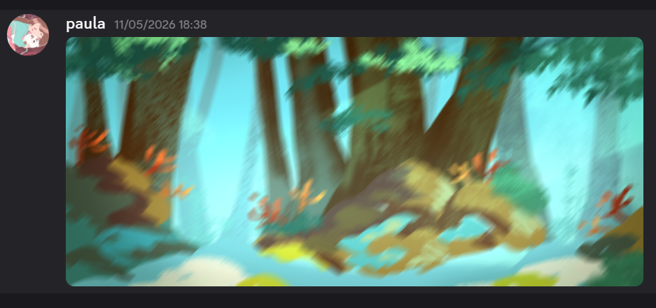
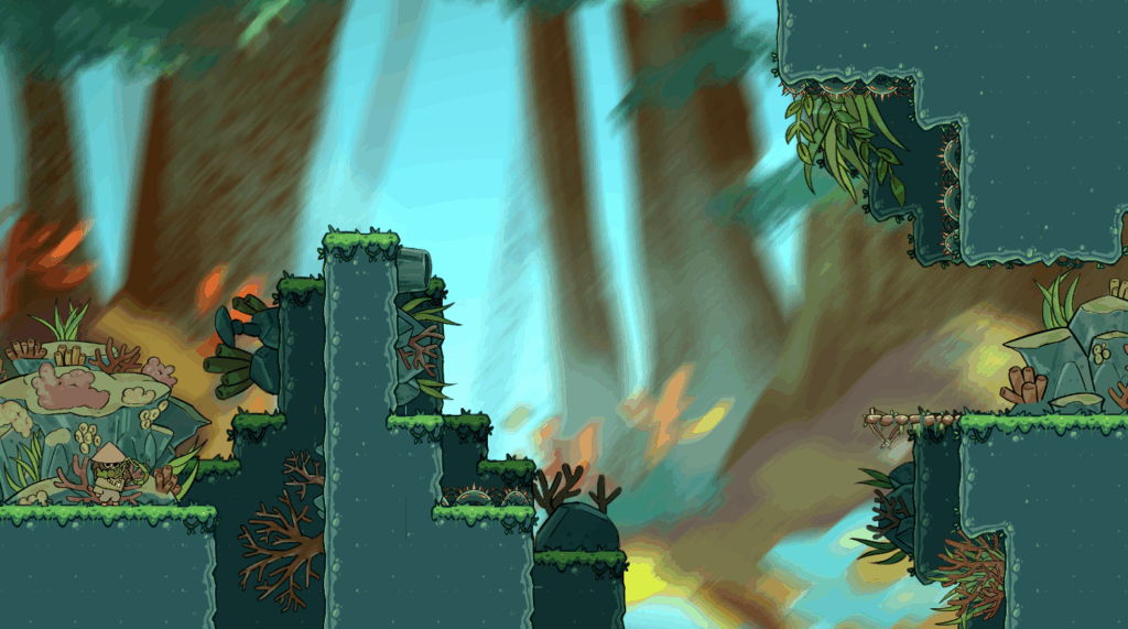
This is the last island the player ventures to collect the last fish hook piece. To make this environment more distinct from the other two, I used more of a teal/cyan blue with orange and browns. I used this colours to replicate the underwater feel from coral reefs.
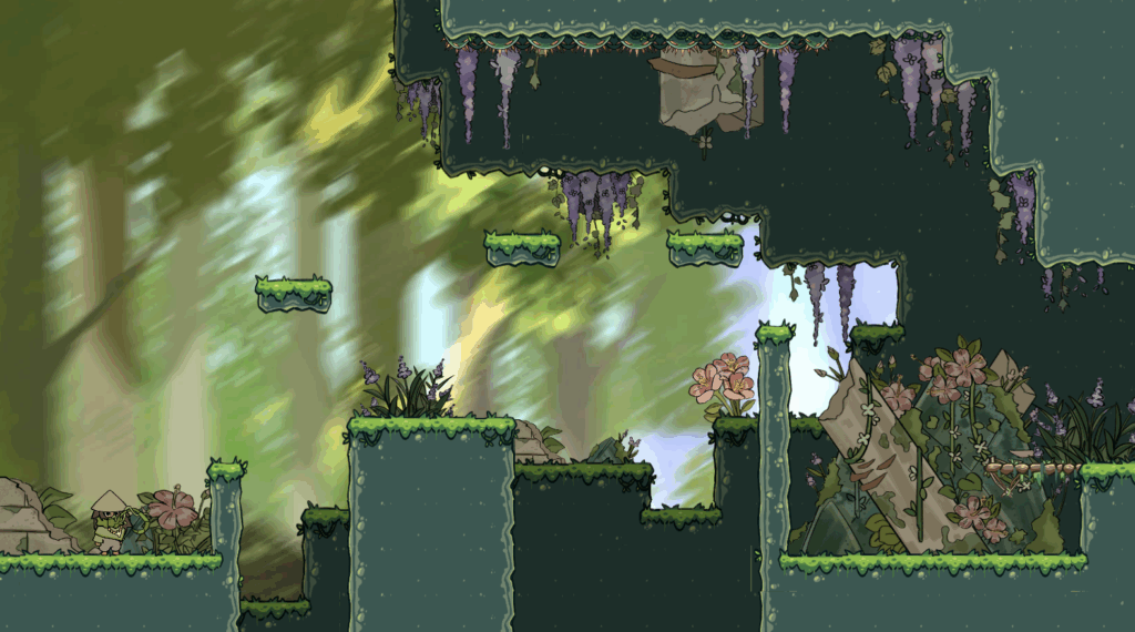
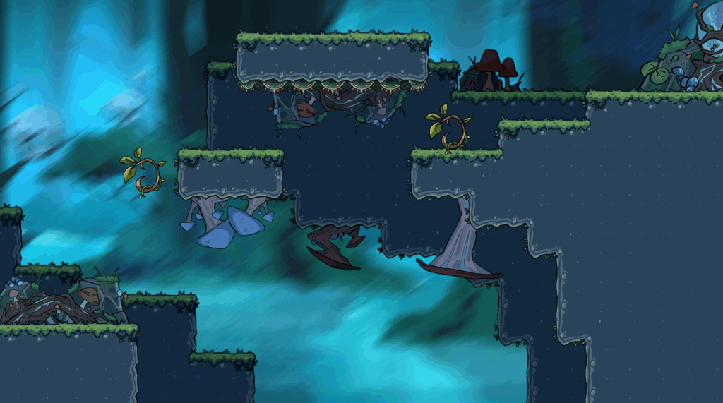
Assets in game (background + decorative assets)
After completing the backgrounds, EJ asked me to help with recolouring the tile sets so it fits with the theme and doesn’t look too out of place.
Overgrown island
Bioluminescent island
Coral island
Social Media and Promoting
Now that we’re creeping up to our deadline, I felt like it was the perfect time to create an Instagram dedicated to showing what me and EJ have both worked on. The purpose of this show our audience the concept of our game and genre.
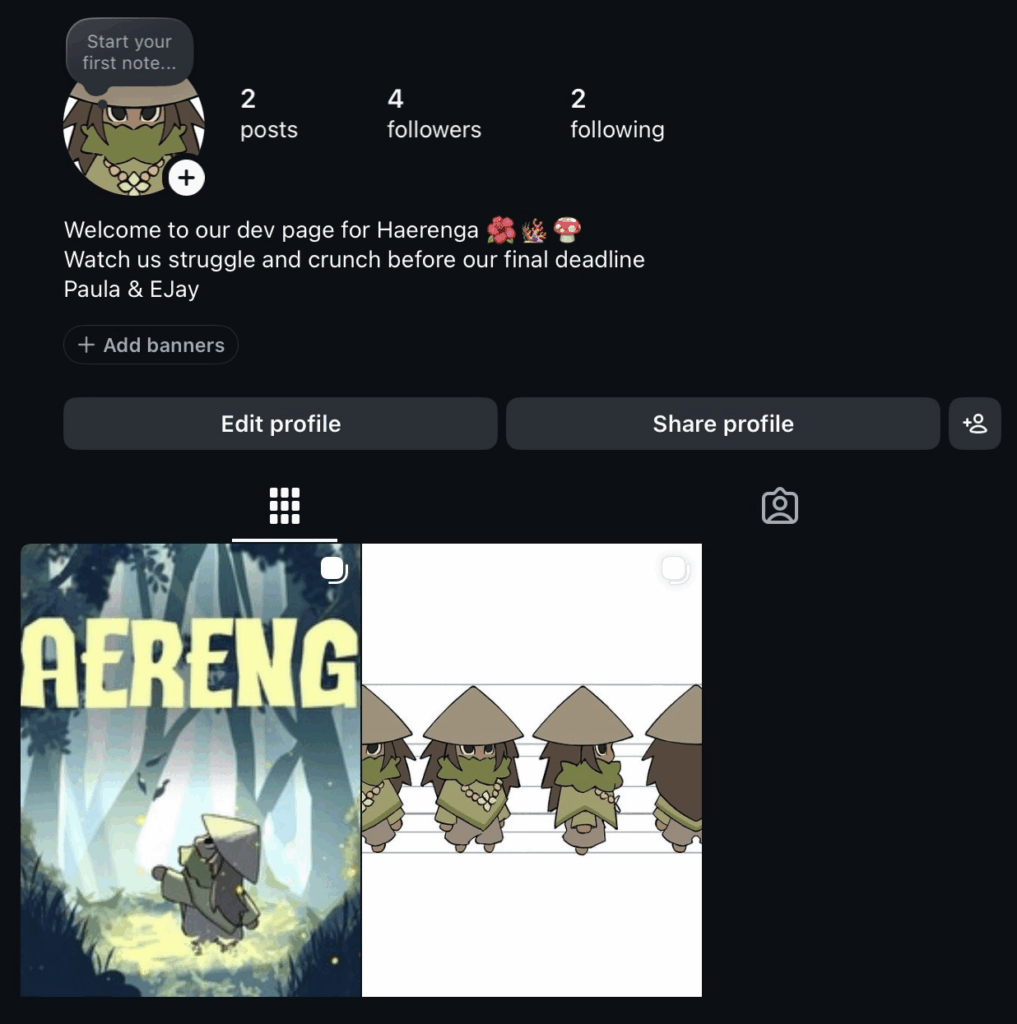
On the first post, I introduced Kauri, who essentially serves as the face of our game anyways. The second post introduces the promotional artwork I did.
I chose to upload to Instagram in hopes of reaching to audiences roughly the same age as me. However, uploading on Instagram had its challenges. Instagram over the past few years had put an emphasis on short form content, which isn’t the best platform to post art work (sometimes).
Despite this shortcoming, creating a social media presence still helped me to understand the importance of knowing your audience and presenting our game in a professional manner. This brings me to my next post:
I chose to upload on LinkedIN as this provides me and EJ the platform to promote our game on a professional standard. Unlike platforms such as Instagram and TikTok with the sole focus of short form content, LinkedIn provides users to promote their developmental work and artistic skills to industry professionals.
Posting on LinkedIn also helped me to understand the importance of building a professional presence online.
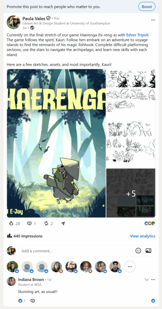
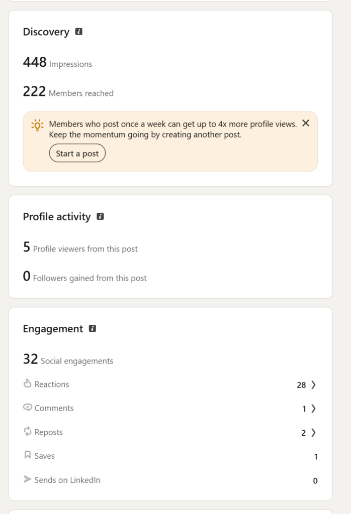
From the screenshot above and looking at the analytics, I believe we have reached a considerable amount of people.
Promotional art
For our year’s publication work, I had to get some high quality work done before the deadline. The dimensions for this work needed to be very large 2160 x 2160px. To really sell this art work as “our own game”, I wanted to use colours relevant and Kauri in the centre of the promotional work as he is our mascot.
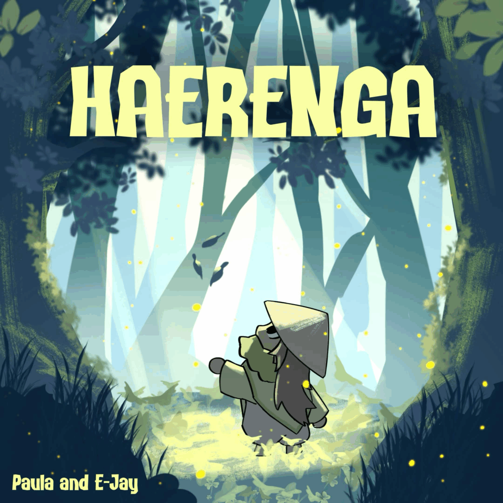
For this art work, I used a lot of greens, blues, and yellows to resemble the stereotypical tropical island colour palette. I wanted this piece to look cinematic without over rendering to the point where the art style is unrecognisable. For the blending layers, I used an add (glow) layer for sun rays peering through the tree leaves and a multiply layer, using an airbrush for a slight vignette. For the final touches, I added small yellow dots to resemble fireflies.
With the art work I have made, I wanted it to appeal to people who like bright visuals and tropical aesthetics.
One of the aspects I took time on was the typography of the game. Considering that the font I pick will be used as the in game text, I wanted to think about my options. Before I came to the font displayed above, I had these ones to look at:

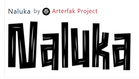

I chose the current font we have because it had lower case letters and most importantly, it’s readable. Some of the options above could’ve been great options, however, I wanted to choose a font that could be used as a logo and text writing, which some of these fonts couldn’t offer.
In the next sprint, I want to create more promotional work involving more of my art work, specifically stickers! I believe stickers are a cute and fun way to remember a game, especially if you have a lot of memorable characters.
Smaller assets + Refining
Particle effects
In the final island (coral), a new mechanic/obstacle will be introduced, which are the geysers. These eject bubbles and steam
I made a very quick bubble asset for the particles:
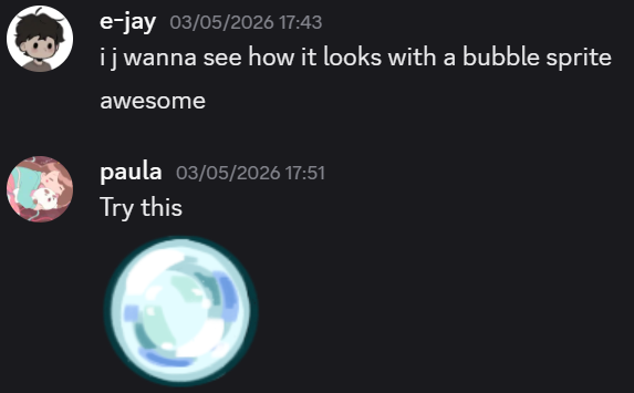
I also made a steam particle:
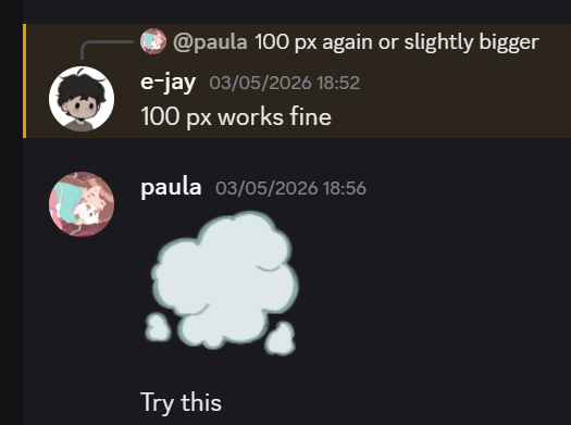
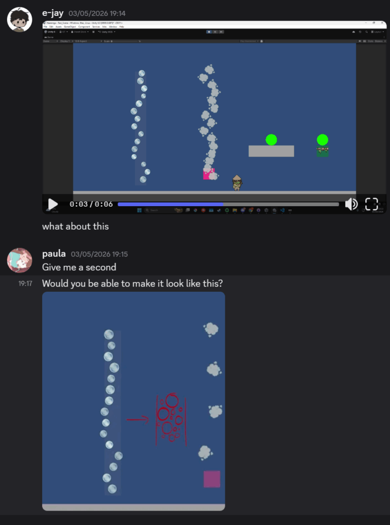
I had also communicated to EJ that I wanted the steam and bubble columns to look a certain way. I asked him if was possible to randomise the orientation, size, and speed of individual particles so it doesn’t look too uniform.
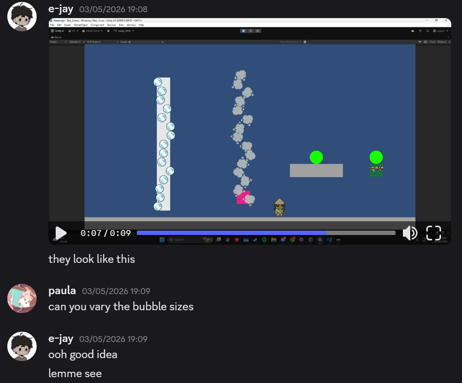
In the screenshot below, my team mate had implemented the environmental elements as I requested, however, I still felt like the composition lacked variety. To better convey what I was thinking, I drew a reference (in red) to communicate exactly what the adjustments I had in mind.
I had in mind the bubbles to vary in size to create a more organic feel that replicates real nature in our world. If these bubble columns stuck to the uniform, symmetrical structure, it tends to look artificial and reduces our game’s quality. This conflicts with the nature driven aesthetic I was going for.
Since nature is rarely perfect, seeing the bubbles with contrasting sizing and irregular spacing helps the scene feel more immersive and believable. Doing this process of collaboration in between our disciplines, helped to translate the ideas I had in mind and implemented them into our game.
Geysers
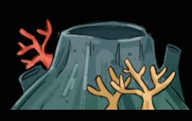
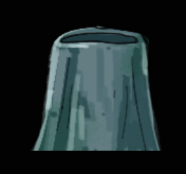
After doing the particle effects, I needed to draw the underwater ventilation of which it came from, geysers!
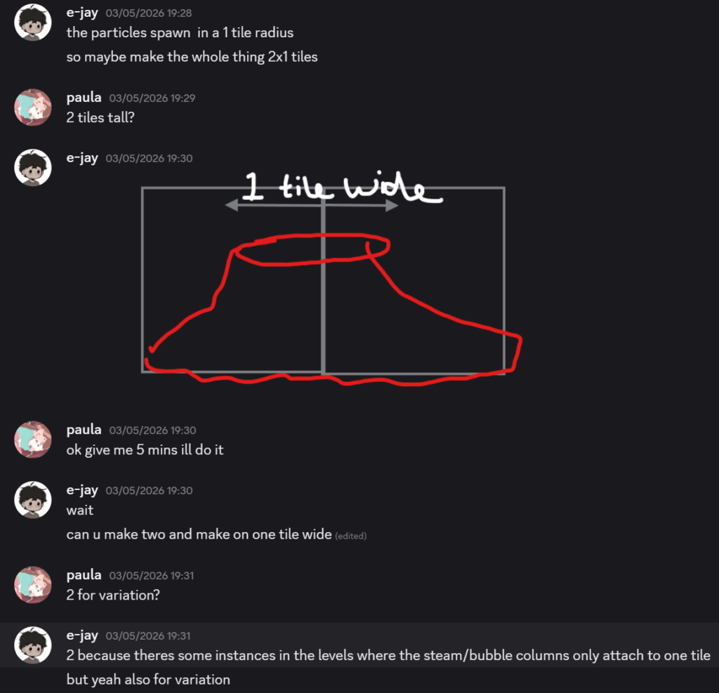
In the screenshot above, me and EJ were communicating what size the geyser should be, he also added that I needed to create a second one for specific instances where the bubble/steam column only come out from one tile:
New mushroom asset
Although a lot of time has passed since I made the first mushroom assets, I felt like they didn’t fit in the scene. This is because the assets I had designed weren’t cell shaded and it was the incorrect shade of blue. Even though it’s a small ordeal, I wanted to make sure that all the assets I had designed, fit the environment in our game.
(Old mushrooms)
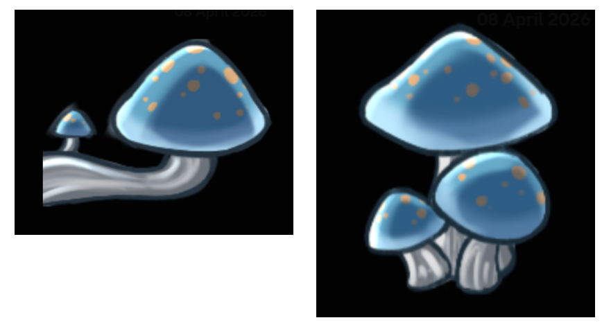
(New mushrooms)
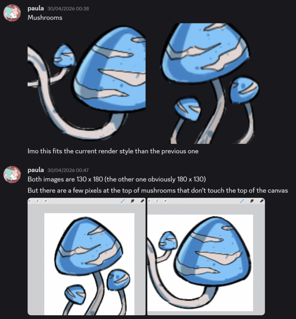
I believe the new ones I have designed fit the visual direction of our game more. It uses a much more vibrant blue, the white striped are emphasised, and the render is cell shaded so the assets share the same render style.
Book (inventory), pages, and fish hook fragment
At this part of our game journey, we are almost done. All I have left to do is to make art and assets that improve the overall quality of our game and to continue to refine existing assets. This asset wasn’t originally on my asset to do list, however, EJ brought up to my attention that we need an inventory which comes up as a book. This is where the players would learn about the way finding mechanic involving stars, it also serves as world building.
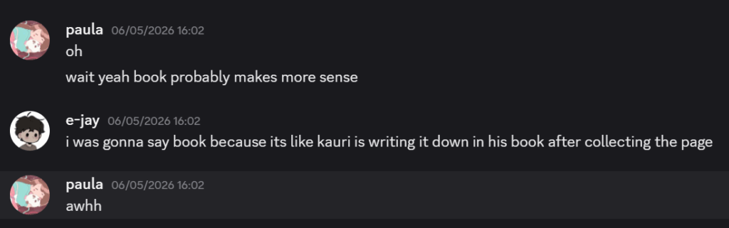
But before the player obtains the book, they need to collect the pages that go in the book, which is another asset I needed to create. I really liked this book/inventory idea, but when EJ suggested that Kauri could “write” in it as the adventure progresses, I was completely sold. This was a very cute way to integrate both UI, player immersion, and environmental narrative all in one box.
(Screenshot of EJ suggesting that Kauri could write in the book)
(Screenshot of EJ showing what I needed to make)
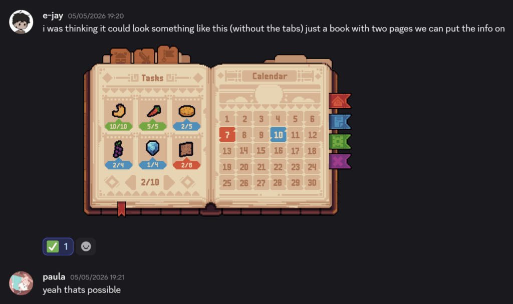
I made the book asset using a graphics tablet on ClipStudioPaint, this is because I had some technical difficulties with my Ipad, so I had to switch over. After many attempts on trying to make the USB port plug into my PC, it finally connected. This is what I made:
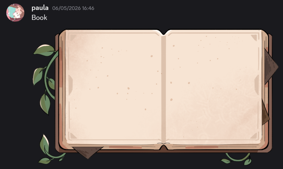
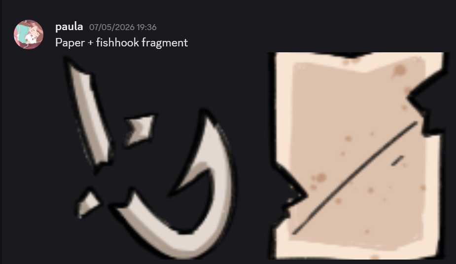
For the book, I didn’t want it to look plain and simple, I wanted it to look overgrown with leaves to stick to our nature theme.
Reflecting on this addition, I realised that small assets such as the book, acts as an immersive aspect that pulls players in and contributes to the world building. Although the inventory wasn’t originally planned, creating new assets for the gameplay made me think carefully about how the visual aspects of the game can support the narrative and mechanics simultaneously.
After sending the assets, EJ immediately got to work and started writing in the book. However, the font he had chosen proved too difficult to read:
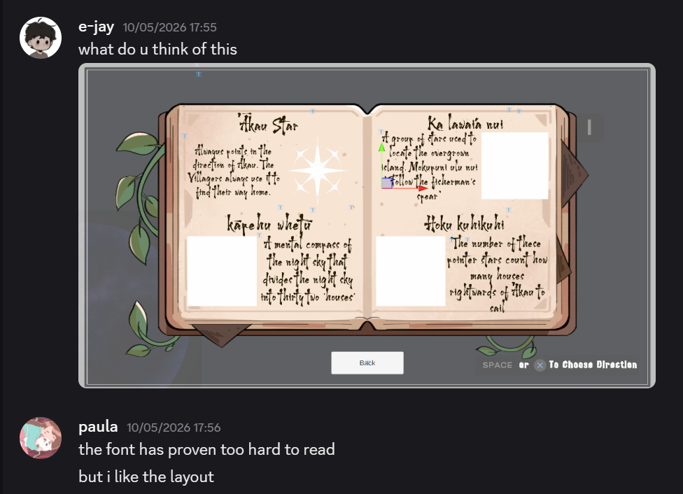
He went on to change the font but keep the hand written feel.
In addition to these small assets, I was asked to make a sand tile for the village scene. We wanted to make this island more distinctive from the rest of the islands as this island isn’t very platform focused. This is where you learn about the world you are in and the habitants. As a result, this island is more narrative focused.
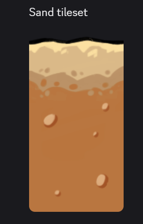
I was only requested to make this tile set 2×1 as this island is completely flat and the terrain is easy to traverse in, so there wasn’t a need to create an entire tile set.
UI box
This is another small detail that only makes the game feel more immersive. Having a UI box that feels personalised to the game’s theme was necessary to contributing to the believability of the game. This UI box would be for the menu, I would also have to make one for the button.
I was asked to look up “9 slice UI” which essentially is a UI box that can be stretched within the mid sections. The corners do not get stretched. What this means for me is that I can create a detailed UI box but keep the detailing in the corners so that they do not get affected by stretching.
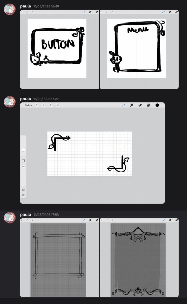
In the screenshot above, I began experimenting with different layouts that the UI box could have. The first UI buttons I made had small leaf embellishments on the corners. Then I gravitated towards something minimalistic, then I realised that it would be transparent and didn’t think it would look nice.
Then I made one that looked like wooden boards being nailed together, one next to it with the semi gothic embellishments. However, we couldn’t move forward with the bottom right because it couldn’t be 9 sliced. However, I really liked the iteration with the wooden boards being pinned with nails.
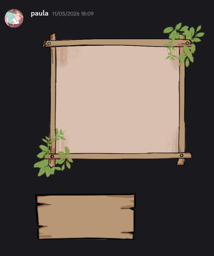
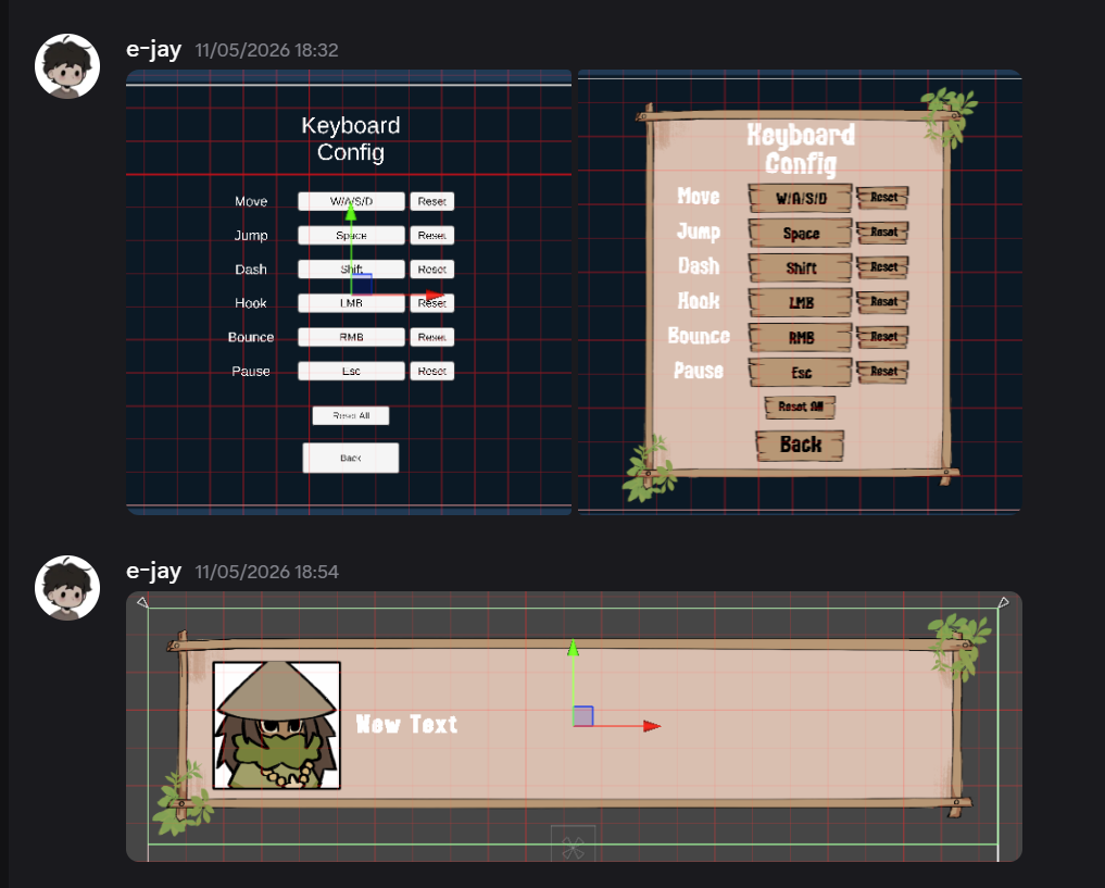
To make the big UI box feel less empty, I put some leaves on the corners and to stay within the wooden theme, I made the small button a wooden plank. This is what they would look like in game:
Canoe
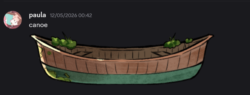
Another thing I was requested to make was a canoe for Kauri to travel in after he completes the village island. In Rito’s dialogue, he states that the canoe hasn’t been used in “many seasons”. So show that the canoe was weathered slightly, I drew some moss around.
Asset in game
Mini reflection
After doing the smaller assets for the game, I realised how impactful and how important it is to get them done to improve the overall quality of the game. Although many of these additions are not features that will change the game play, elements such as particles, UI, and inventory significantly contributes to making the world feel more cohesive and immersive.
Dialogue village scene
I looked at the village cutscene EJ recorded and felt like the dialogue was a bit off. I felt a bit modern for the context and environment for our game. So, I asked if I could change the dialogue entirely whilst still getting the task across. While doing this, I wanted to give the NPC that Kauri was talking to, more character. I wanted this character to be very friendly, bubbly, and a bit ditzy.
To achieve this, I made the NPC refer to themselves as 3rd person and seem overly friendly to let the player know they don’t serve any threat.
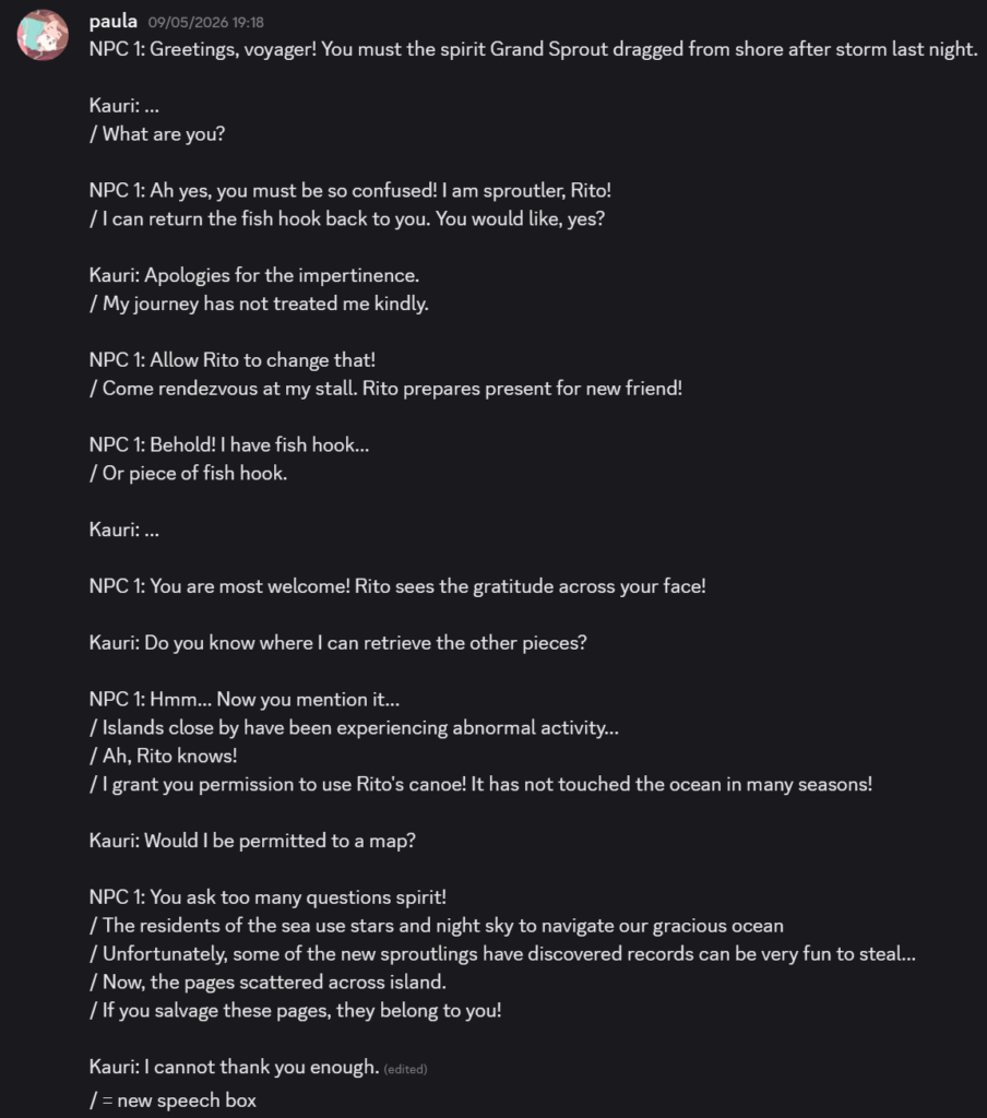
This is the dialogue I came up with, I wanted Kauri’s formal and stern language to juxtapose with the friendly NPC. I made the NPC’s language a little broken in an attempt to make it sound cute.
In the end, me and EJ both agreed that the sproutler with the flowers on their head should be the NPC to do this scene. I gave it the name Rito.
Last playtest!
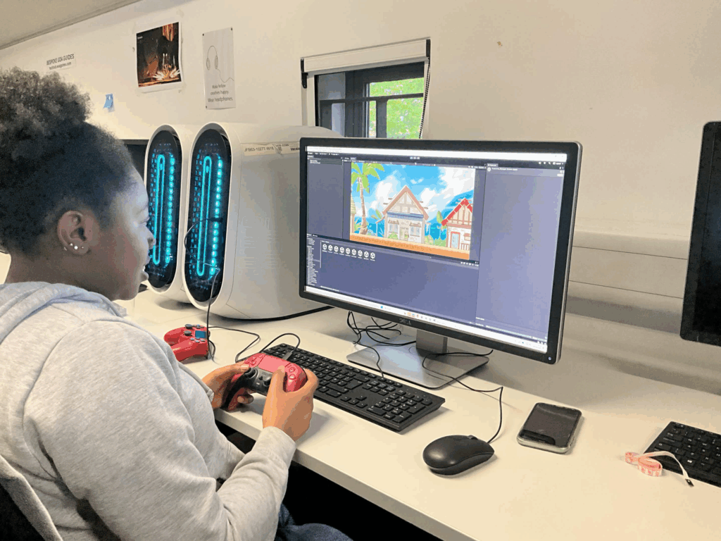
This will be the last playtest that me and EJ will conduct before hand in. I asked 2 of my classmates to play our game and this is the feedback we received:
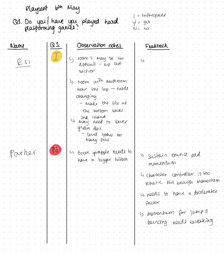
Most of the feedback we had received was in regards to the level creation such as:
- Room 2 of island 1 was too hard
- Mushroom needs in island 1 needs to be placed lower down; when the player jumps on top of it.
- Grapple asset needs to have a bigger hit box
Some of the levels weren’t obvious as to what the player would have to do next. Parker provided some really good feedback for the programmer (EJ) involving the movement and how it felt, especially with the grappling hook mechanic.
From my end, I noticed that there would be a crumbling block asset which would just be the same tile set recoloured. What this means for me is that I need to make 2 more tile sets. One for a crumbling and then disappearing when the player touches it, and the other one falls and becomes collidable when the player touches it.
Here is EJ’s post on how he addresses the changes needed:
Sprint Reflection
This sprint has been one of the shortest, yet most action packed so far. This sprint focused on finalising big assets, refinement, polishing and strengthening the overall visual quality of our game. Unlike previous sprints where experimentation was the primary focus, this sprint heavily involved applying skills and combining mine and EJ’s workflows together.
One of the biggest improvements I have noticed yet which is creating assets with a great amount of confidence and efficiency. This is also something that will affect my personal art moving forward. In early development, I often struggled with my overthinking and indecisiveness when coming up with a final decision. This greatly hindered my workflow entirely. However, as time progressed, through constant practice and collaboration with my team mate, I soon developed a more focused approach towards asset production.
This sprint had also reinforced the importance of considering game play functionality while also being creative within technical restrictions. This was most prevalent when I was making the village assets and UI aspects; I had to constantly think about the readability, how the player would collide, and constraints rather than purely designing assets for the aesthetics.
Another lesson I had learnt during this sprint is to go back to old work if it doesn’t fit within the visual direction. The mushroom assets needed to be re-drawn as they didn’t fit with the render style I had established with the rest of the assets. As I developed more confidence and speed in this sprint, re-drawing the assets wasn’t time consuming. Overall, it added to the cohesion and game’s visual identity.
On the whole, this sprint demonstrated my personal growth as an artist and my professionalism working in different workflows. My confidence when making decisions alone became more prevalent but still collaborated frequently with my team mate to ensure that the visuals and technical aspects are up to par.
Leave a Reply