Research:
Photo inspiration for the guarded fence:
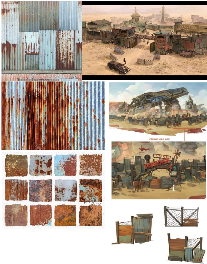
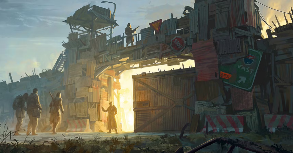
Guarded fence materials: corrugated metal, metal sheets, wooden panels, chain link, barbed wire, launch complex stuff, rocket parts.
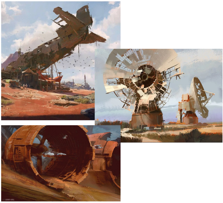
Art style:
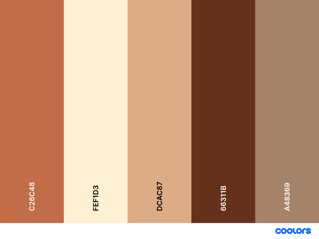
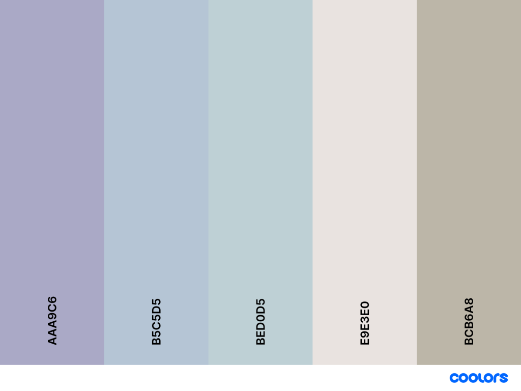
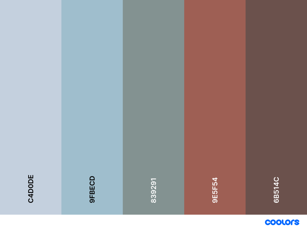
Colour pallets:
Concept art:
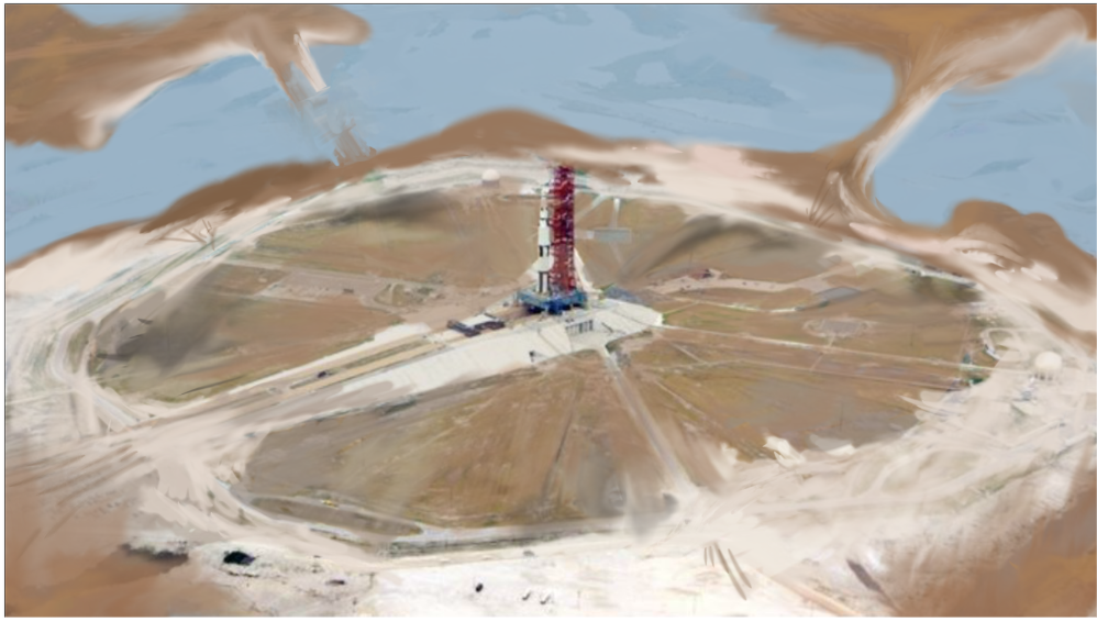
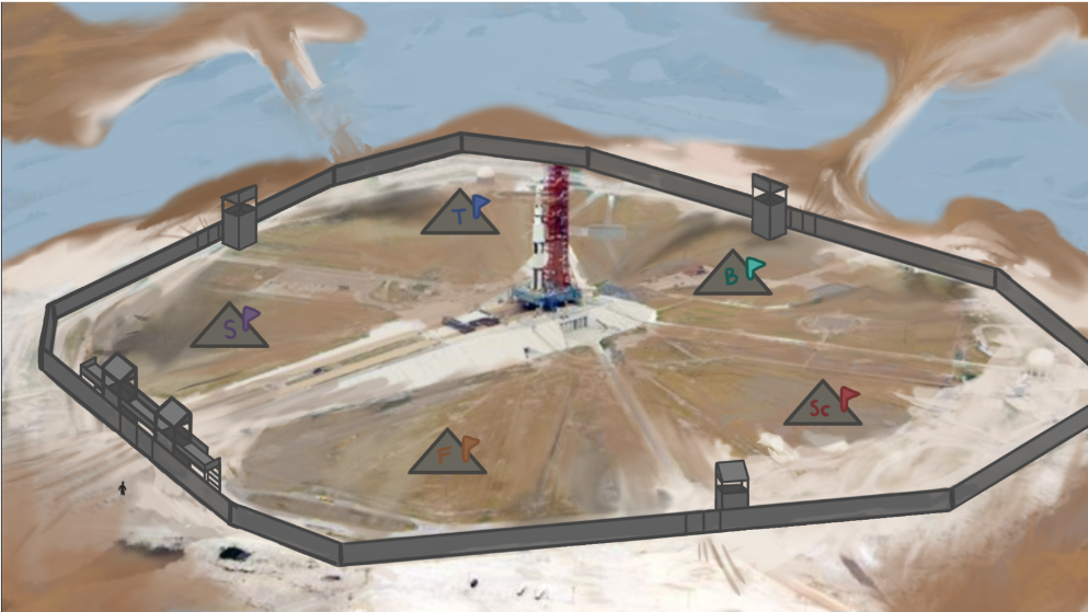
We want to zoom in on the survivor camp slightly, but like this angle.
Survivor camp development:
From my research into the settlement and surroundings, I chose to focus on an outback, desolate scorched earth look, combined with the heavy flooding that would be seen in a post apocalyptic Florida.
I started the artwork by blocking in colours and shapes from my original concept art. I zoomed into the camp slightly and made the boarders a bit rounder to give the resource camps more space.
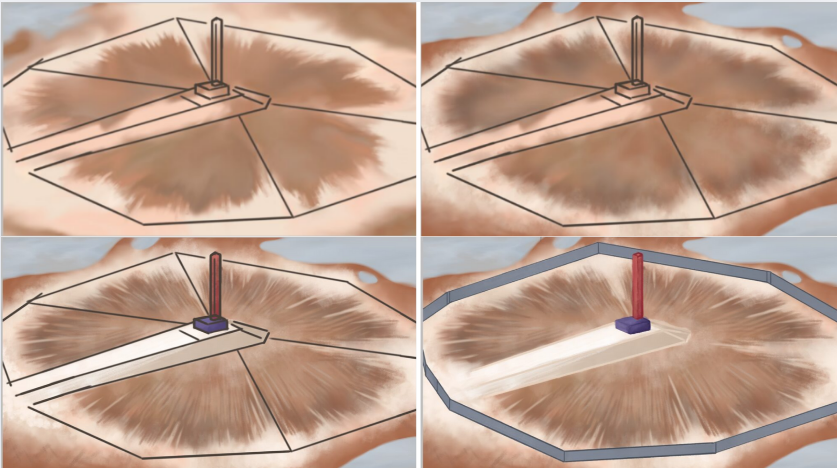
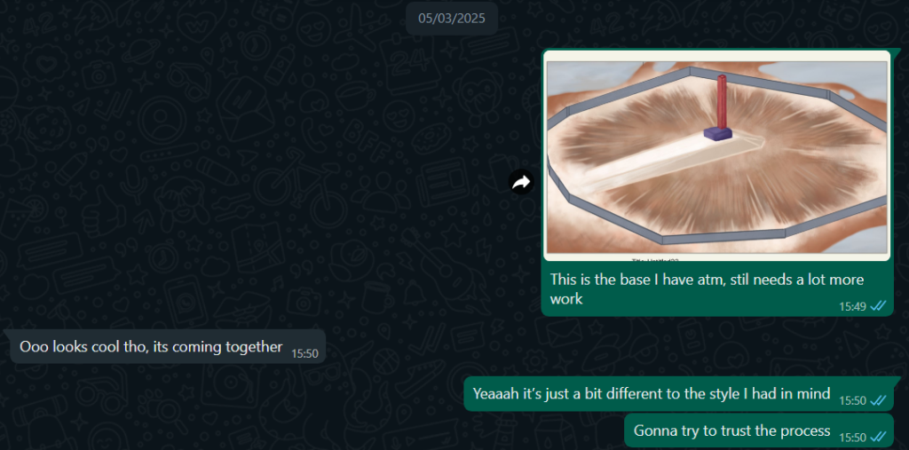
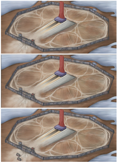
Once I had all the shapes blocked in and coloured, something felt off. I didn’t like the angle of the launchpad and thought the gate was in the wrong place, making it look cramped on the screen. I also just felt unsure about the style as it was taking a long time to come together and the brushes I was using weren’t providing the texture I wanted. I asked Anna for some advice:
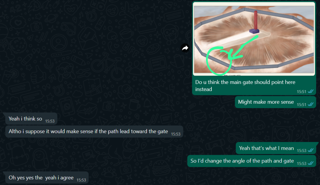
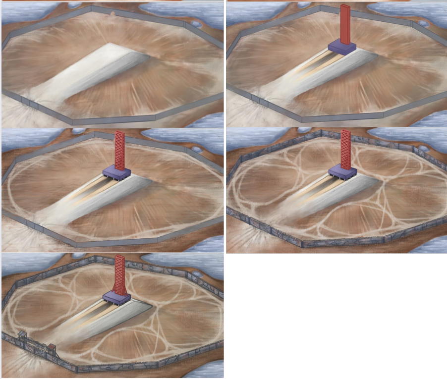
Changing the angle of the gate and launchpad really helped the overall composition. Once I found the gouache brush I was able to create the gritty texture I desired. At first I tried to avoid using dark outlines on items in favour of realism, but it definitely helped provide dimension and character to the world. I am a fan of the comic-y style and I think It also helps connect the characters art style to the world. I outlined the areas where resource camps would be situated with paths, so that they would stand out as visually significant to the player. I really like how the brightness of the launchpad contrasts with the muted world, as the rich would only invest their money in escaping the planet and not helping others to undo the mess they caused.
As our changes to the UI required a slightly different resolution (612×280 instead of 1920×1080) to this drawing, I created a second version to fit. I sent the team the original version anyway for feedback and to support UI creation:
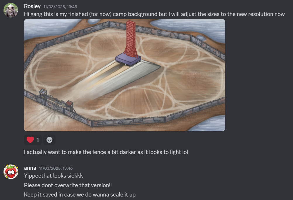
I am happy with the finished camp background, however if I get time before our second playtest there are a few changes I would implement:
- More detail in the surroundings – I would prefer if the outskirts of the camp were littered with scraps, trash, rocks, ect. Id like the ground to have more variation in texture.
- More nods to the Florida environment – I think the design would benefit from having more evidence of a dead Florida, especially littered within the water.
- More detail in the water – I feel like the water looks too clear / clean for how it would really be, I want to add more pollution to the environment.
- More detail in the fence / more guard posts – I feel like a lot of the detail in the fence looks a bit smudged so id like it to be a bit clearer. I also feel like such a big camp would need guard posts on all sides.
However first I want to focus on completing my resource camps so we are ready for the playtest!
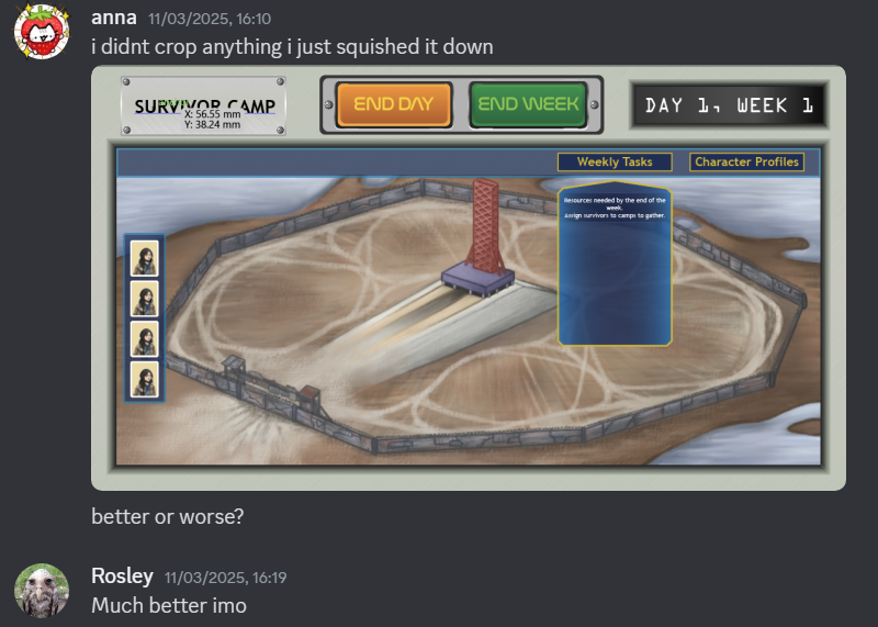
The finished background with the UI design:

Links:
Reply