
Art Vision
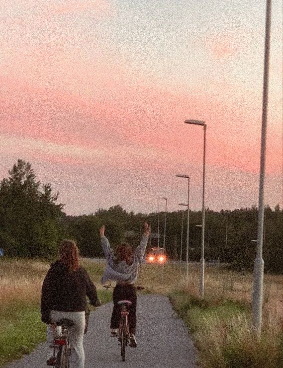
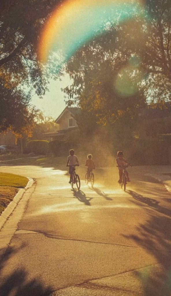
Art Direction – A mix of 2D childish crayon like drawings to reinforce the fact it is taking place in a childs imagination. Visual effects influenced by images of “nostalgia”, grainy, blurry, foggy and lens flares are used to give extra dimension and the nostalgic feeling.
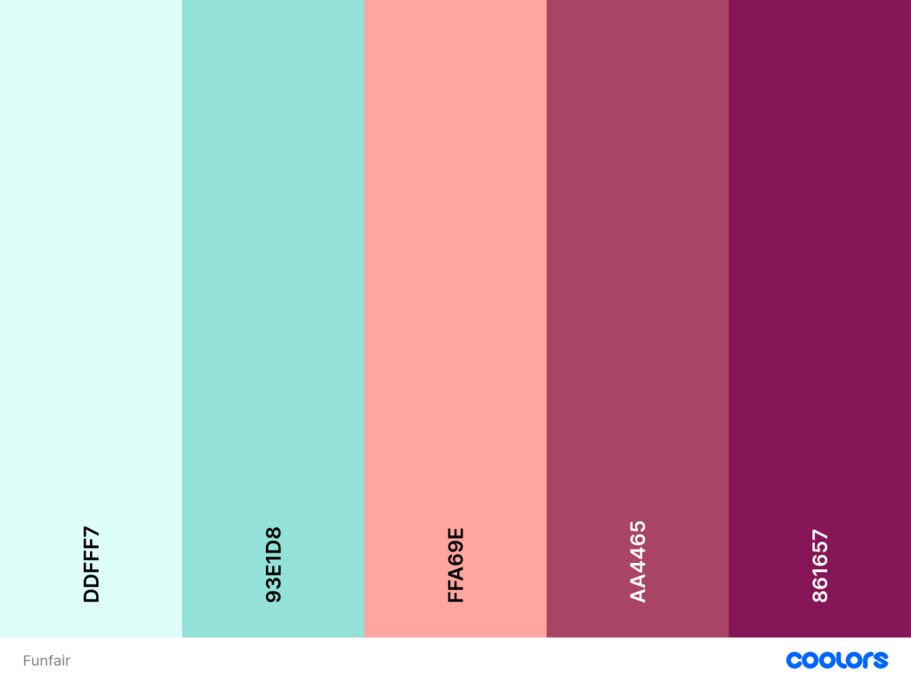
Backgrounds – Parallax backgrounds made up of layers to give movement to the scenes. Pastel colours, blues pinks and neutrals. Not overly detailed, textured Photoshop brushes.


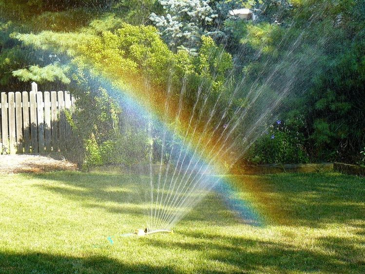
Images 1-2 examples of the types of lens flares used https://www.brusheezy.com/brushes/56971-free-lens-flares-photoshop-brushes#google_vignette – Link to downloadable brushes
Images 3-5 examples of the nostalgia I want to evoke.
Font
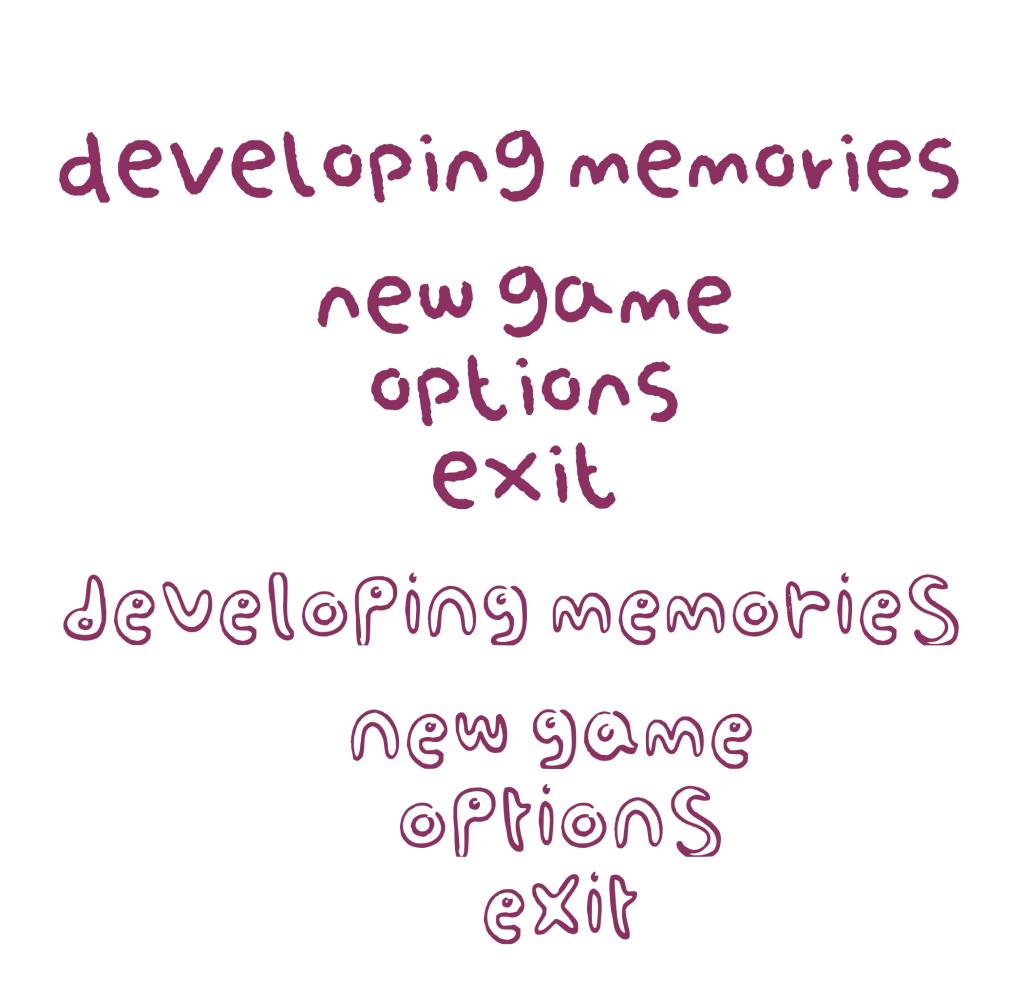
These are two font options. Either one can be used for the menu screens not the dialogue as it needs to be as legible as possible. Although a font that has the feel of being handwritten should still be used for the font.
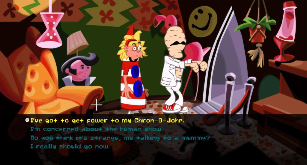
When the dialogue is on screen it should look like this, with the options in a vertical list.
Environments
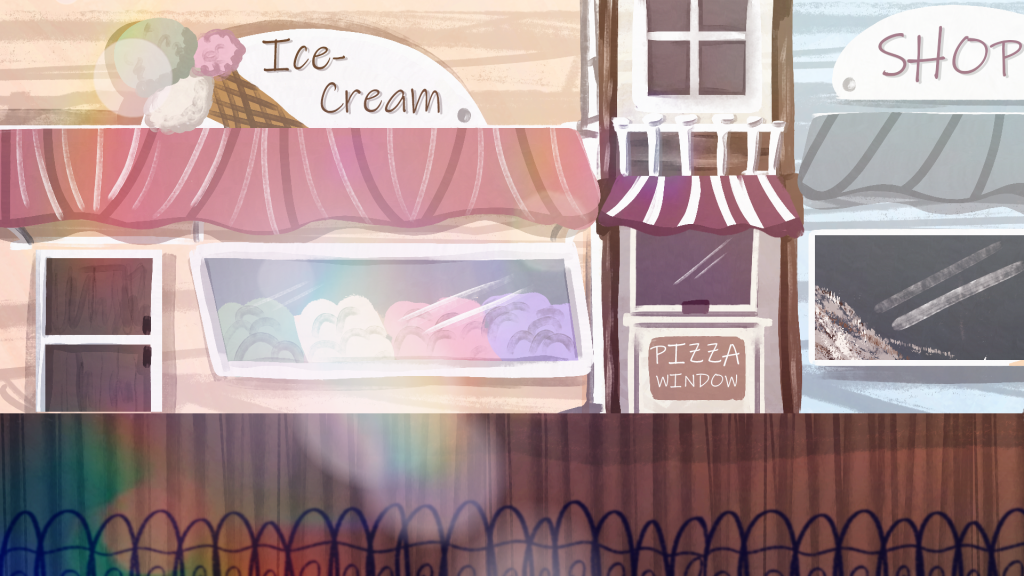
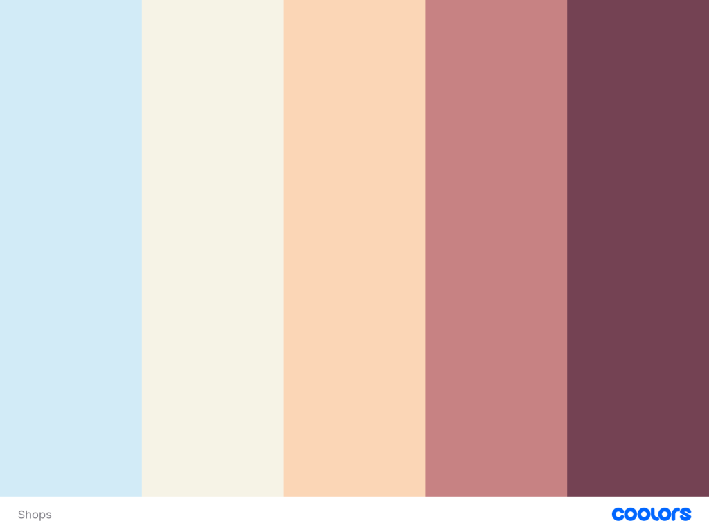
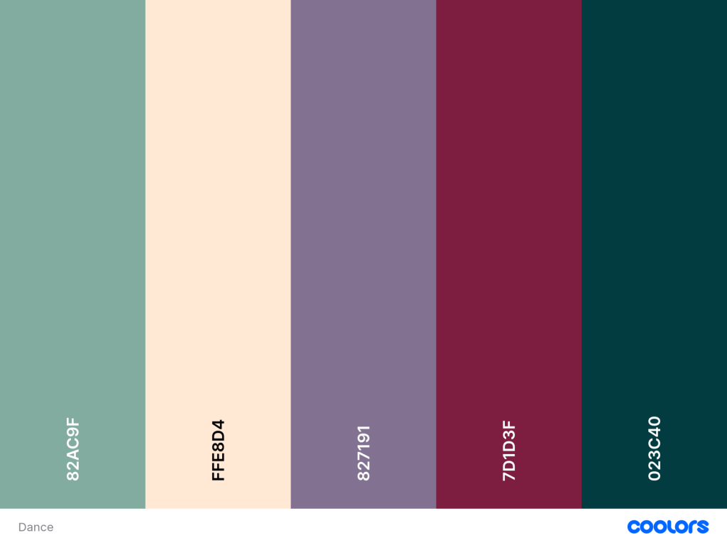
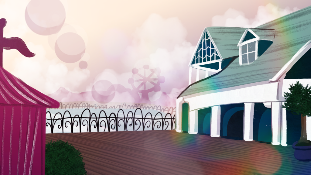
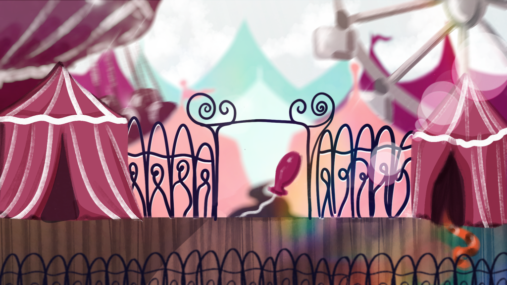
These are concepts for the three main locations. New locations can be added as long as they tie into these ones, such as the interior of the shops, ice-cream parlour, danchall/piano bar and the entirety of the funfair. However they have to follow the art style and use of lens flares and effects. The colour palettes must also follow the same direction and work well with each other.
Characters
Due to the choose your own adventure aspect of the game these characters are only examples of what kind of characters there would be, any further characters created should follow the visual style and thematic elements of these characters. The style is influenced by The secret of Monkey Island Remastered style and the remastered Day of the Tentacle.
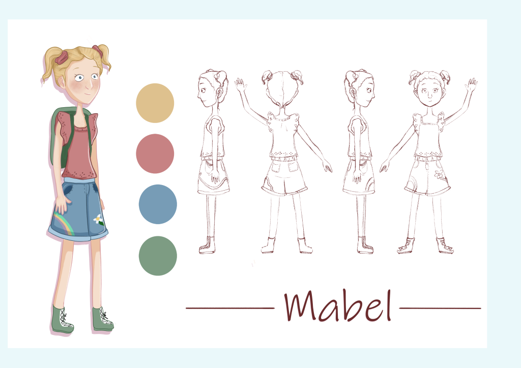
The playable character, she is 11 years old, she is sweet with an occasional bluntness streak though she never means anything with malice. As she is the playable character the player should be able to project a part of themselves onto her whilst empathising and connecting with her.
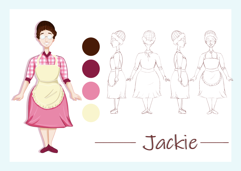
Jackie is a part owner of the ice-cream parlour; it is her whole life she has started to morph and actually look like an ice-cream, styling her hair as a scoopa and dressing in neapolitan colours. She is a motherly figure and provides the player with hints.
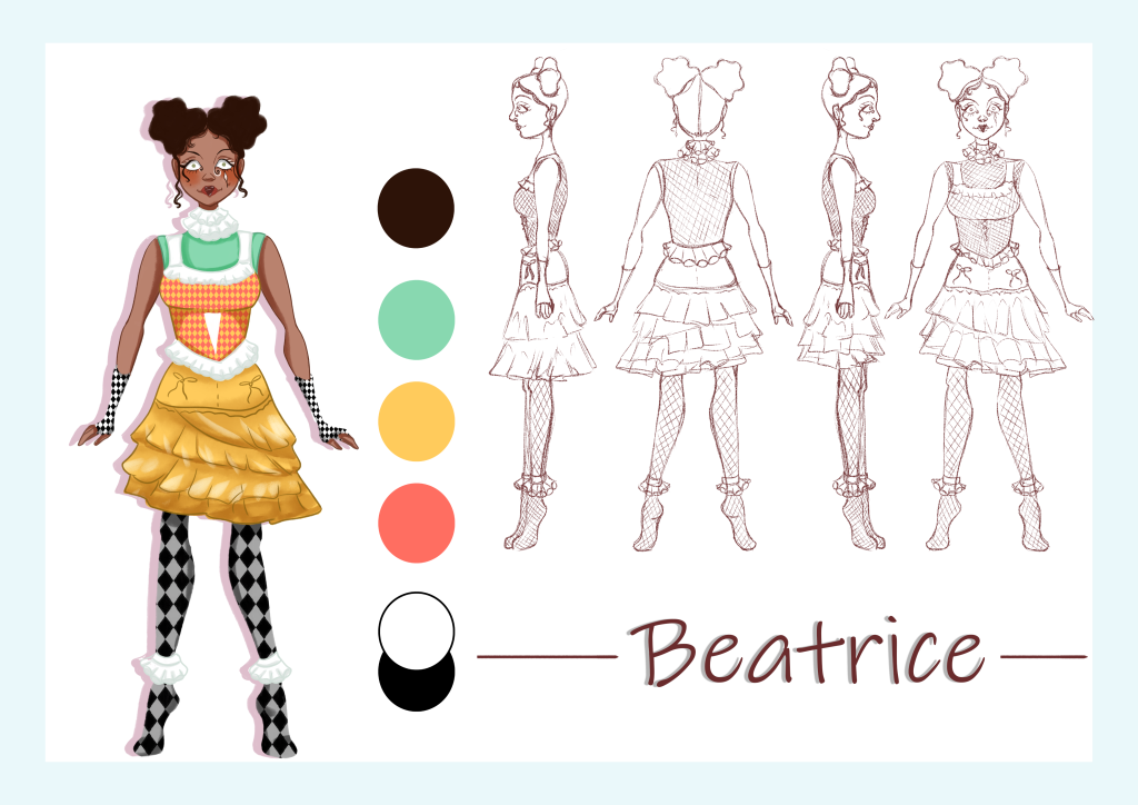
Beatrice is a ring performer for the funfair on the boardwalk, she is highly influenced by clowns and mimes as reflected in her outfit and makeup. Her personality is eccentric and hyper, her brain going at a mile a minute this is also seen in her clothes – they clash and have bold patterns. Her colour palette also features more colours than the other characters making her look busy and over stimulating to the eye. She always stands on her tiptoes making her taller than she actually is.
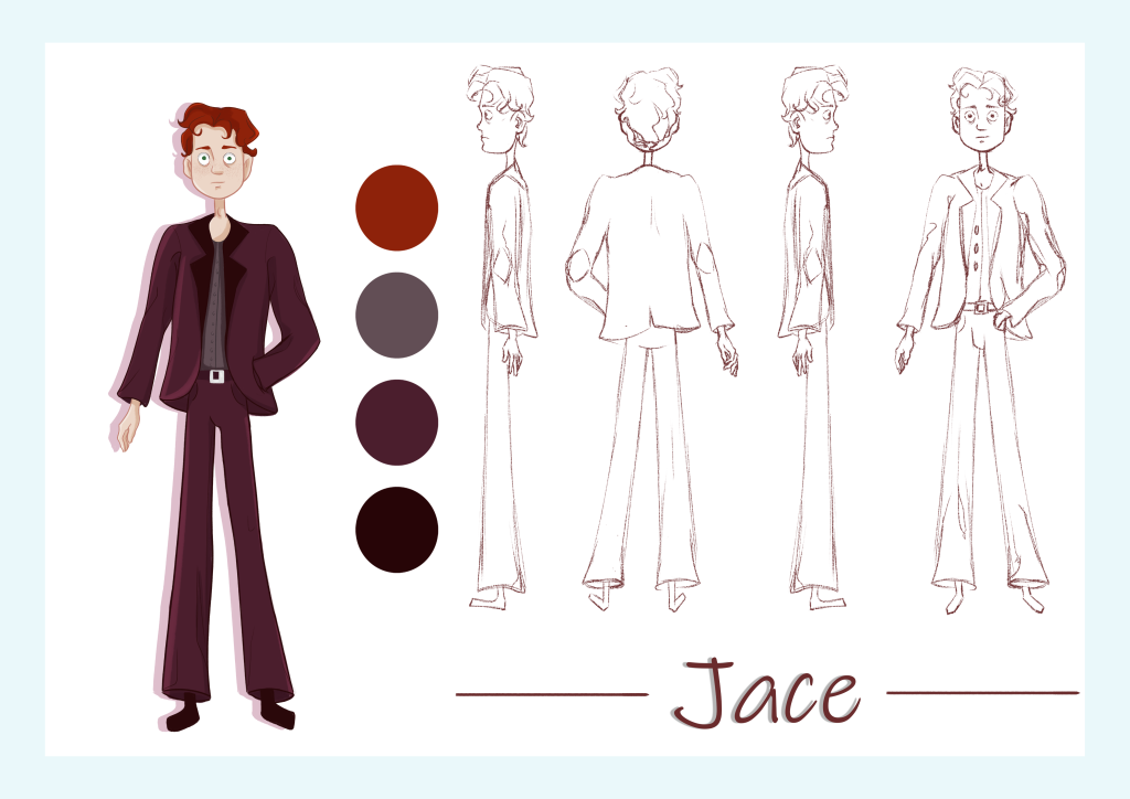
Jace is a newly professional piano player he has his first gig coming up and he is very nervous about it. He wears an oversized suit representing how he feels unprepared for the job. He has dark circles under his eyes and is quite jittery leading up to his performance.
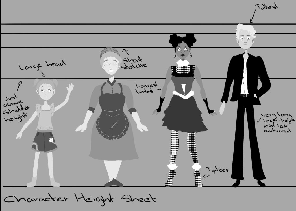
This is a concept sheet of the characters in relation to each other. Mabel is the smallest while Jace is the tallest further reinforcing his awkwardness. Jackie is shorter than average and Beatrice is taller and always on her tiptoes.
Characters in the Environment
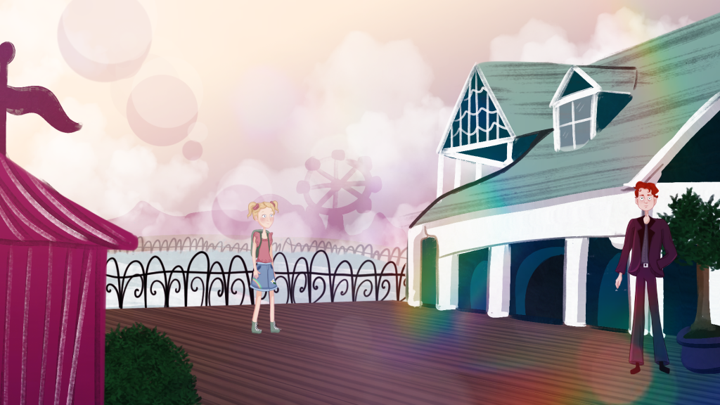
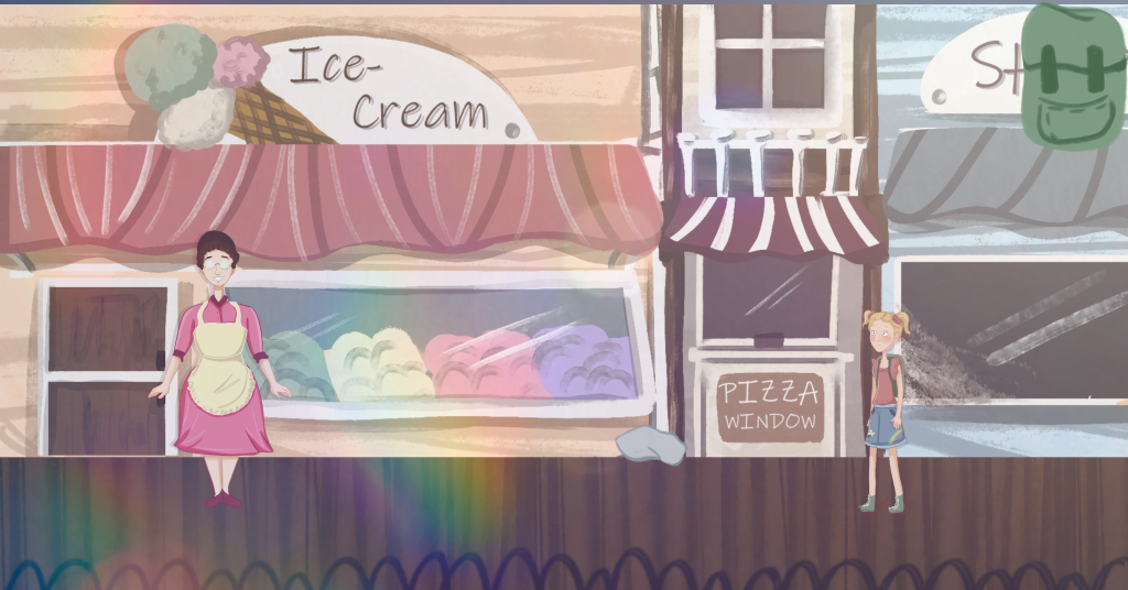
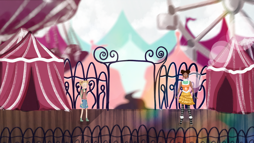
As seen in these concepts the characters should match their environments except for Beatrice as her extroverted personality is reflected through her appearance making her stand out. Perspective should also be used when Mabel walks further away from the camera, becoming smaller.
Animation References
For the crafting and interaction animations they should resemble these from Franbow, with the images for the items being clickable and iteractive. Combining items should just require one item moved on top of the other one.
The cutscenes should also work like this. Animation should be simple and take place in the game, if a cutscene needs to show something a zoomed in version should appear on the screen as like in this clip from franbow.
The walking animations should be simple and not overly concerned with lining up completely with the environments as seen in this clip from The Day of the Tentacle, the character, Hoagie, only moves his legs when walking and simple gets smaller the furtehr away he is from the background.
For the opening and ending sections of the game where the point of view shifts to first person the controls and animation should resemble games like A little to the Left
Leave a Reply