
Research
I decided to create a font as graphic design and typography are a main interest for me. Before I began making the font I researched into fons and how they can be used to communicate ideas and their importance.
The three sites and articles I looked at.
https://www.adobe.com/express/learn/blog/psychology-font
https://medium.com/@maria.lelieveld/why-is-font-so-important-546f31bc2f6d
https://designmodo.com/font-psychology
After looking through these spmething that stood out to me was the concept of decorative fonts, stylish fun fonts mainly used for creating a recognisable brand. I would like to do this for my game.
Fonts can be very important as they can evoke emotions and feelings purely based on their looks, not the words they are used to say. The connotations I want my font to have are childlike and whimsical, matching the idea and character of my game.
Making a Font

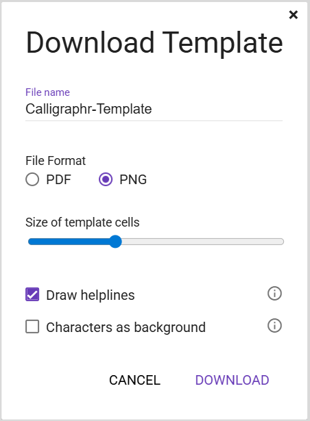
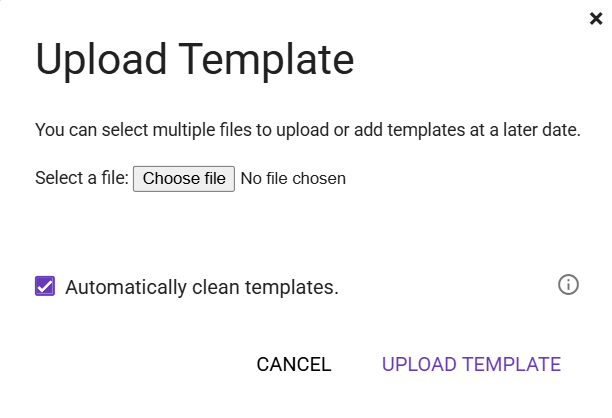
You first choose how many characters you want your font to have then you download a blank template and populate it with characters.
All of the options have been made in Photoshop.
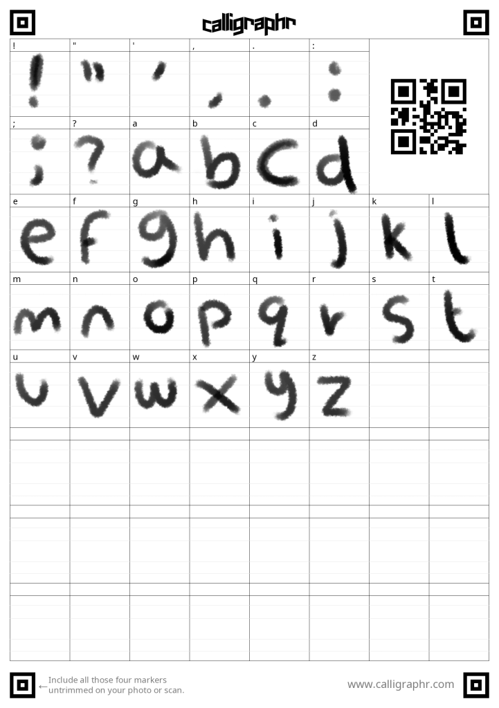
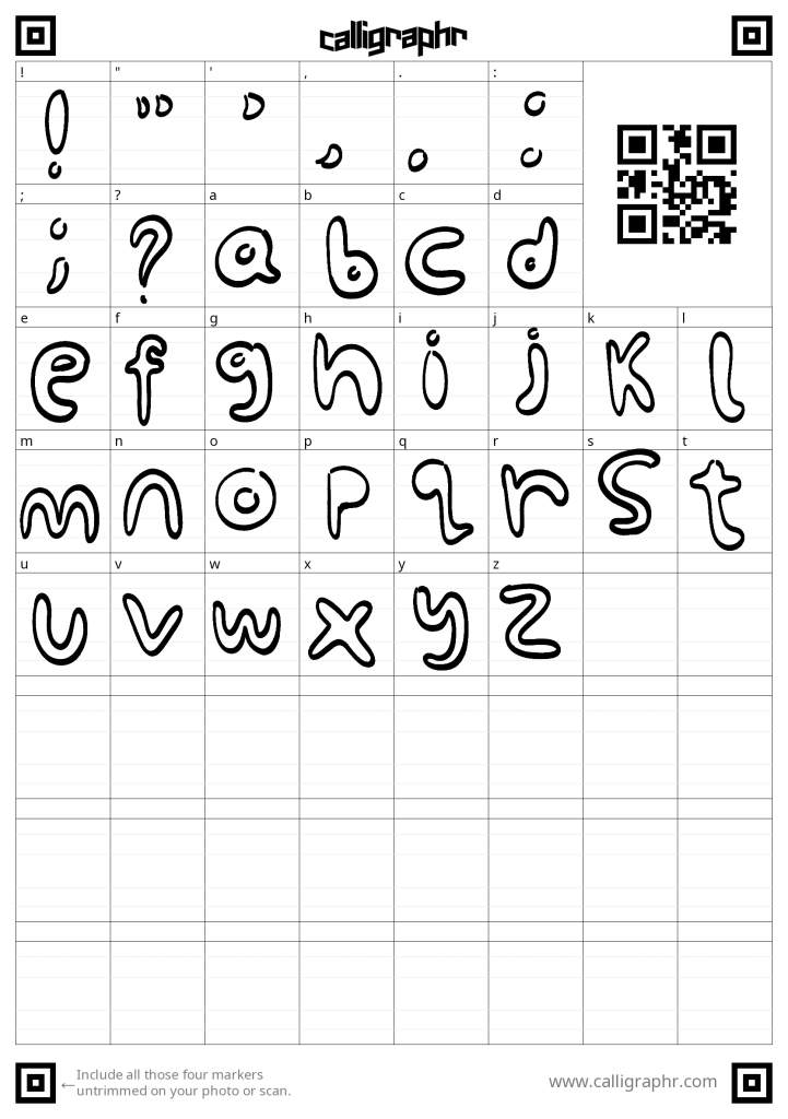
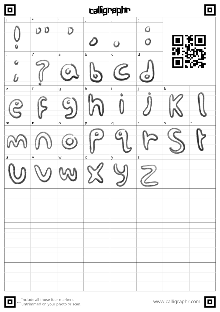
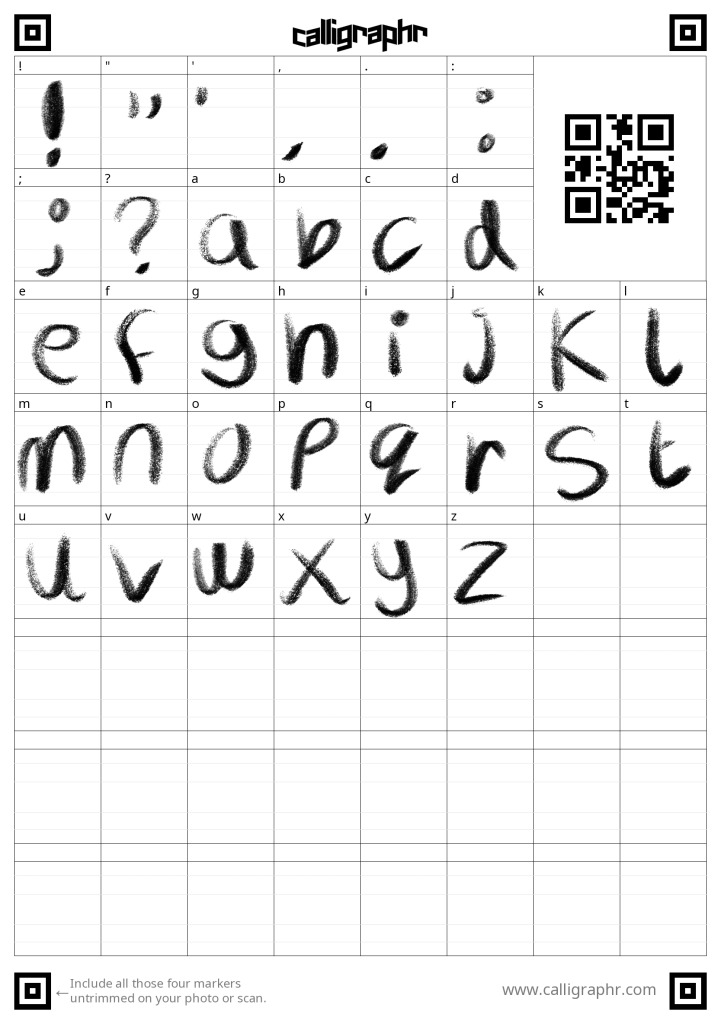
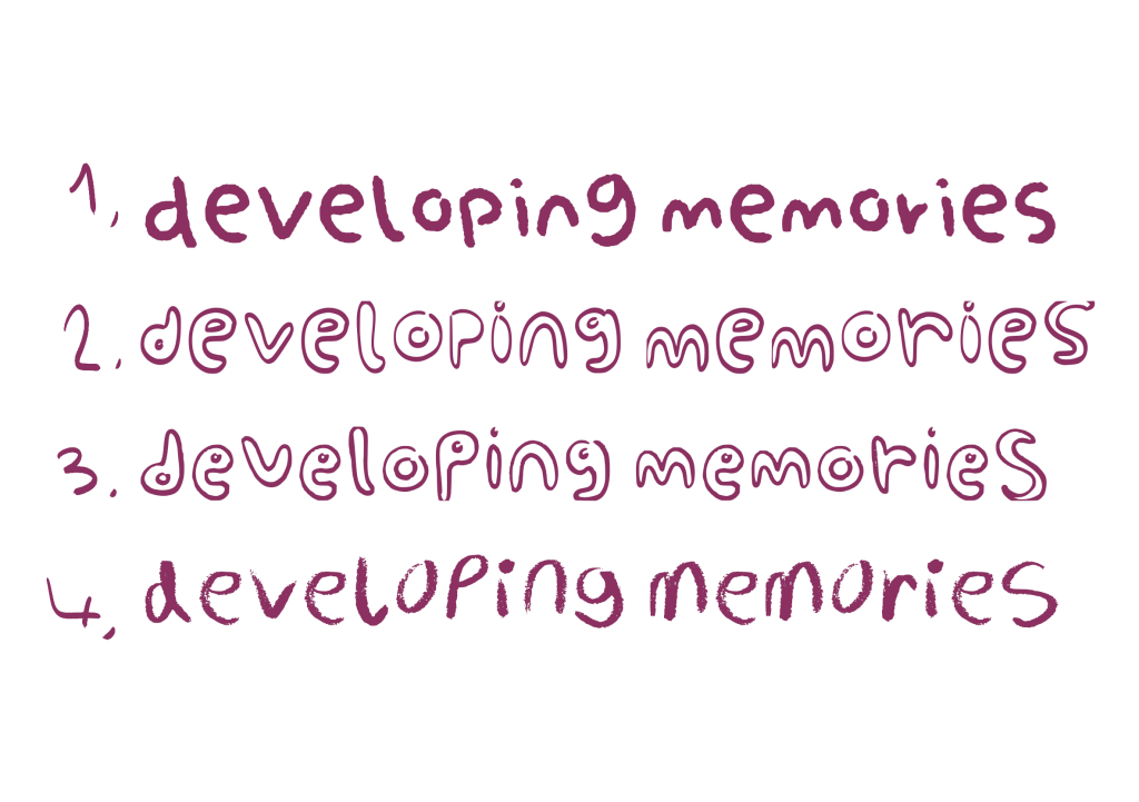
These are the finished fonts spelling out the title of the game. Unfortunately the software I used did not manage to keep the opacity textures in the orginal ones.
To help me choose I sought feedback froma family member. I showed them all of the fonts, they liked 1 and 3. When asked what emotions or feelings the fonts evoked they thought they were childish. As this was one of my goals I felt pleased as I was on the right track.
I also showed the fonts to a peer on my course and they similarly picked 1 and 3 agreeing they fit the goal better.
Next Steps –
My next steps are to add the fonts to my GDD’s Art Bible.
Leave a Reply