Category: Art Development


  • Cutscene Animation

    During formative feedback week, After talking with my PAT she wanted the character to be more graceful and ethereal. I decided to go about this in two ways, one was to update the characters idle and move animations and the second was to create an opening cutscene, as this will be hand drawn and animated frame by frame and can make the character smoother.

    Before I began drawing I refreshed myself with the team mood board about the art style.
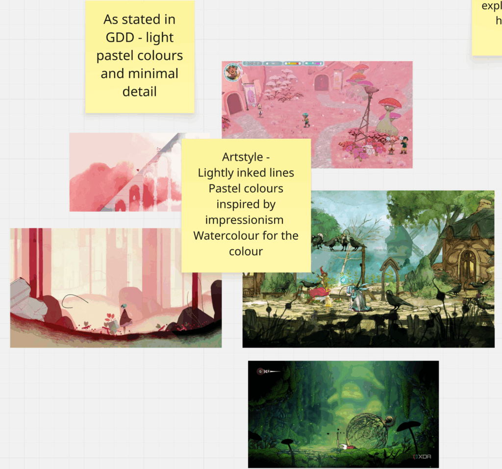
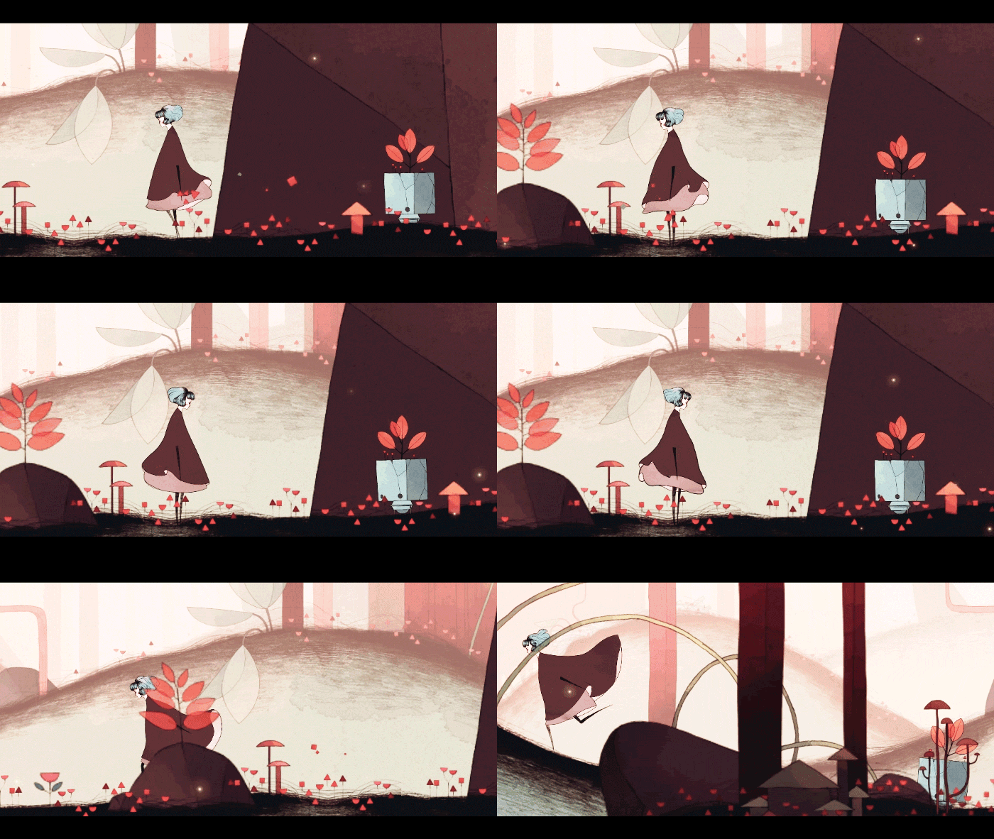
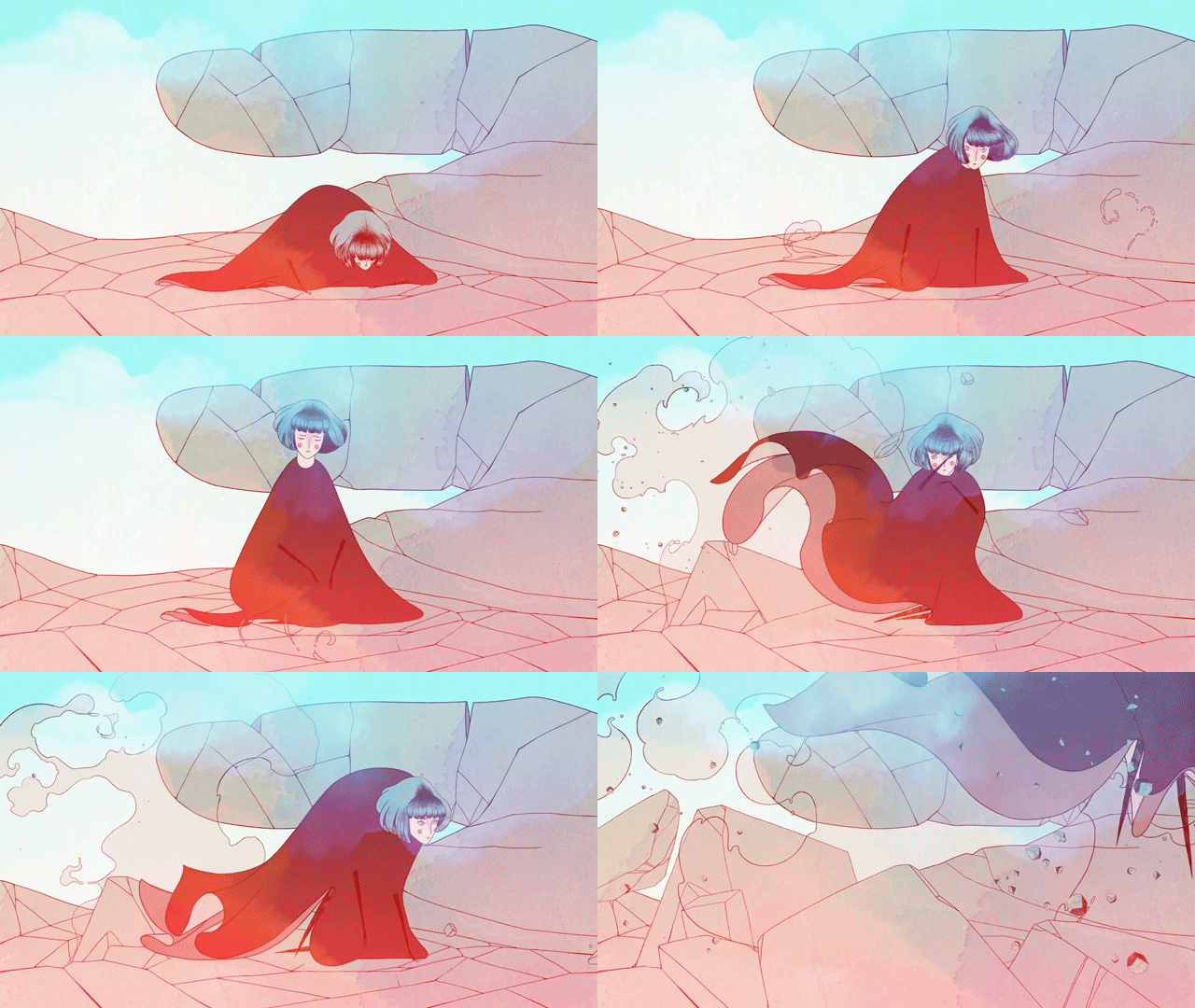
    In this mood board we looked at the game Gris as recommended by our lecturer, for the cutscene I searched for some animation references from it. I do not believe I can make my animation look as smooth or refined as Gris but I will certainly be using it as inspiration.

    First Draft

    This cutscene plan was in the GDD so for my first draft I created a variation of how it looked.

    This was the original version in the GDD.

    “Starting cutscene. The MC is waking up from slumber in the middle of the forest, covered in flowers and grass that turns in her hair and clothes as she gets up. This location can have the same environment as the Lakeside.”

    To create what was specified in the GDD I knew I would need a good reference so I enlisted my sister to film a short video of the characters movements I then went through it and screenshotted key frames. I took these into Ibis Paint x on my tablet and created a draft of frames.

    Speed paint from Ibis Paint X

    In this speedpaint I am importing the keyframes and tracing over them, I then am using the eyedropper tool on the finished character and quickly adding colour to the sketches. I also experimented with different types of backgrounds, by warping the finished environment painting to fit the perspective and playing around with different layer blending modes. I ultimately paused this idea for this iteration and created a mock up of what it looked like in the GDD. I then exported the different frames, 12 in total.

    First Draft put together in Flip a Clip

    This is what I put together in Flip a Clip (a frame by frame animating software.) It is 15 frames in total at 3 frames a second. Using the brushes in the software I added some movement in the background and on the trees. The ease of use in this software helped me iterate versions quickly and try out different techniques.

    The first version was 3 seconds long and felt very stilted. After watching it a few times I got the idea to add in low opacity versions of the previous frames to act as a smear frame and simulate more movement than was actually happening.

    Second Draft

    After I had the first draft I sent it to my team to see if they liked where I was going with it, they did and I promised them I would have the final one ready the Wednesday before the playtest

    I decided to make the final version in Photoshop as I am very comfortable with it and it is what I have been using to animate the whole project.
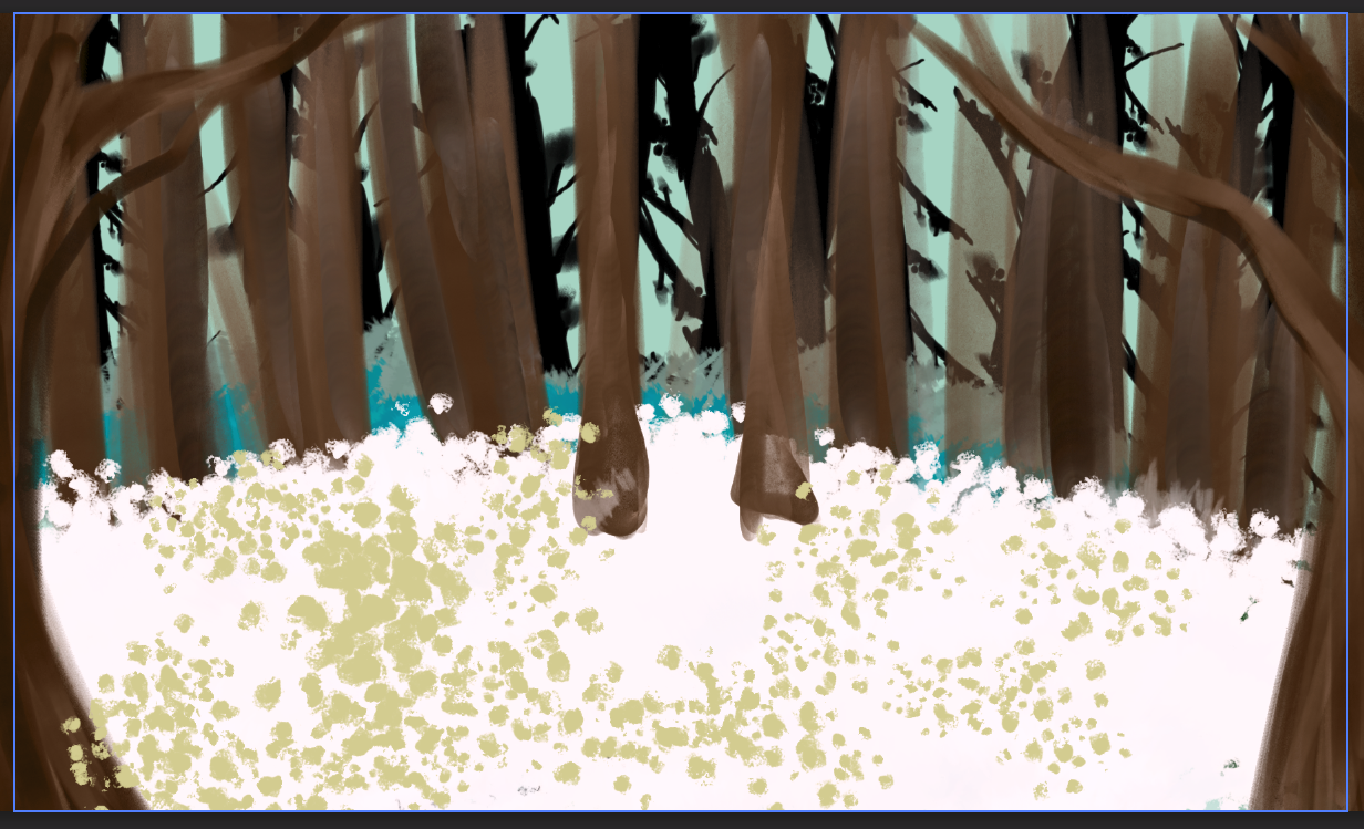
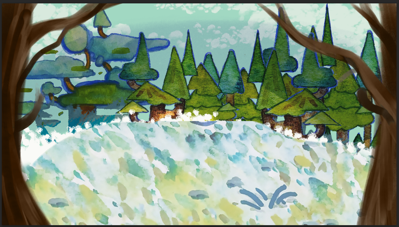
    The first thing I wanted to get done was to have the background finished. Using watercolour brushes I began painting my own inspired by the environment artists work. Midway through doing that when It looked like this, I realised I was being silly and making life harder than it needed to be. All of the environmental asssets had already been created, I should just use those. I found them in the shared slack channel and imported them into the file.
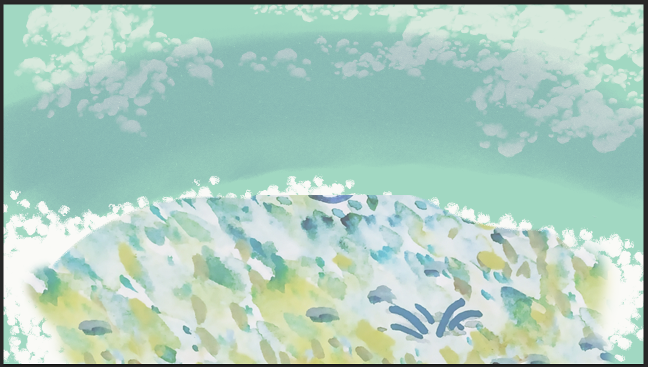
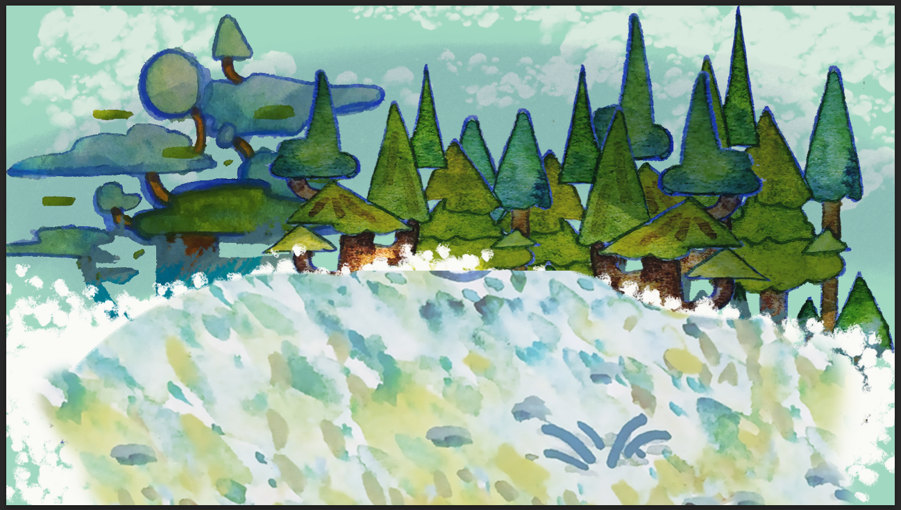
    Using the ground painting I roughly rounded out the edges and added some white dotty texture around the edge. I added clouds and a dark streak to signify shadows in the back. I then added in the trees the envrinment artsit made and used a clipping mask over all of them to darken them as if they were in shadows. To frame the scene I kept the two trees around the edges of the screen.
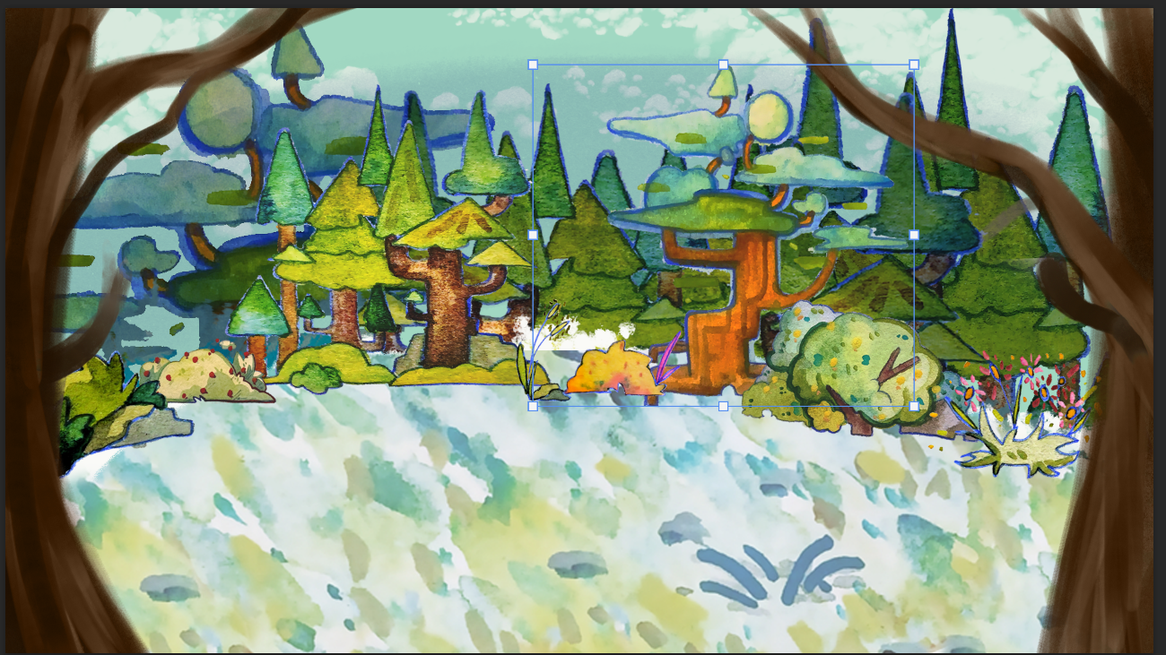
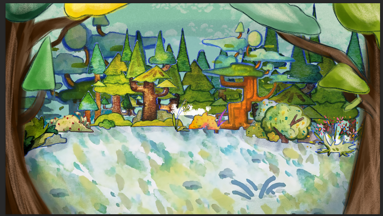
    I then added in midground trees and the foliage assets to hid the awkward sharp edges where I’d cut the ground out. At this point I was really happy with how this was looking. The final elements I added were interestingly shaped leaves on the trees to match the current trees. I painted these on myself mimicking the style.

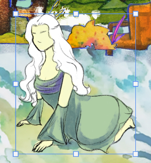
    To test this background with the character I imported only the frames of the characters movements and created a gif. After making this I was excited as it was coming together now and I could fully envision the final product in my head.
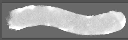
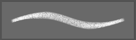
    To try and replicate the physical watercolour textures I used these two brushes. The left one for the colours and sahding as it is a watercolour replica brush. The left one has texture that matches watercolour paper texture.

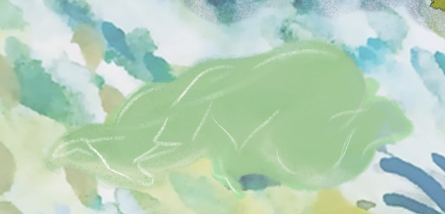
    Once I had the background done I moved on to the character. Using my first draft as references for how detailed each drawing needed to be I began painting. For the first frame where the character just begins to form I used the colour picking tool to paint different streaks of ground colour in the shape of the character.
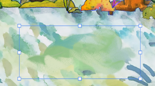
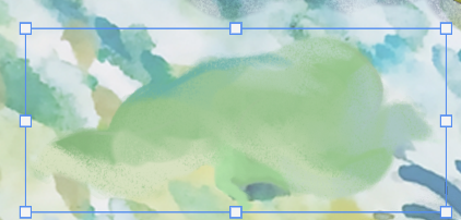
    With each new drawing I added more details, such as white lines that then turn into black lines and the green colour becoming more prominent.
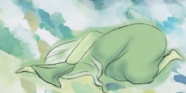
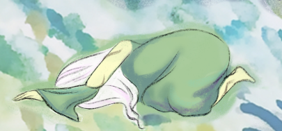
    Before finally the character becomes rendered with bright colours, the final things that materialise are the vines on her skin.

    For the frame where she’s pushing herself up I worked slowly methodically with the lines first then flat colours then shading and details.
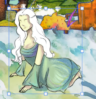
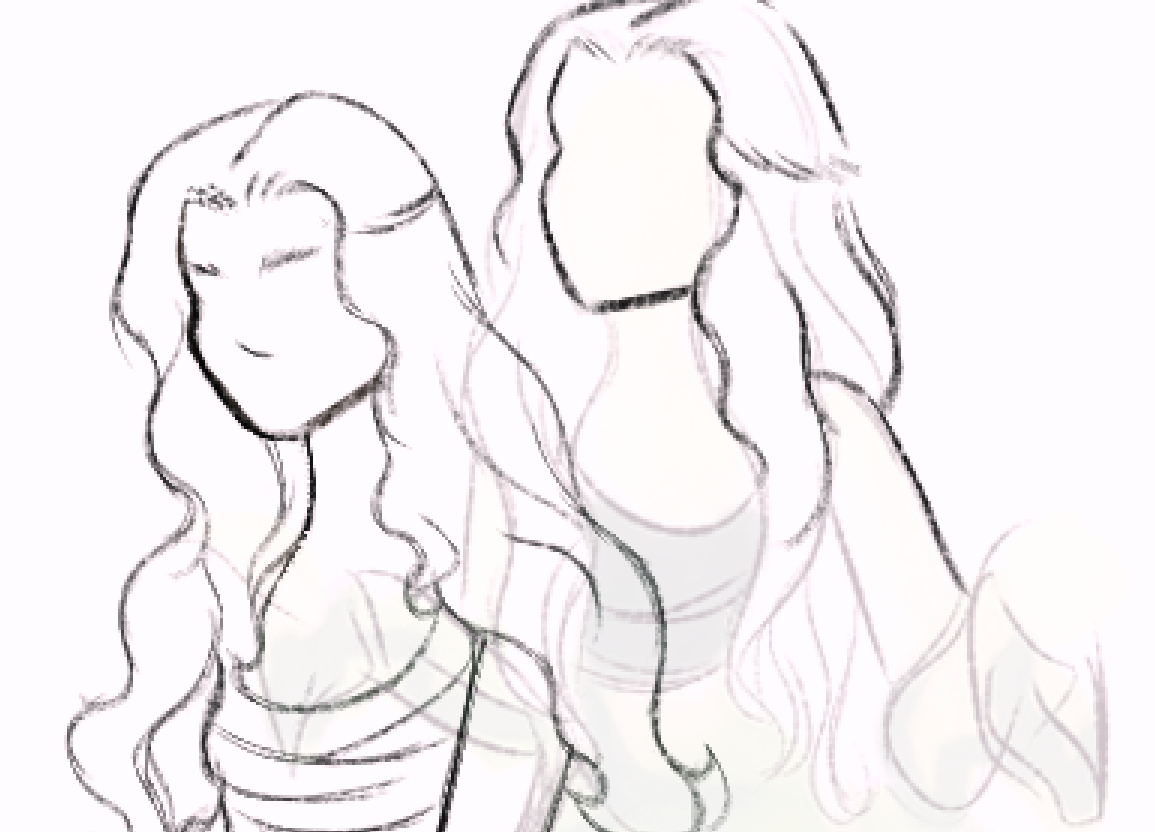
    Once that frame was fully coloured and shaded I hid the colour layers leaving just the lines and then began drawing the sat up frame, using the previous as a reference to make sure the sizing between each frame was consistent. As in the first draft it was not.
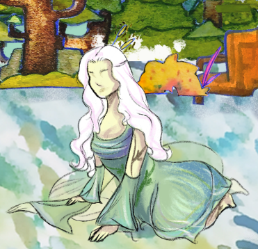
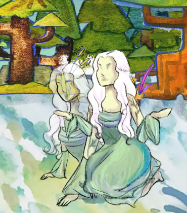
    As with in the first version I kept the low opacity “smear” frames, as I really liked the effect it created.

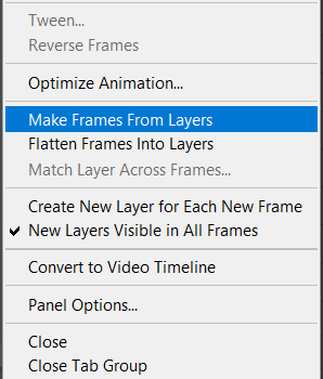
    When it came time for the animation itself I copy pasted my layers into a different Photoshop file to preserve them. I then merged layers into individual frames as the only way to make frame animations is to make frames from layers.

    Once I did that I had a timeline of frames I set the delay to 0.2 so that it was not too quick. I then tweaked it by duplicated frames until I was happy with the length and speed. I then exported it as an MP3.

    Sound

    The sound for the cutscene is important, I had a good idea of what I wanted it to sound like so i went onto Pixabay and began looking for sound effects and music.

    For when the character materialises I wanted it to sound like a plant as she is being made from organic materials. I found this sound effect of plant leaves rustling against one another.

    As the custcene itself signifys a beginning both fo rthe character as she is “born” but also for the player as they begin a new game, a new experience. I wanted the music to sound hopeful and like it was rising. This works nicely and fits the mood I was envisioning.

    To match the games soundscape I also found this of birds singing and wind rushing to try and give the scene more life as I made the decision to not animate the background as it was outside of my skills.

    Adobe After Effects

    Now that I had sounds and the video itself. I created a new Adobe After Effects project. I chose this software as I had briefly used it in college. In this menu I added the video and the sounds then all I had to do was click and drag them into the timeline to add to the finished video.

    I began by lining up the sound effects. This was easy enough for the ambience and the music as it just needed to play throughout the whole video. The plant sounds were a bit more complicated. After researching I discovered I had to keyframe the audio levels, so when I wanted the sounds to start I put a keyframe in the timeline wih the volume on then when I want it to end I put a keyframe on the timeline with the volume off, this creates a subtle fade out.

    what the sound looked like in the timeline.

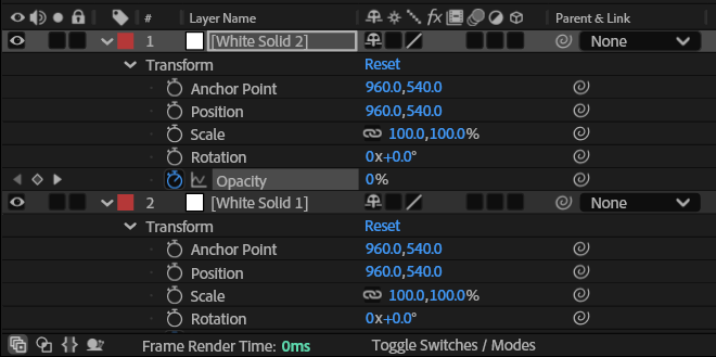
    At the beginning and end of the cutscene I wanted there to be white fade ins and outs. I achieved this in much the same way like the sound effects by using keyframes for the opacity elements of a white solid I had added to the timeline. I put three keyframes in, One where it was at full opacity then another where it was at 50% then the final one where it was at 0%, this created the natural fade in. For the fade out I reversed the keyframes and put them at the end.
    Once I was happy with how it looked I exported the video by rendering it, as the cutscene is only 9 seconds this did not take very long. I exported two versions, one with the music and one without. I will now send these to my team and see what they think.

    Without music
    With music

    Final Thoughts –

    After sending them to my team I received the feedback that the one with the music is the better of the two, though the music is a touch too technological. But they really liked the cutscene itself. I also sent the video to some outside people who were unfamilar with the game and project to get a fresh perspective.

    The feedback was positive especially for the unique look of the video. I am very happy with it and think it is successful, when I began to make it I did not think I would be able to so I am proud of myself that I managed to create something that is not half bad.

  • Unity Effects

    The use of effects in Unity was recommended by my lecturer to add more visual appeal to the game. Me and the techncial designer decided to independently research into them and see where we ended up. For my research I went to youtube and watched videos on the subject.

    https://www.youtube.com/watch?v=m-6QjaDfigs&list=LL&index=3 <- visual effects video

    https://youtu.be/Q-UyHJcFY1g <- particle video

    Tree Animation

    In the first video he used animation on the trees to give them the impression that there is a breeze. I liked this and think this could be a good addition to the game.

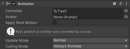
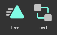
    To do this I made a new animation and attached it to the tree in the inspector.

    For the actual animation I hit record and and used the rotation of the trees to move them right, make a keyframe then move them left and make a keyframe. The end of the animation needed to be the trees in their natural straight position. To make the effect subtle I dragged the keyframes to five seconds so that the movement is perceptible but not unrealistic.

    Visual Effects

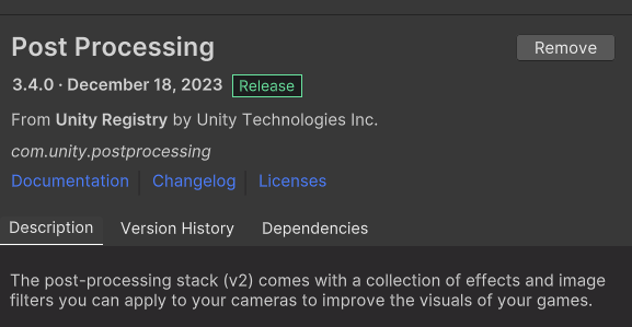
    To be able to add effects to the camera I installed the post processing package to the project.

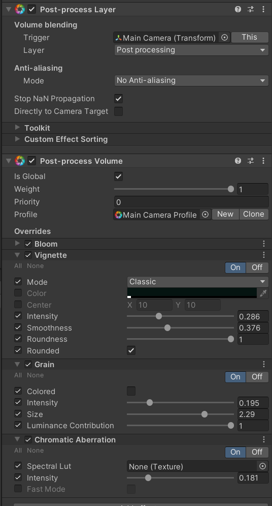
    I then went to the main camera in the hierarchy and added a post processing layer, this then allowed me to add post process volume. From this component I could access a whole host of effects.

    To the game I added bloom to make the whites glow, a vignette around the corners, grain to add more movement to the scene and some slight chromatic aberration.

    In the final game I think all of these would be too much but it was helpful to see what could be done.

    Particle Systems

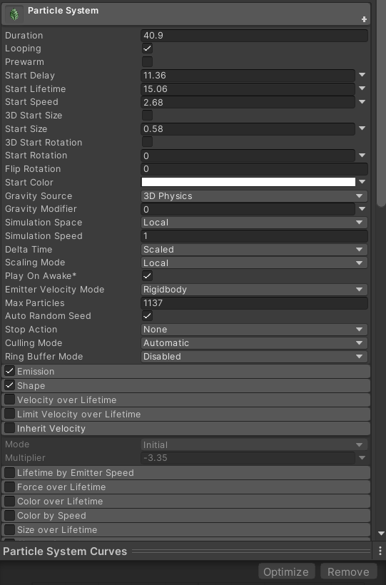
    The last effects I wanted in the game were falling leaves and some glowing lights. After exploring Unity’s options I found particle effects. These are game objects that get added to the scenes hierarchy and use real time simulation to create particles. There are many ways to edit these such as lifetime speed and size all accessed through the inspector.

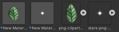
    The default particles are airbrushed looking white dots, these are close to what I wanted but I think they could be prettier.

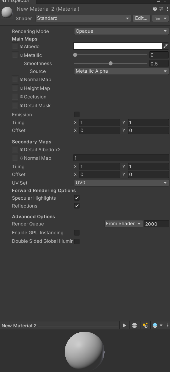
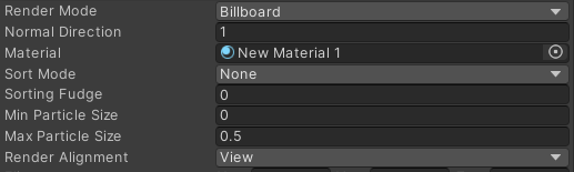
    To swap out what the particles look like I followed half of the second Youtube video. I began by making a new material then changing the shader to particles -> standard unlit. I then set the rendering mode to fade and dragged a PNG of the object I wanted into the Albedo window. This changed the material into a flat image I then went back to the particle menu in the inspector and in the rendering section changed the render mode to billboard and dragged in the materials I made.

    I am really happy with how these came out though further tweaking to the speeds and sizes is required for the final product.

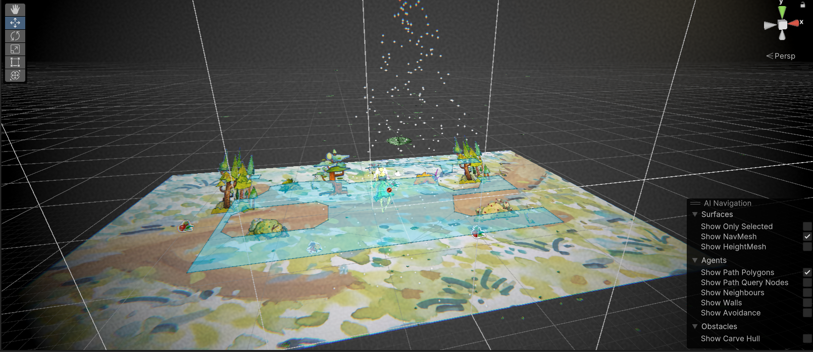
    This is the view in the game editor window I positioned the sparkle particles at the top to rain down and the leaves to come in from the top at the side.

    These are the final effects in the game I like how this turned out especially the particles and animation of the trees. The post processing visual effects perhaps make the game look too moody. I sent it to my team to hear their thoughts. Before the playtest me and the mechanics designer worked together to add them to the game.


  • Animal Animation

    Peacock

    For the first playtest as we had a time crunch I focused most of my efforts in having the player character ready we decided to keep using the environments artist peacock before swapping it for my design.

    Before I animated the peacock I sought out reference videos of peacocks walking.

    What stuck out to me was how their “knees” worked they seem to be backwards compared to a humans so I decided I would need an upper and lower part of the leg.

    The environment artists adorable peacock

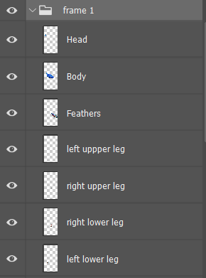
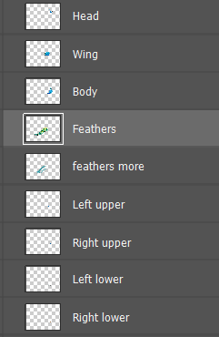
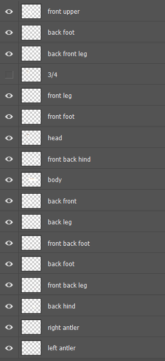
    To animate it I cut out the separate parts using Photoshop’s lasso tool. I then copy pasted each element onto separate layers being sure to name each one.

    The view of the layers

    I then created 8 folders filled with the parts and slowly created the key frames by positioning each piece. Once one frame was done I would lower the opacity of it and begin on the next frame using the one below to see where I was.

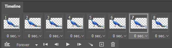
    To create a separation between the character player and the animal I decided to animate at 8 frames instead of the characters 10.

    Photoshops animation timeline

    To finish I saved each frame as a separate PNG and sent the folder to our Mechanics Designer.

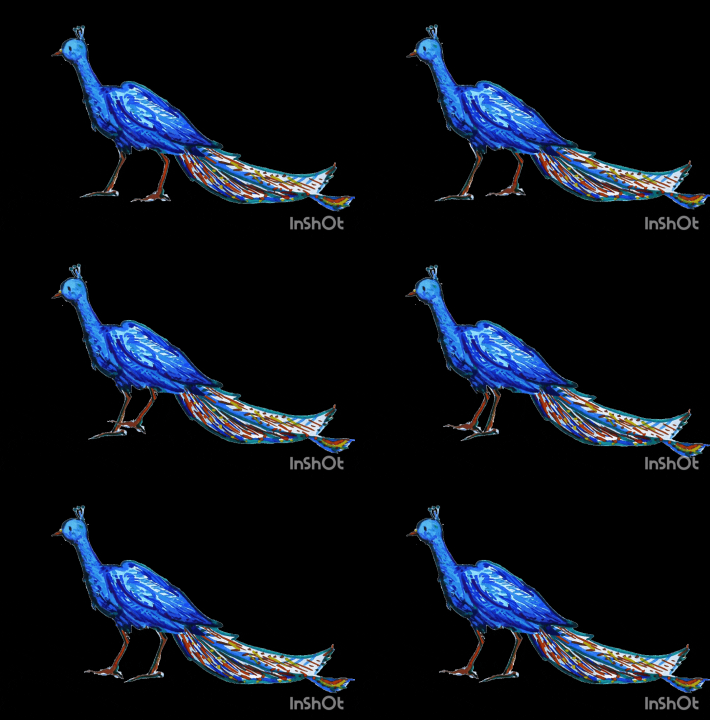
    The finished rough walking cycle. even though there are issues I am happy with how this has turned out and it will do for the first playtest.

    Peacock Second Animation

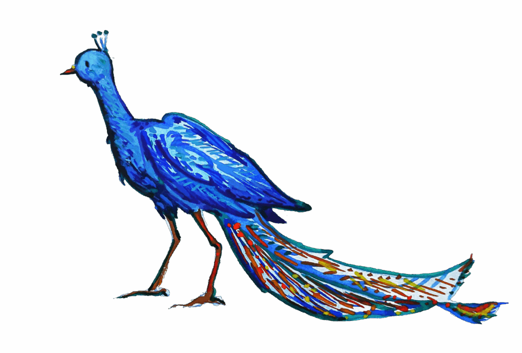
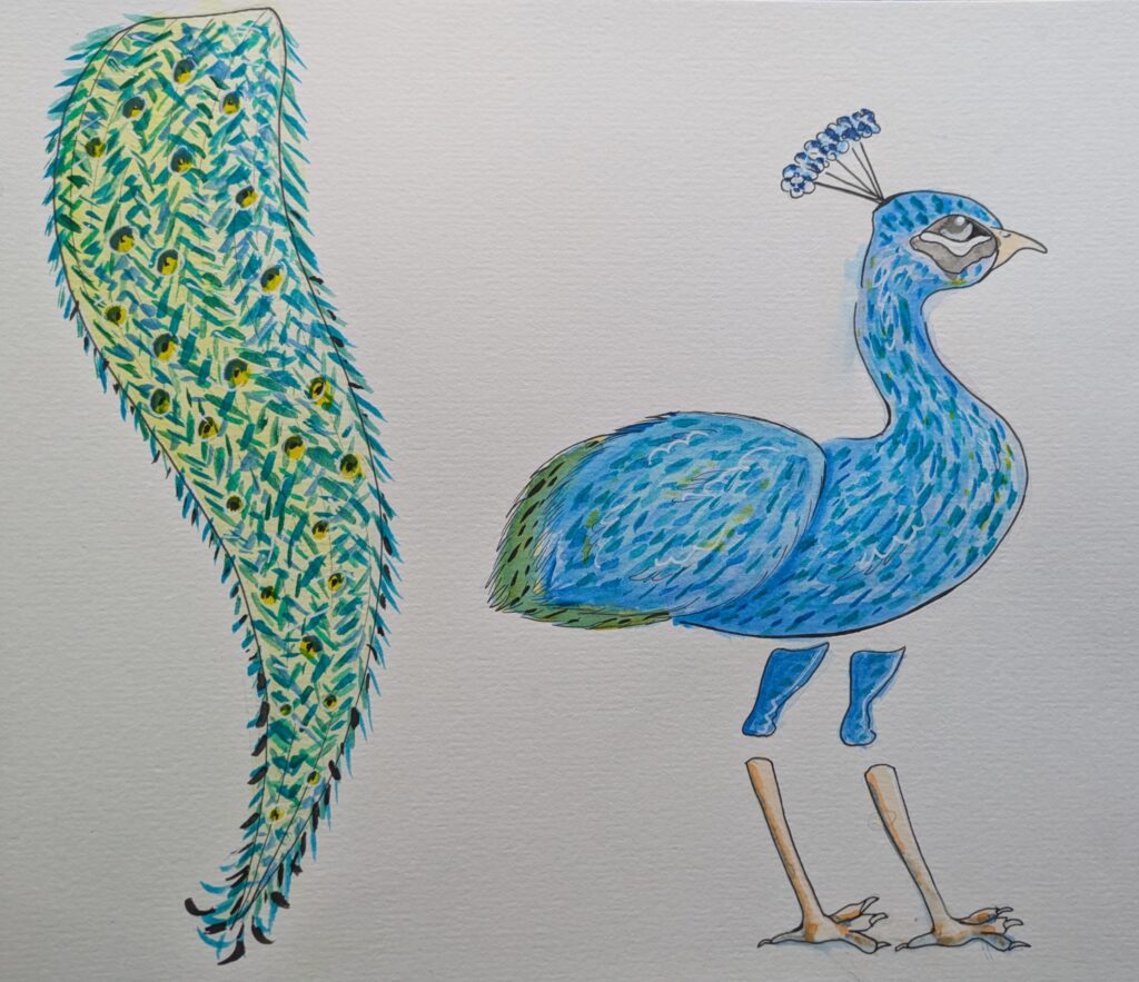
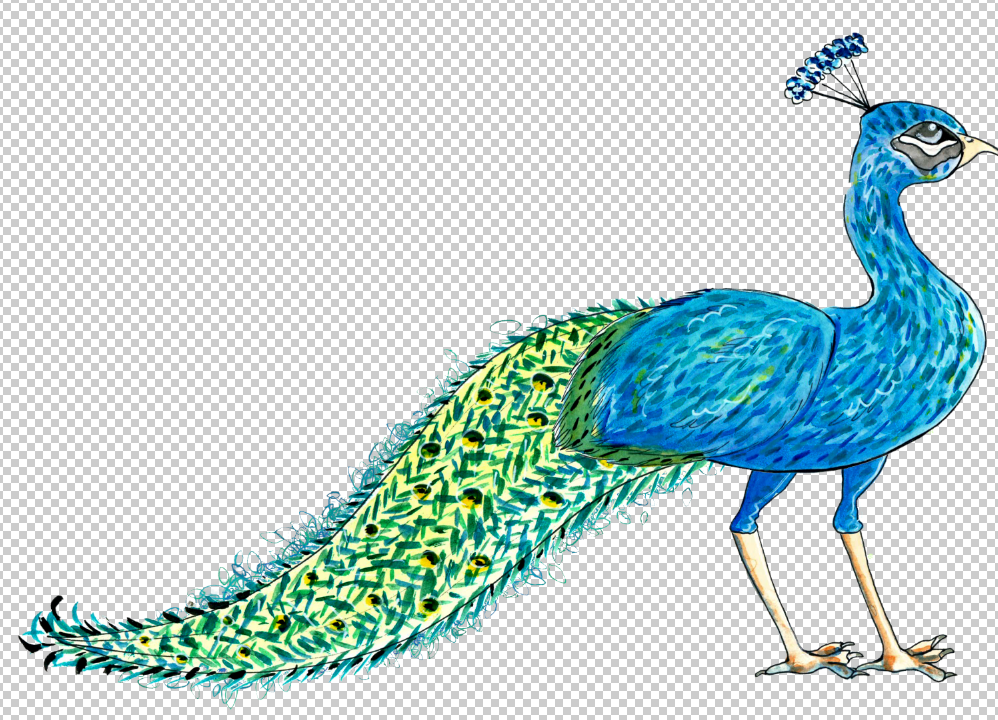
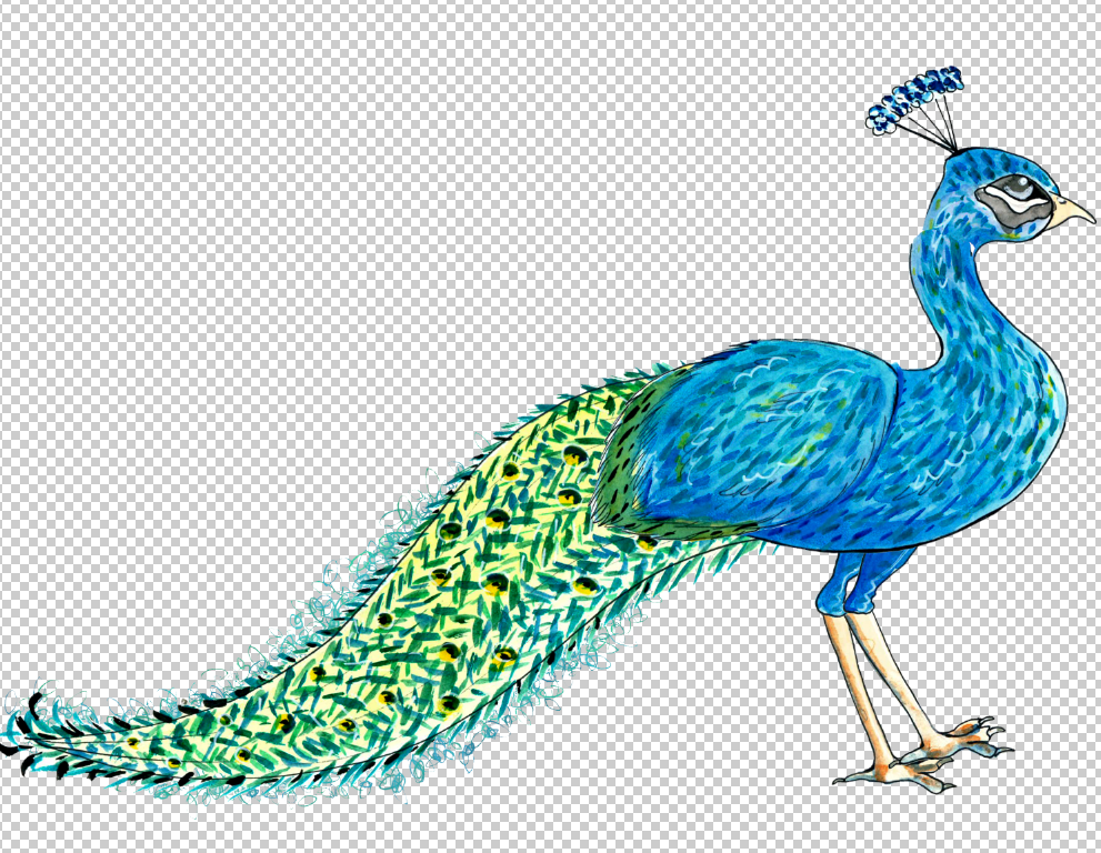
    For the next playtest I want to have my design of the peacock fully animated. Once I had designed it and gotten the approval of my team. I took a photograph of the parts and opened it in Photoshop, I did this because scanning it into the printer warped the colours quite a bit. In Photoshop I upped the saturation and levels so that it popped more.

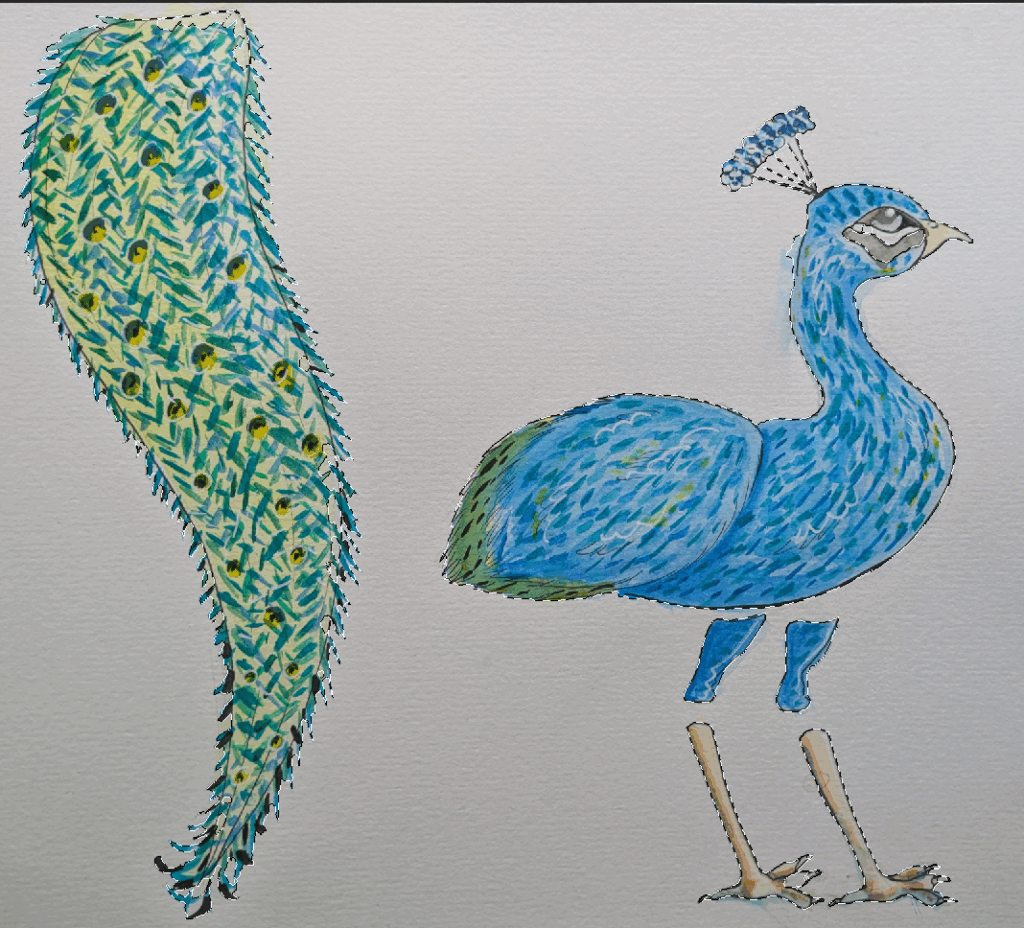
    I then used the object selection tool to quickly cut the pieces out. To get things cleaner I went in with the paintbrush tool and cleaned the edges up, filling in any bits that had disappeared. I then copy pasted each part to a new layer, being sure to name the layer so I could keep track of what’s where.

    Underneath the bulk of the feathers I used a modified leaf brush that leaves a stamp outline increasing the randomness of the scattering this created a cool feather moving effect.

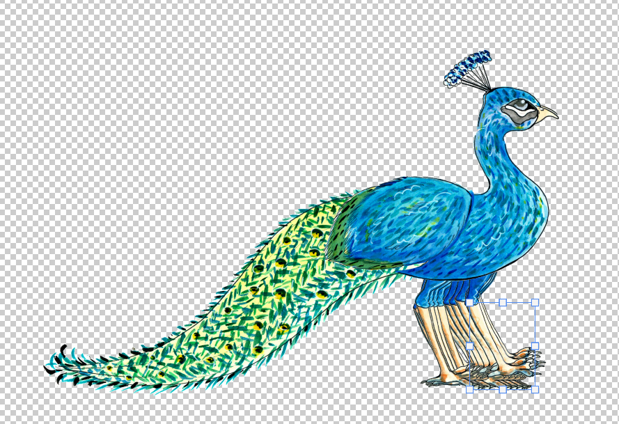
    I then organised these parts into a folder and arranged them in my first key frame, I then immediately duplicated this folder as it will both be the first and final frame of the animation. I then made the middle keyframe for this walk cycle I determined this would be when the peacocks feet are crossing over as it steps the next foot forward.

    First and final frame
    middle keyframe

    Then I worked slowly and meticulously working one frame at a time with the one below it on a low opacity so I could see how far away I was moving the parts. I worked up to the middle frame and then arranged the next frames to get the peacock back into the first frame’s position, ready to start the cycle again.

    To make sure I was on track with the animation every so often I would make all frames full opacity and visible so I could actually see the movement it would do.

    To make the animation I used Photoshops timeline feature to make a frame animation, then I merged all of the groups (after I had backed them up) into single layers then I made frames from layers.

    This is what I had, the main issues were where I had cut the neck there were obvious gaps. Using the paintbrush tool again on a new layer in each group I overpainted to cover the gaps.

    Before and after of the neck as I did each frame individually there are some inconsistencies but I like this look as it makes the neck look like it’s ruffling.

    This is the finished animation. I exported all layers as separate PNG’s and added them to a shared onedrive with the mechanics designer so that she could add the peacock into the game. I am really happy with how this came out, I really like the effect on the tail feathers.

    Pre-minigame Peacock

    The pre-minigame peacock’s walk cycle

    For the peacock before the minigame where it has spots of no pigment. In Photoshop I simply used clipping masks over each element and hand painted the spots on, using a low opacity white layer ove the whole peacock to reduce its overall saturation. I then exported the frames and added them to the folder.

    Deer

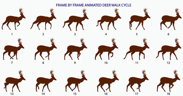
    As with the peacock I sought out deer walking references this time in image and video form as deer are more commonly animated.

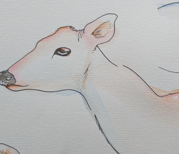
    I then scanned the finished deer parts watercolour into Photoshop using a printer.

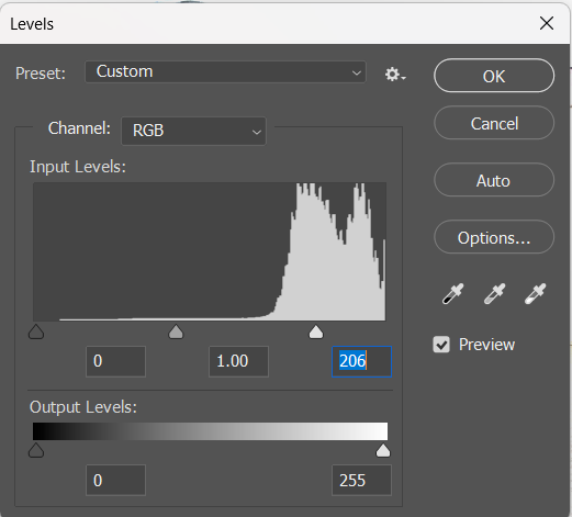
    Unfortunately the printer’s scanner was far too bright for the delicate, light colours I used. In Photoshop I tried to fix this by using levels to increase the contrast and saturation. I then went about and cut each individual part out and put it onto it’s own separate layer.

    After I had done this however I was really not happy with how the deer looked. It was far to bright and luminous I wanted it to stand out against the darker lake location but not by this much.

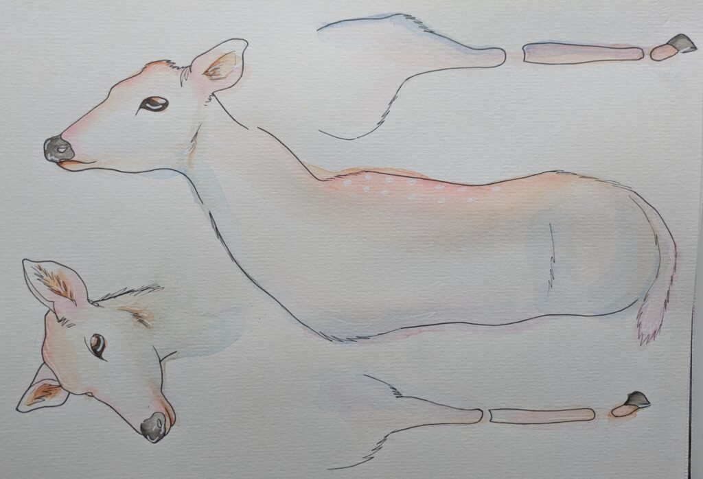
    So I opted for simply taking photographs of my painted deer parts as seen below.

    Once I opened these in Photoshop they were a little too dark.

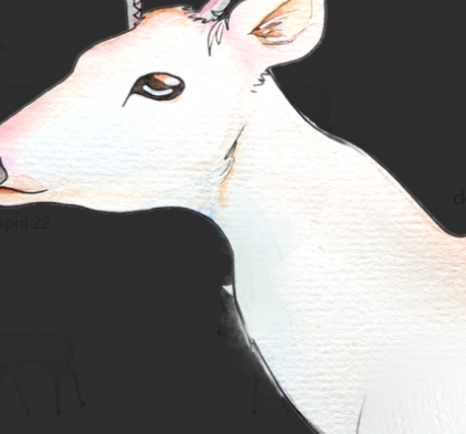
    So I used the levels to tweak it ever so slightly so that the deer was a bit brighter and saturated. A am much happier with how this lookes, especially how the paper texture is coming through as well. It will help to make the visual look of the game more unique and stand out. It also looks like fur.

    before
    after

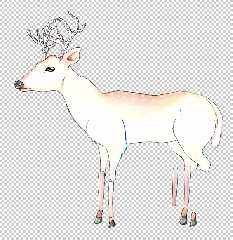
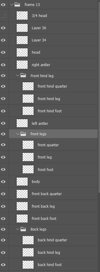
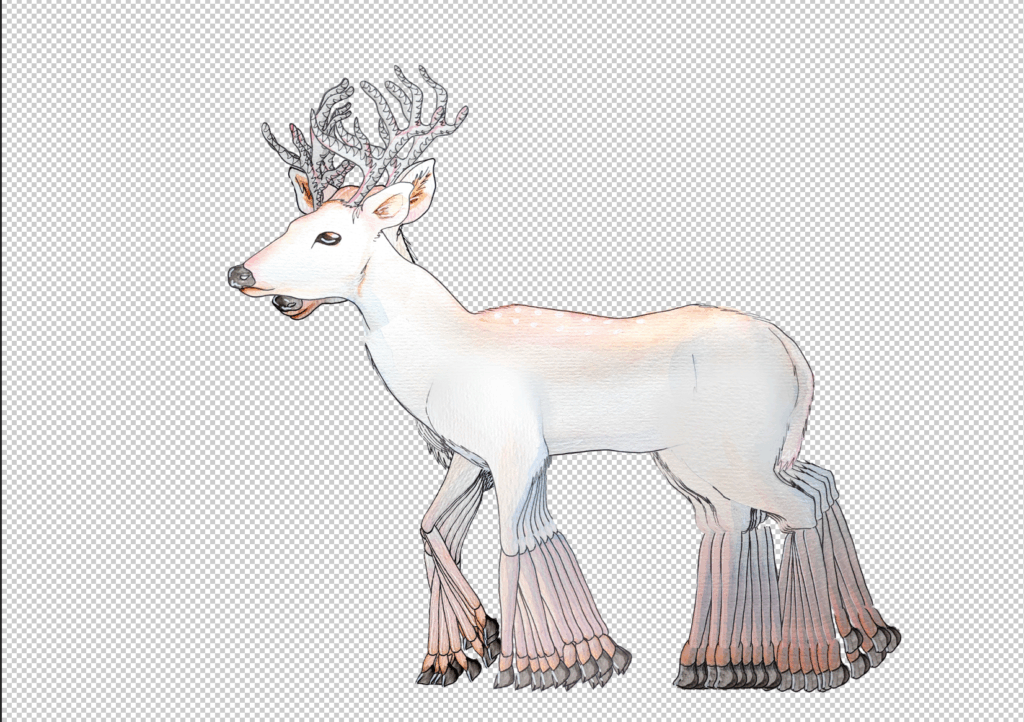
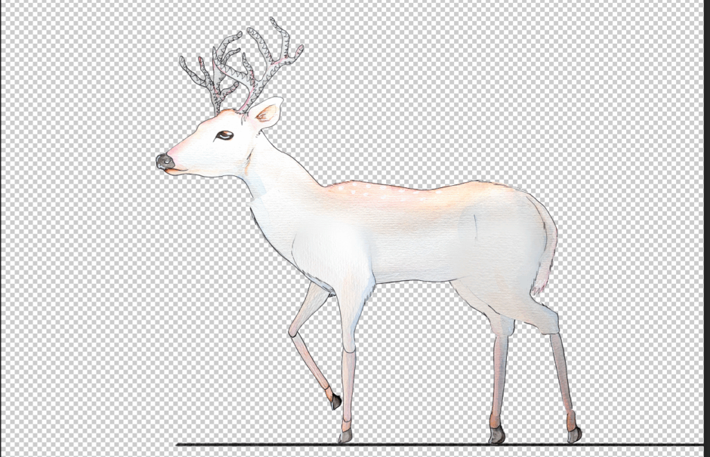
    Now that I was pleased with how the deer looked I cut the parts out again and organised them into folders and subfolders for the legs. As with the peacock I treated each frame as a group assembling the parts in one group then duplicated it and manouvering the parts in the new group. To keep the deer grounded in a space I used a black line so that I could make sure the correct feet where always in contact with the ground. This should help make it look more realistic. I also checked that things were on track often by seeing how the movement of all the legs looked together, if the gaps were too large or small I went and readjusted the frame it was on.

    To try and give the deer more animalistic natural movements I incorporated the 3/4 head for 7 out of the 14 frames. For the walk cycle’s first iteration I included the use of a smear frame for this head turn to give it some movement.

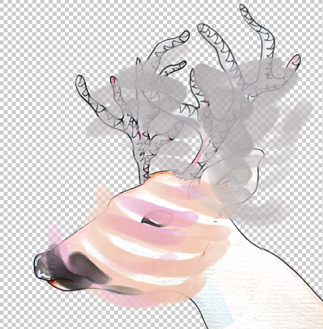
    This is what the smear frame looked like, I used the eyedropper tool to sample colours from the deer then used the paintbrush tool to draw curved lines in the direction the head would be moving in.

    before
    after

    Once the walk cycle was done I went over each frame with the paintbrush tool to draw over any alignment issues.

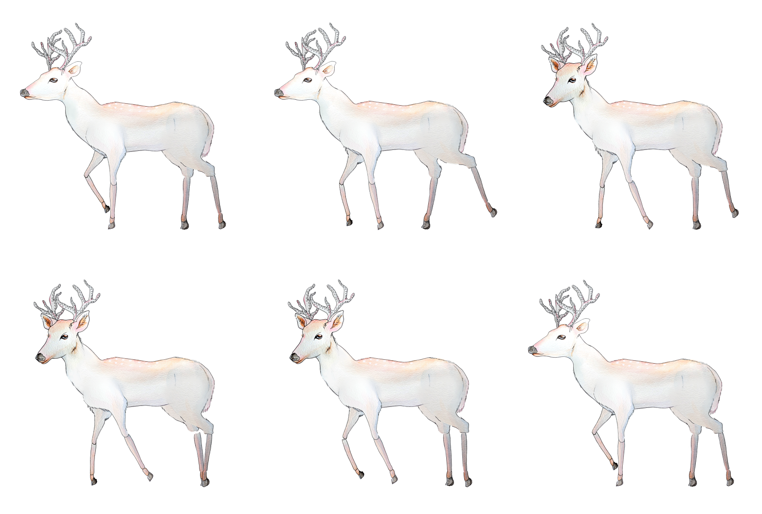
    The finished walk cycle, I exported al of the frames and sent them to our mechanics designer. Once the animation had been imported to unity the smear frame looked strange so we removed it for the week 8 playtest, this unfortunately made it behave strangely and jilted in the game during that playtest but afterwards I fixed it.

    The fully finished deer walk cycle, I am very happy with how this came out. It was a big challenge to animate something with four legs so I am especially happy that it is smooth and looks good. There are some issues with the head looking very inorganic, if there was more time I would animate possibly the snout, ears and eyes.


  • Animal Creation and Development

    After week 3’s decision to revert the roles I began designing the animals.

    Peacock

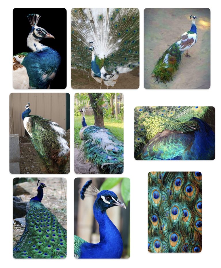
    This is the moodboard given in the GDD, The most notable aspects are the white splotches on them and the feathers that contain “eyes”

    To get a feel for the bird I decided to sketch it realistically first before I began stylising it.

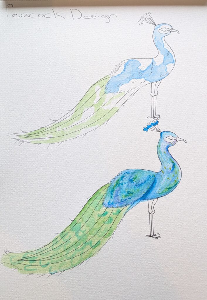
    After I had a design I liked I drew and painted it.

    I wanted the peacock to reflect the aesthetic of the game so I tried to add underlayers of purple and yellow into the blue. I initially struggled with this and accidentally put the yellow when the paper was too wet so it bled too much. When I paint the parts to be used in the game I will need to be extra mindful of this.

    The top version is the peacock when the player first encounters it and the second is after they have played the minigame. The hope is that the white spots will act as a subconscious prompt for the player to colour it in.

    Once I had the design of the peacock I got to work painting the indivudual parts for the animation of the peacock.

    I began with a loose pencil sketch of the parts, I drew them close together so I could have the sizes right. I then slowly began building up layers of watercolour, introducing light washes of purple and yellow – being sure to not repeat the mistakes I made in my earlier painting.

    As the painting was coming along I got the idea to paint more pronounced feathers, I think this added more interesting visual detail and incorporates the impressionist influence from the GDD.

    For the tail feathers I also worked slowly and tried to give the impression of depths with layers of strokes in different colours. For the “eyes” of the feathers I used much less water in the brush so the pigment would be very dense and opaque.

    This is the finished peacock I am very pleased with how it turned out and our technical designer liked it too, I will now scan it into Photoshop so I can start animating it.

    Deer

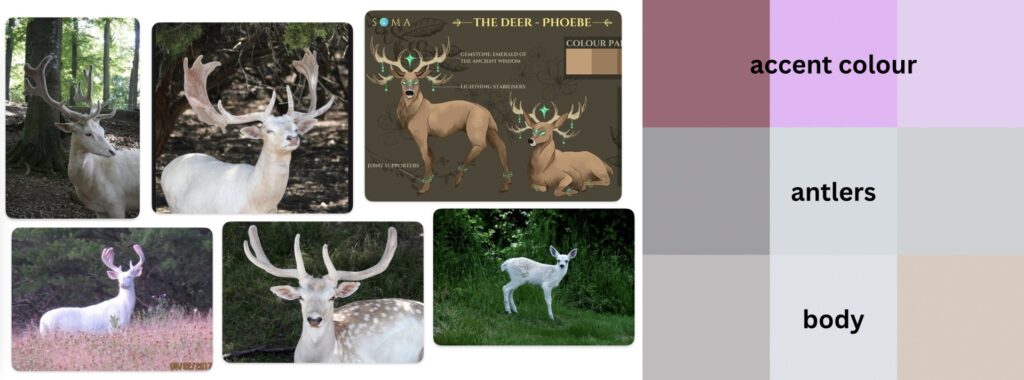
    This is the deer moodboard in the GDD. A helpful colour palette has been included, as the colours are very bright I will need to really work on my blending skills and the use of the accent colours when painting this animal.

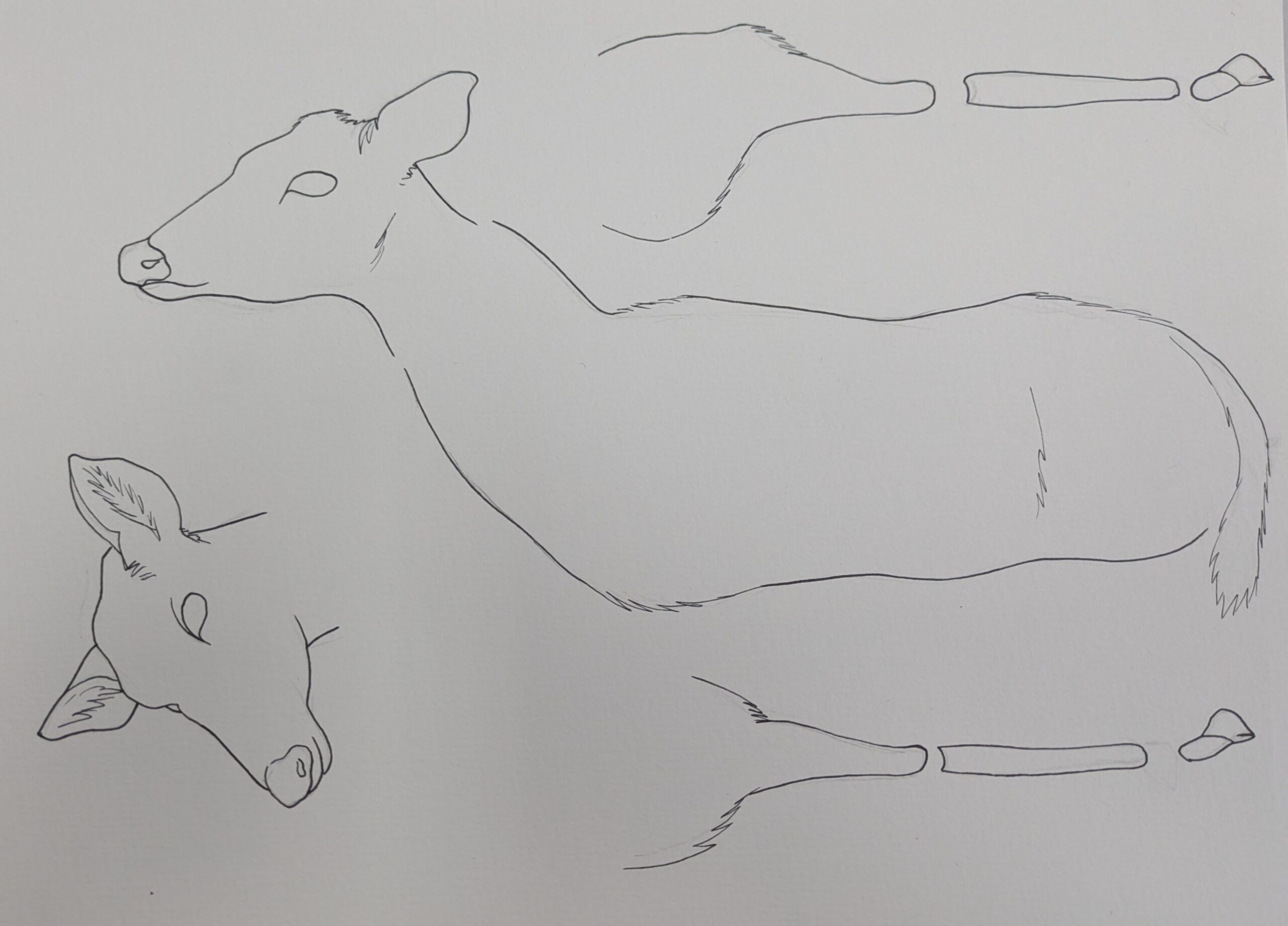
    As with the peacock I wanted to study actual deer anatomy first.
    On this page I was playing around with the full body and trying different mark making for the antlers.

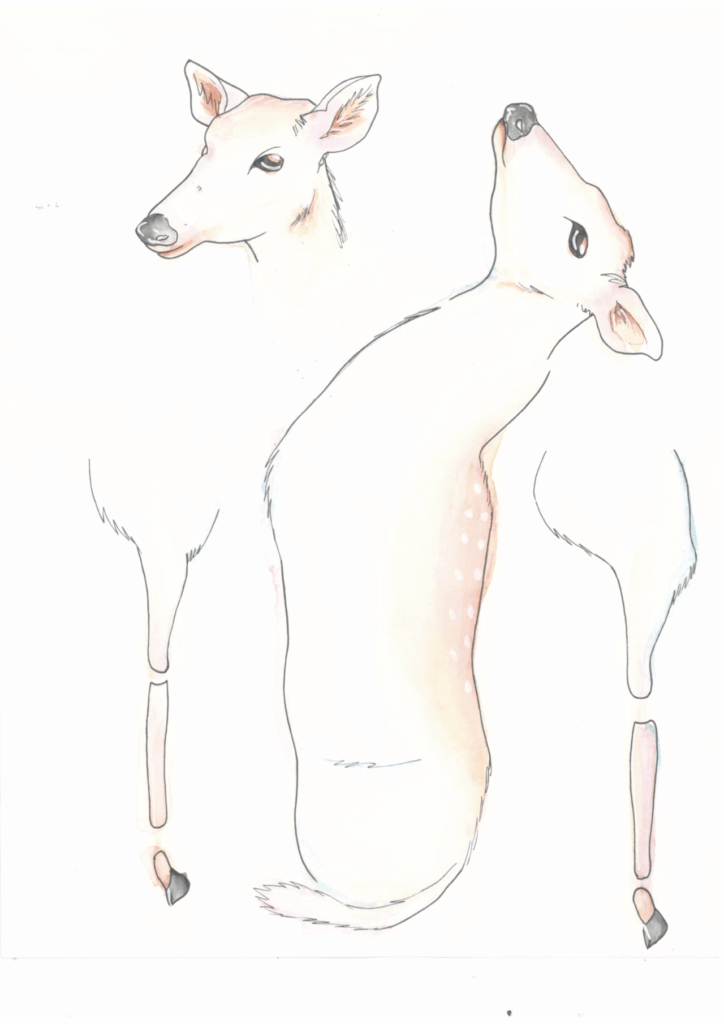
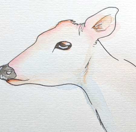
    As specified in the GDD’s artbible the deer is very mystical and uses pink tones in its colour palette. I built on this by also using blue tones to complement the pink. Whilst I was painting the deer I kept the brush full of water so it would have a soft airbrush quality to add to the magicalness of the deer. To finish it I added highlights with a white gel pen.

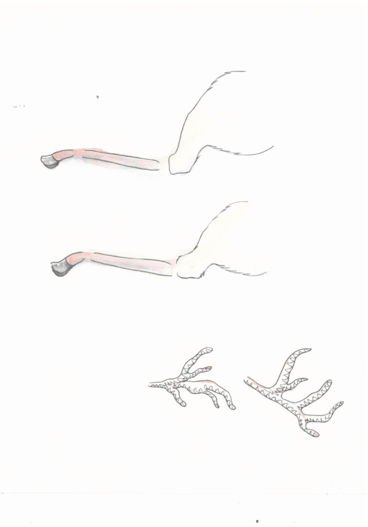
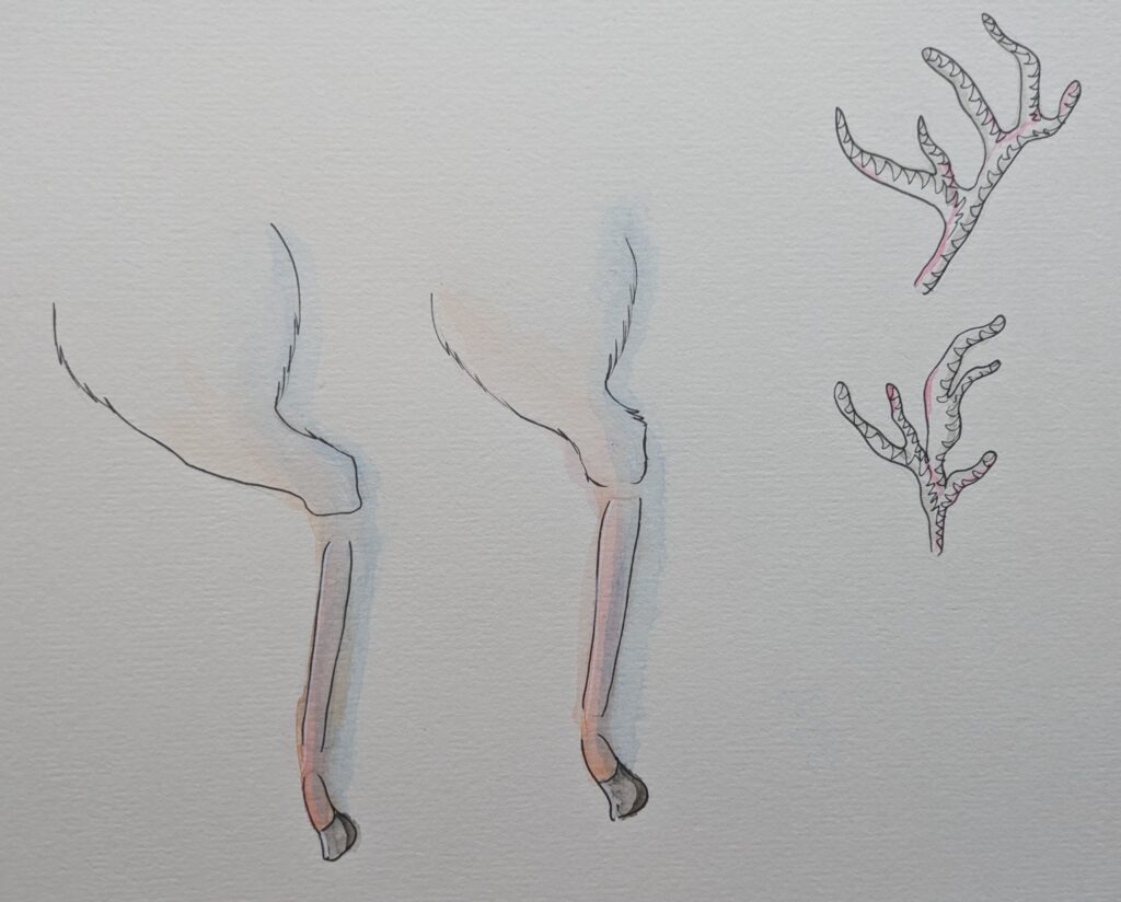
    For the parts of the deer I separated the legs into three parts that attach to a main body and there are two heads that can be swapped out as if the deer is looking around.

    I reused the same techniques as in the concept art as they were successful. I made sure to be patient as I was adding the layers because the paper stayed very wet due to the blending I was doing.

    These are the final pieces I will now scan them into Photoshop to cut them out and do digital retouches. Then animate them.


  • Animating the Player

    I have never animated with physical materials before so I conducted research into paper art and started looking at some motion references. Whilst I was designing the character I had the idea that she could float instead of walk. This is a video moodboard of the references and flying techniques I sought inspiration from.

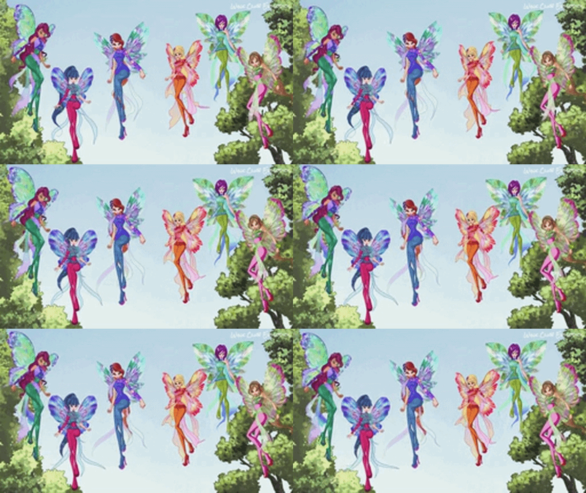
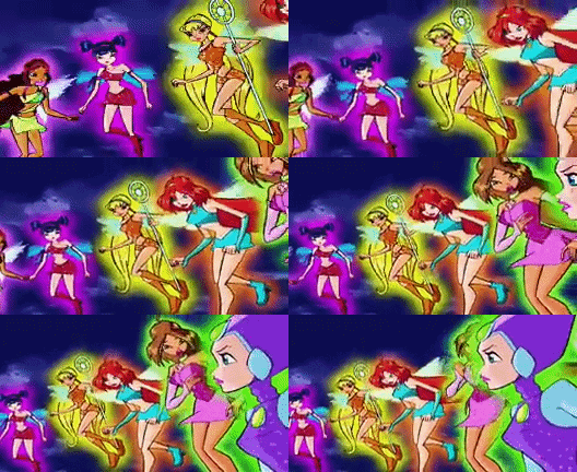
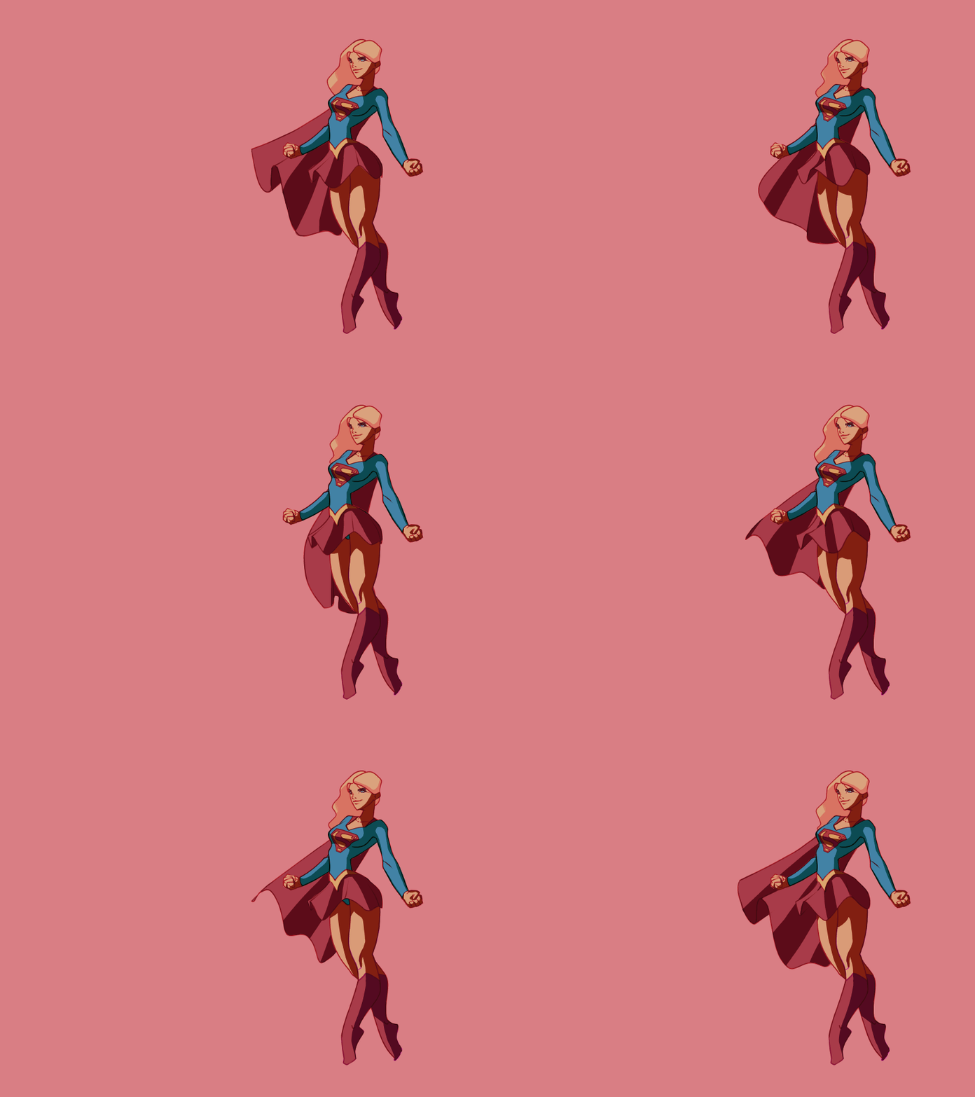
    Growing up I watched a lot of this cartoon called Winx Club, they are fairys and everytime they would fly they would have their legs arranged with one at a bend and the other straight, this creates an interesting sillhouette for character design and easily communicates they are off the ground if the background is blank.

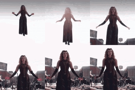
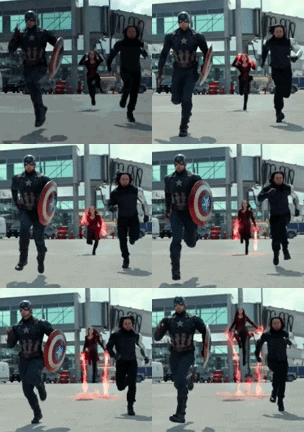
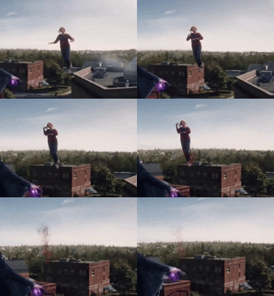
    Scarlett Witch from Marvel had an interesting way she moves her arms when taking off and landing, it is graceful and elegant.

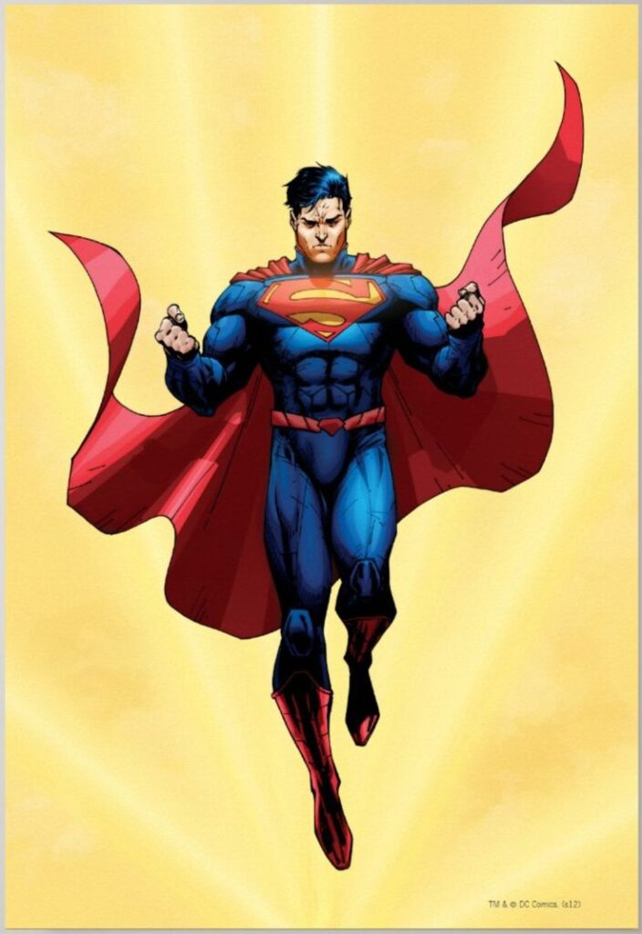
    I also looked at superman his resting hovering pose is similar to the fairies with the one bent knee.

    After I looked at these references I created a short animation in Flip a Clip to show my idea to my team.

    This is 8 frames per second.

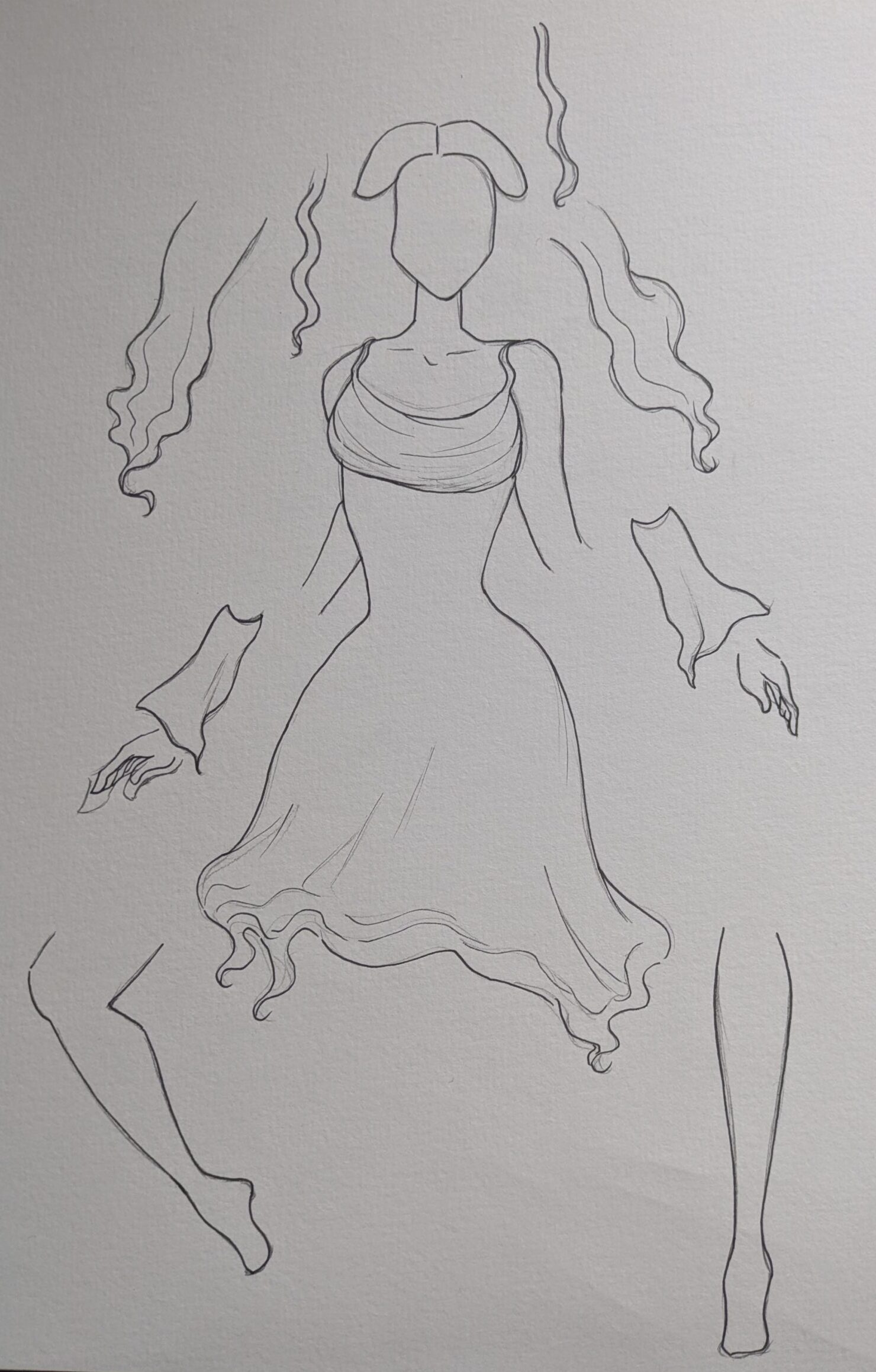
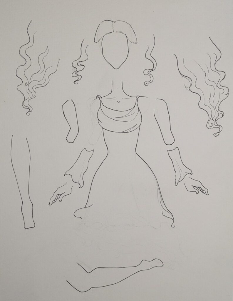
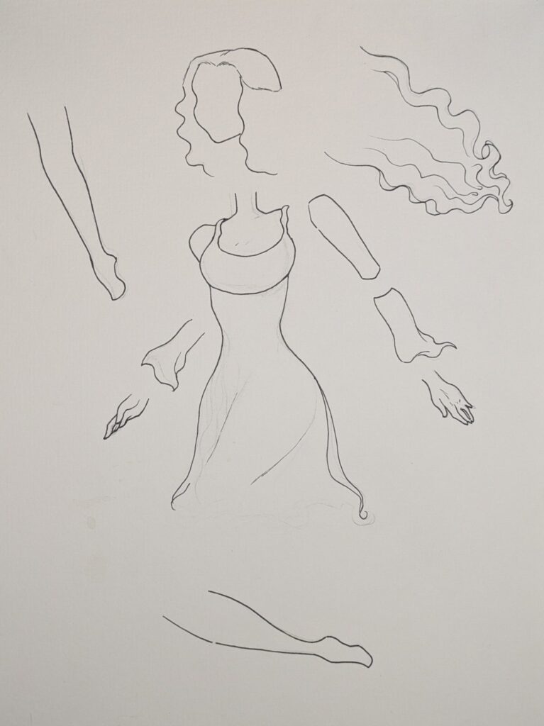
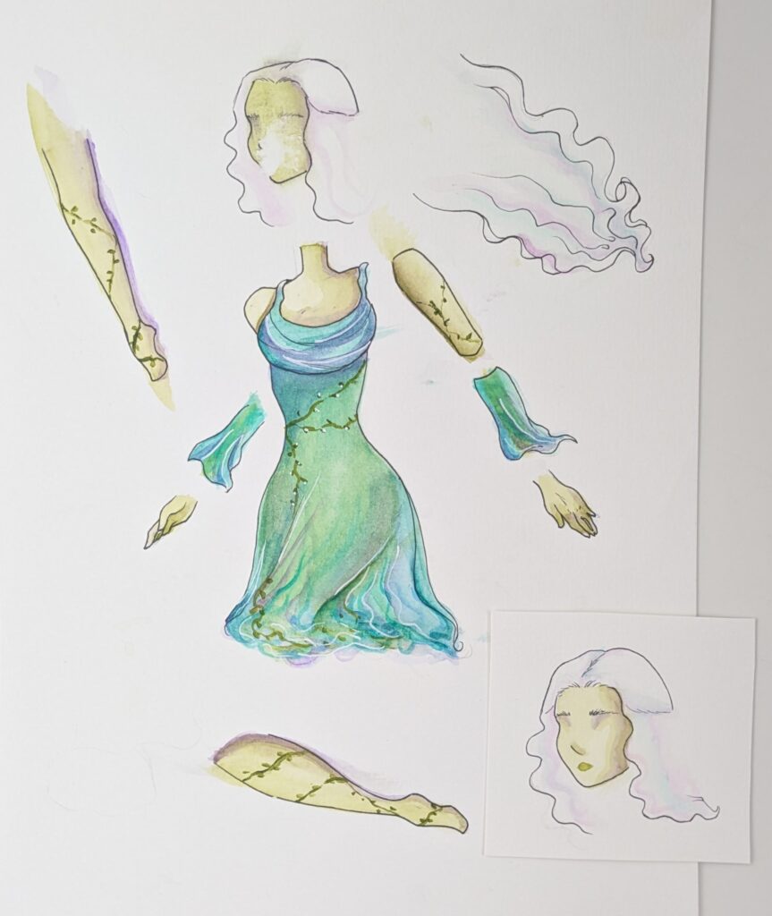
    This was well recieved so I got to work making a paper prototype of her idle pose before I spent time painting the actual character. I divided the character into seperate elements.

    • The head connected to the body and upper part of the arms.
    • Left hair
    • Right hair
    • left lower sleeve
    • right lower sleeve
    • left hand
    • Right hand
    • Left leg
    • Right leg

    I then drew each piece seperately and cut it out. I then taped the main body down onto a piece of paper and set my phone camera above the paper so it wouldnt move whilst I arranged the pieces.

    This is 8 frames

    This was a success and gave me confidence that I can create a refined version. It also highlighted to me where my weaknesses were which was to lump elements together even though the hair is going down the arms are going up. I will need to pay close attention to this later.

    First Playtest Version

    Before our first playtest on the 26th of February we want the character fully animated. So the week before the playtest I created the parts needed for animation.

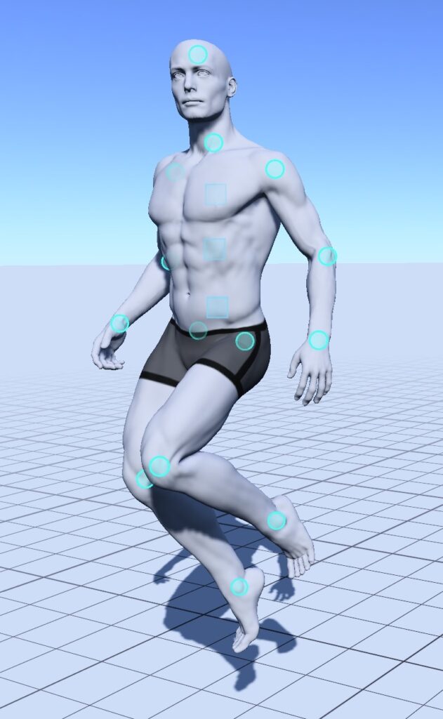
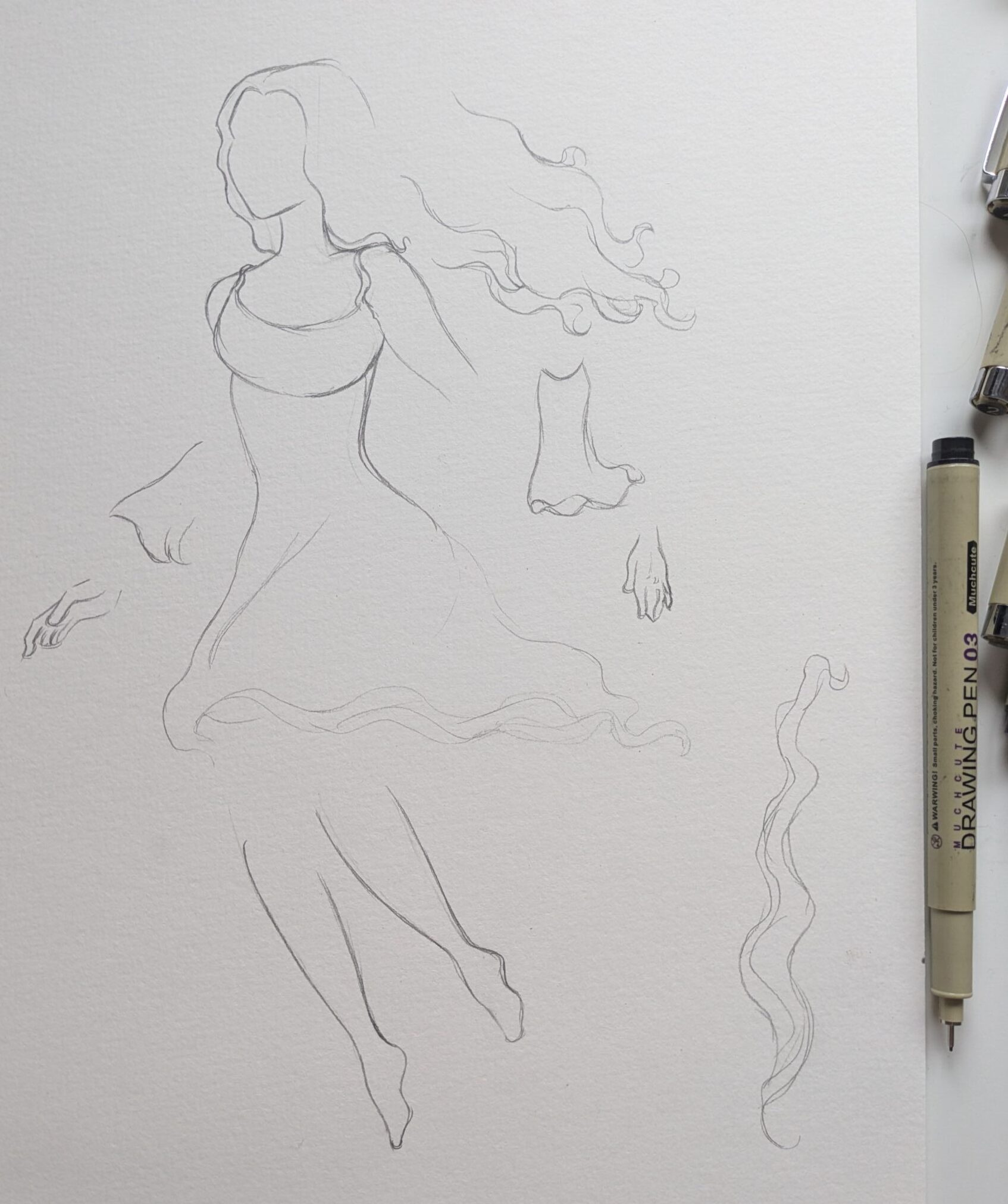
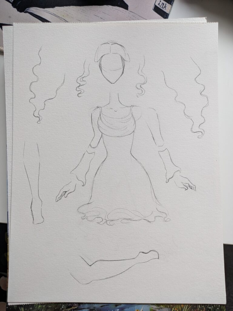
    This is a sketch page of the flying animation. I drew the character and made notes of what would be moving and what pieces I would need. For the pose I used a free model poser app – Magic Poser to create and tweak the pose I wanted. Every blue circle is a piece that you can manipulate.

    I then drew and painted the final version

    I then took the parts and photocopied them, emailing the results to myself. I did it at 300dpi on an A3 size.

    I opened the files in Photoshop and used the object selection tool to quickly isolate the elements. For any parts that were missed I used my XP pen tablet and the quick selection tool to draw over the areas adding them into the selection.

    The object selection tool grabbing the main pieces
    The hair was too light so it had to be traced over. I used the add and minus options for the brush to ensure it was accurate.

    After the elements were separated I put each onto separate layers and named each layer

    before
    After

    Once the everything was set up I noticed that the colours were a bit washed out so to make them pop I adjusted the levels.

    Darkening the shadows and upping the saturation as I do not know how she will compare to the background yet.

    To actually create the animation I put all of the elements into a group and arranged them into the first frame, I then copied and pasted this group renaming it to frame two. Then suing frame 1 as a guide on low opacity I made minimal changes moving the legs and hands up. I continued with this until I had ten frames, she reaches the peak of her height in frame 4 then slowly comes back down to end up in the same position as frame one.

    Once I was happy with the frames I used Photoshop’s built in video feature and made an animation then after I had flattened the layers (keeping a copy of the unflattened layers in a seperate document) I clicked make frames from layers.

    This is the timeline view, it took a couple tries and some tweaks to get it looking presentable and like what I envisioned but eventually I saved each layer as a png and put them into a onedrive folder I shared with the mechanics designer.

    For the movement animation I repeated the exact same steps except with the skirt every two frames the alternate ruffles display. My hope with this is that it would look like the skirt is blowing in the wind.

    These are the finished animations as looping GIFs. I think that the skirt idea has not quite worked with the current execution but I am happy with these for the playtest.

    Second Playtest Iteration

    Once I was finished with the painting I scanned in the pages and cut them out in photoshop, performing a last colour check. I am very happy with how this came out I think that she matches and stands out just the right amount in each location.

    Whilst I was cutting the pieces out using the object selection tool and cleaning up the parts I used levels to every so slightly up the contrast by moving the dark grey arrow to only 50. This has made the purple come through on the dress better.

    Idle Animation

    First and final frame
    middle keyframe

    For the idle animation talking onboard the advice I got during feedback week, I wanted the character to look more graceful so I pushed the movements to be bigger. Starting with the first frame this is when she is about to go up so her hair is tight to her body as well as her arms and hands. For the middle keyframe when she is at the highest peak I made it so that her hair is fanned out behind her and her arms are wide.

    The increased number of parts she has both makes it so that the movement can be natural, but that it is also quite easy to lose track of the parts. So I made sure to check and see how the parts were lining up with each other.

    To further try and show the characters gracefullness I overpainted on some frames the fabric of her dress moving with her.

    This is the finished idle animation. I believe this is very successful and a vast improvement over the previous animation.

    Movement Animation

    For the movement animation I repeated all of the previous steps, upping the levels, cutting out each part and putting them onto individual layers.

    first and final frame

    I then created the first keyframe and the middle one. I wanted this movement to be not as pronounced so that she looked effortless gliding through the air. so the difference between them is not as much as in the idle animation.

    This animation also used a lot less frames, only using 8 instead of the idle animations 14. I like this effect as when the character is moving there is less time and you need to get the movement across quicker.

    middle keyframe

    This is the final animation, it is slightly too fast but once it is in the game and in motion it should suit the characters movement. I am pleased with how this came out, there are still some issues but it is an improvement on the first iteration.


  • Character Development

    The Character

    The player character from the GDD is an ethereal magical being. She is a young forest keeper learning how to help the animals and environments throughout the game. Her physical appearance is heavily inspired by nature and mother nature as well as fairies.

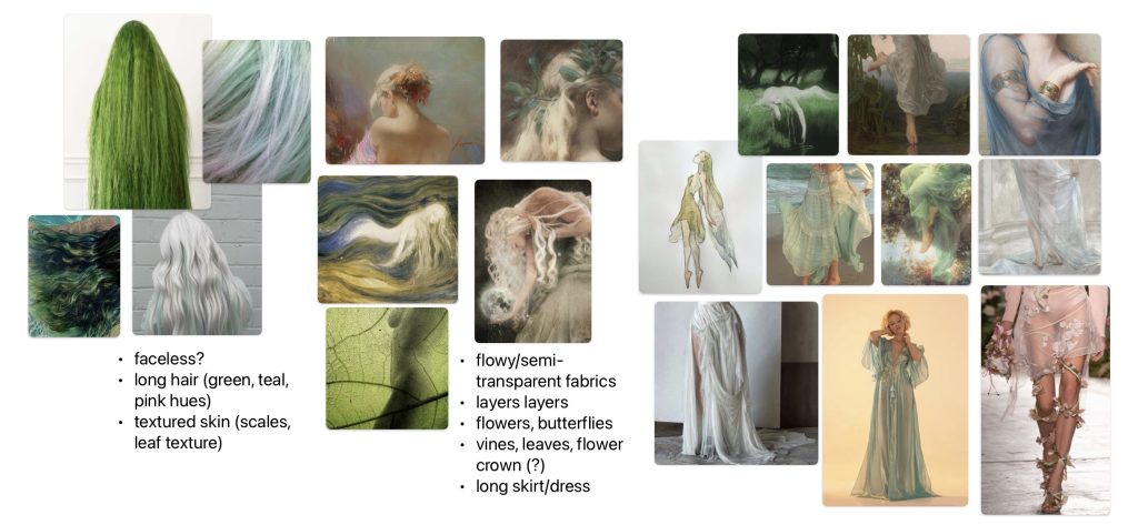
    This is the reference board for her. After looking at it I noted the draped layering fabric, long hair and the faceless nature of the images. I imagine not only does this reinforce the mysterious, mystical nature of the game but would also allow the player to project themselves onto the character easier.

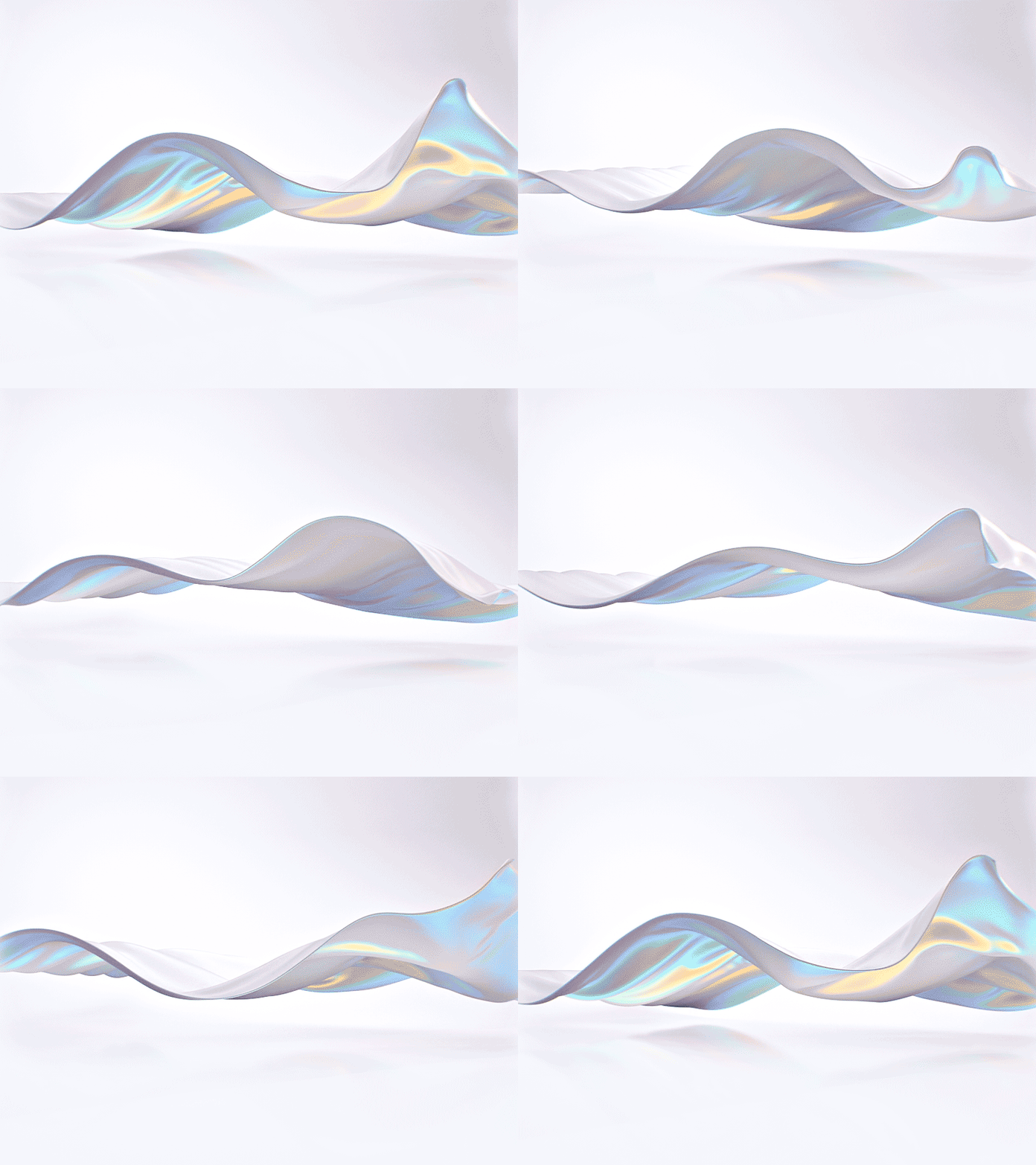
    After looking at the reference board I looked for some fabric references these are fabric simulations giving them a dreamy feel.

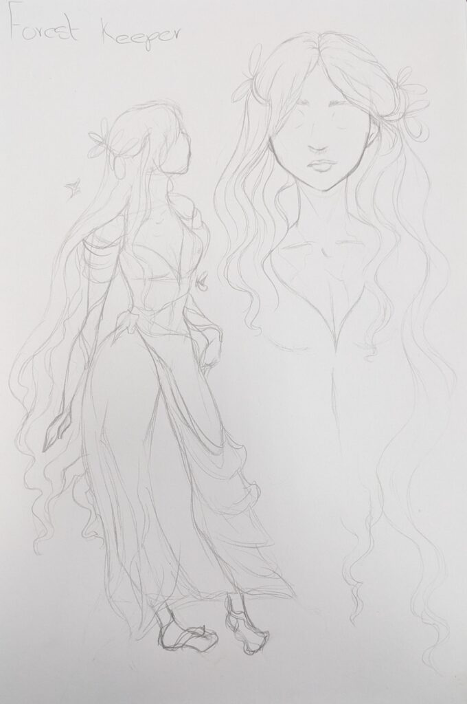
    Initial Sketches

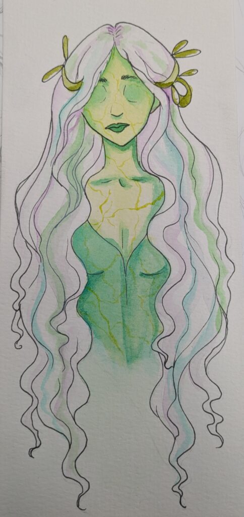
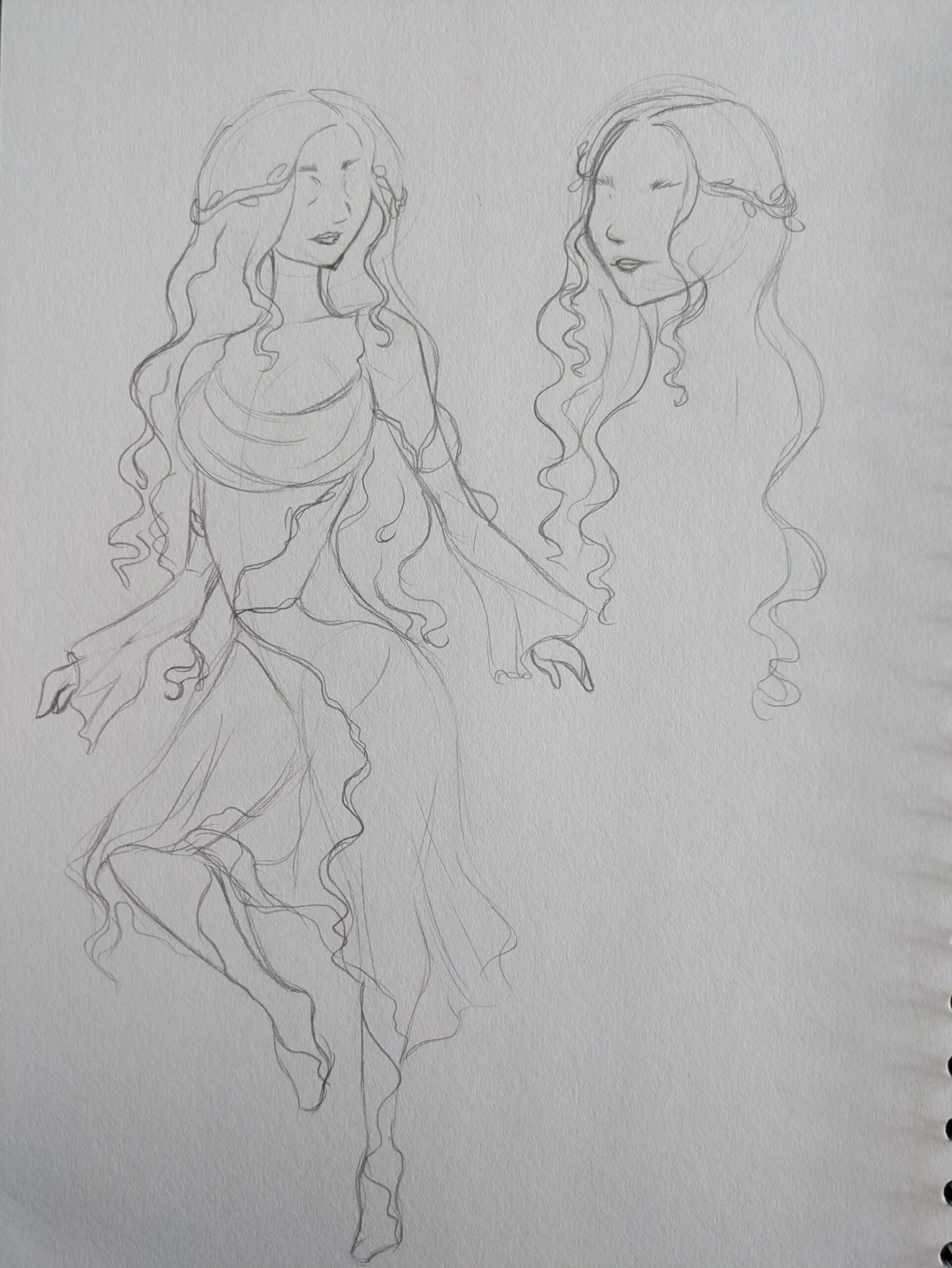
    After I had looked at the reference and concept art I began sketching out some designs. This was relatively easy the supplied materials let me create an informed design quickly. As me and the other artist were discussing watercolour I also painted a small colour test, specifically to see how white iridescent hair would look. I really like this and my group also liked it. Though I think the leaf veins make her look sickly.

    Designing the Dress

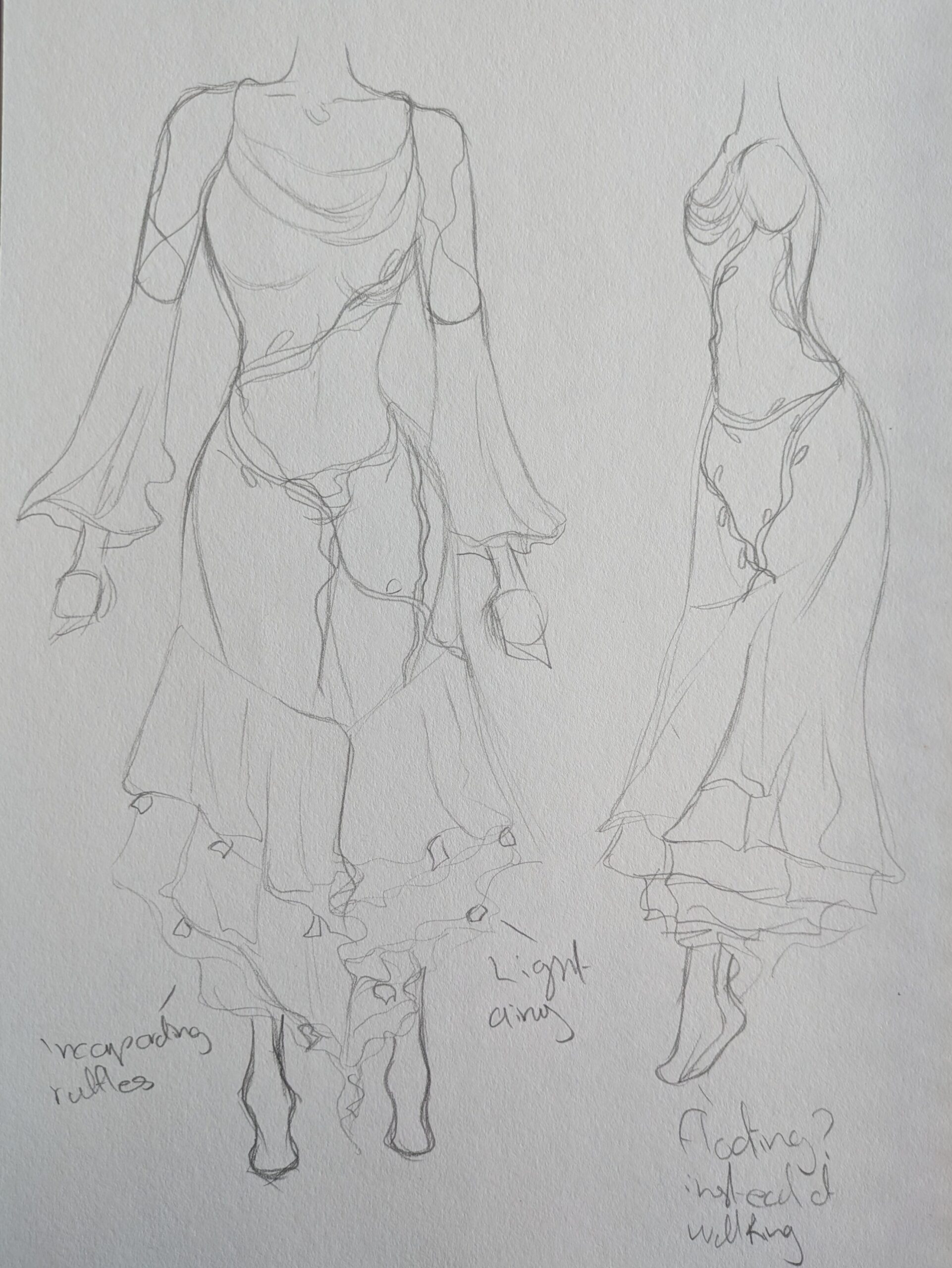
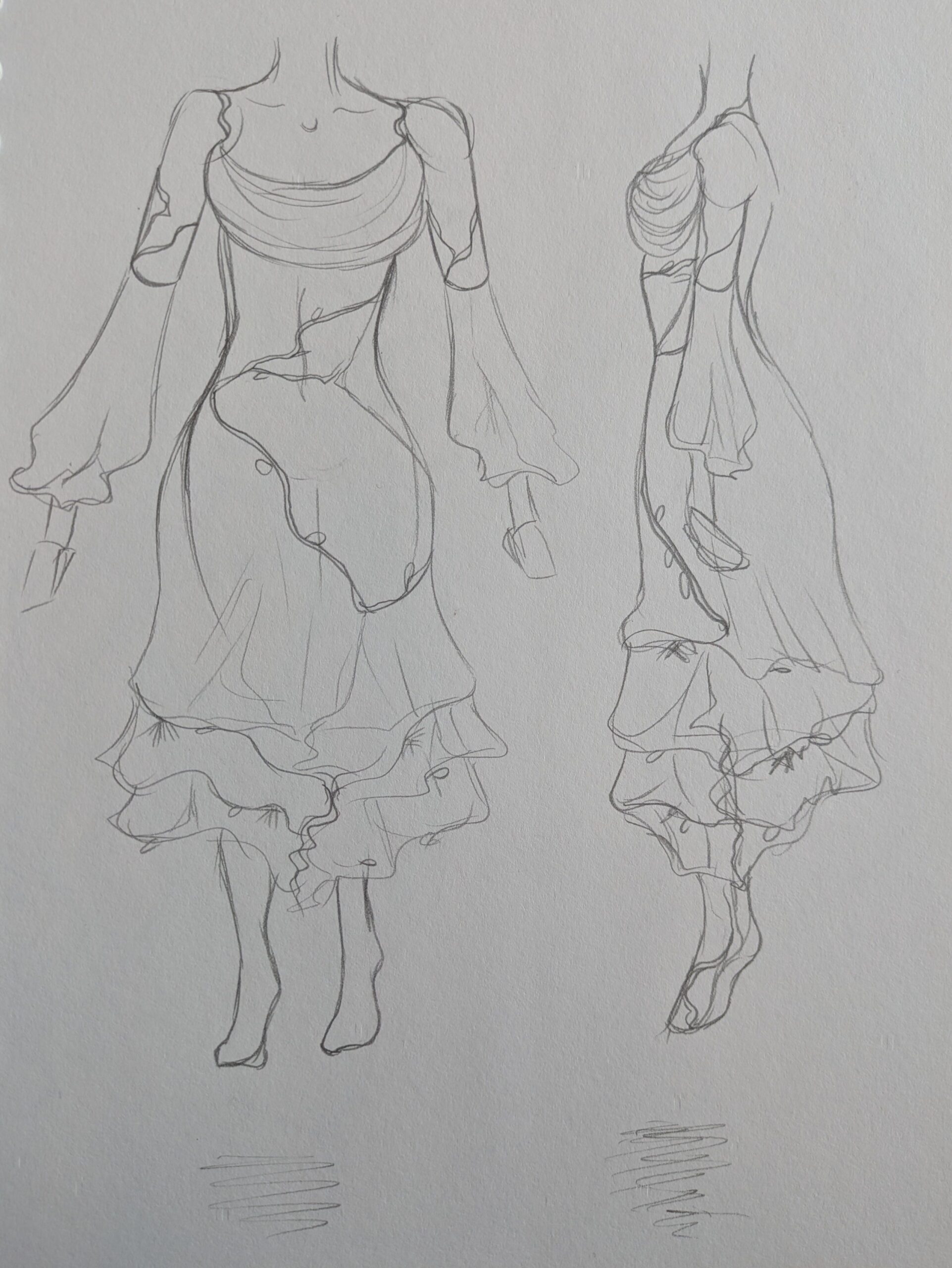
    It was clear from the references that the characters dress is very important to her characterisation so I took my time with this stage of development and created a variety of options. The main issue I ran into was how these ambitious designs could be translated into animation, finding ways to make the process easier is important due to the tight deadline.

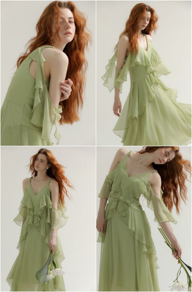
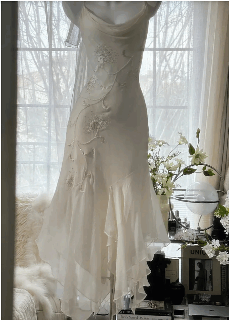
    I began by looking for my own reference images and sketching out aspects I liked from each image, also keeping in mind the original reference board.

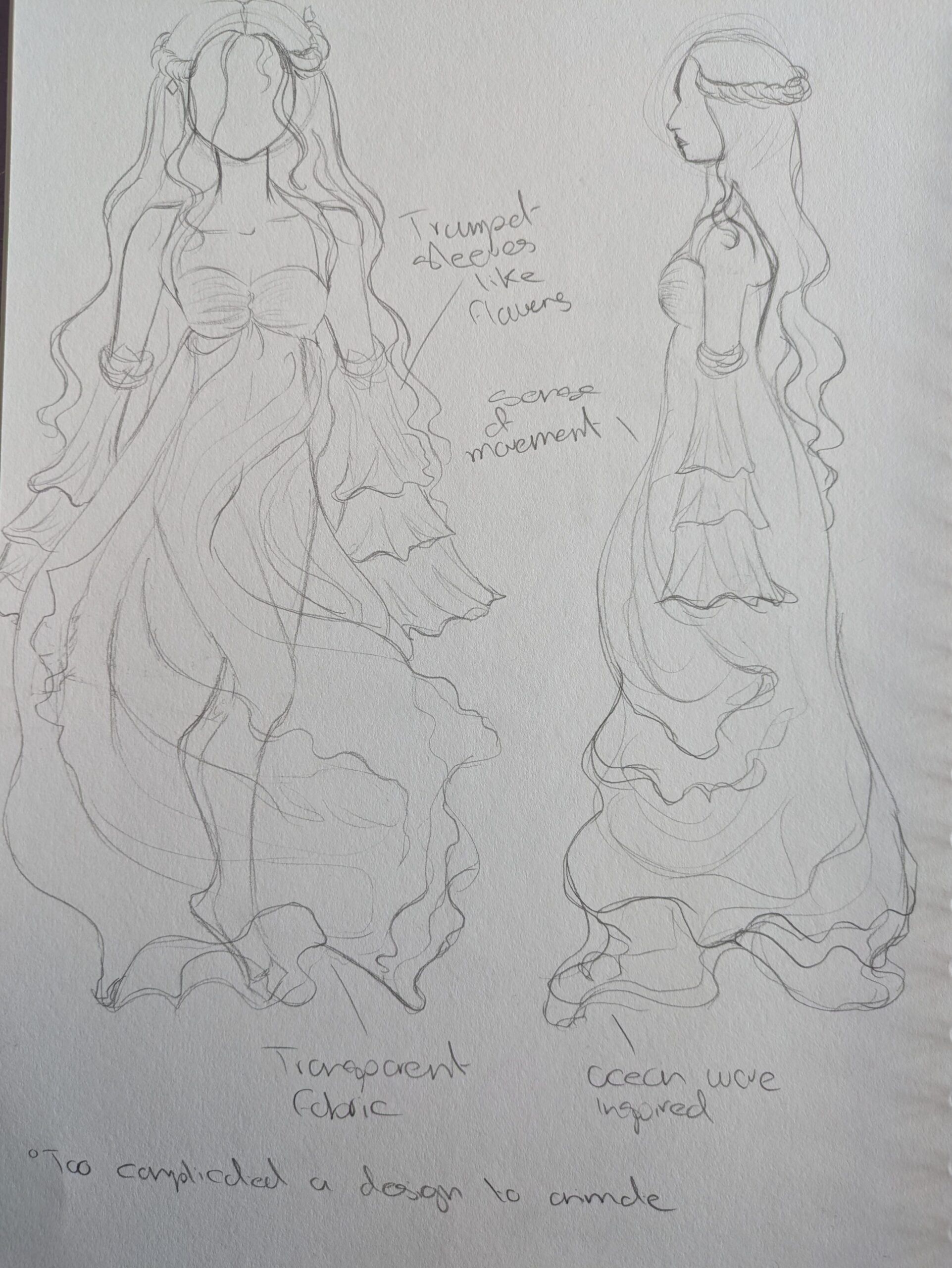
    This is an ocean inspired dress, the folds resembling ocean waves. I tried this as I wanted to explore all aspects of nature.
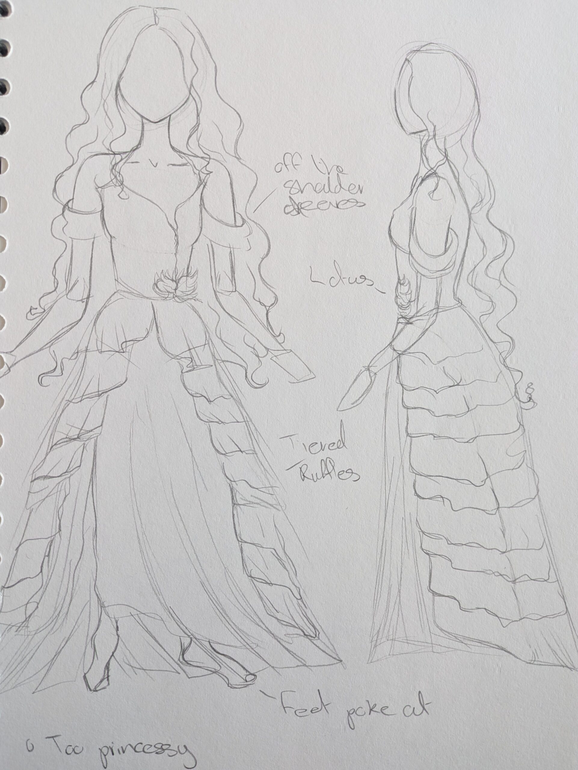
    This design was heavily inspired by traditional princess dresses, something you would find in a Disney movie. The layers of fabric being relegated to traditional skirt layers.
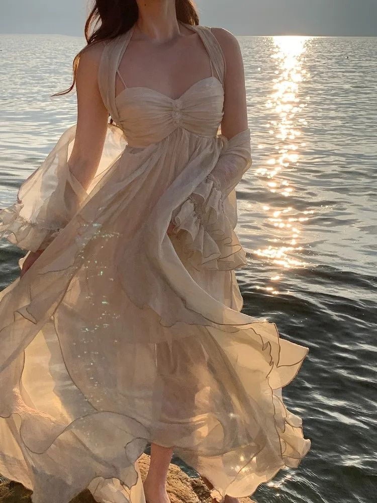
    Through my search fro my own reference images I found this skirt shape which I liked as it incoporated the layers but not at too much an expense of animation.
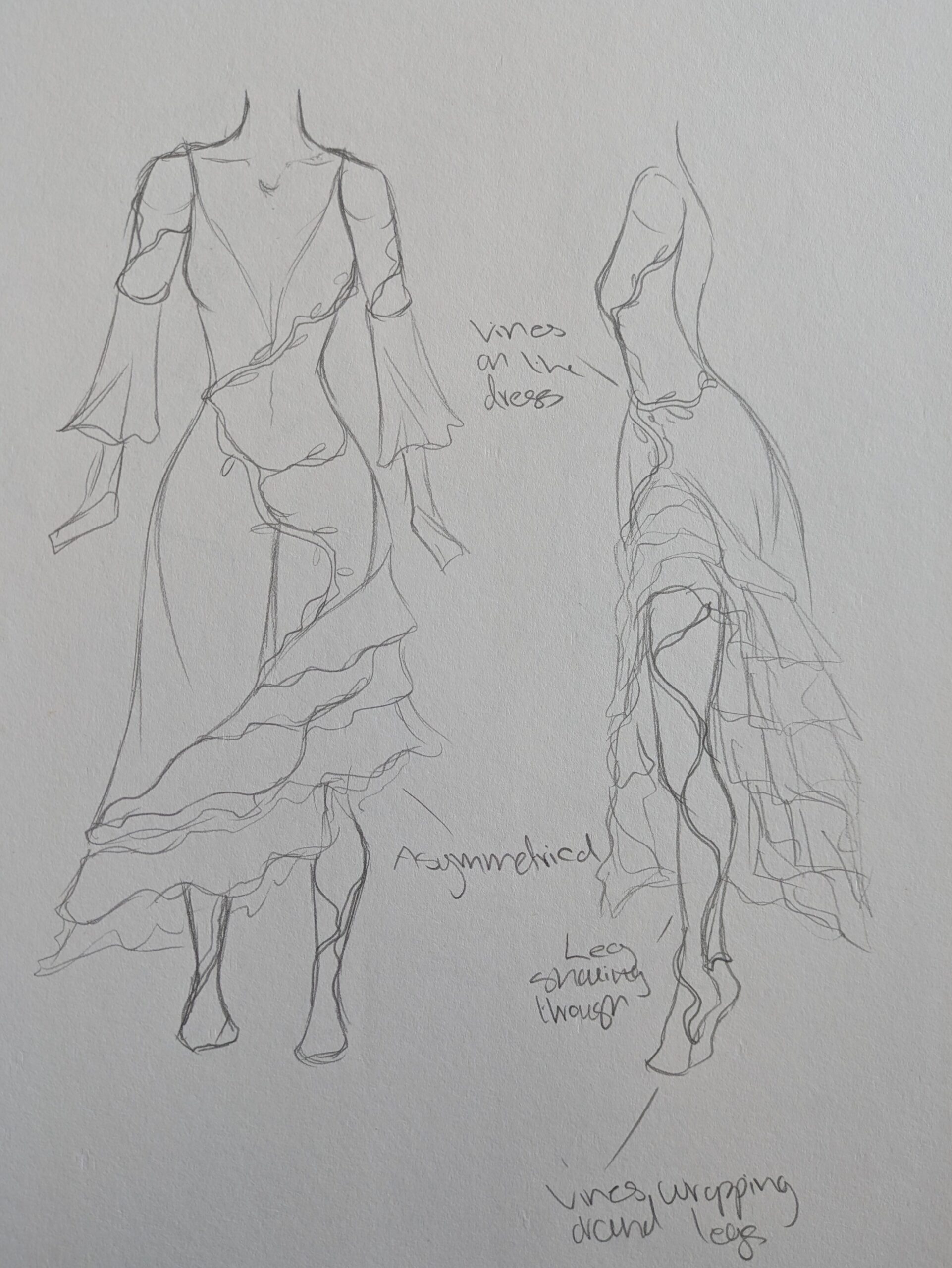
    I tried out this shape with an asymmetrical skirt like the concept art and a more revealing neckline. ,
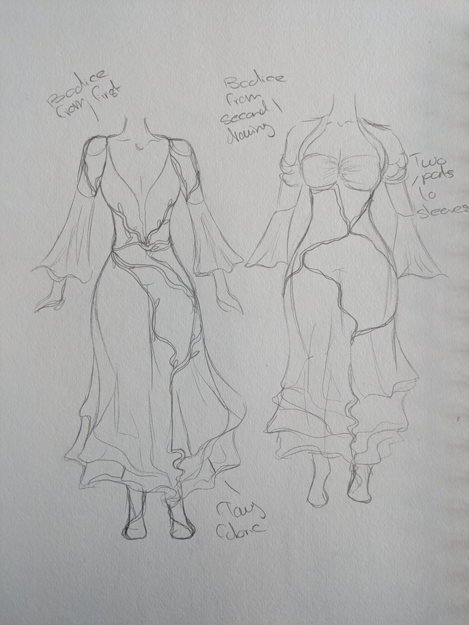
    Once I had the shape of the dress I really liked I started experimenting with different neckline and sleeve combos.
    I eventually settled on this overall design keeping things very simple and swooshy. There are elements of nature across the dress such as the leaves and other flora in the skirt. I settled on the rouched neckline as the more revealing ones seemed too mature for the character.

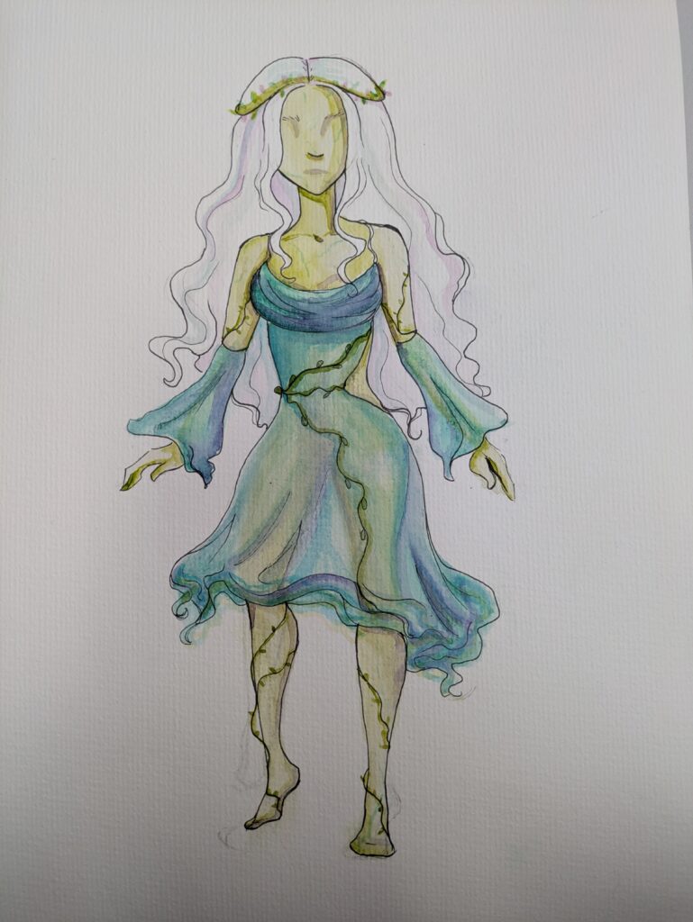
    This is the final dress design on the character. The layers and material of the fabric will need to be paid extra attention to when colouring as if the translucency of the fabric does not show the magical aspect of the character will be lost.

    Even though she is faceless there are many different options for how best to convey this without accidentally entering into creepy territory.

    The best current representation I have found is vaguely defining the eye indents, keeping her nose and possibly keeping her lips. Though I think I will end up also vaguely defining her lips.

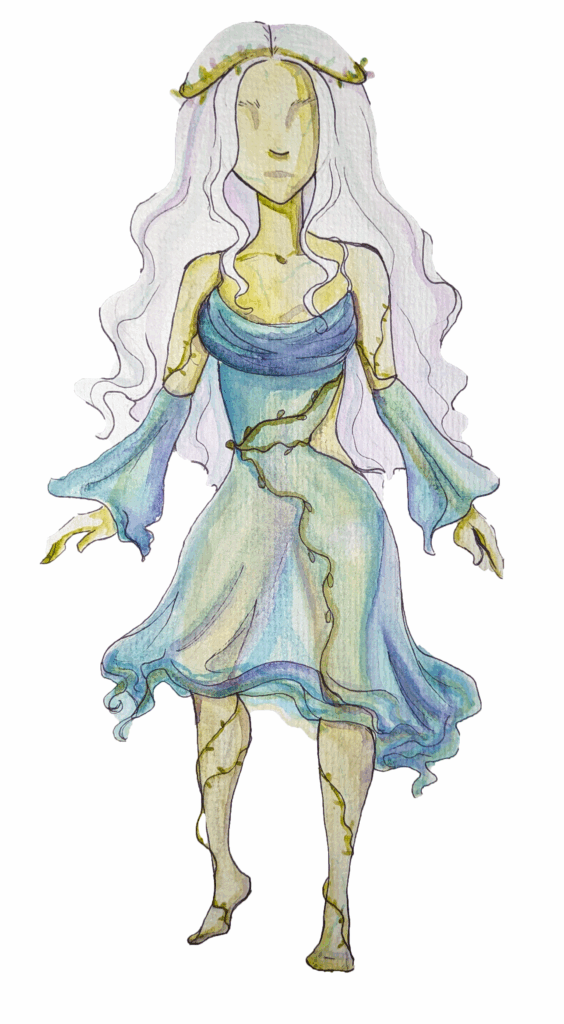
    This is the finished design in watercolour. I began with a heavily watered down green and filled in her whole body I then started on the shadows on her skin slowly building up the density of the pigments.

    I used purple in the shadows to bring the impressionist elements in. For the dress I worked in a similar manner being careful to not lose the green underneath to keep the look of translucency.

    To make the dress look mystical I incorporated purples, greens and blues. I used a black fineliner pen sparingly only using it to enhance the details in the dress.

    Colour Experimentation

    Original
    Lake location
    clearing location

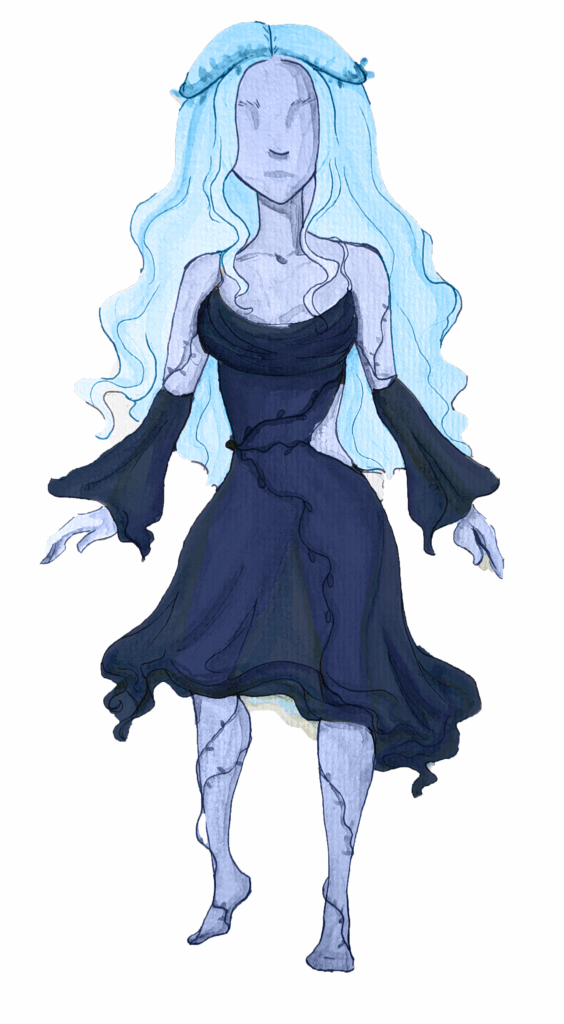
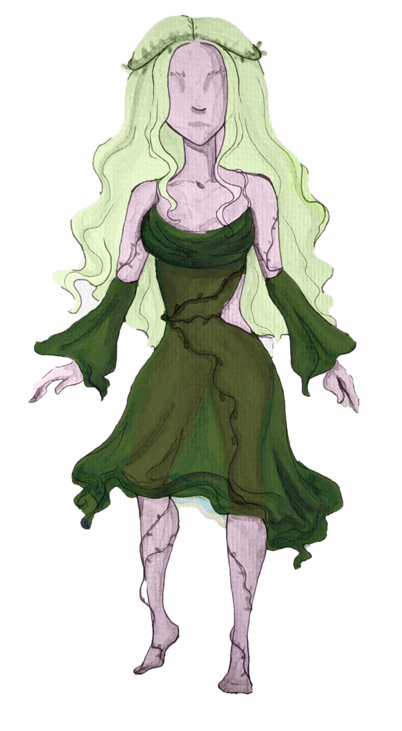
    As specified in the GDD the character naturally changes colour to match the current environment she is in. Now that I have the finished design – her colours being her “natural” ones, I decided to take the image into Photoshop and change the colours.

    I used the object selection tool to select each element that needed to be changed and copy pasted them onto seperate layers. I then used the clipping masks on seperate layers using the blending mode ‘colour’ to change the colours but keep the definition.

    Though these werent used in the vertical slice, it was helpful to see how the design could be changed.

    First Iteration

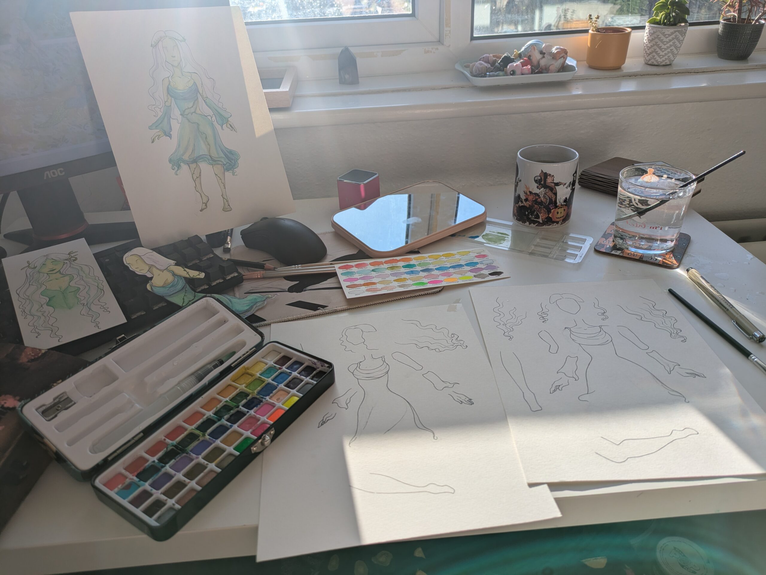
    Once I was confident I was prepared I began drawing the elements. To ensure the character stays consistent over the two animations I drew them both at the same time. Once I was finished with one element I would draw the corresponding element on the other page.

    I then inked both with a black fineliner pen using a gummy eraser to remove the pencil lines.

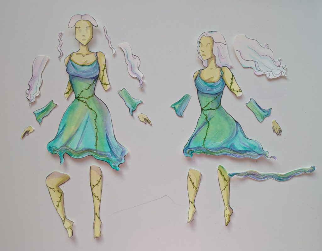
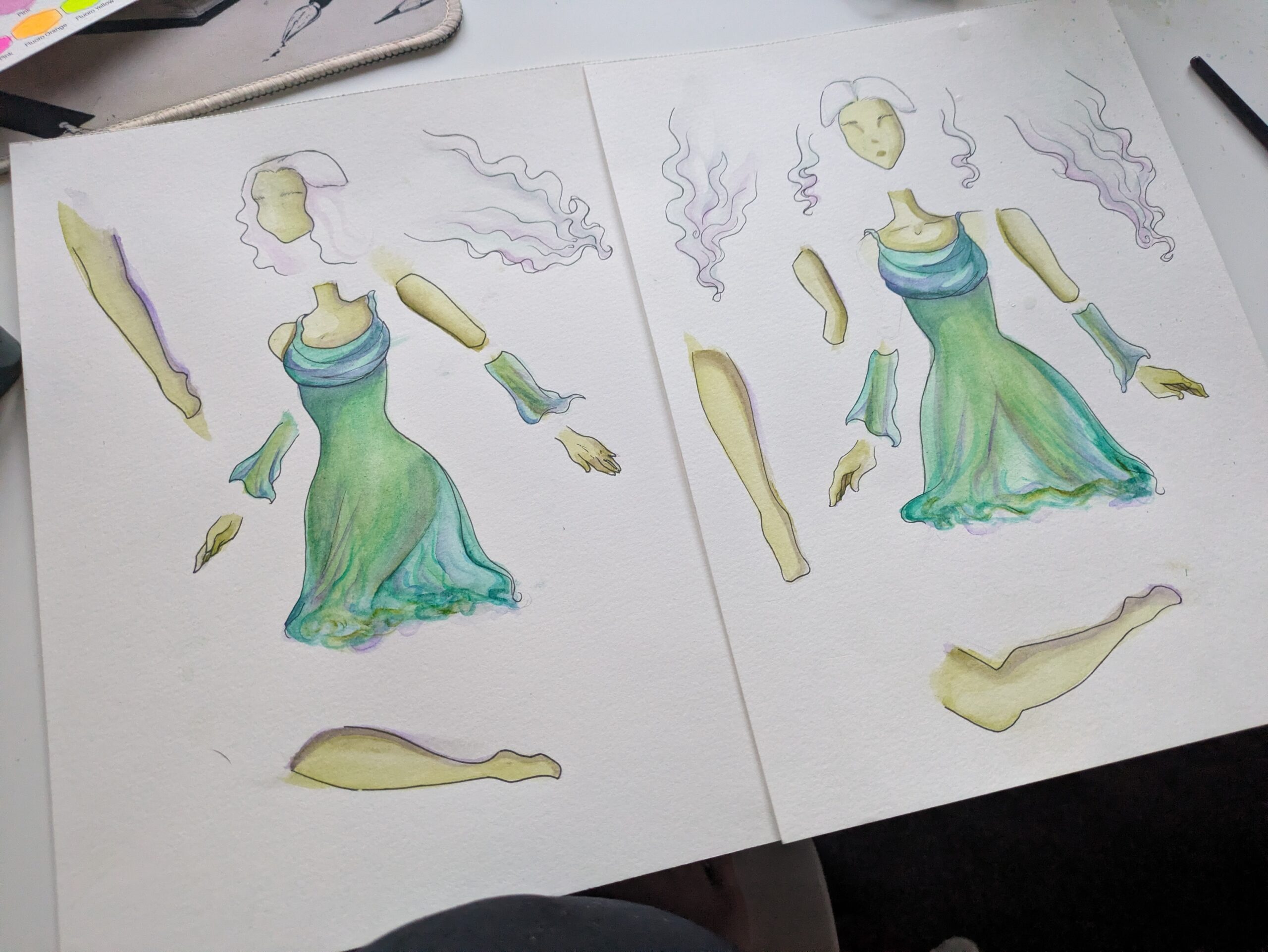
    I then painted both of them using watercolour. As with drawing them I painted each simultaneously so the colours would be consistent. When painting I used many of the same techniques as I did on the final character

    Once both were painted I cut them out using scissors, this was somewhat difficult next time I will use a scalpel to get more precise cuts.

    Animating the Player

    How I animated the player

    Character Redesign Using Feedback from Playtest Weeks 7 and 8

    For the final character design in preparation for the playtest in week 8 I wanted to play around with colour more.

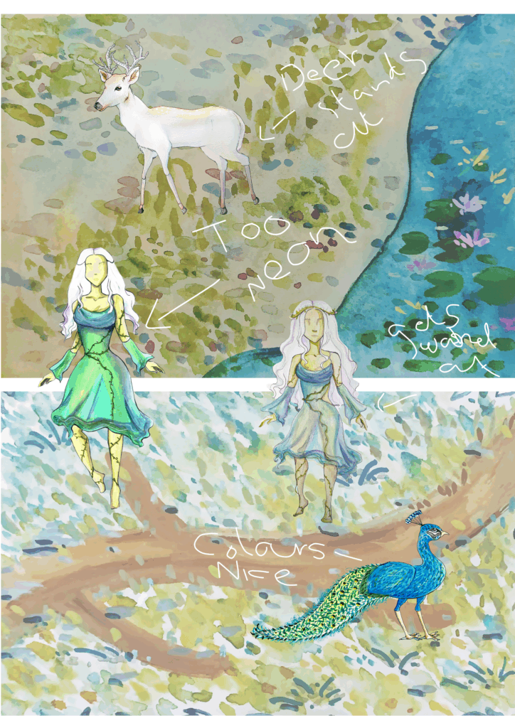
    To do this I got images of the environment artist’s backgrounds and checked the characters I had. When I was designing the animals I wanted them to stand out against the backgrounds so that the player can see them easily I am happy with this and have accomplished it.
    I am unhappy with the character though as the colours feel far too unnatural and bright – she stands out too much and looks like she does not belong.

    After analysing this image I want to create an inbetween of the current design and the first colour test as one is too neon and the other too washed out.

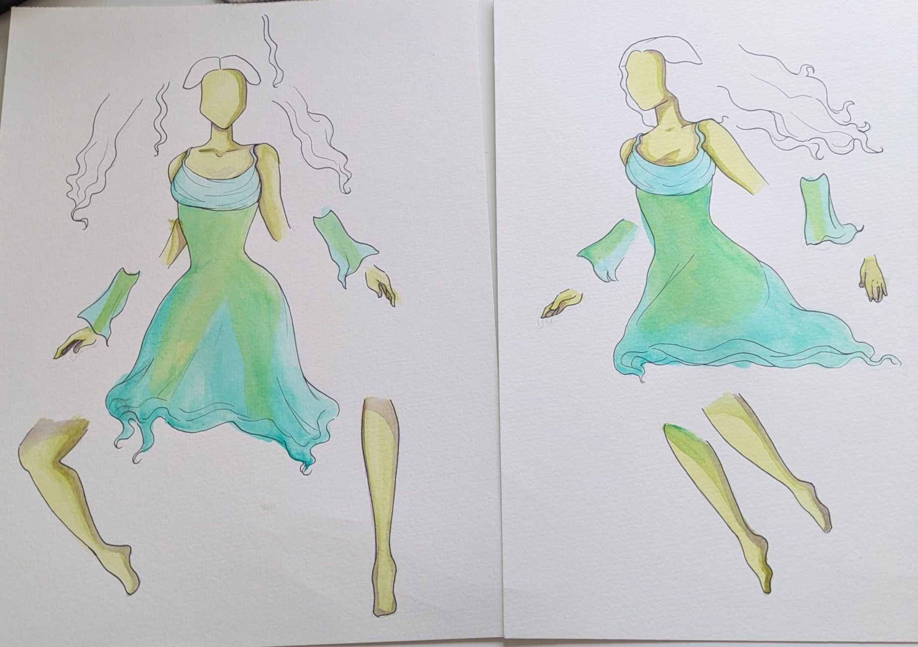
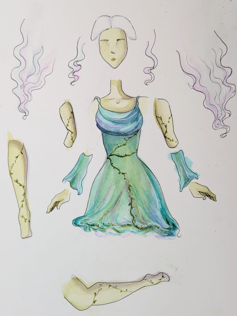
    Using feedback from the playtest where it was recommended for me to separate the “puppets” into more parts I began sketching the designs and outlining with a black fineliner pen. The goal is by further seperating each part the character will feel more organic and fluid fulfilling the GDDs vision for her.

    Whilst I was painting the character I kept the images and references of both the past versions of the character and the backgrounds so that I could make the correct colour choices. I also painted both at the same time again to ensure consistency.

    These are the finished designs, Whilst I wa painting I overworked the face on the first one so I redrew it on a separate piece of paper. I am very pleased with how these came out, the colours are more natural and will fit with the environment better. I will now create the frames needed for the animations from these.

    Character Design Reflection

    Throughout this semester I have tried to pursue more things that align with my career goals of being an illustrator. This has led me to take on the Whispers project and over the Easter break to create a draft of a childrens picture book. I have greatly enjoyed these two side projects and they have helped inform my work for the games development module.

    In these three projects I have created and illustrated characters in all of these projects. The most important skill I have developed and refined further is how to keep character and style consistency for whichever project I am working on. Illustrating the picture book before I created the cutscene gave me experience on drawing the same charater from different angles and helped me get used to illustrating with texture and good colour palettes in Photoshop, where I ultimately developed the cutscene in.

    For the Whispers project I learned a lot about how to simplify designs but keep the core character there. As too many details gets messy and things can easily be lost. I applied this to the player character by removing elements such as the flower crown, and other nature elements. However what those elements suggested was not lost due to the green/nature colour palette and how the character carries herself.

    I am ultimately very proud of the work I have done on the character for this project, the improvements I have made with each iteration are clear and readable and she matches the GDD vision and the atmosphere of our game.


  • Watercolour Experimentation

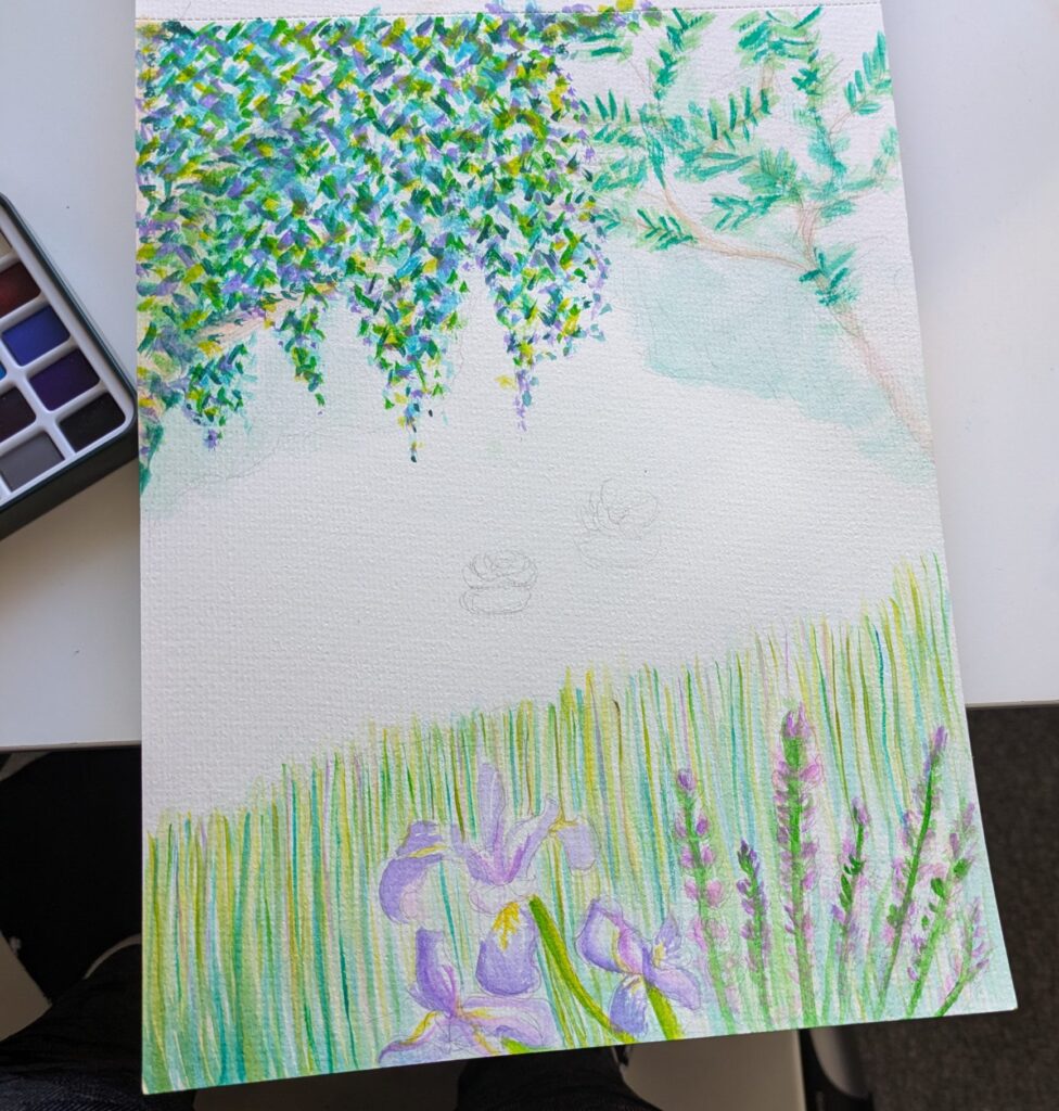
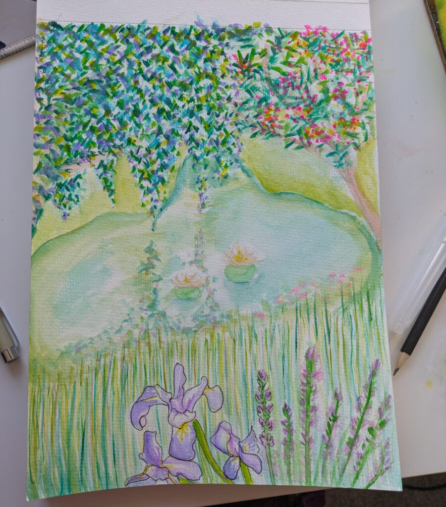
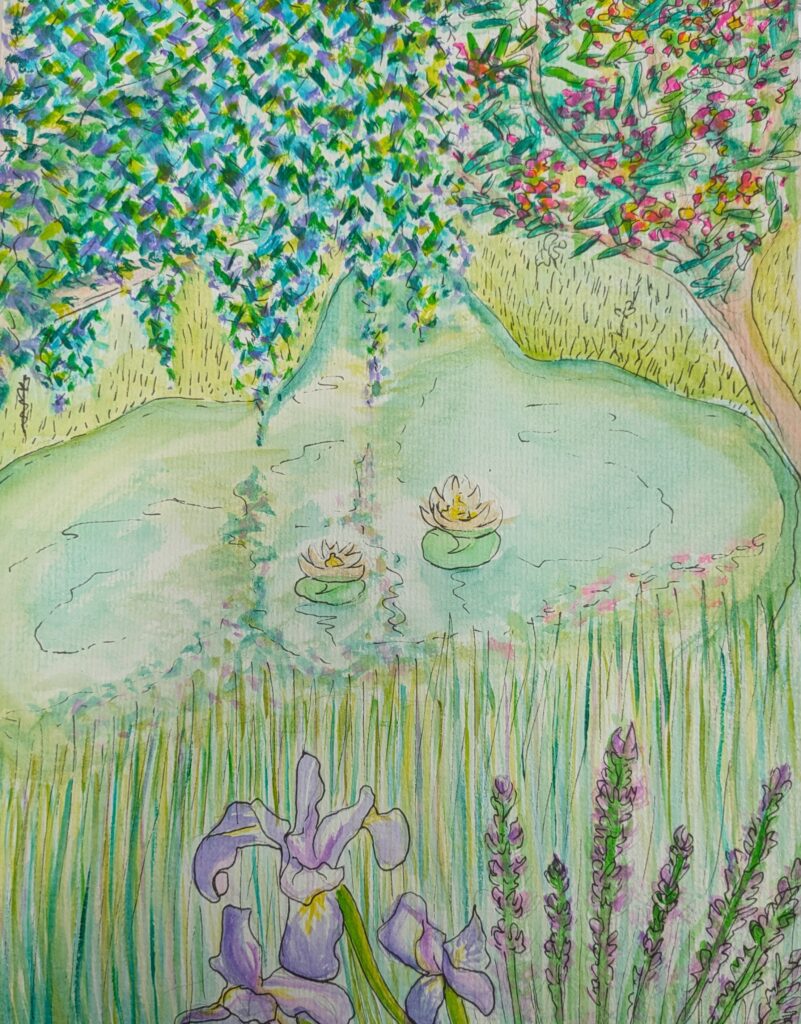
    A possible artstyle for the game is watercolour. I am familiar with it but have not attempted large scale landscape pieces. This is my attempt to create one based on the lake location, incorporating weeping willow trees, northern blue flags, silk trees and lotus flowers.

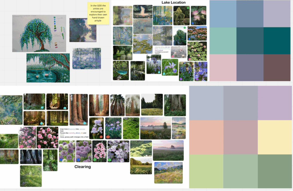
    So that I knew what to include in this artwork I looked at the joint mood board where I have compiled the reference boards from the GDD and my own research and experimentation.

    I began with a light loose pencil sketch and slowly began building up washes of colour over the page. I continued in this manner slowly darkening my pigments and the consistency of the paint. For the lake I focused on what would be reflected in the water not the actual colour. To finish the piece I drew over everything with a black fine liner pen, loosely defining the shapes.

    This was a helpful exercise as it let me get more comfortable with the medium and begin to understand what limitations I have with it.

    Next Steps:

    I will now work with the other artist to understand our different styles with watercolour.

    Week 3 check in – Me and the environment artist have decided to revert back to our previous roles. So, I will no longer be in charge of the lake this was still helpful as the characters will be in watercolour too.


  • Impressionism Experimentation

    After breaking down the GDD and looking at the research that went into it impressionism is very important. Not for the final artstyle but as a way to explore our artistic skills and get a grasp on creatively using colours.

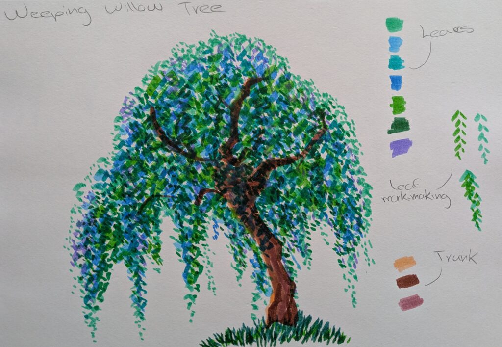
    This is a weeping willow tree made with Ohuhu markers. Weeping willows are important to the location I am creating. I began with the trunk of the tree layering up brown pink and yellow to get a saturated mix of colours. Then I used simple mark making and began constructing the leaves. Using a variety of blues, greens and purples in layers I create dthe final leaf effect. I am very pleased with how this came out not ony was it fvery fun but the colours mixing and levels I achieved would be good to have in the final Vertical Slice.

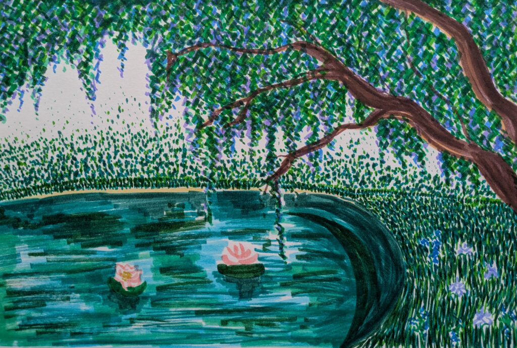
    After the willow tree I decided to create a larger scale artwork of the lake. I employed the same mark making and approach to colour as the previous artwork. I incorporated the other flora and fauna in the location like the lotues flowers, northen blue flags and blue cardinals. The water provided a challenge as it does not have a colour but I got creative with it and focused more on what complemented the surroundings not what actually made sense, much like the impressionists. I am satisfied with how this came out and believe it works as a good starting point for developing the lake.

    Next Steps:

    Explore more artstyles and check in with the other artist to see how their experimentation has come along.