Supermarket
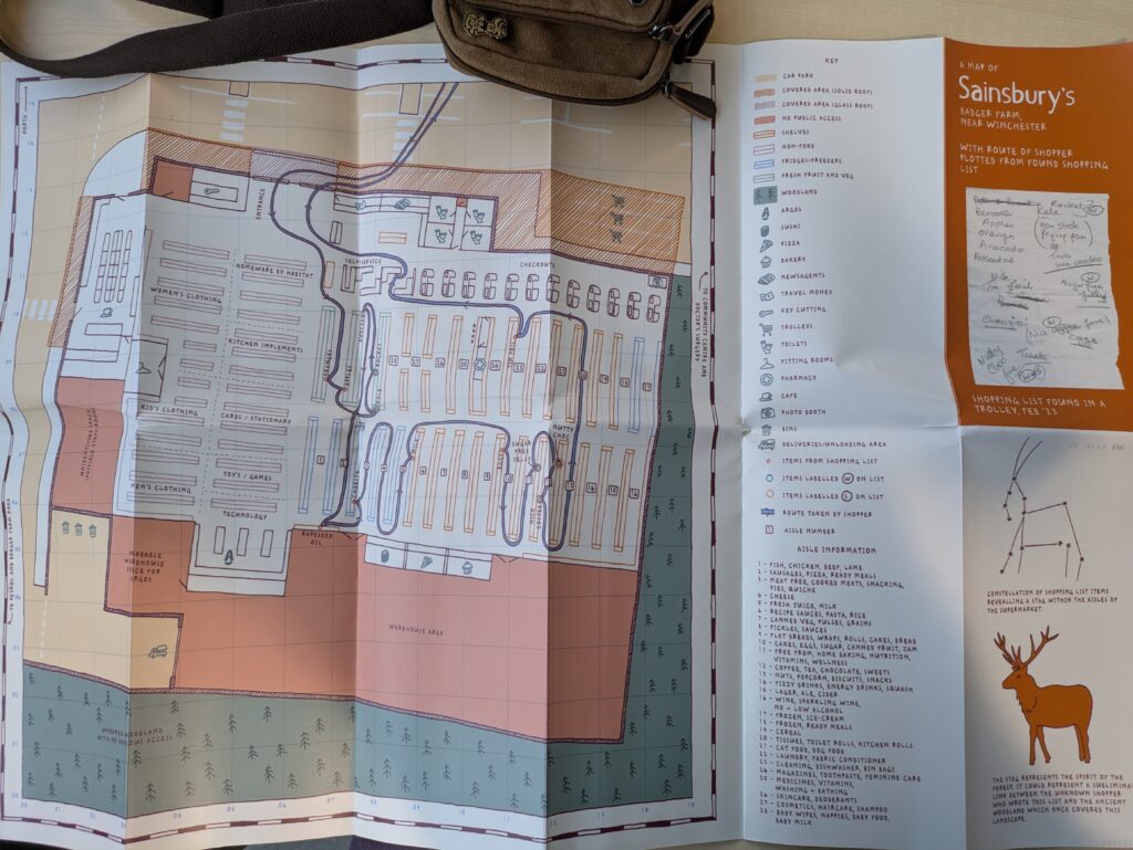
While doing primary research of supermarkets, I went to the WSA library and found this layout map of a Sainsbury’s near Winchester through the recommendation of a librarian.
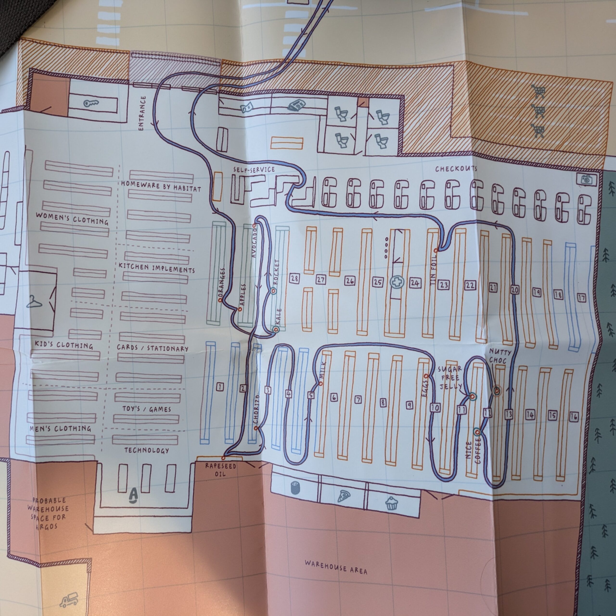
This map served as a great example and lended me a greater understanding of how a supermarket’s overall composition may look like.
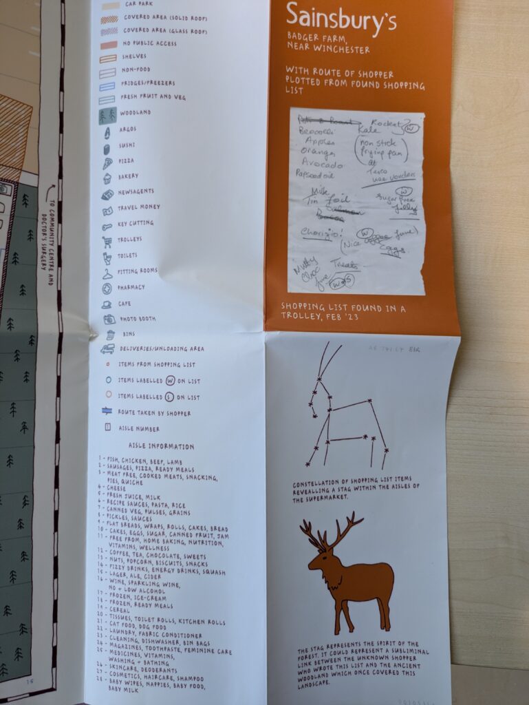
Some things I extrapolated from the map are that supermarkets have repetitive, blocky formations, have their entrance & exits besides one another and more importantly, are usually segmented into two or more areas.
This first, simple layout was to act as a prototype
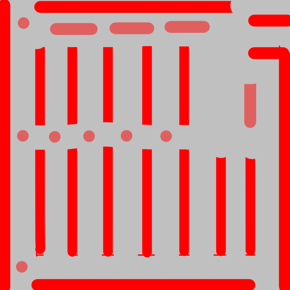
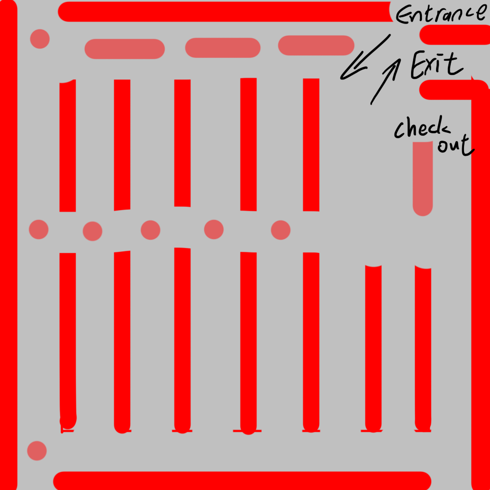
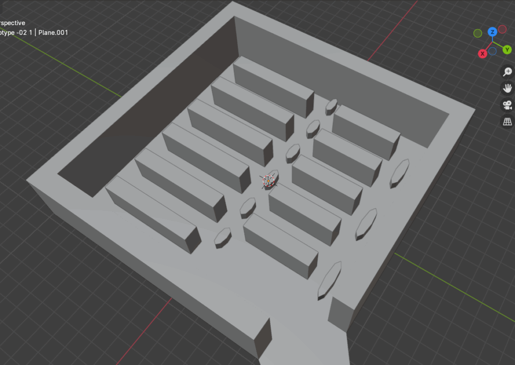
I made a rough graybox of this 1st prototype to get a feel on it
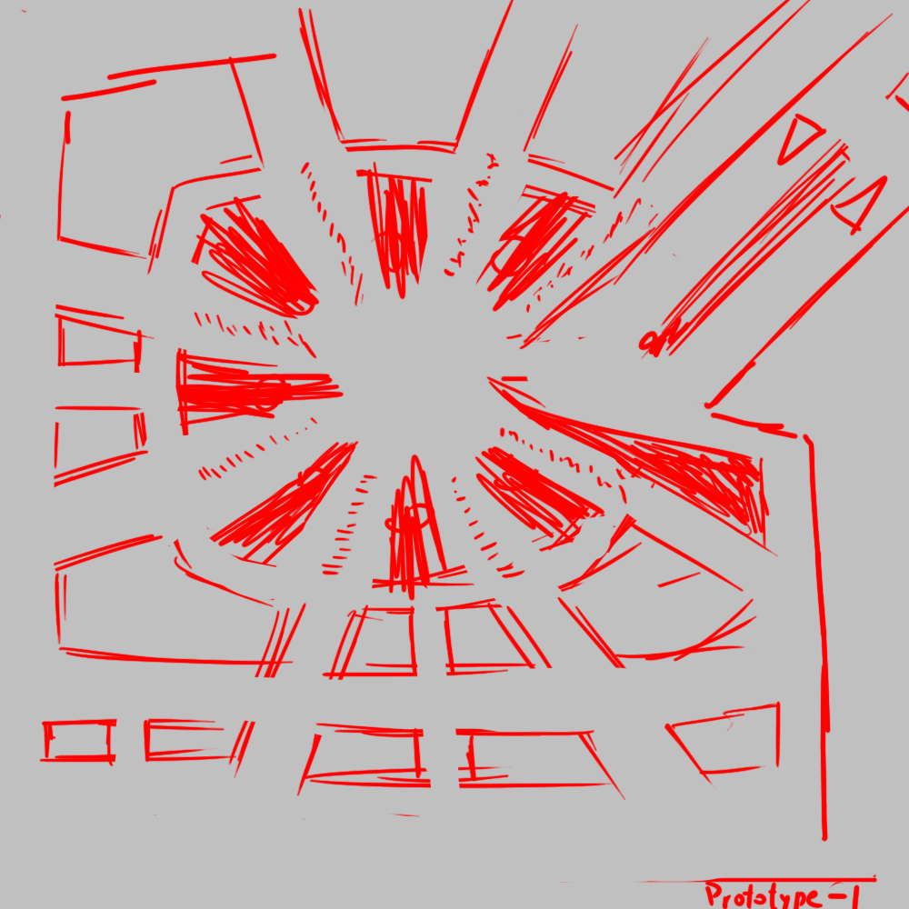
The design intention around this layout is to make the level as confusing and repetitive as possible, so the player cannot eaily dissern where they are and would have to use ulterior methods to navigate like a map or signs.
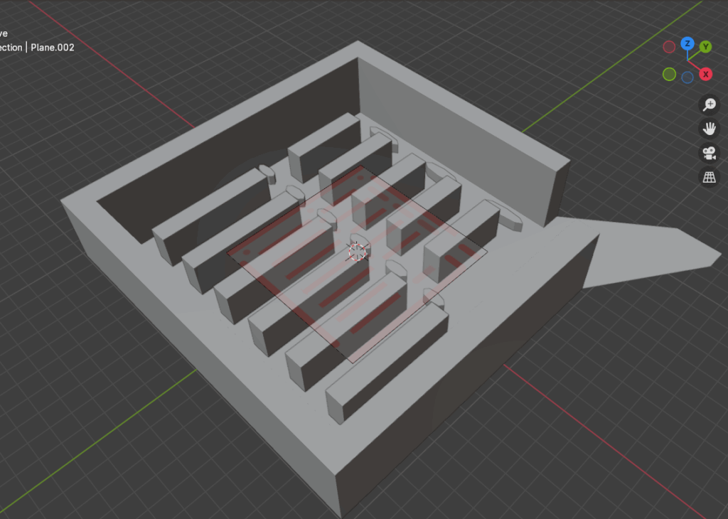
I showed this 2nd prototype to my teammates and they believed something more similar to the 1st prototype would fit the game better.
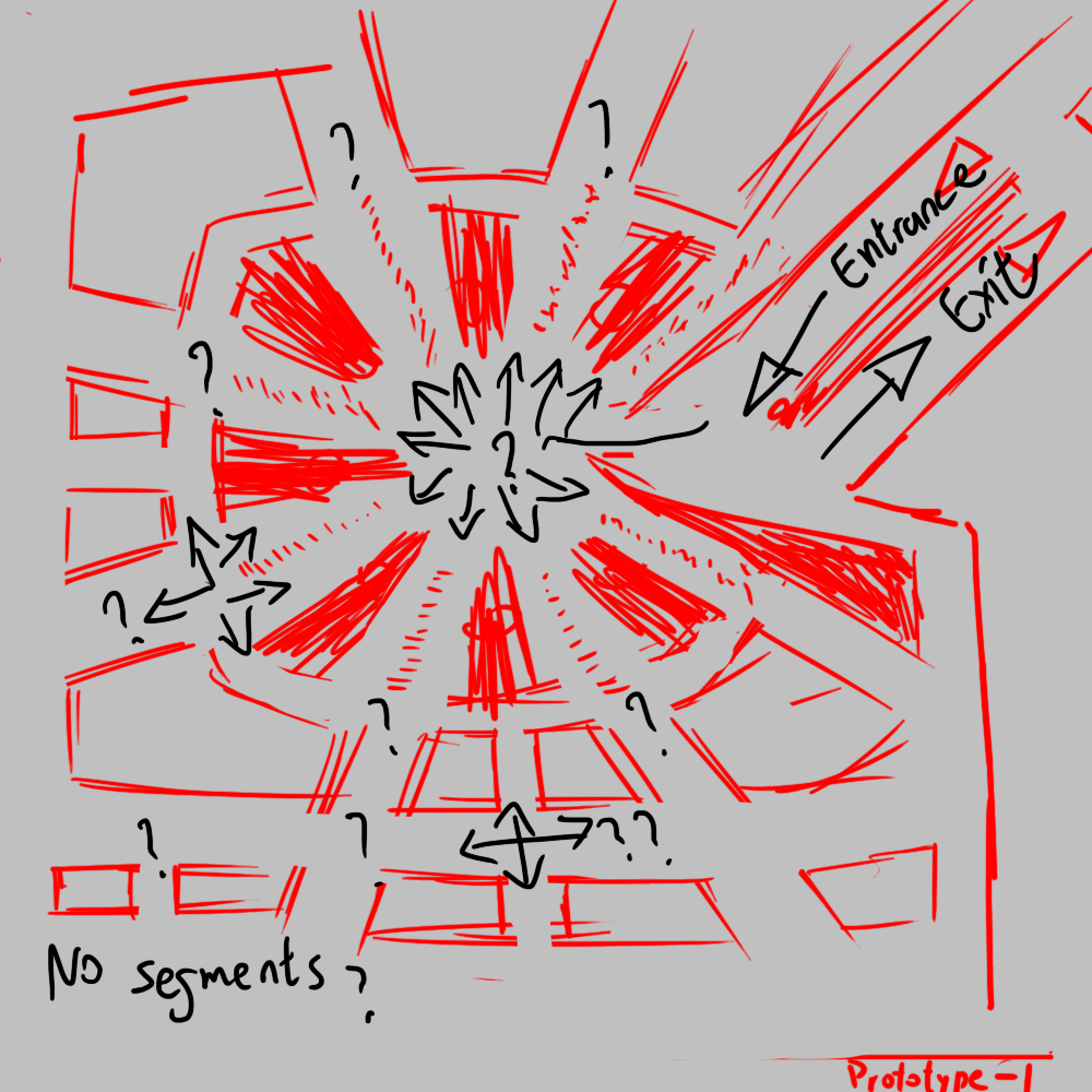
The 3rd iteration was mostly an experiment, which paved way for the 4th ‘final’ iteration. Here I experimented on how the level’s ‘sight lines’, pathing etc.
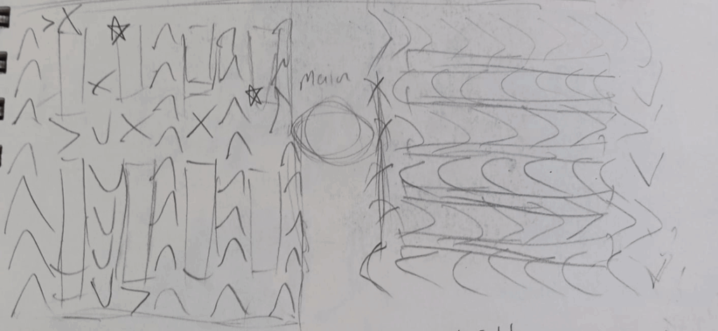
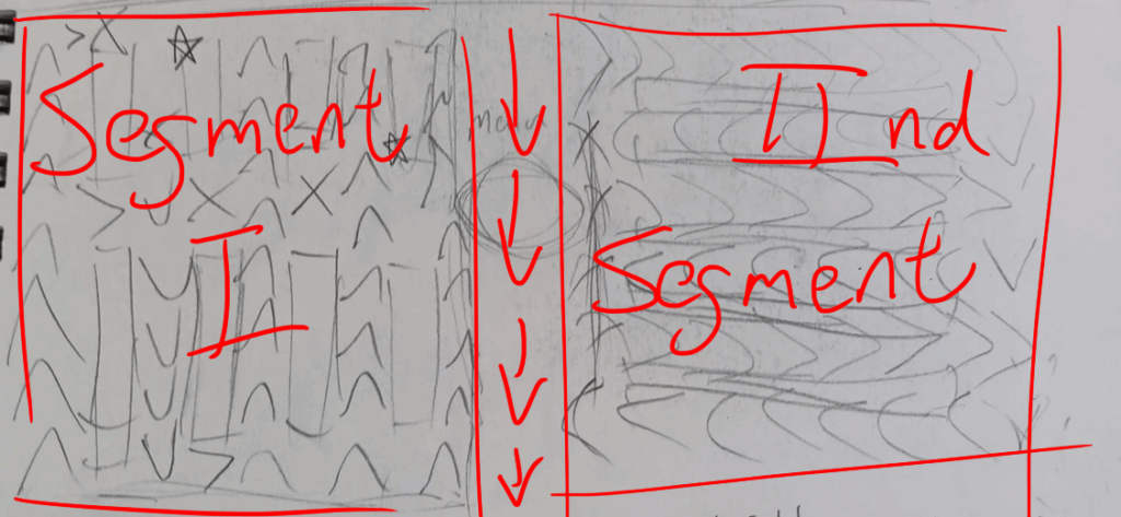
In both the 3rd & 4th iterations, I leaned into segmenting the supermarket for better player readability
4th ‘Final’ Iteration
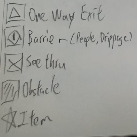
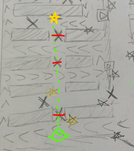
For this iteration, which ended up as the blueprint for what we’d build in UE5, I made it much more technical. These labels represent points on the level which serve an important function.
From top to bottom, we have
- One Way Exit
- blocks the player from entering on one side
- allows passage on the other
- Barriers & See Through Obstacles
- prevent player movement through them
- allow for visibility past them
- Obstacles
- walls which cannot be seen nor passed through
- Items
- objectives which players must collect all to win
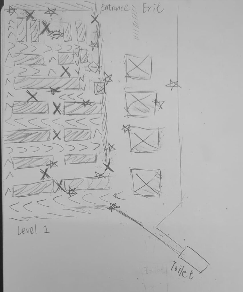
The toilet at the bottom right corner is for a mechanic which ‘heals’ the player from the ‘damage’ enemies deal. (Terminology different in game) Enemies can be placed accordingly after the level is made.
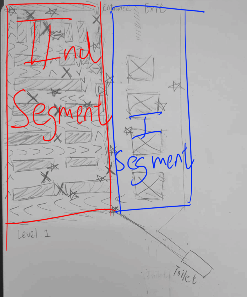
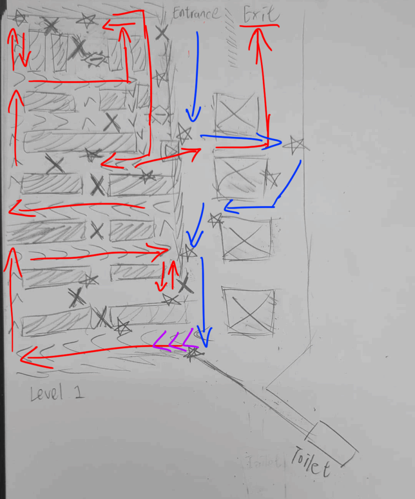
As the annotated maps above display, the level is separated into two distinct segments. Segment 1 being a more free and open area while Segment 2 leads the player through a tight space.
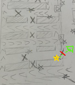
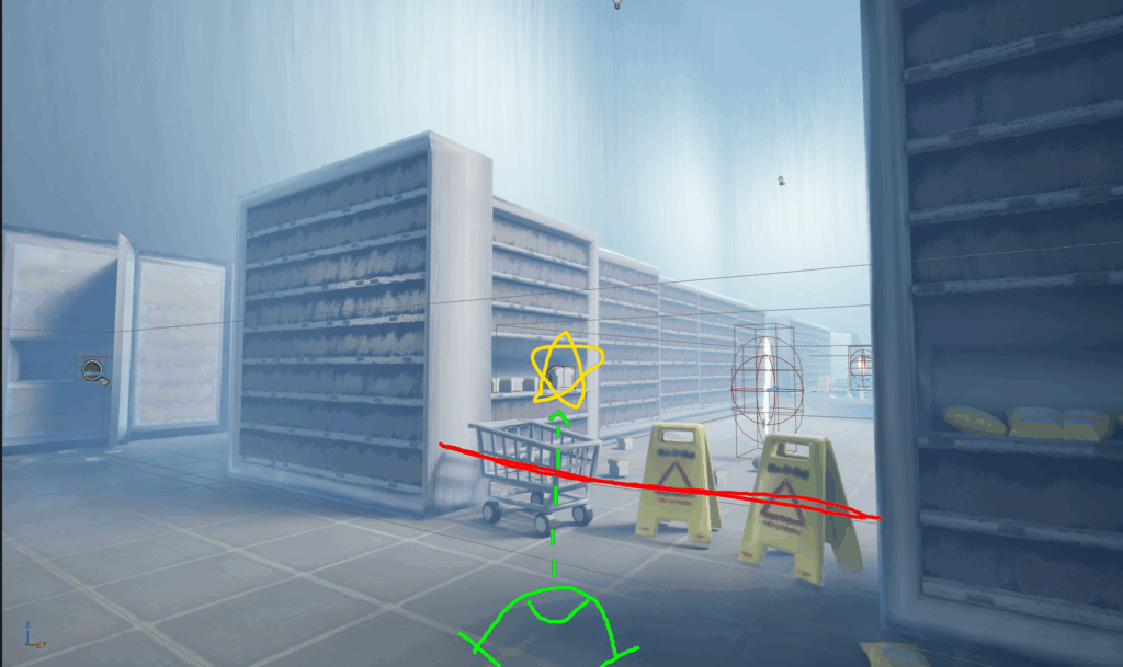
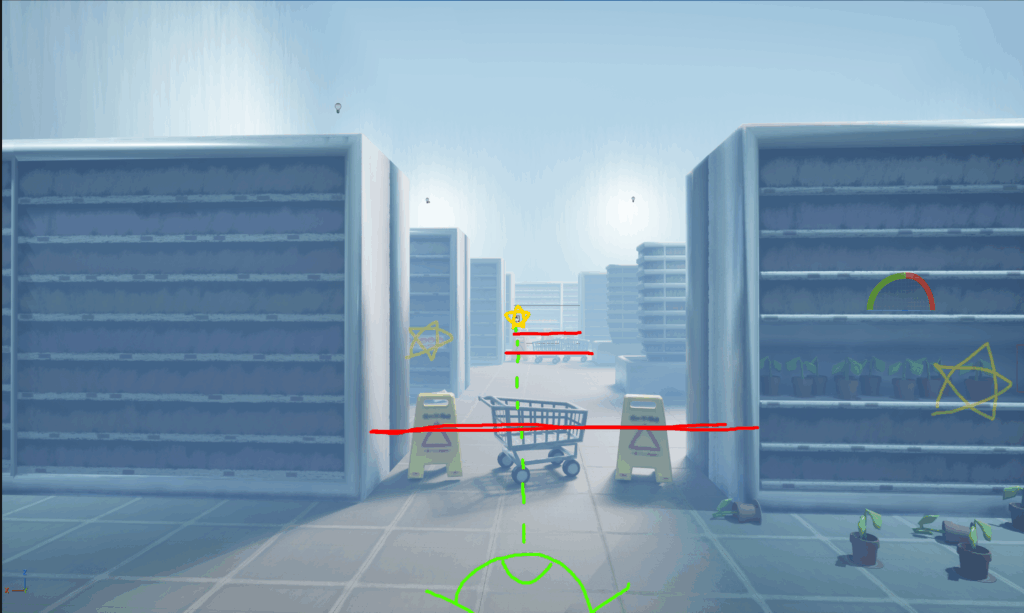
The further annotated map below displays the Sightlines from one item to another in green, Items being yellow stars. Bright red perpendicular lines represent Sightlines which cannot be directly walked to due to See Through Obstacles
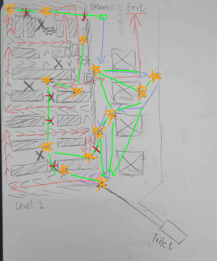
The intent is to always allows players a line of sight to their next objective/Item. However especially in Segment 2, a direct path towards those Items are blocked by See Through Obstacles to force players to explore and navigate.
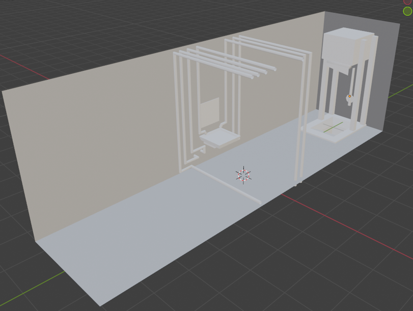
I created a graybox level in Blender using 4th iteration as a blueprint. It was intended for the Week 8 playtest but wasn’t used.
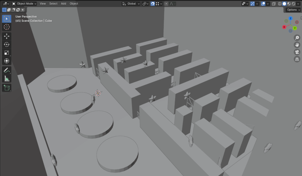
We recreated it weeks later in UE5 with textured assets
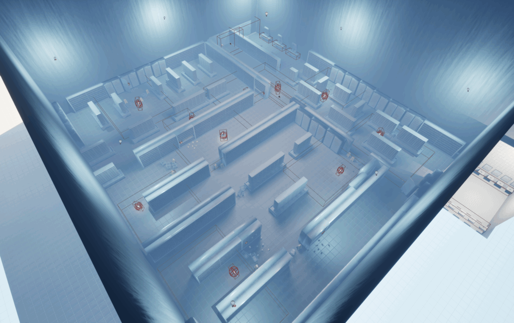
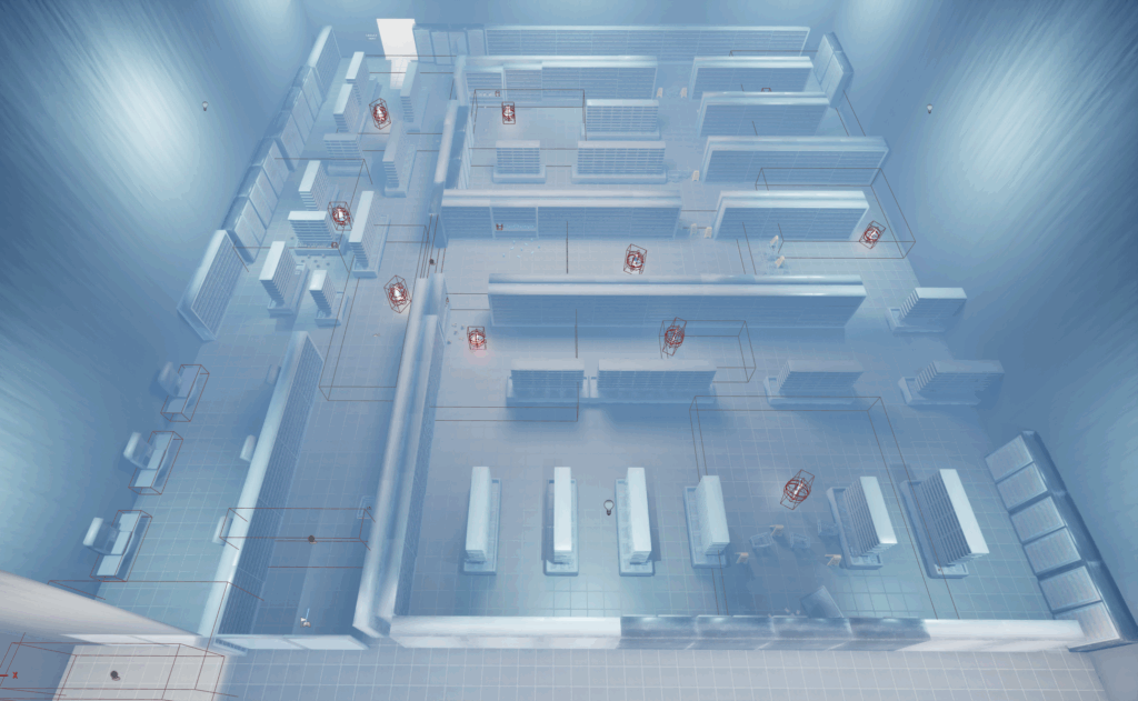
Below are examples of the Sightlines in affect.
Others
For the home apartment & bathroom of the protagonist, I just tried to make their layouts simple & easy to navigate.
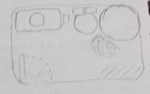
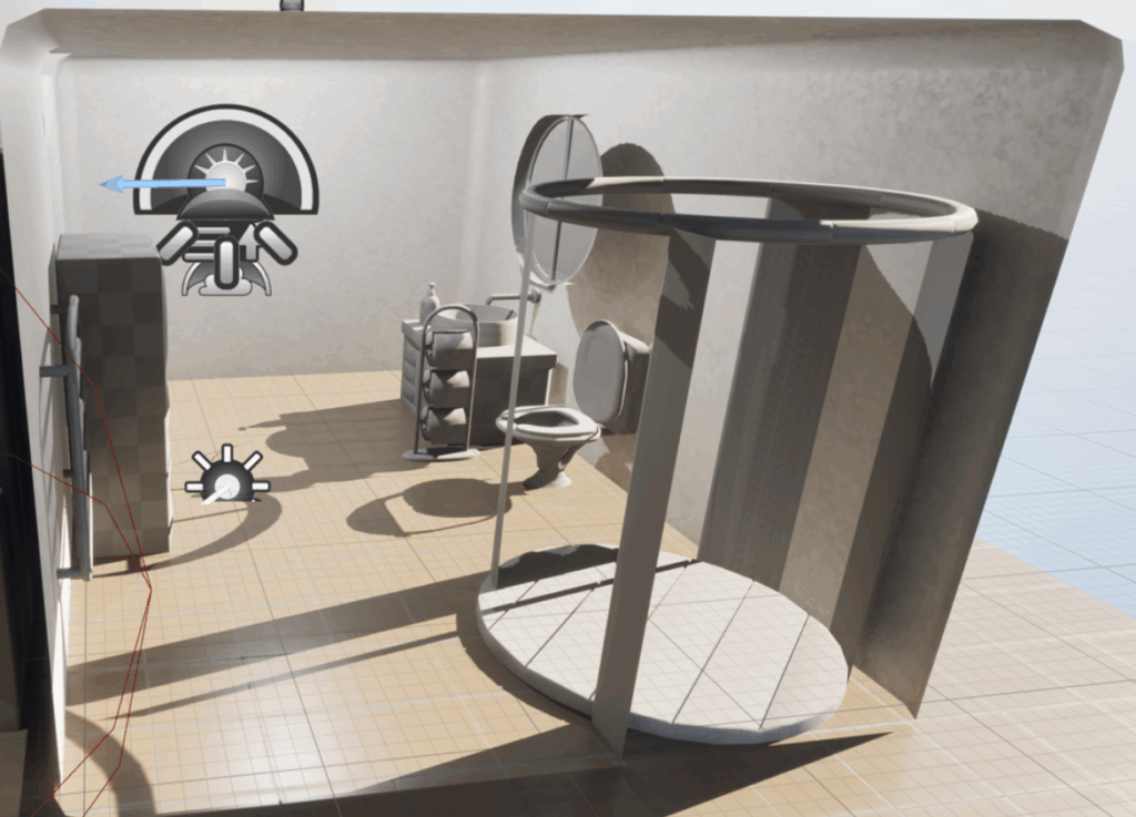
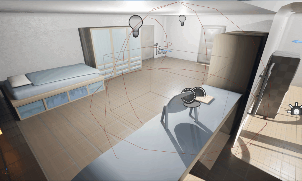
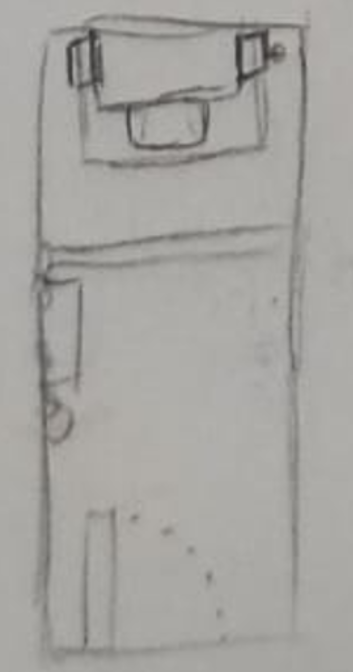
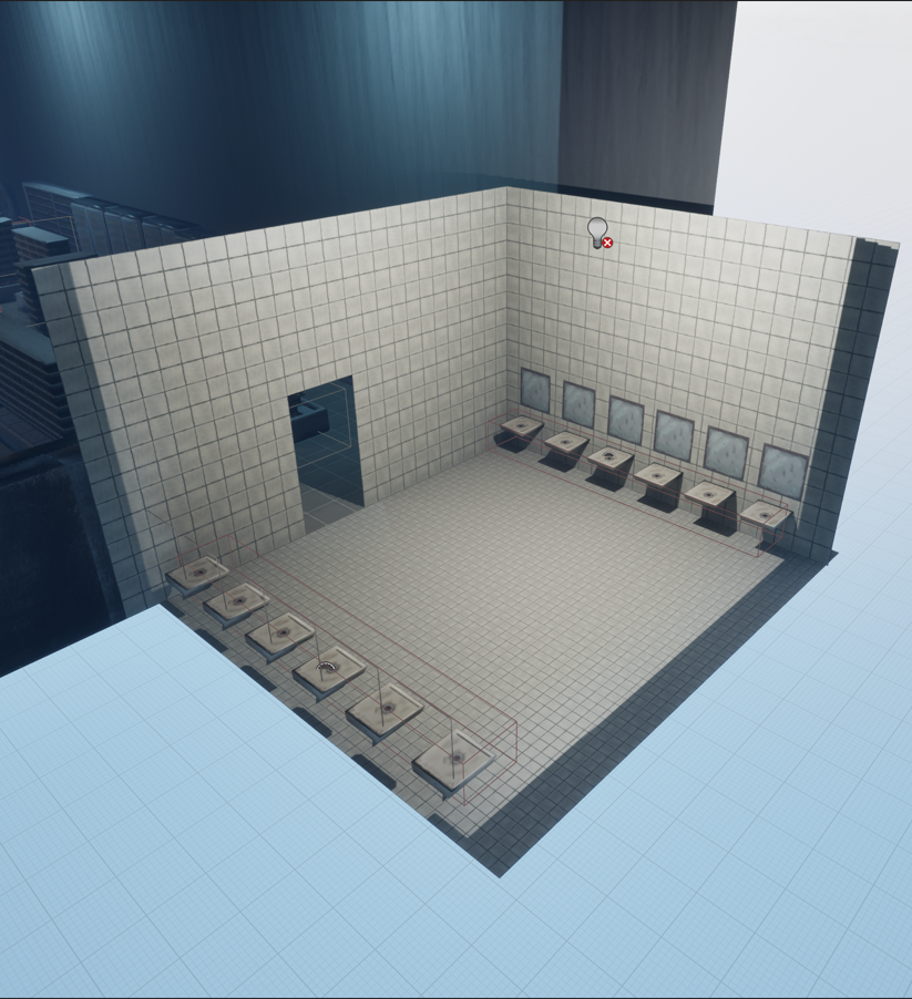
For the Supermarket toilet, we ended up with another look.
Leave a Reply