Monday
On Monday, we presented our research.
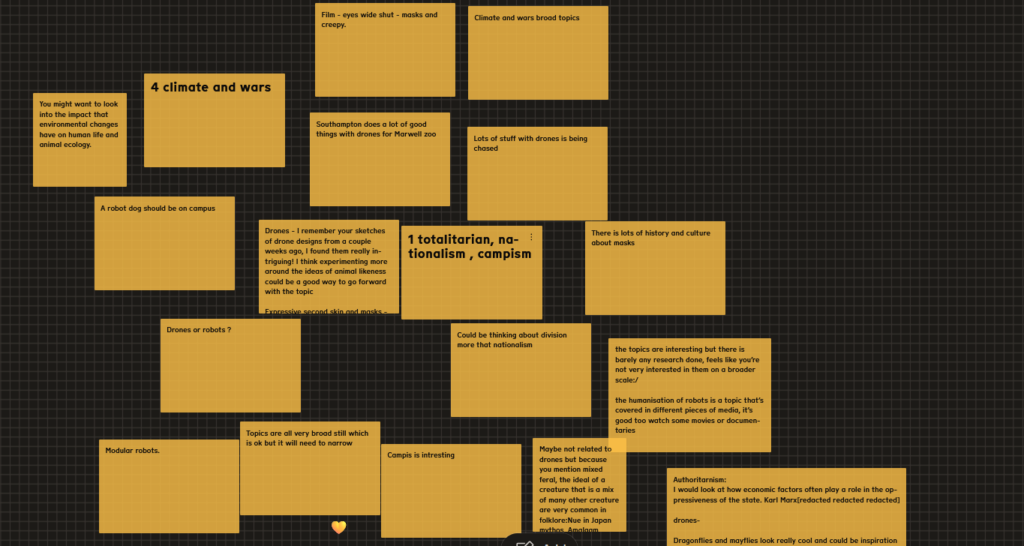
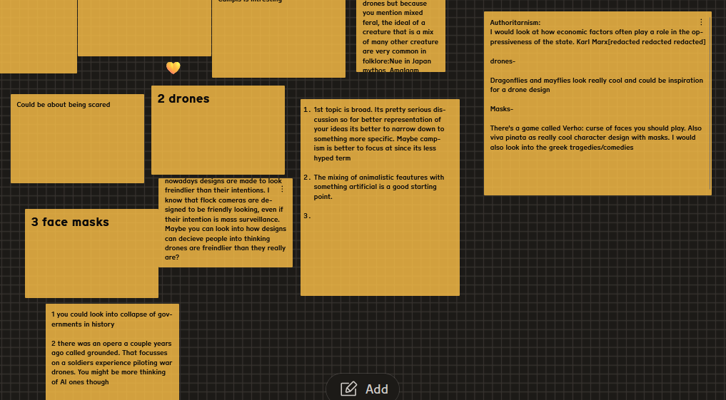
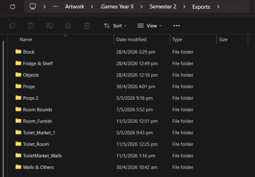
I got this feedback for the 4 themes I presented.
Tuesday
On Tuesday for the Ross tech session, I had completed my
On Monday, we presented our research.
I got this feedback for the 4 themes I presented.
On Tuesday for the Ross tech session, I had completed my
On Thursday, Olivia Gregory, a concept artist & course alumni, came over to give a talk about her insight with the games industry so far.
I took notes, the most important thing for my career I extrapolated from the talk, is to network and talk to people. Another good thing I should do is show my ability to collaborate with others in my portfolio. I asked Olivia how i can best to that and she told me that as a 3D artist, I could go ask permission from artists who’s artwork I like on whether I could 3D model their artwork.
I just arrived in the UK on Monday and wasn’t able to attend the class.
On the Tuesday Ross tech session, I talked with him about what I wanted to learn. I wanted to learn Rigging & Animation in Blender + coding in Godot for the tech sessions, so I asked Ross and he gave me this instruction for next week
We planned that I’d try to do a simple cube animation, then we’d try to export it into blender next week.
I started off by extrapolating Maria’s Scopophobia GDD, mainly the Art bible section.
Here are some cropped screenshots from the Art bible which especially inspired me
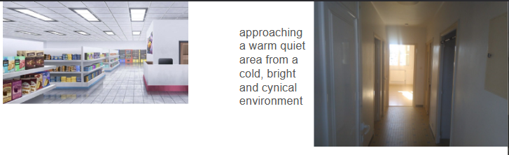
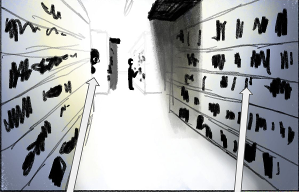
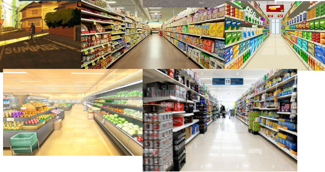
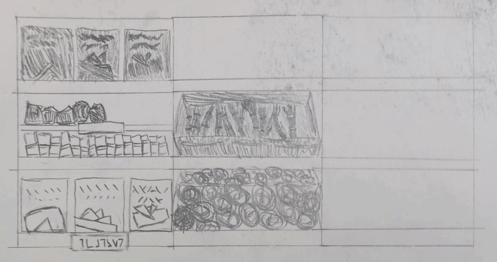
From Maria’s GDD, I was inspired to make this reference/mood board assembled mostly from Pinterest. I believe it conserves some of Maria’s vision on the game, while allowing me to express my own style onto it.
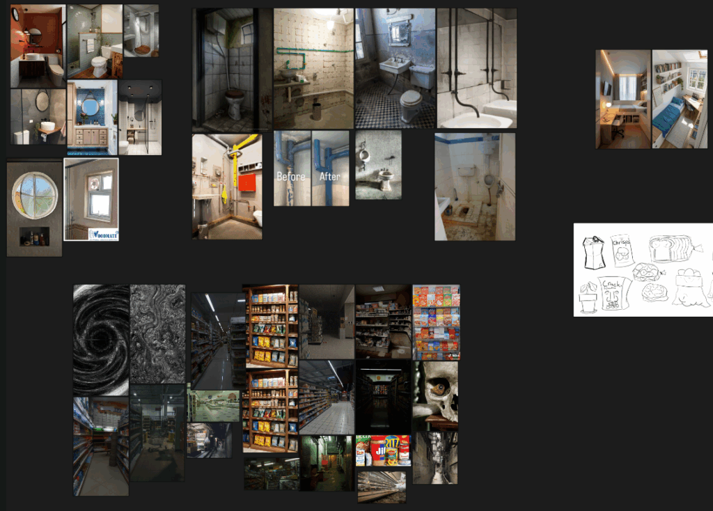
I tried to coordinate with our character designer & artist Junhwan with maintaining a cohesive artstyle, but my approach left a lot to be desired, even if the end result of both our works doesn’t clash.
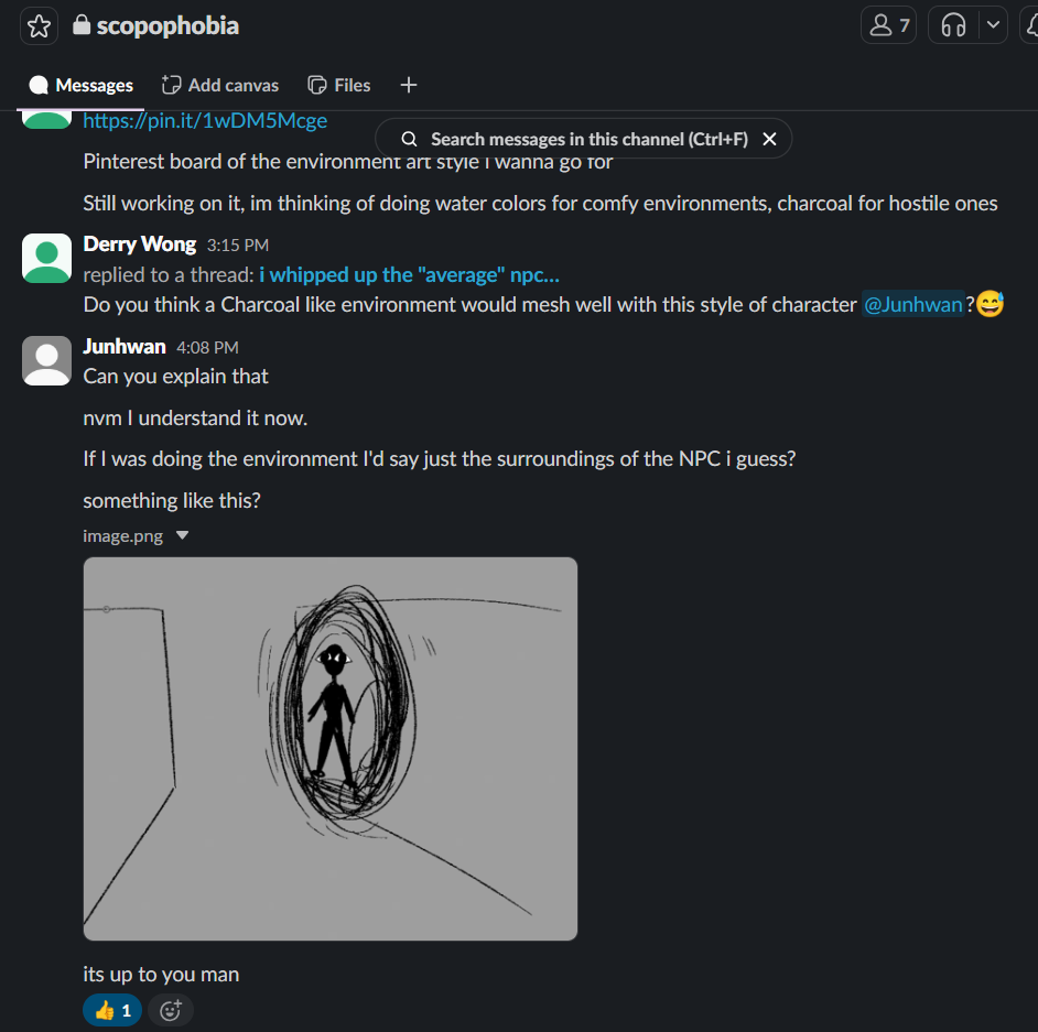
I didn’t really share much of my analysis of Maria’s Art bible with Junhwan, merely sharing surface level decisions through Slack.
I tried to use shape theory & a sense of scale to separate the safe space of the Home Apartment & the scopophobia inducing environment of the Supermarket. In terms of shape theory, I tried to add more rounded elements & a literal circle motif to the safe spaces, while adding more sharp edges in the scopophobic areas.
In terms of scale & proportion, I decided to make the safe spaces’ models rather realistically proportioned to induce a sense of familiarity and thus safety. Inversely for the scopophobic Supermarket, I decided that scaling everything to a larger size helped with inducing a sense of otherness, offput and thus unease. It helps makes the supermarket feel like a place you don’t belong in, something which people with scopophobia feel in such a crowded place.
The above also reflects on the use the watercolours & charcoal, where watercolours might be more rounded & soft, while charcoal may be more sharp & hard. I textured the Home Apartment with mostly water coloured textures to suggest safety while texturing the Supermarket with charcoal textures to suggest the feelings a phobia would bring.
I had originally wanted to try and dedicate an eye-motif to my model’s textures, however later due to time constraints, I seldom committed to that aside from objects like the checkout.
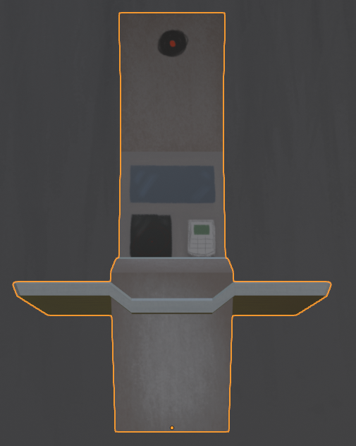

I decided to keep my models low polygon and simple, reserving detail for more important objects.
In retrospect, my communication with all three of my teammates left a lot to be desired.
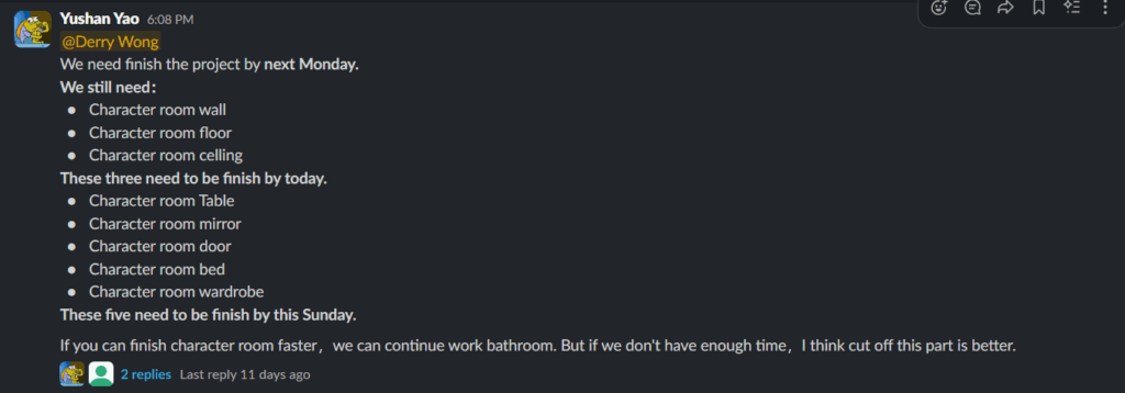
I had poor communication with our technical designer & programmer Yushan in terms of Unreal Engine 5 importing, level layout & design and Blender modelling progress.
I also had poor communication with Junhwan in terms of art direction.
The extent of our ‘communication’ in terms of art direction.
Little communication with Leo in terms of environment art & story cohesion, nothing bad or clashing resulted from this as we worked on the same GGD, but our roles still had some relation as we worked on the same game.
I also procrastinated too much on this project. For every day of work I put in i had two days of ADHD fueled social media addiction plaguing me.
A documentation of my assets was also lacking. I hadn’t decisively commited to a naming convention on my assets.
I did not take Maria’s GDD into consideration as much as I would’ve liked, I referenced and was inspired from it, but especially as the project went on, I feel as though I followed it less and less.
I am proud of the work I had done though. I believe the environment & atmosphere resulting from my art direction is satisfactory and fits as an adaptaion of Maria’s vision in her GDD.
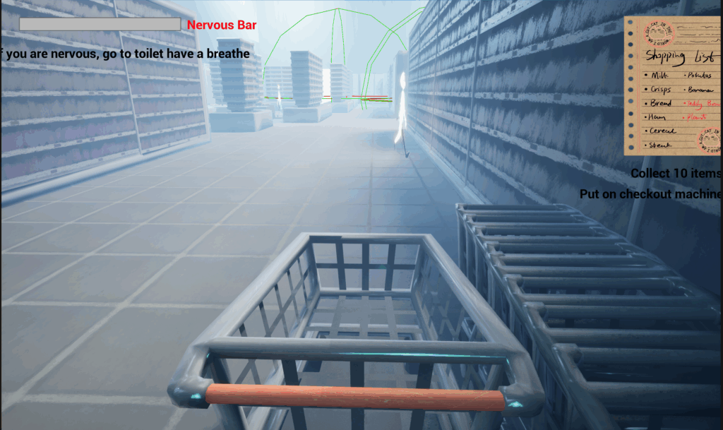
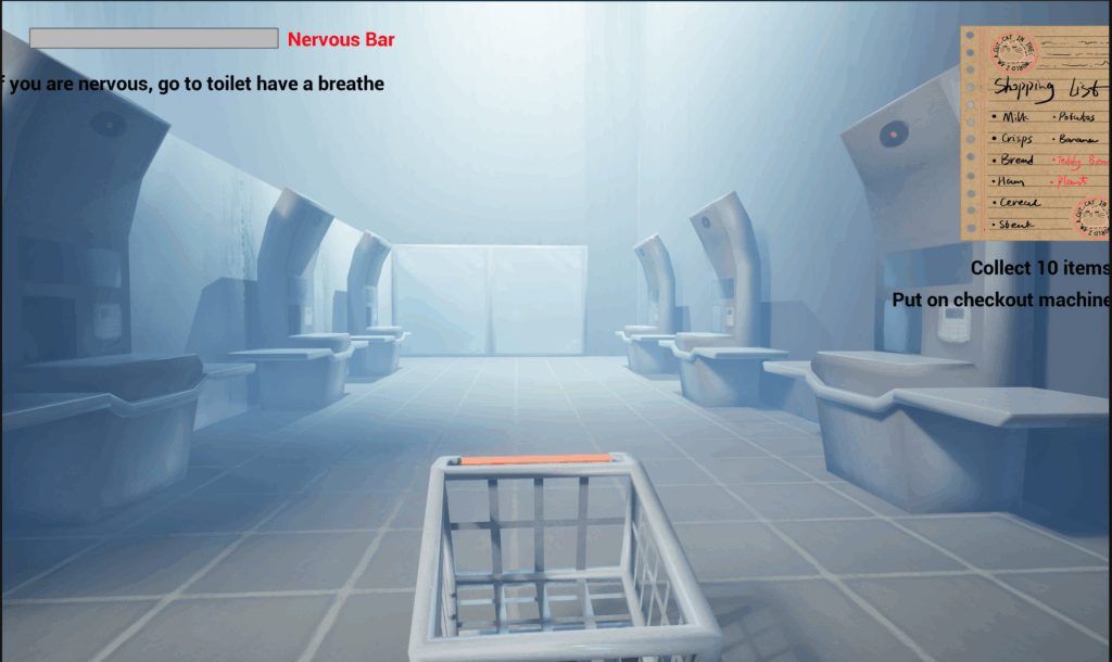
Scopophobia Group Page Weekly Communication
We’d decided to finalise our game by Monday next week, so with the Supermarket assets largely done, I moved onto the environment & assets of the Home Apartment & Supermarket Toilet.

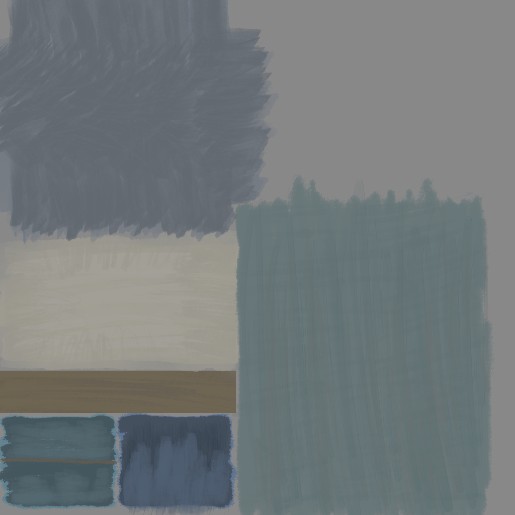
When hand-painting the textures for the Home Apartment, I switched over to watercolour brushes in Krita. I did this to visually/aesthetically separate the ‘safe space’ of the Home Apartment from the scopophobia inducing Supermarket.
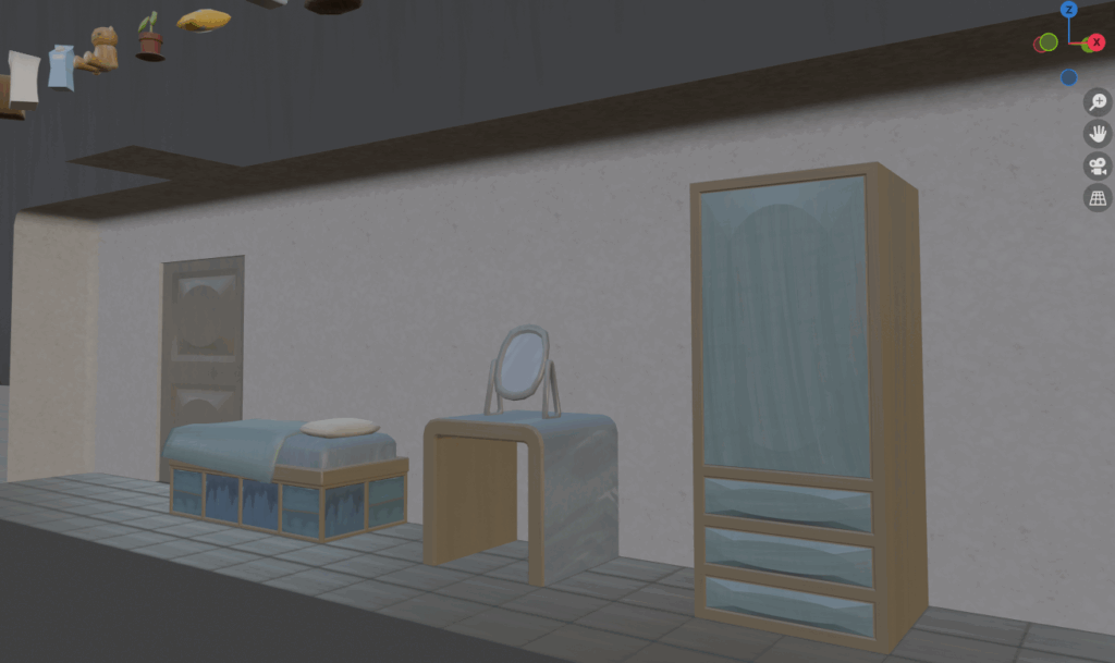
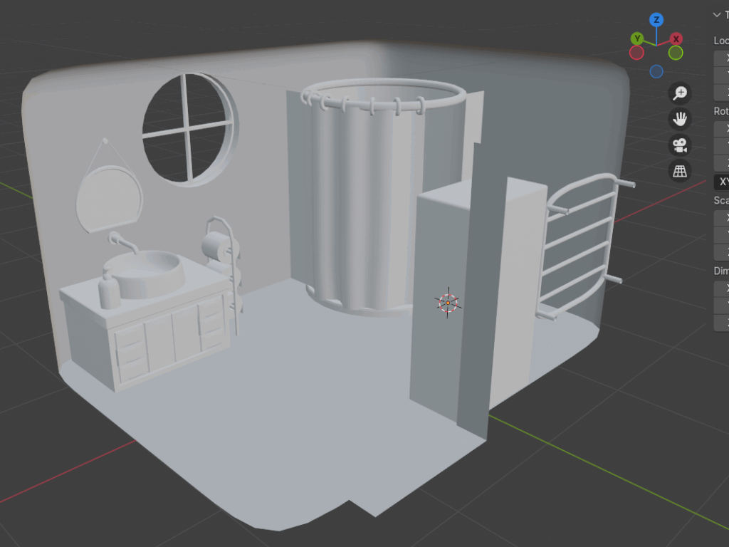
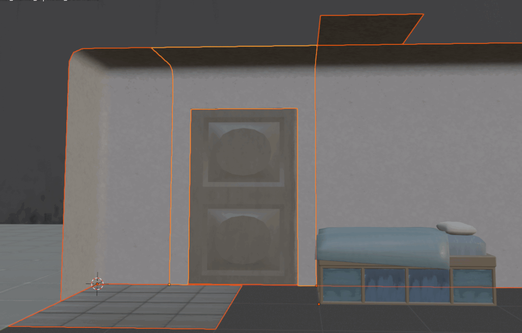
For the Home Apartment’s walls, I followed my concept art & prior Blender model, making it more rounded, which required me to make an additional corner piece as seen leftwards below
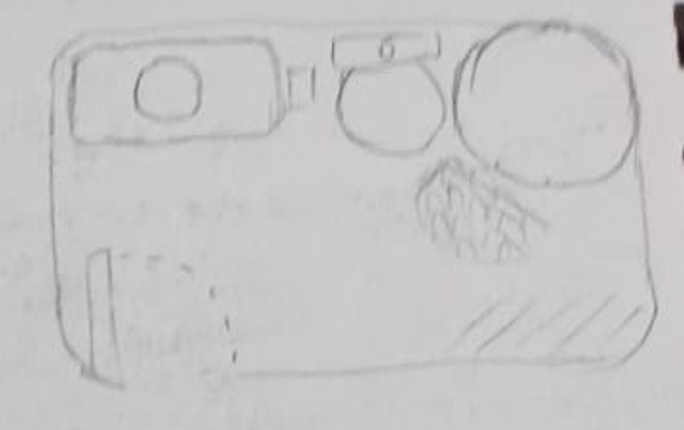
Me and my teammate Yushan then used the incremental pieces to recreate a graybox she’d made of the home apartment room in UE5 prior.
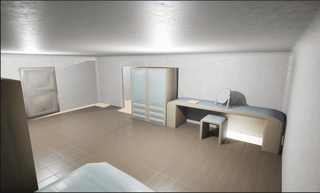
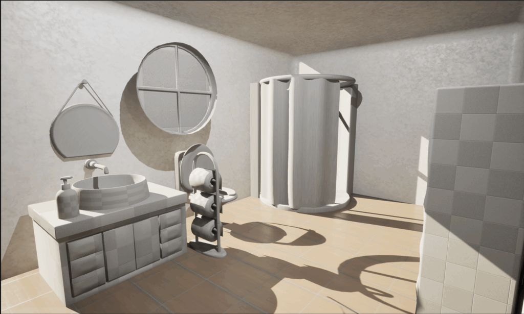
Due to poor time management, I was unable to texture any of the props in the Home Apartment Bathroom. They weren’t very import so they were never prioritised as they only serve as visual flavouring for the home apartment. I exported them straight from Blender without any materials/textures into UE5. I believe their inclusion is better than waste despite their untextured appearance.
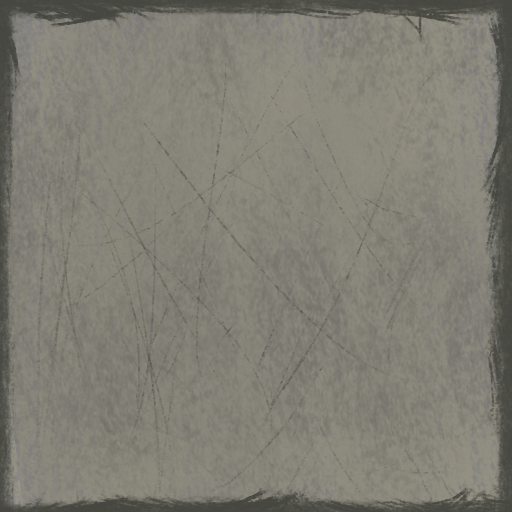
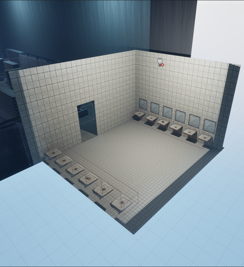
For the Supermarket Toilet, I merely made one material for the walls and floor to save time, while repurposing the floor texture of the wider Supermarket as the ceiling.
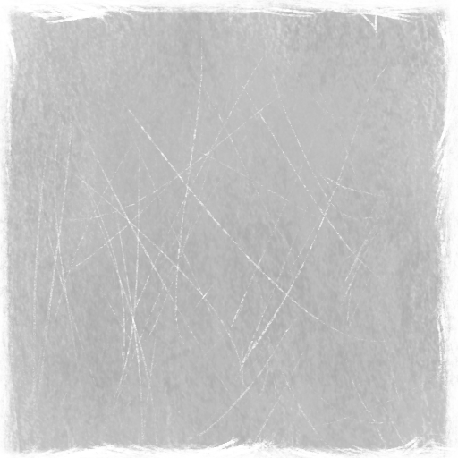
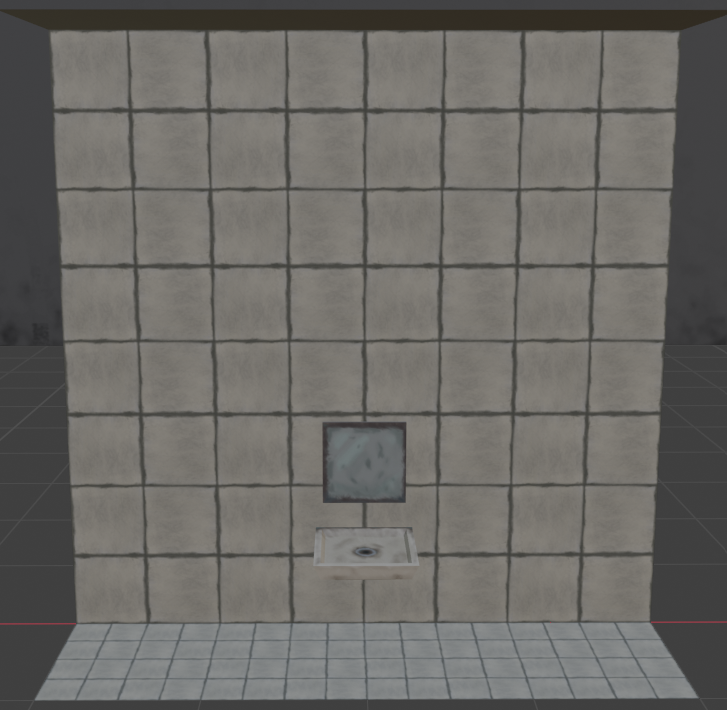
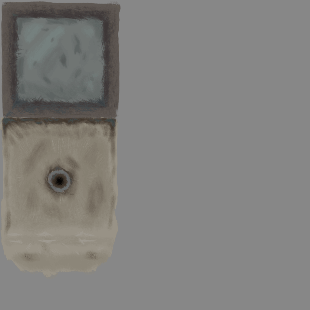
Sink & mirror texture, didn’t have time to make a roughness texture for it, a lot of unused space too…
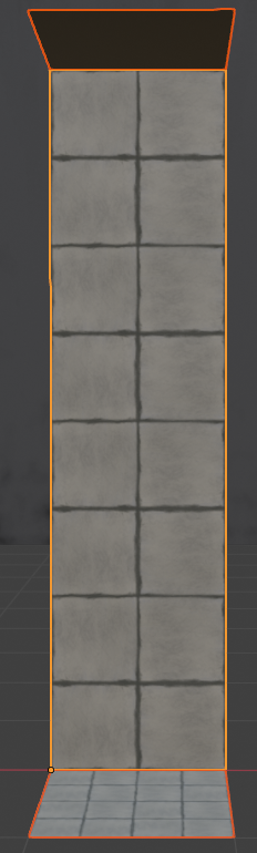
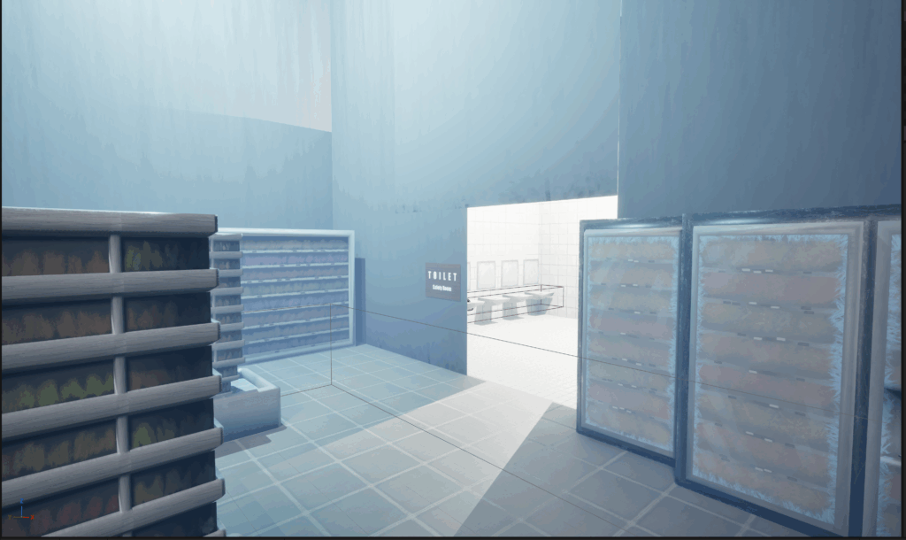
Again I made the pieces incremental. To emphasis the Scopophobic environment of the Supermarket, I doubled the height of the toilet walls in UE5 when re-building it from a graybox Yushan made.
Scopophobia Group Page Weekly Communication
We had our public playtest on Thursday this week. Next in terms of importance were the items the player collects.

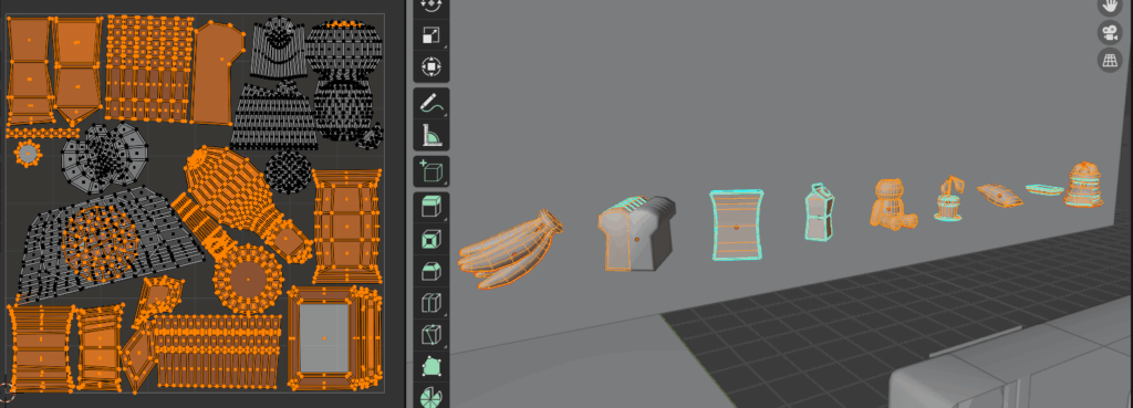
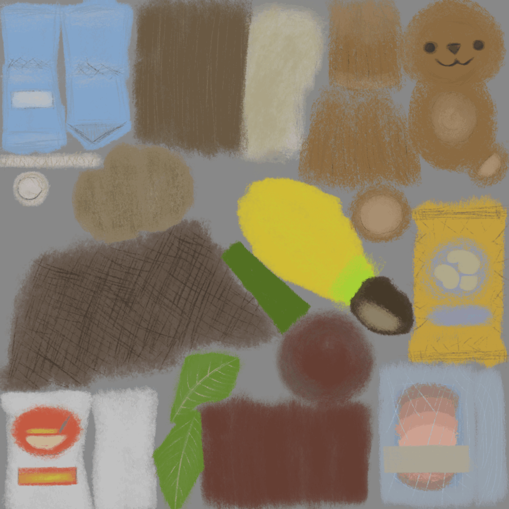
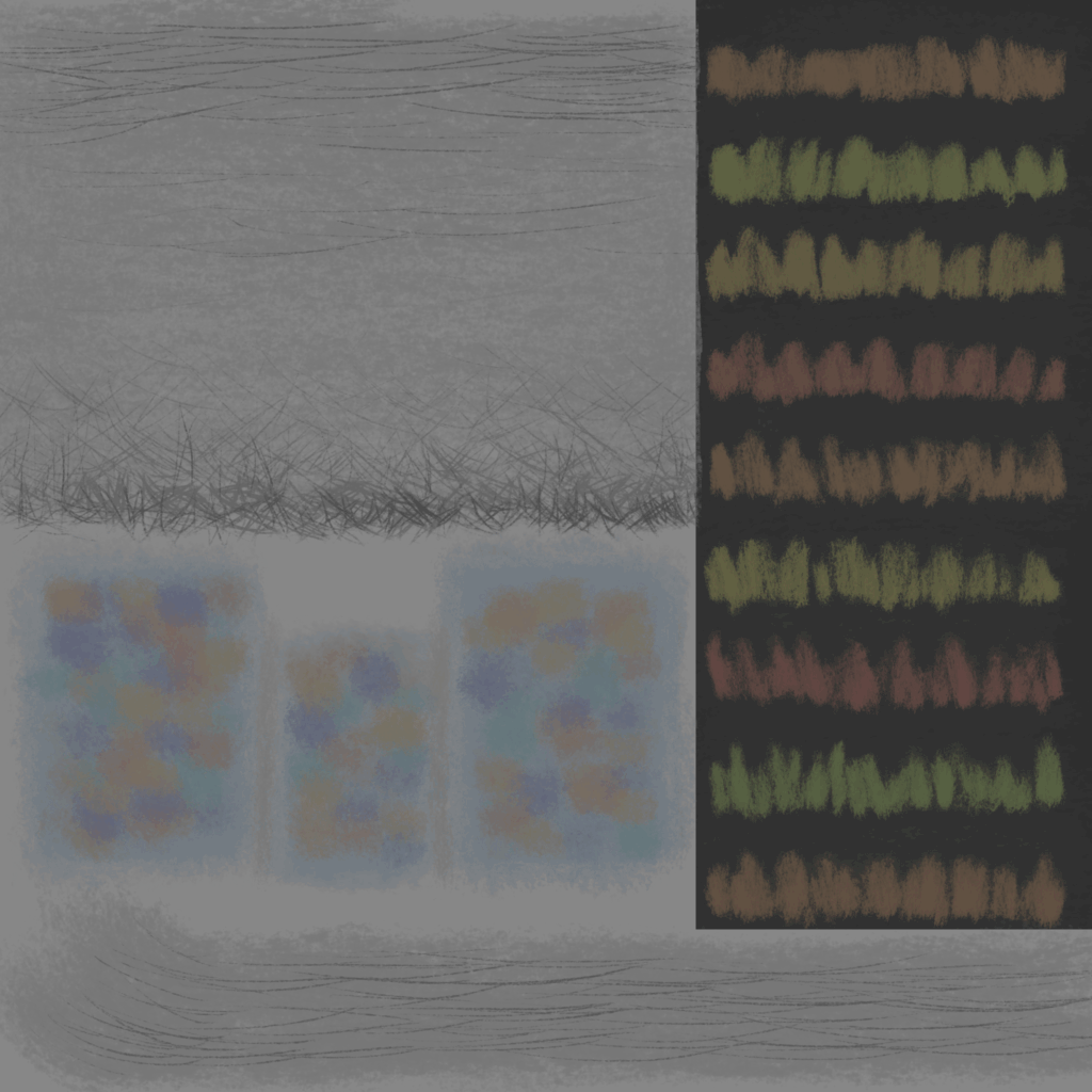
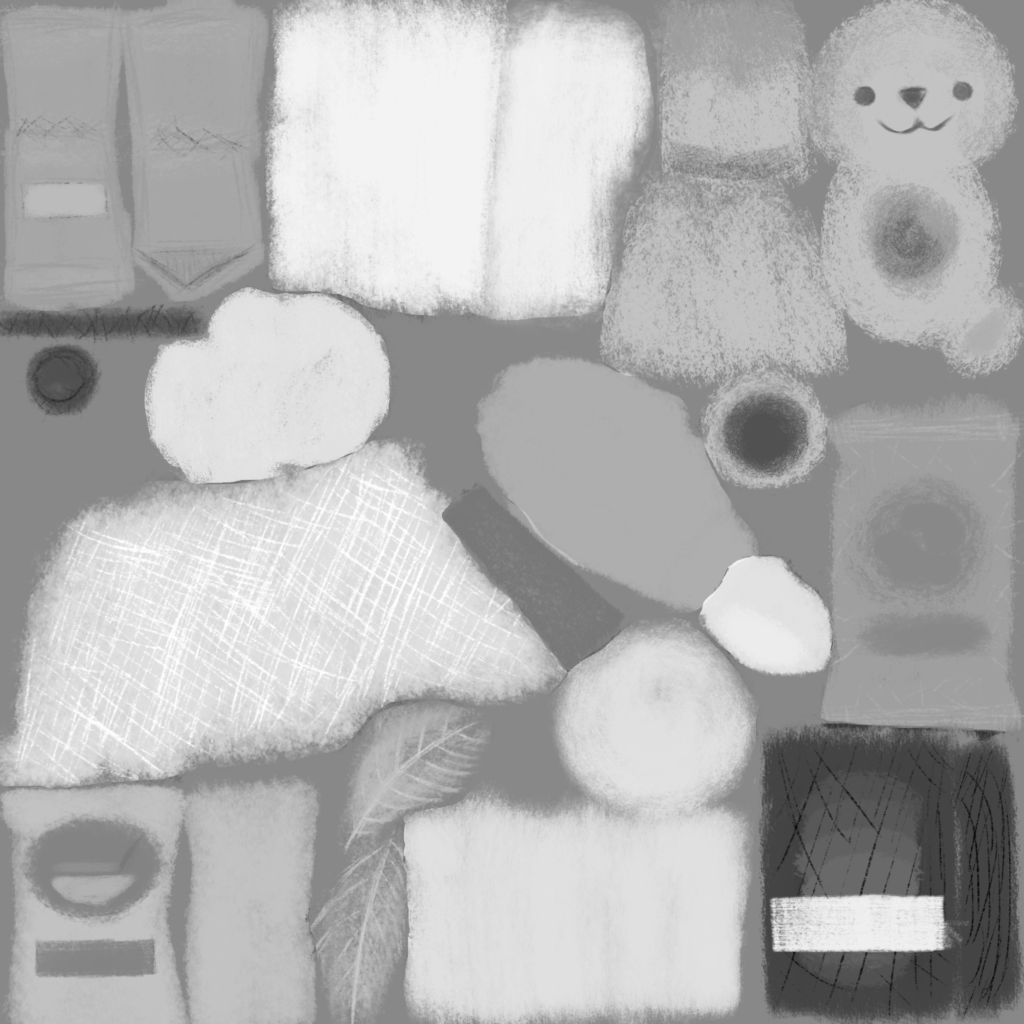
I used a similar workflow, here I put all the objects’ UVs onto a single texture/material.
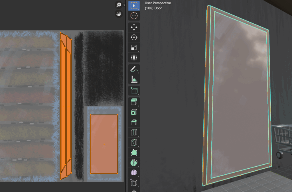
For a sliding door, I just reused the fridge material due to the time contraints of the coming playtest.
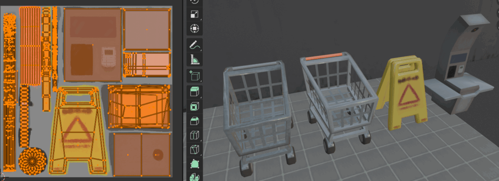
The day before the playtest, I made a two barriers, a non interactable shopping cart and a caution sign, to restrict player access to areas yet allow them to see through to the other side. I also made a checkout machine and a shopping cart for players to push around and put collected items in. The players’ shopping cart is textured to be brighter and more eye-catching, while the barrier shopping cart is more dull.
The shopping cart system is actually a compromise between me and technical designer & programmer Yushan. We communicated poorly before week 8, thus Yushan made a system where the players could carry collectable items physically, as in the item could literally be picked up and thrown around, whereas I thought we would just make an inventory system where collected items would just disappear when interacted with and be ‘collected’ in a more video game way.
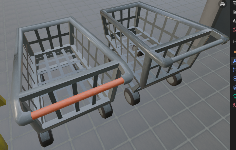
It was made appearant in the week 8 playtest that players having the physically pick up every item to the checkout from across the map wouldn’t be fun for players as they’d have to go back and fourth repetitively. The compromise was that she would make physics based inventory system in the form of the shopping cart
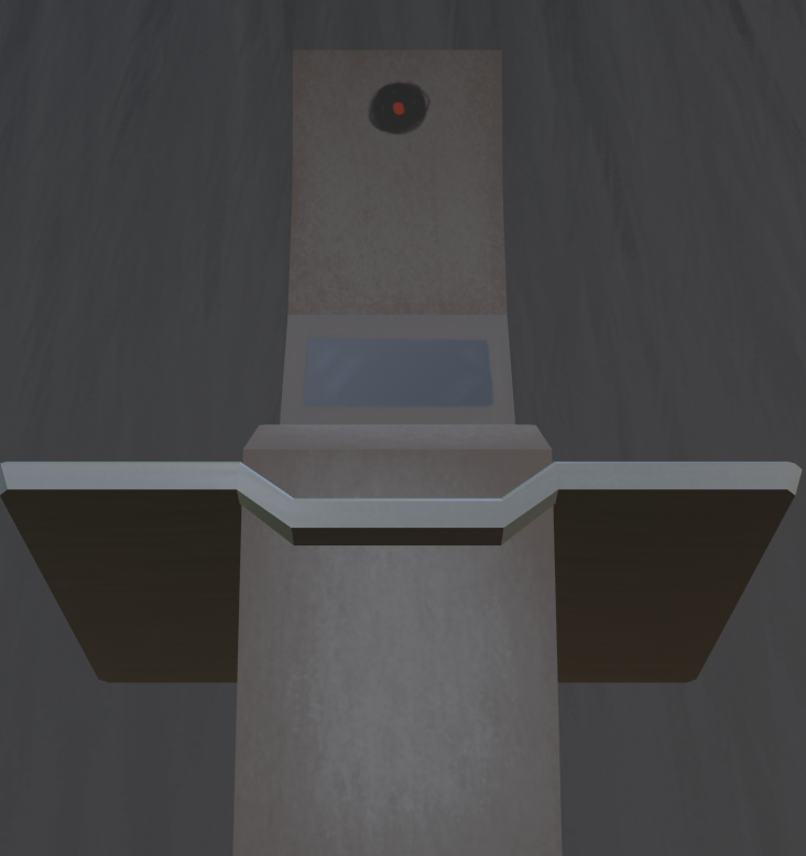
The checkout machine is one of the few places where I tried to do my original vision of having a scopophobia inducing environment, with the camera at the top looming over players with a creepy eye.
If I had more time, I’d have done this more in other places, but my time management left a lot to be desired for this project.
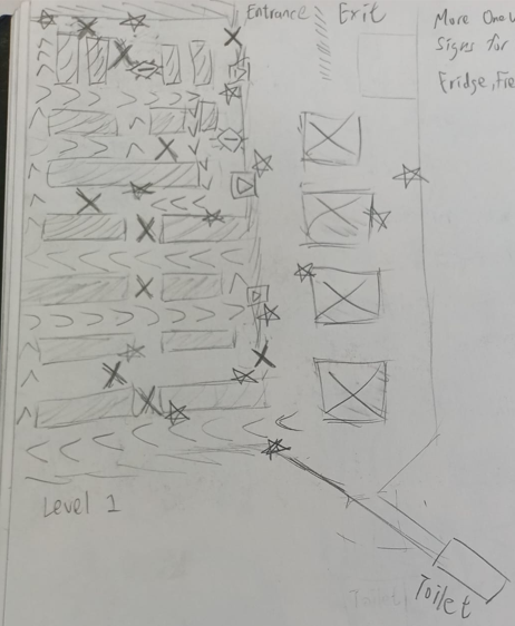
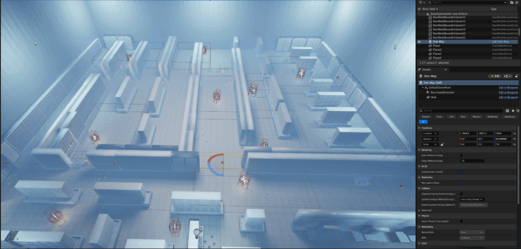
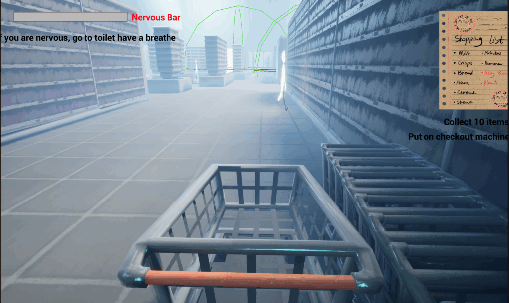
Over this week before Thursday, me and Yushan started making the ‘final iteration’ of the level’s layout in UE5. We followed this map I made for the previous playtest and adapted it using the incremental assets I finished the previous week.

I missed the playtest despite my preparations for it.
Scopophobia Group Page Weekly Communication
It was only until now when I started to ‘lock in’. Due to retrospectively poor communication with our technical designer & programmer Yushan, I hadn’t produced assets which were most urgently needed, instead making the two toilets which were of lower importance and priority in this game’s developement.
I tried to communicate with my team more frequently & effectively.

I decided (or rather understood) then that as the level designer, it should be my responsibility to import my 3D assets into Unreal Engine 5.

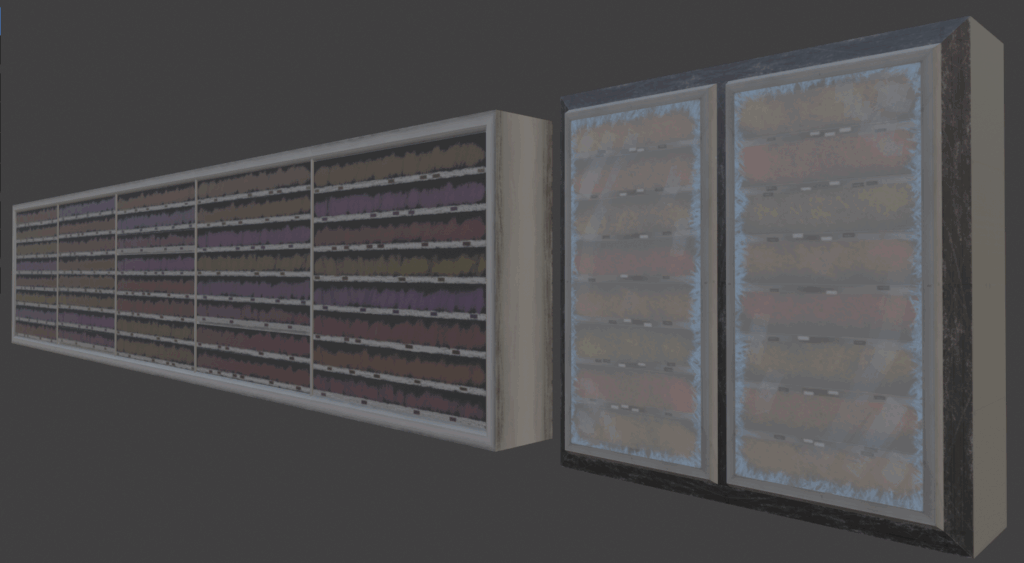
Yushan procured lists of 3D models she most needed and I heeded them and made exactly what she needed. For this week, she most needed shelves and fridges for the supermarket as they were what players would be around the most, while also being vitally important to the level’s layout & design.
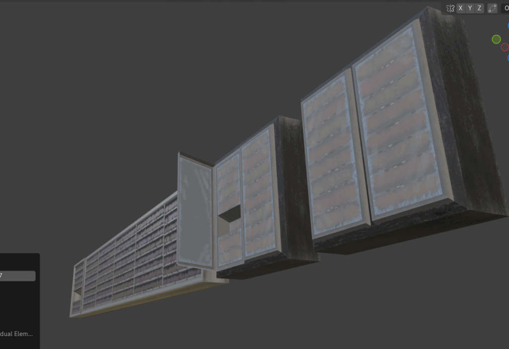
Learning from my previous mistakes, I made them modular, with their sizes being increments of one meter. This made them very easy to build levels in UE5 where they can be effortlessly snapped together.
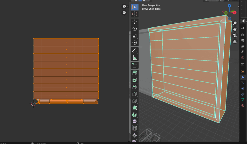
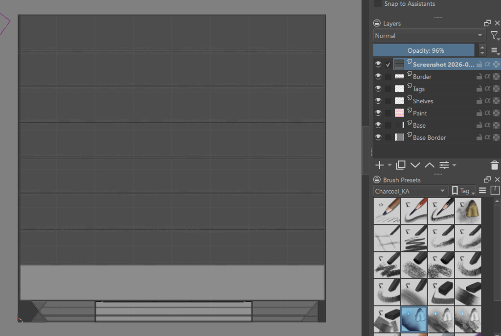
I started by modelling them, then UV unwrapping them and using the unwrapped UVs as a reference for my hand painted charcoal base colour/diffuse texture in Krita.
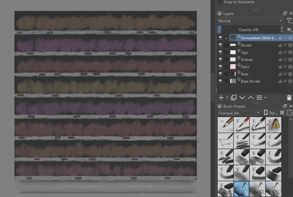

I also made variations of them, with some being UV map trim sheet colour swaps to avoid immersion breaking repitition while others have a hole in them to store items players can pick up.
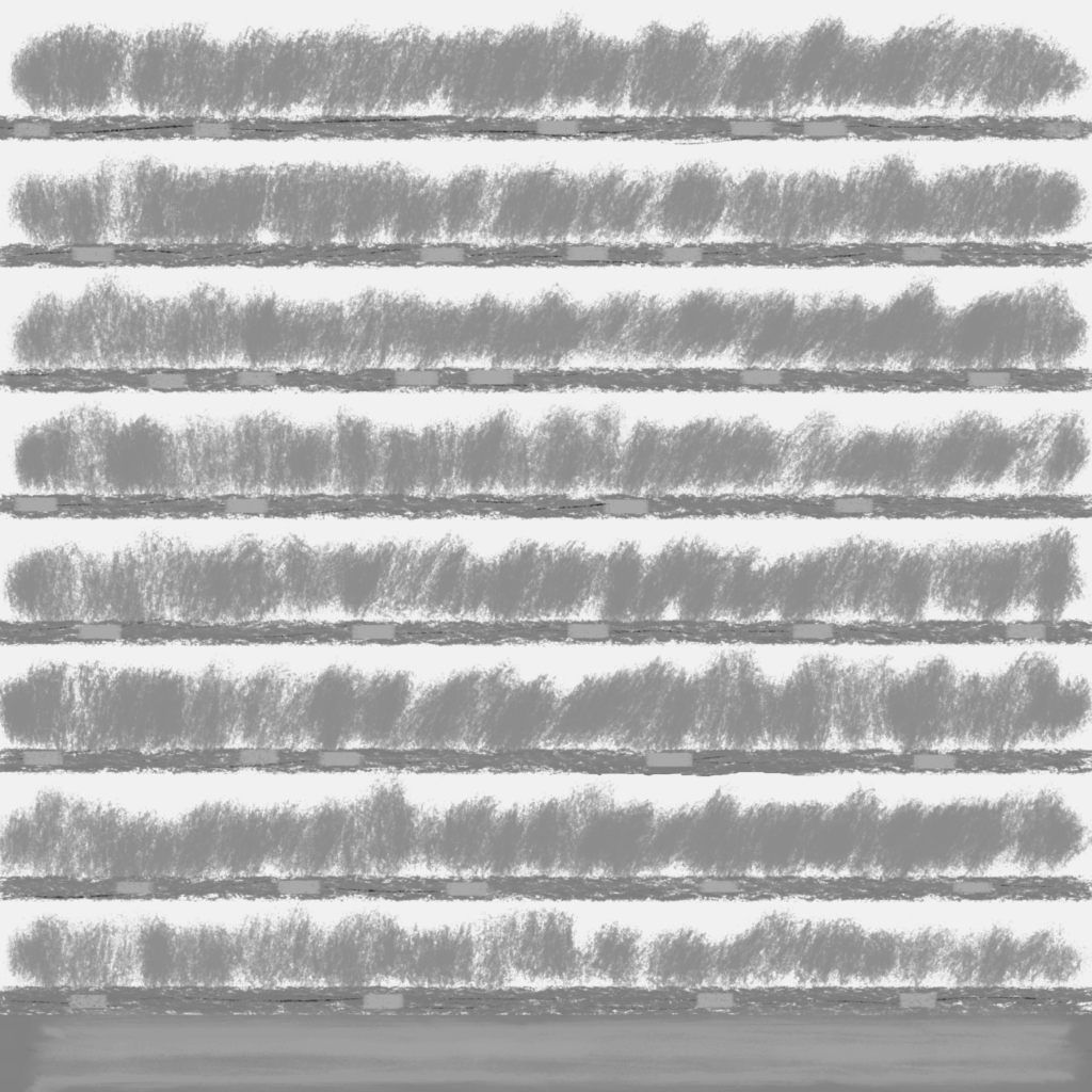
Using Krita, I also made roughness maps for majority of the models by duplicating the base colour/diffuse map, making it grayscale, then adjusting their lightness values to match the glossy-matte reflectiveness the material they’re representing should have.
Using the same workflow, I made a fridge-shelf hybrid and a background for the supermarket. The ceiling shares the same textures as the wall.
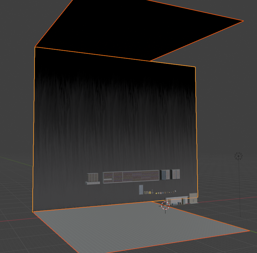
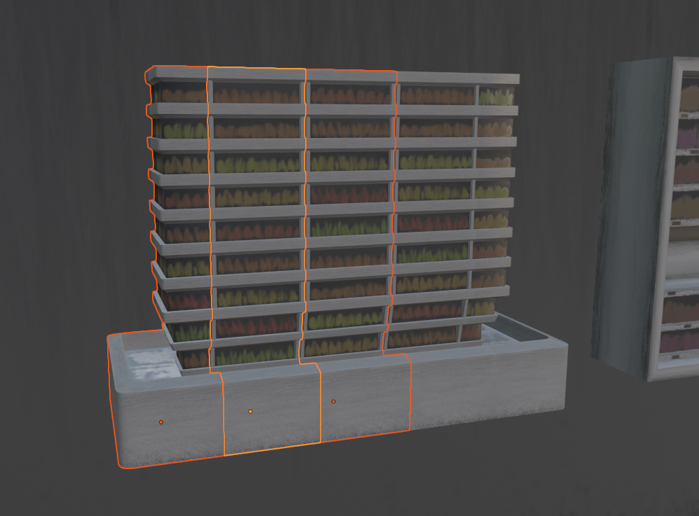
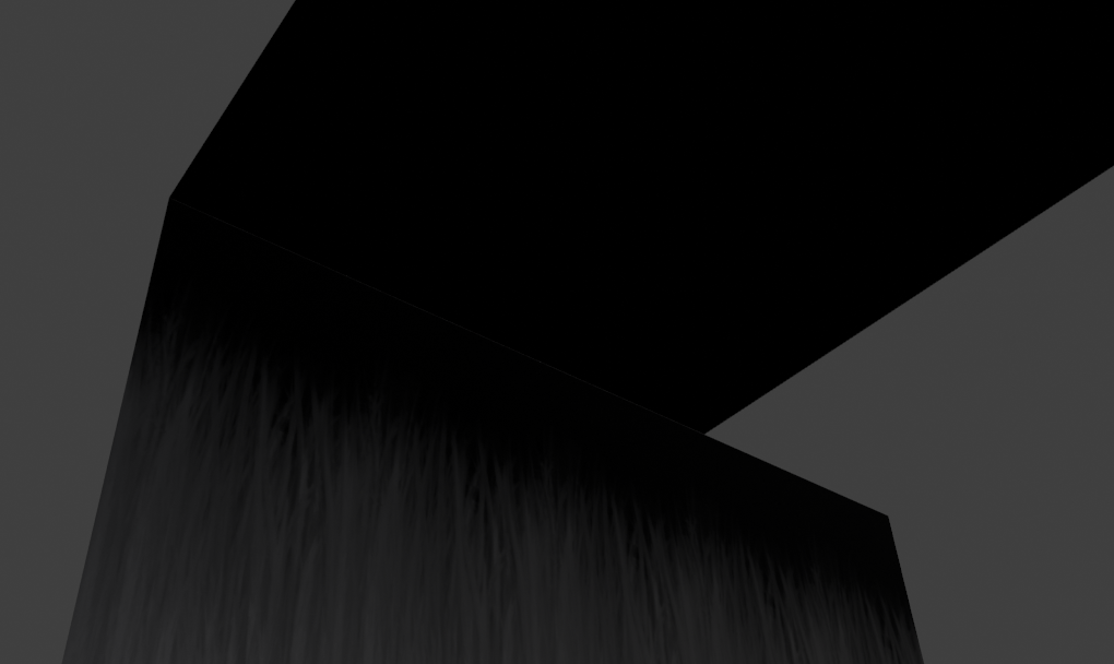
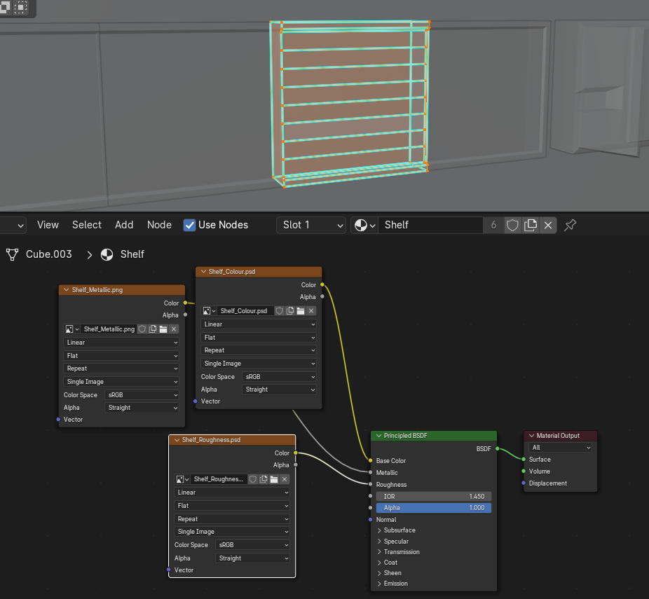
For the walls, I additionally used a metallic texture map, made with a near identical method as all my roughness textures, so that there is no reflection nor visual border between the ceiling and walls, creating the illusion of an endlessly tall interior. This will hopefully add to the players’ sense of scale & proportion being messed with, immersing the player in a phobia-indusing atmosphere.



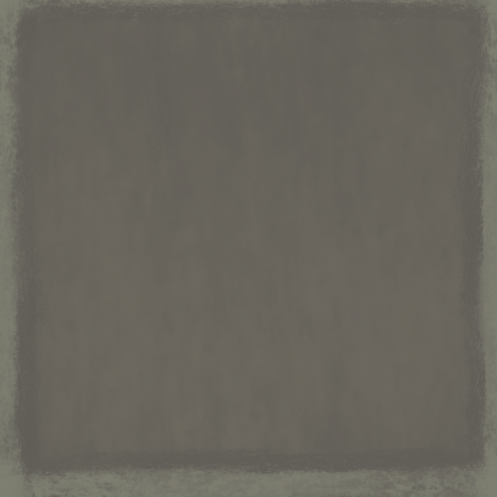
Floor textures, I just made a tile that repeats in an array. Looking back I may have made this material too big, I made it 1k resolution when it could’ve been 512×512.
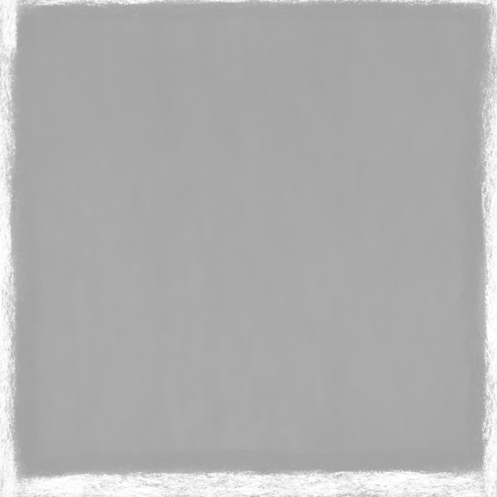
For the wall texture I’d originally wanted to hand-paint it in 1024×4096 resolution, then rearange it into a standard 2k resolution texture, however due to technical difficulties with Krita, I imported them with the weird resolution into UE5 and luckily it worked fine.
Scopophobia Group Page Weekly Communication
I tried to design it to visually communicate to the player where they’d next need to go everytime they reach a visible desitnation.
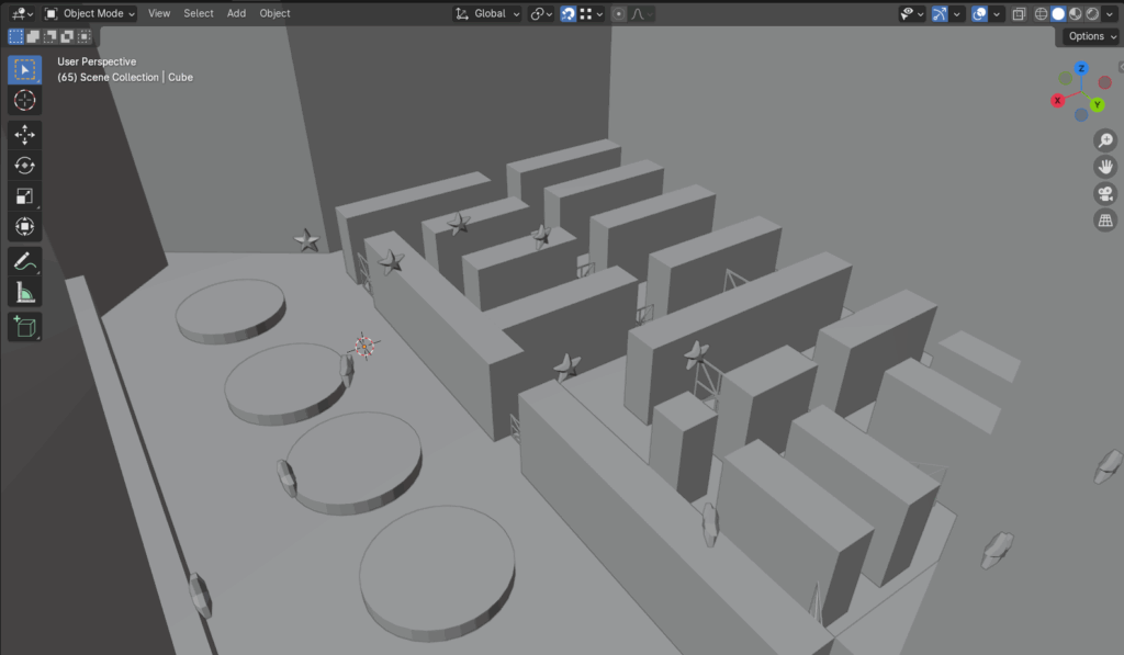
I realised after making these toilets & graybox maps that they shouldn’t be made this way as they were not modular nor flexible. My approach here is flawed in that it severely inconveninces my teammates working predominantly in UE5 too due to its ‘all in one’ format.
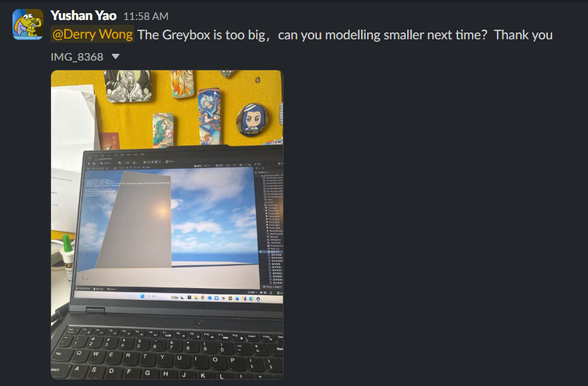
My team’s technical designer, Yushan, was unable to import my graybox due to my inexperience with the Blender-UE5 pipeline. She roughly recreated it in UE5 for the playtest.
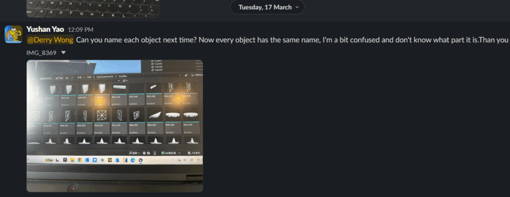
I realised I should switch to using modular pieces so it may be easily edited in UE5 if any factors arise which demand so. Here I duplicated assets in Blender and bloated the UE5 project, adding unnecessarily to file size and confusing my teammate in UE5.
On Thursday, we had the playtest. Although Yushan recreated my level layout in UE5, I was unable to test my design fully as she misunderstood the intent of my layout. This is not her fault, as the level designer, I should’ve been the one who made it. At this point, I thought I could so everything in Blender, in my own PC, and push everything UE5 related to our programmer Yushan. After this experience, I now fully understand my responsibilities as the level designer.
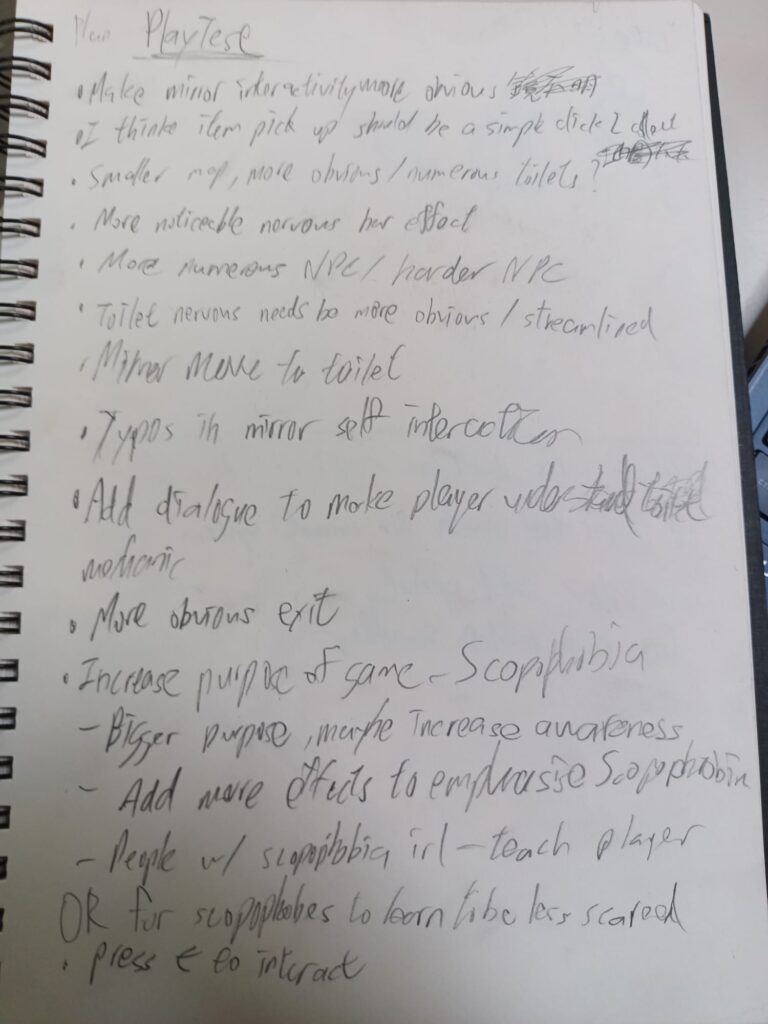
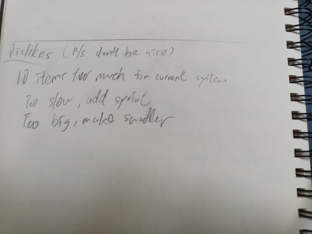
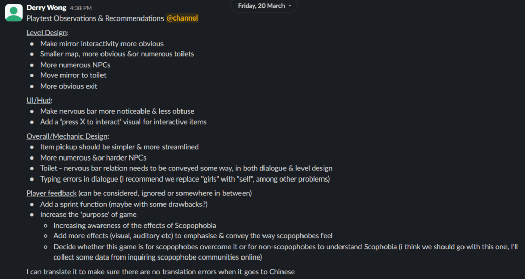
After the playtest, since I was the one taking notes, I summarised everything into neat bulletpoints for my teammates.
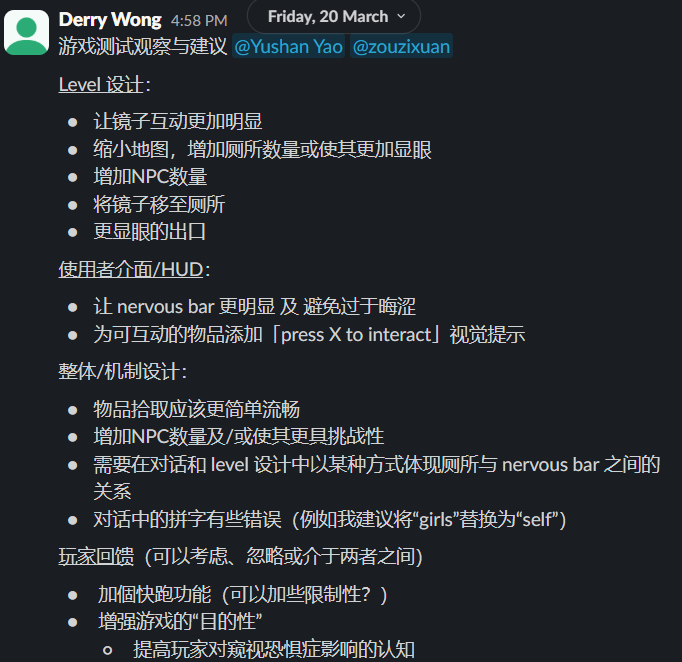
I also manually translated it all into simplified chinese so there’s zero possibility translation error, I do not know simplified Chinese but I do know traditional Chinese, which is identical to simplified in all but aesthetics. I manually translated everything into traditional Chinese then used Google Translate to go from traditional to simplified, which is a 1:1 so there’s no possibility of translation error.
In the book Developing Creative Content for Games, I found a quote I really liked, so much so I was able to apply it to remember and quote it in the context of a gaming Youtuber getting annoyed at the co-op game Helldivers 2 ‘s design of AI enemies.
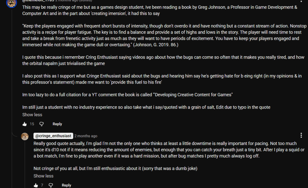
“Keep the players engaged with frequent short bursts of intensity, though don’t overdo it and have nothing but a constant stream of action. Nonstop activity is a recipe for player fatigue. The key is to find a balance and provide a set of highs and lows in the story. The player will need time to rest and take a break from frenetic activity just as much as they will want to have periods of excitement. You have to keep your players engaged and immersed while not making the game dull or overtaxing.” (Johnson, G. 2019. 86.)
I also returned Developing Creative Content for Games (2019)to WSA library this week.
Scopophobia Group Page Weekly Communication
I realised that Unreal Engine 5 does not work on my Laptop, I had faced similar issues before when trying to play UE5 games. I tried troubleshooting it but in the end I had to use the school’s computer to access UE5 while using my personal computer to create 3D assets.
To overcome this limitation, I had to communicate with our technical designer Yushan better. I also tried coming to campus more often so I had access to UE5 via the school’s computers.
I started brainstorming & designing more level layouts for Scopophobia.
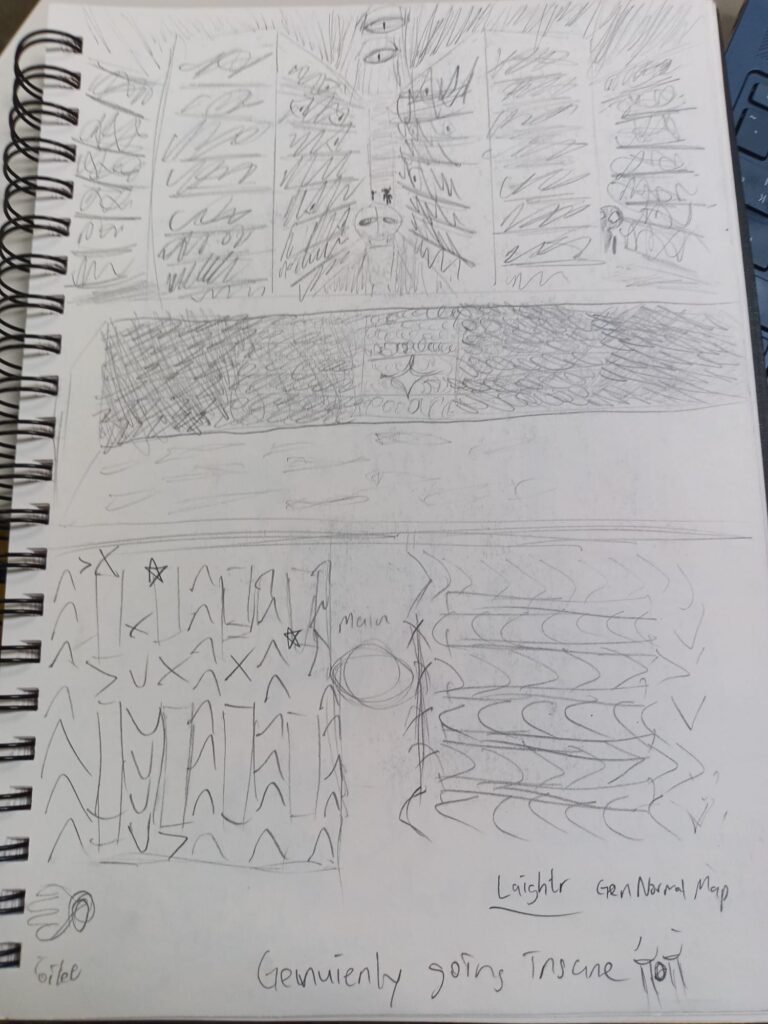

Heeding advice on how good level design should guide a player through an area to ensure they don’t get lost or miss things, I iterated, designed and graybox-ed a level layout in Blender.

Continued reading the book Developing Creative Content for Games (2019)
Scopophobia Group Page Weekly Communication
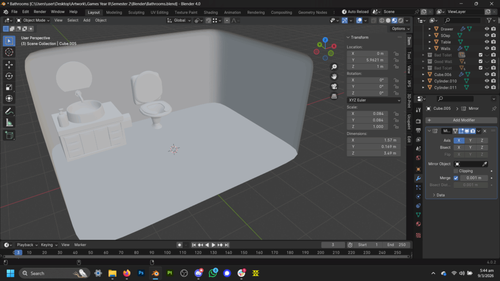
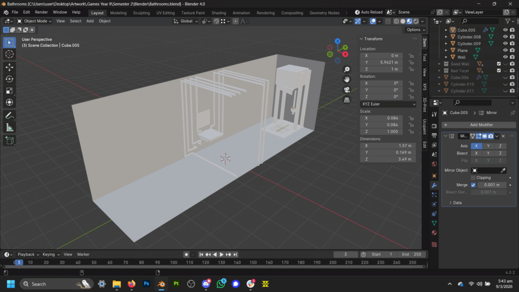
This week, I continued modelling the Home Apartment Bathroom & Supermarket Toilet.
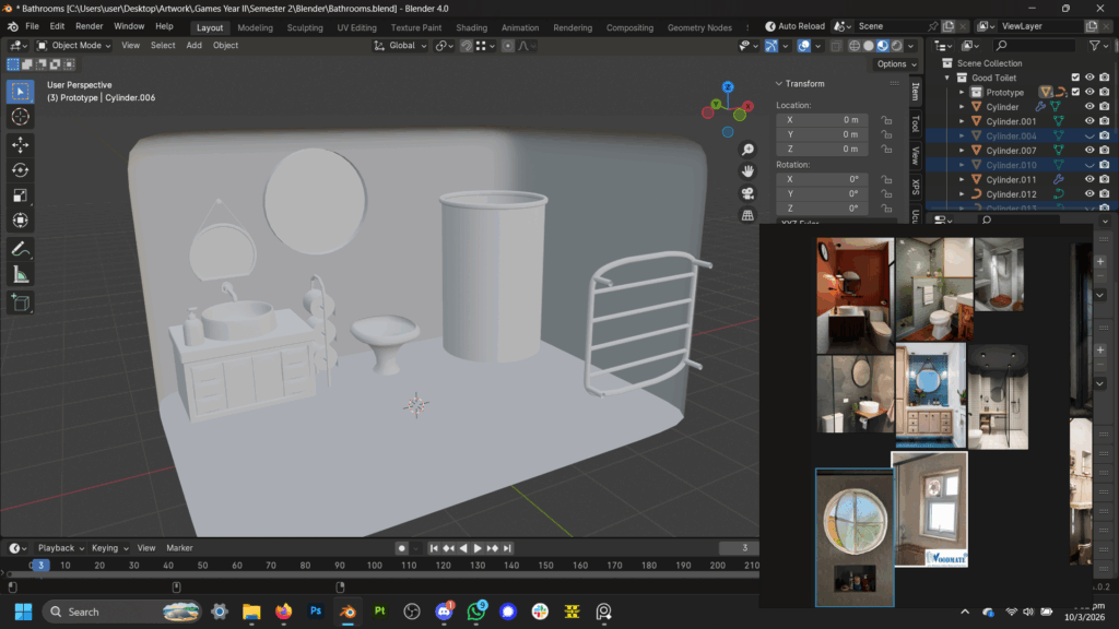
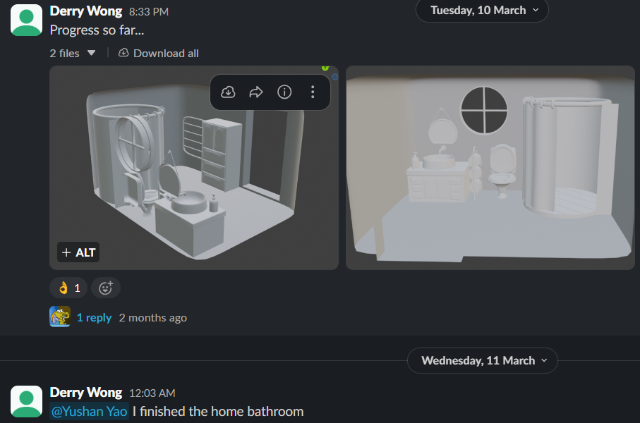
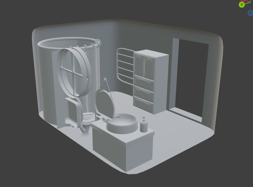
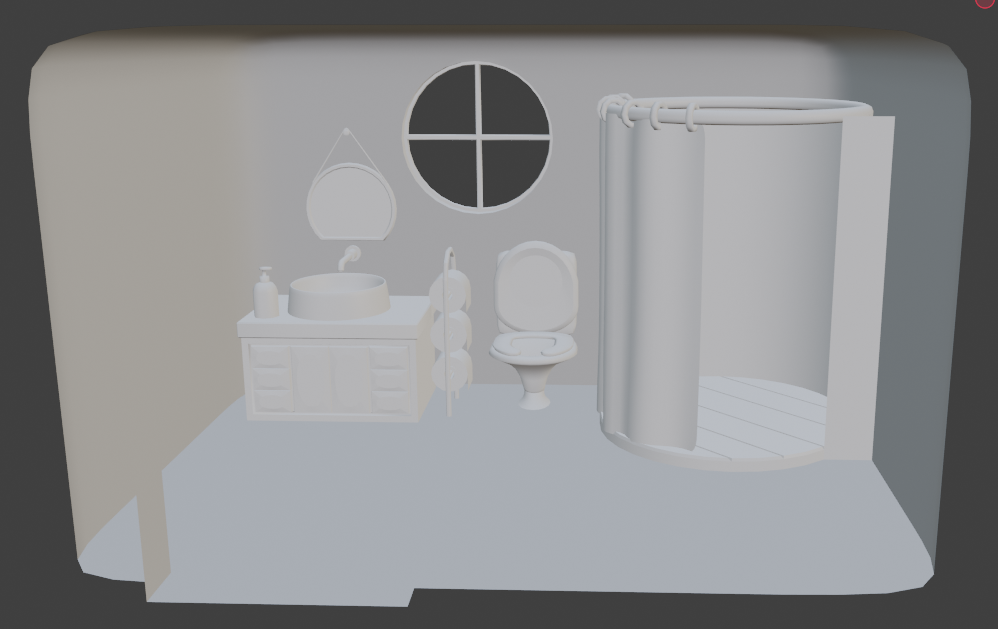
Borrowed book Developing Creative Content for Games (2019)from the WSA library and started reading it.
Scopophobia Group Page Weekly Communication
I continued modelling the toilets.
Started encountering problems with Unreal Engine 5, asked Ross and my teammates for aid.
Scopophobia Group Page Weekly Communication
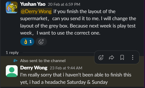
I did not actually have a headache, I procrastinated and did nothing.
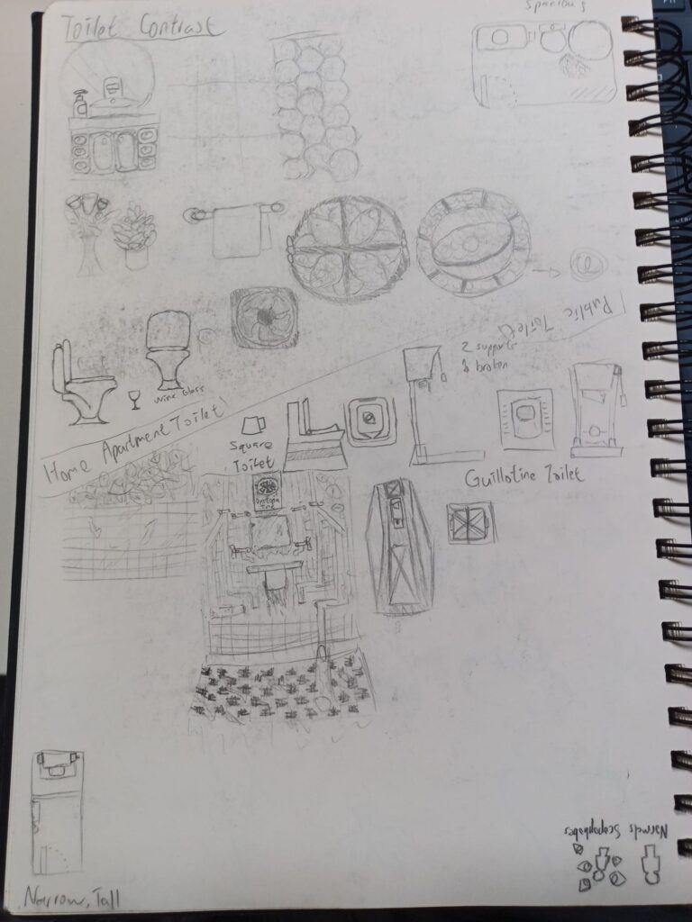
I did some more sketches, this time of the contrast between two toilets located in a safer place, the protagonist’s home, and the scopophobia inducing environment of the supermarket.
For the public toilet in the supermarket, I sketched a more angular & sharp design, with lots of squares.
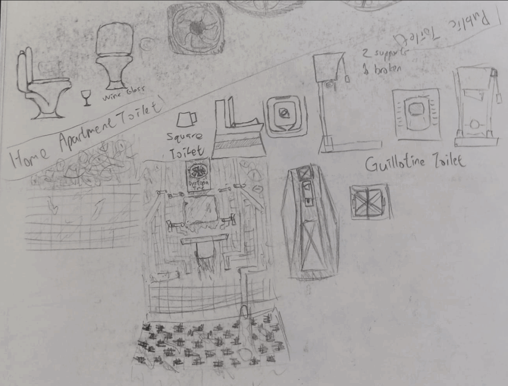
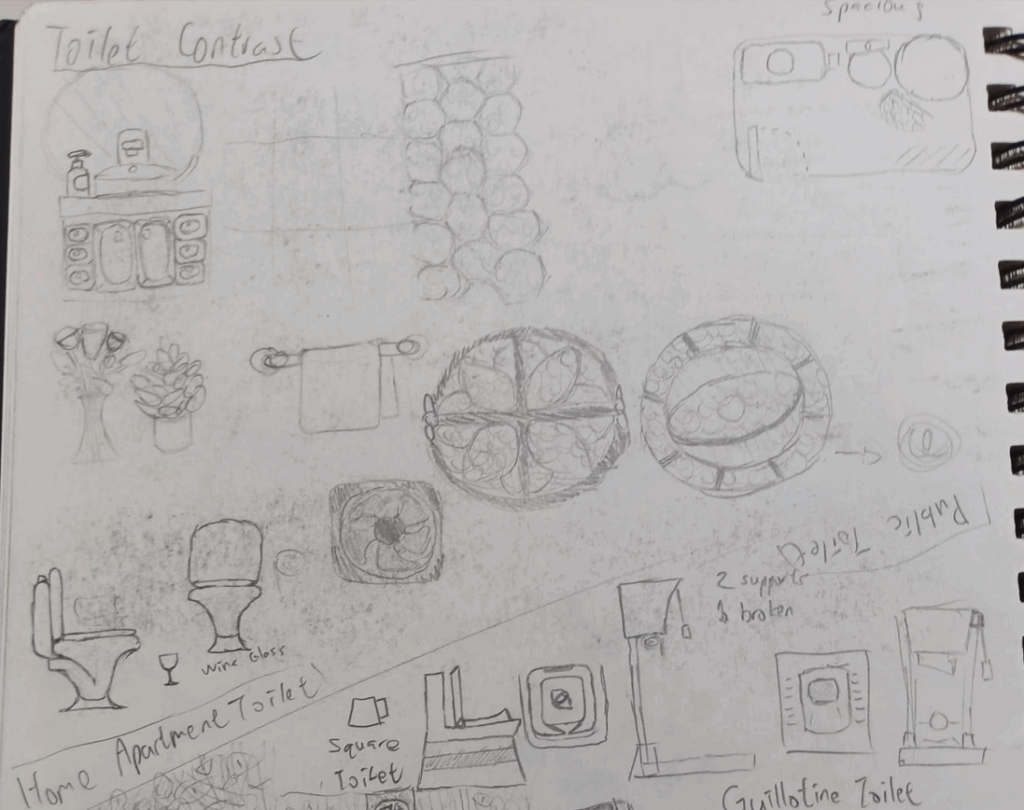
For the home appartment bathroom, I tried a more rounded design & a commitment to a circular motif.
I thought that contrasting the public toilet and home bathroom through the design language of the toilet itself would be a good idea, one would be designed like an eloquent wine glass, while the other would ideally spark imagery reminiscent of a guillotine, though that might not be too appearent so its blocky, sharp shape language might hopefully suffice.
I started modelling the toilets.
Scopophobia Group Page Weekly Communication
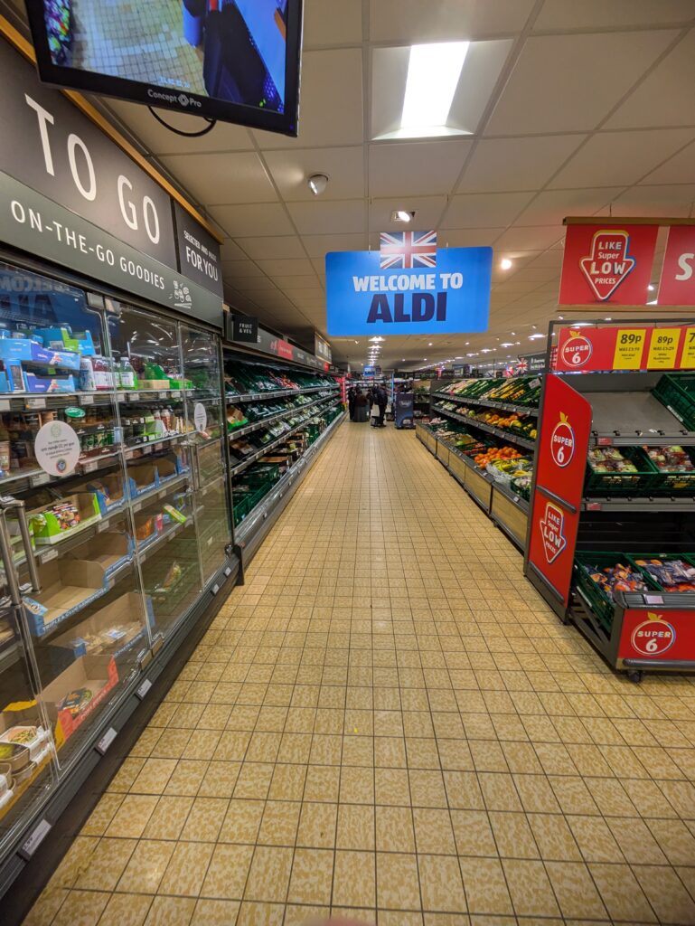
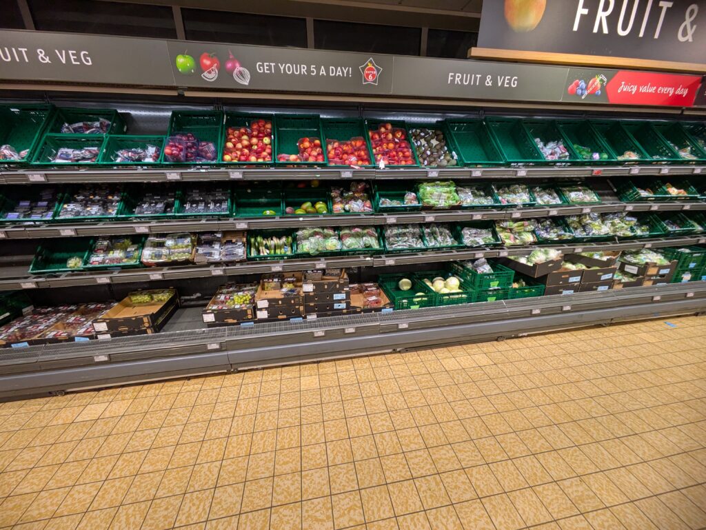
I continued my primary research by visiting an Aldi at Portswood
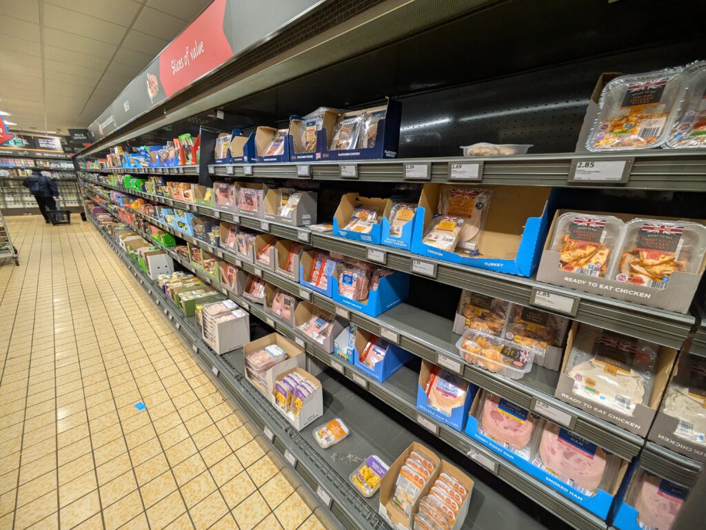
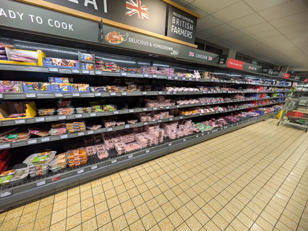
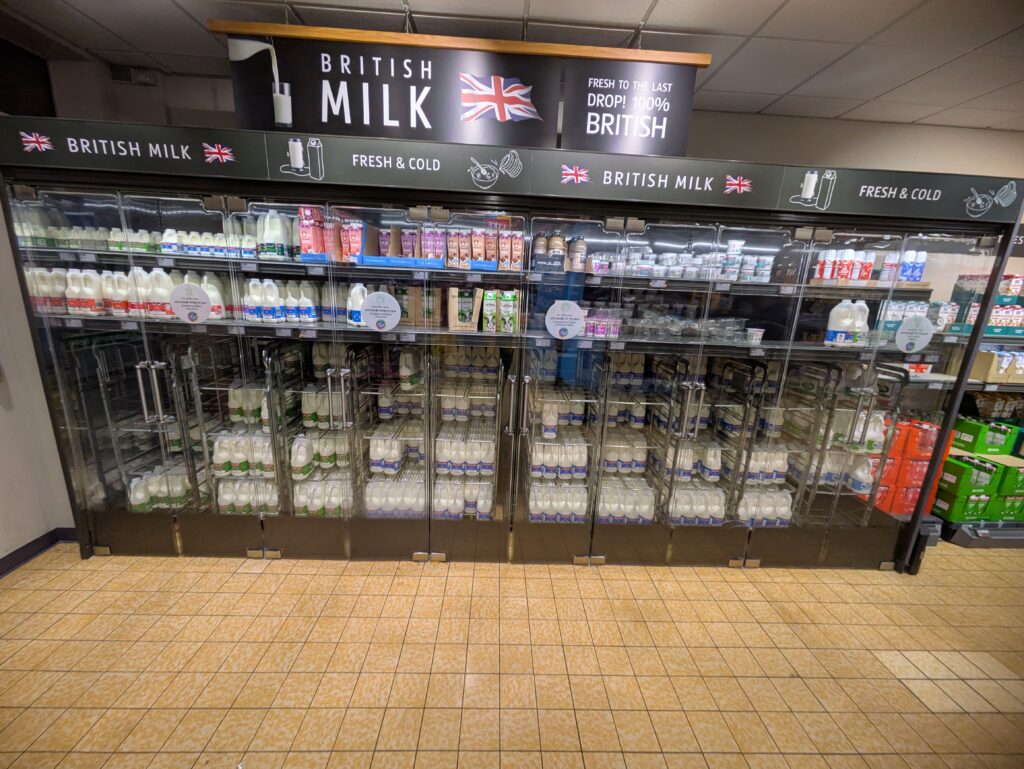
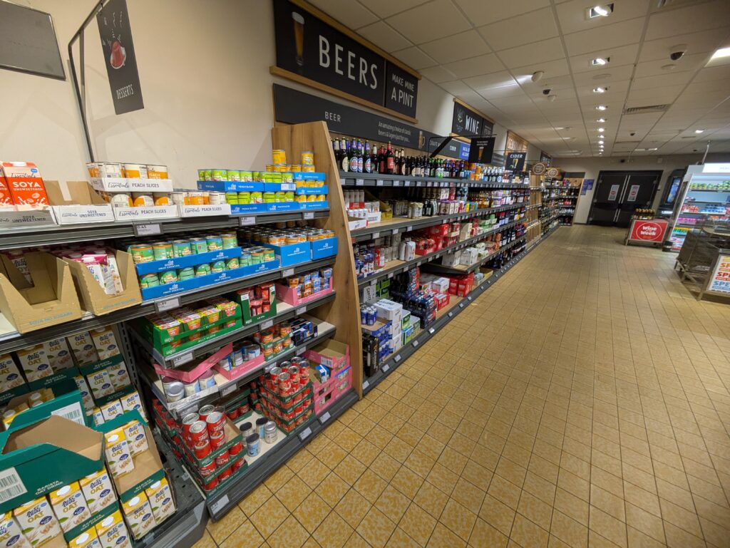
On the 12th of February, our class had to do a presentation on our group projects

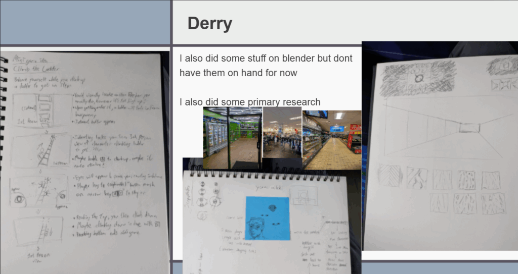
At the time, I didn’t understand the issue with importing a whole level from Blender into Unreal Engine 5 I thought it might’ve been a problem with Yushan, our programmer & technical designer. As the project continues, I will soon understand why making the level in Blender was incredibly impractical, inflexible etc.

I responded with okay and proceeded to export the entire level to Yushan to put into UE5, just separated into different folders instead of what she actually needs – incremental building blocks, something which I can easily state in retrospect now. In the moment, I did not know the error of my ways, and it cost us valuable time.
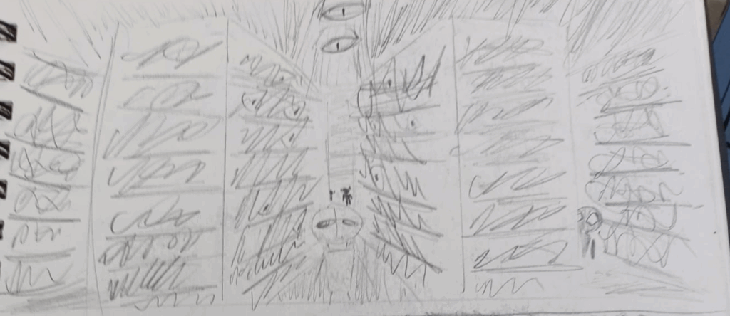
I decided on separating the handpainted artstyle of the 3D environment with watercolours and charcoal to represent safe spaces and scopophobia inducing areas. From Marie’s GDD, I found her sketchy concept art to encapsulate the feeling of Scopophobia, which I feel charcoal can recreate.
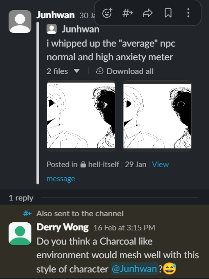
I started assembling a Pinterest board for the aesthetics of the environment, starting with the toilets.

Scopophobia Group Page Weekly Communication
I passed by a store at London Road, Southampton and took some pictures.
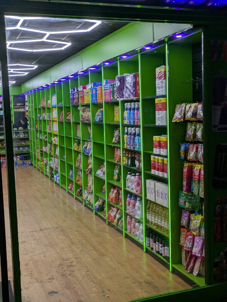
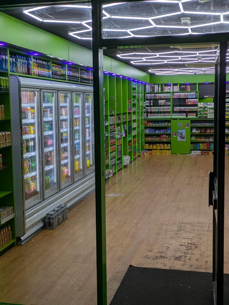
I read up about super market layouts through a map of a Sainsbury’s near Winchester.
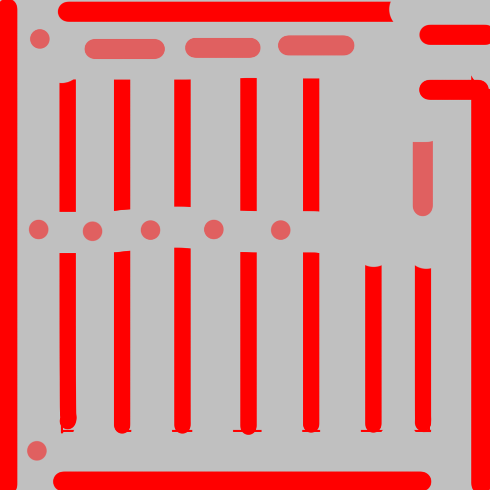
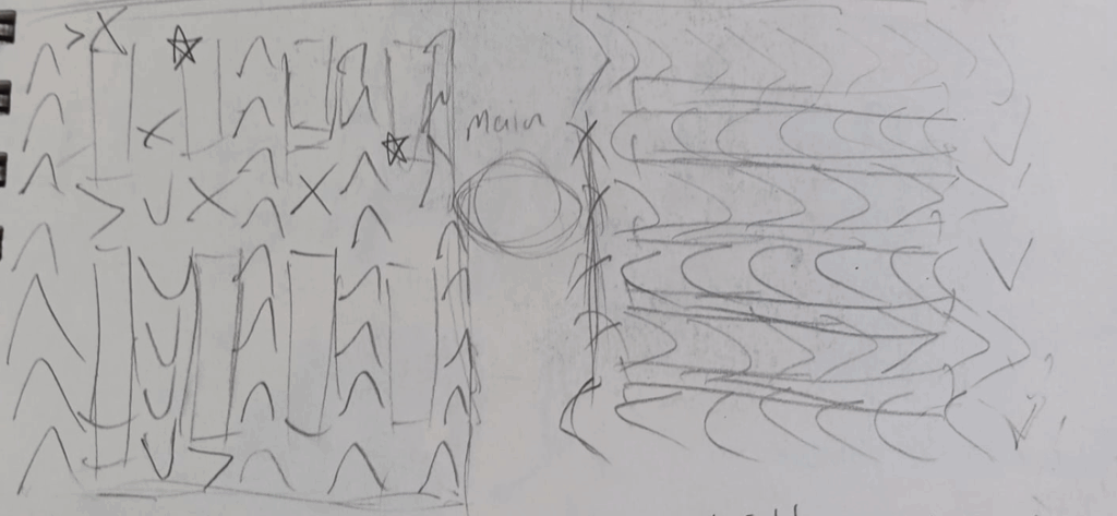
I made some early prototypes of how the level layout should be like. This layout was designed to be very uniform and ordered, like how a real supermarket might be.
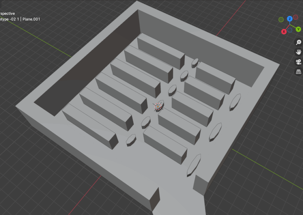
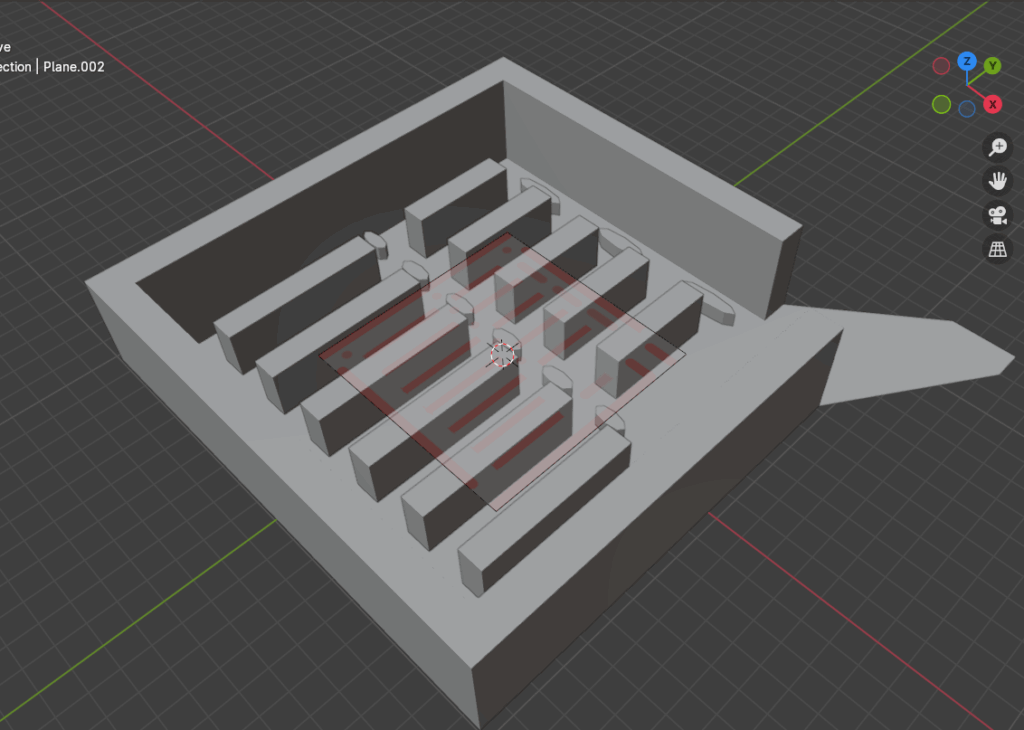
The design intention around this layout is to make the level as confusing and repetitive as possible, so the player cannot eaily dissern where they are and would have to use ulterior methods to navigate like a map or signs
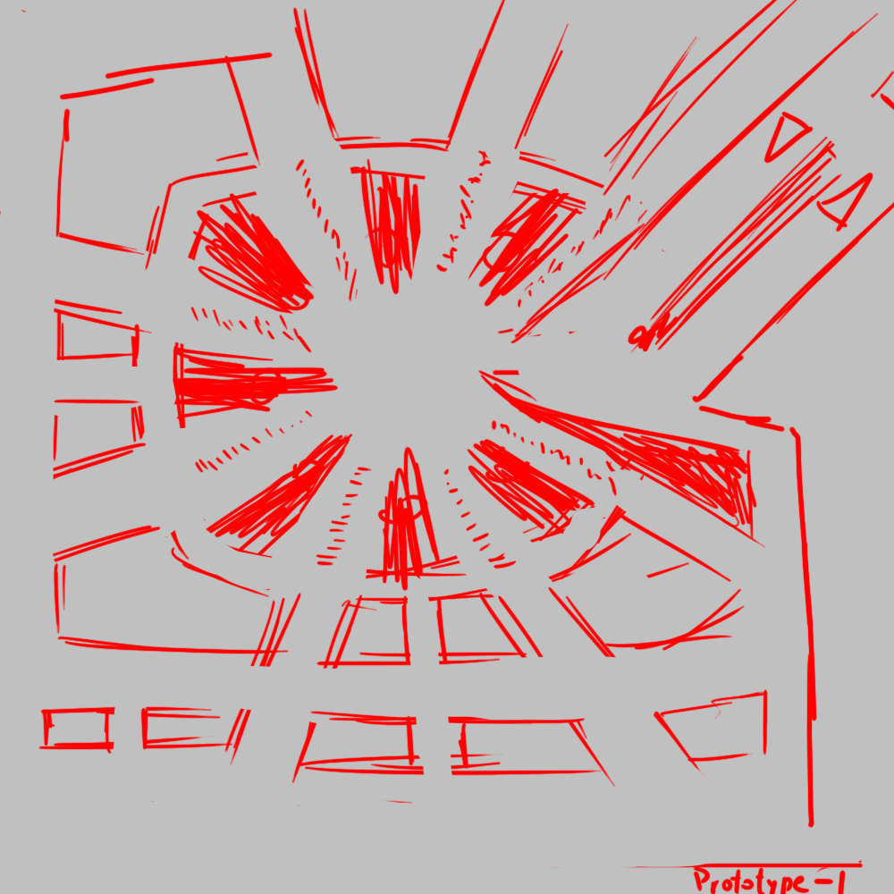
In retrospect, neither of these layouts were what our final gameplay mechanics needed. Although the concept of using other methods to navigate had potential, I did not have sufficient team coordination/communication to convey this to my teammates, and went in another direction.
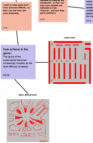
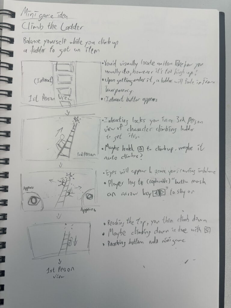
Here, we had thought of having two levels for the game, which now in retrospect was a bit too ambitious
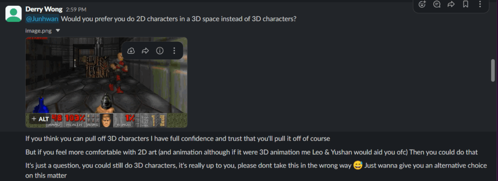
I suggested our character designer, Junhwan, should consider doing the game’s characters in 2D, reminiscent of older games with 3D environments like Doom (1993). I suggested such as i know he has no experience with 3D modelling, and wouldn’t know how to create 3D characters.
Scopophobia Group Page Weekly Communication
I analysed Maria’s GDD, and had extrapolated her vision for Scopophobia.

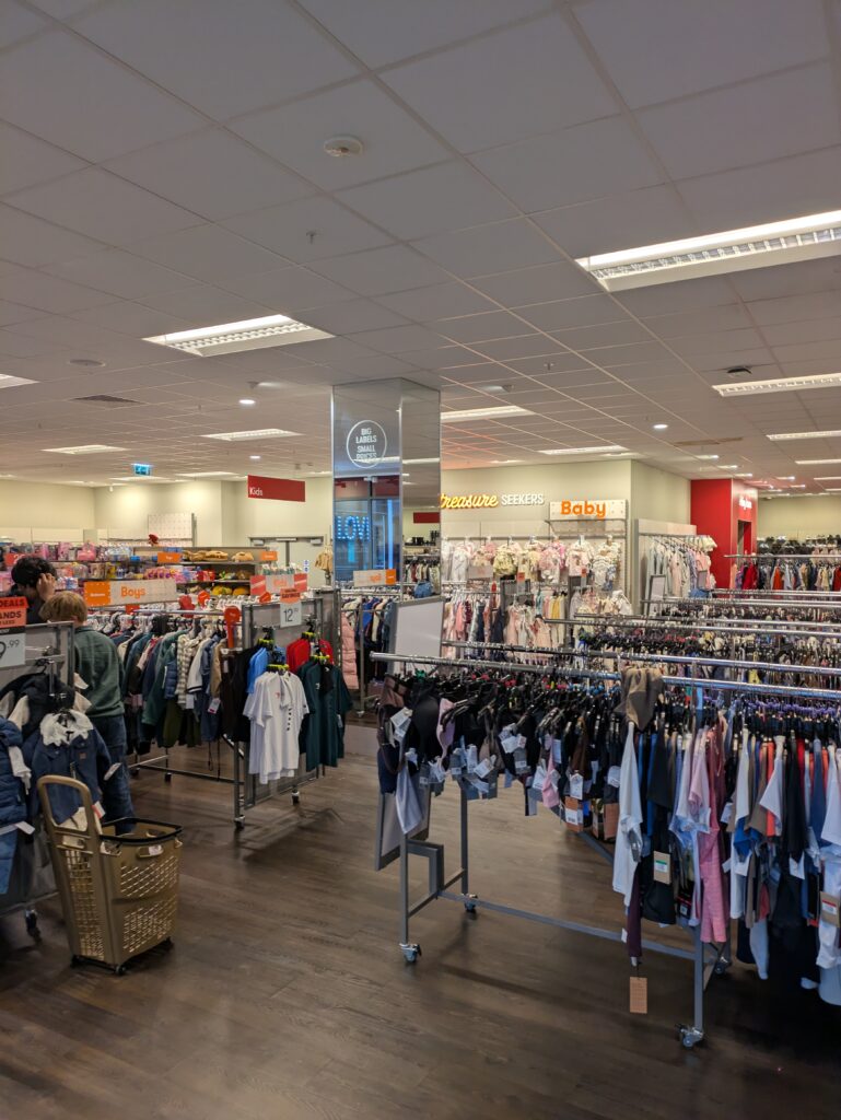
I went to the TK-Max in Winchester to gather primary research for how stores & supermarkets are laid out, how they visually look & feel etc. I took some good photos of them.
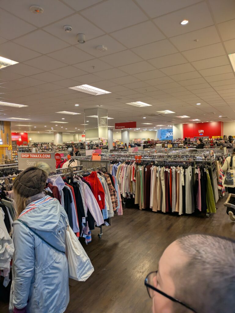
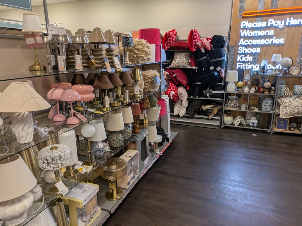
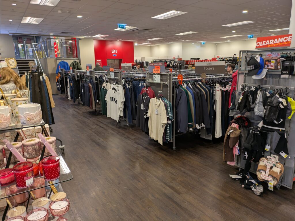
As the Level Designer & main 3D Artist of Scopophobia, I had to keep track & organise a lot of things.
Something I remember from a previous guest lecture talk is the importance of consistent naming & organisation of assets in game developement.
I didn’t follow this advice well until after I realised I had multiple assets sharing a similar description & name, such as the mirror in the Home Apartment & another mirror in the Supermarket Toilet, for example.
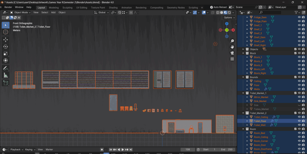
For assets in the Supermarket itself, their names do not reflect their position as Supermarket assets, a mistake which I do not intend to ever repeat. Later on, I decided to organise everything with their location/position, underscore, then their description, underscore again, and finally if needed, their orientation/variation (for ex. left or right, numbered variations etc.)
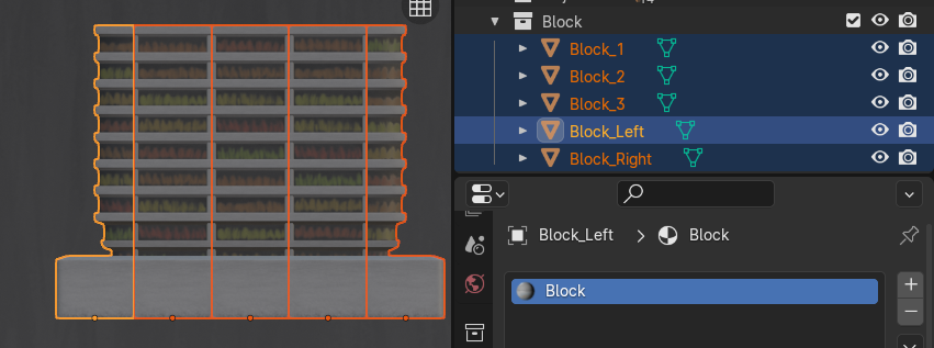
For ‘Block’, since they all share the same material & textures, I simply added “_Colour” and “_Roughness” as an indicator of their status as a base colour/diffuse texture & roughness texture. The material is simply named after the textures without the indicator as it doesn’t need one.

Looking back, I should’ve made an asset sheet too for better organisation & documentation. Here in this project, due to its smaller scale, the number of assets didn’t get out of hand, especially since I was the only one doing 3D modelling, Blender exporting & majority of the UE5 importing. The few assets which were imported by Yushan were highly confusing for both of us.
This post primarily highlights my workflow from Week 9 onwards, wherein i had learnt from the inefficiencies and issues with my prior workflow.
Utilising primary research gathered, Maria’s GDD, a reference/mood board I complied in Pinterest, and sketches inspired by the previously mentioned, I gain a good base/reference to go off of and start my creation process.
Utilising a software recommended by my friend Erik called Pureref, I’m able to overlay references over Blender & Krita, two software which serve as my main tools for the creation of 3D assets.
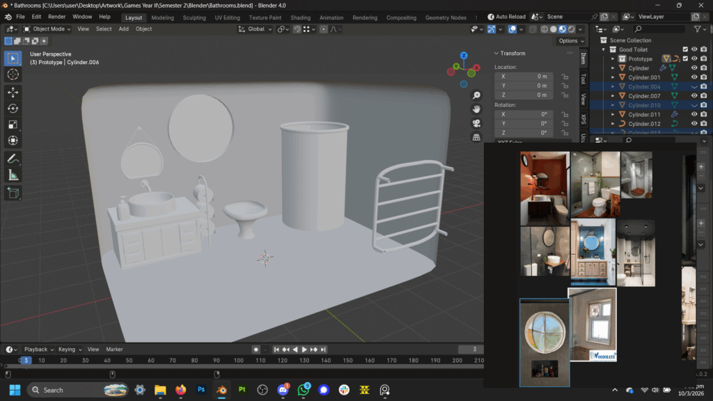
With a references by my side, I start with simple shapes and slowly model them into a desired form. For Scopophobia, since I’m working on environment art I decided to keep my models low polygon and simple, reserving detail for more important objects.
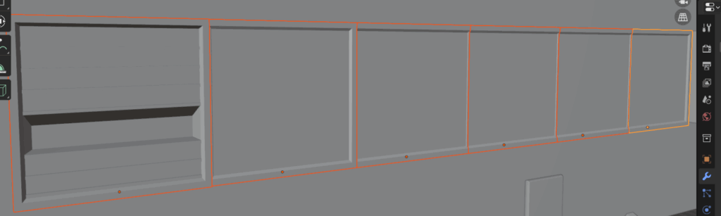
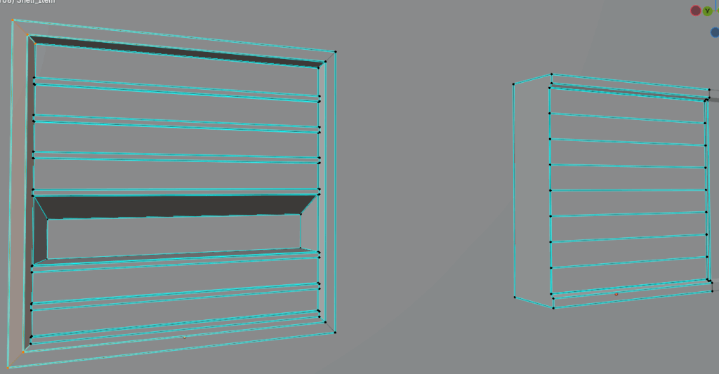
After finalising the shape & form of the model, I UV unwrap it so it may display textures.
For blockly models like this self, I mainly use the function ‘project from view’ while in a orthographic view at a specific direction.
Afterwards, I take a precise screenshot of the unwrapped model, by the left of the screenshot above, and import it into a new Krita project, sized after the needs of the model.
I decrease its opacity and use it as a reference for my digital hand painting, creating a base colour/diffuse texture
I then duplicate and adjust the saturation & values of the painting, taking advantage of its layers, to create a roughness map.
For Scopophobia, I determined just having two textures is enough for most models, base colour and roughness. I do also create metallic maps on occasion to complement roughness textures when they aren’t enough. I also experimented with procedurally generated normal maps using the software Laigtr, recommended to me by a guest speaker, however i did not find the normal textures generated useful.
During the Krita hand-painting process, I utilise a Blender addon named “Auto Reload”, which automatically reloads all texture files connected externally when they are updated/saved.
I saved my Krita projects in the .psd format for compatibility with Auto Reload. This combination allows me to check how my painted textures look in Blender on the model whenever I save the Krita .psd project.
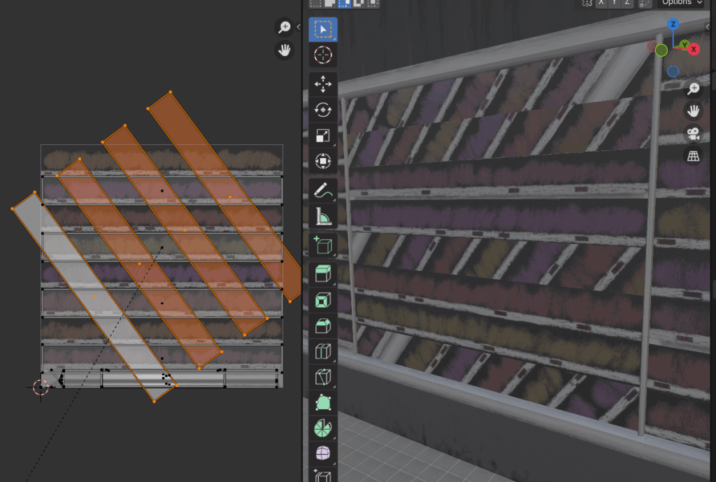
I sometimes create multiple variants of a model so they may not feel overly repetitious, I do this by moving their UVs around so different parts of the texture are projected on the same face.
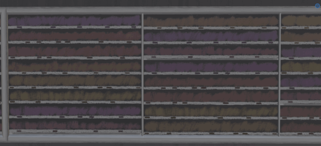
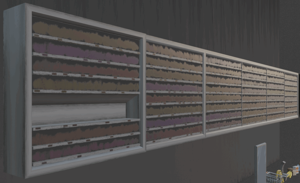
I export the model as a .fbx file from Blender. I then export the textures as .png files from the .psd Krita projects.
Then after, the files or organised into a folder where they are then imported into Unreal Engine 5.
After importing into Unreal Engine 5, I recreate the shading nodes of materials as they are in Blender. I connect the imported .png textures in shading, and connect to finished material onto the imported .fbx models.
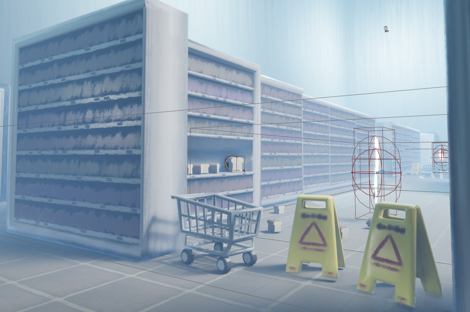
Finally if need be, the model’s collision hitbox is remade to fit the circumstance. Below, the collision hitboxes of the wet floor sign & cart objects are greatly exaggerated to prevent player passage but allow for visibility through them.
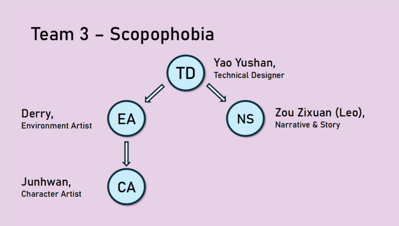
I was been designated the Environment Artist of our group project. I decided to also take on the role of Level Designer too.
In my research on level design & environment art, I have procured the following findings
From Year 2 Semester 1 Week 4 Level Design Workshop
From 5 Tips for Great Level Design Youtube video:
This was very influential in my 4th ‘final’ iteration of the level layout, although it also serves as a good critique of it despite me attempting to follow its guidance.
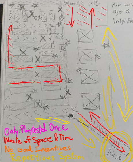
Overall in retrospect, the advice & guidance given by my role research on Level Desgin specifically proved very useful, and specifically helped a lot in elevating my Level Design from the 3rd to 4th iteration, like my intent with Sightlines being inspired by “Having a clear goal”.
Citations
Winchester TK-Max
Store located at London Road, Southampton
Portswood Aldi
I techincally did lots of ‘research’ at the Portswood Sainsbury’s as I go there every other day for groceries, but I never look any photos… Nevertheless, Portswood Sainsbury’s served as a major inspiration due to my frequent visits there.

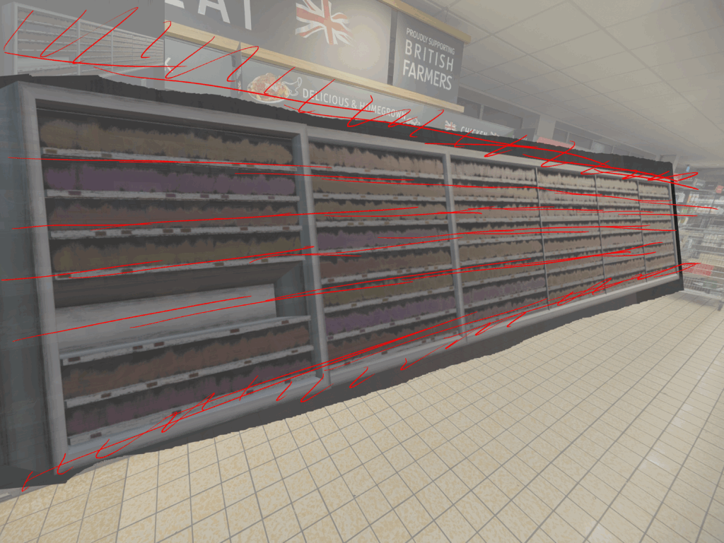
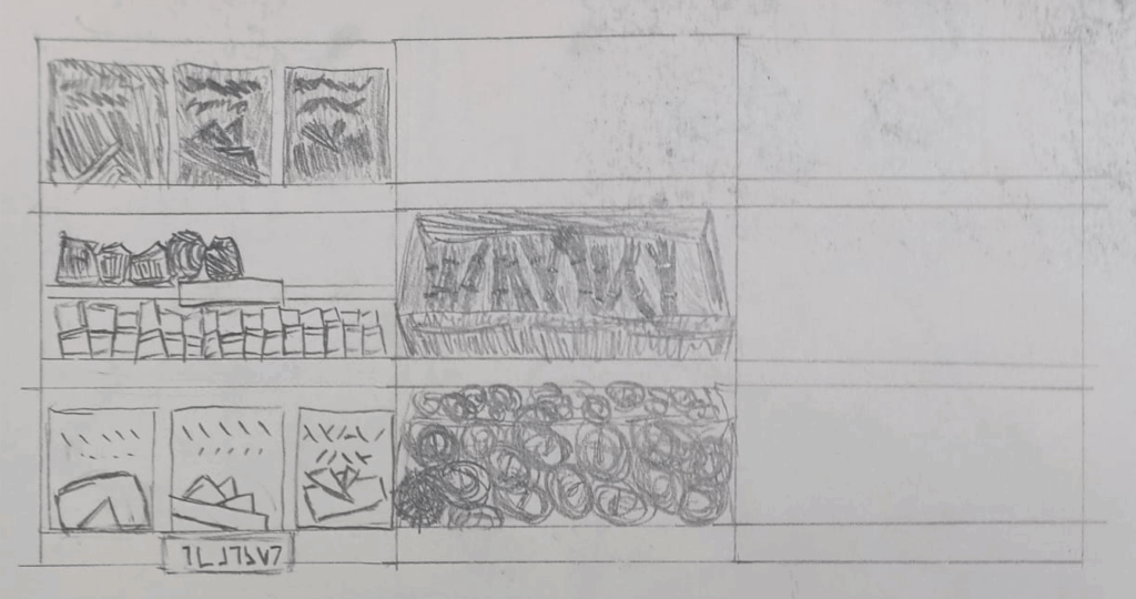
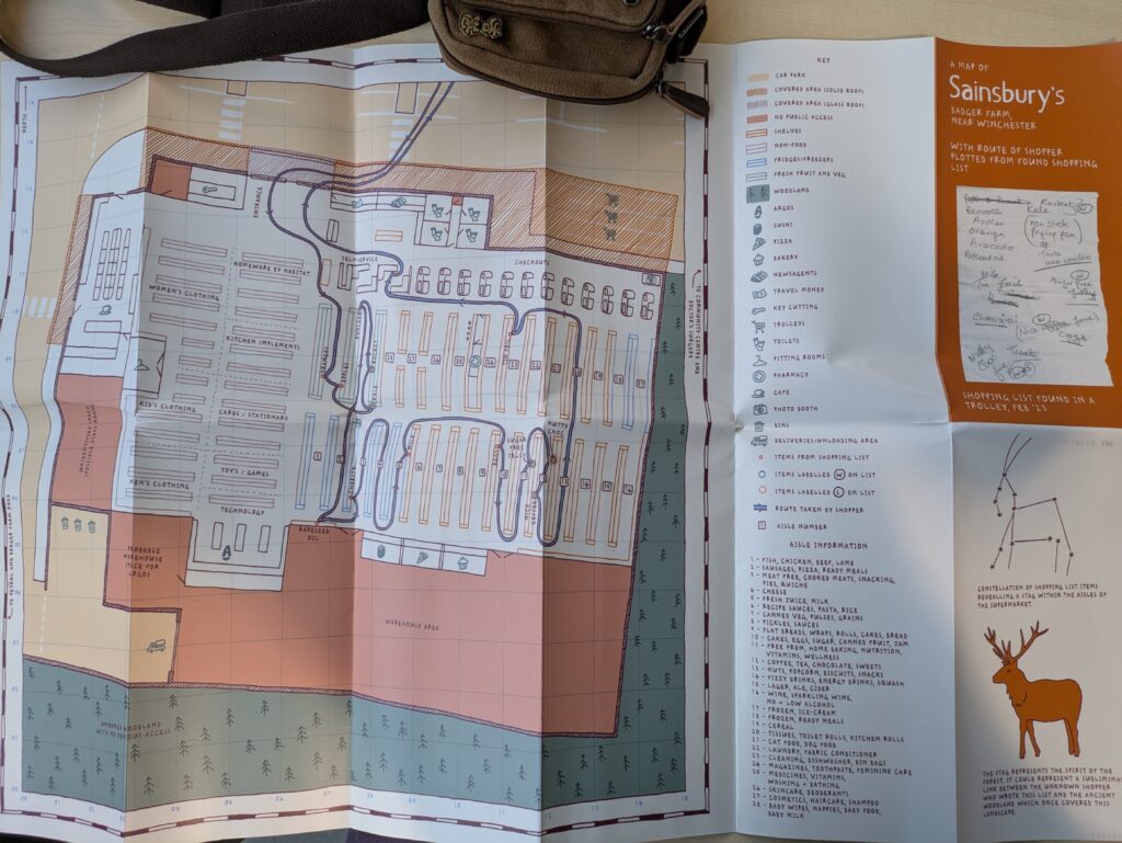
While doing primary research of supermarkets, I went to the WSA library and found this layout map of a Sainsbury’s near Winchester through the recommendation of a librarian.
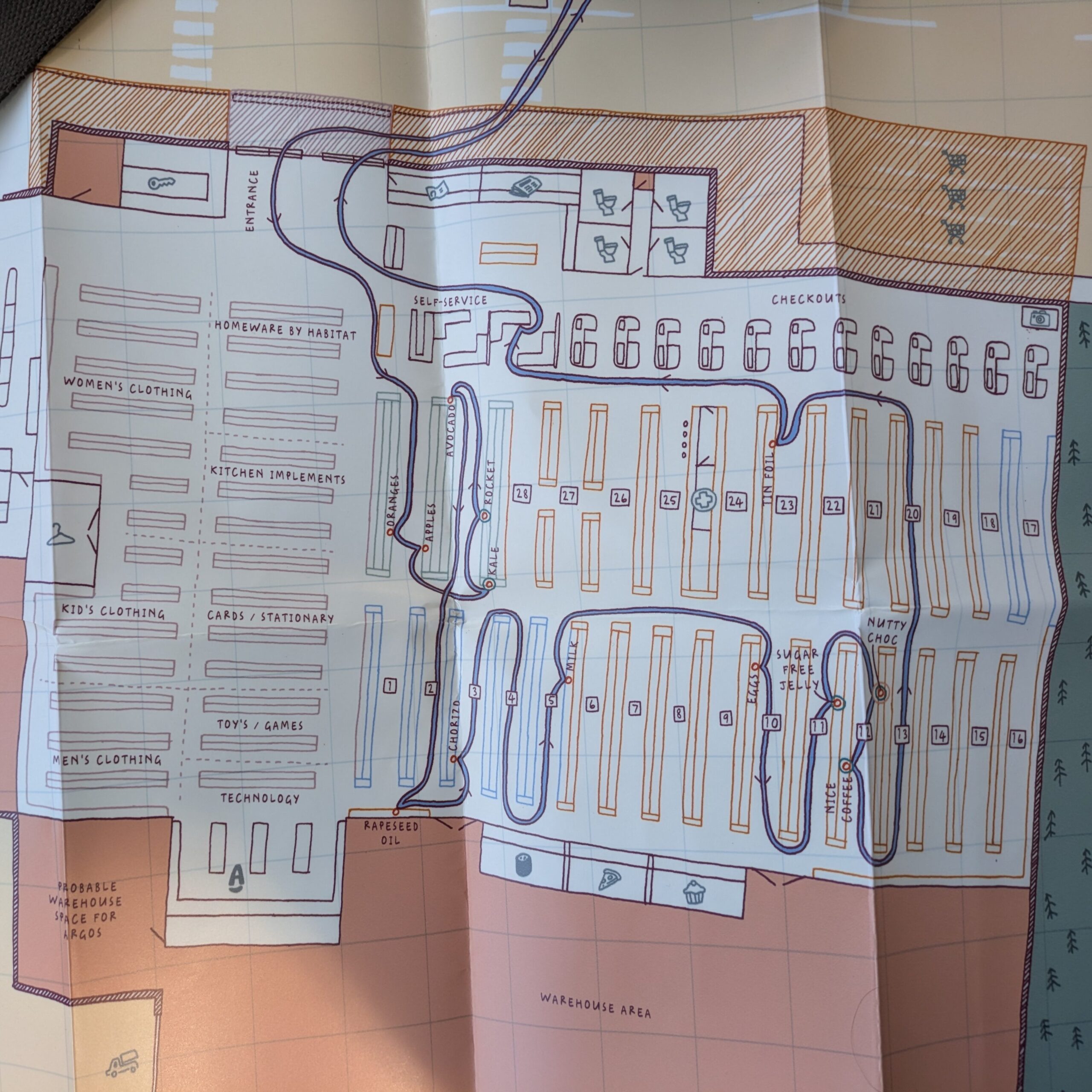
This map served as a great example and lended me a greater understanding of how a supermarket’s overall composition may look like.
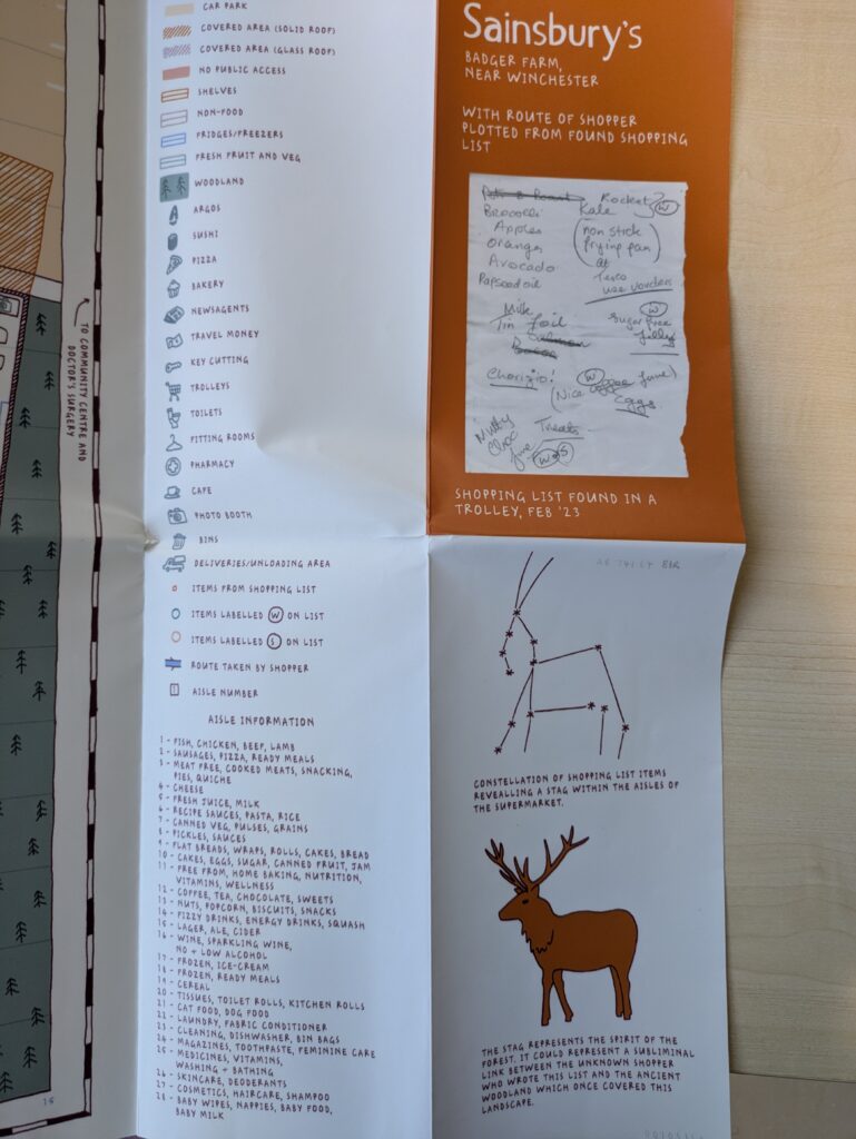
Some things I extrapolated from the map are that supermarkets have repetitive, blocky formations, have their entrance & exits besides one another and more importantly, are usually segmented into two or more areas.
This first, simple layout was to act as a prototype
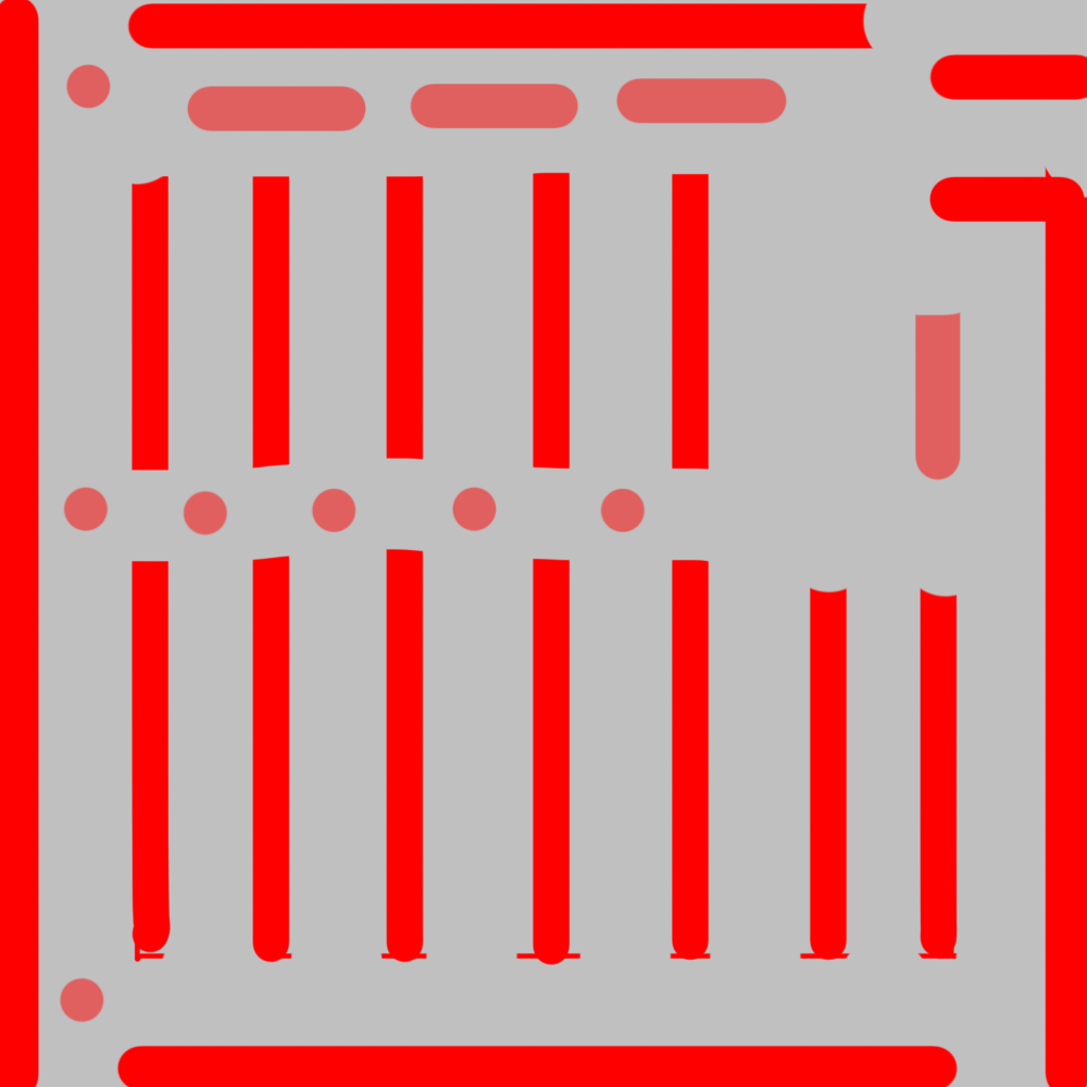
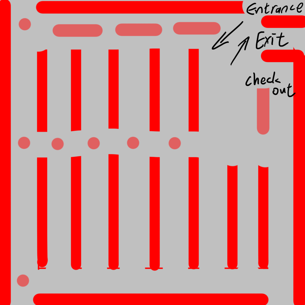
I made a rough graybox of this 1st prototype to get a feel on it
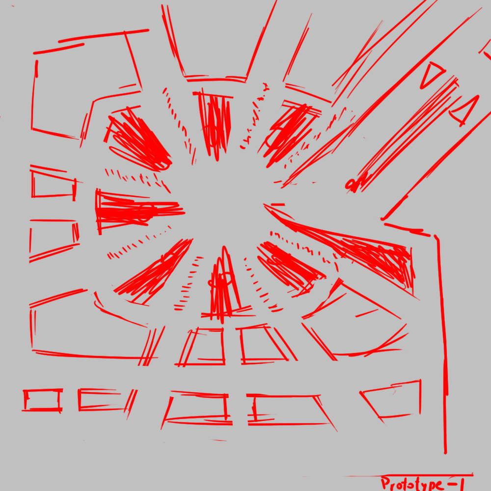
The design intention around this layout is to make the level as confusing and repetitive as possible, so the player cannot eaily dissern where they are and would have to use ulterior methods to navigate like a map or signs.
I showed this 2nd prototype to my teammates and they believed something more similar to the 1st prototype would fit the game better.
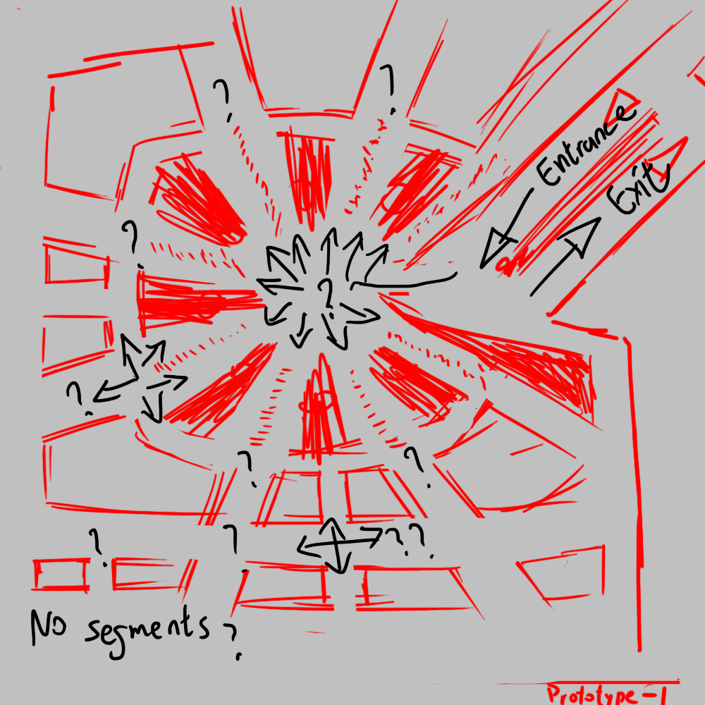
The 3rd iteration was mostly an experiment, which paved way for the 4th ‘final’ iteration. Here I experimented on how the level’s ‘sight lines’, pathing etc.
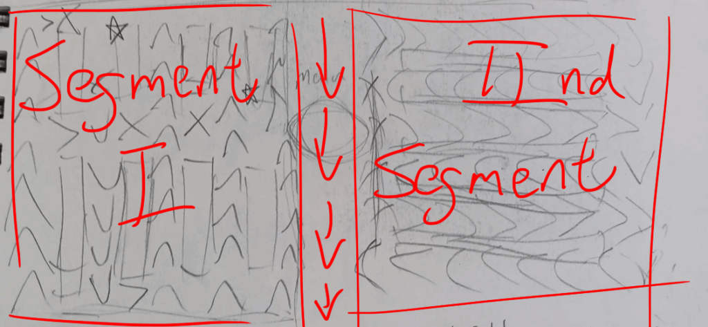
In both the 3rd & 4th iterations, I leaned into segmenting the supermarket for better player readability
For this iteration, which ended up as the blueprint for what we’d build in UE5, I made it much more technical. These labels represent points on the level which serve an important function.
From top to bottom, we have
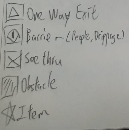
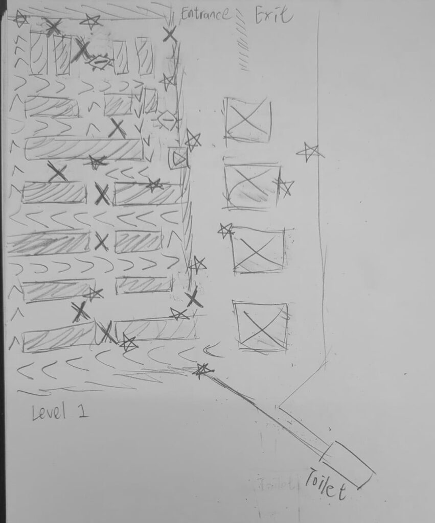
The toilet at the bottom right corner is for a mechanic which ‘heals’ the player from the ‘damage’ enemies deal. (Terminology different in game) Enemies can be placed accordingly after the level is made.
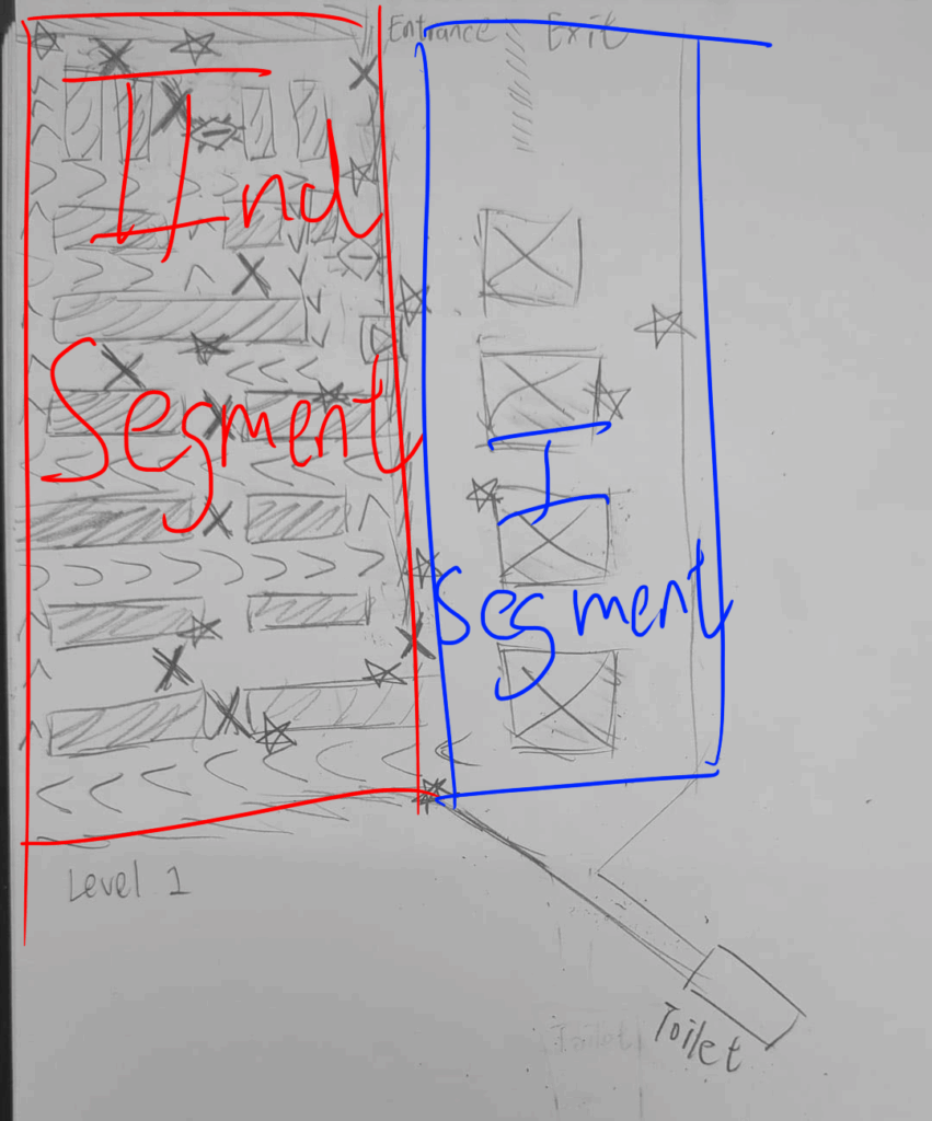
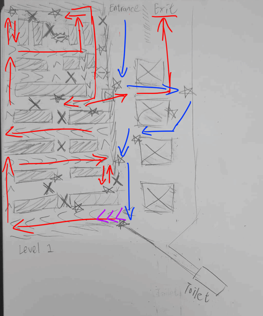
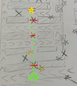
As the annotated maps above display, the level is separated into two distinct segments. Segment 1 being a more free and open area while Segment 2 leads the player through a tight space.
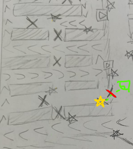
The further annotated map below displays the Sightlines from one item to another in green, Items being yellow stars. Bright red perpendicular lines represent Sightlines which cannot be directly walked to due to See Through Obstacles
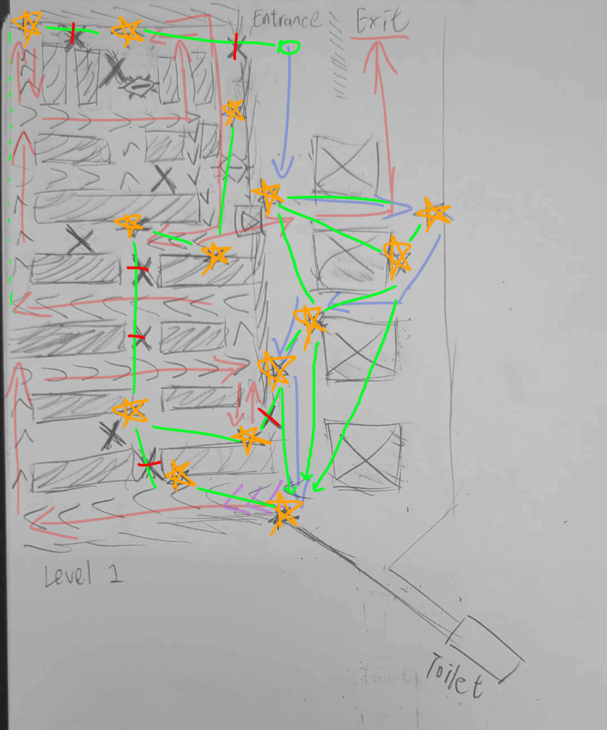
The intent is to always allows players a line of sight to their next objective/Item. However especially in Segment 2, a direct path towards those Items are blocked by See Through Obstacles to force players to explore and navigate.
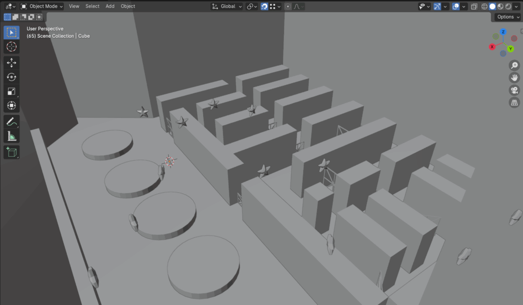
I created a graybox level in Blender using 4th iteration as a blueprint. It was intended for the Week 8 playtest but wasn’t used.
We recreated it weeks later in UE5 with textured assets
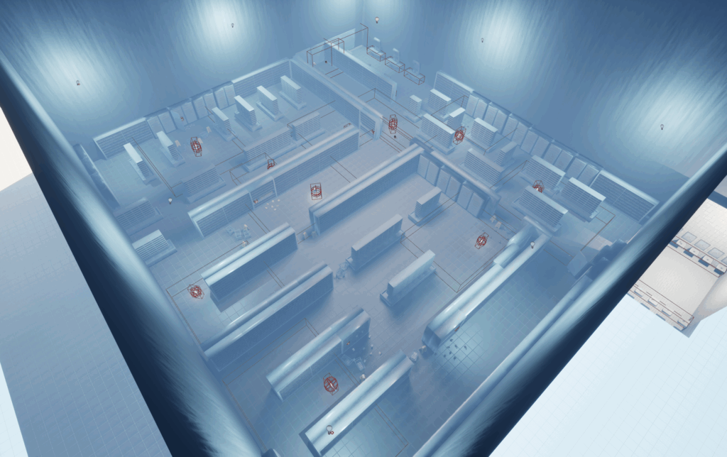
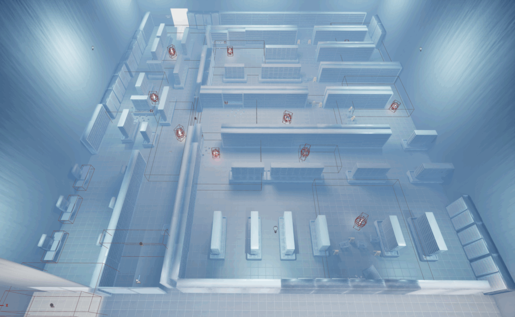
Below are examples of the Sightlines in affect.
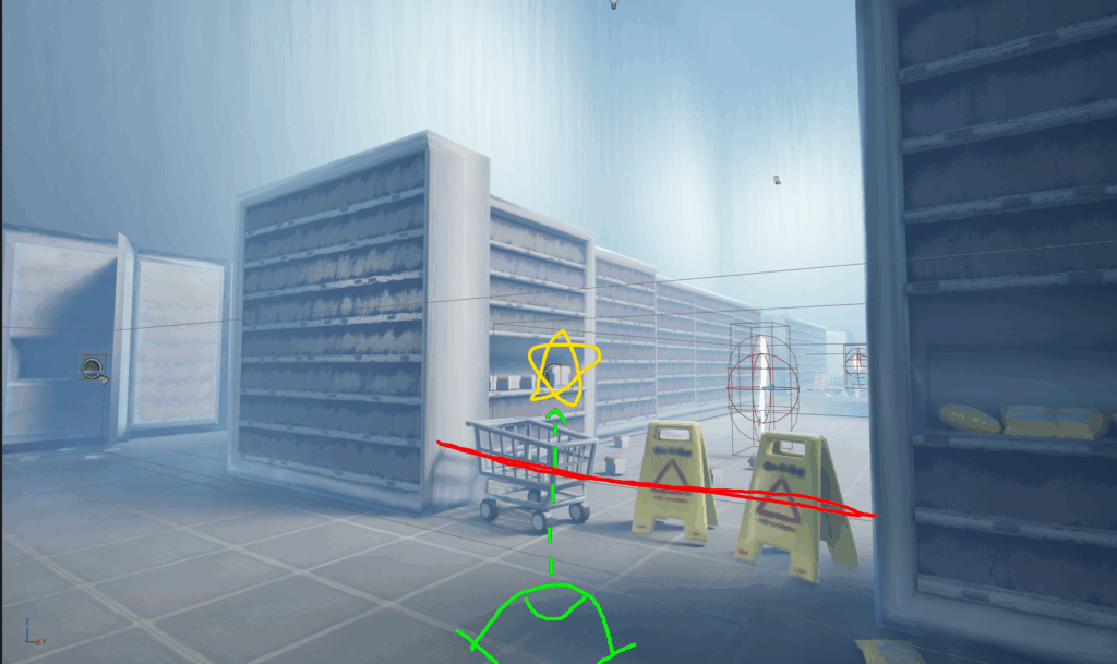
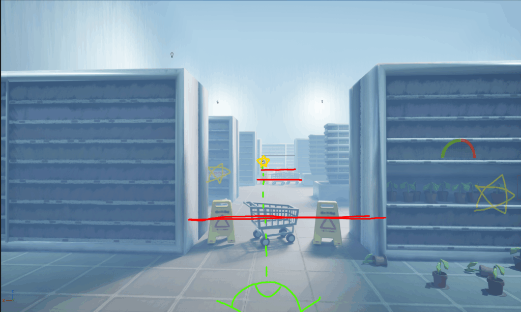
For the home apartment & bathroom of the protagonist, I just tried to make their layouts simple & easy to navigate.
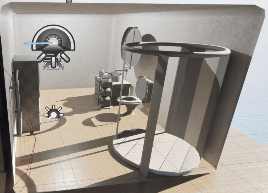
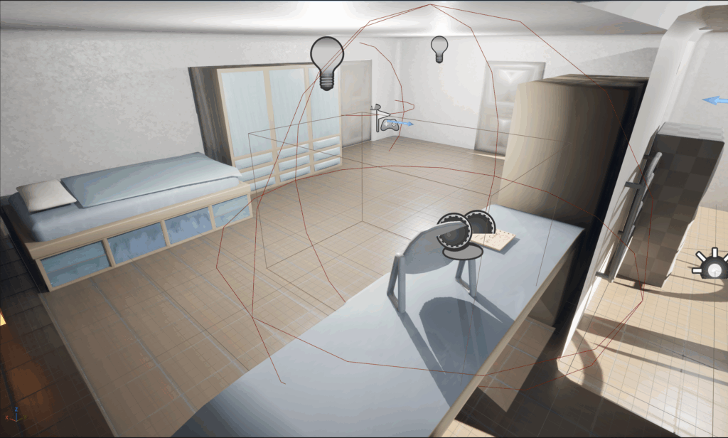
For the Supermarket toilet, we ended up with another look.
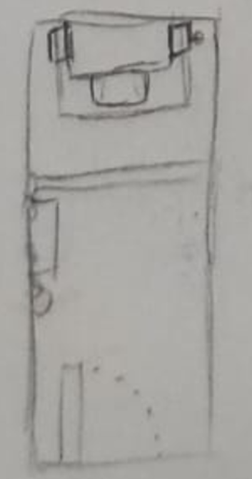
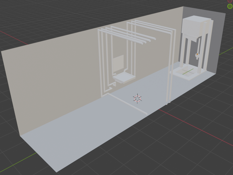
I hadn’t ever really touched pixel art aside from Minecraft skins, but for this GGJ, our team of 4 decided on a pixel art looking theme as we had less than 3 days and I took the role of Character Artist / Designer.
The GGJ theme was masks and we decided to base our platforming game around infiltrating a demon masquerade with a medieval gothic theme.
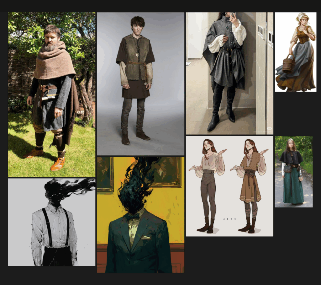
I started with a mood / reference board assembled on Pinterest.
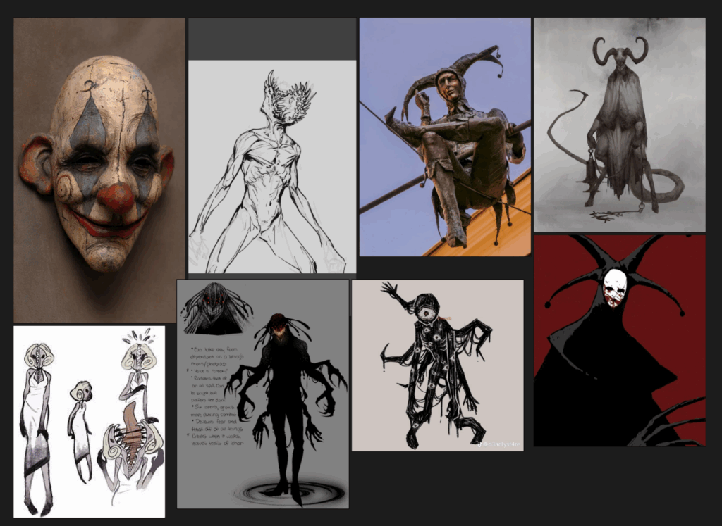
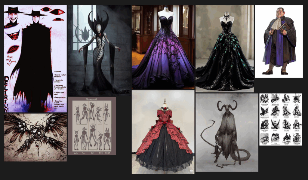
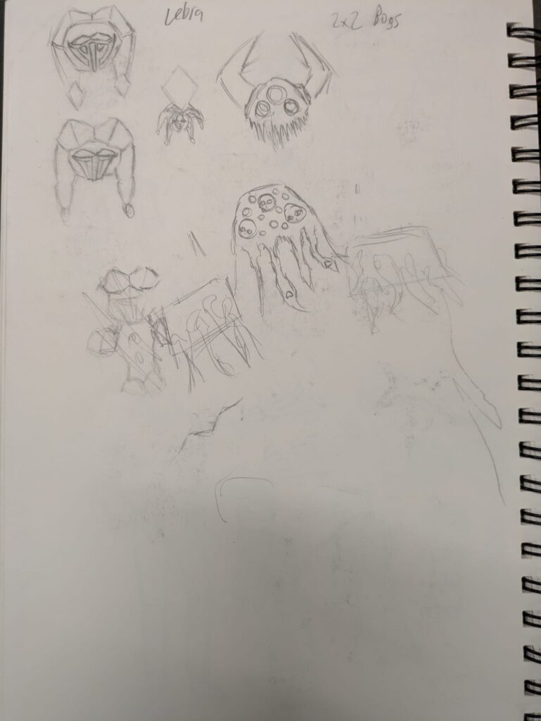
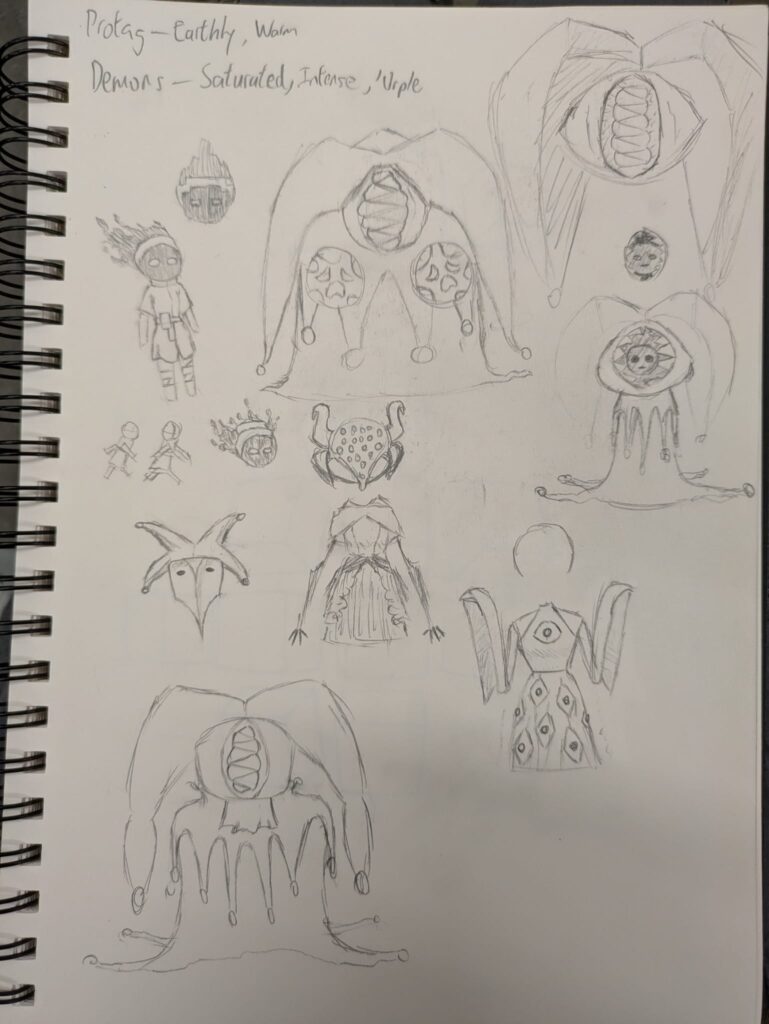
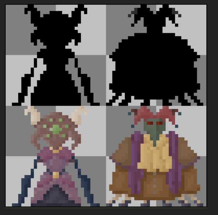
I then made character sprites based on the sketches. I was informed that making rough silhouettes of the characters first would help with their readability and the advice was vital.
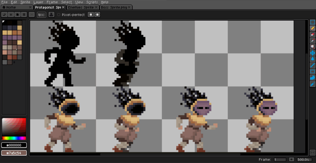
For the protagonist / player character, I made a simple animation + masked variant for them. The story, although unexplained in game due to time constraints, is that the protagonist got their face stolen by a face stealing demon and has to infiltrate a demon masquerade to get their face back from it.
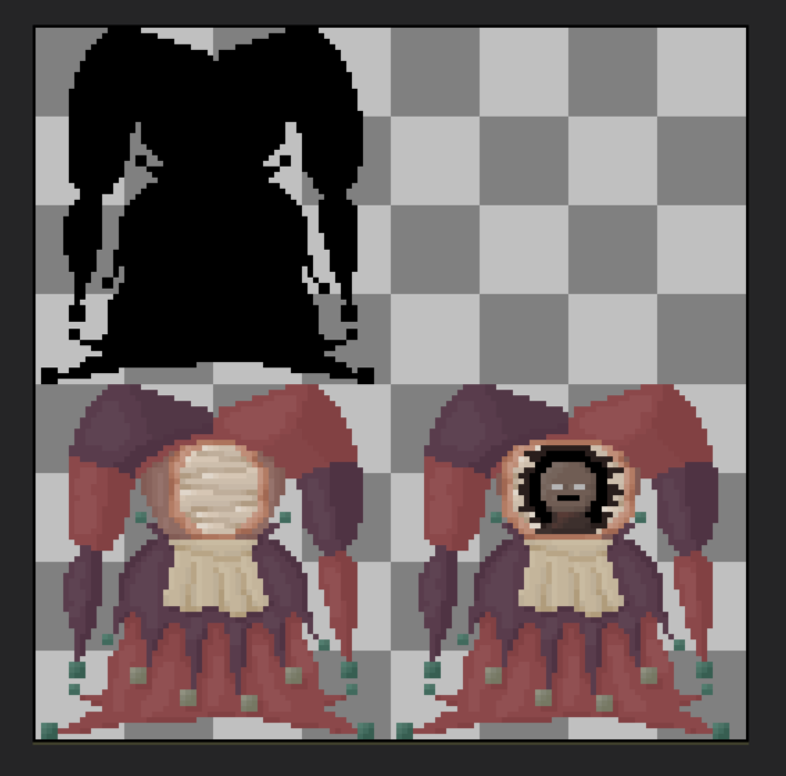
Demons are invisible unless when a mask is worn, but when the mask is worn the player cannot see the platform they’re standing on.
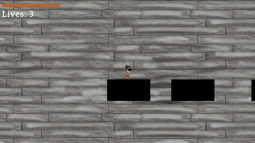
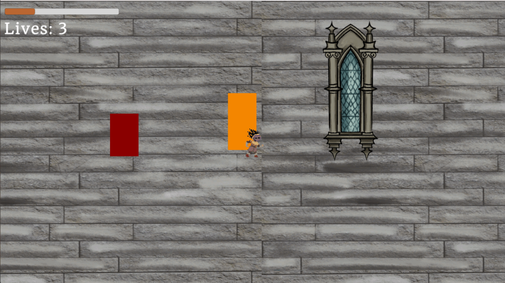
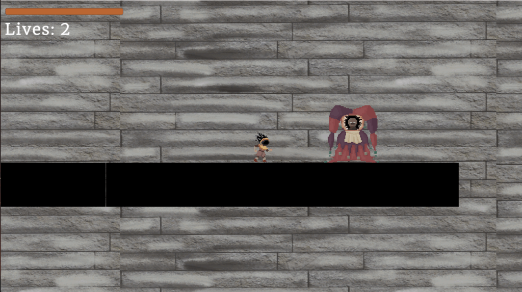
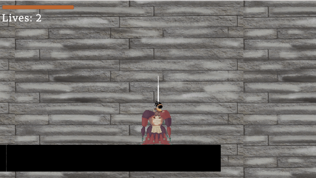
Screenshots of the final game: