I started off by extrapolating Maria’s Scopophobia GDD, mainly the Art bible section.
Here are some cropped screenshots from the Art bible which especially inspired me
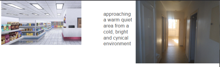
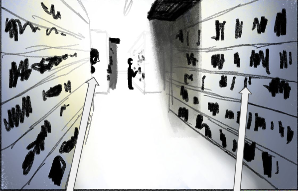
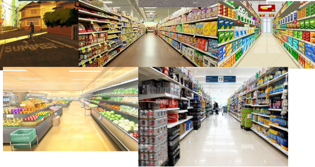
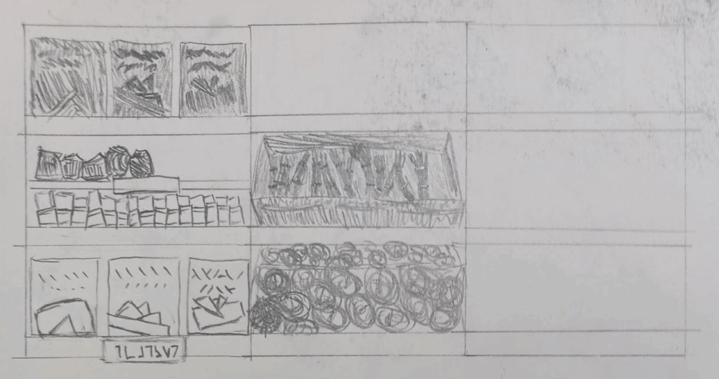
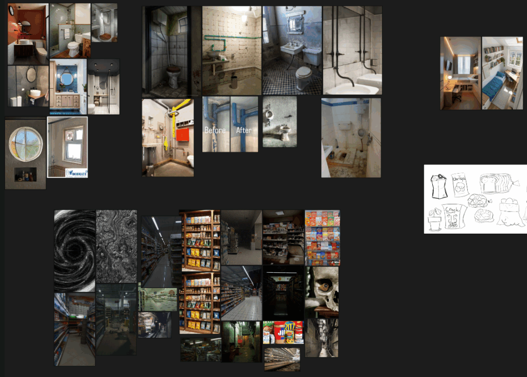
From Maria’s GDD, I was inspired to make this reference/mood board assembled mostly from Pinterest. I believe it conserves some of Maria’s vision on the game, while allowing me to express my own style onto it.
I tried to coordinate with our character designer & artist Junhwan with maintaining a cohesive artstyle, but my approach left a lot to be desired, even if the end result of both our works doesn’t clash.
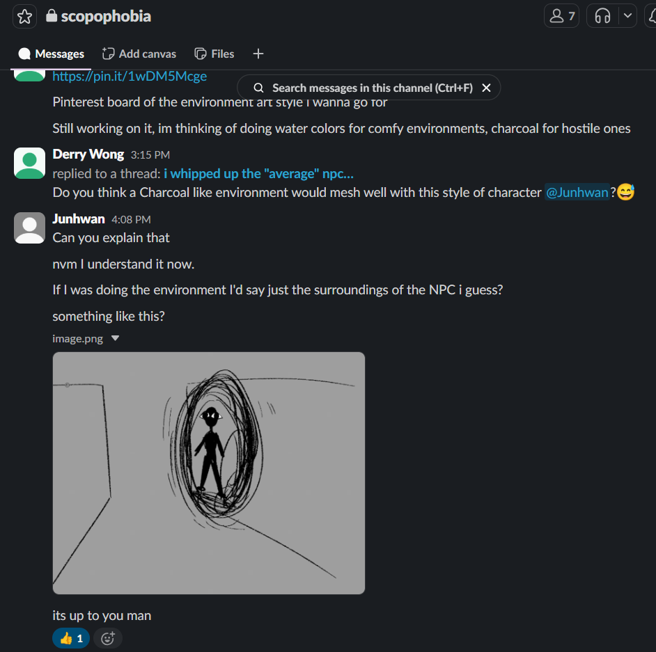
I didn’t really share much of my analysis of Maria’s Art bible with Junhwan, merely sharing surface level decisions through Slack.
I tried to use shape theory & a sense of scale to separate the safe space of the Home Apartment & the scopophobia inducing environment of the Supermarket. In terms of shape theory, I tried to add more rounded elements & a literal circle motif to the safe spaces, while adding more sharp edges in the scopophobic areas.
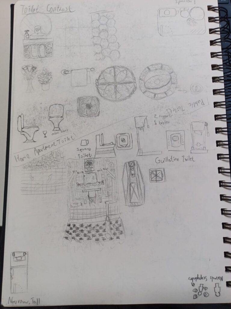
In terms of scale & proportion, I decided to make the safe spaces’ models rather realistically proportioned to induce a sense of familiarity and thus safety. Inversely for the scopophobic Supermarket, I decided that scaling everything to a larger size helped with inducing a sense of otherness, offput and thus unease. It helps makes the supermarket feel like a place you don’t belong in, something which people with scopophobia feel in such a crowded place.
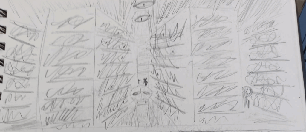
The above also reflects on the use the watercolours & charcoal, where watercolours might be more rounded & soft, while charcoal may be more sharp & hard. I textured the Home Apartment with mostly water coloured textures to suggest safety while texturing the Supermarket with charcoal textures to suggest the feelings a phobia would bring.
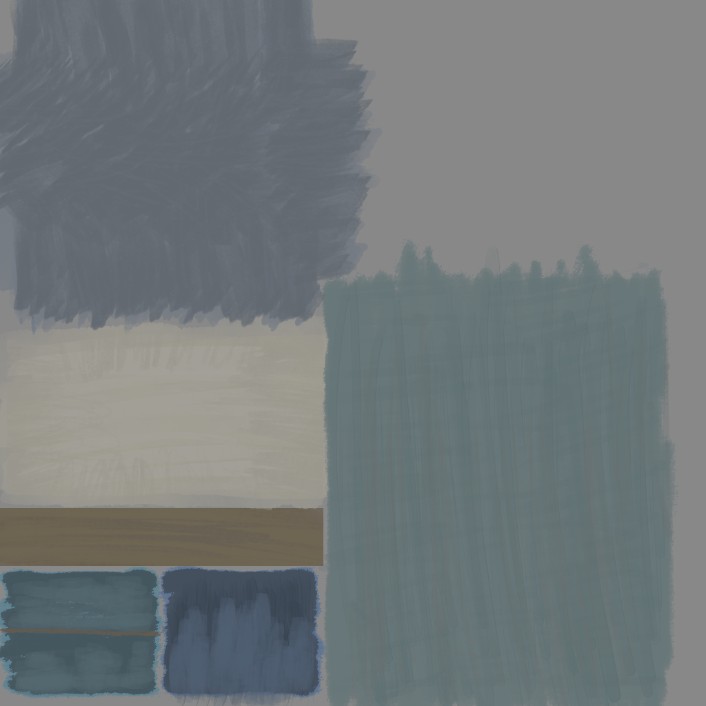
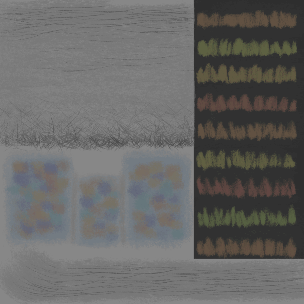
I had originally wanted to try and dedicate an eye-motif to my model’s textures, however later due to time constraints, I seldom committed to that aside from objects like the checkout.
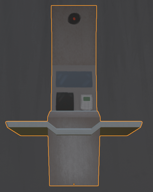

I decided to keep my models low polygon and simple, reserving detail for more important objects.
Leave a Reply