Book(s)
Johnson, G. (2019). Developing Creative Content for Games. CRC Press.
I started off by extrapolating Maria’s Scopophobia GDD, mainly the Art bible section.
Here are some cropped screenshots from the Art bible which especially inspired me
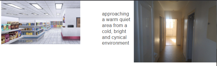
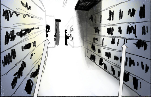
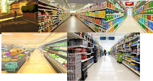
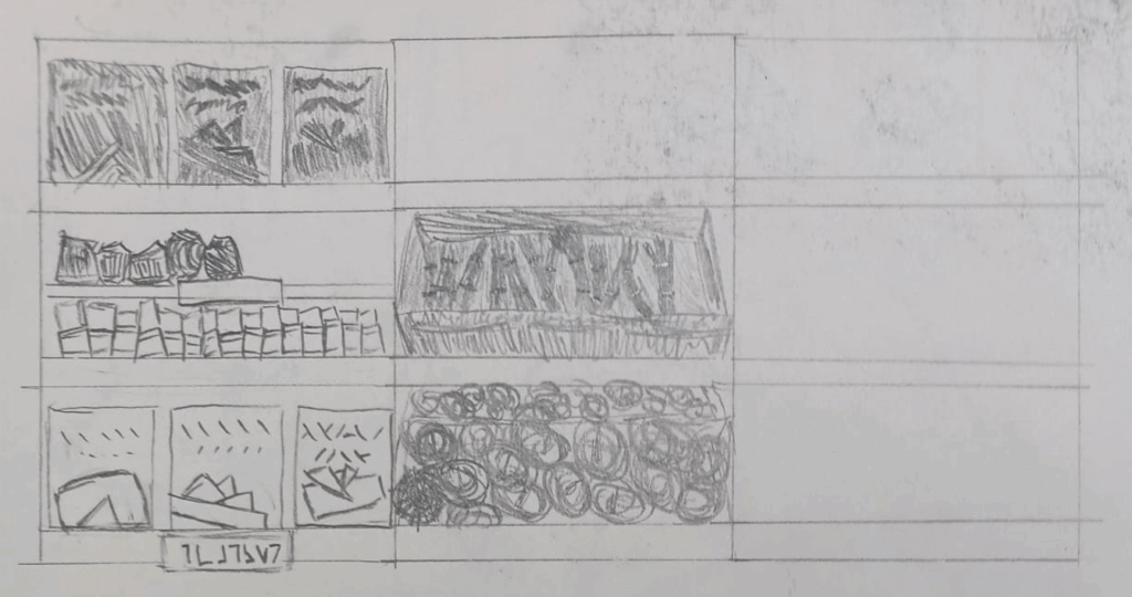
From Maria’s GDD, I was inspired to make this reference/mood board assembled mostly from Pinterest. I believe it conserves some of Maria’s vision on the game, while allowing me to express my own style onto it.
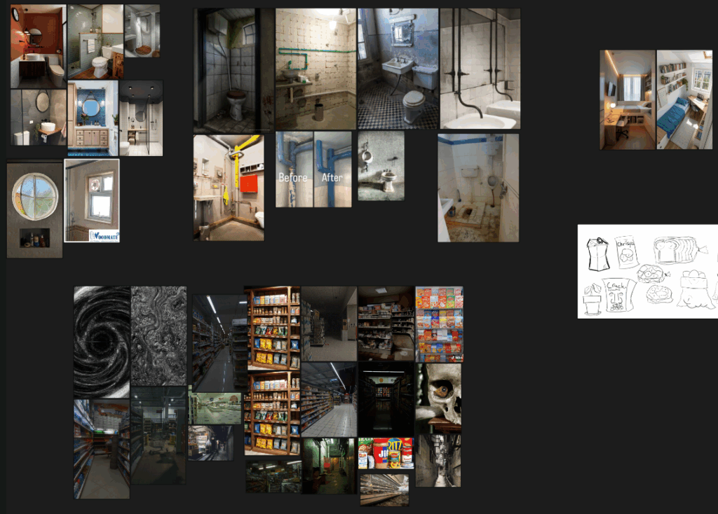
I tried to coordinate with our character designer & artist Junhwan with maintaining a cohesive artstyle, but my approach left a lot to be desired, even if the end result of both our works doesn’t clash.
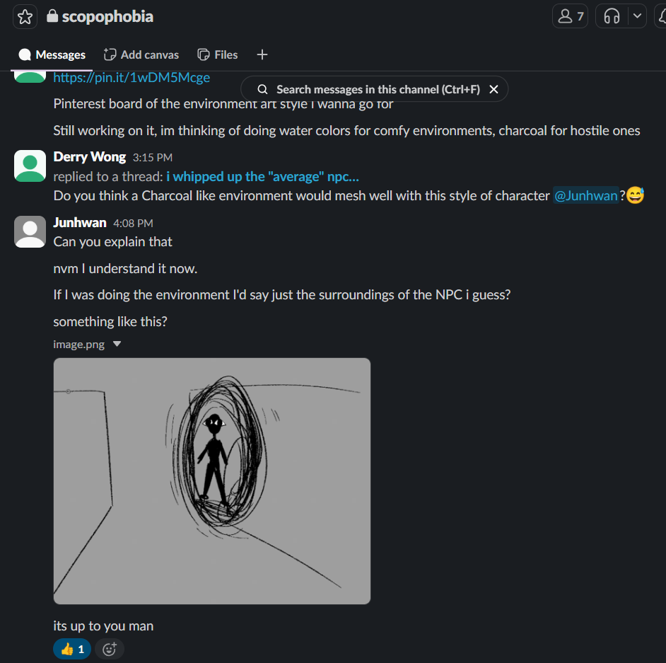
I didn’t really share much of my analysis of Maria’s Art bible with Junhwan, merely sharing surface level decisions through Slack.
I tried to use shape theory & a sense of scale to separate the safe space of the Home Apartment & the scopophobia inducing environment of the Supermarket. In terms of shape theory, I tried to add more rounded elements & a literal circle motif to the safe spaces, while adding more sharp edges in the scopophobic areas.
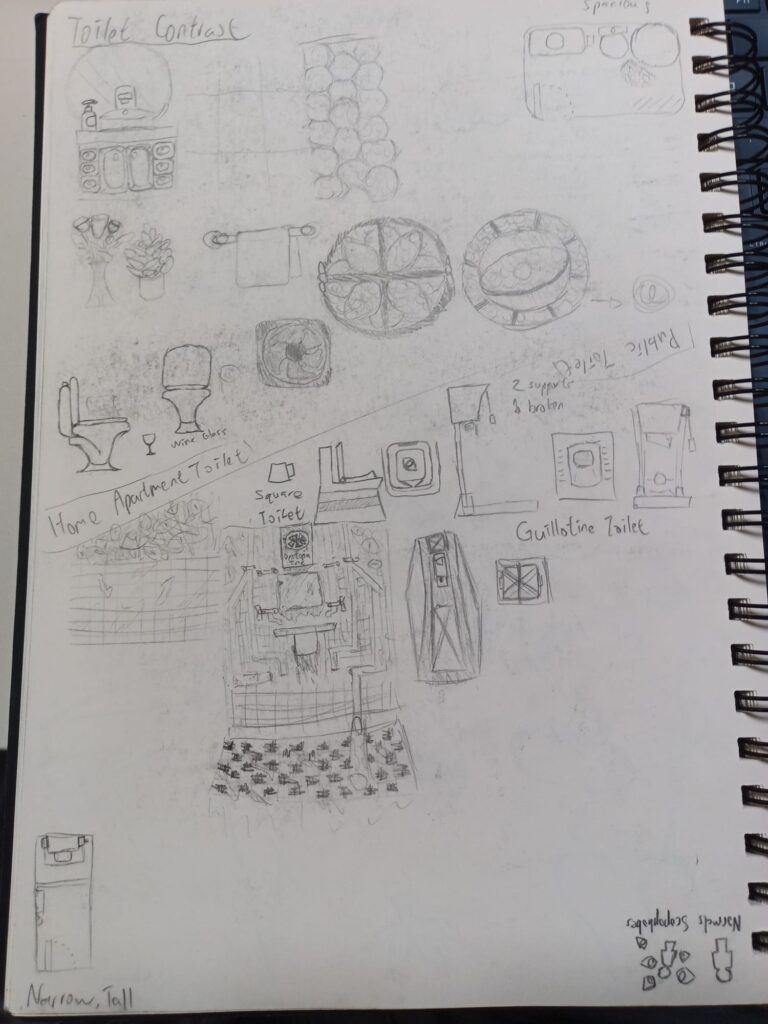
In terms of scale & proportion, I decided to make the safe spaces’ models rather realistically proportioned to induce a sense of familiarity and thus safety. Inversely for the scopophobic Supermarket, I decided that scaling everything to a larger size helped with inducing a sense of otherness, offput and thus unease. It helps makes the supermarket feel like a place you don’t belong in, something which people with scopophobia feel in such a crowded place.
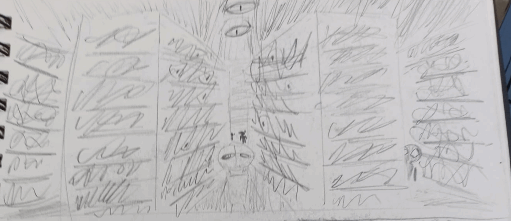
The above also reflects on the use the watercolours & charcoal, where watercolours might be more rounded & soft, while charcoal may be more sharp & hard. I textured the Home Apartment with mostly water coloured textures to suggest safety while texturing the Supermarket with charcoal textures to suggest the feelings a phobia would bring.
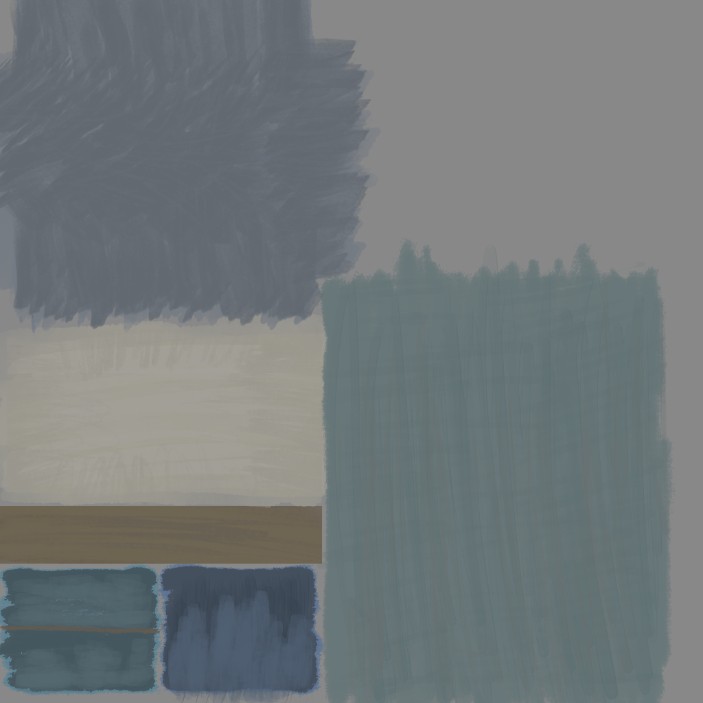
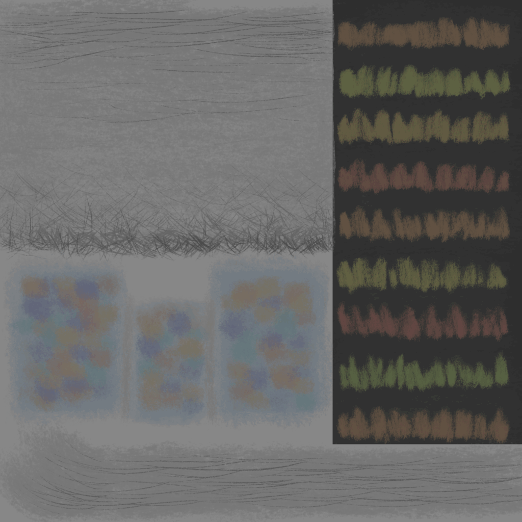
I had originally wanted to try and dedicate an eye-motif to my model’s textures, however later due to time constraints, I seldom committed to that aside from objects like the checkout.
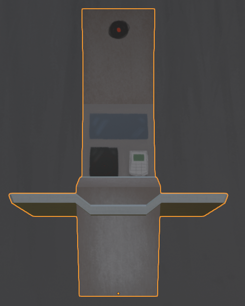

I decided to keep my models low polygon and simple, reserving detail for more important objects.
As the Level Designer & main 3D Artist of Scopophobia, I had to keep track & organise a lot of things.
Something I remember from a previous guest lecture talk is the importance of consistent naming & organisation of assets in game developement.
I didn’t follow this advice well until after I realised I had multiple assets sharing a similar description & name, such as the mirror in the Home Apartment & another mirror in the Supermarket Toilet, for example.
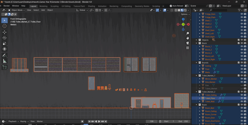
For assets in the Supermarket itself, their names do not reflect their position as Supermarket assets, a mistake which I do not intend to ever repeat. Later on, I decided to organise everything with their location/position, underscore, then their description, underscore again, and finally if needed, their orientation/variation (for ex. left or right, numbered variations etc.)
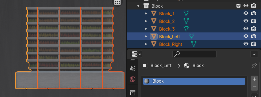
For ‘Block’, since they all share the same material & textures, I simply added “_Colour” and “_Roughness” as an indicator of their status as a base colour/diffuse texture & roughness texture. The material is simply named after the textures without the indicator as it doesn’t need one.

Looking back, I should’ve made an asset sheet too for better organisation & documentation. Here in this project, due to its smaller scale, the number of assets didn’t get out of hand, especially since I was the only one doing 3D modelling, Blender exporting & majority of the UE5 importing. The few assets which were imported by Yushan were highly confusing for both of us.
This post primarily highlights my workflow from Week 9 onwards, wherein i had learnt from the inefficiencies and issues with my prior workflow.
Utilising primary research gathered, Maria’s GDD, a reference/mood board I complied in Pinterest, and sketches inspired by the previously mentioned, I gain a good base/reference to go off of and start my creation process.
Utilising a software recommended by my friend Erik called Pureref, I’m able to overlay references over Blender & Krita, two software which serve as my main tools for the creation of 3D assets.
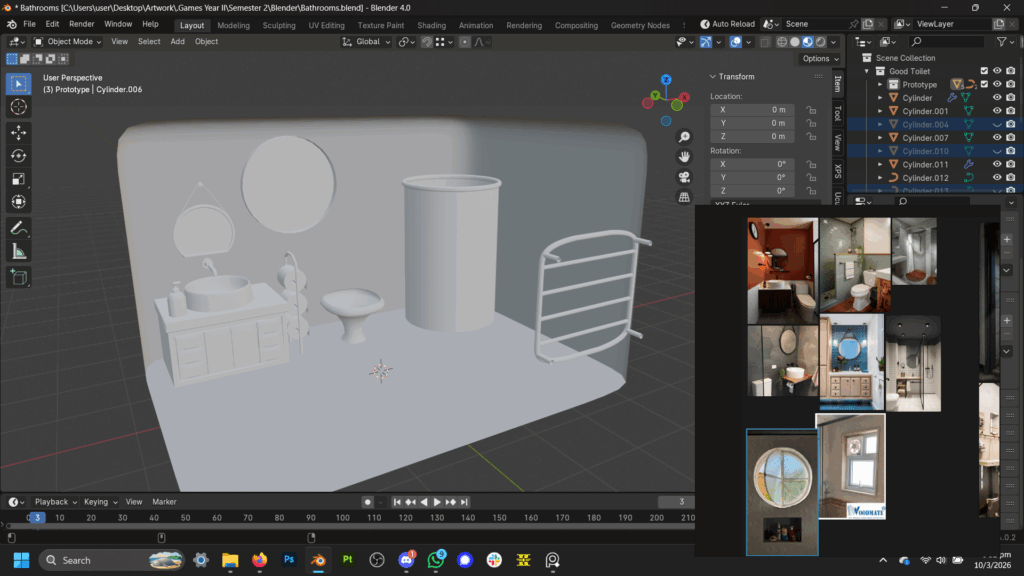
With a references by my side, I start with simple shapes and slowly model them into a desired form. For Scopophobia, since I’m working on environment art I decided to keep my models low polygon and simple, reserving detail for more important objects.
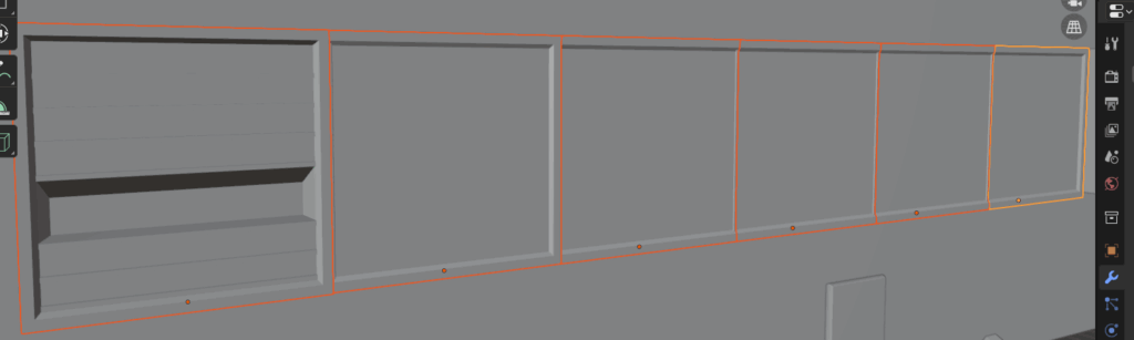
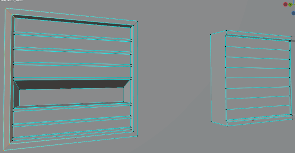
After finalising the shape & form of the model, I UV unwrap it so it may display textures.
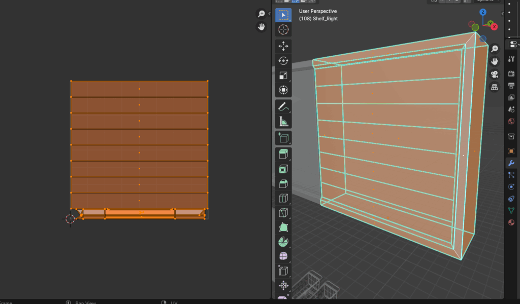
For blockly models like this self, I mainly use the function ‘project from view’ while in a orthographic view at a specific direction.
Afterwards, I take a precise screenshot of the unwrapped model, by the left of the screenshot above, and import it into a new Krita project, sized after the needs of the model.
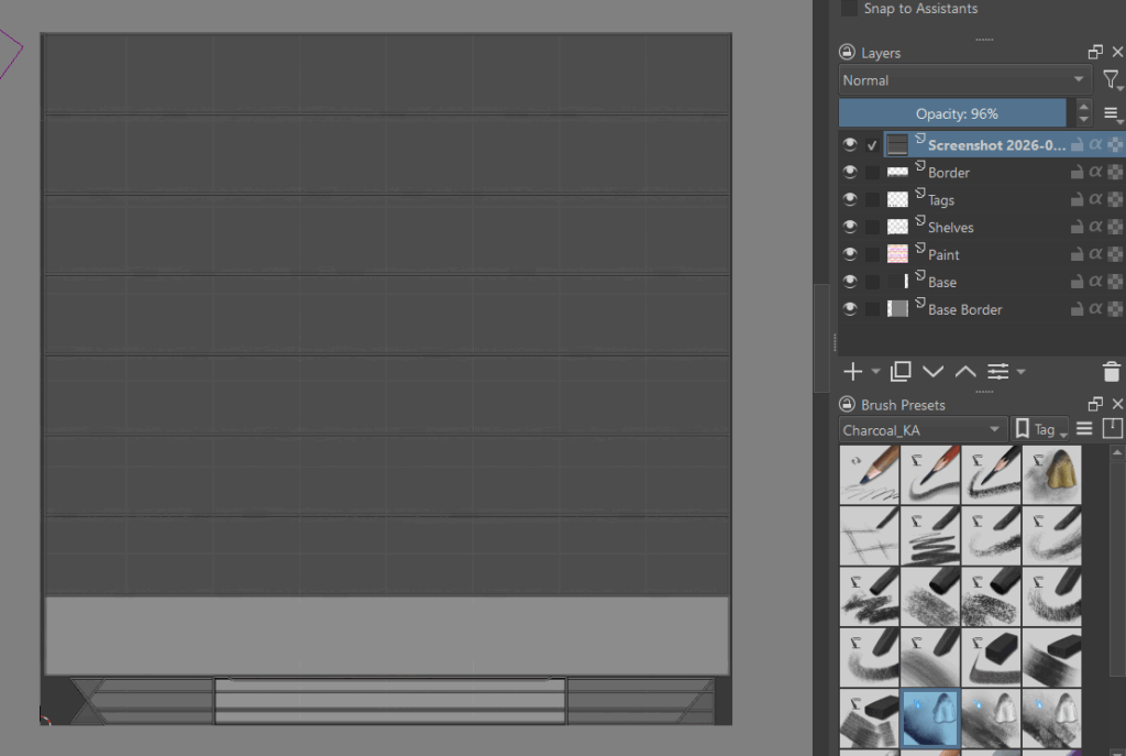
I decrease its opacity and use it as a reference for my digital hand painting, creating a base colour/diffuse texture
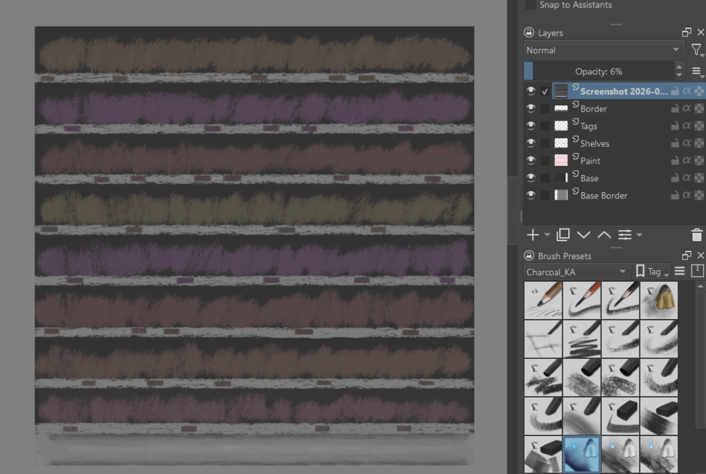
I then duplicate and adjust the saturation & values of the painting, taking advantage of its layers, to create a roughness map.
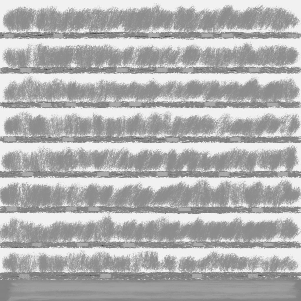
For Scopophobia, I determined just having two textures is enough for most models, base colour and roughness. I do also create metallic maps on occasion to complement roughness textures when they aren’t enough. I also experimented with procedurally generated normal maps using the software Laigtr, recommended to me by a guest speaker, however i did not find the normal textures generated useful.
During the Krita hand-painting process, I utilise a Blender addon named “Auto Reload”, which automatically reloads all texture files connected externally when they are updated/saved.
I saved my Krita projects in the .psd format for compatibility with Auto Reload. This combination allows me to check how my painted textures look in Blender on the model whenever I save the Krita .psd project.
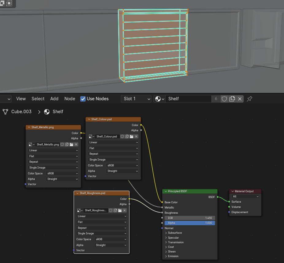
I sometimes create multiple variants of a model so they may not feel overly repetitious, I do this by moving their UVs around so different parts of the texture are projected on the same face.
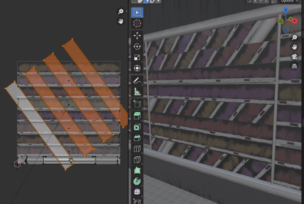
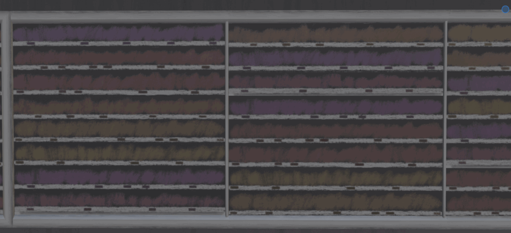
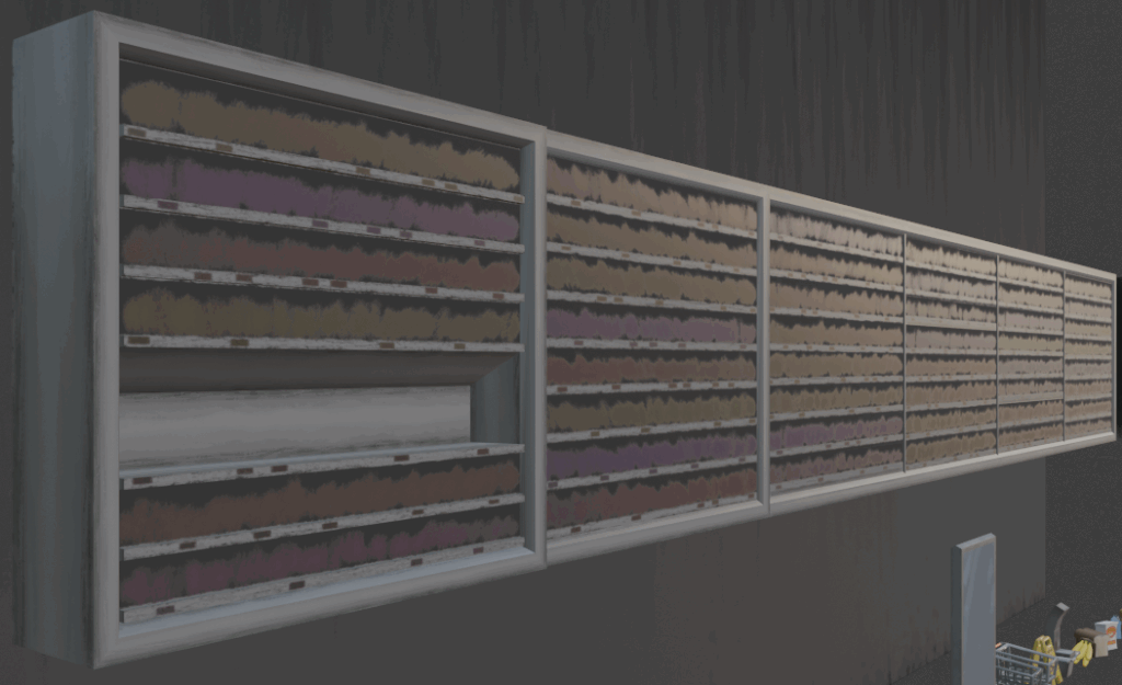
I export the model as a .fbx file from Blender. I then export the textures as .png files from the .psd Krita projects.
Then after, the files or organised into a folder where they are then imported into Unreal Engine 5.
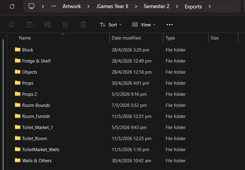
After importing into Unreal Engine 5, I recreate the shading nodes of materials as they are in Blender. I connect the imported .png textures in shading, and connect to finished material onto the imported .fbx models.
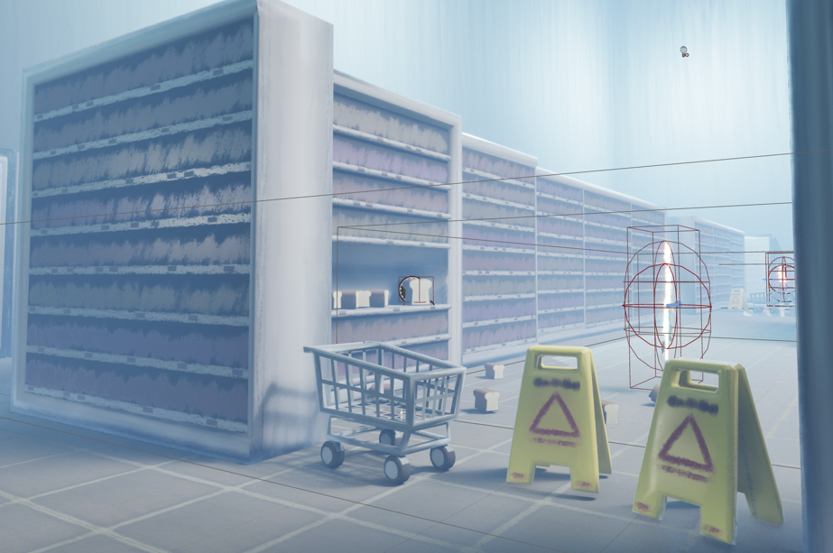
Finally if need be, the model’s collision hitbox is remade to fit the circumstance. Below, the collision hitboxes of the wet floor sign & cart objects are greatly exaggerated to prevent player passage but allow for visibility through them.
I was been designated the Environment Artist of our group project. I decided to also take on the role of Level Designer too.
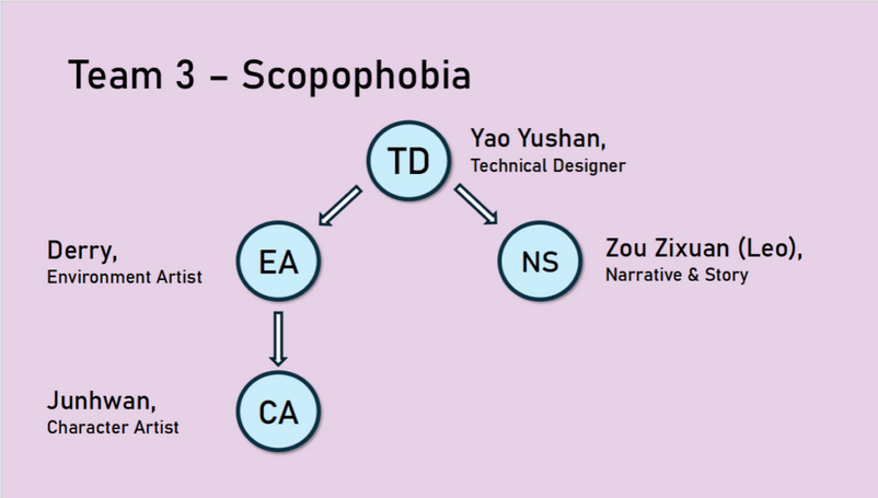
In my research on level design & environment art, I have procured the following findings
From Year 2 Semester 1 Week 4 Level Design Workshop
From 5 Tips for Great Level Design Youtube video:
This was very influential in my 4th ‘final’ iteration of the level layout, although it also serves as a good critique of it despite me attempting to follow its guidance.
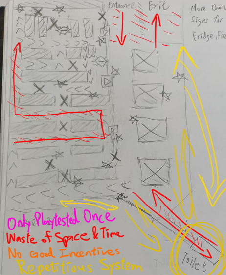
Overall in retrospect, the advice & guidance given by my role research on Level Desgin specifically proved very useful, and specifically helped a lot in elevating my Level Design from the 3rd to 4th iteration, like my intent with Sightlines being inspired by “Having a clear goal”.
Citations
Winchester TK-Max
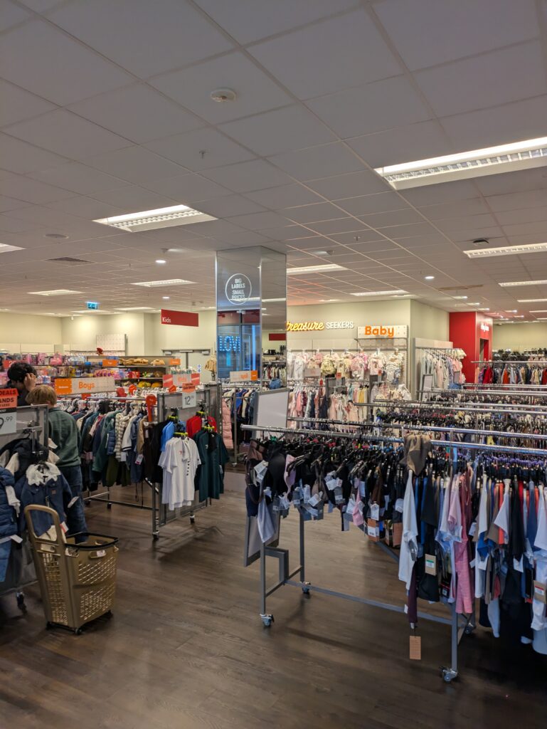
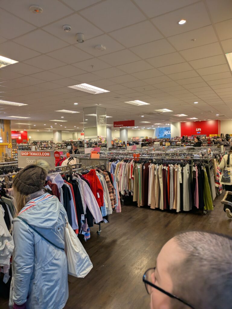
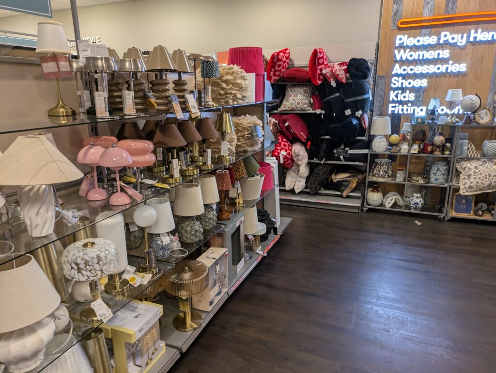
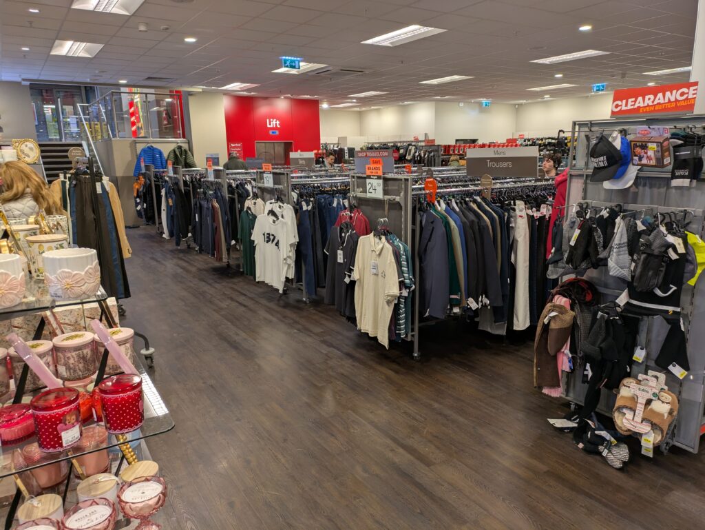
Store located at London Road, Southampton
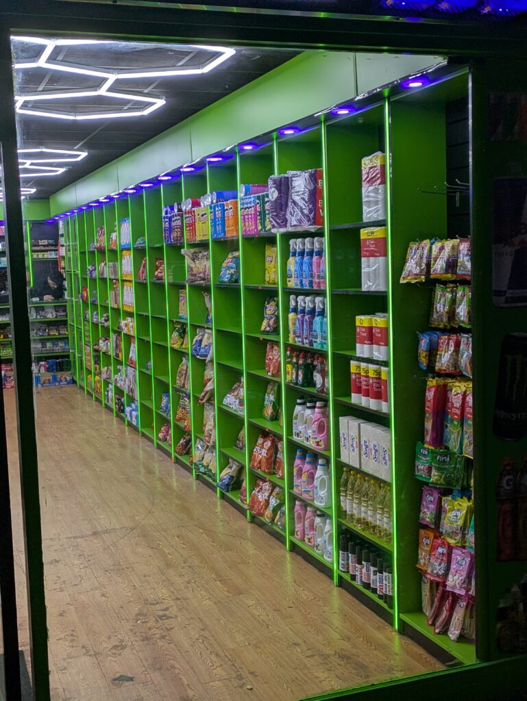
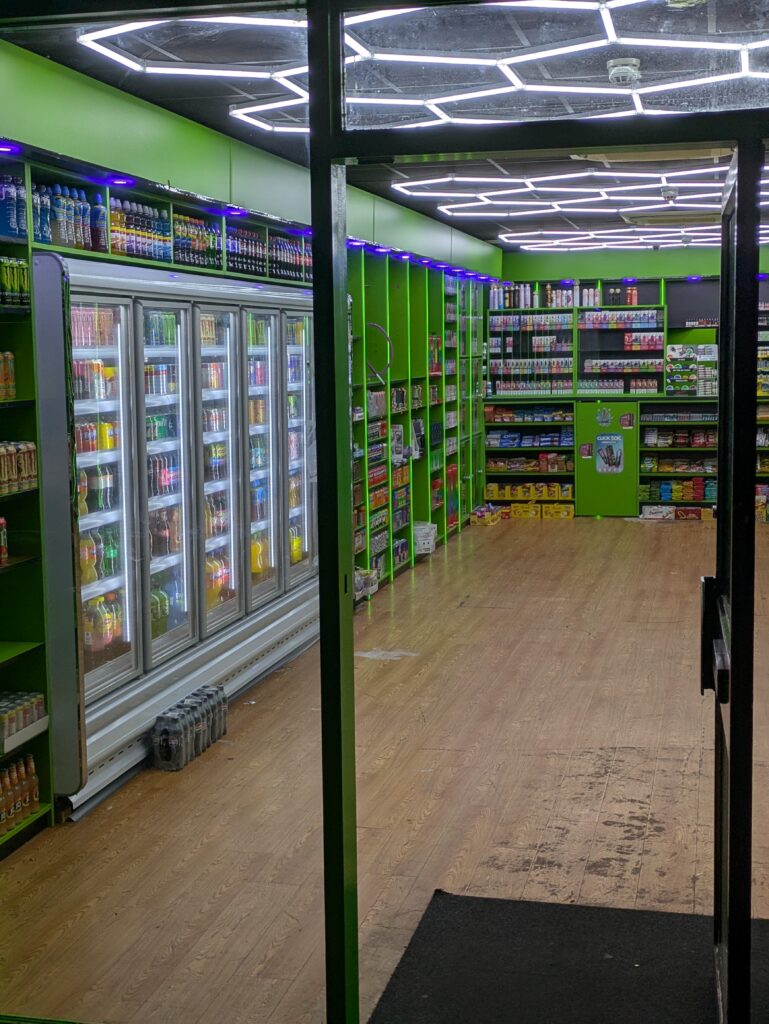
Portswood Aldi
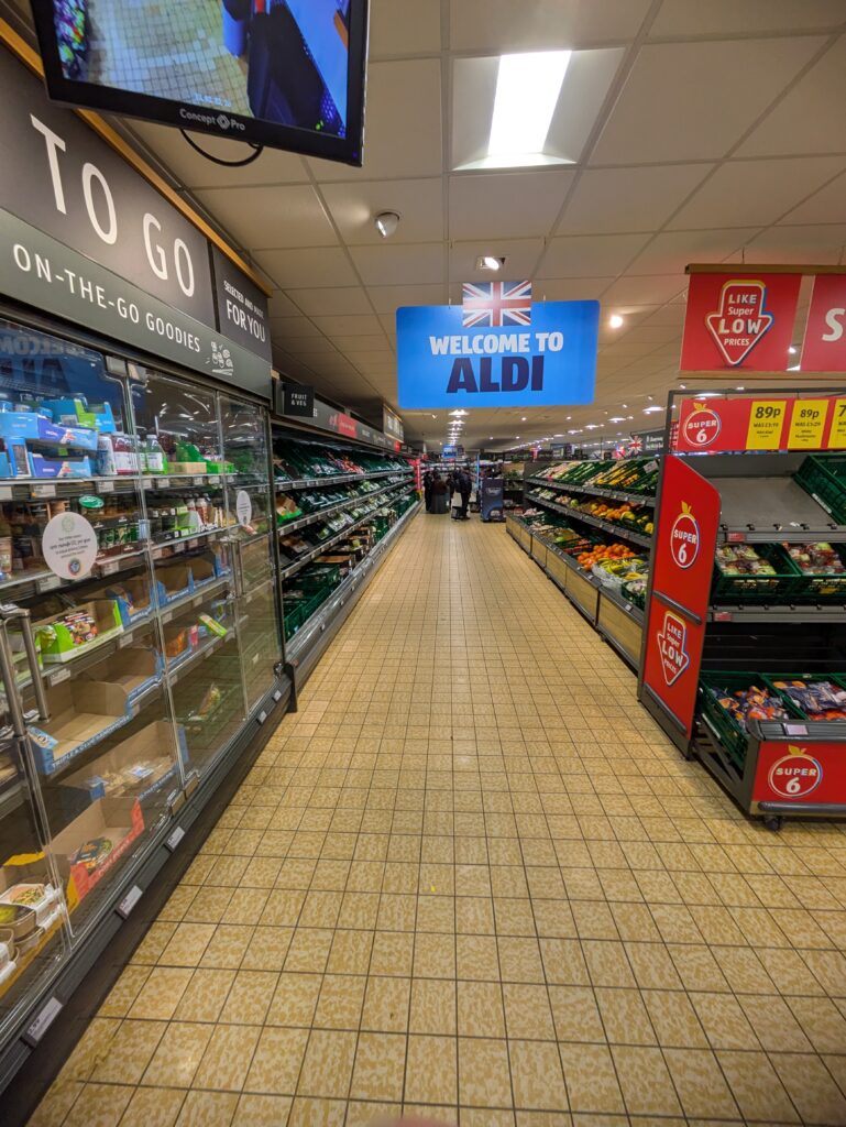
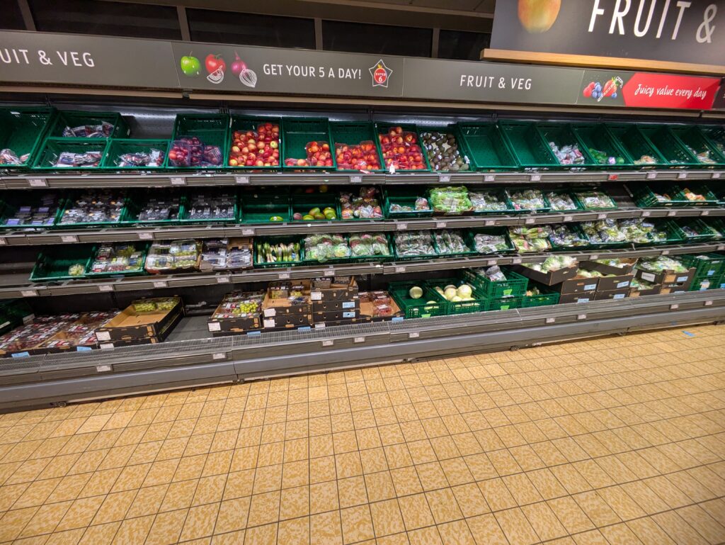
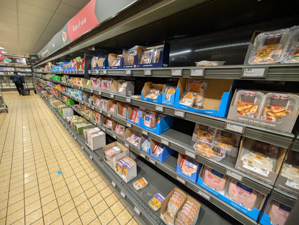
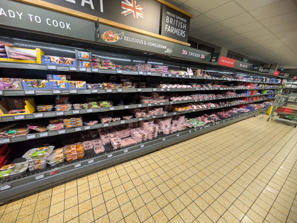
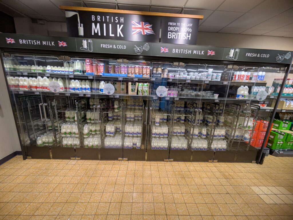
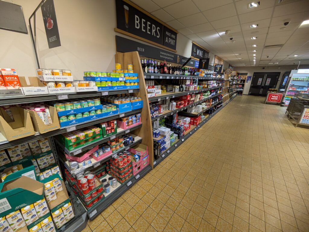
I techincally did lots of ‘research’ at the Portswood Sainsbury’s as I go there every other day for groceries, but I never look any photos… Nevertheless, Portswood Sainsbury’s served as a major inspiration due to my frequent visits there.

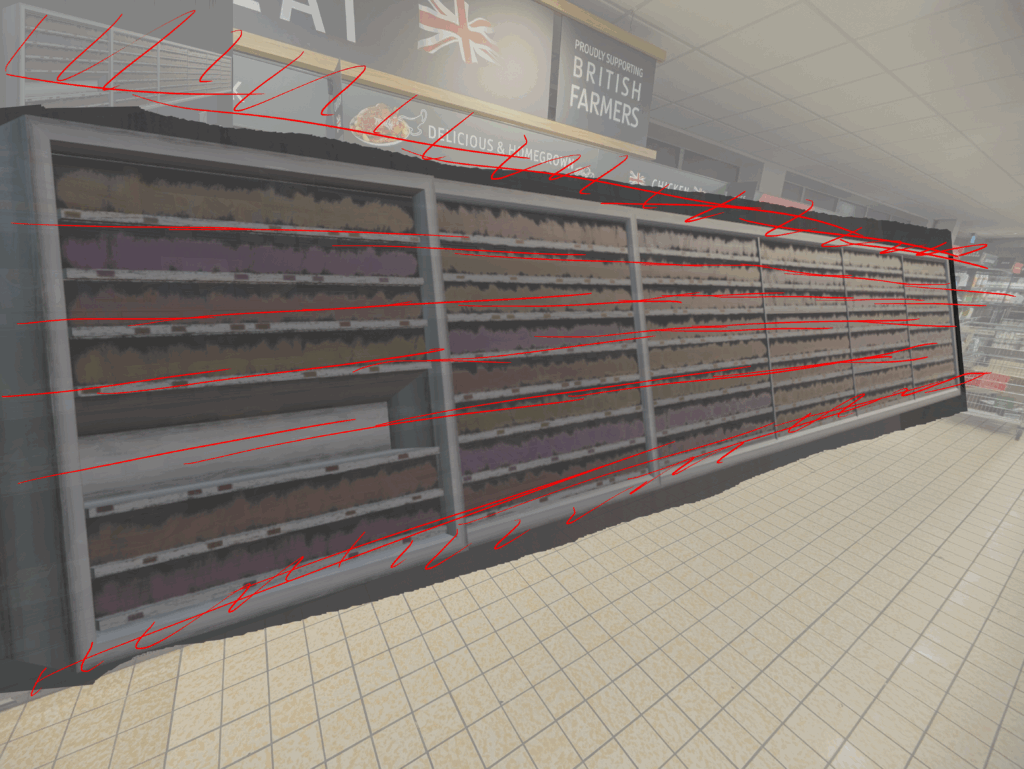
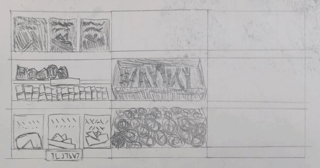
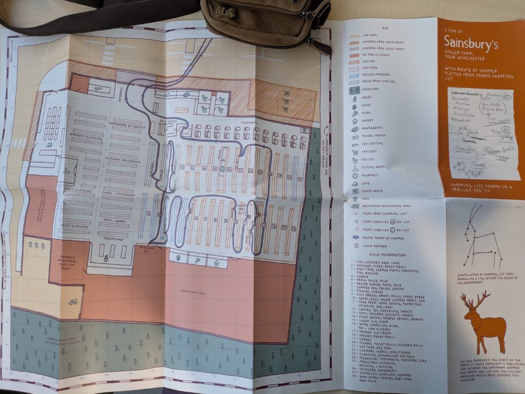
While doing primary research of supermarkets, I went to the WSA library and found this layout map of a Sainsbury’s near Winchester through the recommendation of a librarian.
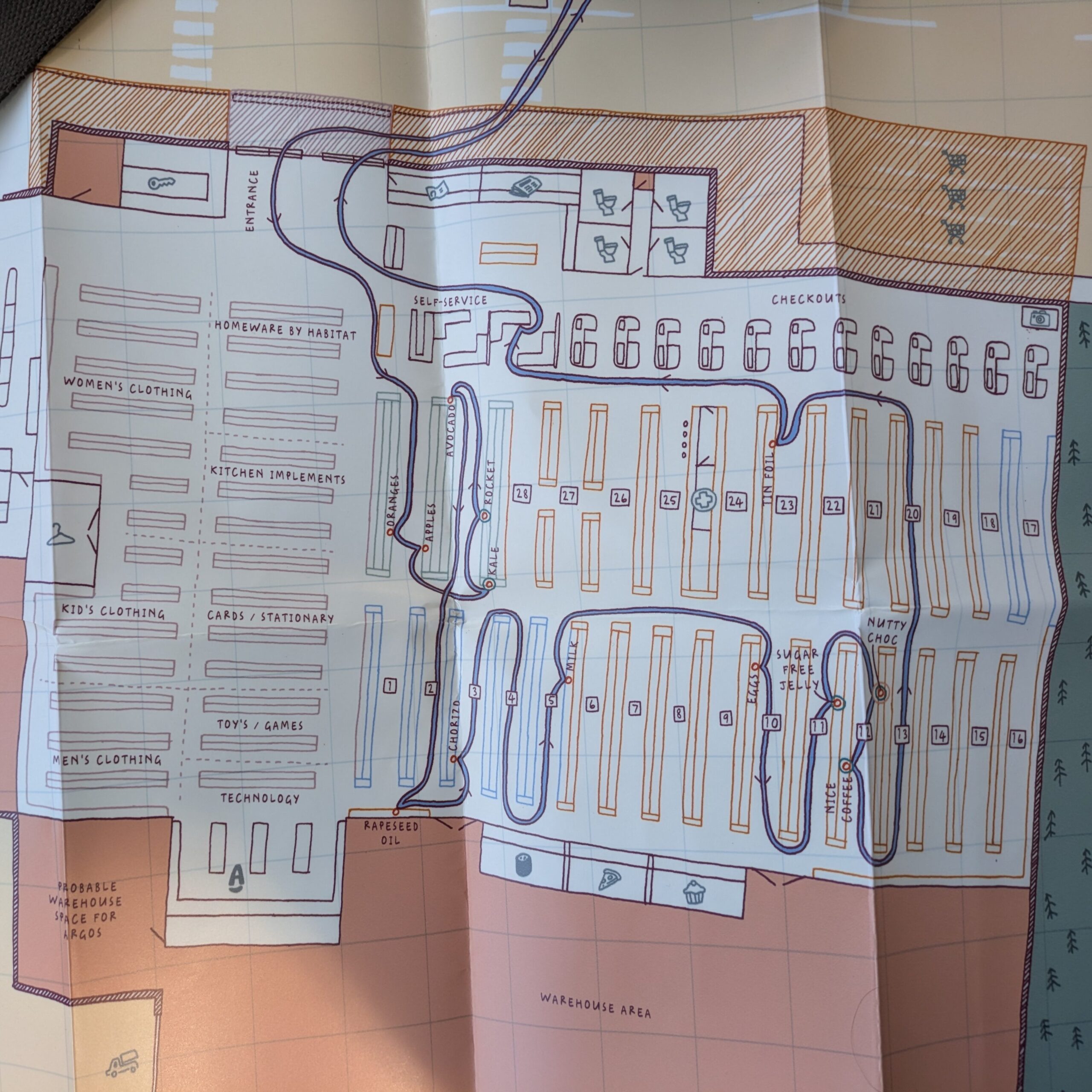
This map served as a great example and lended me a greater understanding of how a supermarket’s overall composition may look like.
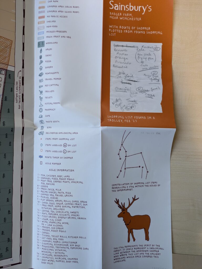
Some things I extrapolated from the map are that supermarkets have repetitive, blocky formations, have their entrance & exits besides one another and more importantly, are usually segmented into two or more areas.
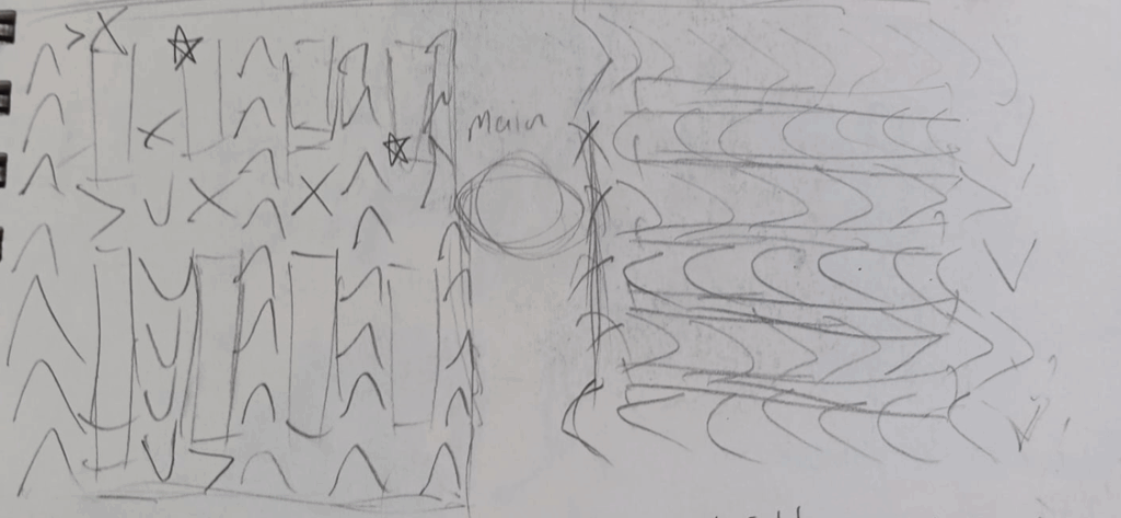
This first, simple layout was to act as a prototype
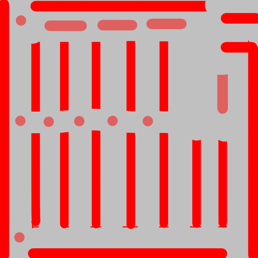
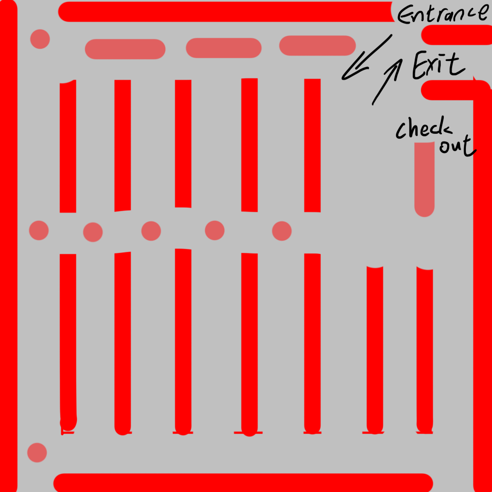
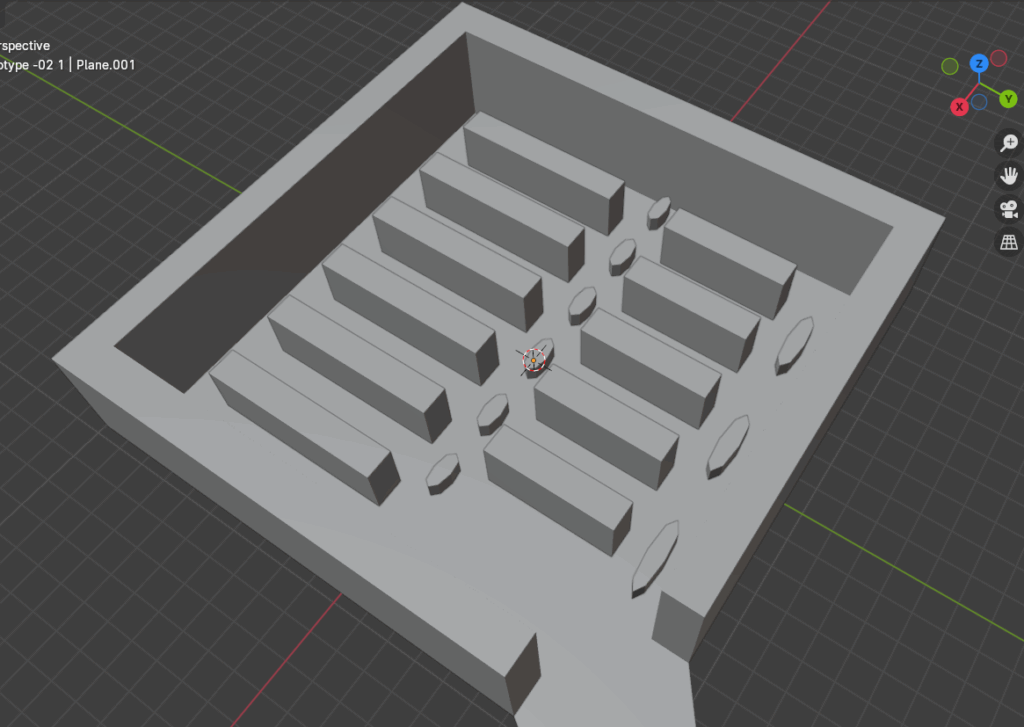
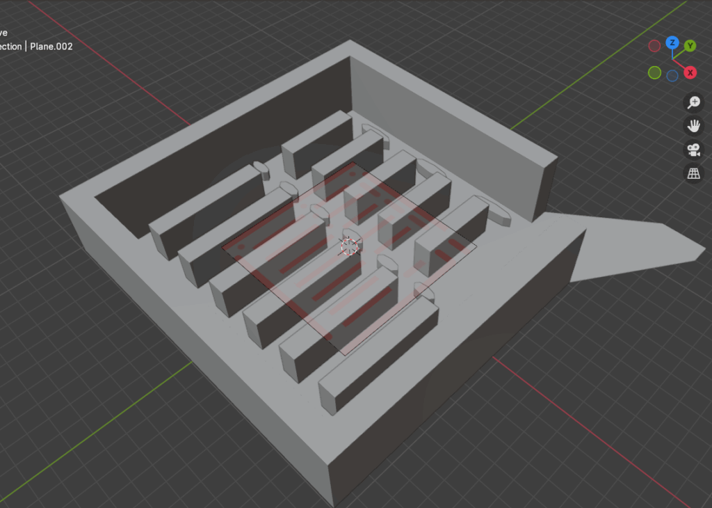
I made a rough graybox of this 1st prototype to get a feel on it
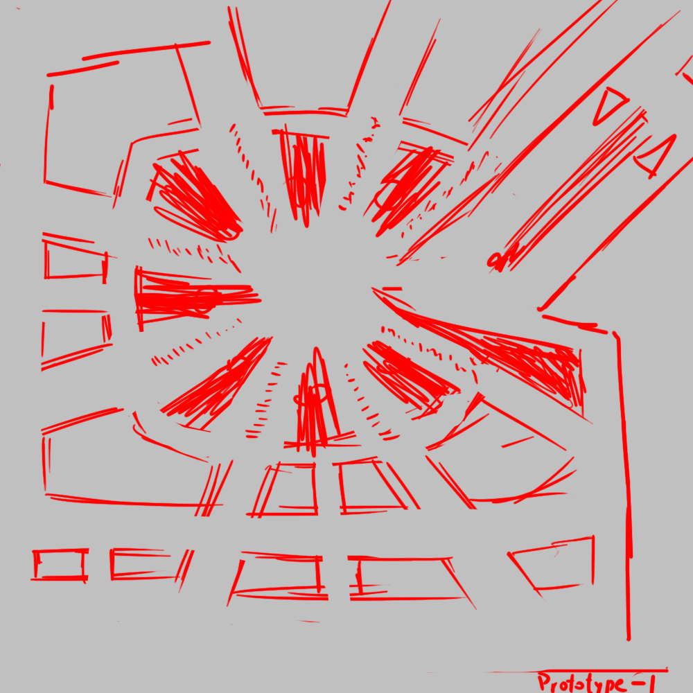
The design intention around this layout is to make the level as confusing and repetitive as possible, so the player cannot eaily dissern where they are and would have to use ulterior methods to navigate like a map or signs.
I showed this 2nd prototype to my teammates and they believed something more similar to the 1st prototype would fit the game better.
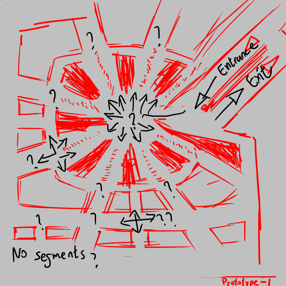
The 3rd iteration was mostly an experiment, which paved way for the 4th ‘final’ iteration. Here I experimented on how the level’s ‘sight lines’, pathing etc.
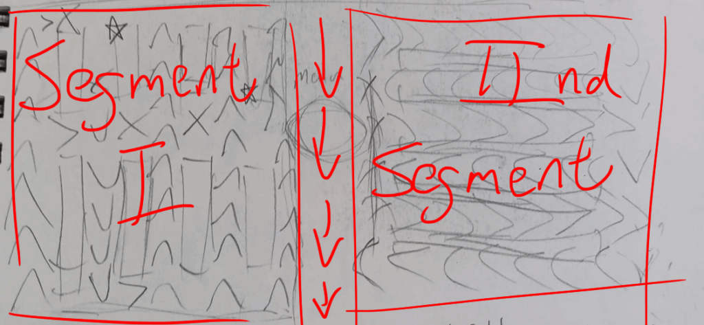
In both the 3rd & 4th iterations, I leaned into segmenting the supermarket for better player readability
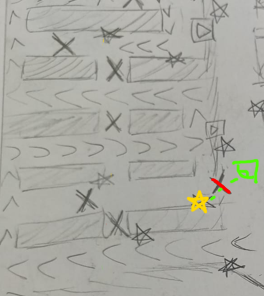
For this iteration, which ended up as the blueprint for what we’d build in UE5, I made it much more technical. These labels represent points on the level which serve an important function.
From top to bottom, we have
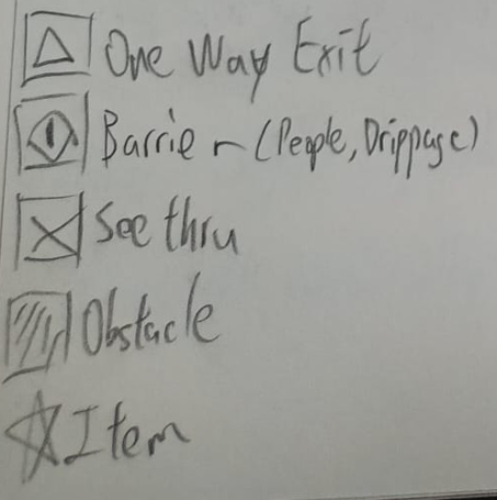
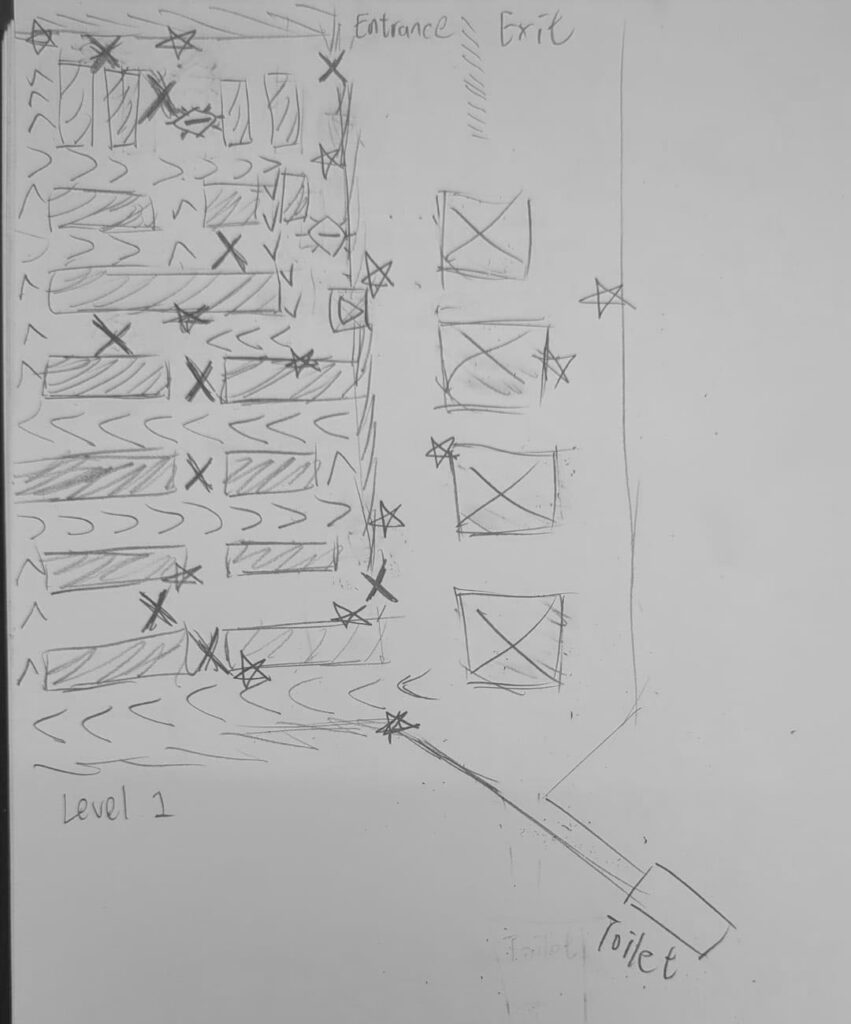
The toilet at the bottom right corner is for a mechanic which ‘heals’ the player from the ‘damage’ enemies deal. (Terminology different in game) Enemies can be placed accordingly after the level is made.
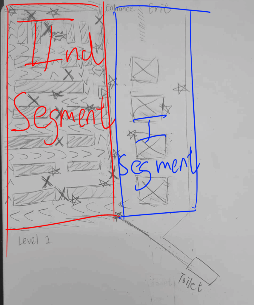
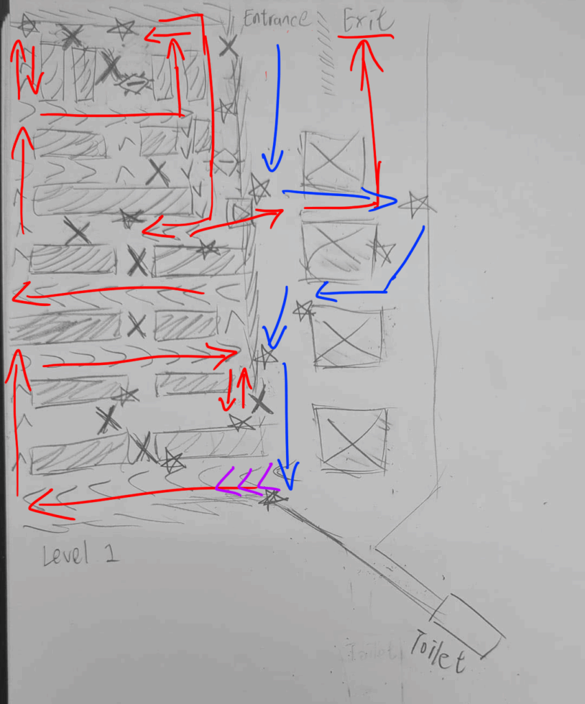
As the annotated maps above display, the level is separated into two distinct segments. Segment 1 being a more free and open area while Segment 2 leads the player through a tight space.
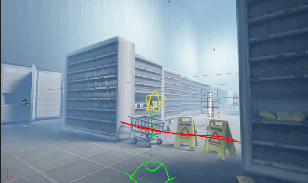
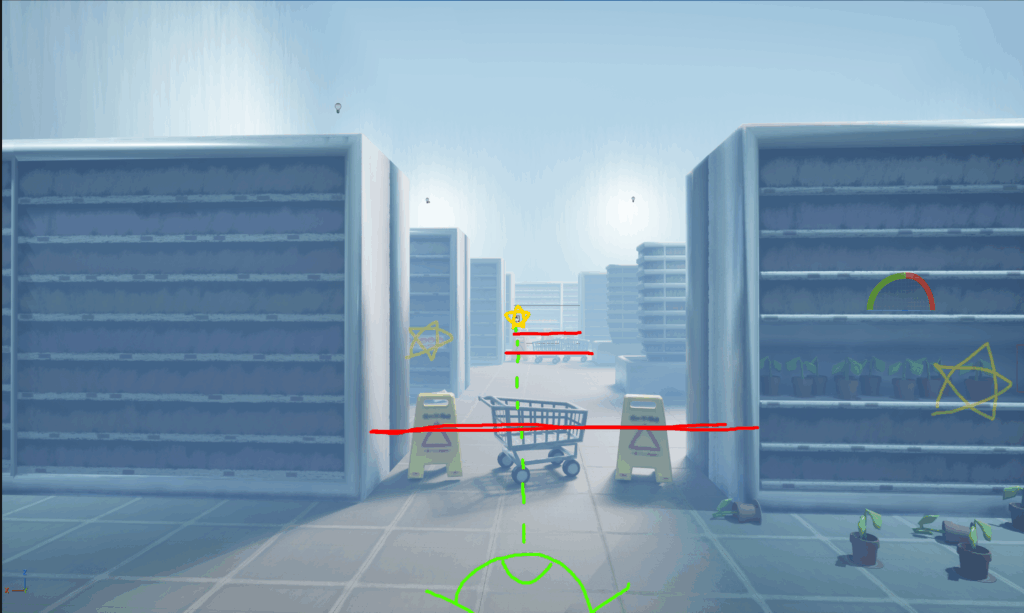
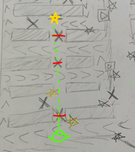
The further annotated map below displays the Sightlines from one item to another in green, Items being yellow stars. Bright red perpendicular lines represent Sightlines which cannot be directly walked to due to See Through Obstacles
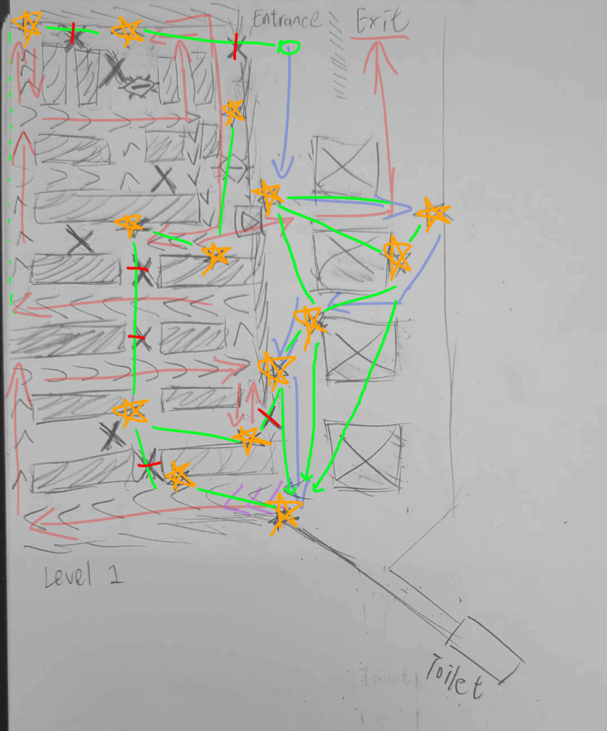
The intent is to always allows players a line of sight to their next objective/Item. However especially in Segment 2, a direct path towards those Items are blocked by See Through Obstacles to force players to explore and navigate.
I created a graybox level in Blender using 4th iteration as a blueprint. It was intended for the Week 8 playtest but wasn’t used.
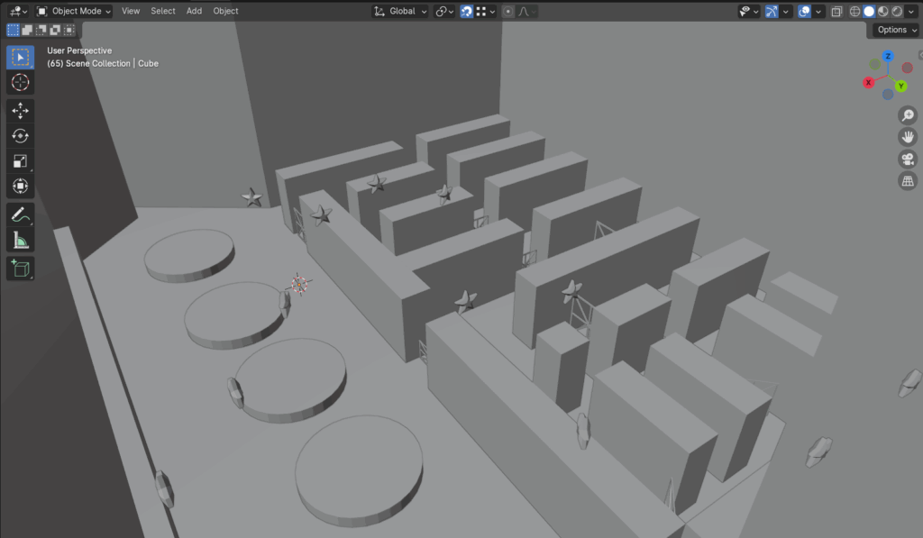
We recreated it weeks later in UE5 with textured assets
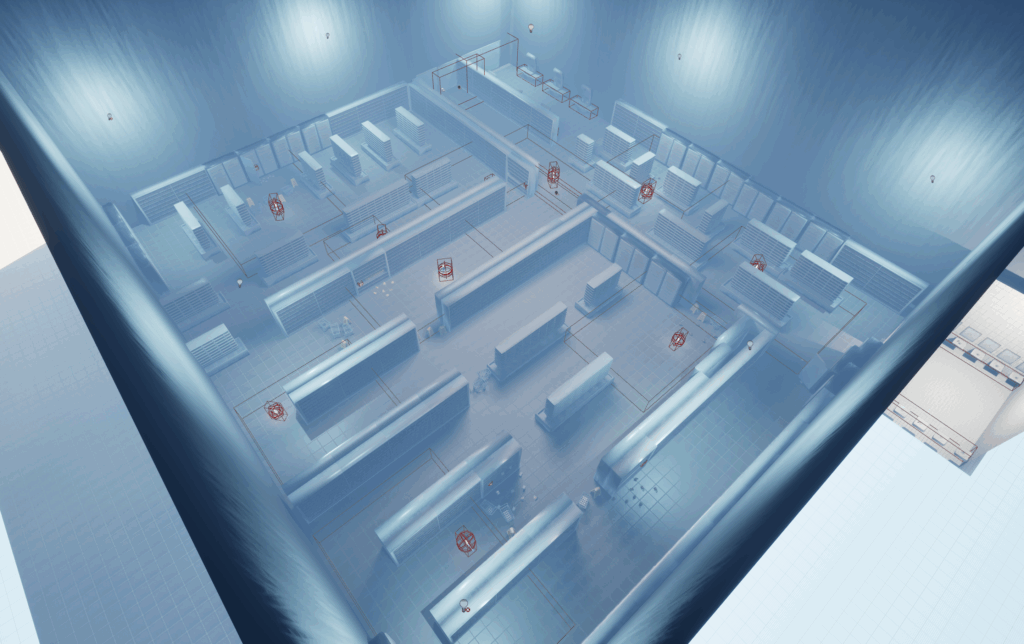
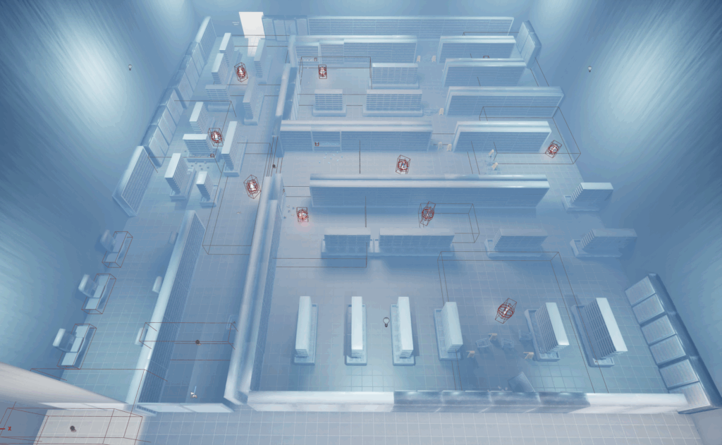
Below are examples of the Sightlines in affect.
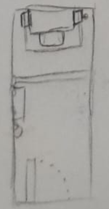
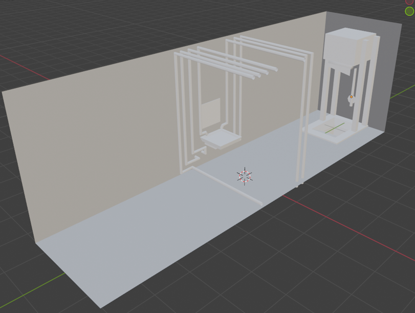
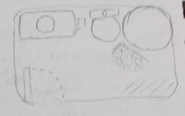
For the home apartment & bathroom of the protagonist, I just tried to make their layouts simple & easy to navigate.
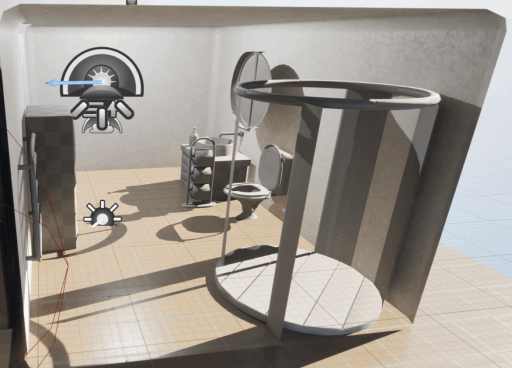
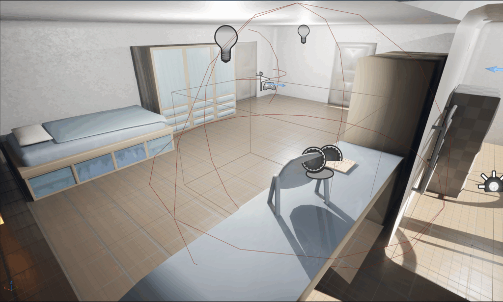
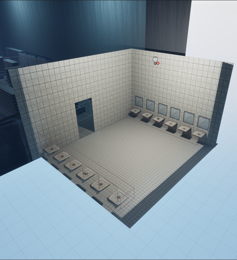
For the Supermarket toilet, we ended up with another look.