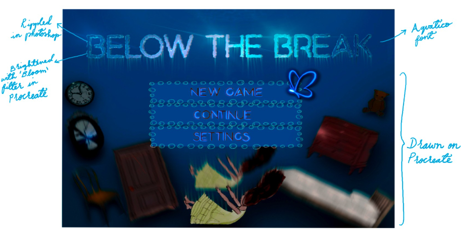
For the start screen I used a downloaded font called Aquatico. I wrote out the name of my game in Photoshop and converted the text to a smart object so I could add effects. I added a wind filter as well as ripple to look like to text has some movement from the water. I also wrote out: new game, continue and settings using the same process.
Look at my font process here: Load screen/logo design
Once I was happy with the text I imported all my assets to Procreate where I brightened up the text with the lightbrush tool and sketched a butterfly icon.
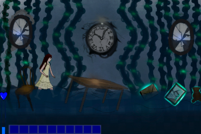
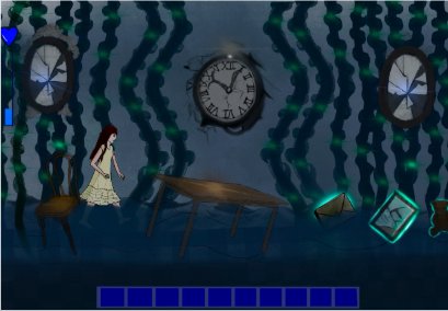
Once I had created an inventory and anxiety meter I began to play around with how they would look in-game.
For the first experiment I placed the anxiety meter and inventory in the bottom left corner. I didn’t like how this looked as the rest of the screen had too much space.
For the second experiment I moved the inventory bar more central and the anxiety meter in the top left corner. I loved the placement of this however players would have a hard time trying to read the anxiety meter.
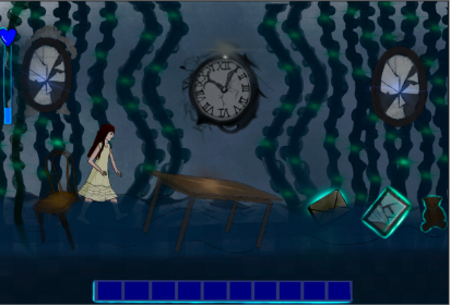
So players could see the anxiety meter better I highlighted around the bar using the lightbrush pen in Procreate. I also added a glow around the bottom of the inventory to give more definition.
I love the layout and I’m happy with how this turned out.
Anxiety meter animations: