Category: Ideas and Iteration


  • Prototype Creation

    To accompany my GDD I decided to make a proof of concept protoype of my game. This will be a simple point-and-click level, showcasing the artstyle and aesthetic.

    To help me make the prototype I watched and took information from both of these videos as well as the AC site.

    After my research I decided to use Adventure Creator to make the prototype. I began by installing it into Unity and creating a new game wizard. Here you create the interface for the game and how the player will interact with it.

    These are what I chose, keeping everything close to old 2D point-and-click games. Thye interactions are handled by a menu that lets the player choose what to do.

    After Adventure Creator set the scene up I imported my assets and the environment.

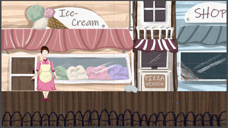
    I decided to use the shops scene and the ice-cream vendor for the prototype as it most closely aligns with my nostalgia that I’ve put into the game.
    Inventory and Interactions

    Before I started with my player character I focused on ensuring the scene and puzzle worked first. To do this I added cloth and dirt assets into the scene hierarchy putting them on a seperate layer.
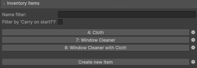
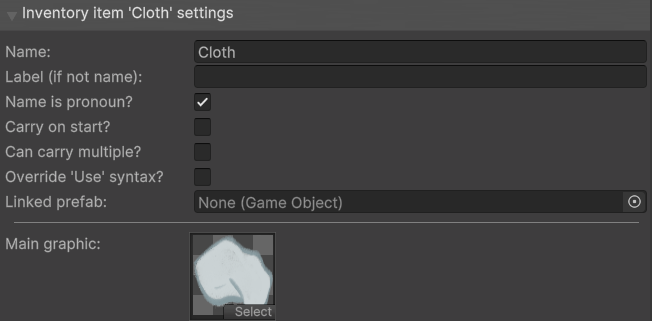
    Using AC’s menus I added three inventory items for the simple puzzle, which is to acquire a cloth and cleaning solution to clean a window and find a piece of your camera.

    For each item I assigned a the cloth and dirt game objects in the scene I made these in Photoshop.

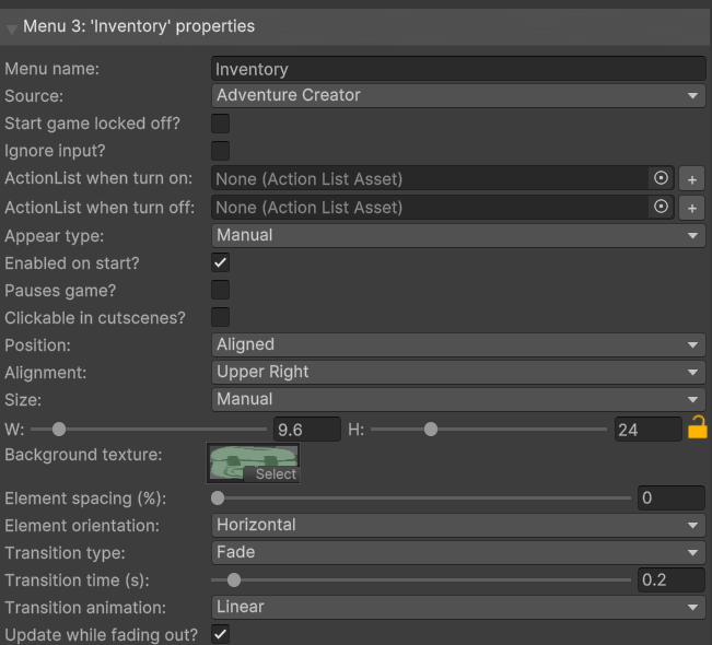
    To make the inventory look how I imagined I made a sprite in Photoshop then in AC’s inventory menu I simply changed what sprite was in the background texture box.

    I also changed the alignment to be in the upper right and manually changed the size of it.

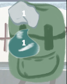
    This is what it looked like afterwards. Not exactly how I envisioned but it communciates what I want for a proof of concept.
    Hotspots
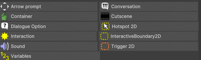
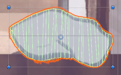
    To make the Hotspots, the interactable parts of the scene, I used AC’s scene menu and clicked hotspot 2D whilst the cloth asset was selected.

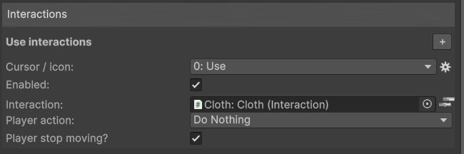
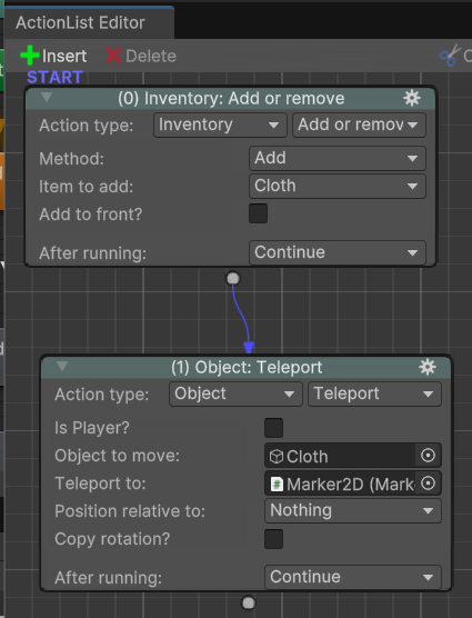
    This made it a hotspot automatically adding a collider onto the shape. I then added a use interaction onto the object in the inspector. This took me to the Action List Editor where I made a simple set actions that happen when the player clicks and picks the cloth up.

    It adds the item to the inventory and makes the cloth object “disappear” by teleporting it to a 2D marker off screen.
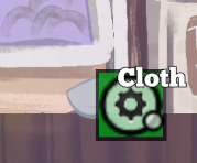
    What it looks like onscreen when picking the cloth up. The text and menu icon were created by Adventure Creator.

    The end goal of the scene is to clean the dirt off the window so I wanted the player to be able to interact with the dirt and understand the goal, then once they have found the items be able to return to the window and finish the protoype.
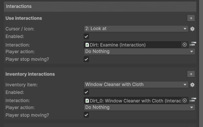
    So there are two interactions on the dirt, one, a look at interaction where the player simply observes and then an inventory interaction that lets the player use their items to interact.

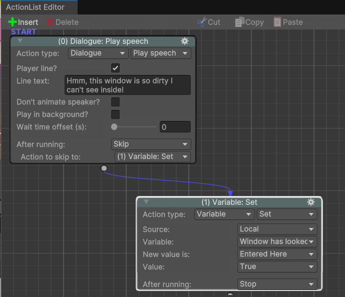
    In the action list for the first interaction I made a dialogue action of Mabel expressing her frustration. Then from this action I added a variable that makes it so that the game can keep track of if the player has looked at the window, this is important as if the player has not when speaking to Jackie she will not offer to give them the cleaning solution.

    For the actual cleaning interaction AC’s inventory system lets the player drag and drop to combine the items making the new item, which only needs to be dropped on top of the dirt triggering this action list.

    I first made a teleport action to get rid of the dirt asset, using the same 2D marker as before.

    I then used an inventory action to remove the combined window cleaner item.

    Then a dialogue action from the player acknowledging the result.
    NPC

    I then made a new character wizard for the NPC – Jackie. This configured her and allowed me to use her in the interactions as she gives the player one of the three items. Configuring her made an NPC game object and held the sprite asset and allowed me to add interactions to her by making them children of the NPC game object.

    In the hierarchy in the NPC folder I clicked and went to the AC section and made a new conversation.

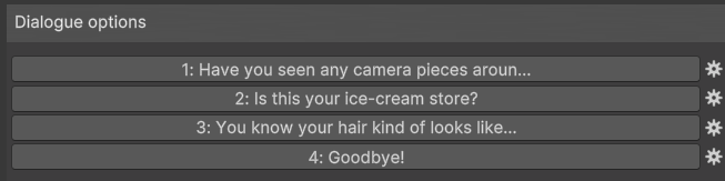
    In this objects inspector I created four dialogue options.

    I then added a use interaction to the NPC game object. In this one’s action list editor I made a new action – Dialogue Play Speech, which means when you click on her she automatically says this line of dialogue.

    From there I made a start conversation action, dragging and dropping the conversation I made previously. From this action I could now create branches of dialogues and loops, even variables too.
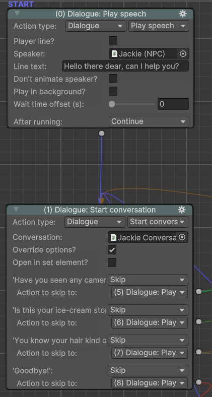
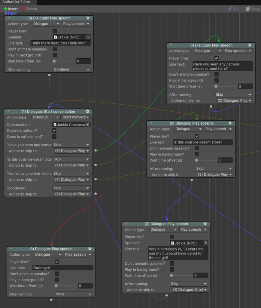
    Left side of action list
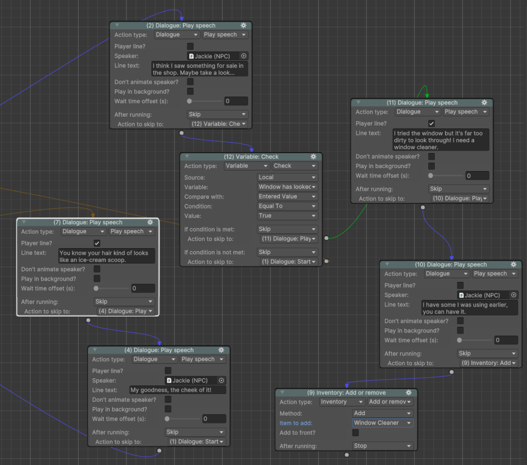
    Right side of action list

    This is the final action list, it simply contains the dialogue options that the player can respond to Jackie with and the variable action that triggers Jackie to either give the player a clue or to give her the cleaning solution.

    Player Character
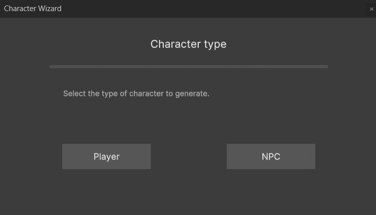
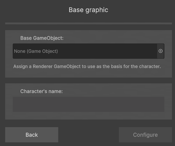
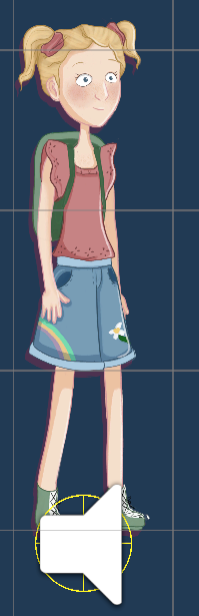
    To make the player character, Mabel, I used the Character Wizard assigning the PNG asset and naming her. Once configured it adds the character to the scene with an audio source and animator attatched.

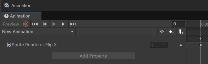
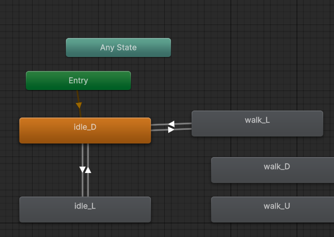
    I then made her a prefab in the project and got to work animating her. I wanted this to be simple as it is only a proof of concept so I focused on making her flip which way she is facing depending on where the player clicks.

    To do this I made a new animation and put the flipped image of her into it and saved. In the animator controller I then put this animation of her flipped to the left into the walk left animation state and idle left animation state.

    The idle down is her nomral resting position flipped to the right to let these all link I dragged arrows to and from each state.
    Finishing Touches

    To create the visual style I want in the game I overlayed a low opacitylens flare image used I used in the concept art for the game but I put the characters on a seperate layer to help them stand out in the scene. I really like how this looks overall and I think it accomplished my goal.

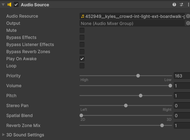
    To create some ambience in the prototype I created an empty game object in the scene and attatched an audio source element to it, importing a free boardwalk “walla” audio file

    To end the prototype I made a new scene and put my art for the funfair environment into it. I then created a square game object and added some text.
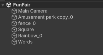
    The scenes hierarchy
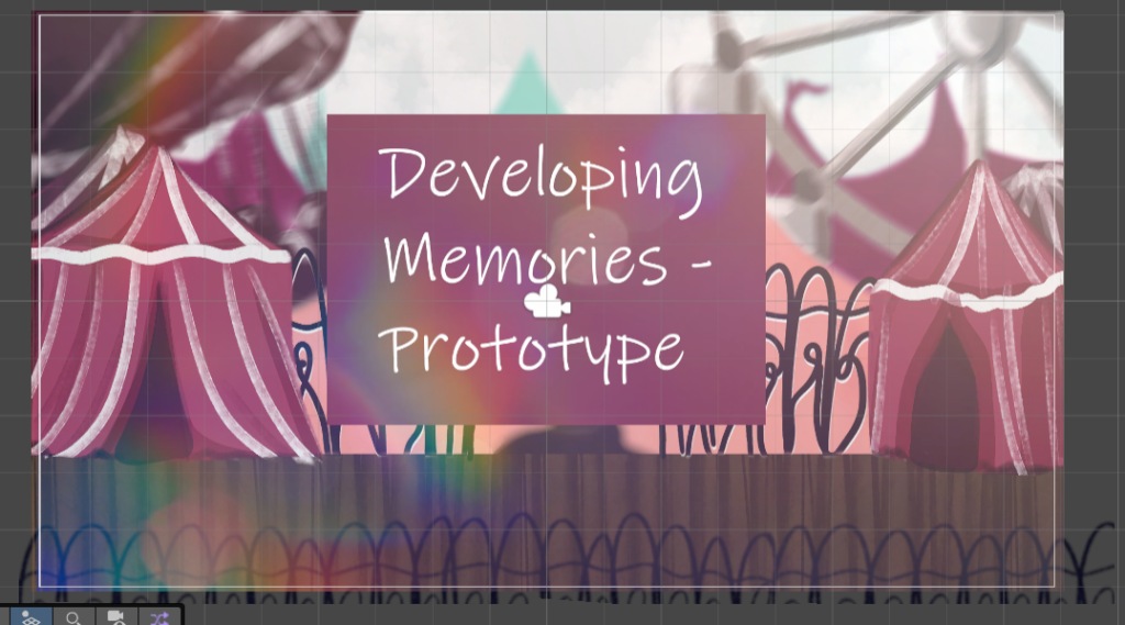
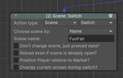
    To access the scene I added a scene switch action onto the final interaction on the dirt, so that after the player exclaims taht they can see through the window the scene changes.
    To build the game I went to the build profiles and selected the web option, made sure it was to my specifications then just clicked build and selected the folder I wanted the game to go to.

    Itch.io Page
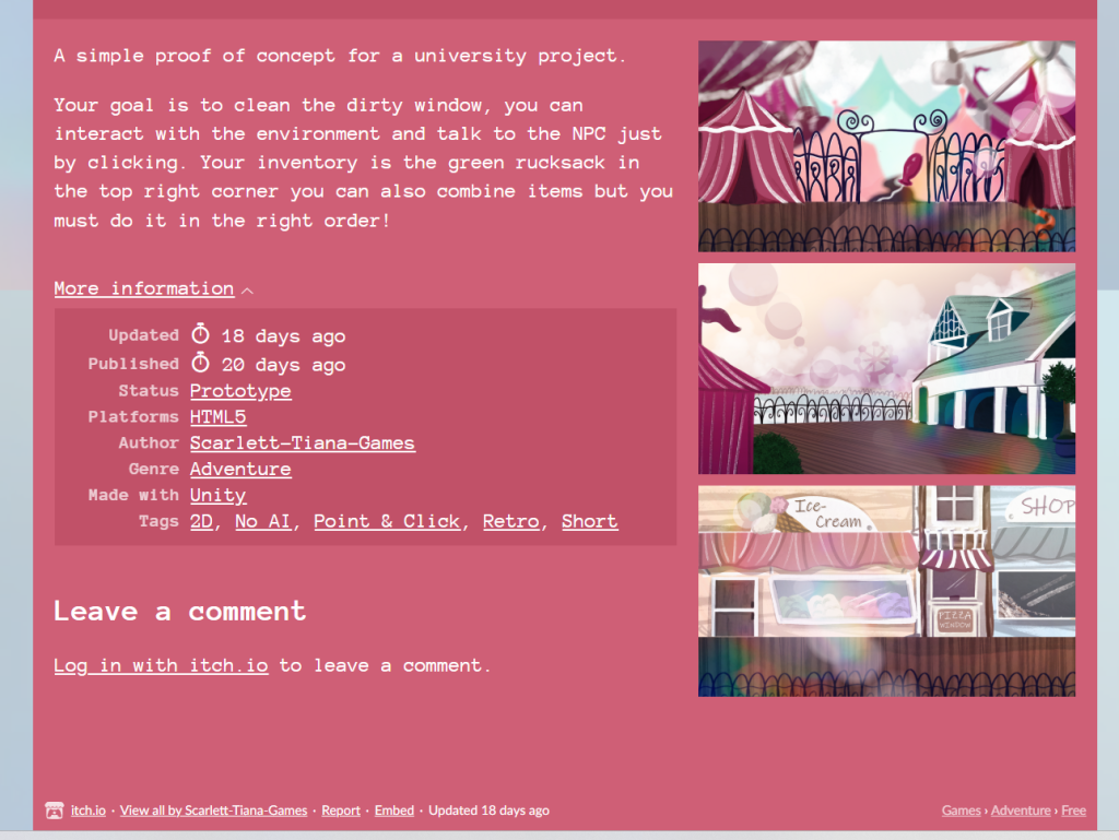
    After the game was finished building and exporting I unzipped the folder and added it to Itch.io as a HTML game to be played in the browser.

    I decorated the page with the games main colours and added some screenshots to make it feel busy and exciting. I also added the poster I made for the presentationto the top of the site.
  • Photograph Development Mechanics

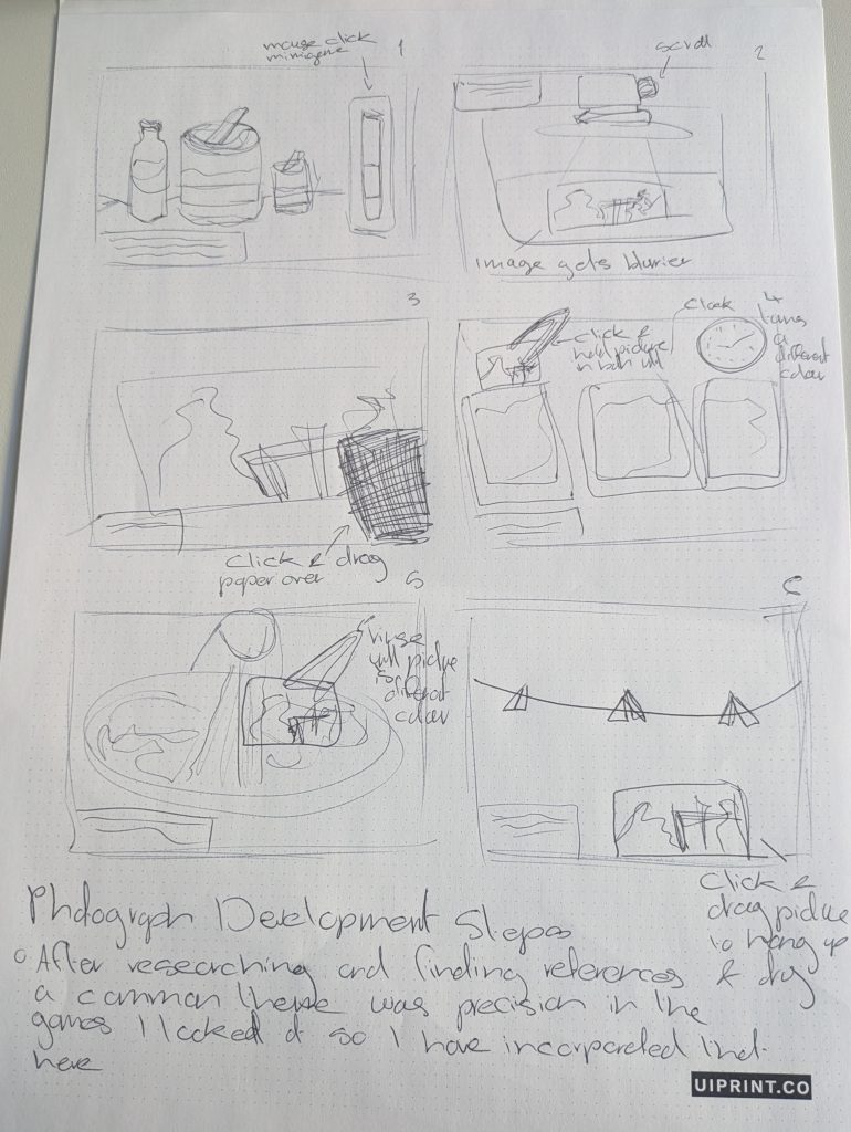
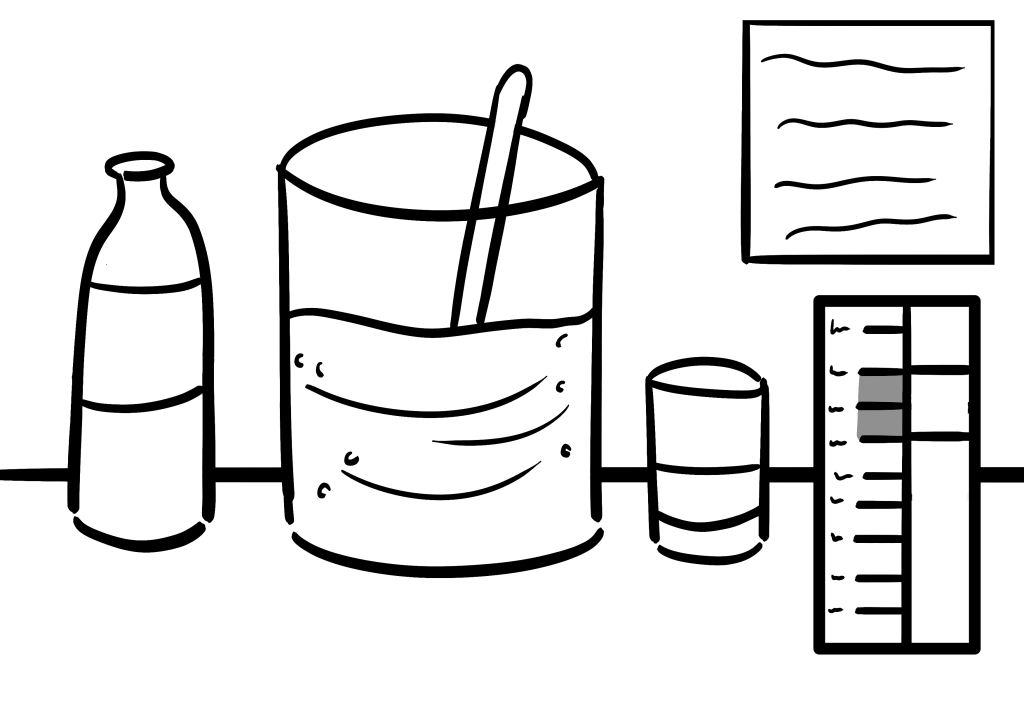
    After my research into developing photographs and how to gamify that process, I have created a step by step of the process.

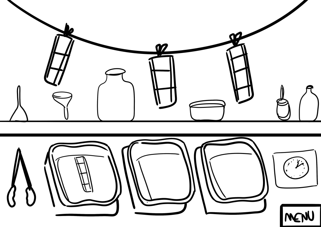
    This is my quick pen to paper mock up and the digital one I created in week 11 for the presentation/ With these I was playing around with mechanics and figuring out what works.

    There will be three photographs to develop, the first one will be a guided tutorial with text appearing from the grandmother in text boxes. For the second and third this box will be gone so players must remember what to do.

    Step 1

    The first step in the developing process is to mix the chemicals. In the game this is a mouse clicking minigame where the player must hold the bar between the highlighted notches. Similar to the Stardew Valley fishing game – not clicking makes the bar fall and clicking makes it rise.

    Step 2

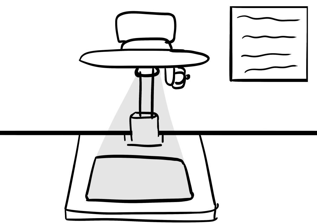
    The next step is to focus the projection of the image. This will show up onto the projected area in grey and scrolling the mouse wheel will focus and unfocus it the player must find the right spot.

    Step 3

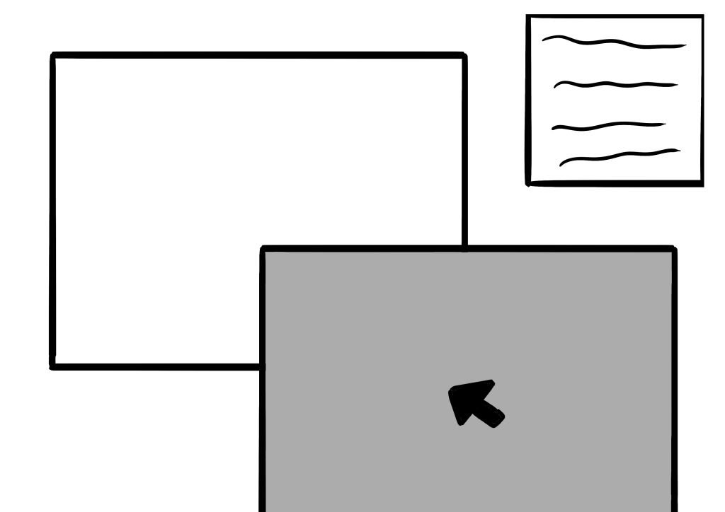
    The third step is to click and drag the photograph paper over the projected image ensuring it lines up correctly.

    Step 4

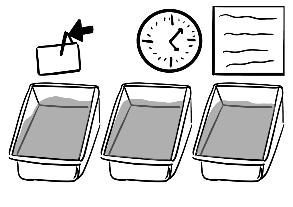
    The fourth step is to use the tongs to click and hold the photograph into each individual bath. Players will be guided by the clock at the top once the photo has been in the bath for the correct amount of time it will change colour. Players will not know how long this will take so must be alert and ready to move the photo.

    Step 5

    The fifth step is to clean the solution off of the photo by holding it under the water until the visible solution is gone.

    Step 6

    The final step is to click and drag each photo onto the awaiting pegs so that they can dry.


  • Creating A Font

    Research

    I decided to create a font as graphic design and typography are a main interest for me. Before I began making the font I researched into fons and how they can be used to communicate ideas and their importance.

    The three sites and articles I looked at.

    https://www.adobe.com/express/learn/blog/psychology-font

    https://medium.com/@maria.lelieveld/why-is-font-so-important-546f31bc2f6d

    https://designmodo.com/font-psychology

    After looking through these spmething that stood out to me was the concept of decorative fonts, stylish fun fonts mainly used for creating a recognisable brand. I would like to do this for my game.

    Fonts can be very important as they can evoke emotions and feelings purely based on their looks, not the words they are used to say. The connotations I want my font to have are childlike and whimsical, matching the idea and character of my game.

    Making a Font

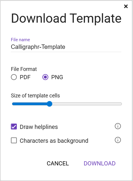
    To make the font IU decided to use Calligrapher, a free to use software that provides you templates and automatically makes the font.
    This is the download options, you can customise what helplines you want.
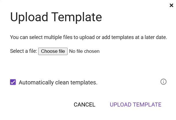
    Once you have populated the template you re upload it to the website then download the font from there in the form of either a .ttf or .otf file.

    You first choose how many characters you want your font to have then you download a blank template and populate it with characters.

    All of the options have been made in Photoshop.

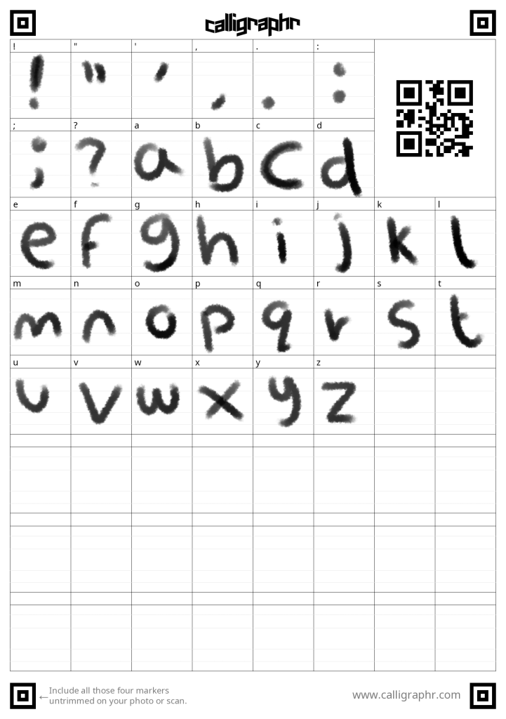
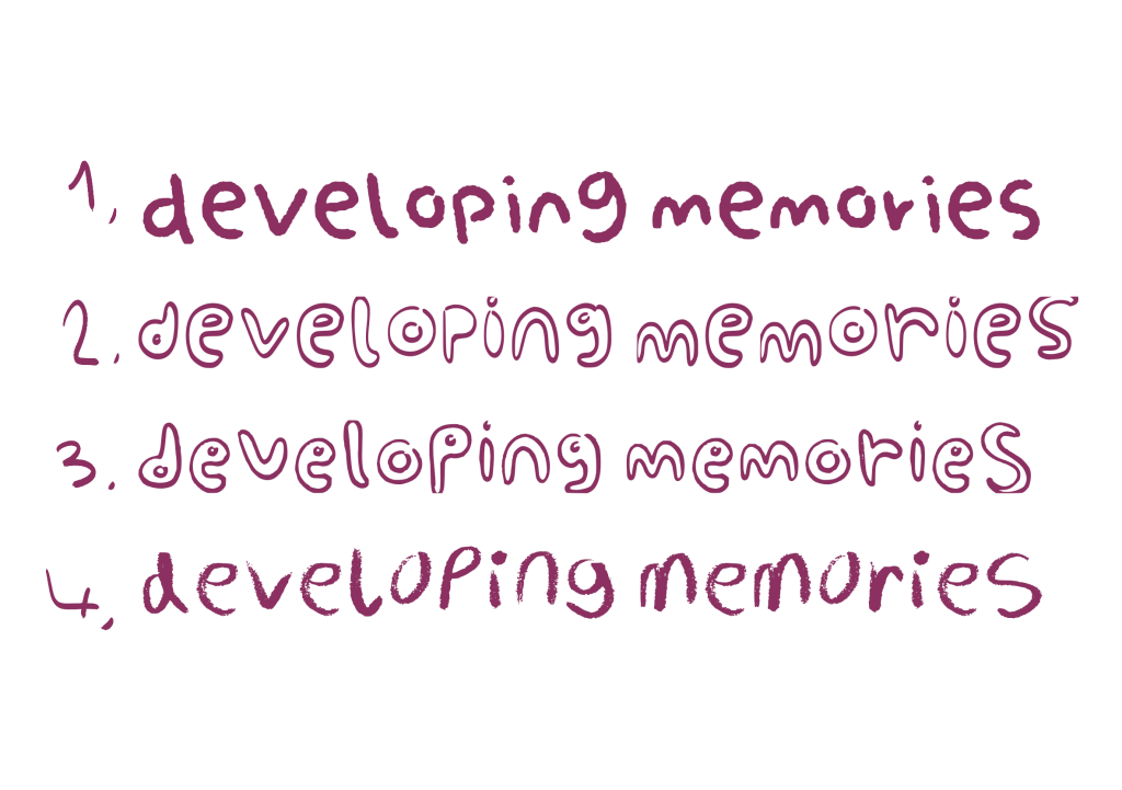
    Option 1 – I tried to emulate the mood of my poster with this, choosing a cloudy brush and being loose with my shapes.
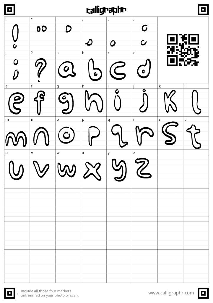
    Option 2 – For this one I focused more on childlike “bubbley” letters to reinforce the fun aspect of the font.
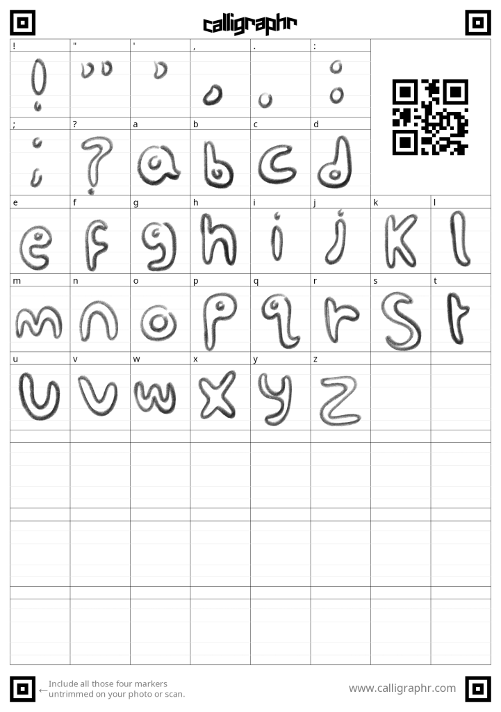
    Option 3 – For this one I combined the elements of the first two, a cloud like texture and bubbly writing.
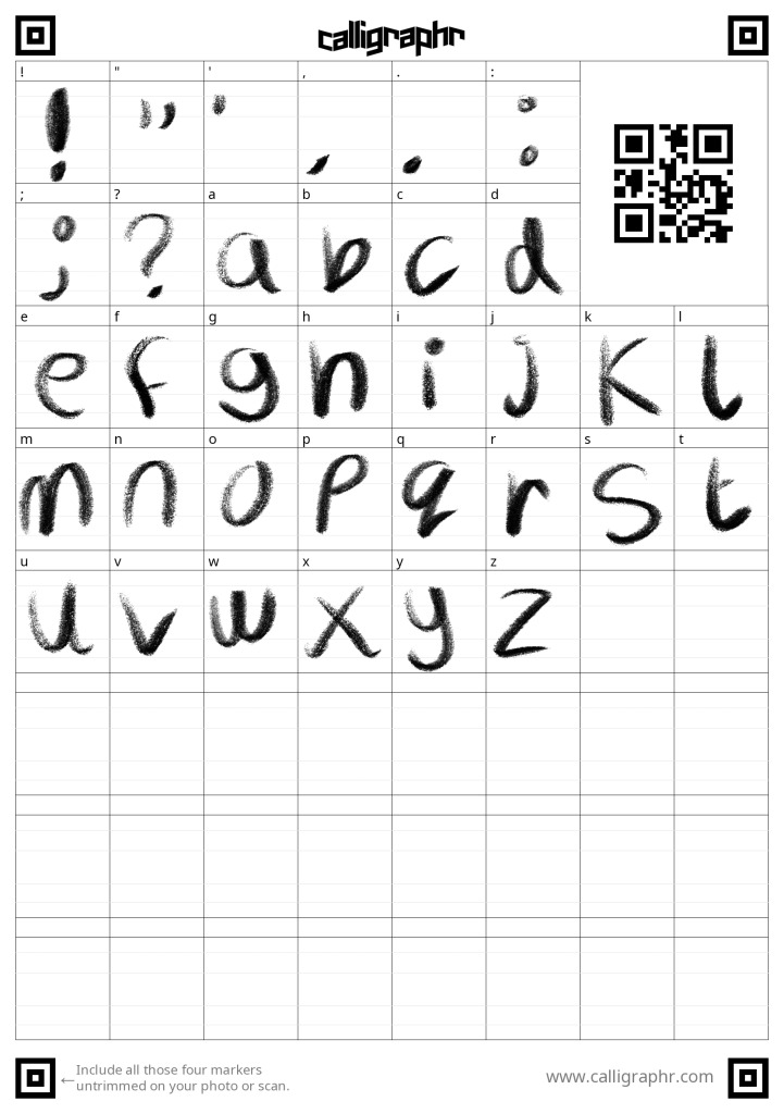
    Option 4 – For this one I decided to use a chalk like brush, this evokes more of a handwritten pencil feel.

    These are the finished fonts spelling out the title of the game. Unfortunately the software I used did not manage to keep the opacity textures in the orginal ones.

    To help me choose I sought feedback froma family member. I showed them all of the fonts, they liked 1 and 3. When asked what emotions or feelings the fonts evoked they thought they were childish. As this was one of my goals I felt pleased as I was on the right track.

    I also showed the fonts to a peer on my course and they similarly picked 1 and 3 agreeing they fit the goal better.

    Next Steps –

    My next steps are to add the fonts to my GDD’s Art Bible.


  • Gameplay and Mechanics

    Point and Click Mechanics

    As my game will be a point-and-click game I have compiled a list of the actions you can do in those games.

    • Use – use items, either on NPC’s or on the environment
    • Talk To – start conversations with NPCs
    • Give –give NPC’s items
    • Push – push items in the environment
    • Pull – pull items in the environments
    • Combine Items – This makes a new item from two items

    Another key element of point-and-click games are the long winded puzzles, which I will be creating.

    Week 6

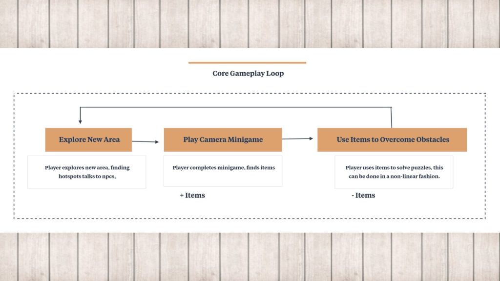
    This is a preliminary core game loop, though it serves better as a meta game loop. A core game loop for point-and-click would look like this.

    Explore InteractOvercome obstacle
    Click around the environmentInteract with NPC’s and hotspotsEither gain knowledge of what to do, or overcome an obstacle, this could be as simple as learning to choose the right dialogue options

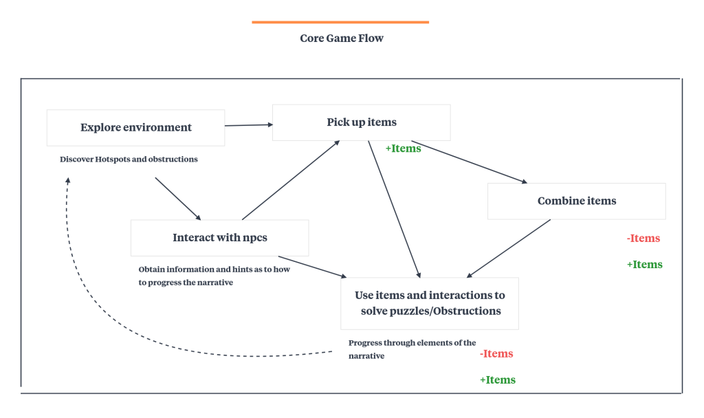
    For the GDD I created this game flow diagram to better capture how point-and-click games function, as there are constant obstacles that you overcome through a variety of ways.

    Minigame –

    I do not have a clear idea of what the minigame will be so I am going to look at some different games for inspiration.

    Shutterbug

    This is a free to play on the web itch.io game. I found it last year and I love the unique camera mechanic where you resize the tab to zoom in and out.

    Eastshade

    During week 6 I was recommended this game, where you play as a travelling artist the paitning mechanics works like taking a photo, lining up the lanscape.

    Around week seven and eight I had done further work on my narrative and I had begun my puzzle dependency graph.

    Working further on these and getting feedback from my lecturer I decided to stop pursuing the idea of this minigame as my narrative now involved the player recovering the pieces of the camera to rebuild it.

    In week ten once I had overhauled my narrative I found myself developing a different kind of minigame about photo development.


  • Ice-Cream Vendor Development

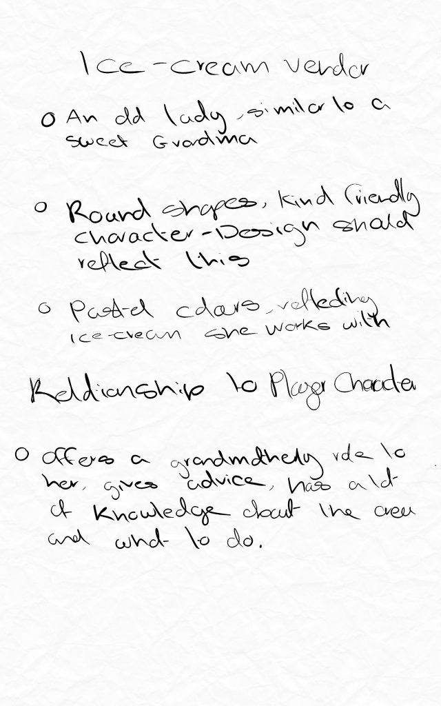
    For the shops section of the boardwalk the NPC will be an ice-cream shop owner.

    The vision for this character is a helpful guiding figure.

    As the games story takes place in a childs imagination it would make snse for the character to resemble a grandmother.

    Reference Board

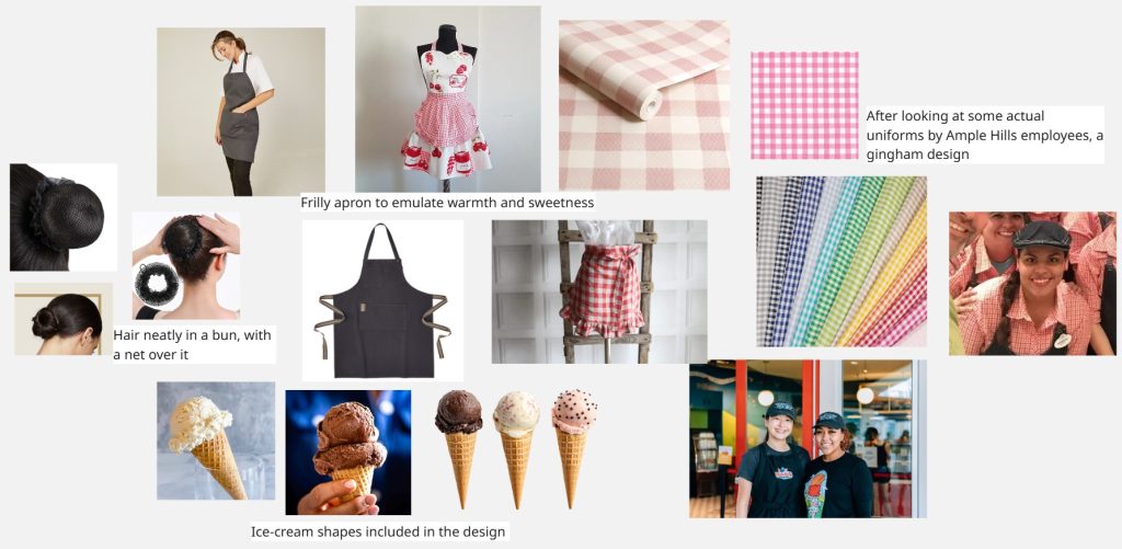
    For the reference board I rsearched actual Ample Hill bakeries to see what kind of uniforms and colours they use. The common denominator in these were neatly tied away hair and gingham like designs on the uniforms. I also researched soft scoop ice-creams and want to incorporate the shapes into the design.

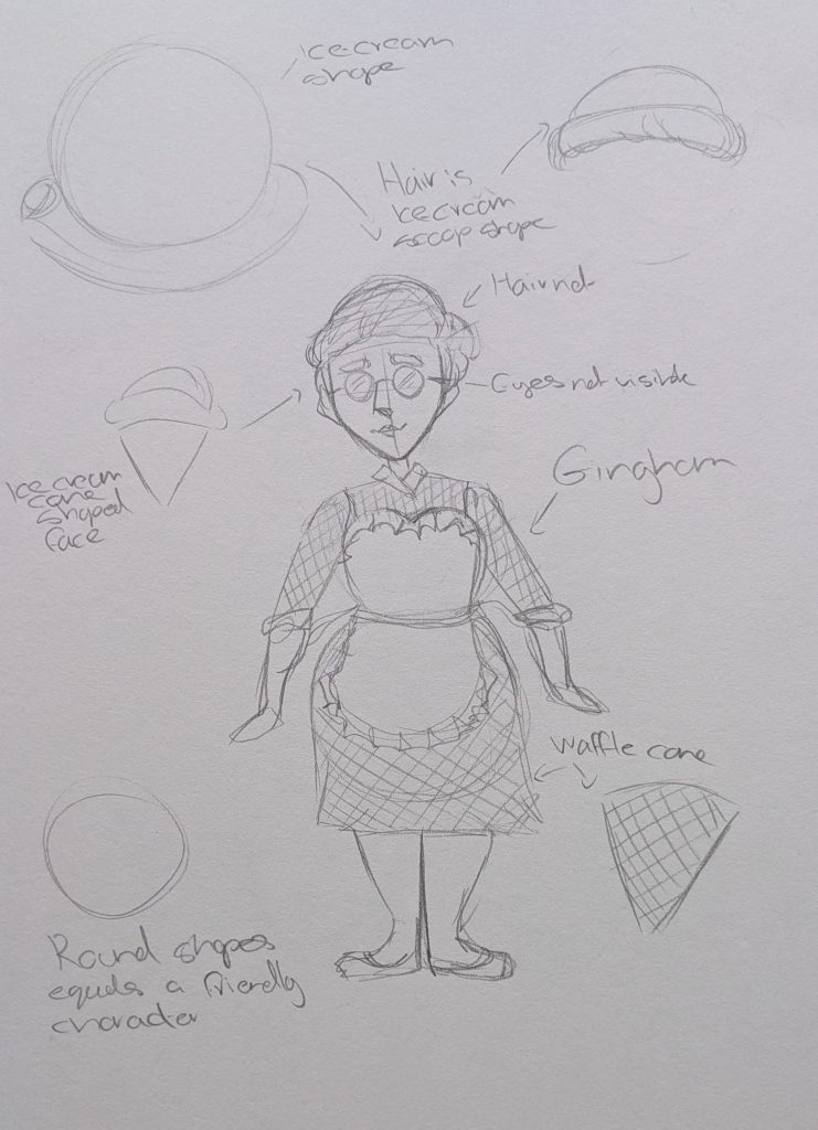
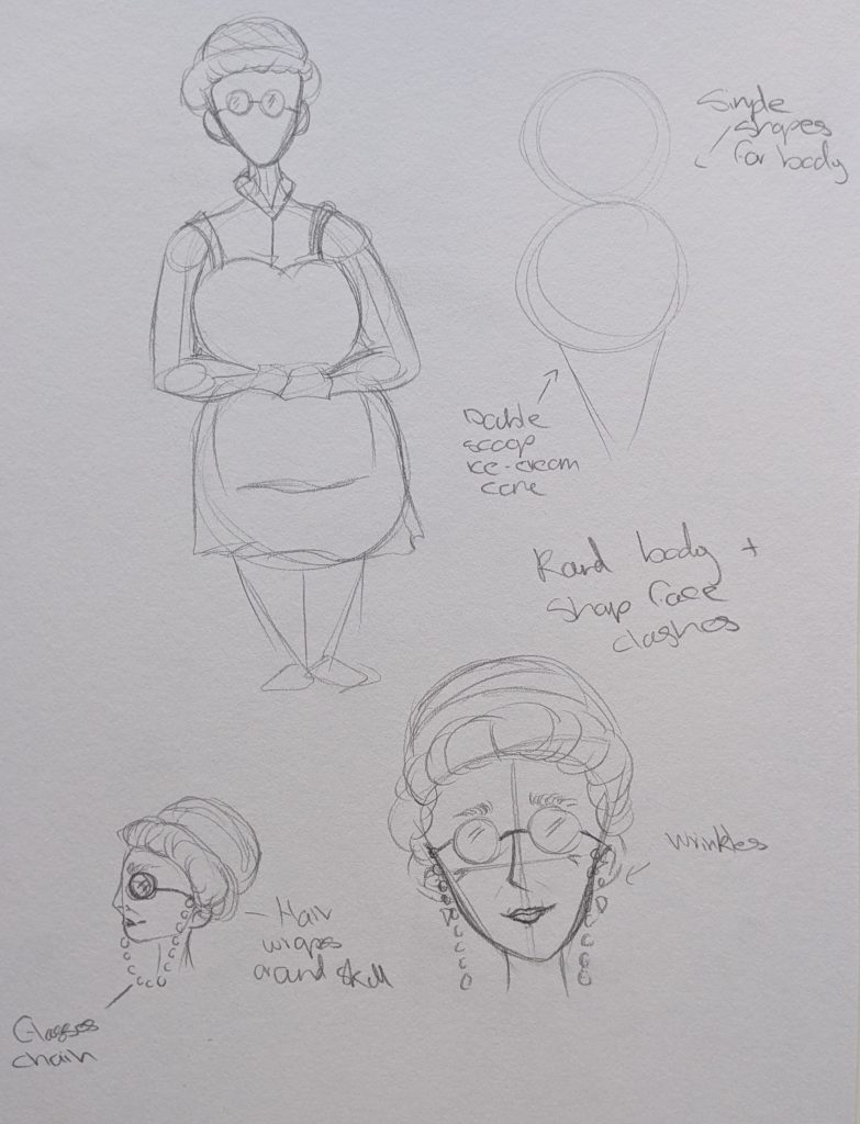
    These are my pencil sketches. I began with the generic shape of an ice-cream, two circles on top of an inverted triangle. These lined up nicely with a round body shape. I also gave her hair that looks like a scoop of ice-cream. There was one problem that I ran into where I tried to make the face pointy as well unfort7unntaely this looked weird when put on top of the round body. So I will have to lessen the more obvious ice-cream shapes.

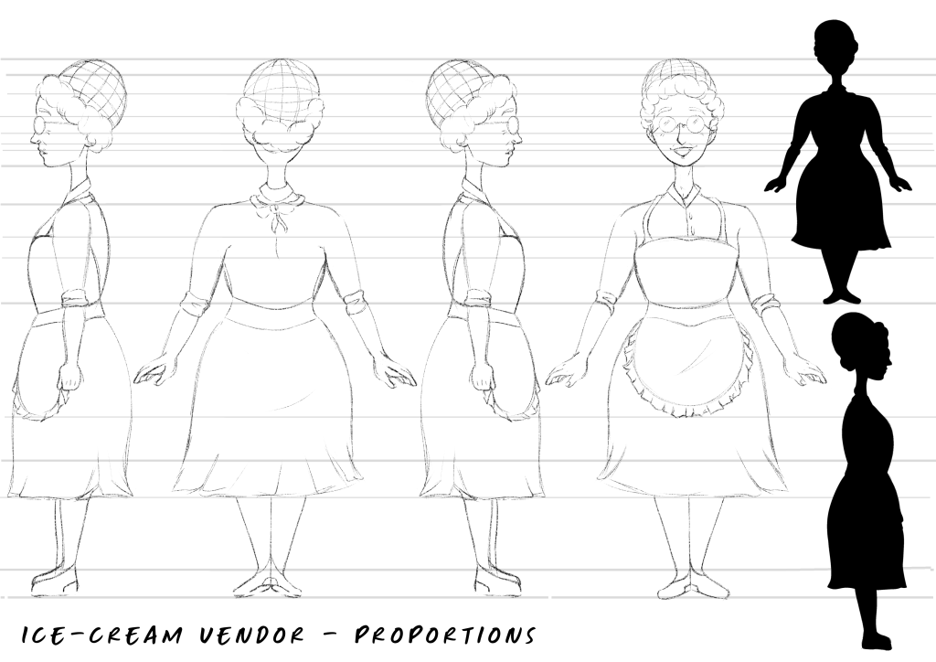
    These are the Ibis Paint X turnarounds, I used the same method to draw them as when I drew Jace, using lines to keep thinmgs proportional and lined up. Although I had to lessen the more dramatic shapes I am still very satisfied with the shape language I used. She looks friendly and welcoming exactly how I wanted. For her silhoutte her hair is interesting to look at and the welcoming impression is still there.

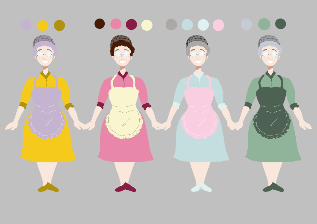
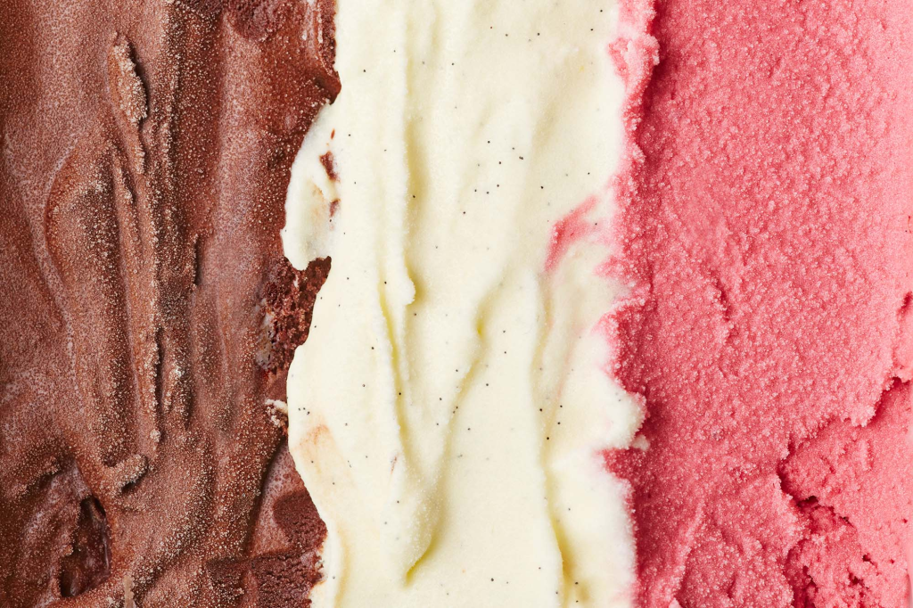
    These are the colour thumbnails for her. I focused on bright colours, as the environemnt she is in uses pastels I wanted her to stand out. I chose the second colour combination because the colours complement each nicely making her pleasing to look at and the colours are based off of neopolitan ice-cream. I did not choose option one as though they are complementary colours the yellow does not suggest ice-cream to me. Option three was liked by my peers but it did not stand out enough in the environemnt as the colours where too similar it was also very alike the player characters design. Option 4 felt too flat and the green did not suggest welcoming.

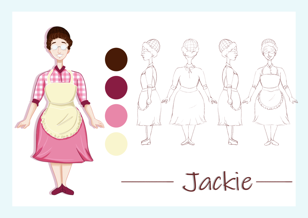
    Final Character Design

    I am satisfied with all of the elements brought together. She looks how I imagined and wanted. The name came from the co owner of the real Ample Hill ice-cream parlours as her name is Jackie too.


  • Street Performer Development

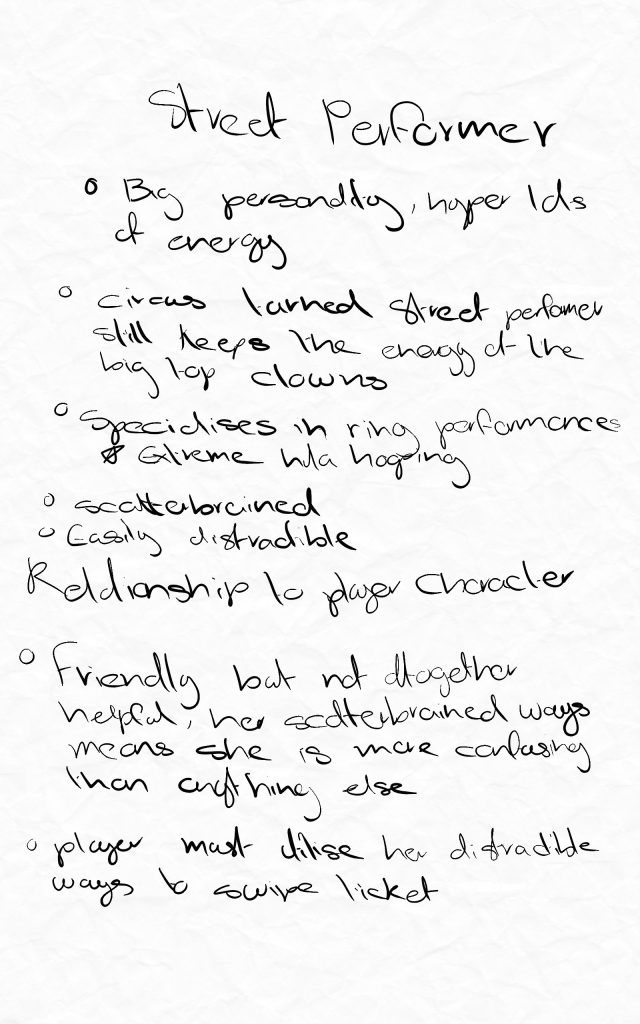
    Earlier in this project I knew thgat I wanted a street performer as on the real boardwalk there are often many little shows happening. I did not know what kind of performer it was going to be until I saw a video online of a ring performer this sparked some inspirastion and I began making notes of the character.

    She is a hyper energetic character, she both helps the player and serves to confuse them.

    Reference Board

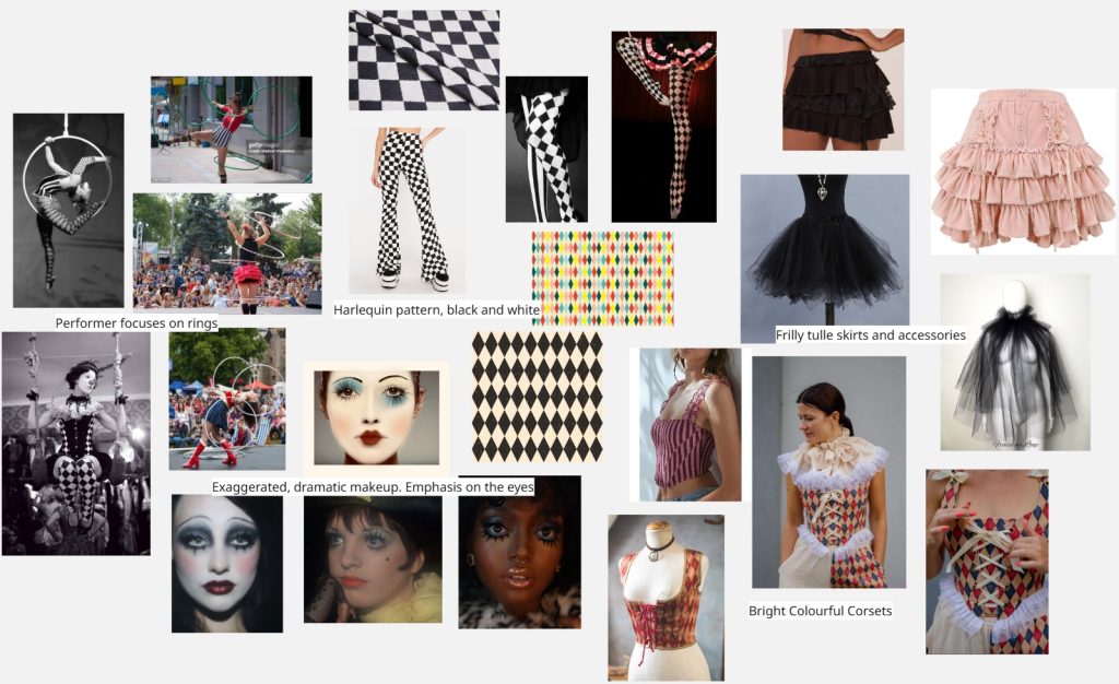
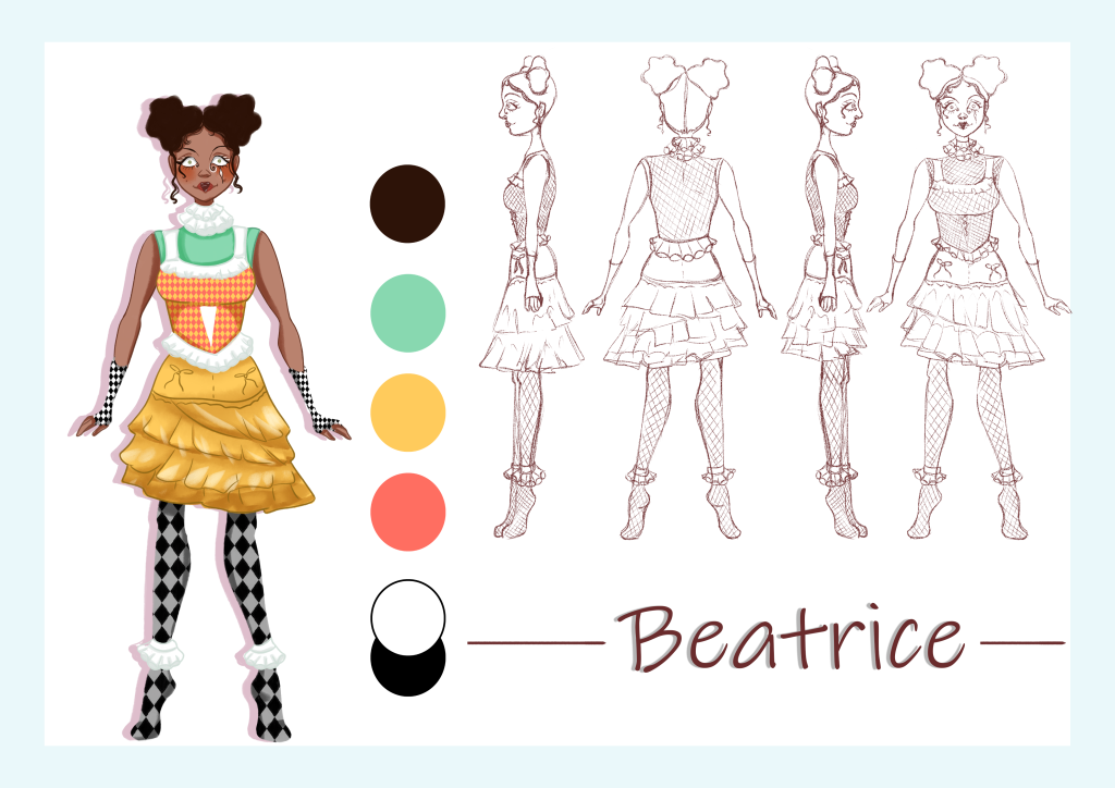
    This is the reference board. My inspirations are mostly from a circus aesthetic, harlequinn patterns, lots of tulle and exaggerated face make-up. The characters personality is loud and bright I want her appearence to scream this as well.

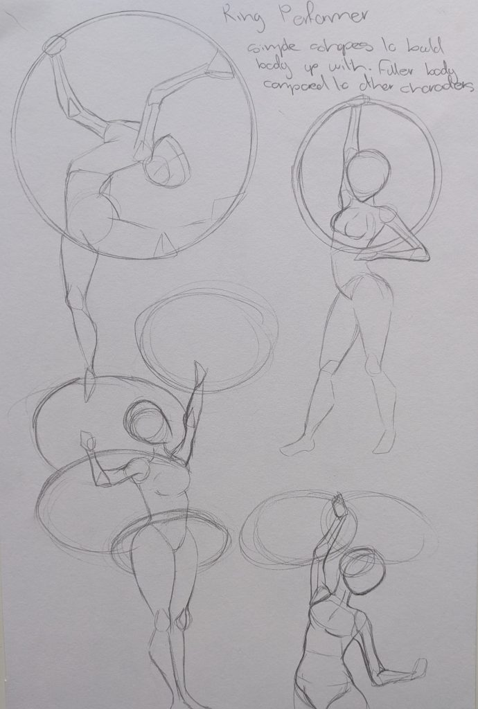
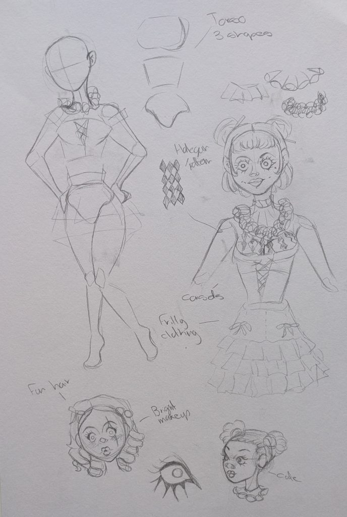
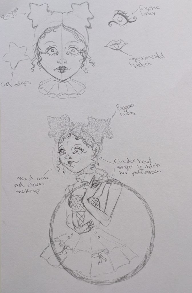
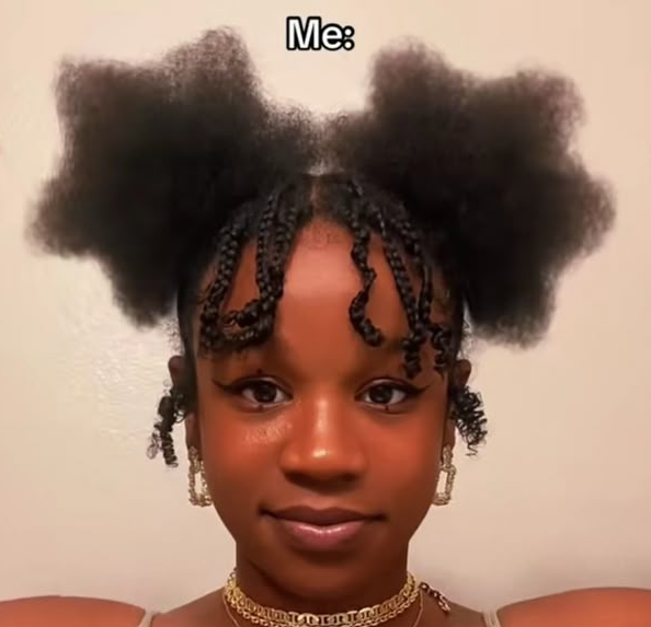
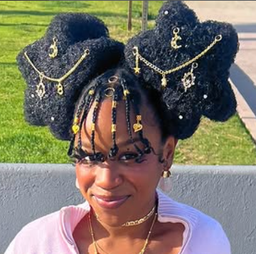
    Once I started sketching her I did some observational drawings of actual hoop performers to see how they do it and what muscles they use, this helped me see that her body would need to be more complicated than the previous simple NPC’s shapes, such as splitting the torso into three shapes. For her costume I had a lot of fun with it, testing different materials and shapes plus corset make ups. For her hair I took inspiration from an influencer from instagram I follow who specialises in hair shaping, most known for her star looks. It was difficult to draw these at a 3/4 angle but they add to the look and communciate her fun personality.

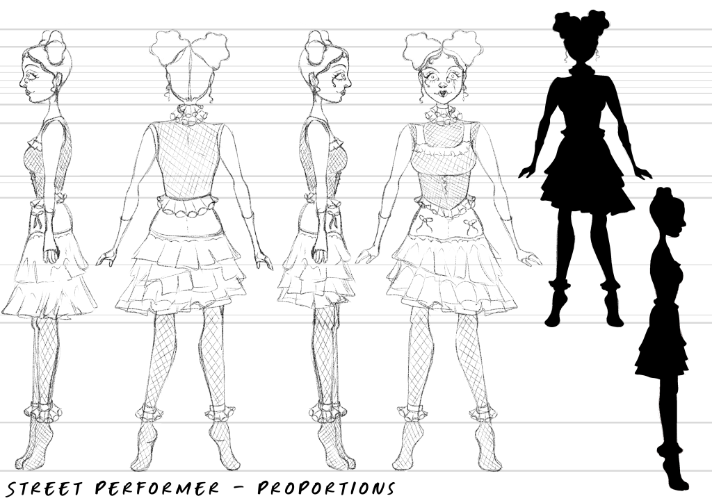
    For the character turnarounds in Ibis Paint X I settled on the full design for her costume, adding frills and playful elememts to it such as the skirt being asymetrical. This created a very striking silhouette. The most difficult part was rotating her hair around and keeping the recognisability of the star shape.
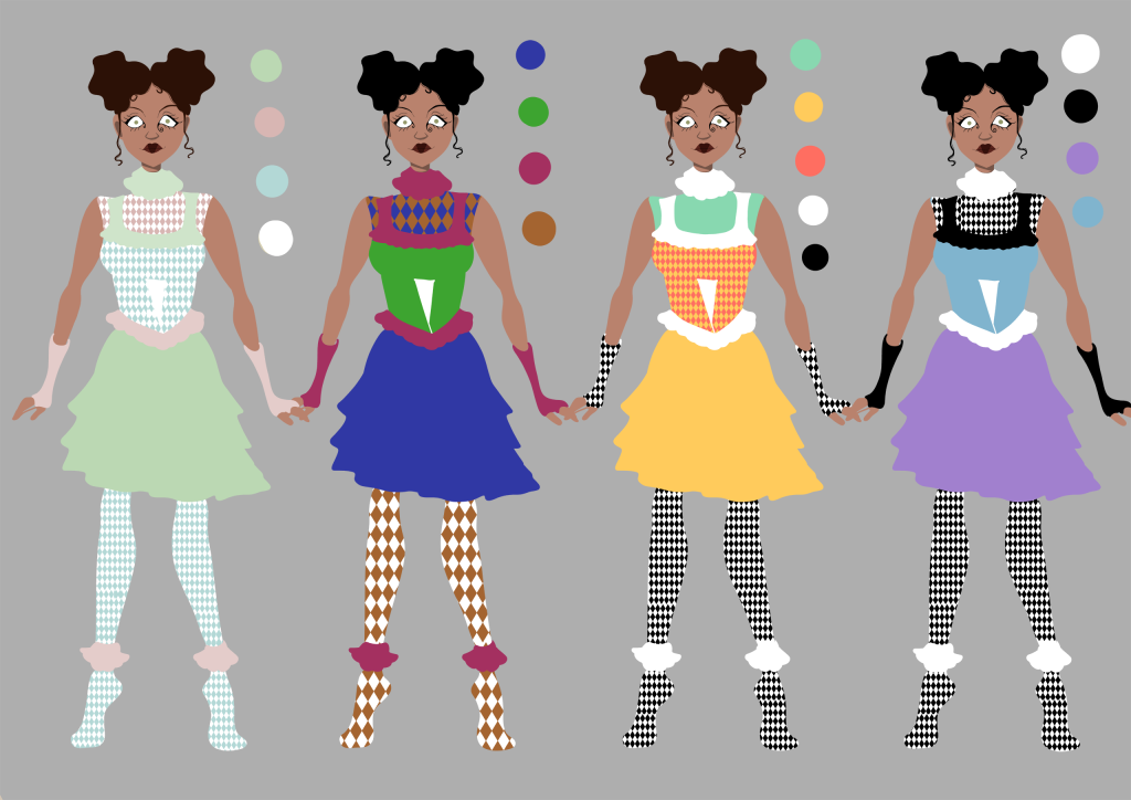
    These are colour cominations in Photoshop, for the harlequinn patterns I just imported turxtures and used clipping masks to change the colours, this was easy and efficient so I could do these quickly. The first options colours are too pastel allowing her to be washed out. The second option feels to dark and though I want her to stand out in the environemnts this would look too out of place. I chose option three as my peers liked it and it was more fun, staying in line with her personality more than option four.

    Final Character Design

    I really like how this design came out, she looks fun and quirky exactly how I wanted her to look.


  • Piano Player Development

    One of the NPC’s in my game is loosely based off of the real life piano players at the actual Jelly Rolls location.

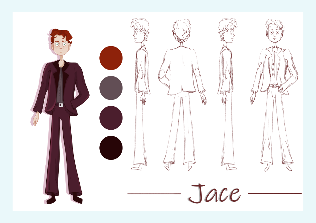
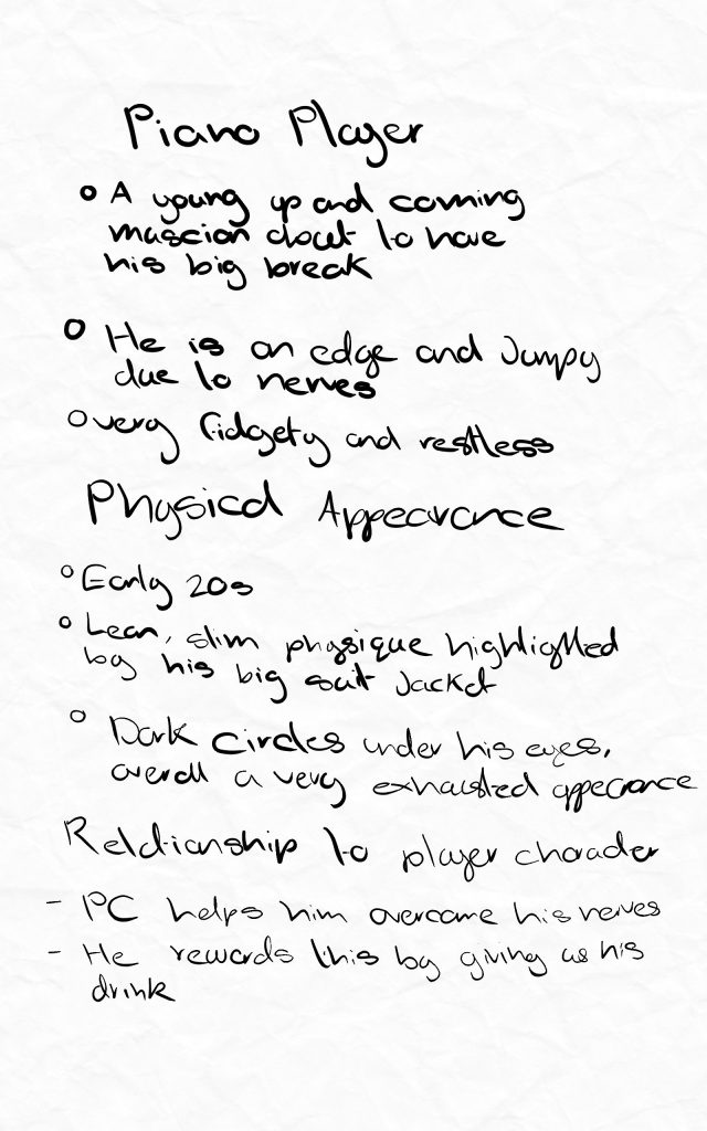
    These are notes I made about him, focusing on his physical appearance and his relationship to the player.

    He is very young, only just getting his first professional gig so when I design him I want his appearance to reflect all of these aspects.

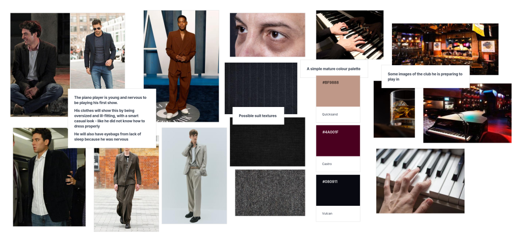
    Reference Board

    This is the reference board I created for the character. He is new to the professional music world so I gathered images of baggy clothes to suggest that he is scared by the big responsibility the job brings, he still feels like a kid playing dress up in grown up clothes. I also looked at actual piano players and saw that many have developed long skinny fingers to easier reach the keys.

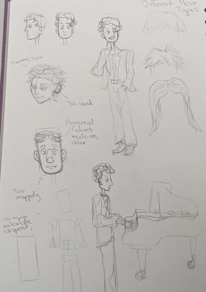
    After my reference board I began sketching him. Starting with basic block shapes to figure out his proportions and physicality. I liked the ones that emphasised his height and legs making him feel and look awkward. For his actual face I played around with different shapes but found myself drawn back to the long rectangular face, I felt it also resembled a piano key. I initally liked a messy haired lookkeeping with the theme of him feeling out of place but I thought it looked too careless and that is not one of his traits. Eventually I found a curled style that can still look slightly unkempt but ultimately suggests that he cares about his appearence, he just lacks experience.

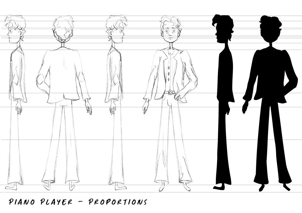
    After my pencil sketches I used Ibis Paint X to finalise his design more and make a turnaround poroportion sheet. I started with the forward facing one incorporating the elements I previousely looked at. Then I drew lines from each important part such as hip placement, size of head etc. and began drawing the side profile. I am really pleased with how this came out as I am not very experienced drawing turnarounds. I also tested the silhouette of his design seeing if it is recognisable and if any parts are unclear. I think it is a successful silhouette as the contrast between his skinny neck and larger torso communicates the baggy clothes and his hair nicely breaks up the uniformity.

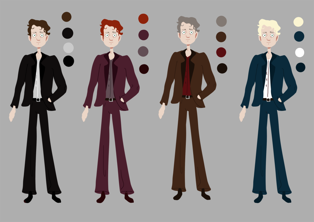
    Once I had a good base sketch, I went into Photoshop and used a large blocky brush to create some colour thumbnails. So that I could see the colours for what they are I used a neutral grey background. After making the reference board I knew that I wanted subtle deep tones for the colours to reflect the establishment he works in. Once these were done I showed them to my peers for feedback and most of them liked the red one. I went with the decision as I also belive this one suits him the most and the ginger hair looks more youthful.

    Final Character Design

    I am happy with the harmonius colours and his appearance I think I have accomplished what I wanted to communicate with the character design.


  • Puzzle Development

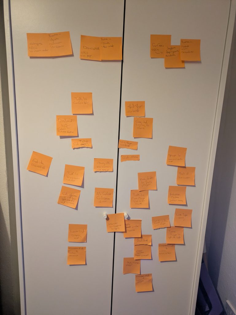
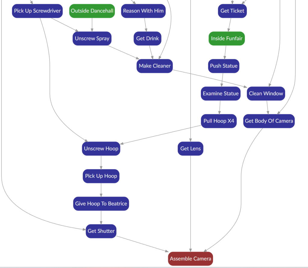
    This is a rough puzzle dependency graph made from post it notes stuck to my wardrobe. I started with the end goal of the puzzle – to reassemble your camera by finding three parts. At the top are the three main locations and what NPCs and items are in them.

    I put the three camera pieces at the bottom along with the locations they are found in. I then worked my way up by stating what is needed to get them, then splitting up those conditions even more. Whilst I was doing this I tried to make it so the puzzle was not just linear, there are multiple things you can do at once, and the solution to one part can be used in other parts as well. I intentionally made it long winded making sure that each part sprouted multiple other parts. Trying to emulate the puzzles of LucasArts.

    Digital Puzzle Dependency Graph

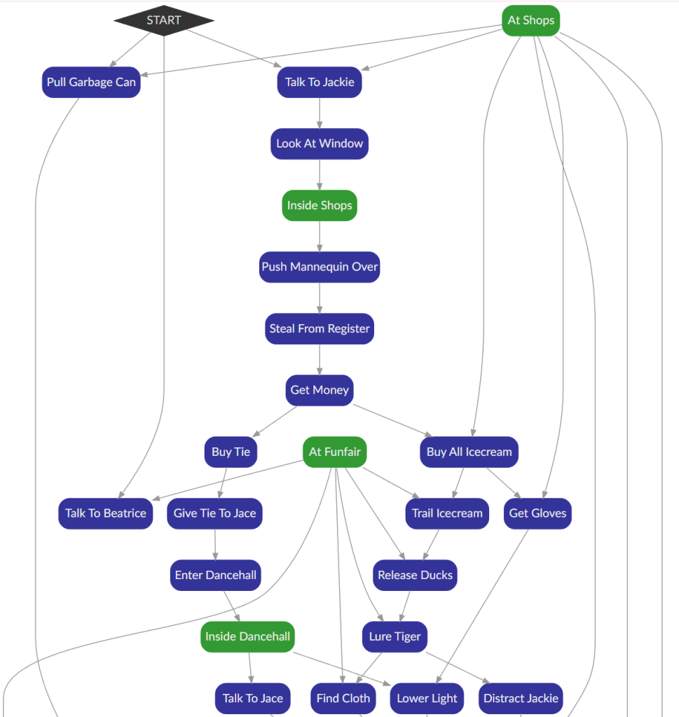
    This is my digital puzzle graph it using the browser software Puzzlon. It is free to use and was made by Chris Ainsley. It was also explicitly based off of Ron Gilberts blog post that I researched.

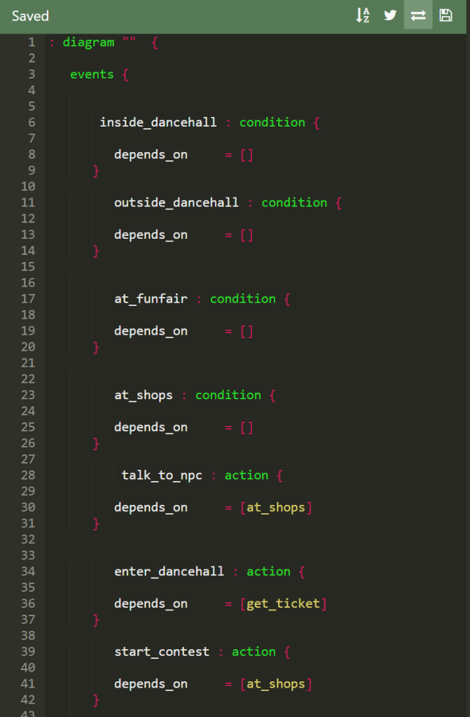
    On the left is the “editor”. It works by using 3 types, action(blue), condition (green) and goal(red).

    in the depends on section you put what that specific action, goal, condition is dependent on and an arrow is created in real time.

    This software had a slight learning curve, but due to its visual nature it is very easy to correct any mistakes and see how your puzzle is flowing.

    Puzzle Expansion

    After feedback from my lecturer I decided to expand the puzzle as it was too short. I added two new environments in this version of the puzzle, the shops and funfair. As with the first draft I tried to keep things not only linear so that you can perform one task and it helps you with two obstacles.

    I am pleased with this iteration, I think it provides a good challenge for players whilst staying whimsical and fun. It also reinforces my game design pillars the exploration and quirky characters.


  • Player Character Development

    In my game there will be 4 characters, the player character and 3 NPCs. I am going to start with the player character. As my game is based around my memory of neing on holiday as a child the player character is going to be a child.

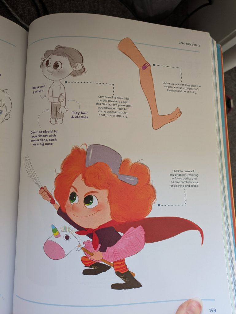
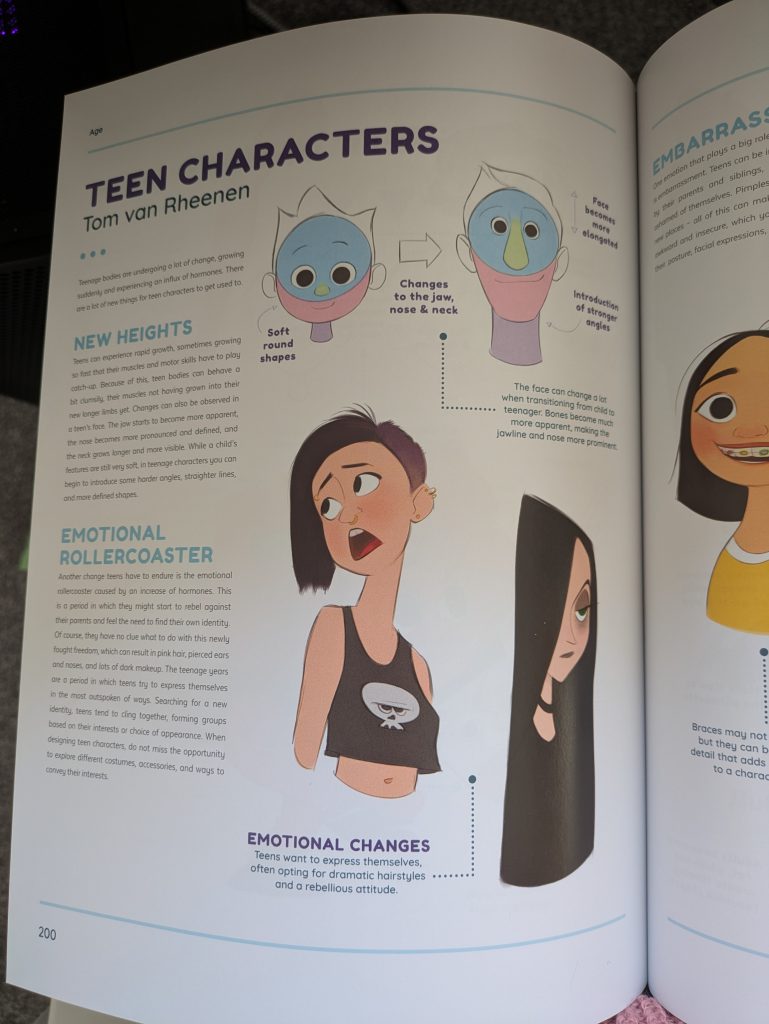
    Before I started drawing I conducted reseqarch into how child and teen characters are drawn using a book called The Fundamentals of Character Design.

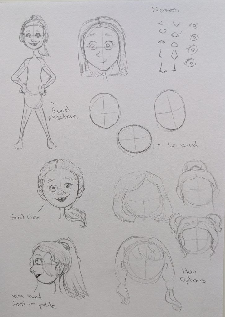
    From this book there are certain characteristics that lets the viewer know the character is a child

    • Usually a very large head compared to the body.
    • facial features are located towards the lower part of the face and are close together.
    • Their eyes are large.
    • Clothing and body language play a big role too.
    • As they grow up the head elongates and facial features drift apart.

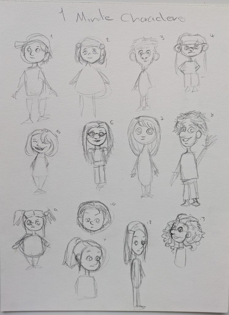
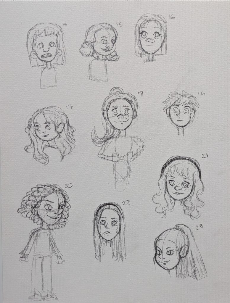
    After my research I decided to begin with some warmup 1 minute sketches. I do not have any defined traits or features yet so I kept everything loose this was just to feel a bit more comfortable drawing child characters.

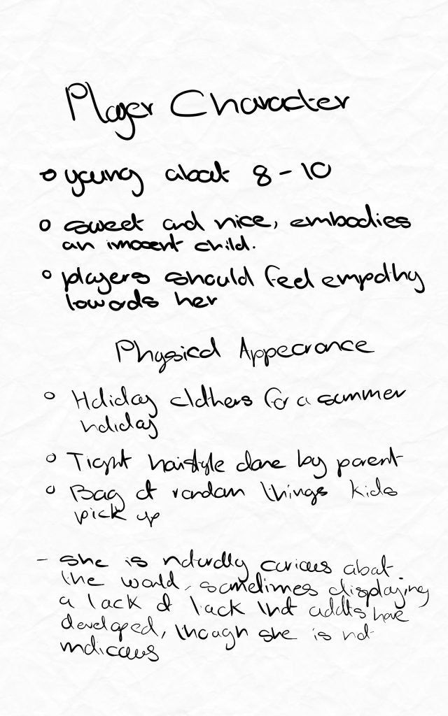
    After I had practised drawing children I started on the characters personality.

    She is very much a character in her own right despite the fact that the player controls her, so instead of the player projecting whatever they want to on her she needs to have an engaging personality that lets the player empathise and connect with her.

    As she is a child she will have more cheeky responses to NPC’s not out of malice but just because hse is a kid.

    Reference Board

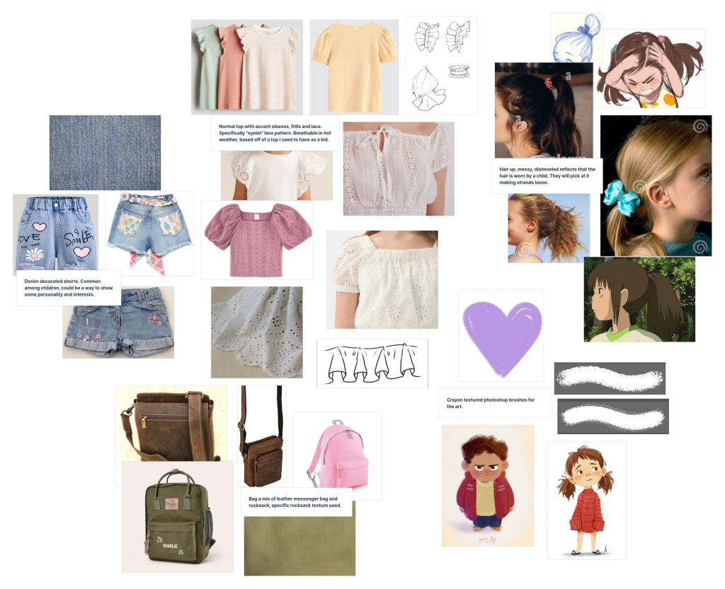
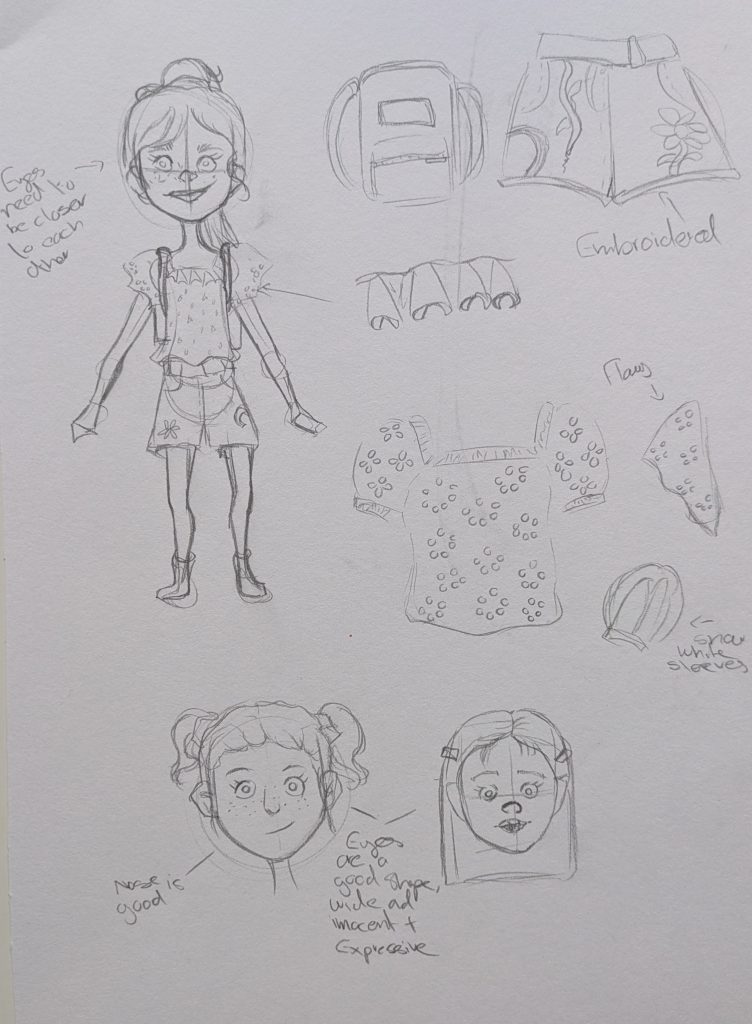
    For the reference board I began with items that I owned when I was a child, such as tops with eyelet lace and embroidered denim shorts. I also looked at how kids are commonly drawn, a lot of these are with chunky crayon textured brushes. As her bag will be the players inventoryI also researched those so I could begin to build up the idea of her outfit.

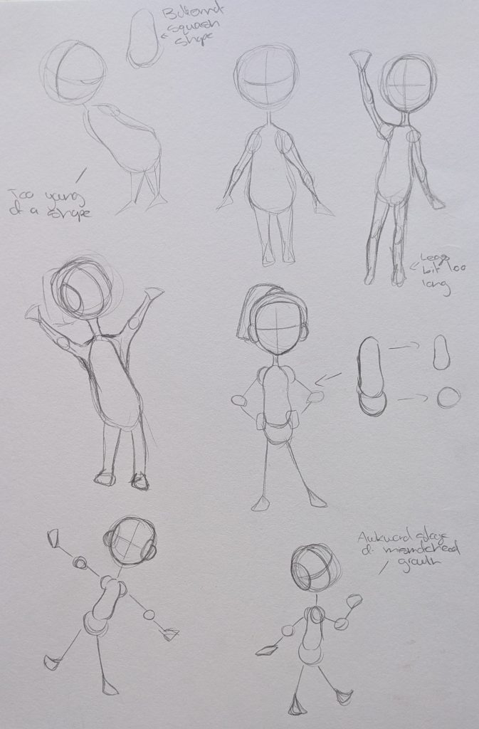
    For the pencil sketches I began with figuring out the shapes I will use. One shape for the body gave the impression it was of a much younger child so I broke it dwon into two shapes – a bean for the torso and a ball for the hips, I played around with some poses of these shapes I really liked it. I then focused on drawing the different elements in my reference board and trying out different facial features and hair styles.

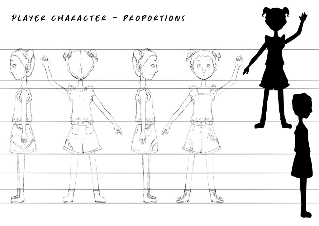
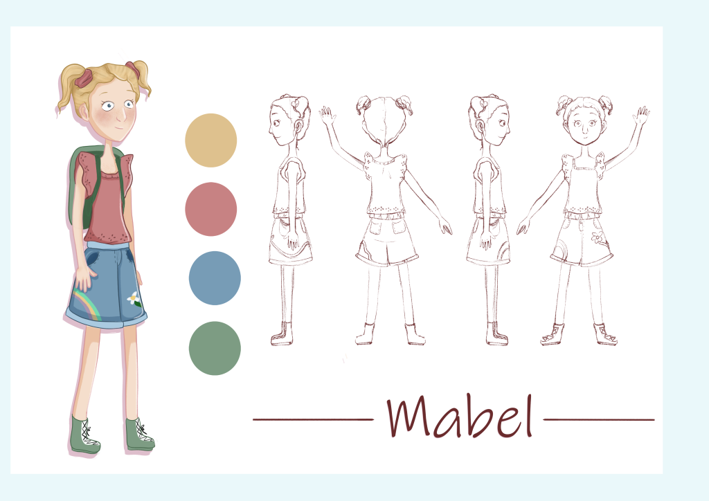
    To create the final sketch design in Ibis Paint X I looked over my pencil sketches and chose the elements I liked best. For the emboidery on the shorts I settled on a flower and a rainbow on opposite sides this was fun to evsion in 3D when drawing the turnarounds. I initially was going to have her wear a ponytail but for the silhouette pigtails were more recognisable.

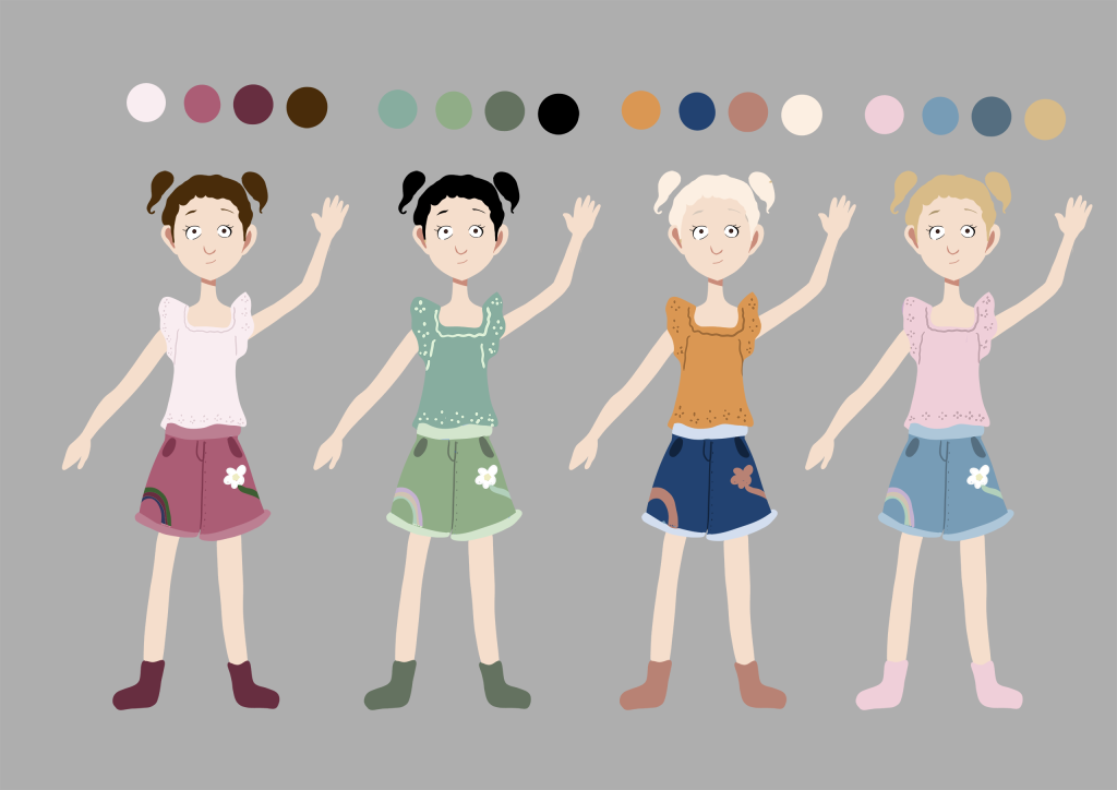
    For the colour combinations I played around with different main colours such as pink, green orange and blue. There were elements of each palette that I liked so after seeking feedback I chose number four but darkened the pink as it clashed with the hair and incorporated green elements seen in her shoes and bag.

    Final Character Design

    I am not very satisfied with the final drawing as I struggled to draw the 3/4 angle of her face but I am pleased with her design elements she has enough personality and things for players to grow attatched too and like.