As the final vertical slice demonstration event approaches, this week my primary task is to work with other team members to complete the playable version of our vertical slice.
My responsibility is to finalize the layout of the final determination level, and help other team members integrate the latest environmental assets, and make corresponding improvements based on the feedback from other players during the last test.
Another piece of good news is that our environmental artists finally brought some assets to use this week, which has made our game no longer look entirely gray. There are some models and some texture maps among them. I applied them to the cylindrical shape where players start and the bottom of the water pool to simulate a modern urban feel. This also corresponds to the description in the GDD.
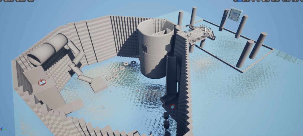

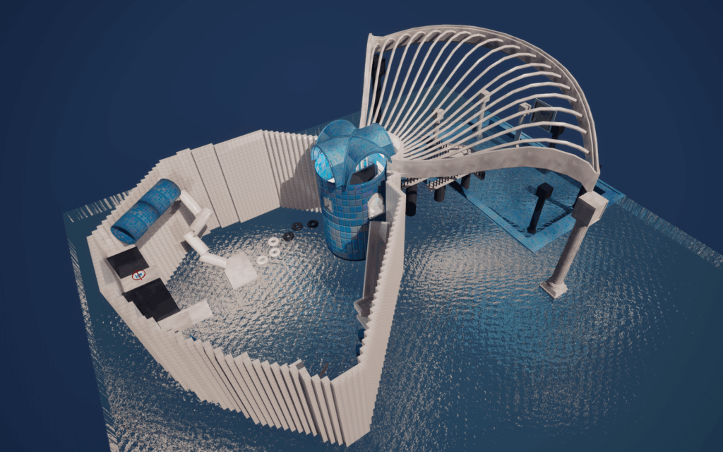
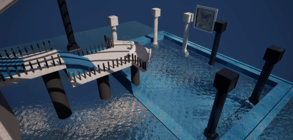
Screenshots of the same level after using the artistic assets brought by other team members, as well as before-and-after comparison images.
Additional artistic assets have enhanced the visual effects of the levels. For instance, the peculiar arched structure shown in the screenshot, as well as the new column model used to replace the original ones at level 1.5, and all of these are consistent with the original GDD. I believe everything we have done perfectly aligns with the theme of “dream”.
Also, the water material I created earlier has been consistently used in the project. After finalizing the adjustment of the game’s background color and lighting, it has become even more in line with the artistic style of the game.
Based on the feedback from the previous playtest, some classmates and tutors pointed out that the guidance in our level was not clear enough. In response, I added more instructional text throughout the level.
I also considered creating effects such as particle effects and lighting effects to guide the players. However, it was obvious that we didn’t have enough time to do so anymore. Moreover, with our current technical level, if we tried to produce the corresponding effects, players might still encounter difficulties in following the guidance due to not being able to understand the meaning conveyed by the effects. Therefore, I chose the fastest and most direct solution, which was to create several signs with simple and clear text to tell the players what they need to do in the game, how to do it, and where to go.
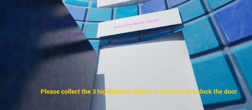
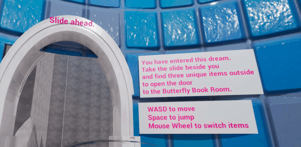
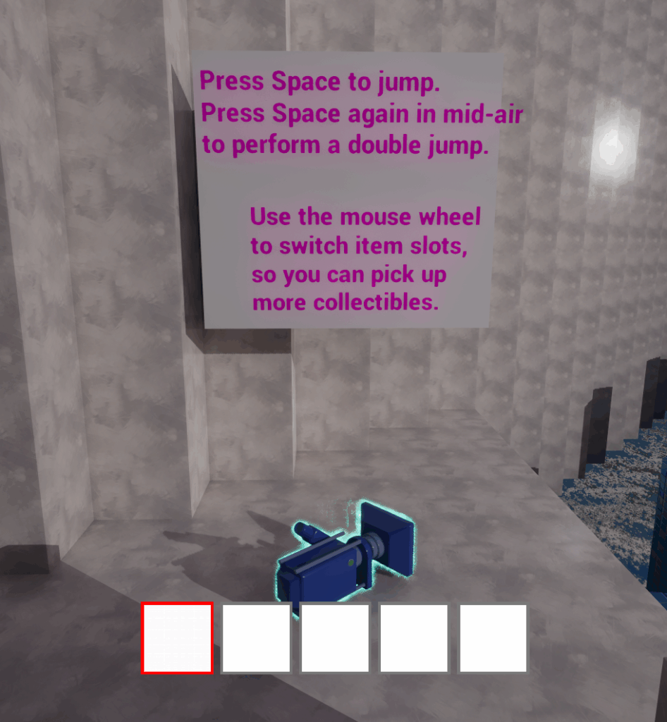
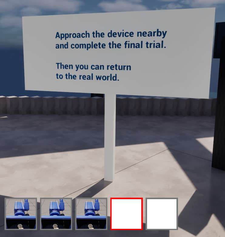
These texts use highly visible colours to make sure players can easily notice them. The main changes include adding short story text to explain the background and context of the level, as well as adding clear text instructions for all important gameplay actions, such as double jumping and using the mouse wheel to switch item slots.
Reflection
This week, I realized that level design is not only related to spatial layout, but also to communication. During the previous game testing, many players played our game and maintained communication with us, providing us with many valuable suggestions.
For example, there were opinions about unclear in-game guidance. Due to insufficient and incorrect guidance, although the mechanisms were already functioning within the game, players still felt confused during the gameplay.
By introducing signs and text in bright colors, these can help players clarify their in-game goals. Without changing the level structure, the levels become easier to understand.
Looking back on the past few weeks of work, it was such communication and collaboration among the team that allowed our game to continuously iterate in aspects such as levels and artistic style, making the entire game more complete.