This week I made my game LOGO.
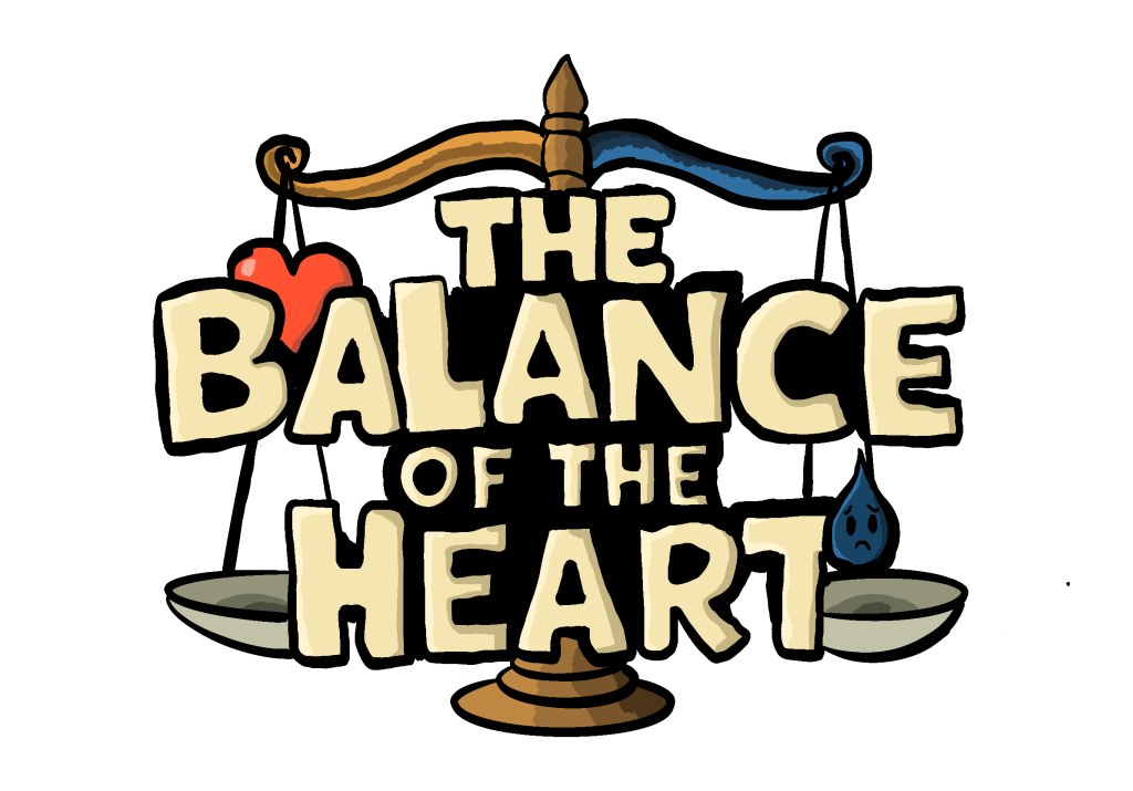
Game-Logo
With the balance as the background, I used a cartoonish font to better match the overall style of the game. I also divided the balance into two parts with warm and cool colors, with the left side representing “good” and the right side representing “evil”. Additionally, I drew two small icons and incorporated them into the logo: a red heart on the left and a tear with a sad expression on the right. Dividing the picture into two completely opposite themes with the center as the boundary is my favorite design style. My poster background is also designed in this way, with the LOGO and the background complementing each other.
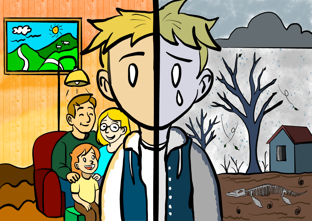
Game poster background
This poster is the core image of my narrative game “The Balance of the Heart” : the same person, two worlds. The lights, wood grain and the smiling faces of family members on the left symbolize the daily life nourished by kindness. The grey sky, withered trees and bones on the right point to the desolation left by indifference.
When the two are combined, they form my game poster
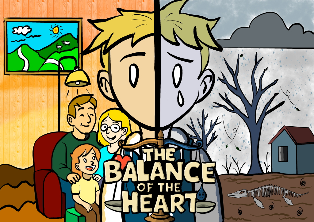
Game Poster
I also made a PPT, in which was my elevator pitch about my game
Industrial page: Follow-up development