Main Character concepts: each is designated to a specific location in order left to right (Starting location, Lakeside, Clearing, Cliffside)
Brushes used for character concept.
App: Procreate

Character Reference Board

Character scale against animals


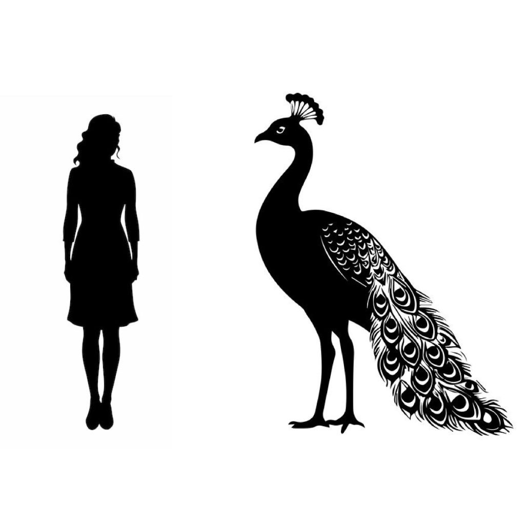

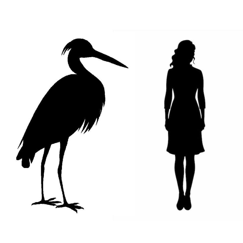

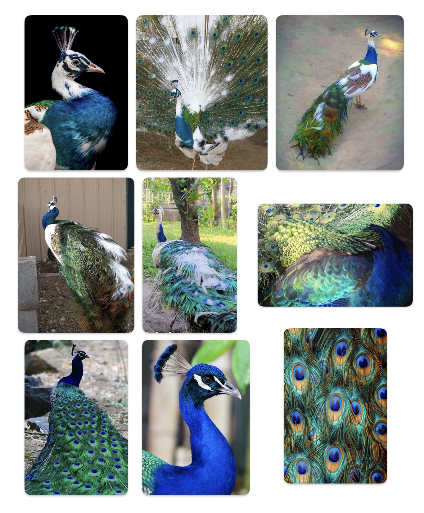
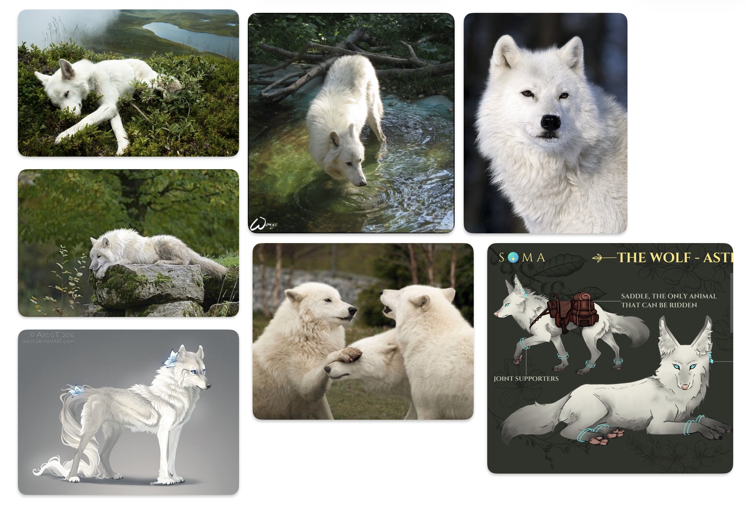
Animal reference Boards


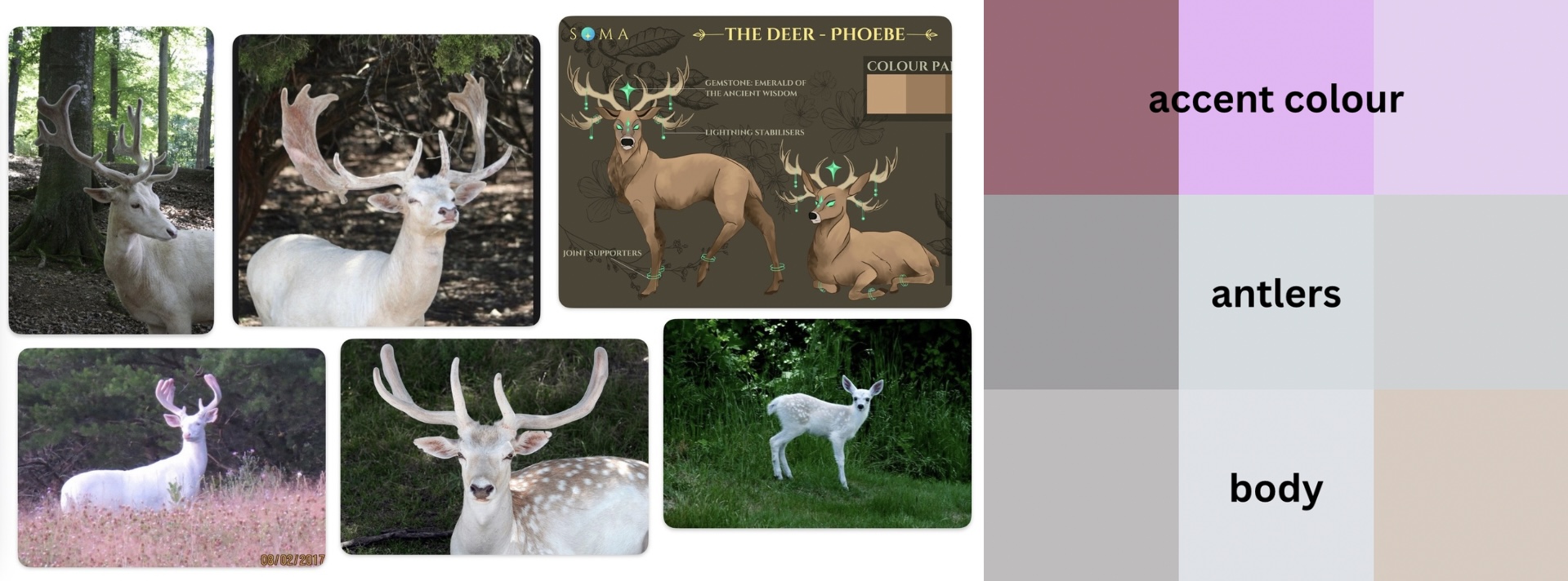
Below are the animals that do not necessarily have an accent colour, but I believe that their appearance should remain the same. Besides, for a peacock, for example, the appearance is already quite unique, plus it ties with the mechanic that’s assigned to it.


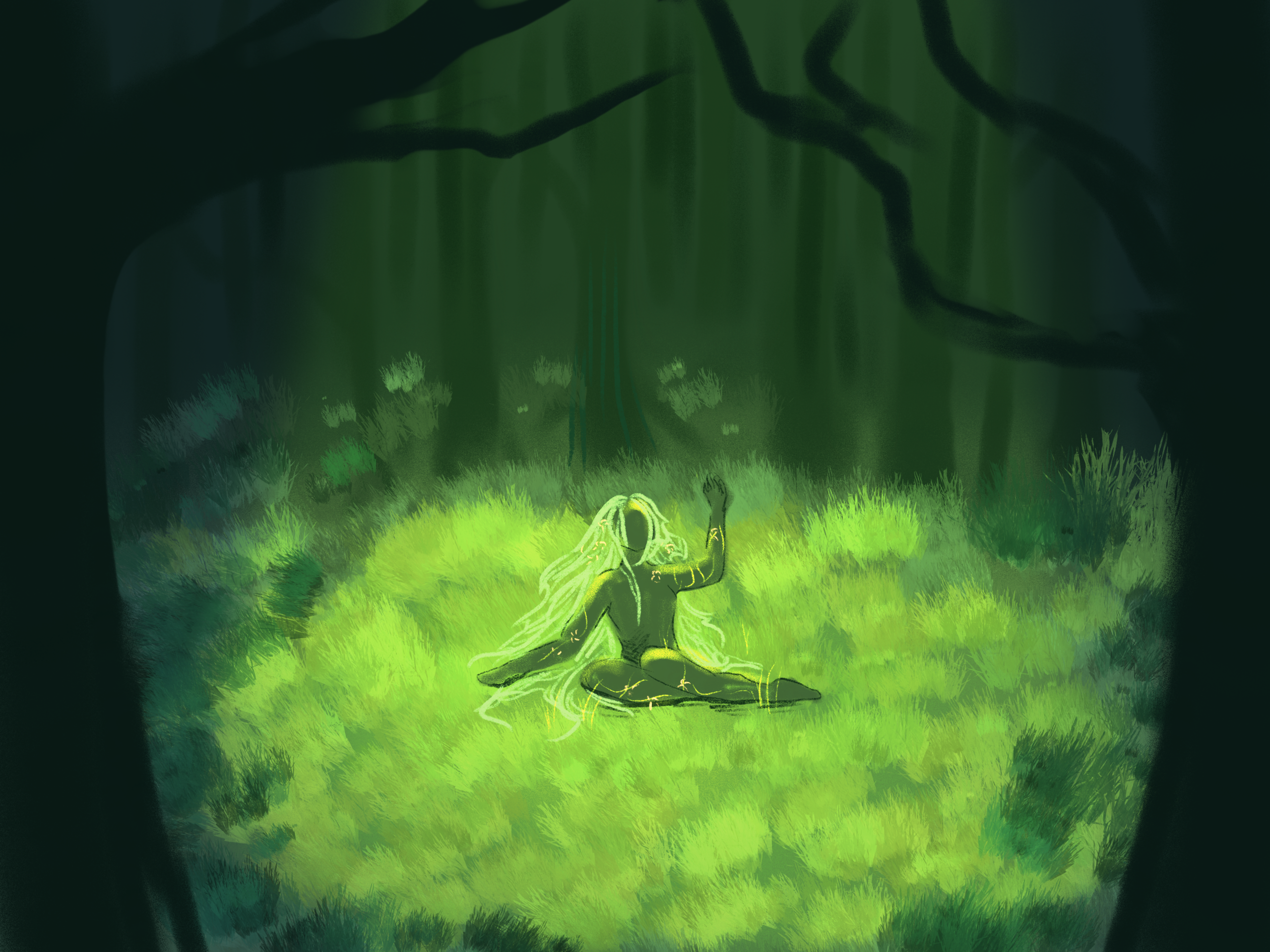
Starting cutscene. The MC is waking up from slumber in the middle of the forest, covered in flowers and grass that turns in her hair and clothes as she gets up. This location can have the same environment as the Lakeside.
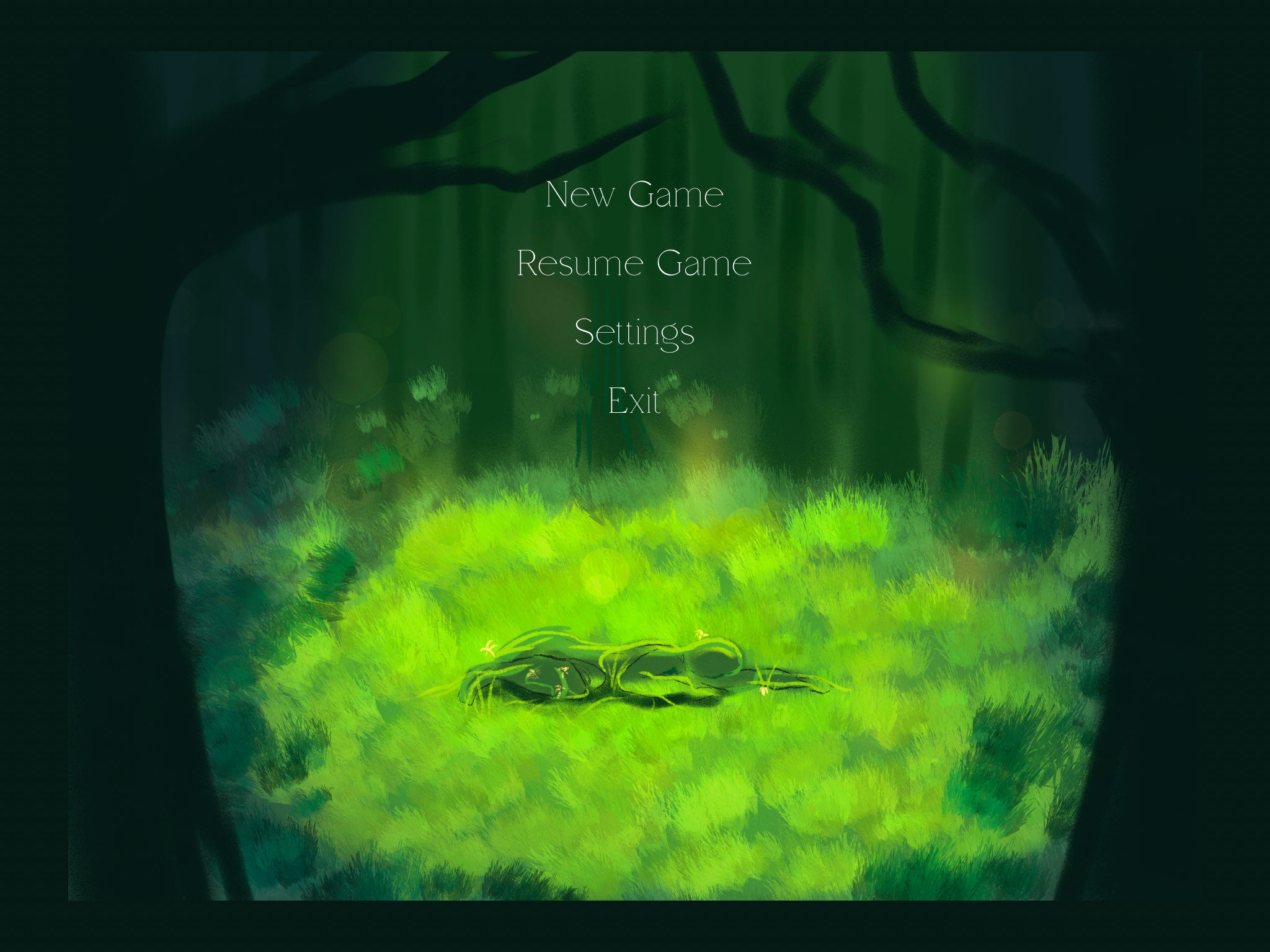

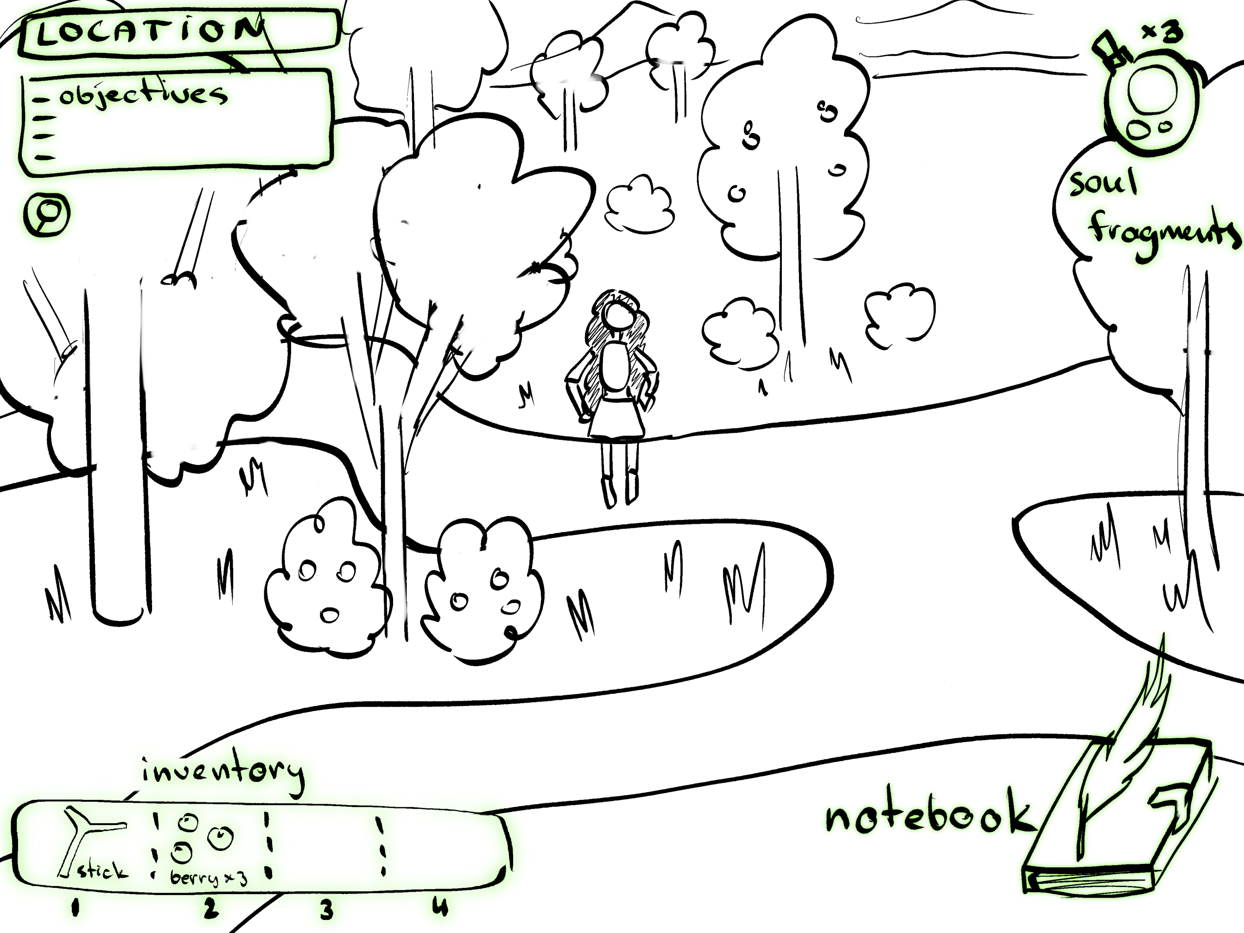
Example of the UI and starting cutscene.
Fonts: Arcadian, Spire. All the similar fonts are fine, I love the feel of fantasy-like writing and simplicity of these two.
UI animation was made in CapCut.
Tutorials shouldn’t be too flashy, very minimal wording and simple visuals.
Same goes for all the HUD elements and pop-ups.
Some more UI sketches, specifically an opened Notebook and HUD.

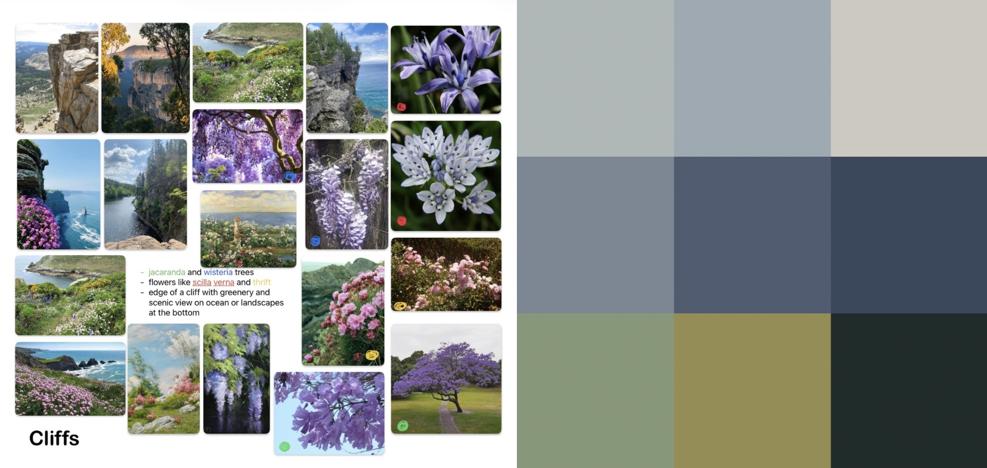
Location Reference Boards
Colour Combination Examples
Colour combinations were created for visualisation purposes only and can be altered throughout the development process, but the accent colours and colours of the flowers on reference boards should remain the same and can not be changed.


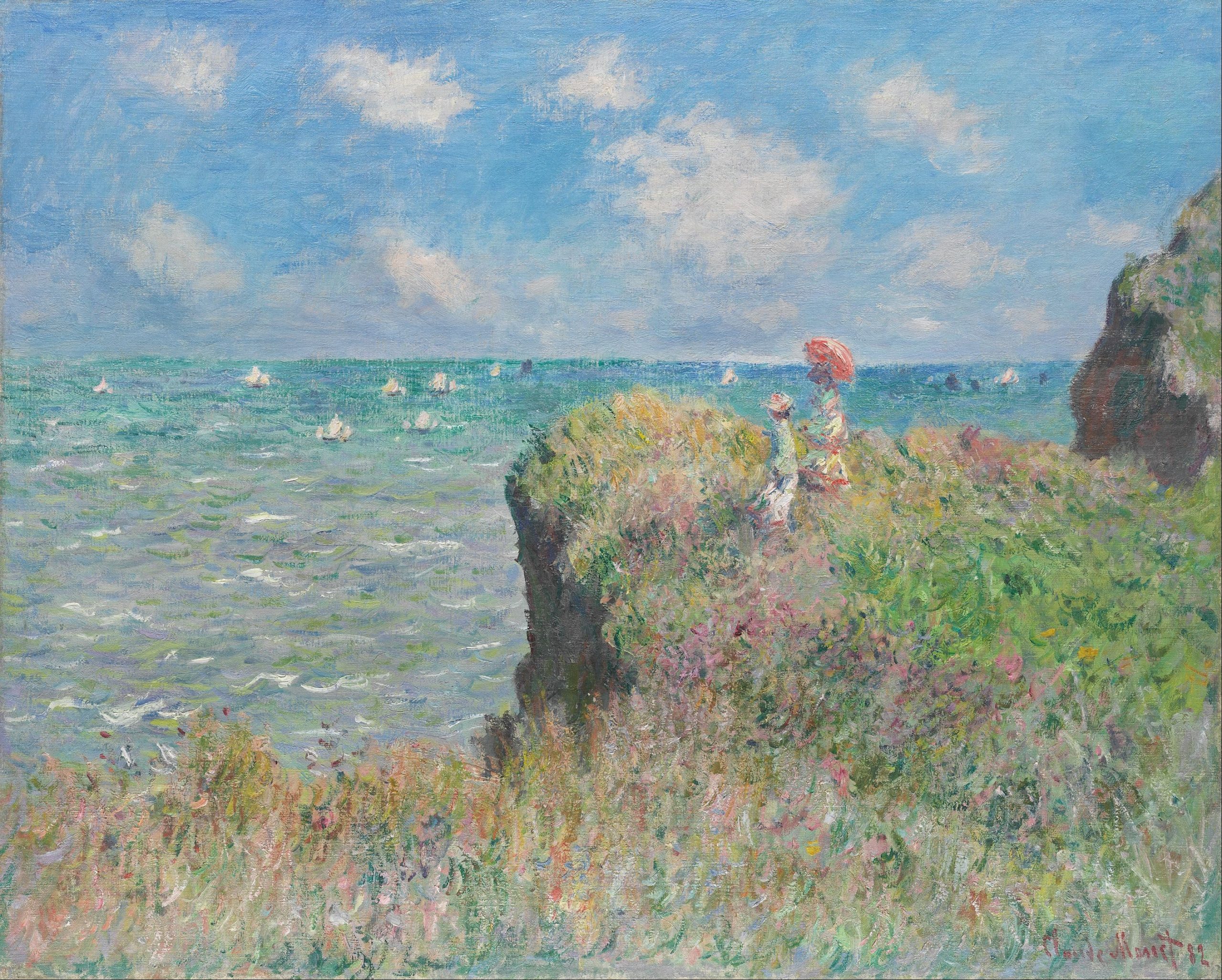
Not necessarily an art style choice, but Impressionism has had a big influence on me in terms of colour palette and the general feeling I want the game to project. Light, pastel colours; minimal detailing of the background. More about Impressionism here. More artists here.
I believe that the person who will be responsible for visual aspect of the game should have a chance of exploring their own hand-drawn art style, while taking inspiration from Impressionism and games like Hollow Knight, Neva and Gris. More about reviewed games here.