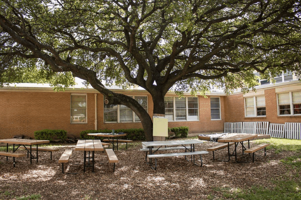
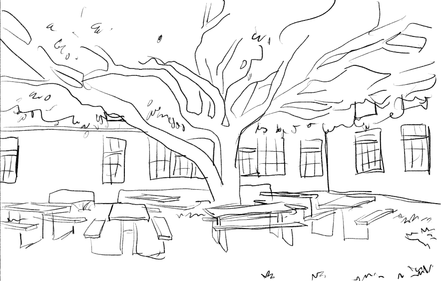
I decided that I wanted there to be two areas to the cafeteria, inside and outside, the outside one having a large tree as in the script a tree meeting spot is mentioned. I managed to find some great references on Pinterest.
I wanted it to feel large enough to fit about 300 students, have windows present, and still have the cafeteria’s food section be visible as well but not too close to the screen. I searched for references but the ones with the café section showing tended to have it be the focus or too close to the camera, and the ones I liked the most didn’t have one visible. I wanted the tables and seats to be the most prominent as the goal is to make it feel somewhat overwhelming.
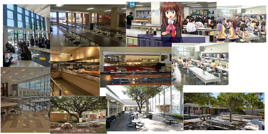
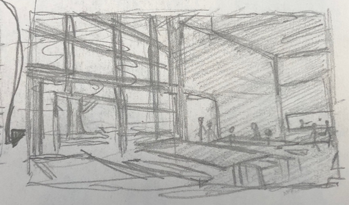
My main reference was in portrait mode so extended it with the sketch and in the very back I added the café area where you get the food. When I sketched this, I realised it was fine if the huge walls were just empty as I remember my old school having a large cafeteria with tall ceiling with few things on them, such as awards and posters. I think it came out good, it looks like a cafeteria, and I love that you can see the tree from the outside area.
I wanted it to feel very cozy and refreshing, a perfect spot in the shade to just hang out and play cards with people, and I think this sketch does so successfully. However it’s mostly copied so it’s not an original concept yet and I will have to keep iterating it.
I then imported it into Krita, where I tried to line up both sketch and reference image together.
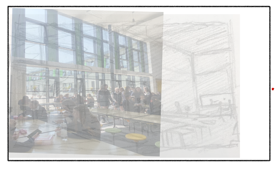
I then I found the perspective lines and extended them till they connected into the perspective points like I did for the “Classroom”. I then started tracing the lines from the image. I was then going to use the perspective tool on the extended part of the image.
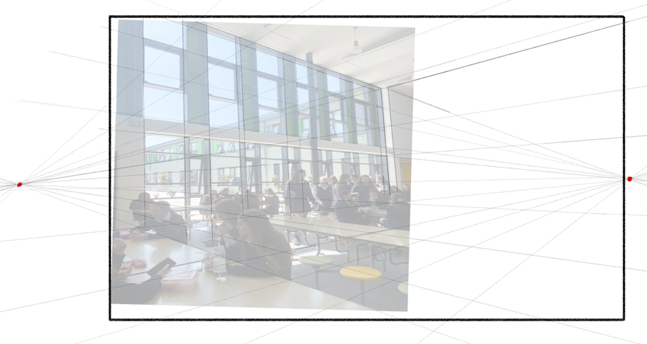
But when I used the perspective tool, I realised that the vertical lines did not follow the tool (blue=tool),
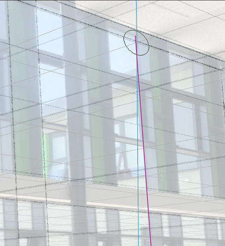
which really confused and irritated me, but I realised that the picture being from real life, has more perspective points or I didn’t find the correct two points or the picture was taken in specific setting, I’m not sure but I had to scrap the tracing I did and just draw the lines with the image as reference underneath and fully relying on the tool to keep the perspective consistent.
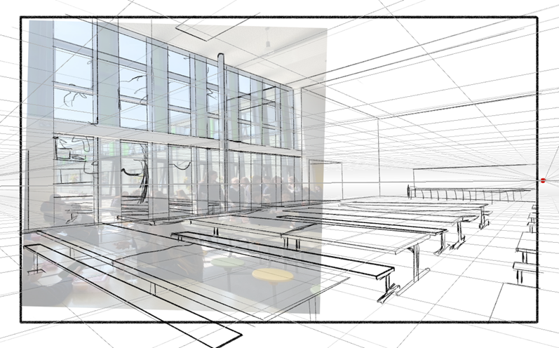
I drew the background, midground and foreground separately again.
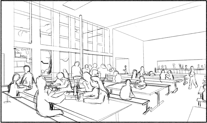
I then traced the people from the reference and added some in the extended pats of the image, then I made an “erase” layer to erase behind the people and began to colour.
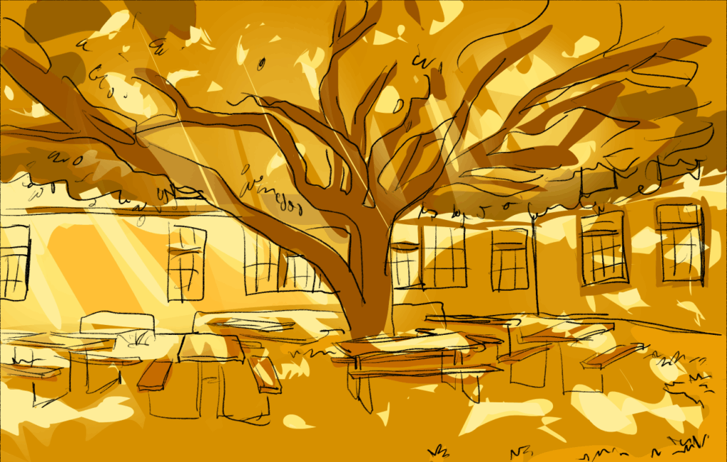
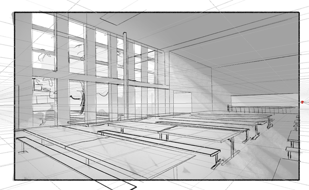
I coloured it in black and white first for the values which I put into a folder and set the folder to multiply so it would have effect on the colours below the folder, and then coloured in everything in a different colour palette than the GDD outlined because I wanted to experiment more with colour palettes. I wanted to explore colour changing backgrounds according to mood or daytime where the NPCs will always perfectly match their environment and blend in, whereas the MC will always stand out a little more in, however I fear I might have made it look a little too spooky and uncomfortable, which is good but I wasn’t 100% sold on it. One reason may just be because I really like the colour scheme in the GDD and I don’t feel set enough in my ideas to move away from it, and also because of how unpolished it looks at this stage.
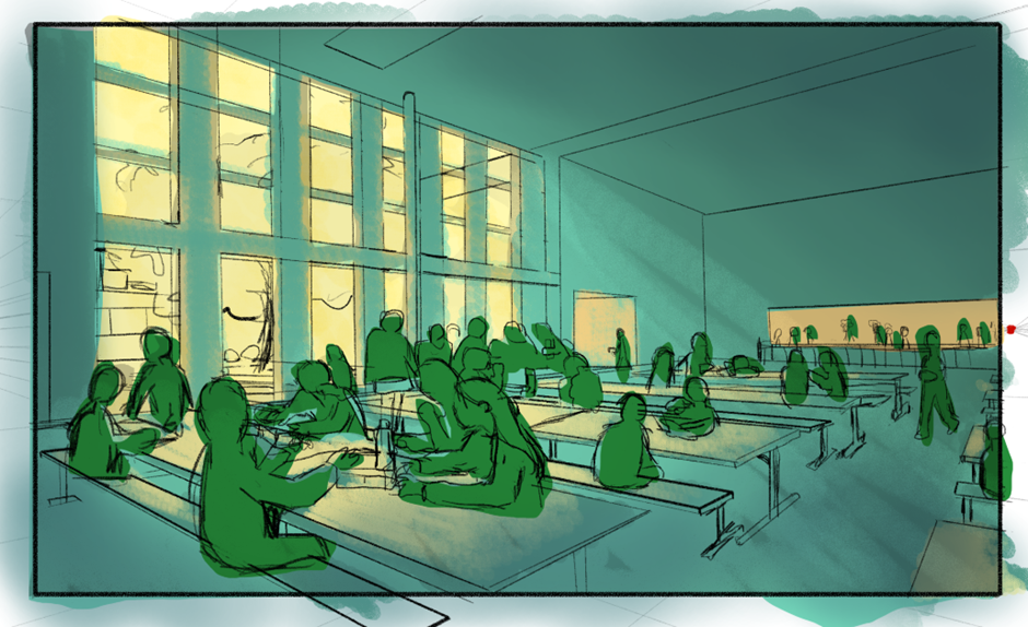
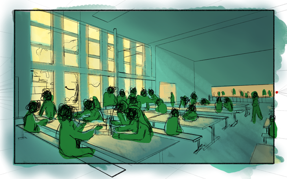
Towards the final playtest I decided to go back to the original GDD idea as I hadn’t carried on with experimenting with this colour scheme and hadn’t tested it with the UI.
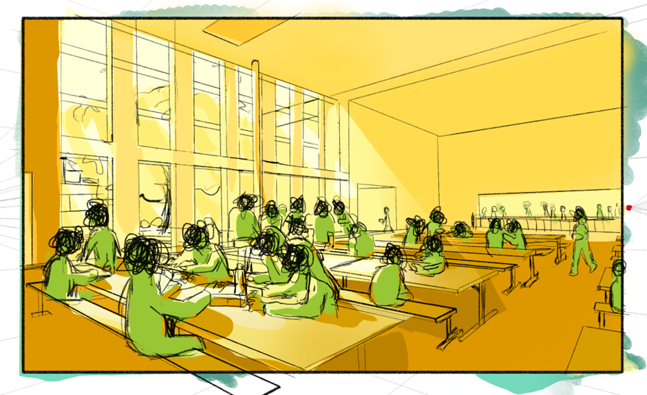
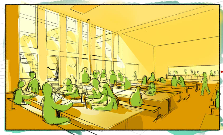
I think this looks quite nice, however I made it a little too bright, which takes away any discomfort that the player should be made to feel from it. It looks cozy, which is far from what the game is supposed to be at the beginning, perhaps towards the end where the MC settles in a little it would make more sense, however, the cafeteria being loud, full of people and overstimulating in general would probably never feel truly comfortable or cozy for an autistic child with social anxiety.
Outside cafeteria:
Because I didn’t have time, I took the major reference for this background, traced it, and coloured it in yellow, brown and orange hues using the Shapes fill brush and an Airbrush on Krita.