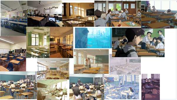
The first background I began working on was the classroom. I started by looking at the references and making a mood board.
Throughout my entire background drawing process, I used a custom pencil brush on Krita, derivative from the h) Charcoal pencil large brush, because it best suited the sketchy, hand-drawn art style we were going for the game, and I also used the Shapes Fill brush for filling in colours.
I picked a main reference and began copying it down, coloured it yellow to match the GDD, and then I copy-pasted the UI from the GDD to see if it worked, which I believe it did.
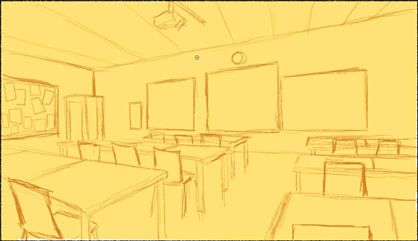
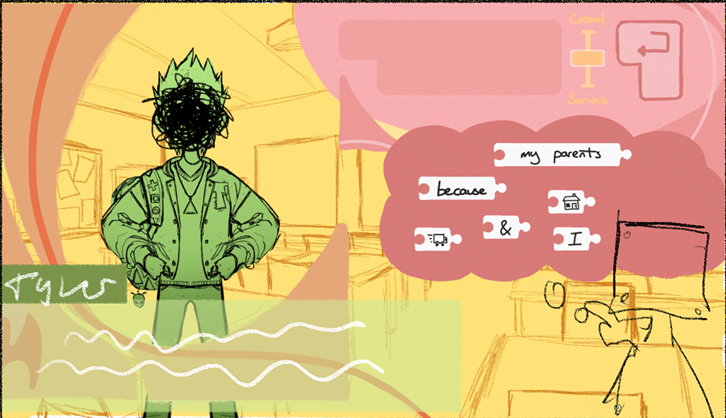
I sketched it again in my sketchbook to change/add some details to make it feel more original, especially because there’s many detail about the reference image that I didn’t even like, such as how claustrophobic, dark and gloomy it felt, so in ana attempt to make the room feel bigger, I changed how close the front of the classroom is to the POV and I added windows looking in from the hallway.
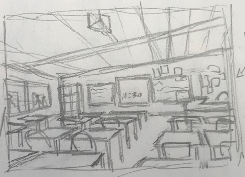
Back in my secondary school in the UK the math building had hallway windows, I hated them as I felt watched, but it simultaneously helped with the feeling of being stuck in class, like a reminder that I would be leaving soon. I’ve seen them a lot in Korean manhwas and dramas and I really like the look of them.
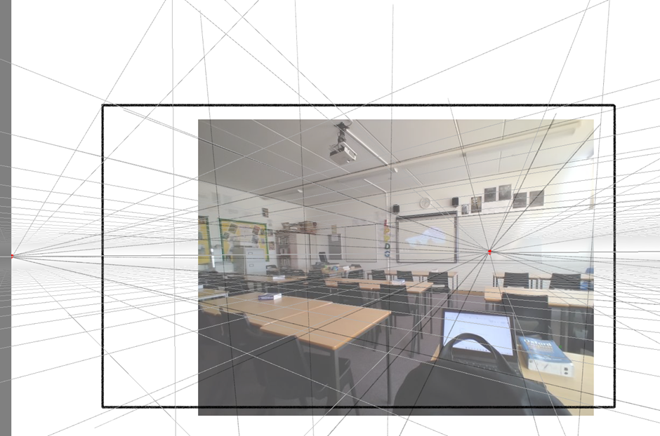
I began to make it digitally and to make it I took that main reference image I was using and took reference of the perspective lined and figured out where the vanishing points were, then using he Krita perspective tool which is called Assistant tool.
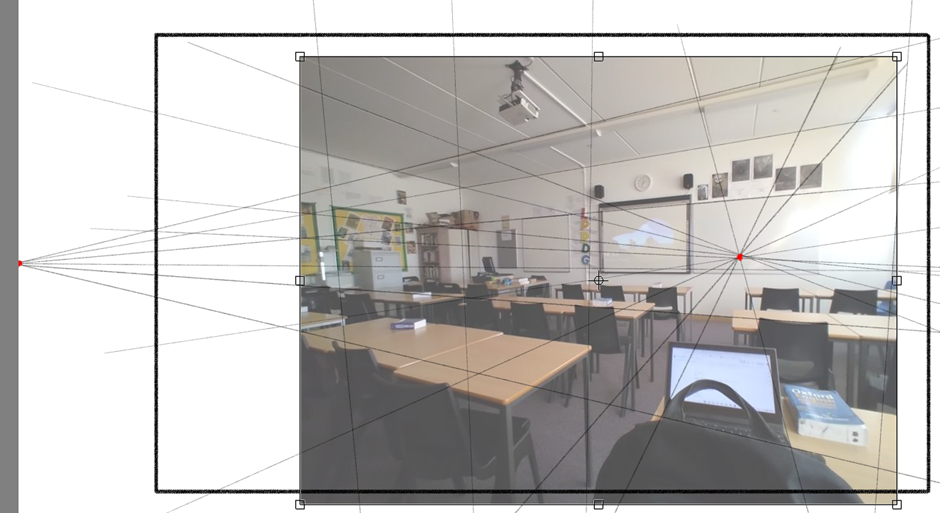
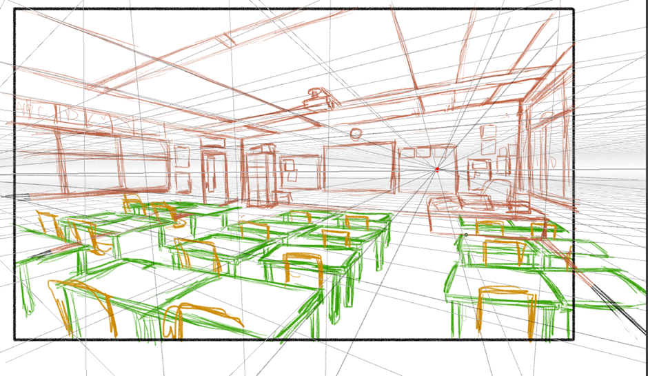
Here I inserted my pencil sketch and used it as a baseline for the finished product, which was hard because I realised how messed up the perspective was in the sketch, so i had to use the transform tool to make it align closer to the perpective lines. I used the perspective tool to extend the sketch as well, which was much easier to do thanks to it.

I sketched the components on separate layers to make it easier to fix any positions or add future background props or NPCs.
I then did the lineart using a variant of my custom pencil brush, one without any pressure sensitivity. I made sure to not focus much on making the linework perfect as I was going for a somewhat messy sketchy style. Then I coloured it yellow with the windows a lighter shade of yellow and white.
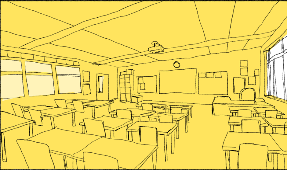
Evaluation: I really like how neat and realistic the perspective is, however, I also didn’t like how “clean” it felt despite the messy linework. It doesn’t have much life to it, which may have to do with the lack of NPCs or colour variation due to it being unfinished, but because of how I felt about it I just couldn’t carry on with this version, and I brainstormed some new ideas instead.
Following some research on ASD, I reminisced on how they can get really overwhelmed by the environment they’re in, for instance how loud it is or from unmanaged stress. I thought about how I could show that through the backgrounds and concluded on odd, uncomfortable perspective.
The work of Vewn, an artist and animator on YouTube came to mind. All her work is very distinctively simple yet complex through her use of non-linear perspective which follows its own rules, and the details in said backgrounds, which are able to tell a story all on their own.
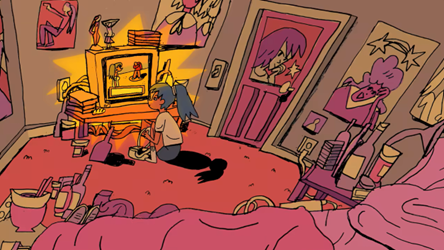

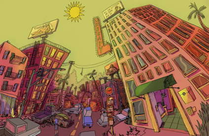
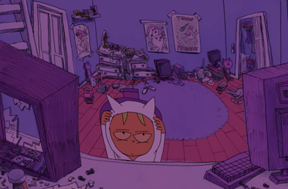
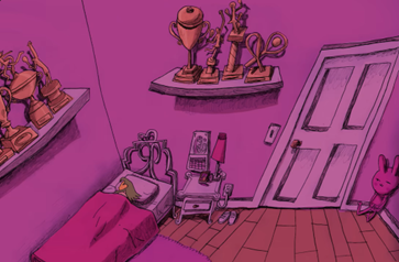
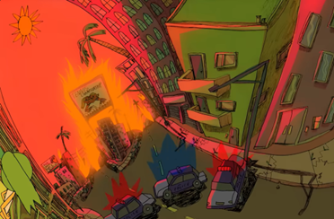
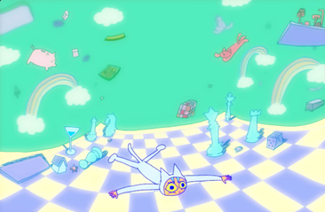
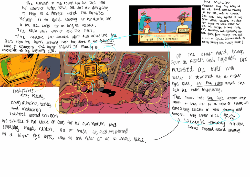
It’s so weird yet captivating and lively and I wanted to somewhat utilise this in my own background work.
So I sketched over the background I made with the intention of messing up the perspective and making it a little more stress inducing or uncomfortable to look at.

This was the first attempt. I didn’t like it as it made the POV appear to be up in the air, which isn’t good as its supposed to feel like a first-person POV. So I moved on to the next one.
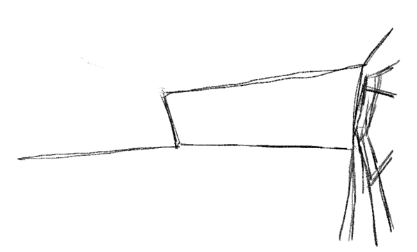
I made the same mistake of making the perspective too high and moved on again. In general I really liked the perspective and how dramatic it seemed, but it just wasn’t what I wanted for Backchat.
So I then made this one with the goal of a fisheye perspective + desks that looked like they were on uneven ground, like hills or waves of water.

I really liked this one, but you can tell I didn’t fully commit to the weird perspective I was aiming for, so the desks on uneven ground looks “weird” but not in a desired way, since it doesn’t all lookweird. It’s inconsistent as the desks appear to be moving upwards only on the left side. So, I experimented by changing the direction in which the desks “waved”
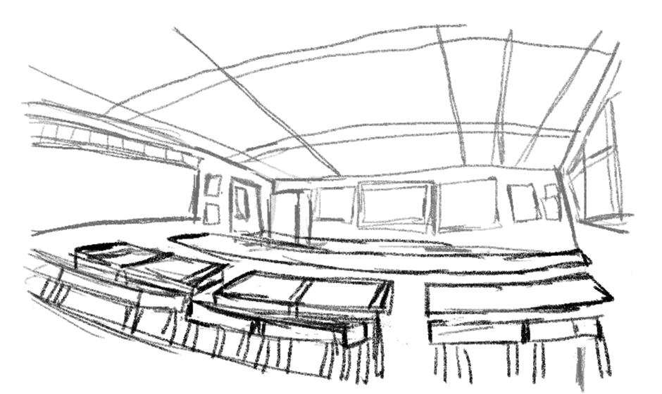
This came out as a result. I drew the lines of desks with long parallel lines which I would split and connect to form the desks. However, the perspective was too weird, and not in an appealing way. The desks closest to the camera are facing towards it sideways way too much for my liking. It almost looks as it the POV is from either someone laying their head on their own desk, or a really really short person. If I decided to fully commit to this “wave” direction, I would have to animate it to make it work, to really make it look like everything is moving , almost giving the player motion sickness, but I don’t have the time to do that.
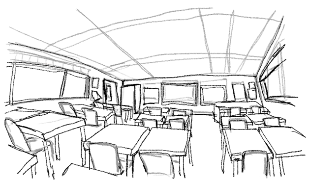
So I went back to the previous one and made a cleaner line art sketch over it.
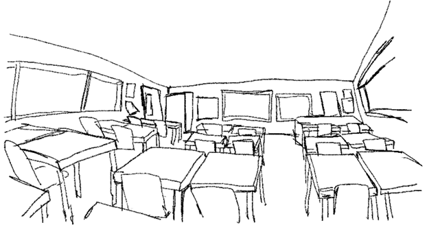
This became the base for the final background.
I opened a new krita file so I could draw the background on a larger canvas and not have it be pixelated, and began doing the line art on separate layers like for the first version.
(Note: I don’t have progress images of the weird, elevated desks on the left as when I decided to change it, I didn’t duplicate the layer. I am using the post-editing images instead)

I then began colouring it in and kept contrast in mind. I knew that the light yellow would be the most prevalent colour in the artwork, so I decided that would be the walls and ceiling, and the floor would have to also be darker to create the illusion of shadow and add depth, which meant the desks were going to have to either be lighter than both walls and floor, in between or darker than both. I tried in-between but I didn’t like how it creates a gradient down to the floor, so I made the legs darker, which made them stand out more than they should, whereas the desks did stand out at all.
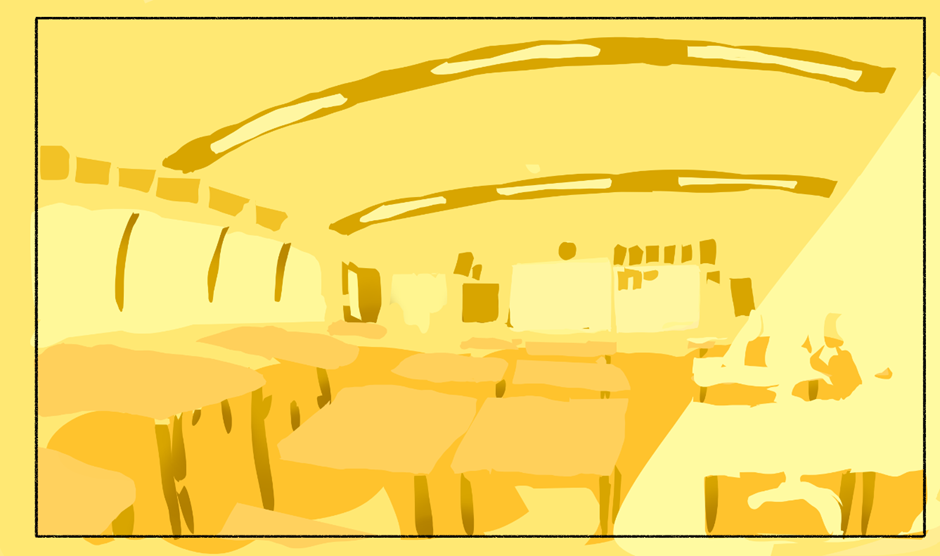
So I opted for darker desks and lighter legs to make them stand out more and also because I wanted to have a deeper almost brown colour be like an accent colour, then I checked the values by creating a white layer and set the blending more to “colour” which made everything below it black & white.
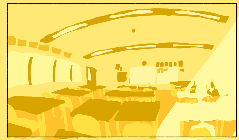
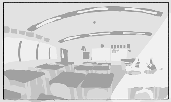
I then moved on to adding the NPCs, but first I looked at some references.

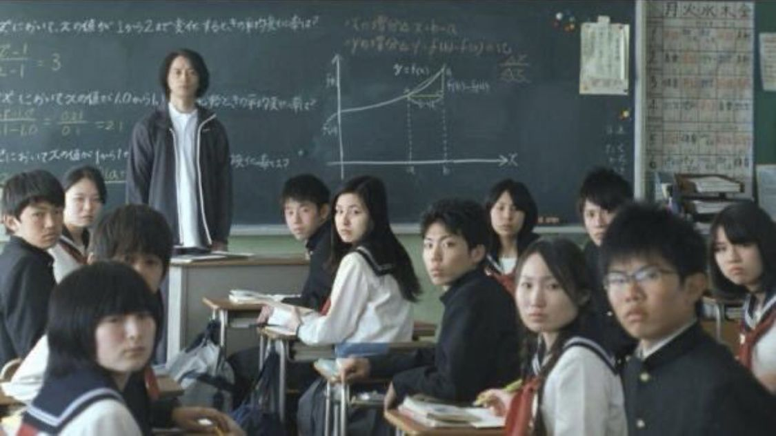
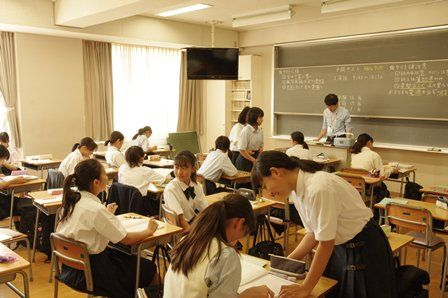
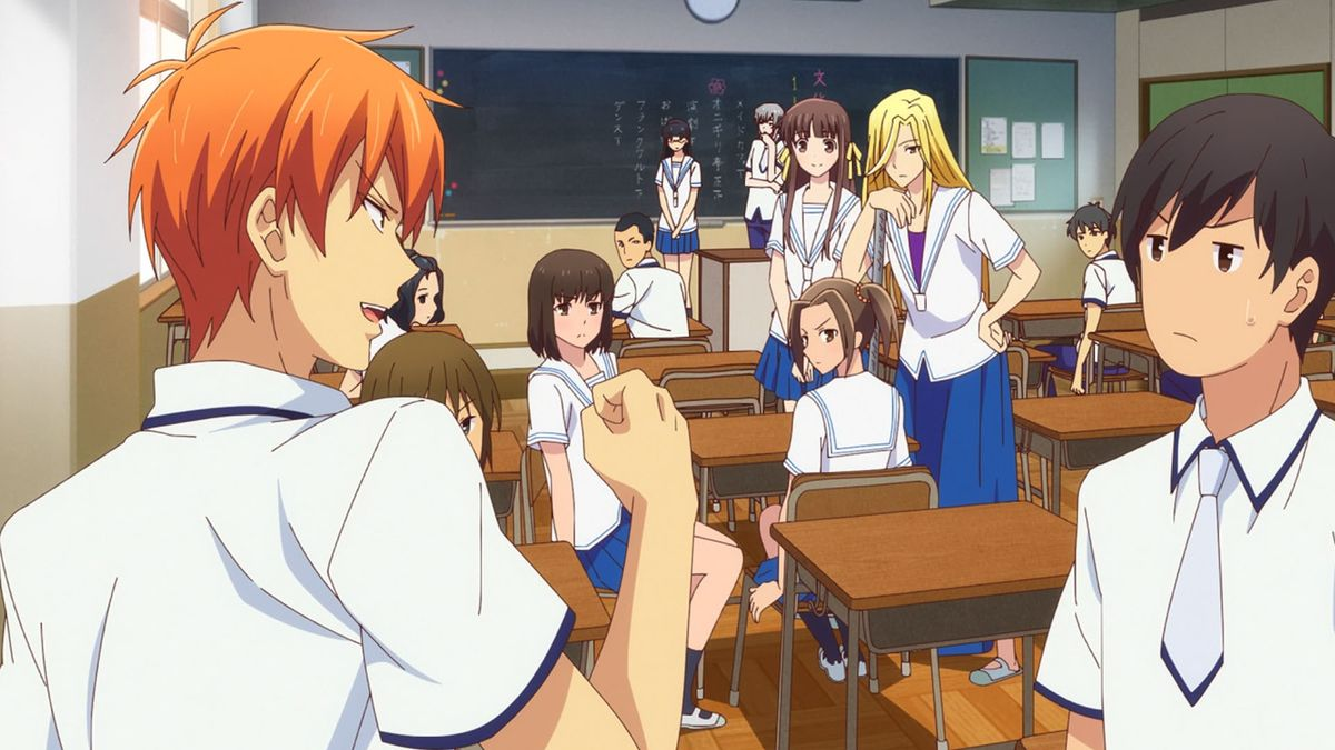
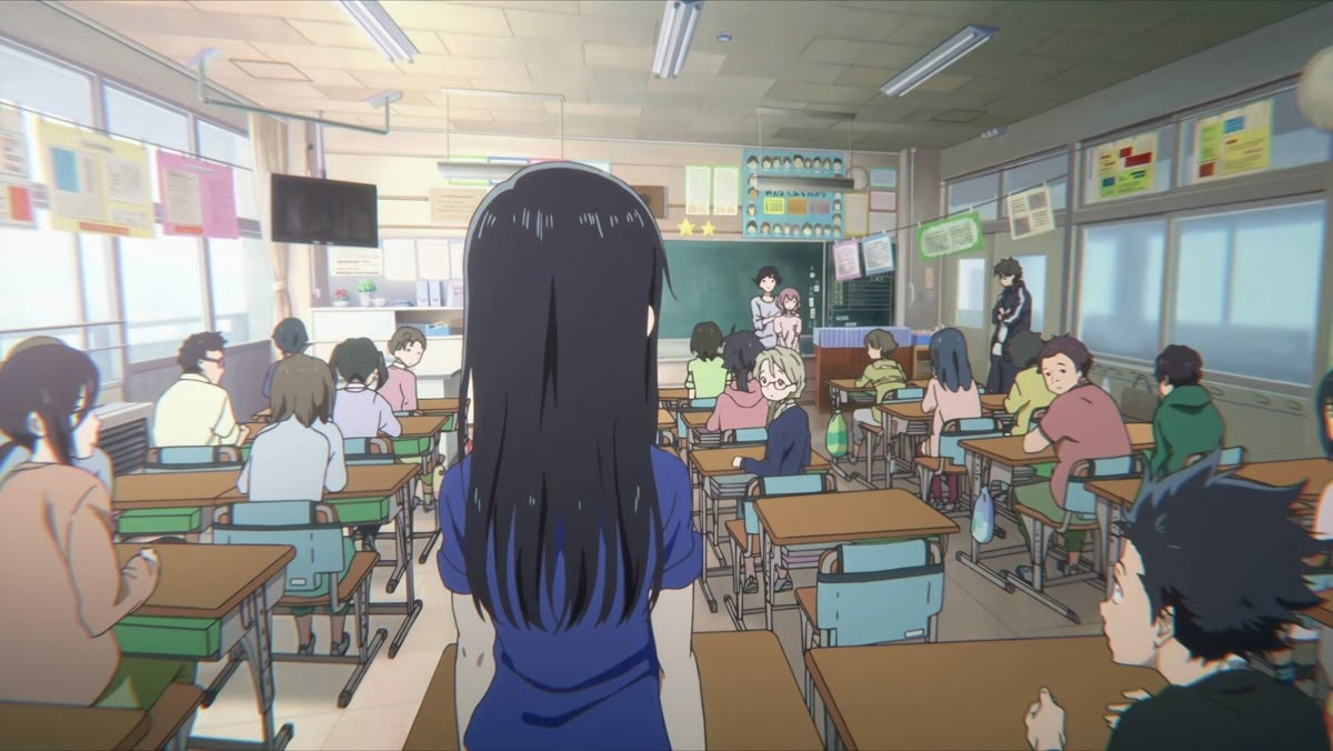
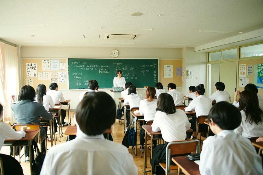
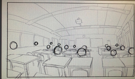
I started by drawing circles for the heads over each desk, then on a separate layer I sketches the bodies, then actual heads with hair on top. Then put all line art/sketch layers into a folder (otherwise the “erase” blending mode erases everything under it, including colour layers and the white Background layer on which everything is drawn on) and coloured behind each NPC on a layer set to the “erase” blending mode which made it so that anything behind them wouldn’t be seen through without having to actually erase the parts where the NPCs would be placed from each line art layer I made, also making it simpler and quicker to do again for different types of scenes.
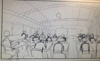
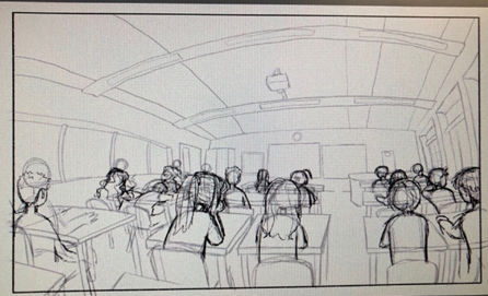
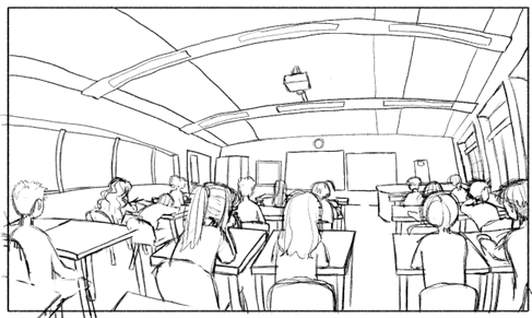
I then coloured them in green and checked the value to make sure it had enough contrast with the background (light green wouldn’t work) and erased the shadows on the lighting layer for the NPCs being hit by the sunlight and added some shading on the walls and ceiling.

At this point I deepen the fact that the desks looking so high up on the left just looks like a mistake and not intentional at all because I didn’t commit earlier in the process but still wanted to latch onto the idea I had, so gave it up I lowered them to be in line with the other desks, keeping the fish eye perspective. I did this using the lasso tool to lower them, and the liquify tool to make them less bendy, then I recoloured as well.
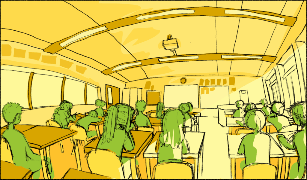
I then started drawing the second version where all the students turn to look at the player which is a scene in line with what we walked about in week 1 where the player introduces themselves to the class. I then added the scribbles over their faces, but i felt that it was harder to tell they’re looking at the player, so I removed them. I think the scribbles should only come up when speaking face to face to people because of the direct eye contact and such, and the GDD maker who was passing by, Ollie, agreed that the scribbles kind of took away from the emotional response.
After sketching them I made another layer on the “erase” blending mode and erased behind the NPCs and did the same for the “Breaktime/lunchtime” background.
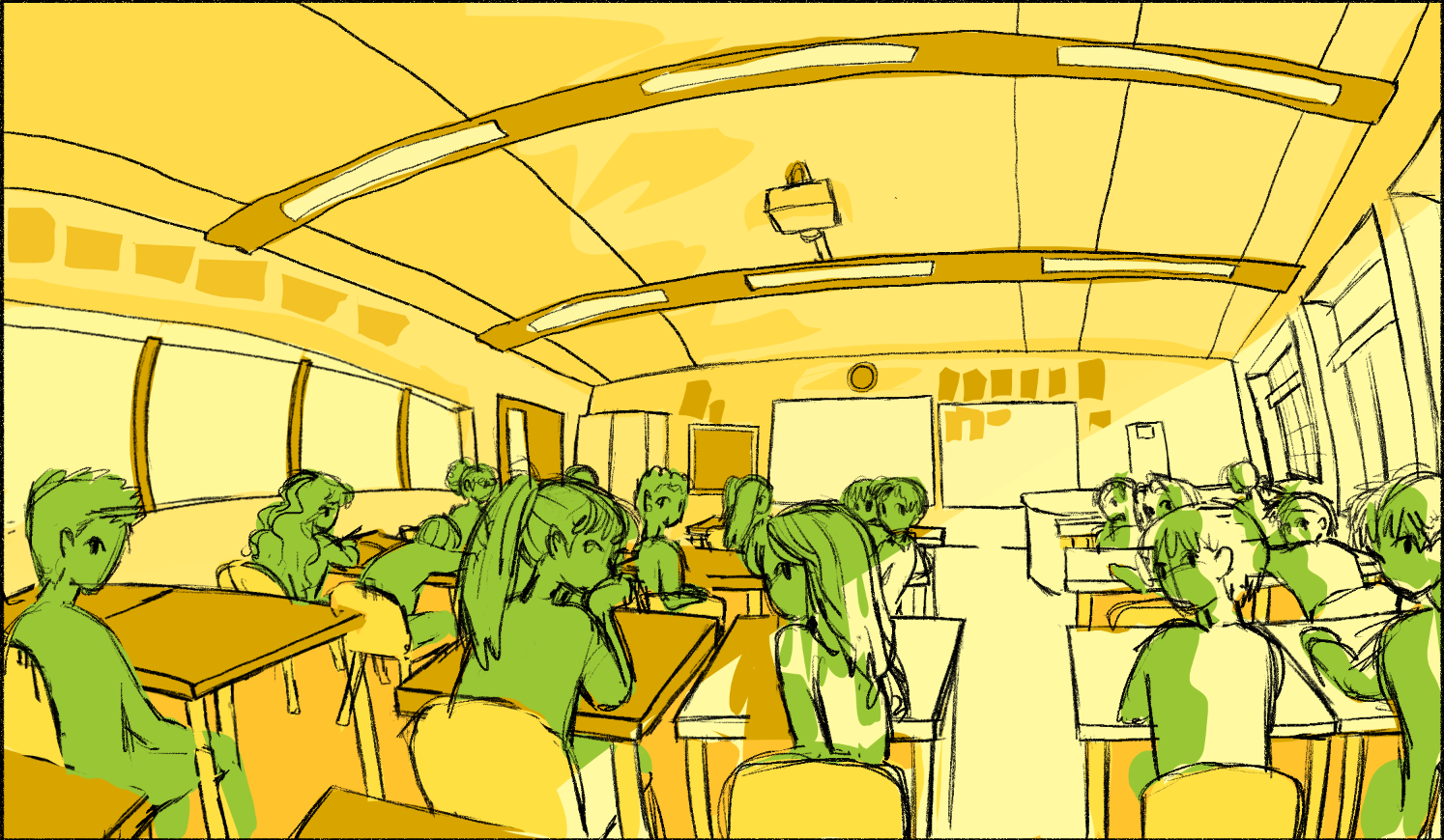


Yippie the classroom is finished!