The games I chose to inspire my environmental design style: ISLANDERS
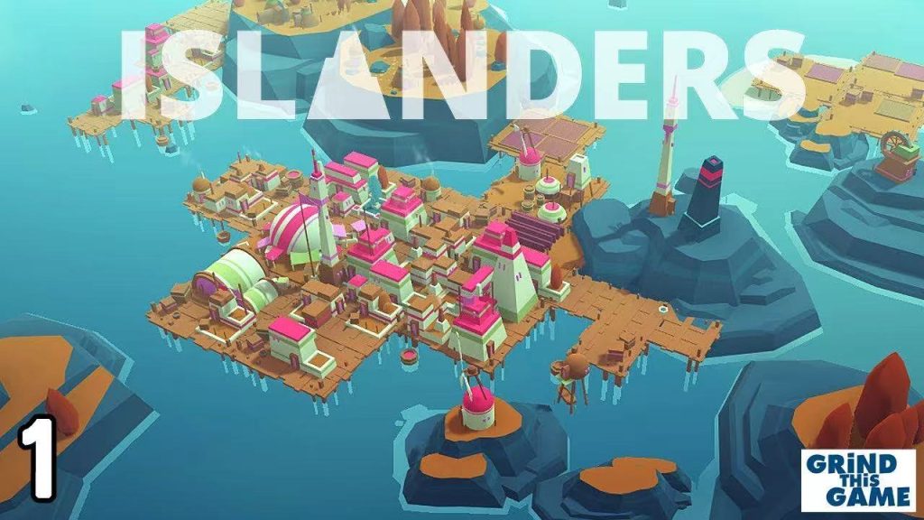
Introduction: This is a construction/strategy game characterised by a low polygon visual style. Inspiration point:
Low polygon + clean geometric structure, suitable for expressing future cities but retaining a sense of abstract memory.
The bright and clean colour matching helps to make the scene highly readable, and players are not distracted visually.
It can be used as a reference for the construction of “memory afterglow” and “time modular space” in my game.
Mirror’s Edge
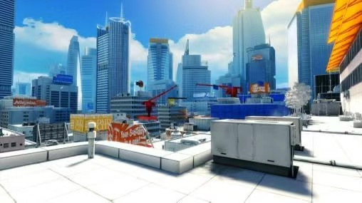
Brief introduction: This first-person parkour game developed by DICE takes the future city “Glass City” as the background, and the environment adopts a large area of white + minimalist structure + bright colour block as navigation tips.
Its minimalist colour (mainly white) makes the key path, structure and player action more prominent, and the architecture and space layout emphasise fluidity and coherence, which is very suitable for players to move in the scene and feel the design of space. Finally, the use of its navigation colour (such as red “Runner Vision”) can provide an example of my game prompt path. I can learn from its practice of “clean structure + highlight colour block prompts” and use low-saturation background colours to make the main interaction or influencing areas warm or orange hints, so as to guide players while retaining a sense of memory and the future.
How does space affect the player’s experience?
The scene layout, streets and buildings in the game will change slowly with the cycle of time, which makes players feel hope and growth. Open areas make people want to explore, and narrow or quiet places make players stop and think. The space itself can drive emotions and desire to explore.
What makes your world visually coherent and convincing?
Unified colours, similar architectural styles and reasonable light and shadow make the whole game world look consistent and real. The interaction between the characters and the environment also makes the world look alive, and small changes (such as flowers or lights) make players feel fresh in every cycle.
How to use contrast and composition to guide attention?
Through the contrast of bright and dark, cold and warm colours, as well as natural lines such as roads and lampposts, players’ eyes are guided to see important items or places. Dynamic changes (such as flashing lights or plant changes) will also attract players’ attention, making exploration and storytelling smooth and natural.
My thoughts on the design of the game environment
I. The overall tone
The overall tone of the game is “gentle hope and growth”. Some keywords: hope, change, courage
II. Visual style
The visual language maintains a sense of simplicity and the future, and the whole is bright, warm and vivid.
Colour system: From the cold tone of dark blue and gray to the warm and cold contrast of “soft gold + morning blue + fog white”, symbolising hope and rebirth.
Scene atmosphere: The “city” in the game will gradually “revive” in each cycle – the withered plants are reborn, the street lights are restored, and the air becomes transparent.
Light performance: Time is no longer a pressure, but a natural flow. Soft light, backlight and reflected light reflect the “hope given by time”.
Character vision:
The character design is more exquisite, and the style is more cartoonish.
1. Design Objectives The character design goal of this project is not to create a visually prominent “hero character”, but to design a character that can be highly integrated with the environment and exist as a part of the world.
The character Steve needs to meet the following core requirements:
Be able to naturally integrate into a world similar to the ISLANDERS style
Convey narrative progress through color and state changes in multiple time loops Serve as the player’s operating vehicle to provide a stable, reliable, and emotionally neutral presence
2. By studying the color matching logic of ISLANDERS, I established the following principles: Use low-saturation colors Avoid strong contrasts Character colors are always slightly darker than the environment
3. Character color matching is divided into three stages:
Early Loop:
Cool gray tones that emphasize functionality and stagnation
Mid Loop:
Neutrals + a few warm colors to hint at the beginning of change
Late Loop: Warm gray and
soft highlights, as the characters gradually blend into the restored city
1. Design Goals
The goal of this project’s character design is not to create a visually prominent “hero character,”
but to design a character that blends seamlessly with the environment and exists as an integral part of the world.
The character Steve must meet the following core requirements:
Naturally integrate into a world with a visual style similar to ISLANDERS
Convey narrative progression through changes in color and state across multiple time loops
Serve as the player’s controllable vessel, providing a stable, reliable, and emotionally neutral presence
2. Color Principles Based on ISLANDERS
Through analysis of ISLANDERS’ color logic, the following principles were established:
Use low-saturation colors
Avoid strong contrast
Ensure the character’s colors are always slightly darker than the environment
3. Character Color Phases
The character’s color design is divided into three stages:
Early Loop: Cool gray tones, emphasizing functionality and a sense of stagnation
Mid Loop: Neutral tones with subtle warm accents, suggesting the beginning of change
Late Loop: Warm grays and soft highlights, as the character gradually blends into the restored city
I referred to Playtime (1967) – Jacques Tati
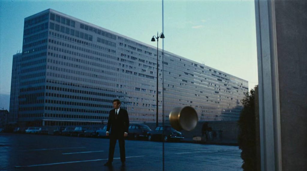
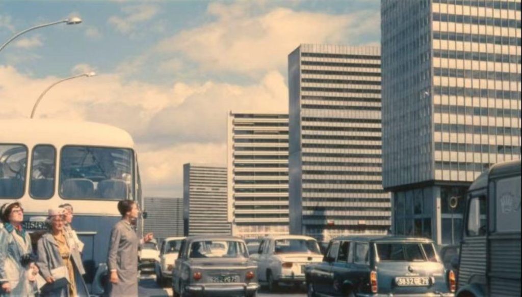
The character is “swallowed” by the city
The character functions like a component within a system
Humor and warmth emerge from observation, not performance
Implication for Steve:
The character is part of the system, not the narrative center.
In Monument Valley:
Characters are extremely minimal and geometric
The character is part of the space, not the focal point
Emotion is conveyed through color and spatial relationships
Implication for Steve:
Clear character silhouette > richly detailed character design.
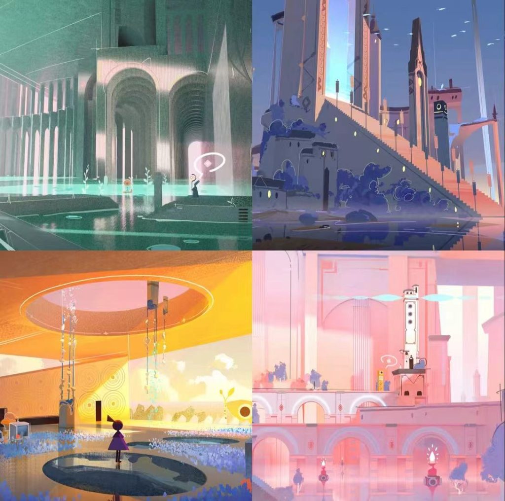
The design direction for Steve is defined as:
A character abstracted into geometric forms,
expressing the passage of time through color rather than detail,
and ultimately blending into the environment.