In this part of the project, I am mainly responsible for several visual assets, including the main menu, four open-field animation pictures, camera props and Mabel’s backpack icon. Before making the final assets, I first studied the overall visual direction of the game and compared my own design with the art content that the team members had completed. Because our game theme revolves around memory, childhood imagination, photos and dream worlds, I hope my visual works can present a nostalgic, soft and easy-to-understand feeling.
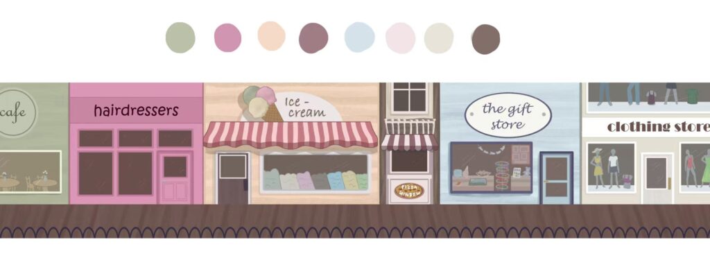
In the main menu design, I hope that players can feel the atmosphere of the game at first sight before officially starting the game. I studied the background map drawn by Jess:
And use the brush to extract colours in procreate to extract some of the colours she uses. She used light pink, lilac, blue, cream and other low-saturation tones when drawing the background, so I try to keep the colour direction similar in the main menu. I don’t want the main menu to look too dark, too modern or too realistic, because it will be inconsistent with the nostalgia of the game and the sense of the picture book.
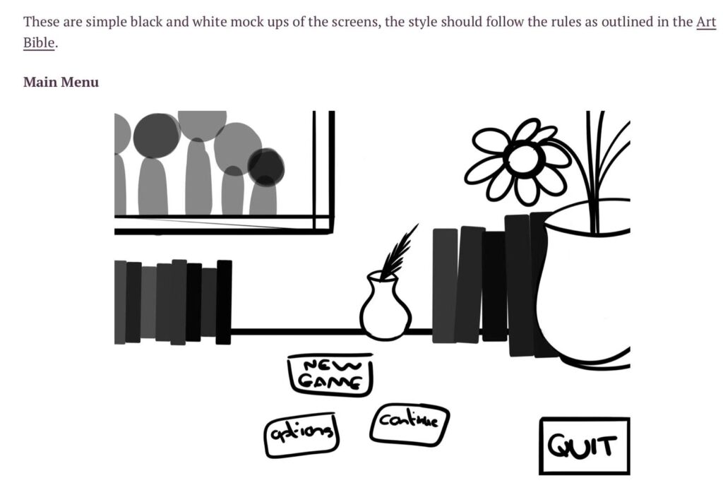
In my final main menu design, I referred to Lette’s original design, and the picture screenshot was taken from her GDD.
This is my draft of my preliminary idea about the main menu:
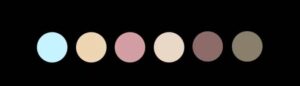
In terms of colour matching, I want to choose a colour similar to lettie’s original GDD, and it should be similar to the Mebal colour matching of Jess’s painting, so I plan to use low-saturation colour matching:
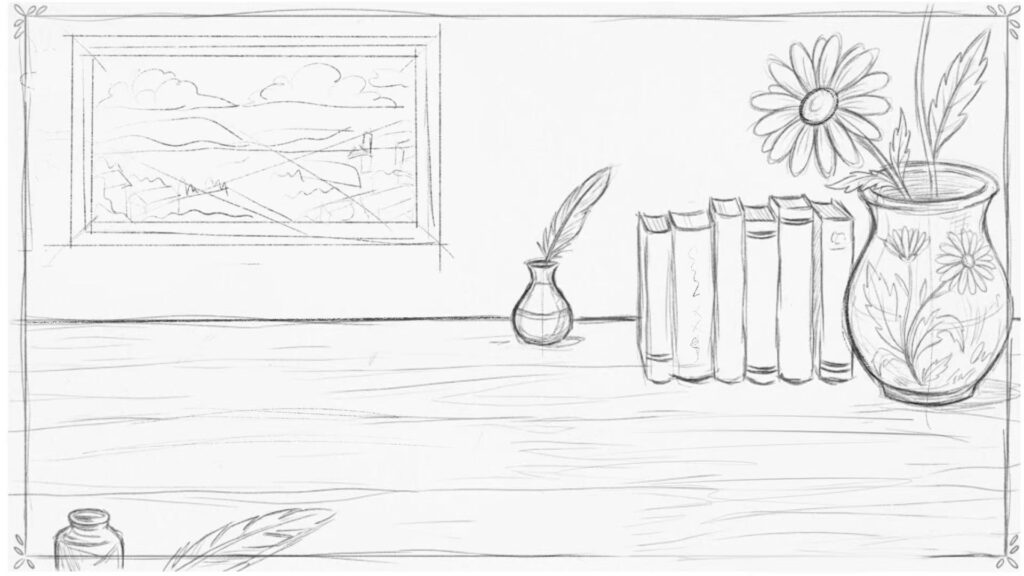
This is a preliminary drawing picture. I superimposed the rainbow effect on the picture, which refers to Lettie’s idea:
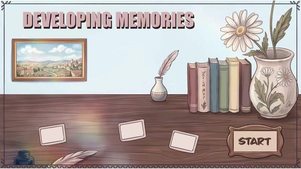
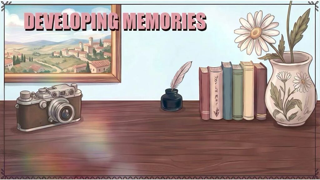
The composition of the main menu also takes readability into account. I plan to put the game title Developing Memories in the upper left area so that players can notice it at first sight. I left a large blank area at the bottom of the screen to reserve space for menu buttons such as “New Game”, “Settings” and “Quit”. This is very important, because the main menu is not only an illustration, but also a user interface. Therefore, I need to strike a balance between decorative details and actual interactive space.
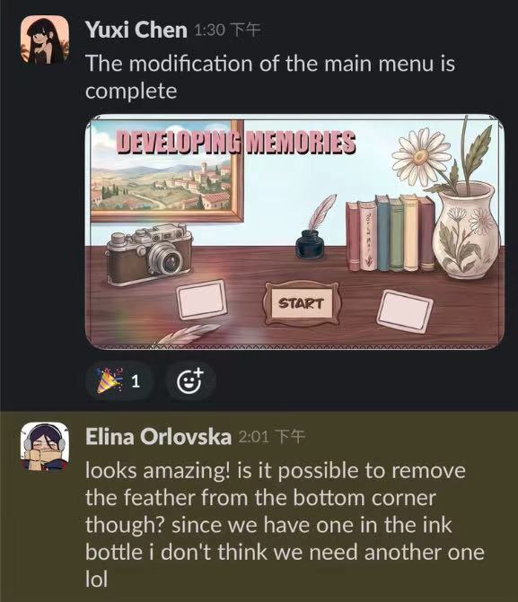
My original intention was to draw the main menu of the game according to Lette’s original design, but Elina felt that this was a big deviation from her design. Her suggestion to me was to change the size of the background frame to make it bigger, then add a camera on the desktop, and change the layout of the item. After modifying it according to her suggestion, I sent it to the slack group chat.
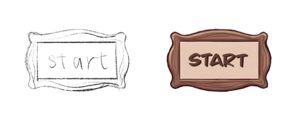
the main menu button:
I wanted to make its material the same wooden material as the desktop, so I found some pictures of wooden buttons on Pinterest:
Based on these pictures, I drew a sketch of the button: (But Yufan Wei told me that I didn’t need to draw fonts. He would add fonts in the programming process, so I deleted it later. The picture was just to see the general effect)
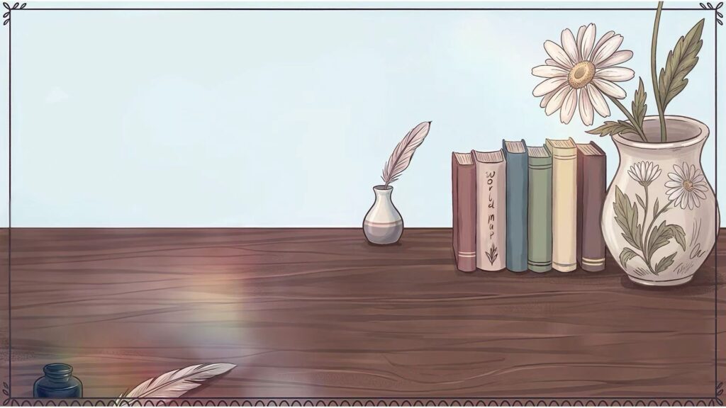
My original intention was to create the feeling of feather pens and photos scattered on the table, but it was indeed a little redundant. Then I deleted another extra feather, which is the final finished product of the main menu. We will use this final version of the game. ( This final version does not add the button of the main menu, just the background of the main menu, so the desktop looks relatively empty, because Yufan Wei needs to add the button of my painting to the main menu later)
In terms of visual reference, I have studied some games that use hand-drawn or painting styles to create a nostalgic and emotional atmosphere. Broken Age is a very useful point-and-click adventure reference for me (https://youtu.be/y1KbUHvdLq4)
Like our game, it has adventure puzzles, fairy tales, exaggerated but clear characters and scenes. The official introduction is that it is a family friendly, hand-animated, puzzle-filled adventure game, so it can be used as a reference for my main menu and 2D adventure atmosphere.
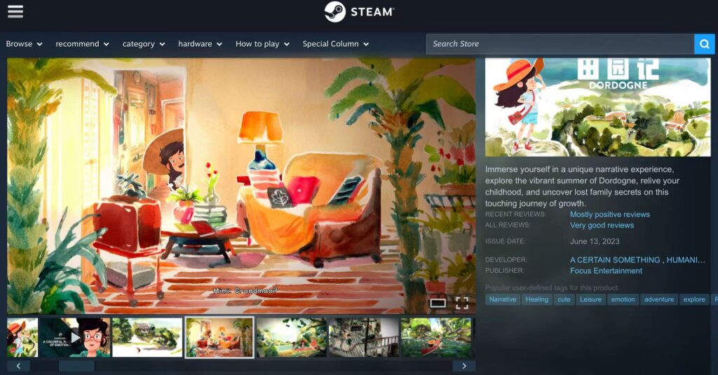
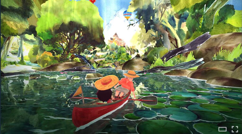
Dordogne helped me understand how soft colours and painting textures support the theme of childhood and memories.
I think I am suitable for referring to its memory, childhood, family, soft colour, hand-painted / watercolour feeling. It is also very close to the theme of “photos, childhood, memories” of our game.
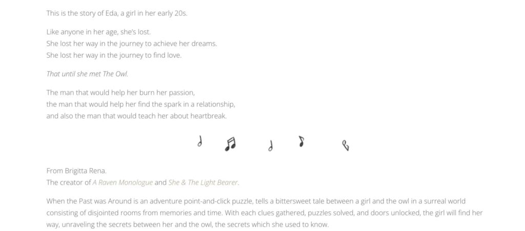
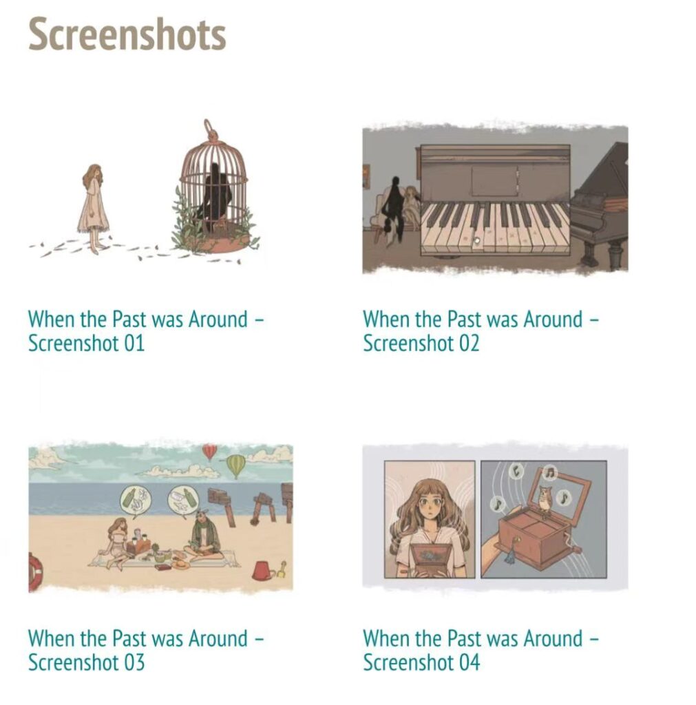
this photo is The Game:When the Past Was Around(https://store.steampowered.com/app/1164050/__When_the_Past_Was_Around/)
It tells emotional stories through point-and-click puzzle and memory-based space, and the tone is also a low-saturation colour matching, which looks very comfortable.
These references made me realise that visual design is not only for good-looking, but also to help players understand the emotions and themes of the game world.
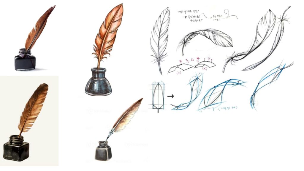
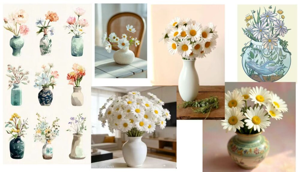
Regarding the style of the items on the desktop, I found some pictures that inspired me on Pinterest and put them together. About the content of the wall photo frame, the design of the feather pen and vase on the table:
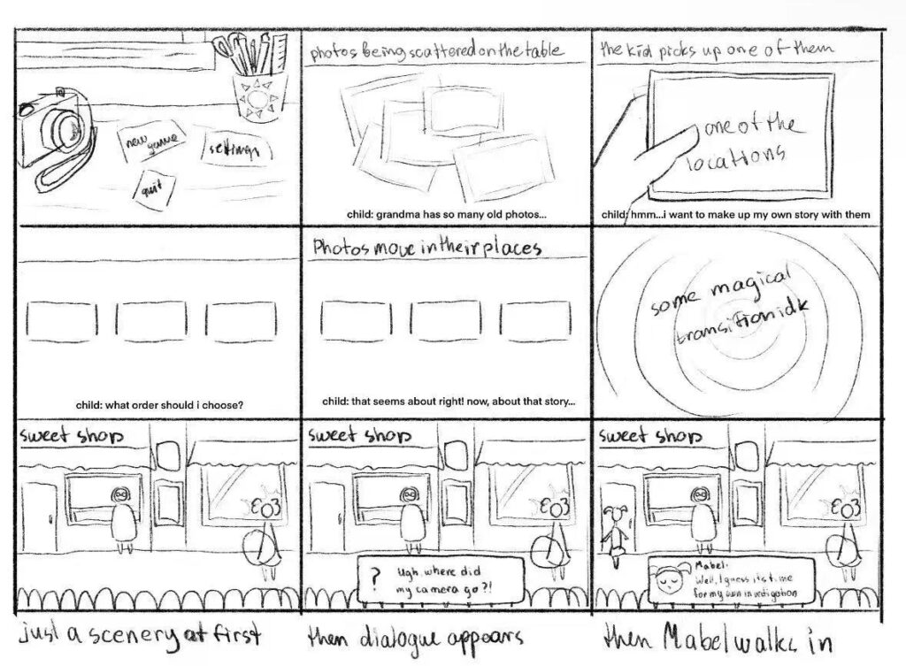
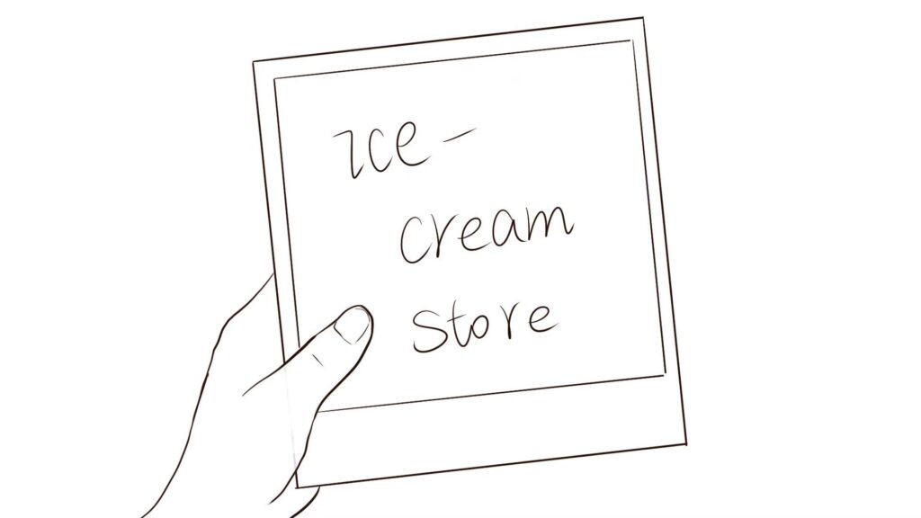
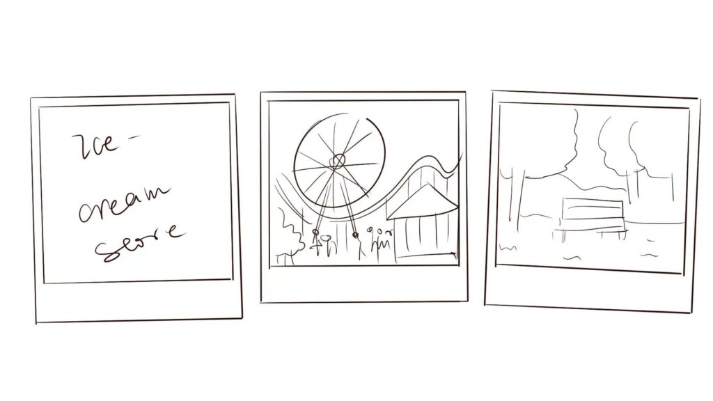
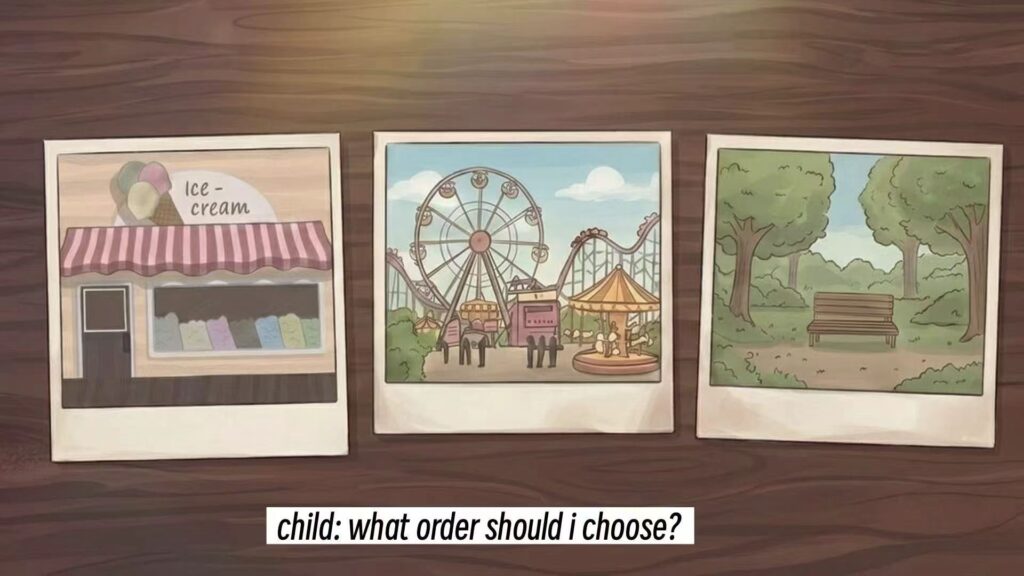
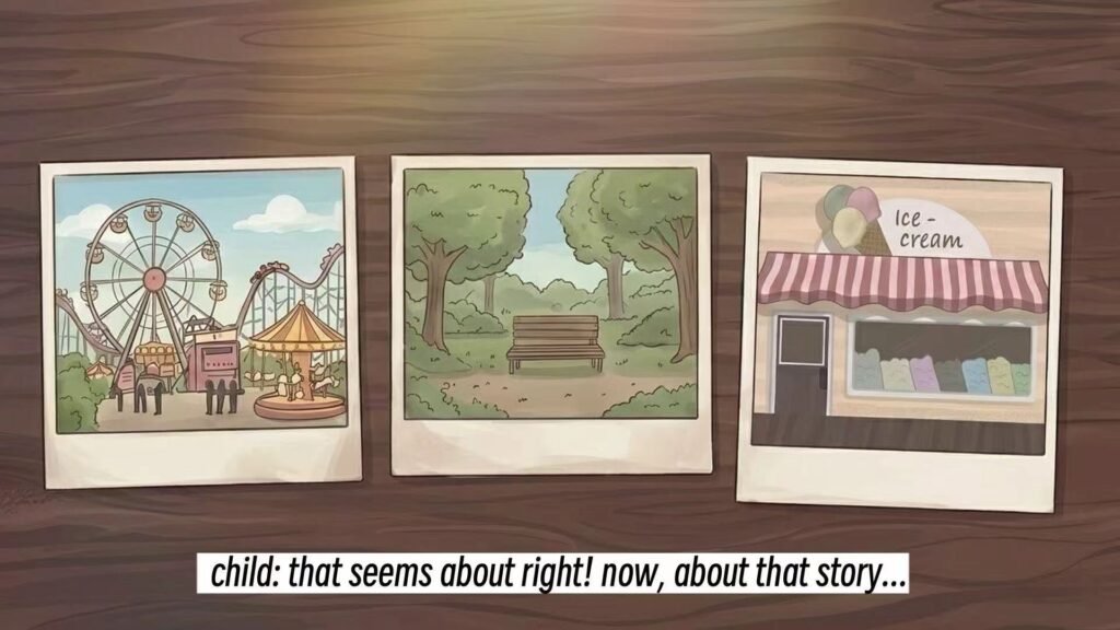
In the opening animation part, I drew it strictly according to the storyboard sketch provided by Elina. ( Figure 2 – Figure 4)
I didn’t change the main composition and the location of the items, because the original sketch has expressed the development of the story more clearly. My task is to transform the rough plan into a completion diagram that conforms to the art style of the game. This means that I need to keep the original order of action while improving the colour, line quality, light and shadow, and overall completion.
We choose to use a set of static illustrations to present the opening instead of making a complete animation. This decision is suitable for the production scope of our project, because it is easier to complete within the time limit, and it is also in line with the theme of old photos and memories. Static pictures look like pages in picture books and fragments in memories, which can enhance the nostalgic atmosphere of the game. Since the story itself is related to the photo, telling the story with picture sequences will make the transition more natural.
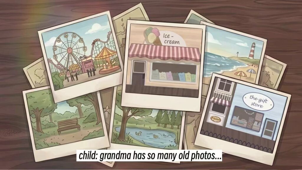
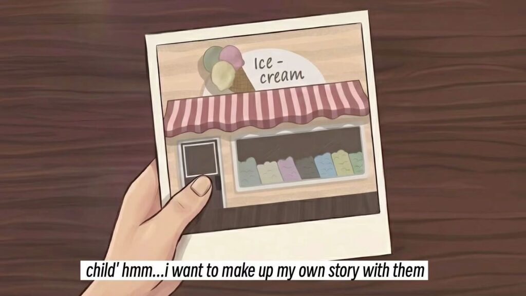
When completing the opening picture, I also considered the visual clarity. Each picture needs to express a main action, and players can understand the story without too much explanation. For time reasons, I intercepted some scenes in the jess background. They are very suitable for adding to the desktop photos, so that the style will be more suitable for the game background.
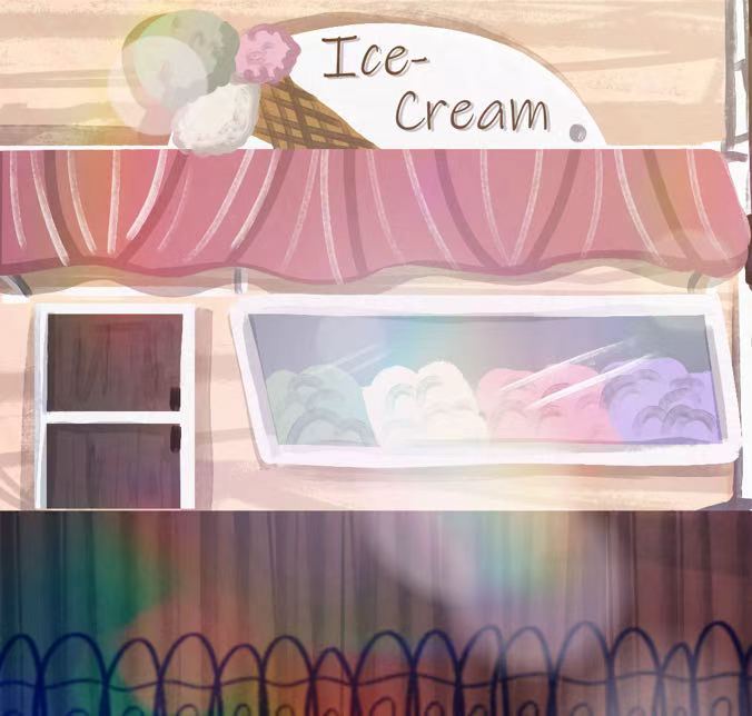
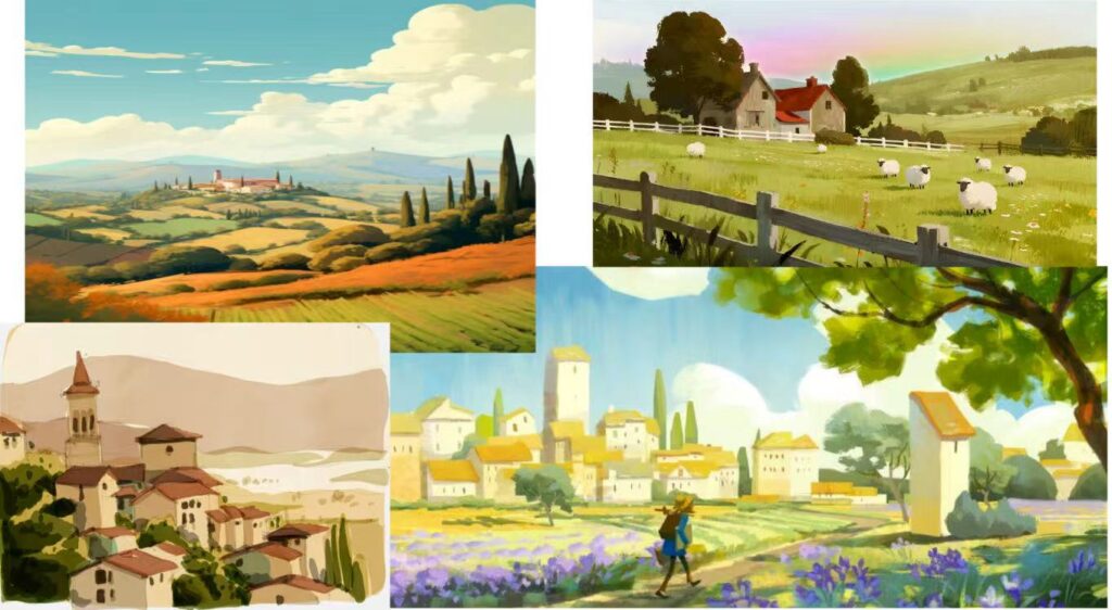
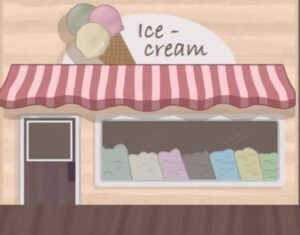
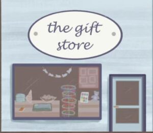
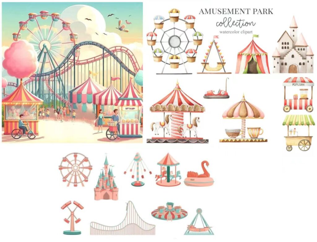
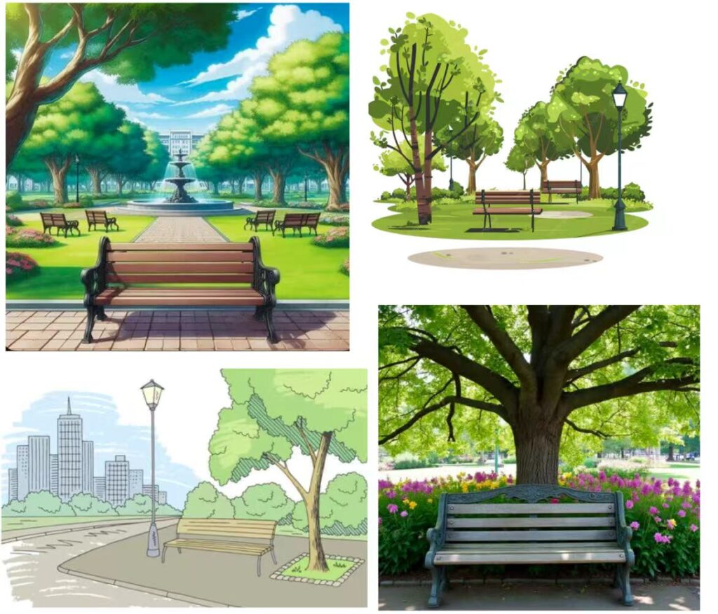
I now have the materials for ice cream shops and gift shops, so now I start to think that in addition to these two scenes, I also need to draw some scenes of amusement parks and parks, so I began to look at some pictures of these scenes on Pinterest to find inspiration. These are the two collages I made from the inspired photos:
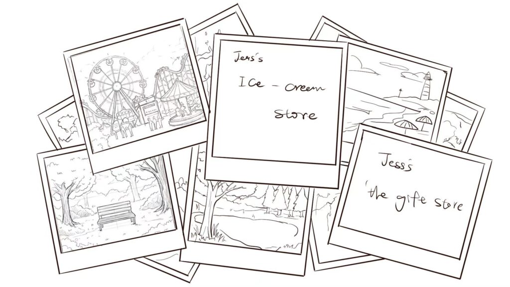
So I began to draw my draft according to these pictures (it was relatively simple at the beginning, and I would refine it later)
After I showed my picture to Yufan Wei, he thought it could be used directly after colouring, but I needed to add some text on it, so I added the copy provided by elina to the picture, In order to respect Lette’s design in her GDD, I also added some rainbow special effects in the process of colouring.
This is the finished product of the opening animation:
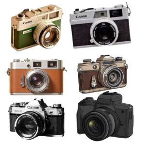
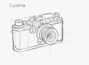
The camera design in the main menu and the camera as a prop should be the same for the unity of the game, and for the sake of style, I will design it as a retro camera, but I don’t know what it should be like, so I looked for some camera photos that can provide me with inspiration.
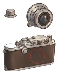
This choice is more in line with the nostalgic theme of our game. I want to use brown, gray and low-saturation metallic colours for the camera to make it look older and more like a part of grandma’s old things. I also want to better disassemble them into three parts: large lens, clear fuselage shape and easy-to-speart buttons to ensure that players can quickly recognise them as part of the camera in the game
Because the group urgently needed these assets at that time, I first drew the complete camera, and then intercepted the corresponding part from the same drawing and made it into separate camera parts. This saves time, keeps the separated parts visually consistent, and allows team members to use resources for game development earlier.
In Mabel’s backpack icon design, I keep the same style and colour as the Mabel character backpack designed by Jess. This is important because this icon needs to look like a Mabel, not a random UI object.
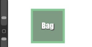
At the beginning, I considered using a simple square icon to represent the backpack.
Because it is faster and easier to make in this way. But after discussing with Yufan Wei, he suggested that I draw it into a real backpack shape, because the interface would be more exquisite and easier for players to understand. I accepted this feedback and tried to find more, and finally changed the design to a clearer backpack icon. After this modification, the icon is more recognisable and more closely related to the role.
I also considered the actual function of the backpack icon. Because players can click on it to open the backpack page, it must be clear and easy to understand in a small size. I simplified the shape of the backpack to avoid adding too many unnecessary details. At the same time, I adjusted the size of the front pocket, because we need to reserve space for Yufan Wei to add the “BAG” text.
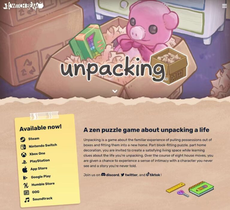
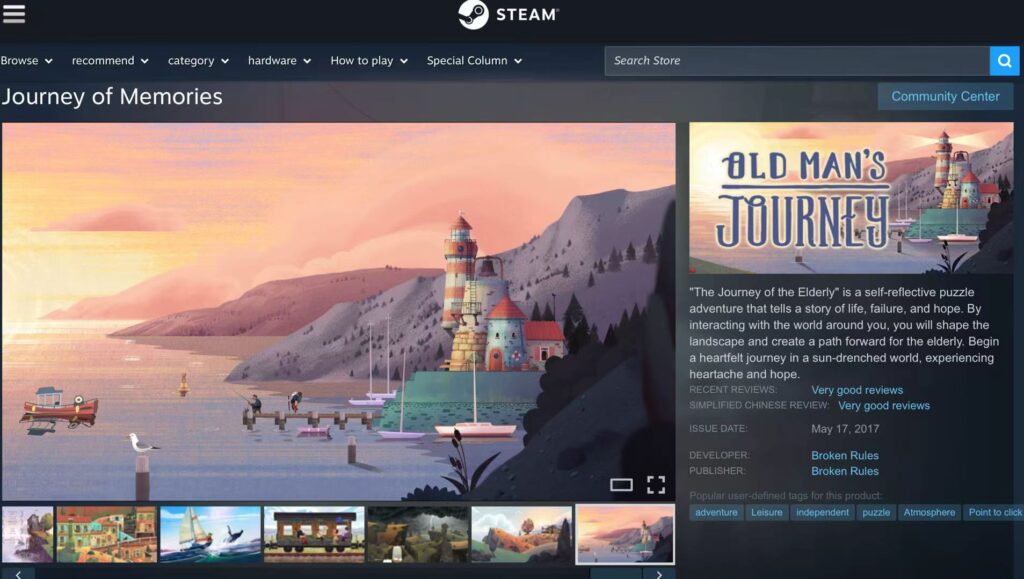
Among all these assets, I try my best to keep the visual style and the game consistent as a whole. I used similar low-saturation colours, simple lines and soft shadows, so that my work could match the background and character design made by the team members. I found some games that look visually comfortable.
Old Man’s Journey https://store.steampowered.com/app/581270/_/
Their matching is very coordinated, so I think art assets must look consistent in style, which is very important, because I am responsible for many types of assets, including menu diagrams, opening diagrams, props and UI icons. Although they have different functions, they still need to look like they belong to the same game world. Through this process, I learned how to adjust my painting design according to the story, gameplay, UI needs and the overall art style of the team.