After returning from the Easter break in week nine, our group felt time was running out, so we reviewed the game testing feedback from week eight. The game from week eight wasn’t quite complete; compared to our Vertical Slice, we were missing backgrounds and UI. My research on text-based games revealed that (link here) the design of text boxes and name displays during character dialogues is crucial, establishing the basic atmosphere and tone of the game. Also missing were speech bubbles and answer boxes in the word selection section. These are indispensable parts for a game to look complete and stylish.
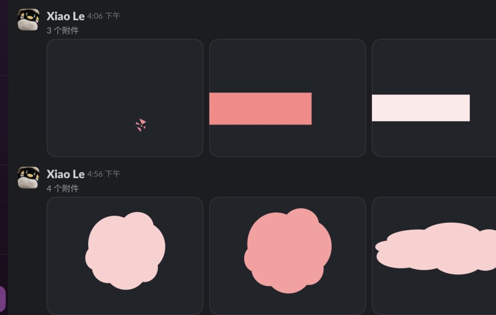
Because Maria was challenging herself with backgrounds, something she hadn’t done much with before, I started designing the UI. My research on people with ASD revealed their strong interest in graphics, including in the character designs and preferences I wrote, where graphics were used as a way to express personality—for example, Tyler’s unusual triangular watch. Therefore, for Tyler’s text box, I used red (his representative color, symbolizing his enthusiasm, cheerfulness, and many friends) and used triangles as embellishments.
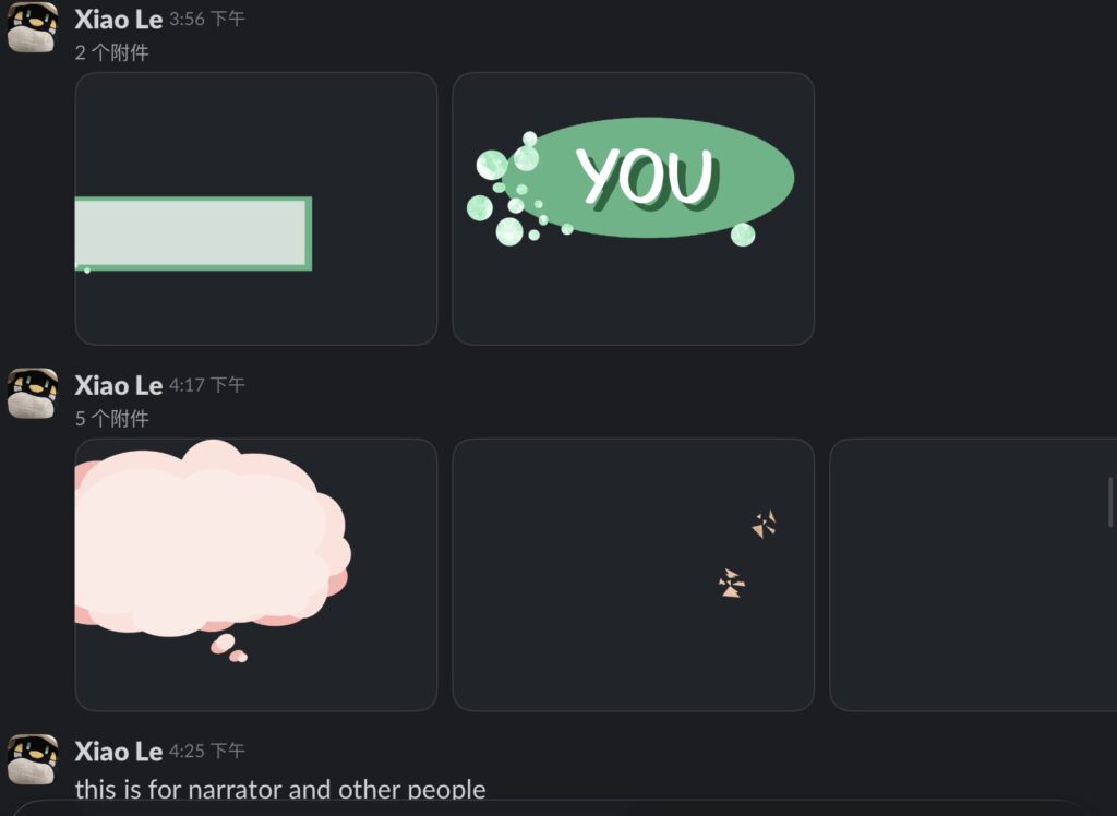
For the text box for the main character ‘The Boy,’ I used green and speech bubble elements. The green is the same color as the green square hood in his character’s image, creating a sense of harmony. Visually, red and green are opposite colors, and the contrast between warm and cool tones reflects the differences between these two individuals with vastly different personalities and ways of expression.
During the Unity import process, Nam requested a freely adjustable format, so I broke down each UI element into different layers and sent them to him separately, making it easier for him to make adjustments.