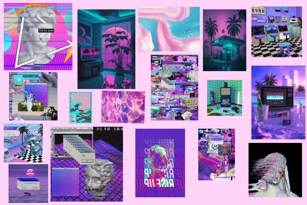
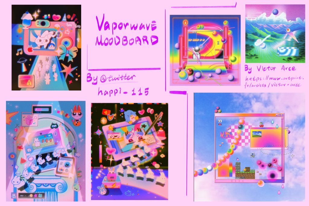
I wanted my game to differentiate itself from other dream-core games, but it couldn’t stray from the theme. So, I chose some highly saturated colors for the first three levels, which are all set in houses. Therefore, I unified the color scheme to a retro-futuristic style with vaporwave aesthetics, using pink, purple, and blue as the main colors, hoping to emphasize that this is not the real world.
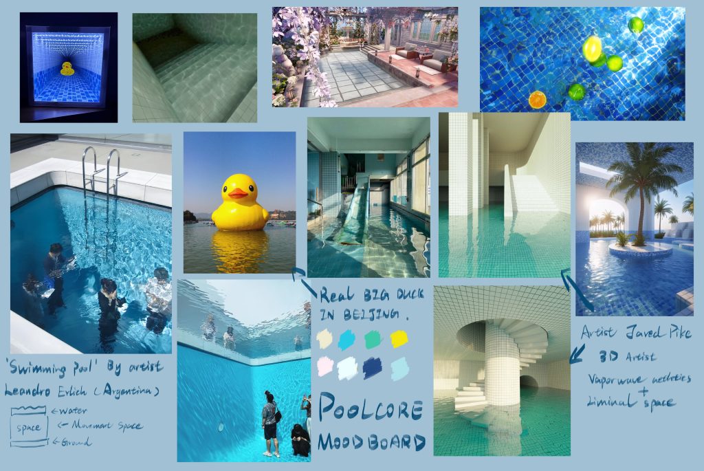
When I reached The Pool, I incorporated a reference to the Dreamcore world, specifically the Pool Core. The main colors of the Pool Core are blue, green, and white. This actually felt quite disconnected from my previous three levels, which caused me considerable frustration. After some thought, I found another work by Jared Pike that primarily used warm colors and pink tones. So, I changed the pool tiles to a light pink to connect with the previous levels and added pink self-illuminating orbs to echo the vaporwave style.
For the Last Memory Garden, I looked for many references because it’s a very important location. I considered many ways to plan the garden’s layout, and ultimately I chose a retro oil painting style and a dreamy color scheme, with lower saturation to connect it with the real world behind it.