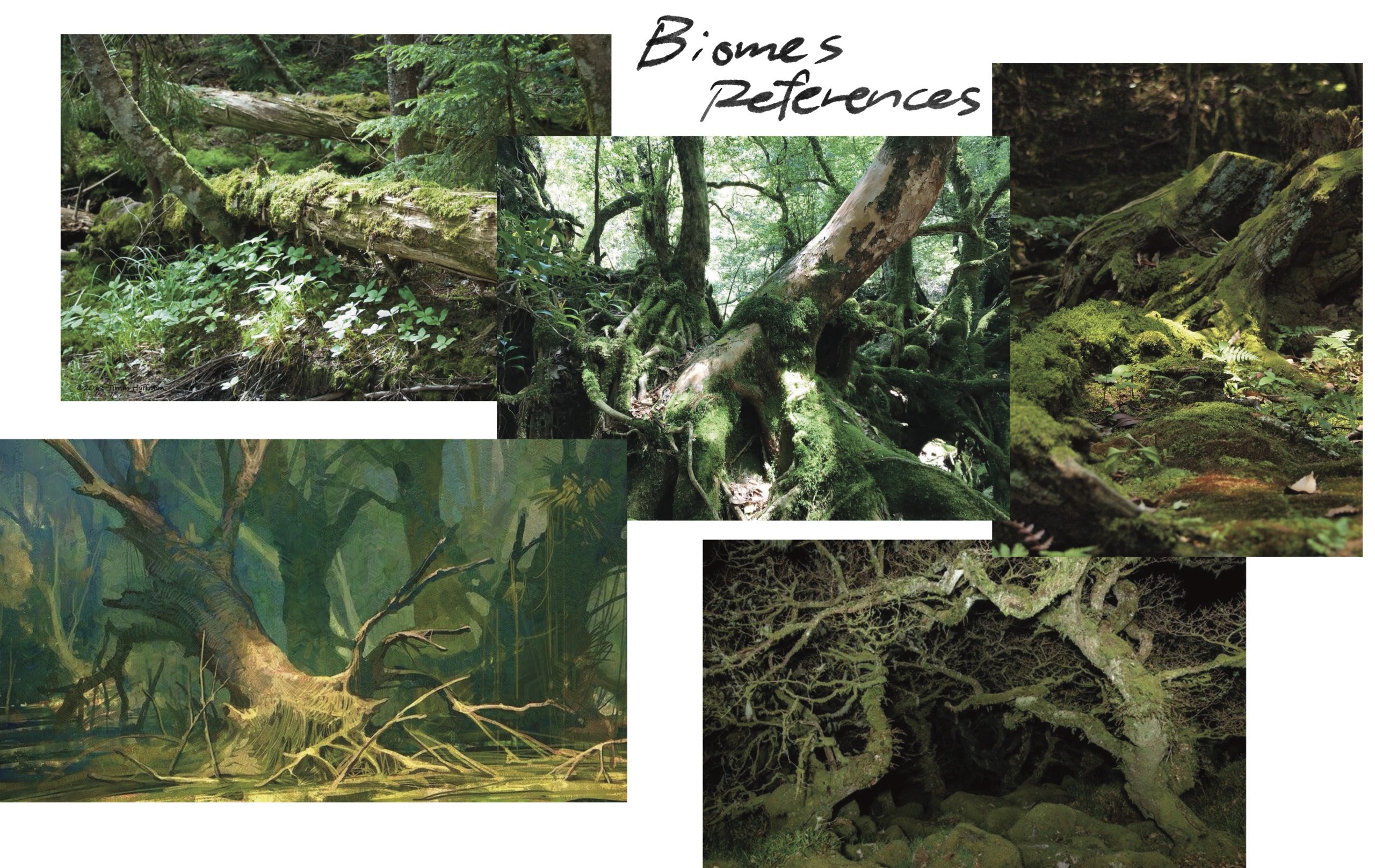
The ideation for the game poster began with defining the core world setting of the project. The game takes place in an underground world beneath the roots of an ancient tree, a space that represents emotional depth, isolation, and the unseen layers beneath everyday life. This decision immediately shaped the visual direction of the poster: instead of open skies or heroic landscapes, the focus became enclosed spaces, organic forms, and a quiet sense of scale.
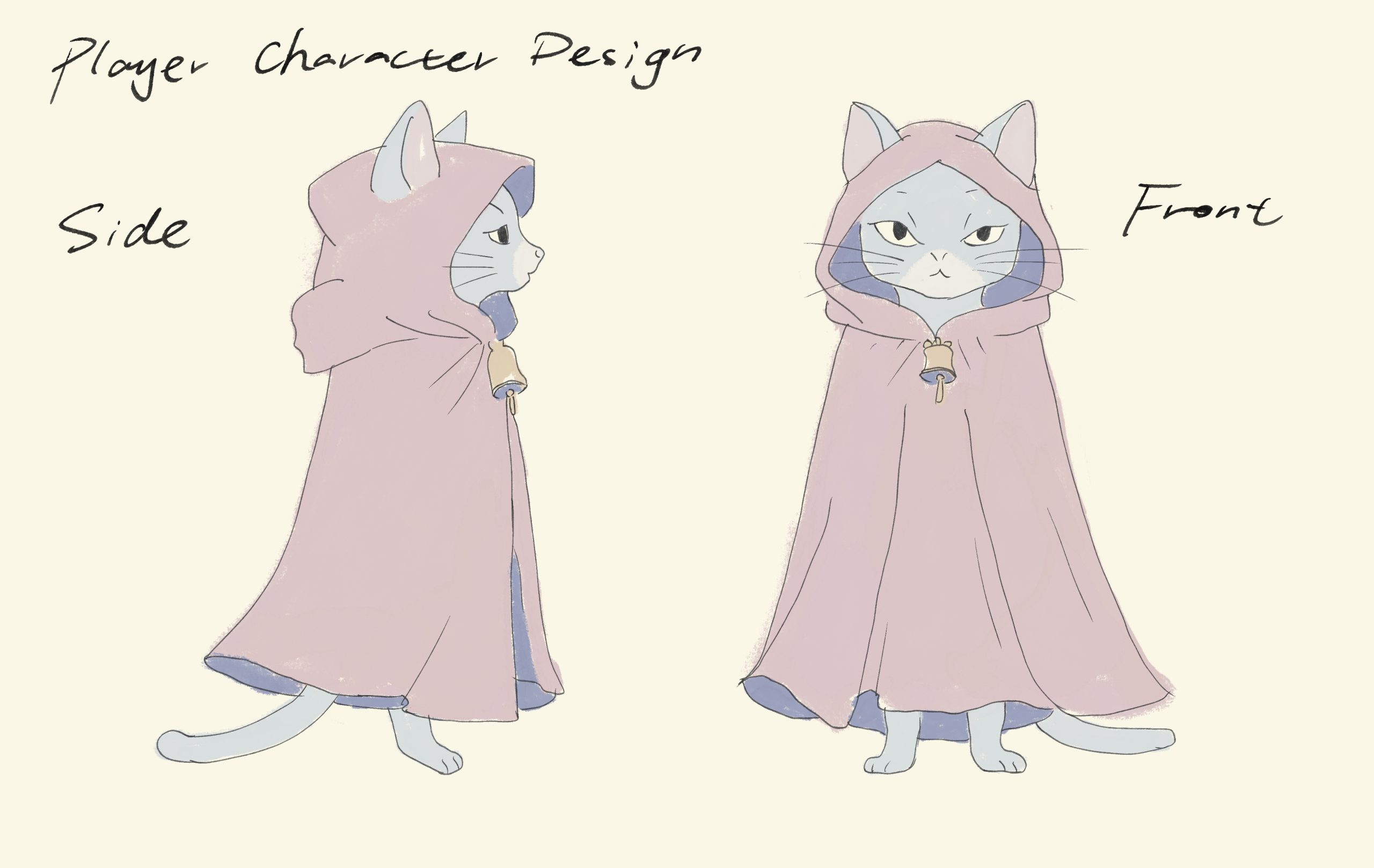
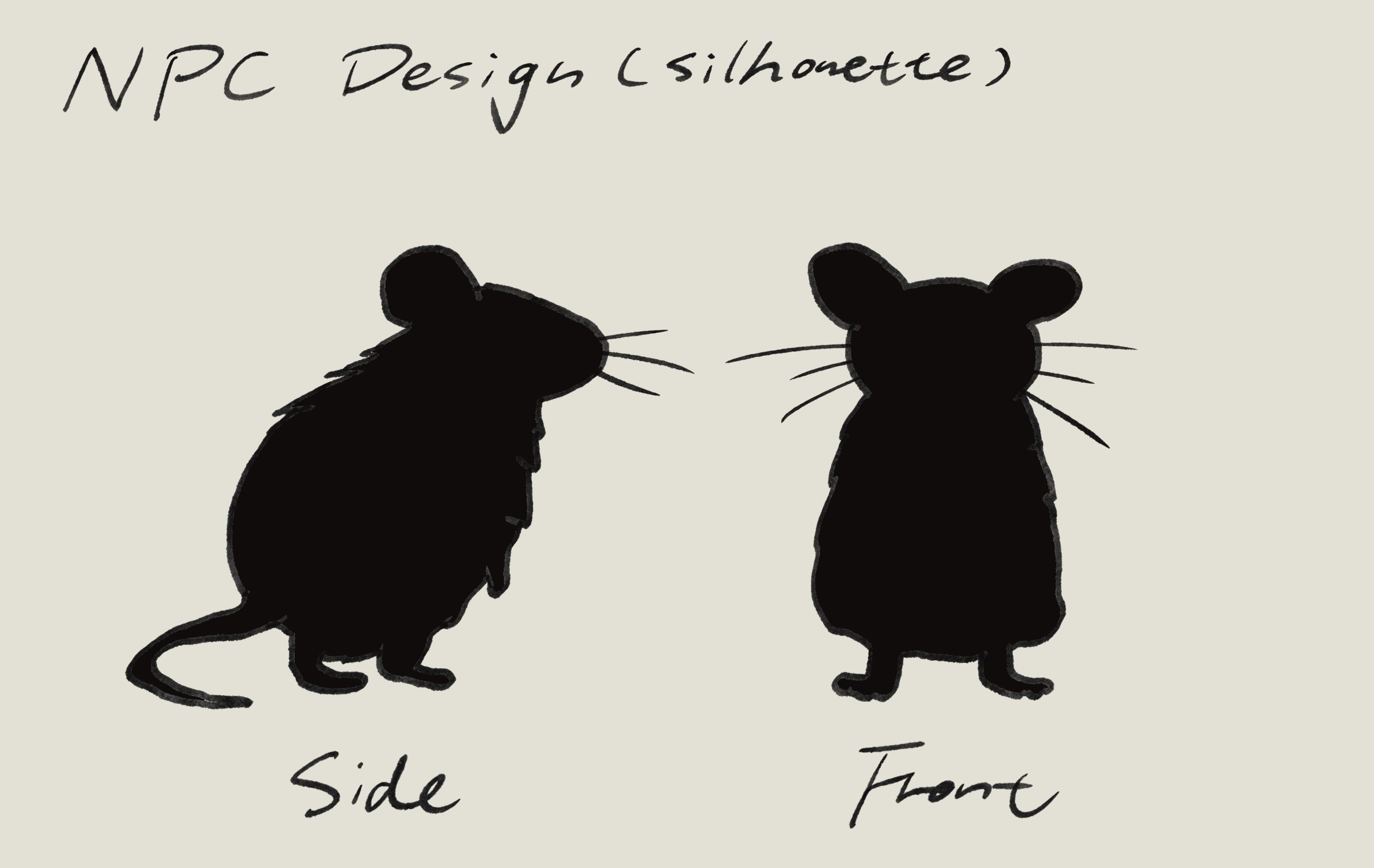
From this world setting, the identities of the characters were developed. The player character is a cloaked cat, designed to feel solitary and slightly out of place within the environment. The cloak creates a clear silhouette and suggests self-protection and emotional distance. In contrast, the NPCs are voles: small mice that naturally belong to the soil. They are depicted as simple silhouettes rather than detailed characters, reinforcing their role as a collective presence rather than individual personalities. This contrast between the singular, detailed protagonist and the simplified NPCs became a key visual theme for the poster.

The poster composition was designed to reflect this relationship. The cat is placed slightly off-centre, standing alone on a platform formed by tree roots, creating negative space around the character to emphasise isolation. The Root Voles appear as silhouettes on surrounding platforms, positioned close together to suggest proximity and social pressure without direct hostility. The tree roots function both as environment and framing device, guiding the viewer’s eye through the image while reinforcing the underground setting. 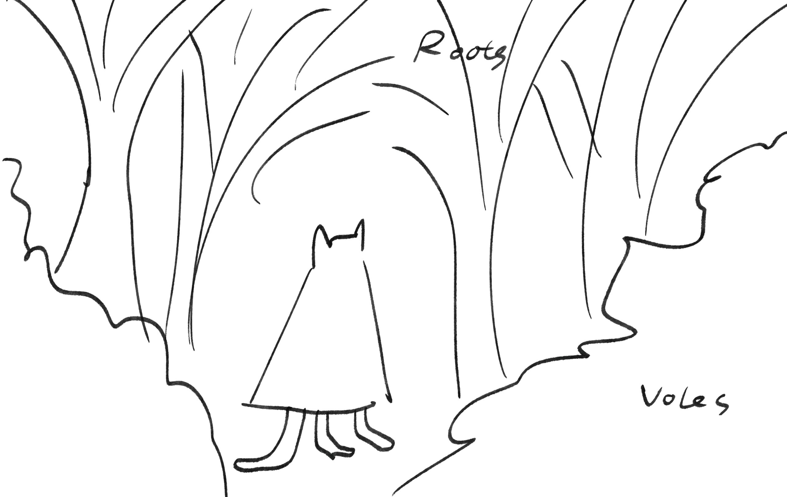
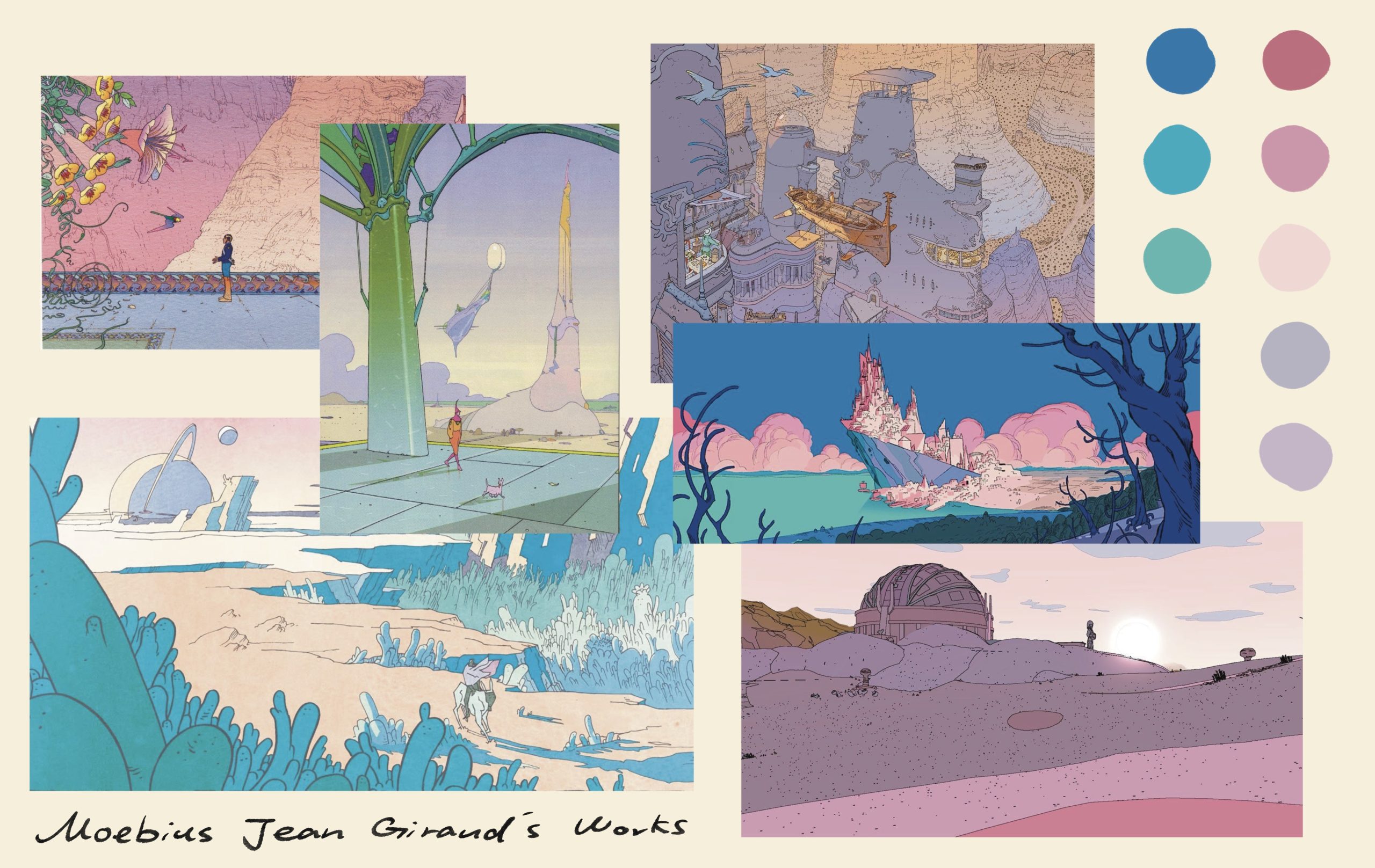
Visually, the illustration draws inspiration from Moebius’s use of simplified forms, restrained colour palettes, and calm visual rhythm. Details are intentionally limited, and the scene avoids visual noise, allowing space and atmosphere to carry the emotional weight. This restraint supports the game’s themes of quiet exploration and internal growth.
Finally, the typography was chosen to match the tone of the image. A clean, understated font was selected to avoid competing with the illustration, prioritising readability and emotional neutrality. The type complements the minimalist composition and reinforces the contemplative mood of the poster, ensuring that the overall design feels cohesive, calm, and intentional.

The First version. Typography is too fancy and overpowers the poster.

The final version.
Leave a Reply