
Design Principles:
1. Negative Space
The art style embraces restraint in colour, motion, and composition. Limited colour palettes, slow animations, and uncluttered scenes create visual breathing space, supporting calm exploration and introspection. Excessive effects or high visual density are intentionally avoided to maintain a peaceful and contemplative tone.
2. Simplified Shapes and Clear Silhouettes
All characters and environments use simple geometric shapes with clear, readable silhouettes. Details such as textures, patterns, and small decorations are kept to a minimum. If an element is not readable from a distance or does not support navigation or mood, it should be removed. This ensures visual clarity and avoids overwhelming the player.
3. Limited Colour Palette Per Area
Each area uses a strictly limited colour palette, usually one dominant colour with one or two supporting tones. Sudden colour changes are only used to signal emotional or gameplay transitions, such as danger, safety, or progress. Decorative colours without functional meaning are avoided.
MoodBoard & Colour Palette:
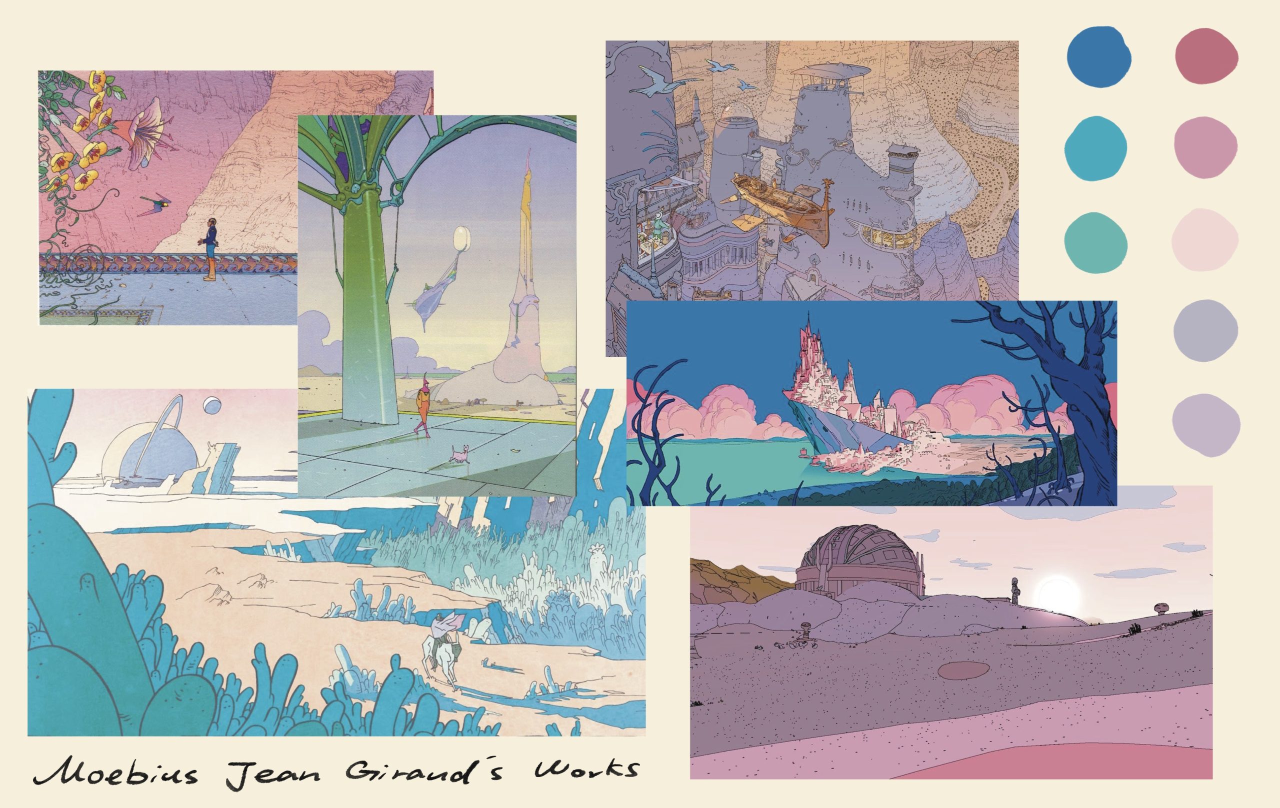
Moebius, the pseudonym of French artist Jean Giraud, is known for his minimalist line work, expansive compositions, and restrained use of colour. His illustrations often depict vast, quiet landscapes inhabited by small, solitary figures, creating a strong sense of scale, distance, and introspection. Rather than relying on dense detail or dramatic contrast, Moebius’s work communicates mood through simplified shapes, clean silhouettes, and carefully balanced colour palettes.
This visual approach closely aligns with the art design principles of Rooted but Flow. The use of clear silhouettes and simplified forms supports visual readability and emotional clarity, ensuring that environments feel spacious rather than overwhelming. Moebius’s tendency to limit colour (low brightness and saturation) within each scene directly reflects the game’s principle of restricted colour palettes per area, where colour functions as an emotional and spatial signal.
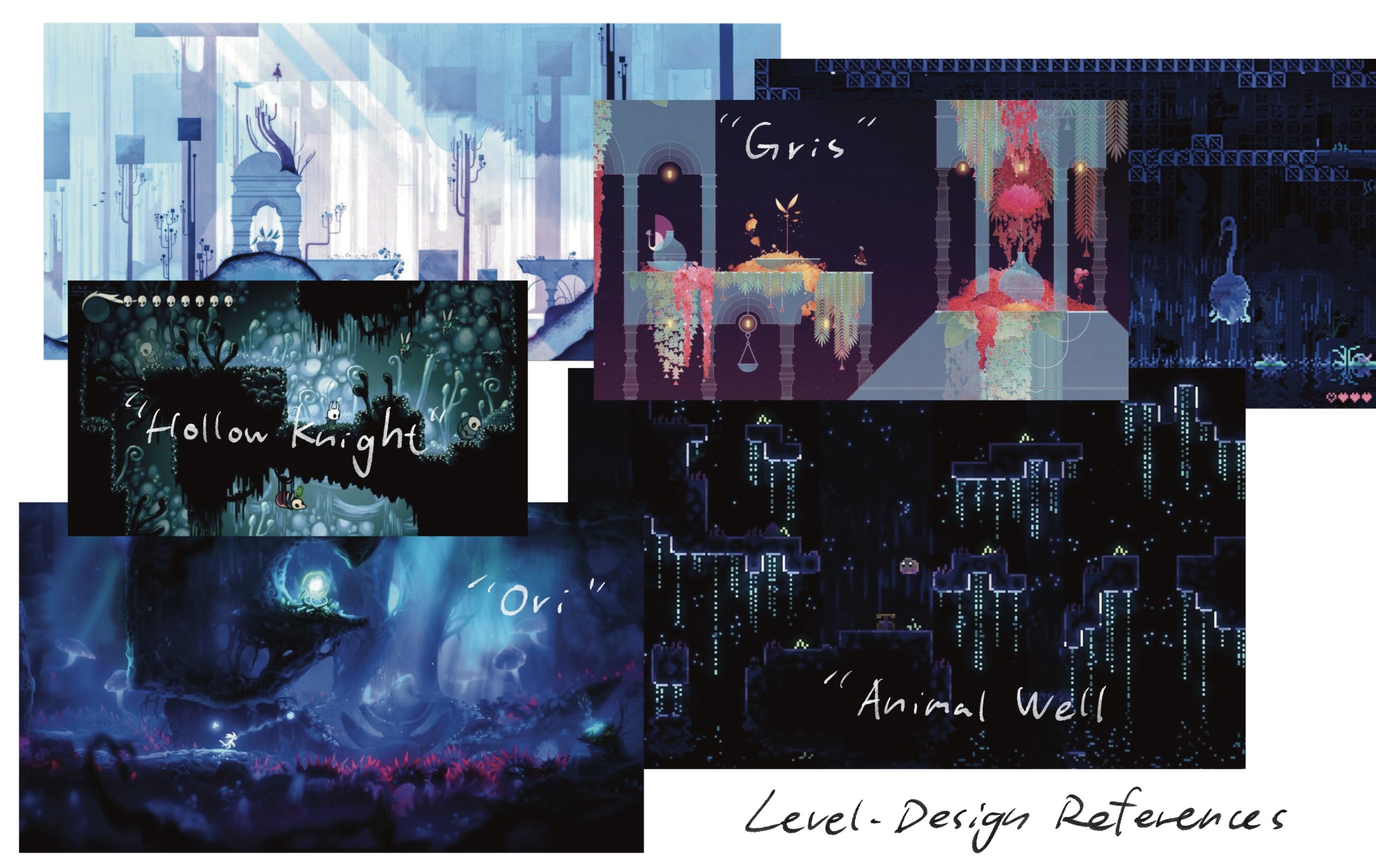
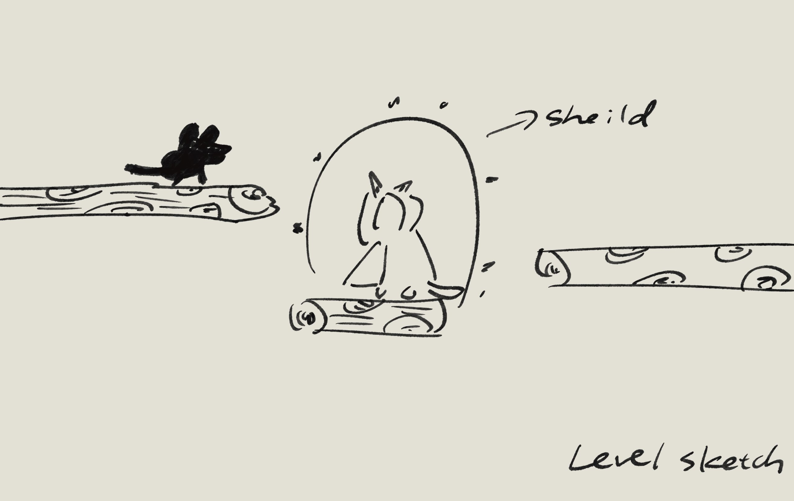
Level design:
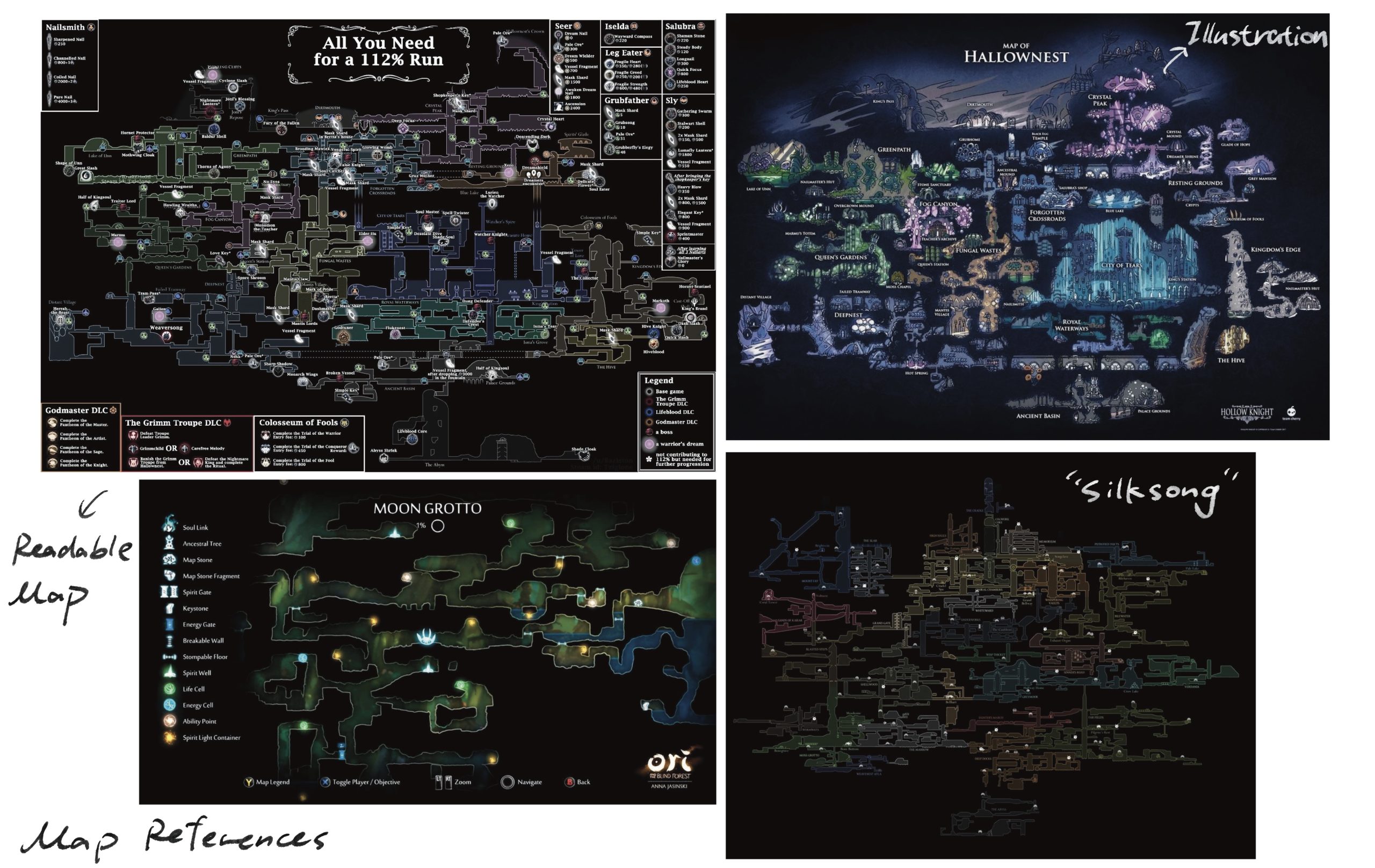
These are classic Metroidvania-style map designs. The entire map is interconnected, yet each area represents a distinct ecological environment requiring specific abilities or secret passages to unlock. Designers often employ different musical styles and colour palettes to allow players to intuitively perceive regional shifts through sensory cues.
Character design:

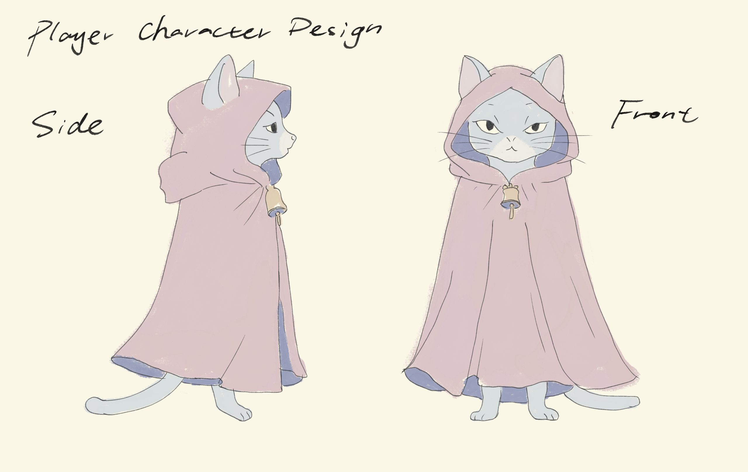
Player Character Design: The Cat
The player character is a cloaked cat, designed to visually communicate quiet independence, sensitivity, and emotional distance. The cat’s silhouette is kept simple and readable, with the cloak forming a clear outer shape that separates the character from the surrounding environment. This reinforces the idea that the player character is an outsider within the world of Rootmere. The lack of detailed facial expression allows players to project their own emotions onto the character, supporting identification rather than predefined personality. The cloak also serves a symbolic function, representing self-protection and emotional boundaries, which later evolve through gameplay mechanics as the character learns to balance isolation with expression.
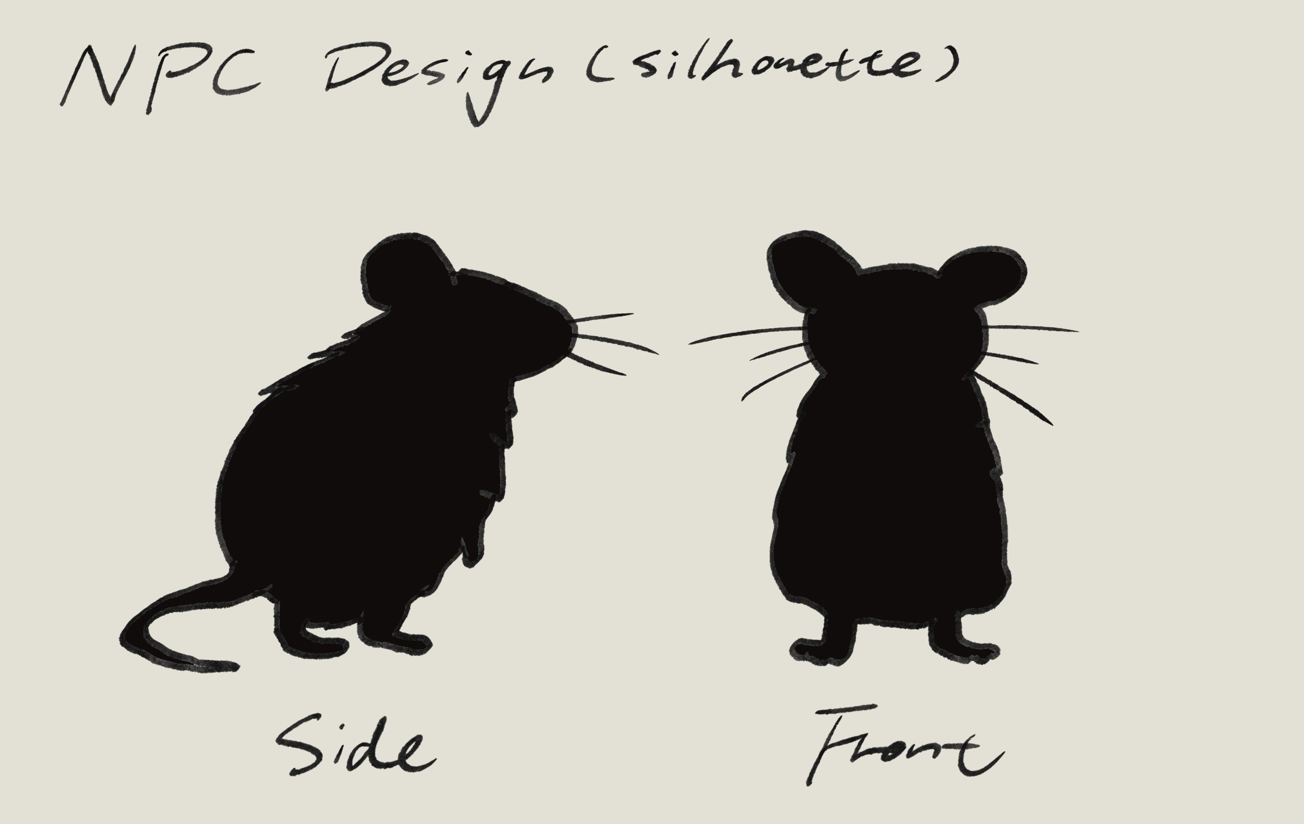
NPC Design: Voles (Mice)
The NPCs are designed as Root Voles, small burrowing creatures that naturally belong to the underground world around the tree’s roots. Visually, they appear as simplified silhouettes with minimal detail, often seen in groups on platforms or clustered in space. Their design avoids aggression or sharp features, emphasising neutrality rather than threat. By using silhouette-based forms, the NPCs read as part of the environment rather than individual characters, reinforcing their role as a collective presence.
UI Design:
The game adopts a highly minimal UI design approach. During gameplay, no UI elements are displayed: there are no health bars, meters, minimaps, or text overlays. All player feedback is communicated through visual, audio, and mechanical cues within the game world itself, such as changes in light, sound, and character behaviour. This decision supports immersion and ensures that the player’s attention remains fully on the environment and emotional experience.
UI elements are only present on the start menu, which includes essential options such as New Game, Load, and Settings. The menu design is kept simple, using clear typography and minimal interaction to avoid distraction.
Ideation:6. Poster
Researches:
Leave a Reply